Revamping a Crypto Payment Widget with Stellar UX/UI Design
Ivan Kalkaev
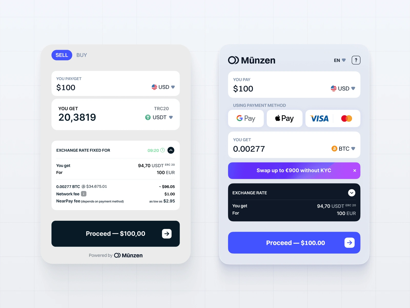
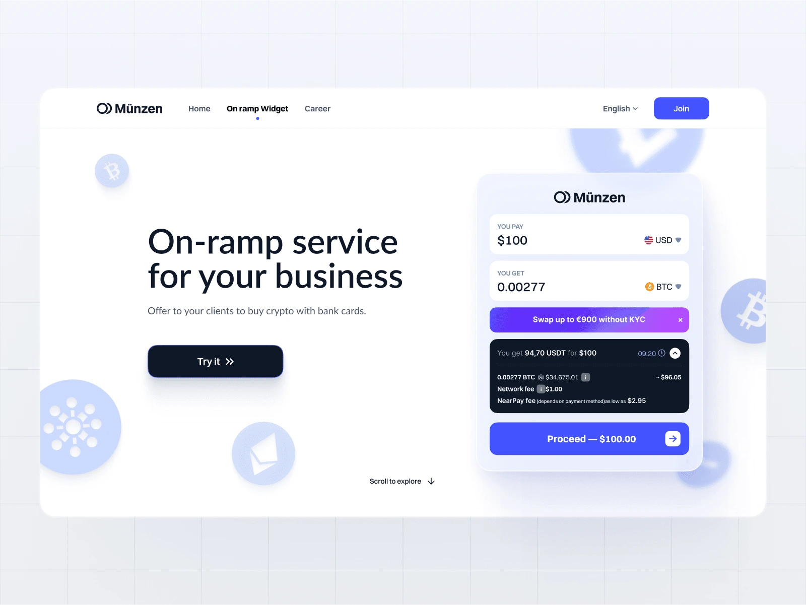
Hey there, startup fans! Get ready for a wild ride as we dive into one of our coolest projects at Unipaws Design Studio – revamping the Near Pay Widget for Münzen. This widget is like the VIP pass for users to jump into the Near blockchain, making it super easy to buy NEAR tokens using their go-to payment methods. Our job? To turn this widget into a UX/UI rockstar!
Where We Started
When Münzen knocked on our door with the widget, it was already pretty sweet, but we knew we could crank it up to eleven. We put on our design thinking caps and got to work, making sure every little detail was in sync with Münzen's vibe.
Making the Background Pop
First up, we whipped up an adaptive 'Vibrancy' background that changes its colors based on the website it's chillin' on. It's like a chameleon, but for design! This way, the widget always looks fly and blends in perfectly, making it easier on the eyes.
Layouts, Layouts, Layouts
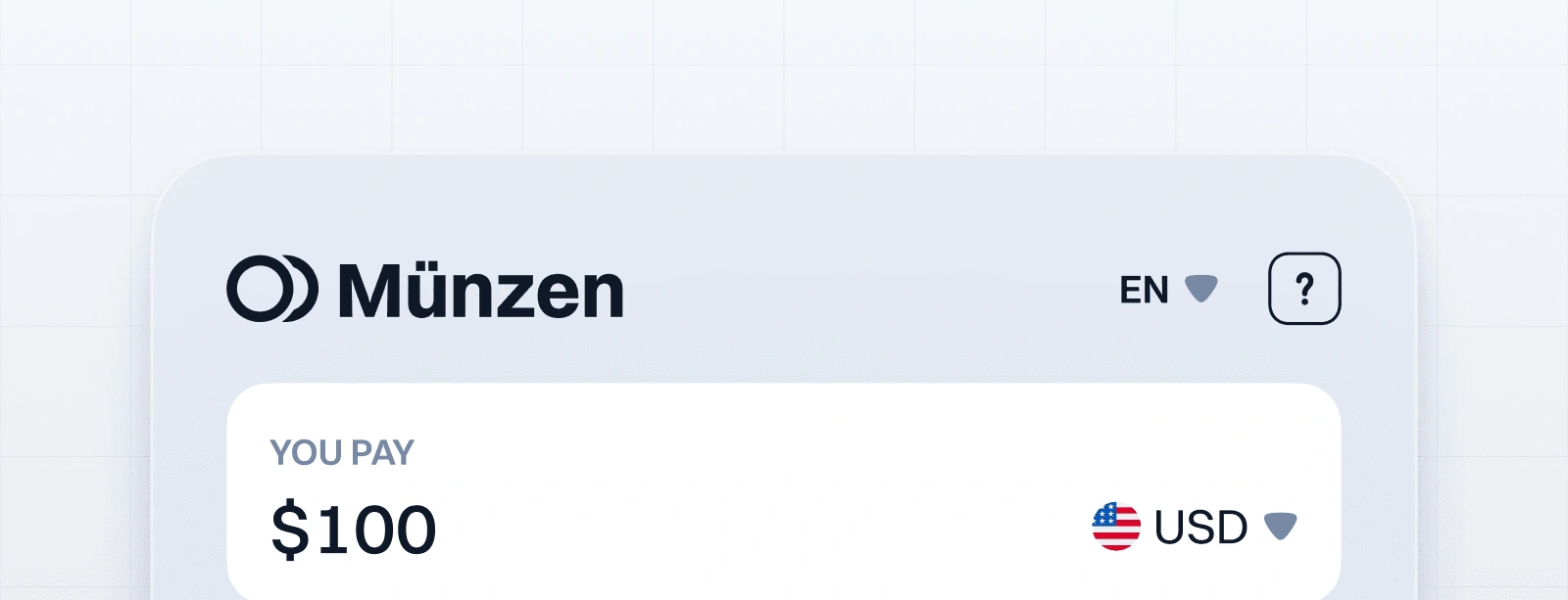
Putting the Logo in the Spotlight: We moved the logo to the top, so it's the first thing users see. Instant brand recognition and trust, baby!
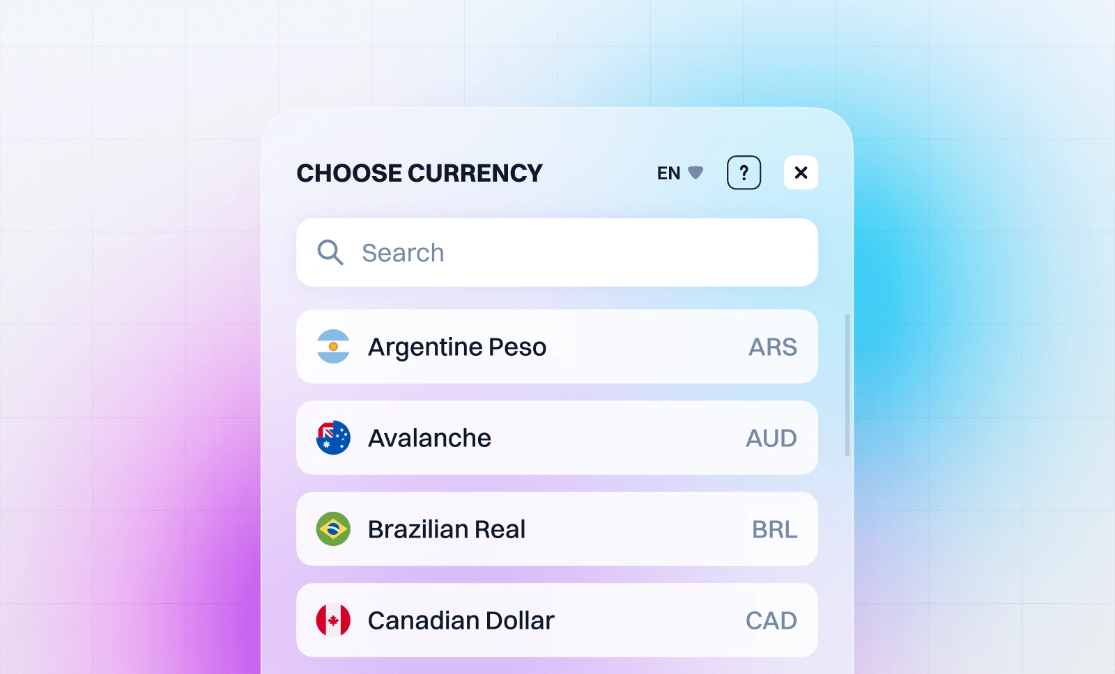
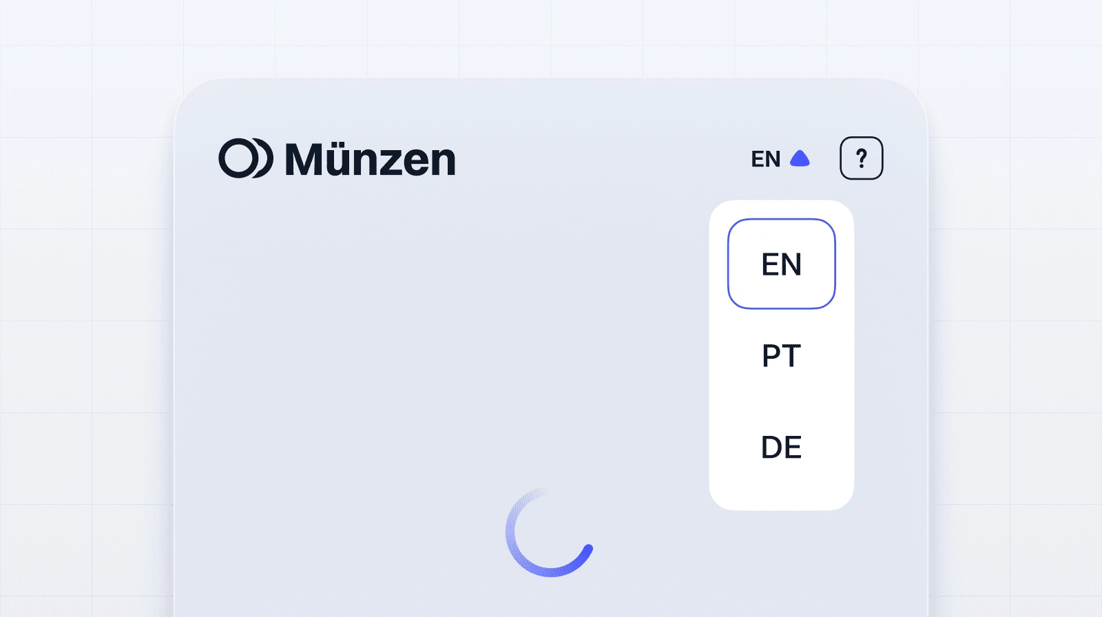
Speaking Your Language: We threw in a language switch and mini guide so users from all over the globe can navigate like pros.
Swap Your Tokens, No KYC Required: To get more people trading without any hassle, we added a KYC-free swap promo banner that's eye-catching but not too in-your-face.
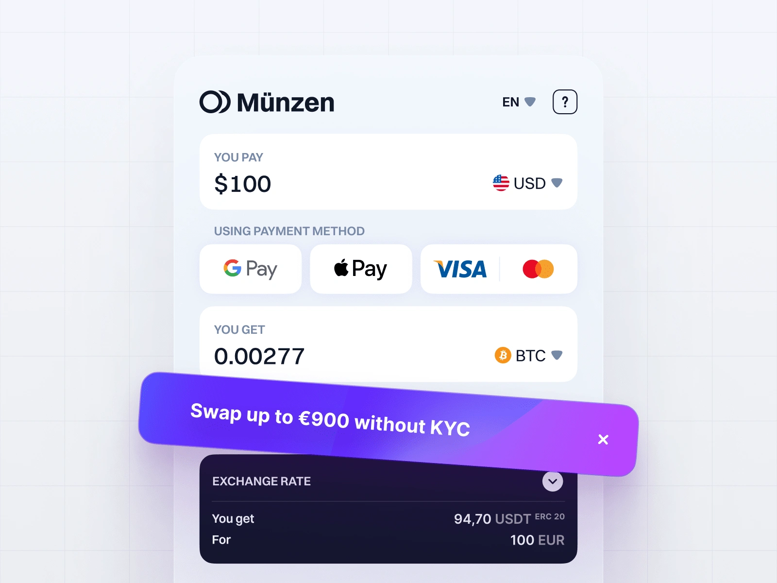
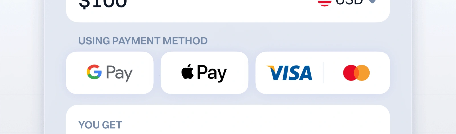
Slick Payment Flow: We gave the payment section a major glow-up, making it a breeze to use. The Visa/Mastercard button got a sleek combo makeover, showing off our love for the little things.
Balancing Act: We played around with the payment and receipt areas until they were perfectly balanced, like yin and yang. This makes the whole transaction feel more intuitive and less of a brain-buster.
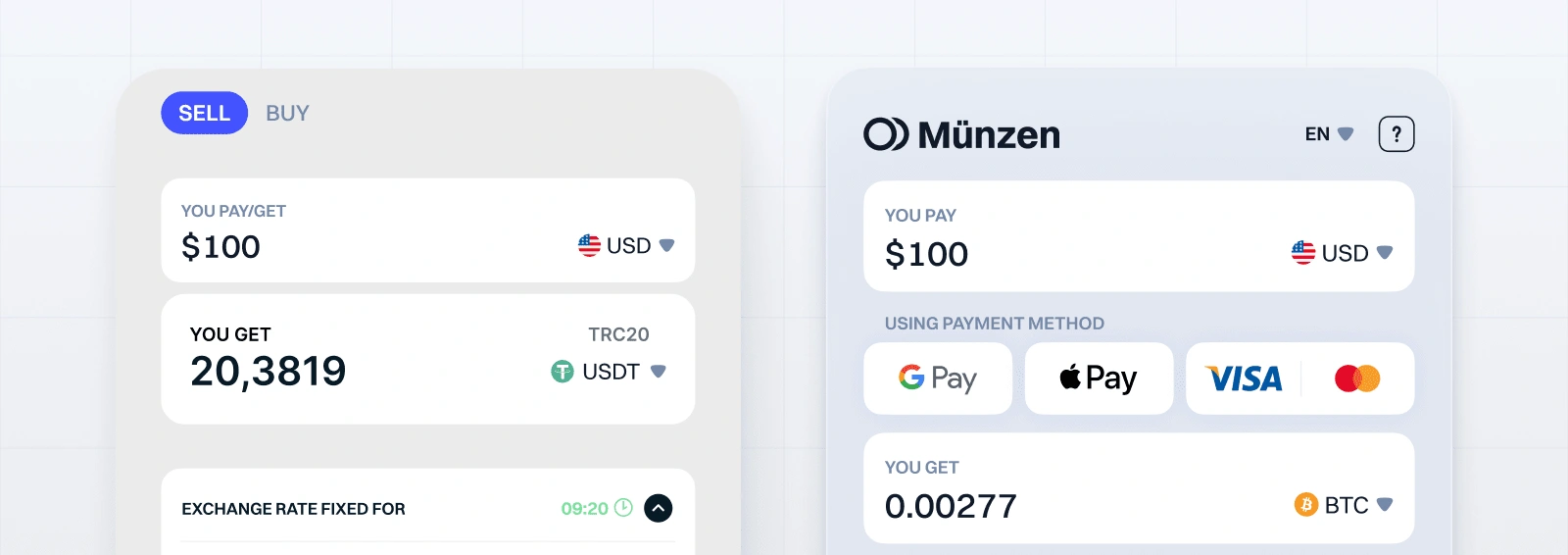
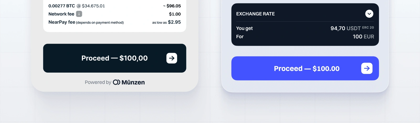
Pushing the Right Buttons: The payment button got a size upgrade for easy clicking, and we splashed Münzen's electric blue on it for some extra brand power.
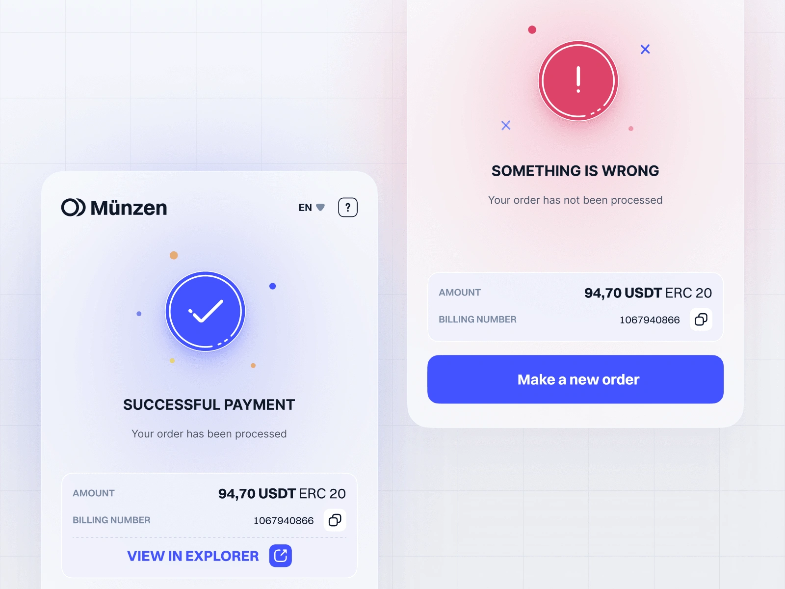
Icons, Navigation, and More
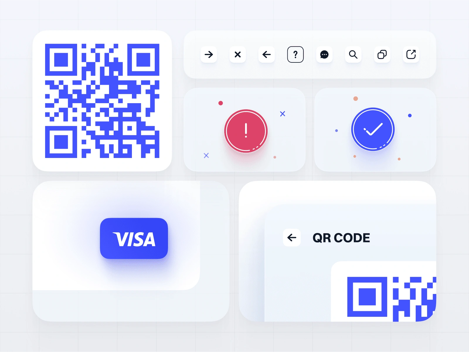
Icon Makeover: We gave the icons a fresh coat of paint, so they're easy to recognize and nice to look at. Plus, they make the widget way more user-friendly.
Smooth Sailing: From the 'Back' button to the address editing icons, we designed every little navigation bit with the user in mind. It's like the widget reads your mind!
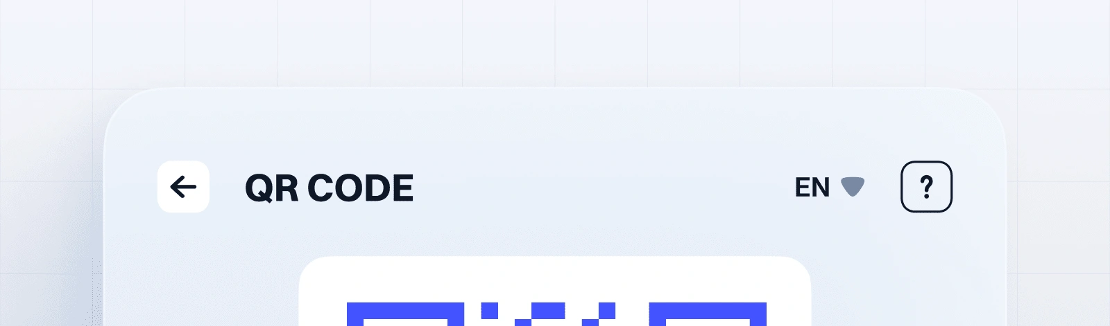
QR Codes Never Looked So Good: We styled up the QR and copy icons, so they fit right in with the widget's fresh new look.
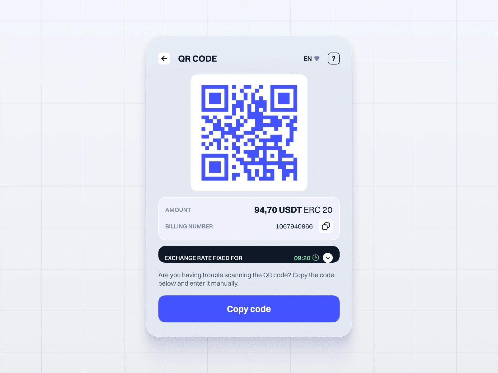
All the Feels: We put extra TLC into the error and success screens, so they match up with how the user feels at each step of the transaction.
Status States on Fleek
We went all-in on redesigning the widget's status states – loading, success, error, and confirmation. Each one's got its own custom animations and icons that keep users chill during transactions and let them know what's up. These nifty visual cues make the whole journey smoother, keeping users happy and loving the widget.
Responsive Design FTW
The widget's a pro at adapting to different devices and screen sizes, so it looks slick whether you're on your phone or your massive desktop. We had to do some fancy CSS and JavaScript footwork to keep everything in check, but it was totally worth it.
The Unipaws Edge
User-Focused: Before we even started designing, we dove deep into user testing and heat map analysis to get inside users' heads and spot any hiccups. This helped us make choices that put users first.
Teamwork Makes the Dream Work: We were in constant pow-wow mode with Münzen's dev squad, ensuring every design bit was not only drop-dead gorgeous but also doable on the tech side.
It's All in the Details: From the tiny interactions to the big picture, we obsessed over every little thing to create a seamless, intuitive experience that shows off our passion for top-notch design.
Leading the Charge
Our rad art director Ivan Kalkaev and design wizard Marie Melnikova steered this ship like pros. They pushed the boundaries of what's possible in UX/UI design, and the love from Münzen and widget users after launch proves it was a slam dunk.
The Unipaws Way
At Unipaws design agency, we believe killer design is all about mixing beauty and brains. The Near Pay Widget redesign is the perfect example of how we bring that philosophy to life. We're talking looks that'll make you swoon and user experience so smooth, you'll want to high-five your screen.
Tips for Startups
If you're a startup looking to crush it in the crypto world or any other space, steal a page from our playbook:
Go all-in on UX research – it's the secret sauce.
Make your brand style shine through every little thing.
Get your dev team on board early and often.
Don't cut corners, even when the clock's ticking.
At the end of the day, it's about whipping up a product that doesn't just look pretty but also puts a big ol' grin on your users' faces. That's the Unipaws way, and we're stoked to help more startups reach that level of design greatness.
So, if you're ready to take your crypto project to the next level, give us a shout. We can't wait to make some UX/UI magic together!
The work was done as part of studio job Pixpowder.
Design by Marie Melnikova, art-direction by Ivan Kalkaev, project-management by Alice Skhabovska.
Like this project
Posted May 2, 2024
From adaptive backgrounds to custom icons, our Near Pay Widget redesign prioritizes both UX and visual appeal for a truly exceptional user journey.
Likes
1
Views
78