VAEL Black-themed E-commerce Store Design

Praveen N


VAEL — Black themed E-commerce Store
Overview
VAEL-images.zip
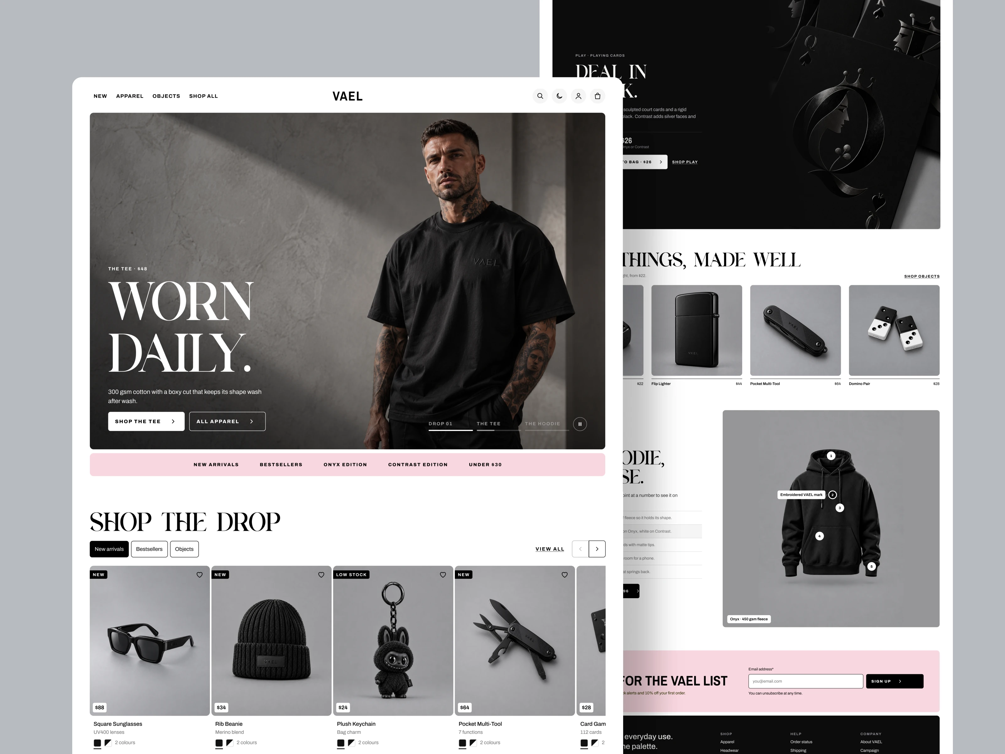
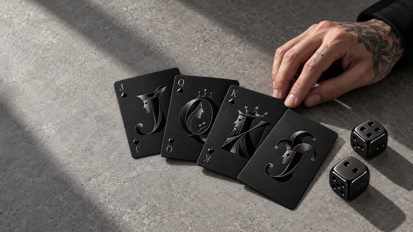
VAEL is a monochrome lifestyle brand selling 15 apparel pieces and everyday objects, each in two editions: Onyx (all black) and Contrast (black with white trims). I designed its brand and full online store across desktop and mobile, in light and dark mode.
Role: Brand identity, UX/UI design, design system ·
Tools: Designed in Figma, Built in Claude
Live demo: View VAEL
SKU Collections :
The challenge
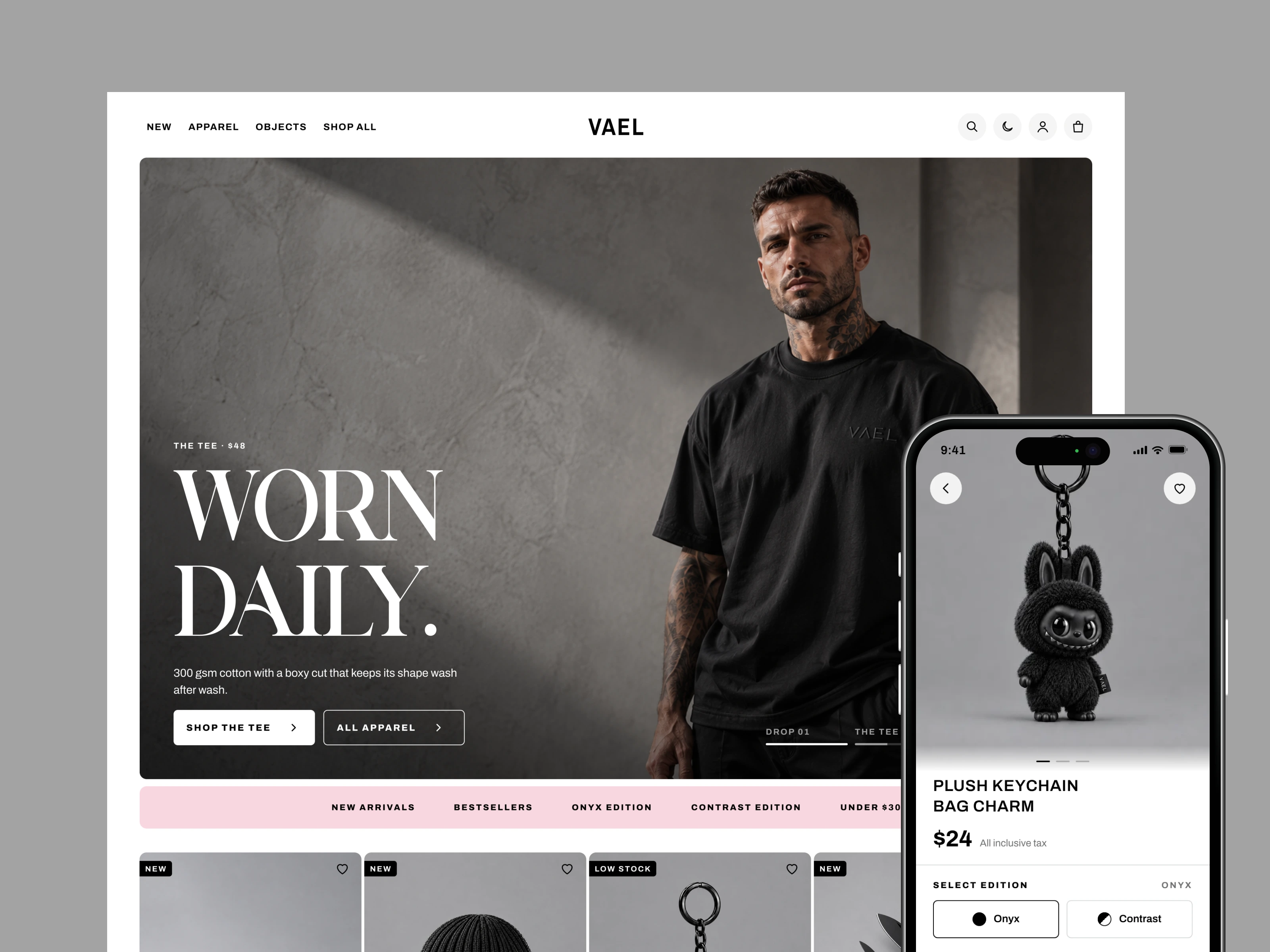
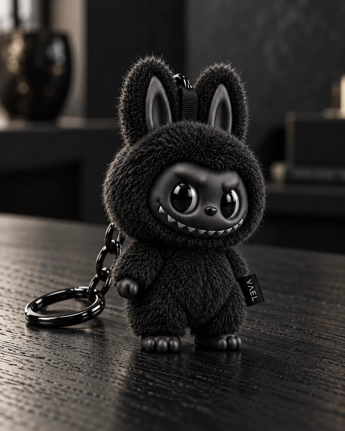
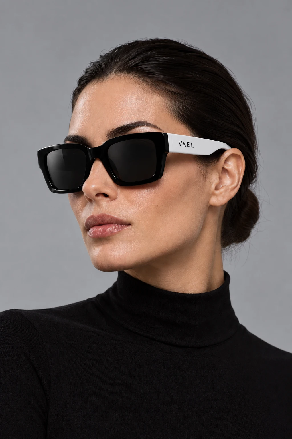
When every product is black, colour can't guide the shopper. Photos and swatches look alike, and a grid of black cards quickly becomes noise. The store had to feel as sharp as the product while staying easy to scan and buy from.
pdp
The approach
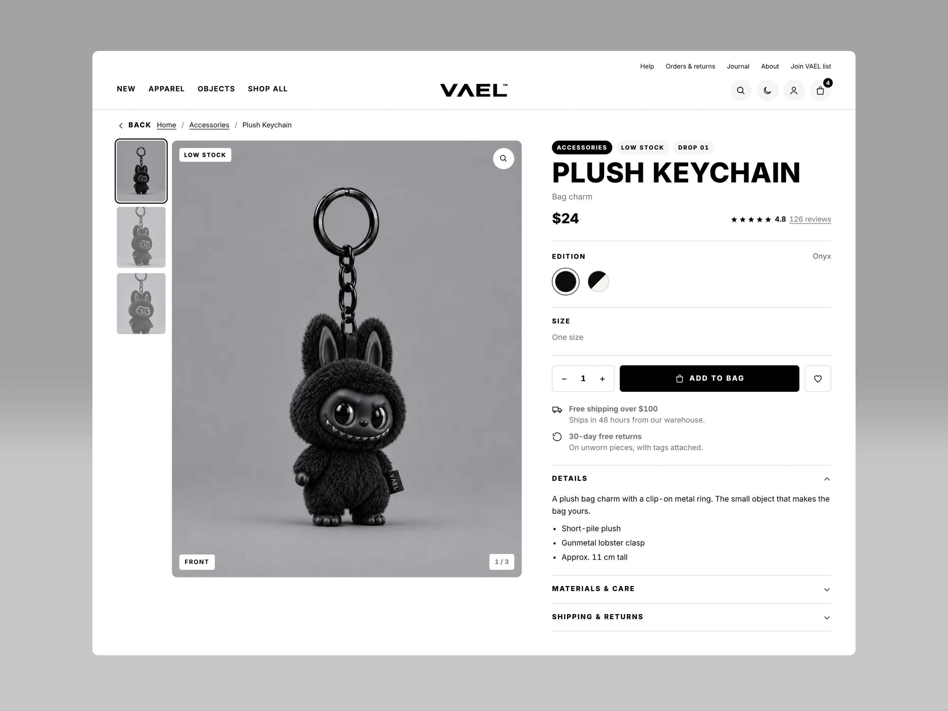
Hierarchy comes from type, outlines and a single accent instead of colour.
Type: Archivo, condensed caps for headlines, normal width for body
Colour: warm ink #0B0B0C and paper #F4F4F2, with signal pink #F9D7DF as the only accent, for sales and rewards
Shape: rounded cards, buttons and inputs to soften the dark palette
Modes: light and dark, switchable by the shopper
Key screens
Home: full-bleed hero slideshow, product rails, a hotspot product feature and a category accordion
Collection: sticky filter sidebar, 3-column grid, edition swatches that swap the photo
Product: gallery with lightbox, edition and size buttons, sticky add-to-bag bar
Bag: outlined item cards, promo code inside the summary, one black checkout button and a light-green free-shipping moment
Checkout and confirmation: three short steps, then a black confetti screen with a floating order summary
Account and support: member dashboard, order tracking, help centre, contact and size guide
Outcome
VAEL now has a complete, on-brand store where one-colour products stay easy to browse. The lesson: in a monochrome store, small cues do the heavy lifting — an outlined chip turning black, a pink sale tag, a green free-shipping banner.
Like this project
Posted Nov 2, 2026
A store where every product is black, so the design does the guiding: bold type, sharp outlines and one pink accent. Built for light and dark mode.
Likes
5
Views
4