
pro
Praveen N
Product Designer, Brand Designer, Founder & Jitter Expert
- $50k+
- Earned
- 7x
- Hired
- 5.00
- Rating
- 159
- Followers
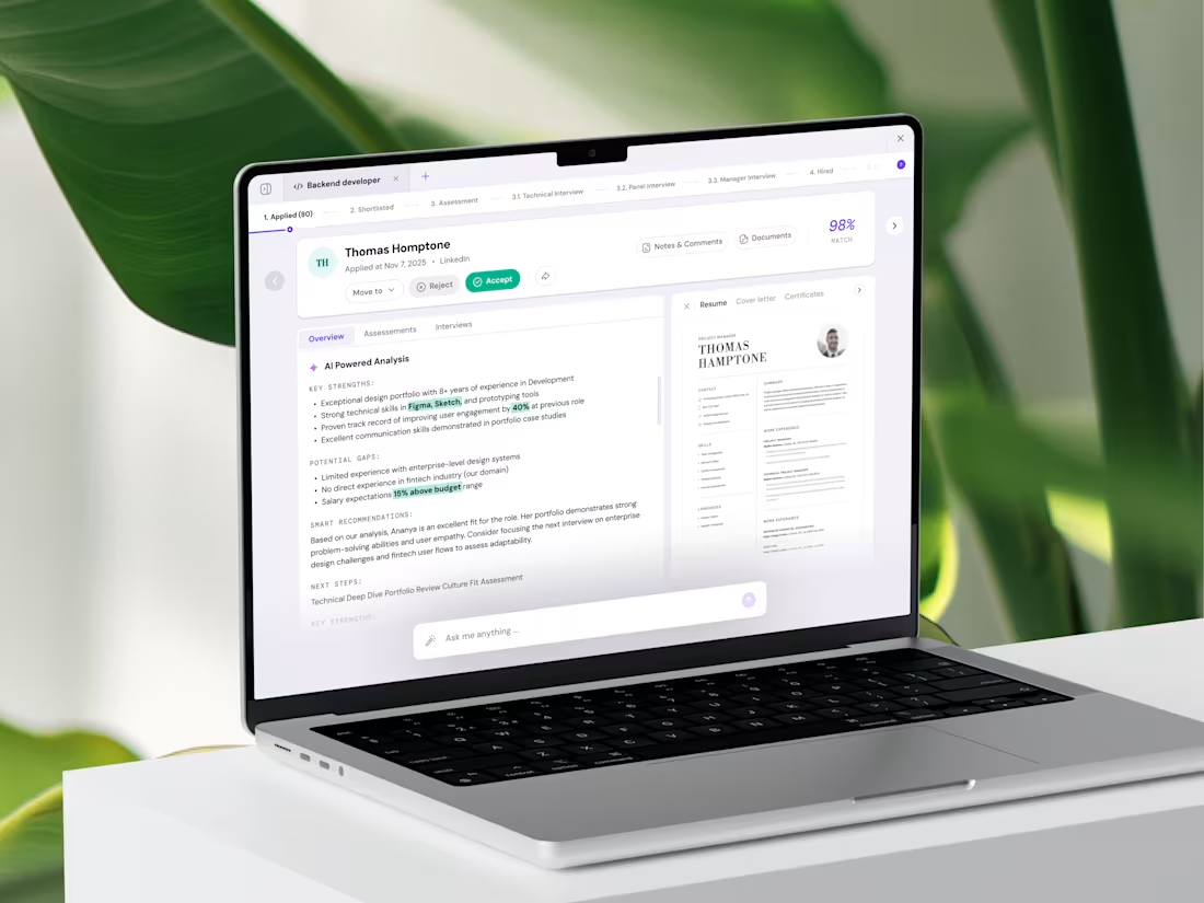
AI-Driven Hiring Platform Development for Propellum
6
25
1
6
16
669
1
7
44
1
7
32
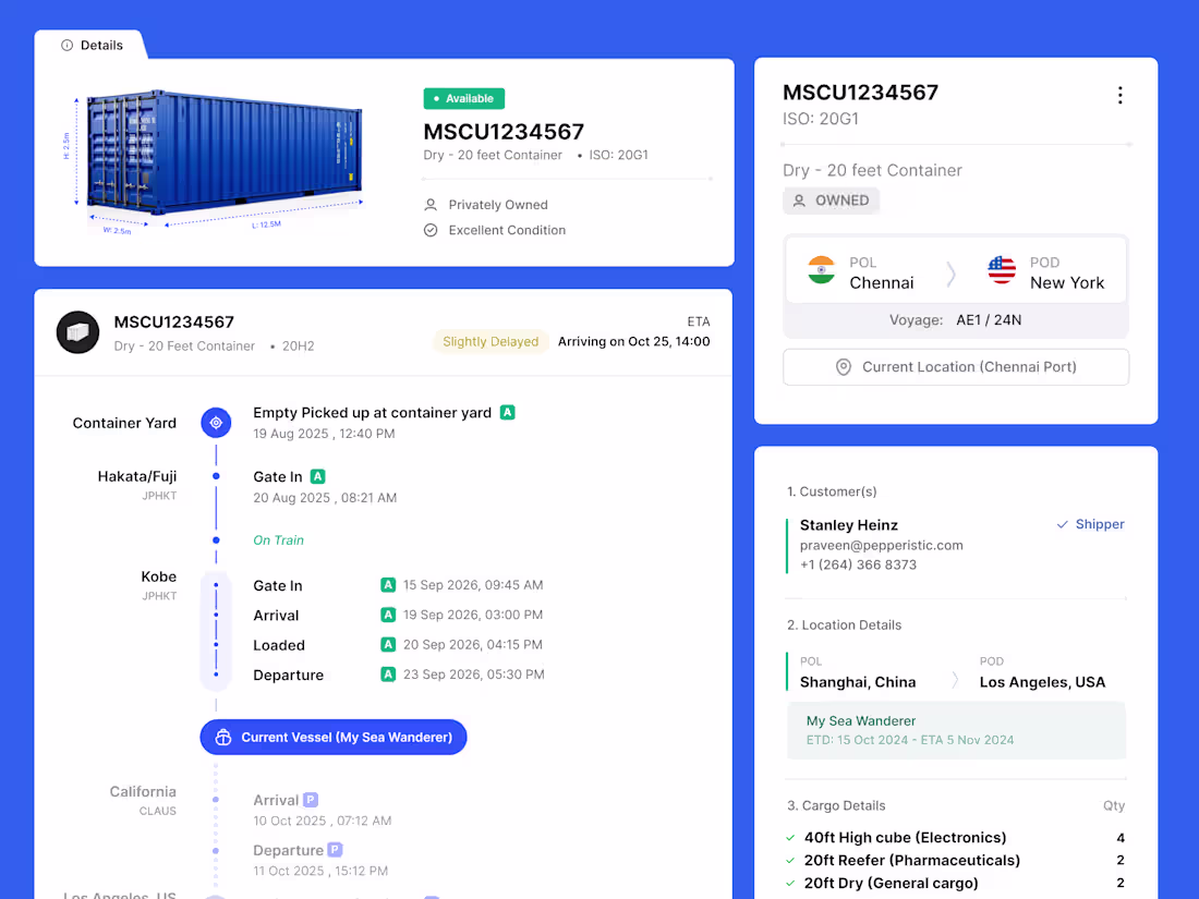
Logistics is messy; tracking it shouldn't be.
Meet Contrack, a comprehensive platform designed to give logistics managers a bird’s-eye view of their entire supply chain. From real-time GPS coordinates to automated port documentation, we’ve distilled complex global data into a clean, actionable interface.
Key Features Focus:
1. Live Geospatial Tracking: Visualizing cargo movement across oceans in real-time.
2. Smart Alerts: Instant notifications for port delays or temperature fluctuations.
3. Inventory Optimization: Predictive analytics to manage container turnaround times.
The goal was to balance "data-density" with "visual clarity"—ensuring users feel in control without feeling overwhelmed.
Tools used: Figma.
2
13
534
1
3
25
From ideas to execution our showreel captures the journey.
This is how we design, build, and think at Pepperistic Studio.
5
8
526
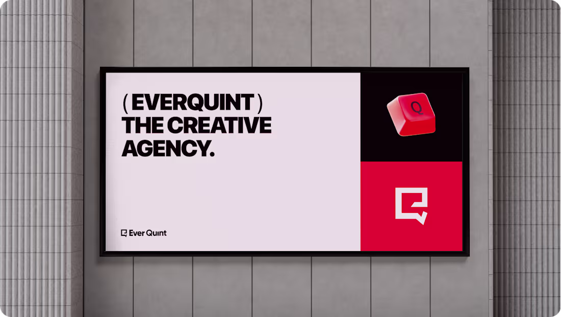
EverQuint Logo & Branding
6
23
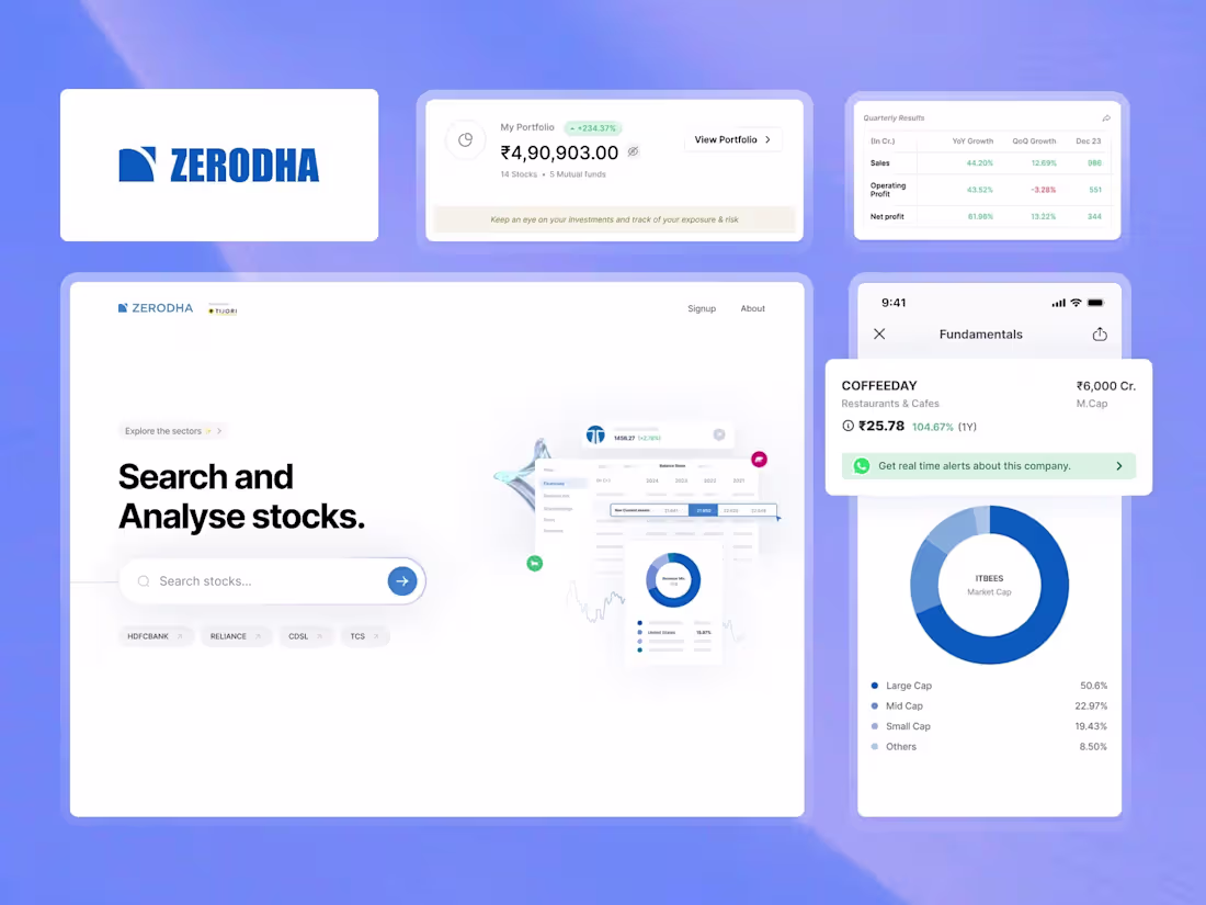
Redefining Stock Analysis: Zerodha x Tijori
Financial data doesn't have to be overwhelming. For this project, the goal was to bridge the gap between complex fundamental data and intuitive user experience.
By focusing on clean typography and structured data visualization, we’ve created a dashboard that allows investors to "Search and Analyse" with zero friction. From quarterly growth tables to deep-dive fundamental charts, every element is designed to make the data the hero.
Key Features:
Streamlined "Fundamentals" mobile view.
Interactive Portfolio tracking with clear YoY/QoQ growth metrics.
Minimalist Search UI for faster stock discovery.eading
5
11
558
AtlasLM: AI-Powered Financial Research Platform
9
35
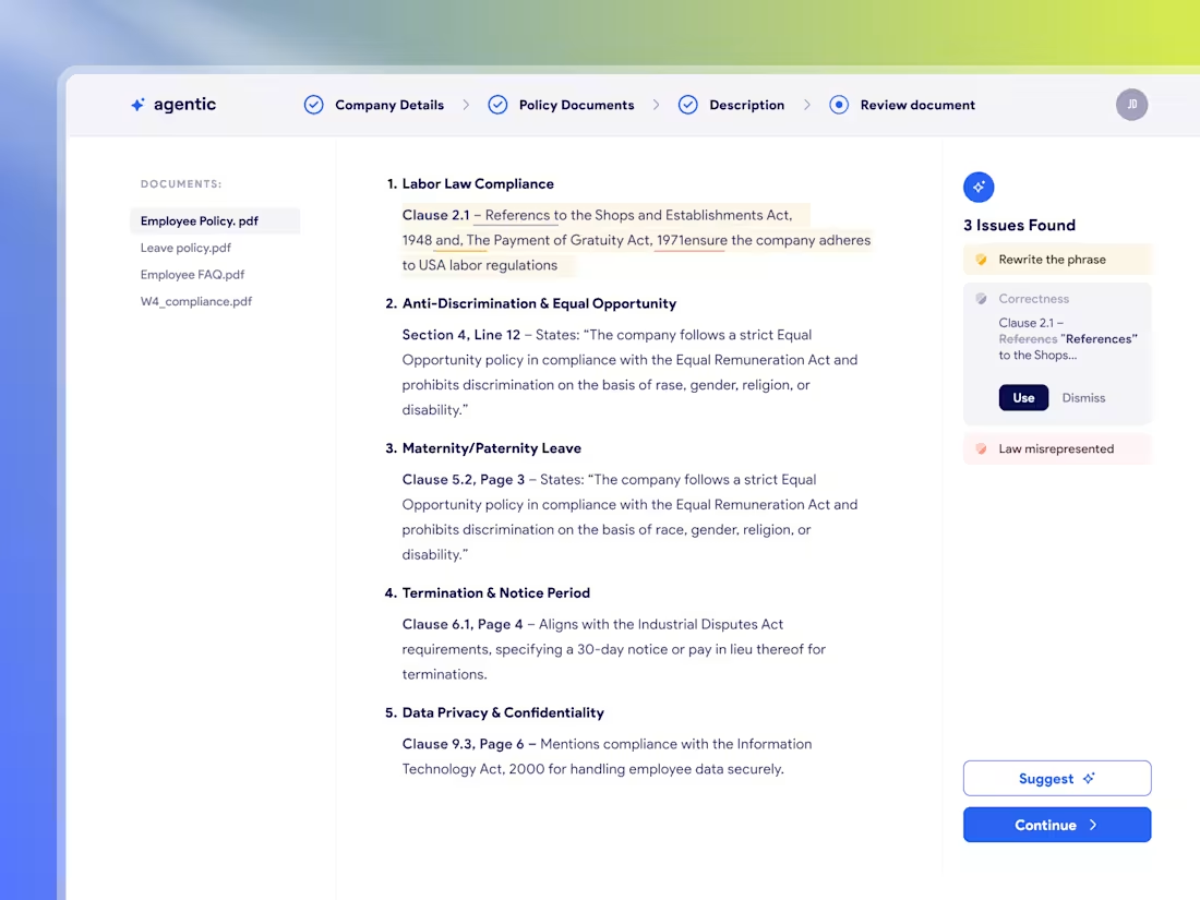
Agentic AI Platform Redesign
4
18
VPlans - Product Design Process Breakdown
(From idea to interface, here’s how we designed VPlans)
Discovery & Research
We started with stakeholder interviews, competitor mapping, and user behavior analysis to identify gaps in planning consistency and follow-through.
Wireframing & Flows
Key user journeys were mapped through low-fidelity wireframes, prioritizing clarity, minimal cognitive load, and smart plan creation.
Visual & UI Design
A clean, modular UI with cards, timelines, and interactive check-ins was designed to reduce planning fatigue while keeping actions clear.
AI UX & Microcopy
Contextual nudges and microcopy were refined to feel supportive, guiding users without distraction.
Testing & Iteration
Continuous feedback loops helped sharpen plan visibility and strengthen team accountability.
6
20
628
VPlans: Engineering Accountability Through Intelligent UX Design
Strategic Discovery: Analyzed competitor gaps to solve the core issue: the breakdown of planning consistency in high-output teams.
Architecture & Logic: Mapped low-fidelity journeys for automated plan generation and notifications to minimize cognitive load.
Modular Visual Identity: Developed a clean UI system using cards and timelines. A neutral palette was chosen to reduce task-management stress.
AI & Behavioral UX: Refined AI-driven nudges and microcopy to ensure the system’s voice remains supportive and prevents notification fatigue.
Iterative Validation: Conducted beta testing to sharpen dashboard visibility and accountability features for real-world operational needs.
2
6
505
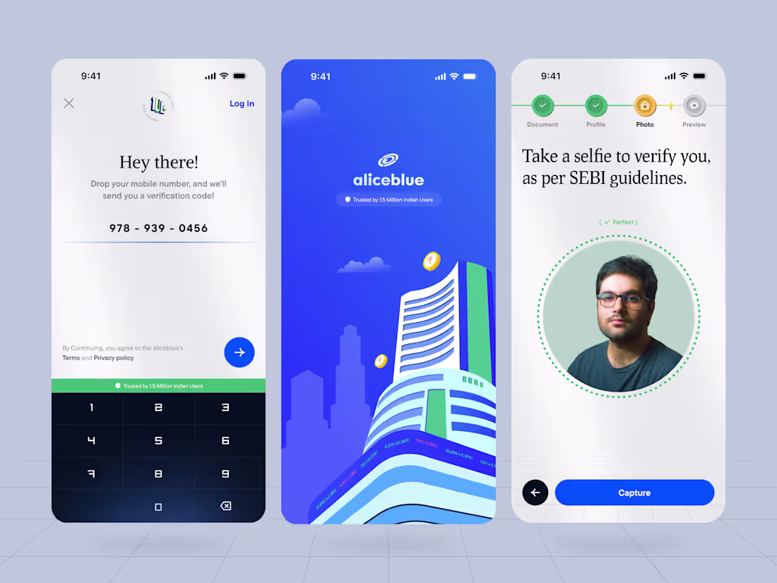
Few months back, we got Aliceblue as our client and we got a challenge on make sure the EKYC verification while creating Demat account as engaging as possible, so we made their existing boring designs to a highly visual enhanced design with bit of gamification. This project was a real fun to work with. Another Fintech in the Inventory.
We made sure the steppers are followed by the money theme so we did the coin style stepper instead of regular ones.
Customised their keypad to something unique and proper.
To ensure they belong to the stock market and fintech we helped them create stunning Illustrations for their onboarding and the product.
6
477
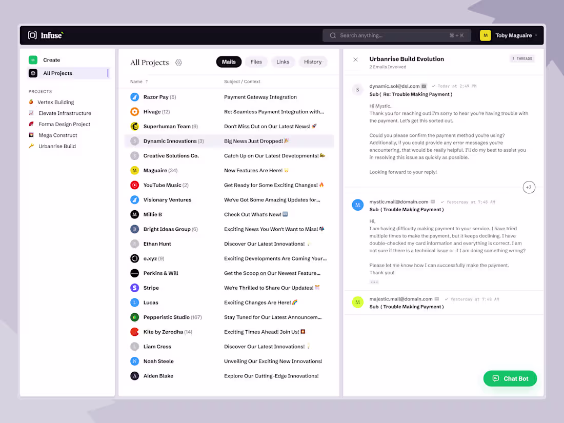
Infuse — Project-Based Email Workspace
Infuse is a modern email workspace that organizes scattered communication into project‑based threads. Instead of digging through a traditional inbox, users group emails by context—projects, clients, or workflows—making collaboration and follow‑ups faster.
Its clean three‑pane layout includes:
Projects panel for quick workspace access
Unified inbox that merges emails across platforms
Conversation view showing full threads and participants
With smart grouping, fast search, and smooth navigation between emails, files, and links, Infuse turns email into a structured productivity system. The minimal, professional interface prioritizes clarity and focus—ideal for teams managing multiple projects and stakeholders.
7
445

I have been cooking lot of AI products recently, This one was bit challenging to work as a concept also the client 😂 , Still That's what product designing gives us. Hope you guys enjoys as much as i do while seeing designs like this simple but effective.
7
510
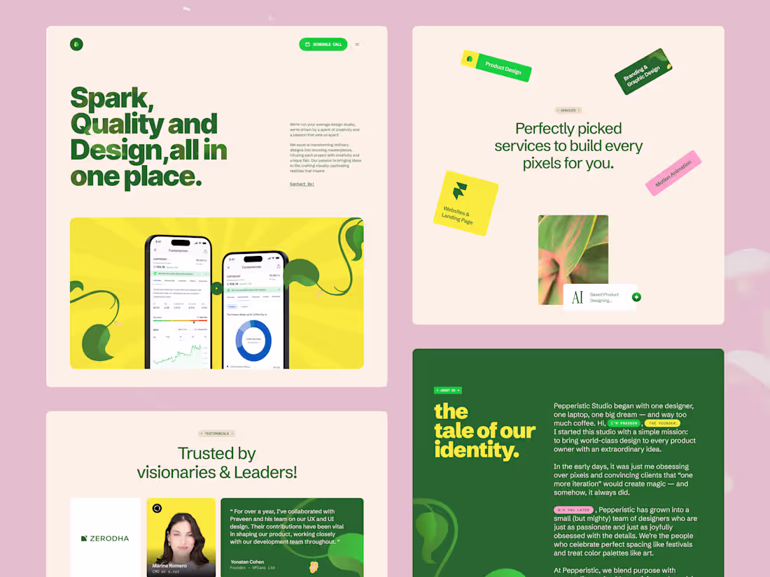
Redesigned our Pepperistic Logo: Inspired by the freshness of a pepper leaf, our new logo reflects Pepperistic Studio’s roots in nature, clarity, and evolution. It’s minimal, modern, and built to scale, just like the UI/UX systems we craft for fast-moving SaaS and founder-led brands. This mark isn’t just visual, it’s a reflection of how we design: intentional, user-first, and ready to grow with every product we touch.
8
514
1
7
58
1
9
130
2
8
63
2
21
243
1
19
216
Vplans product design
8
37
Landing Page Design for Vaiku's AI Platform
6
29
3
6
51
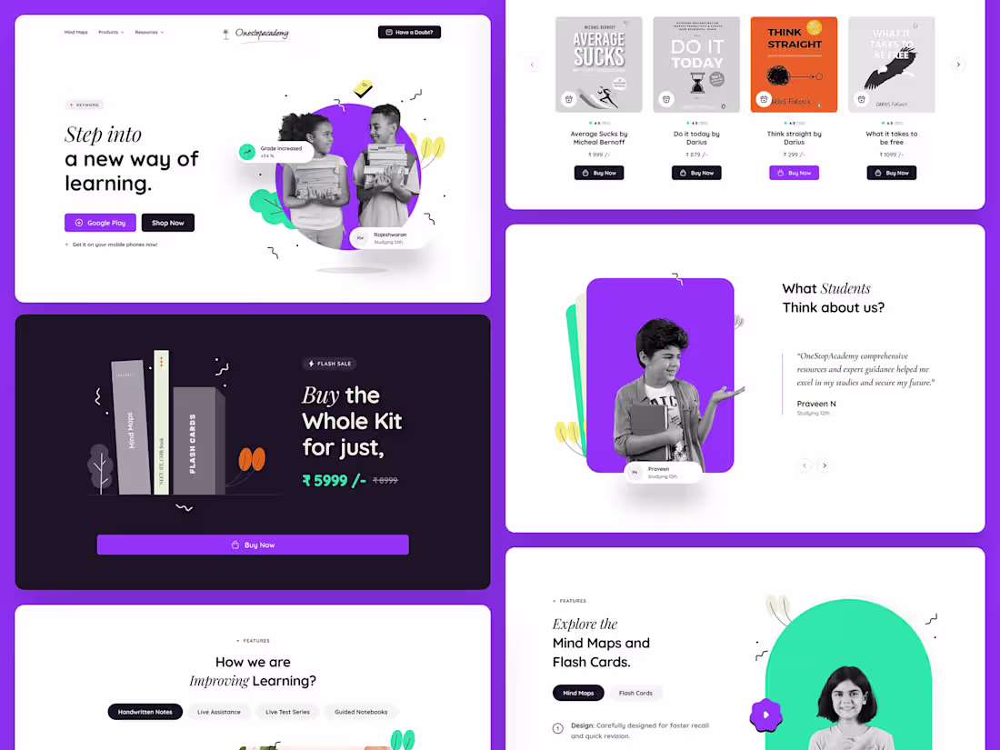
Landing page - Onestop Academy
3
28
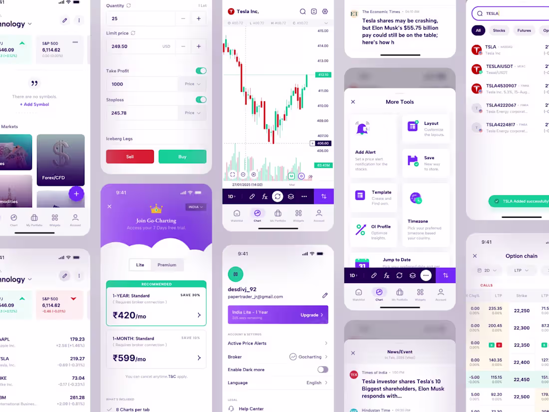
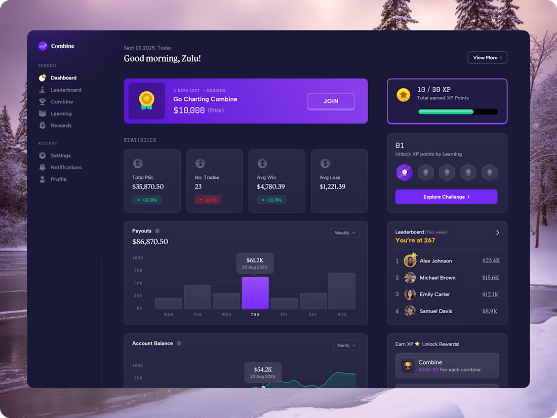
GoCharting Mobile Application Redesign
5
23
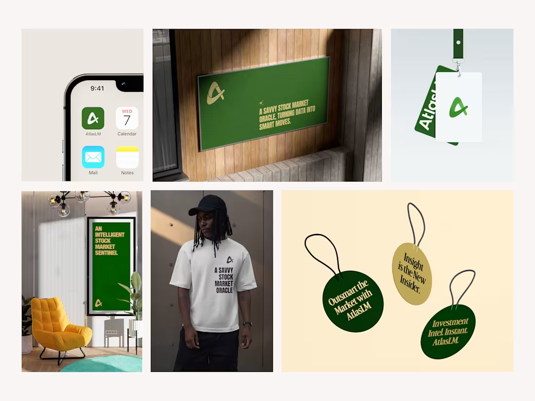
AtlasLM Visual Identity Design
6
28
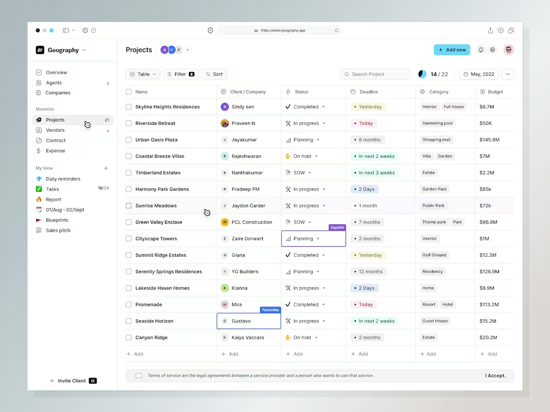
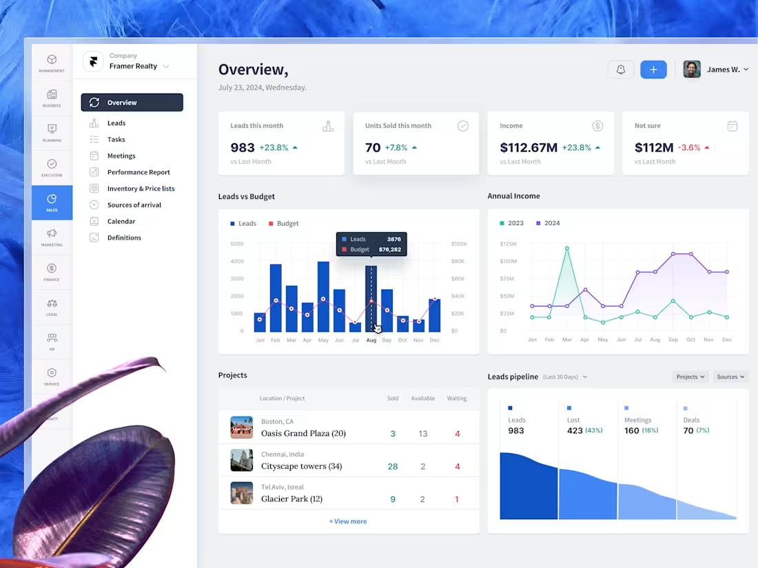
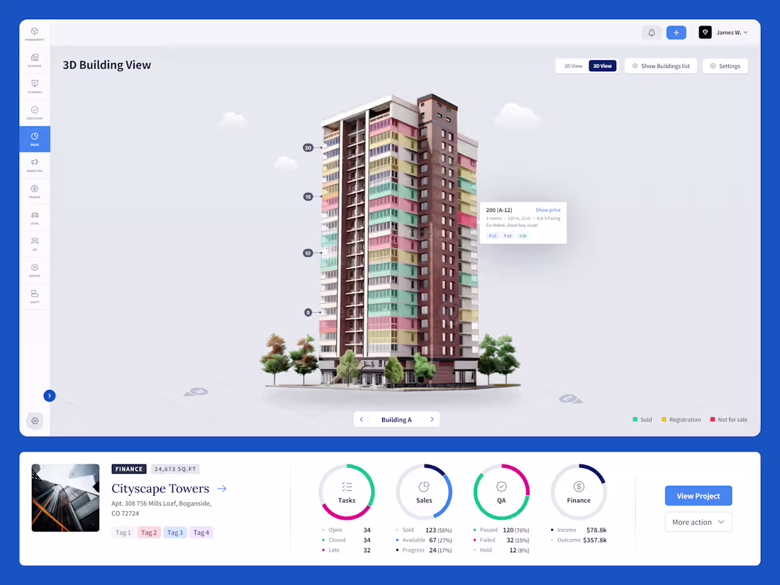
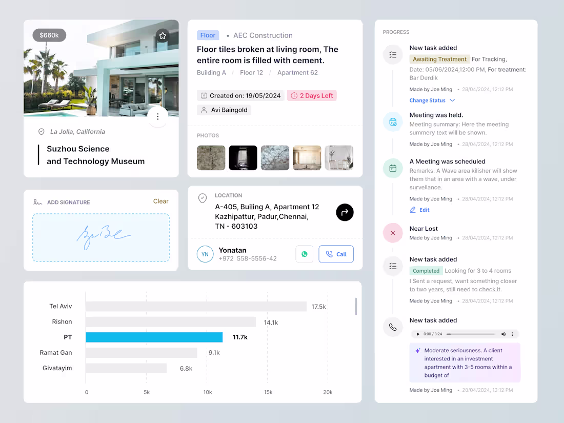
Construction Management Software Implementation
5
40
1ly options Components
5
18
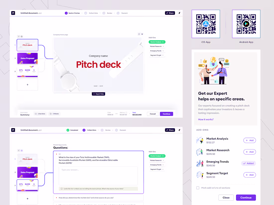
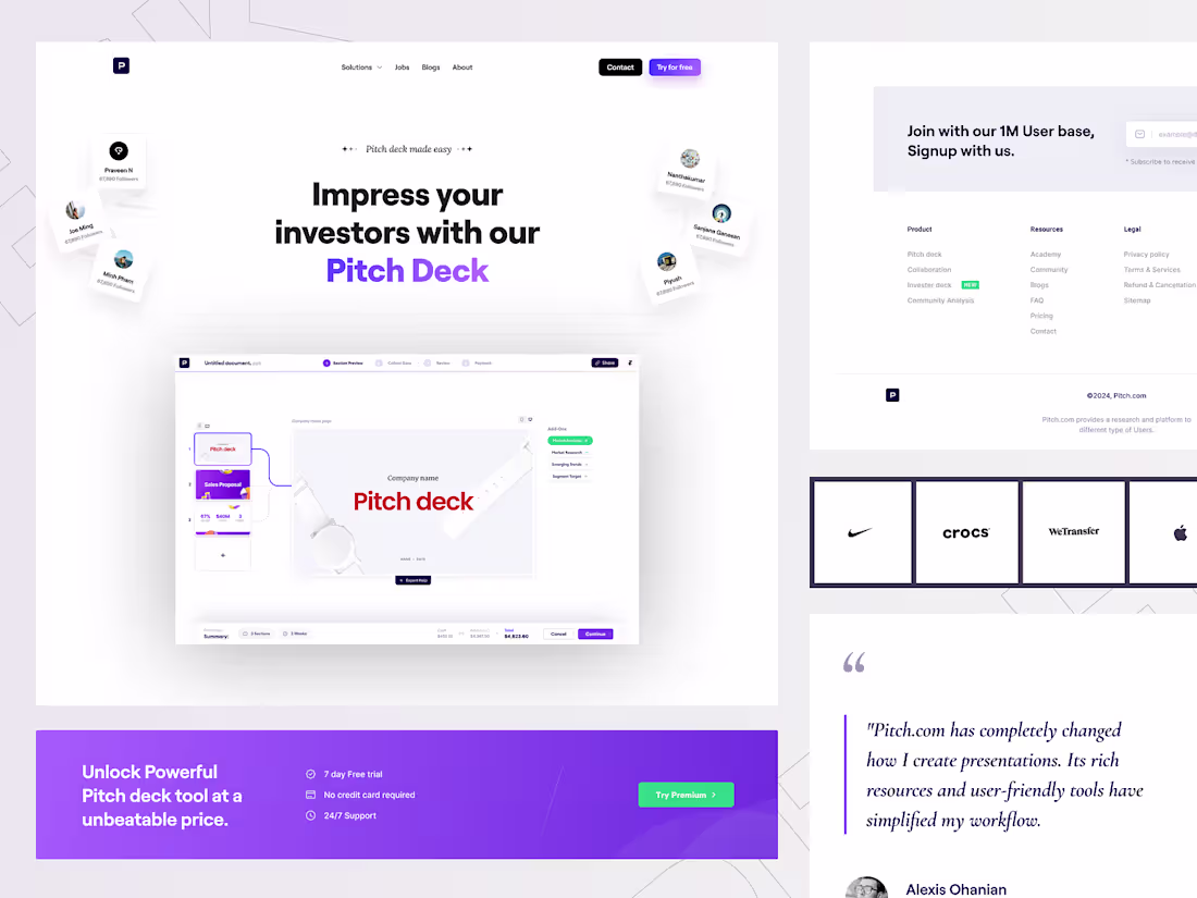
Development of Vaiku AI-Powered Pitch Deck Platform
5
19
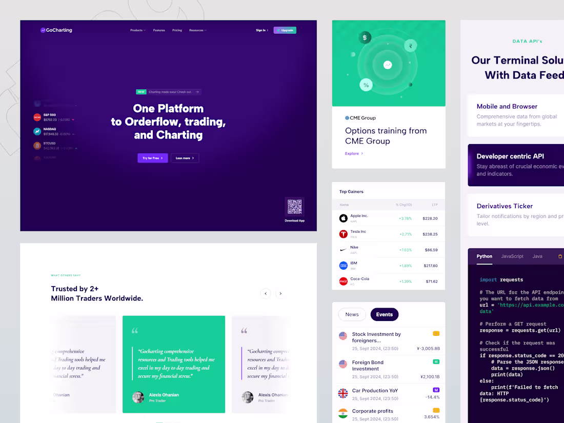
Gocharting Website redesign
7
15
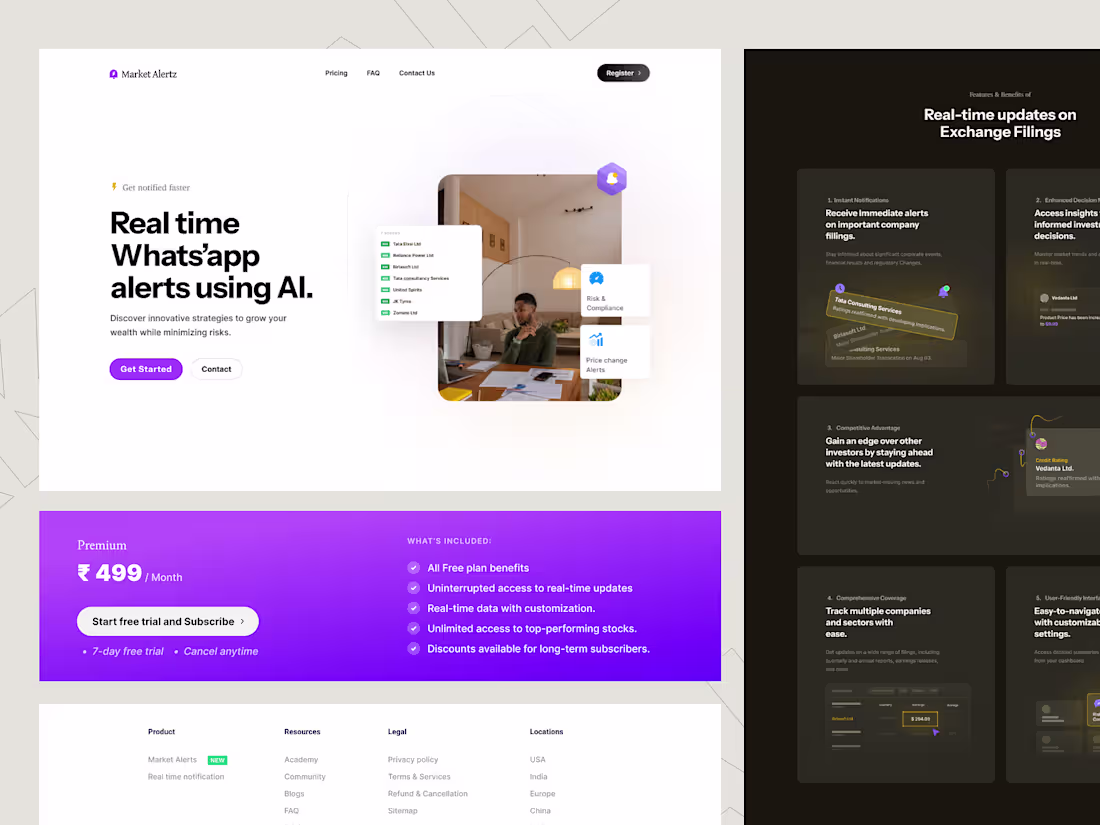
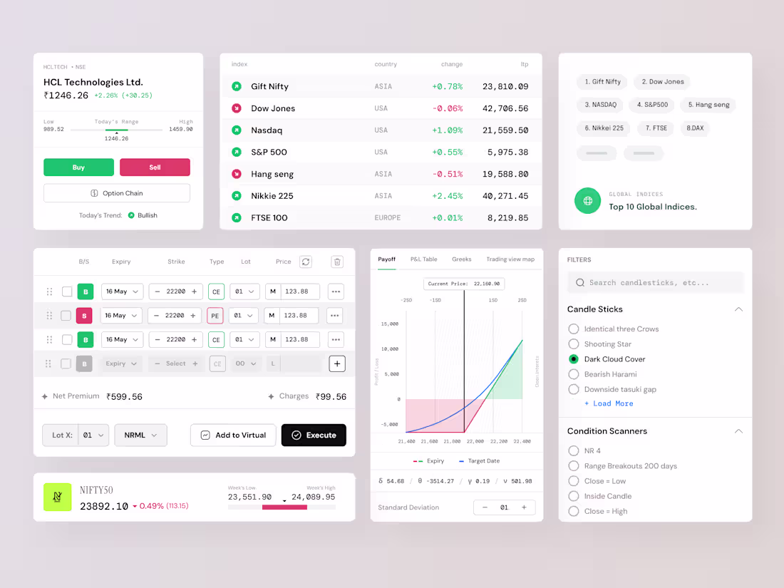
Market Alertz Website by Praveen N for Pepperistic Studio
6
14