Built with Jitter
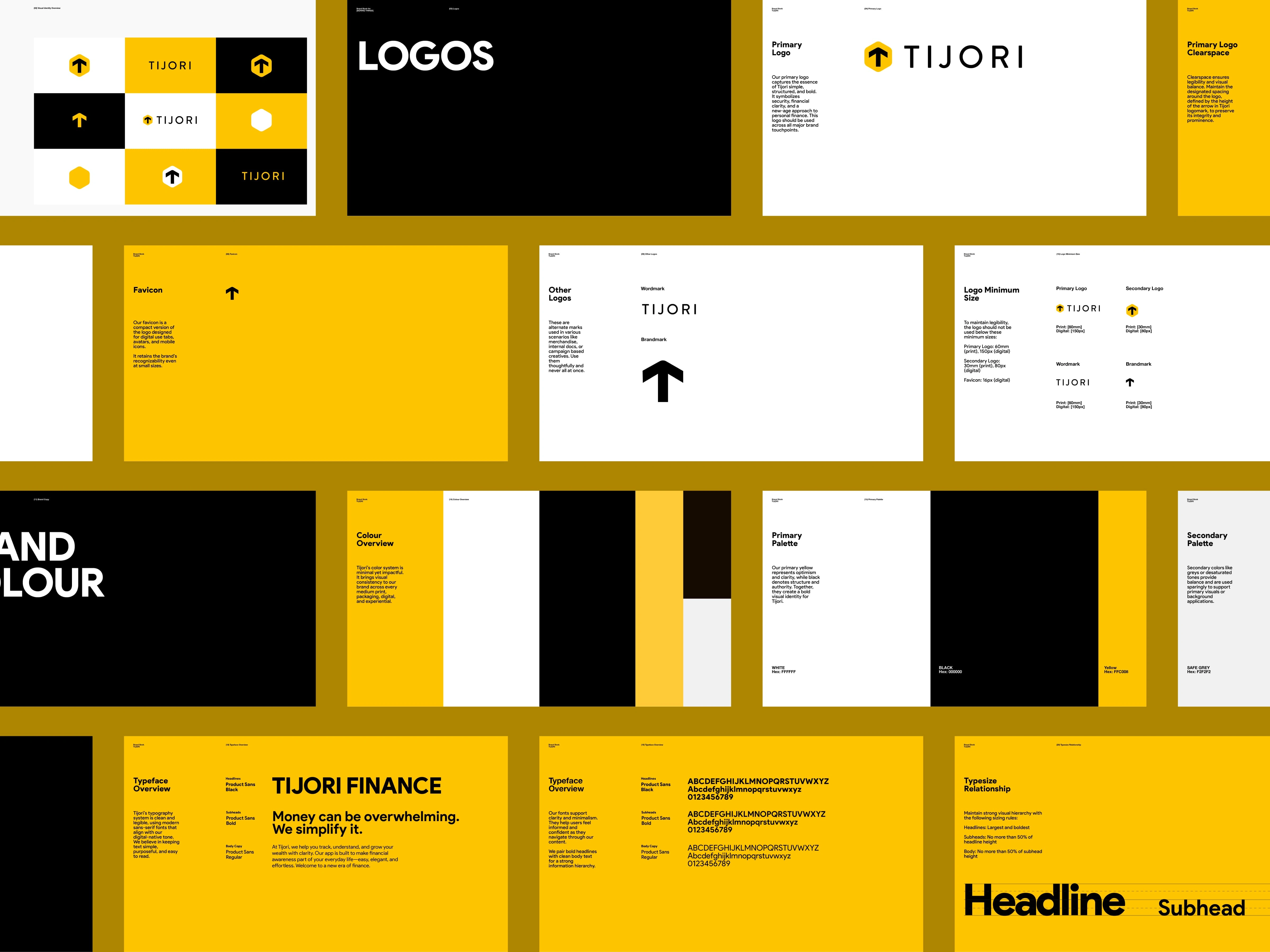
Tijori Branding and Logo Redesign
Praveen N
2 collaborators
Tijori Branding and Logo Redesign
The Problem :
Tijori had built a powerful financial platform-but the brand didn’t reflect its strength. There was a disconnect between the product’s potential and how it was perceived. Users didn’t instantly recognize the trust, security, and boldness behind it.
thumbnail
The Challenges:
Lack of emotional resonance in visual identity
Weak recall in a crowded fintech space
Absence of modern credibility and user confidence
A brand voice that didn’t match the product's clarity and ambition
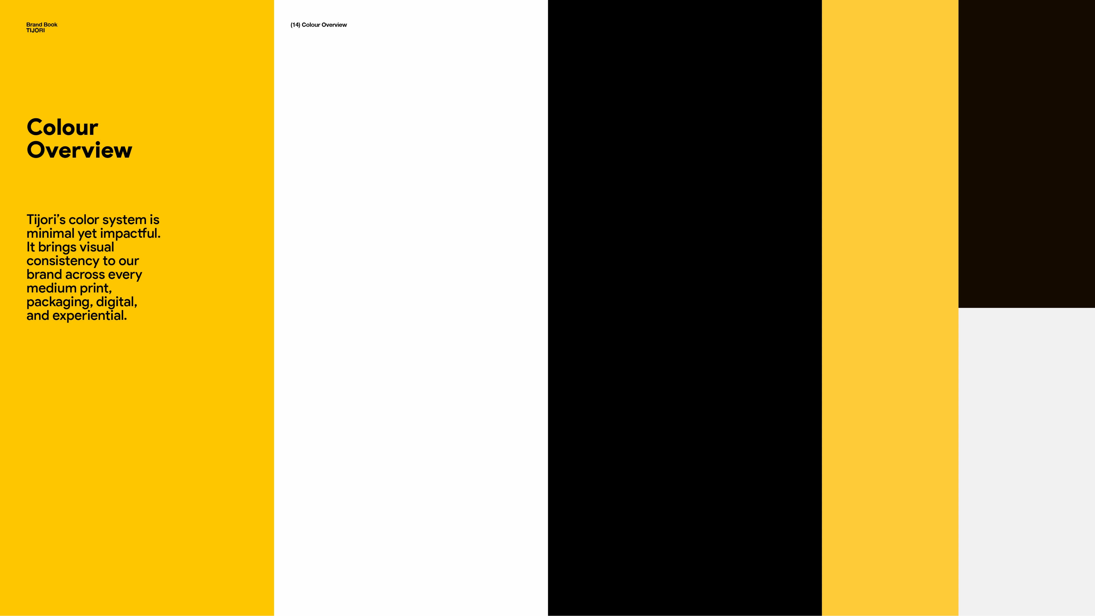
The Essence:
“Tijori” means “vault” a symbol of safety, growth, and empowerment. We set out to build a brand that could live up to that name-and elevate it.
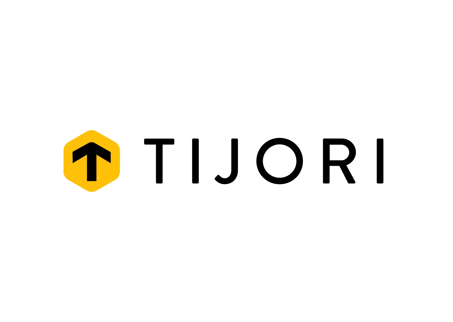
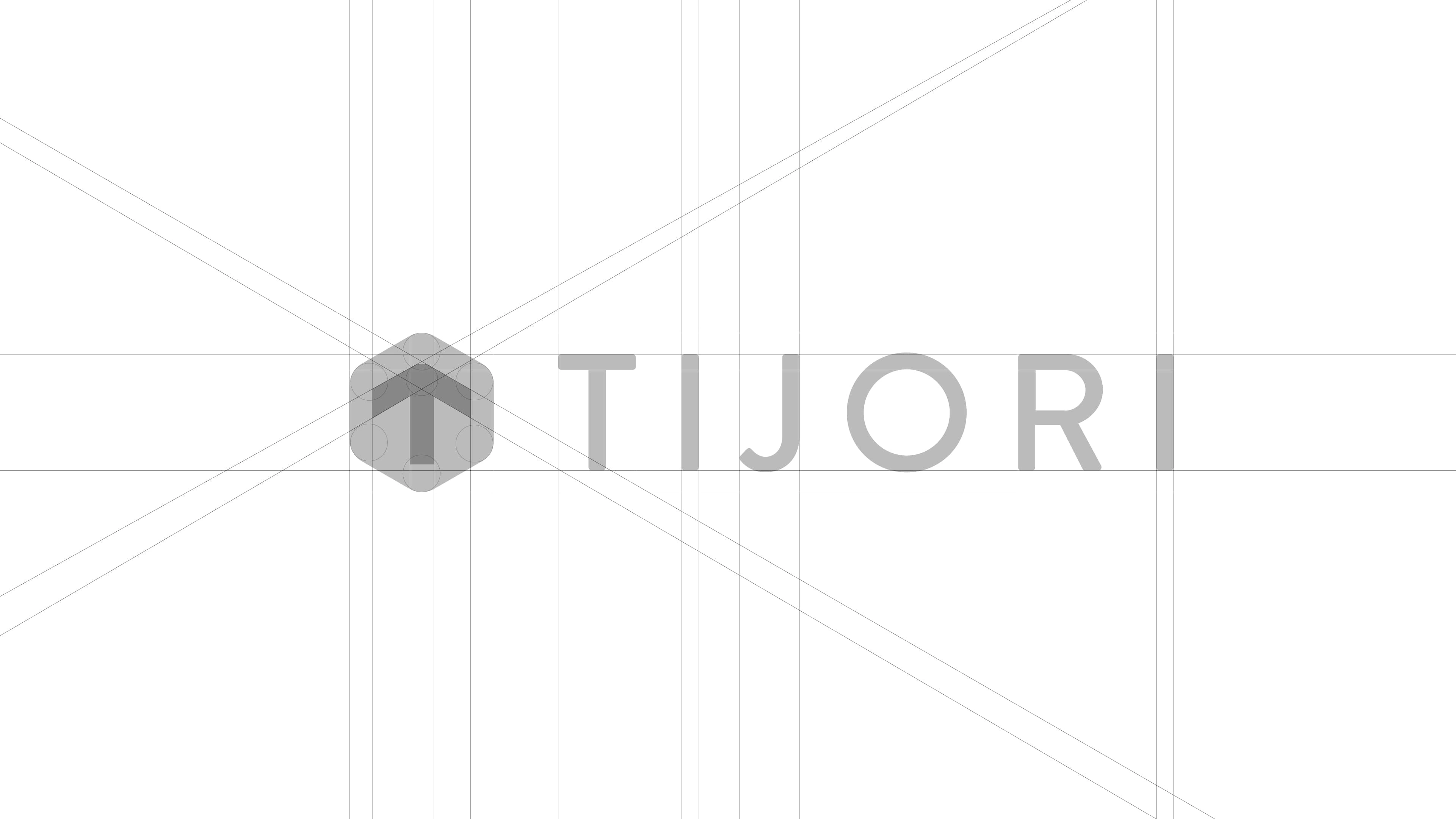
logo
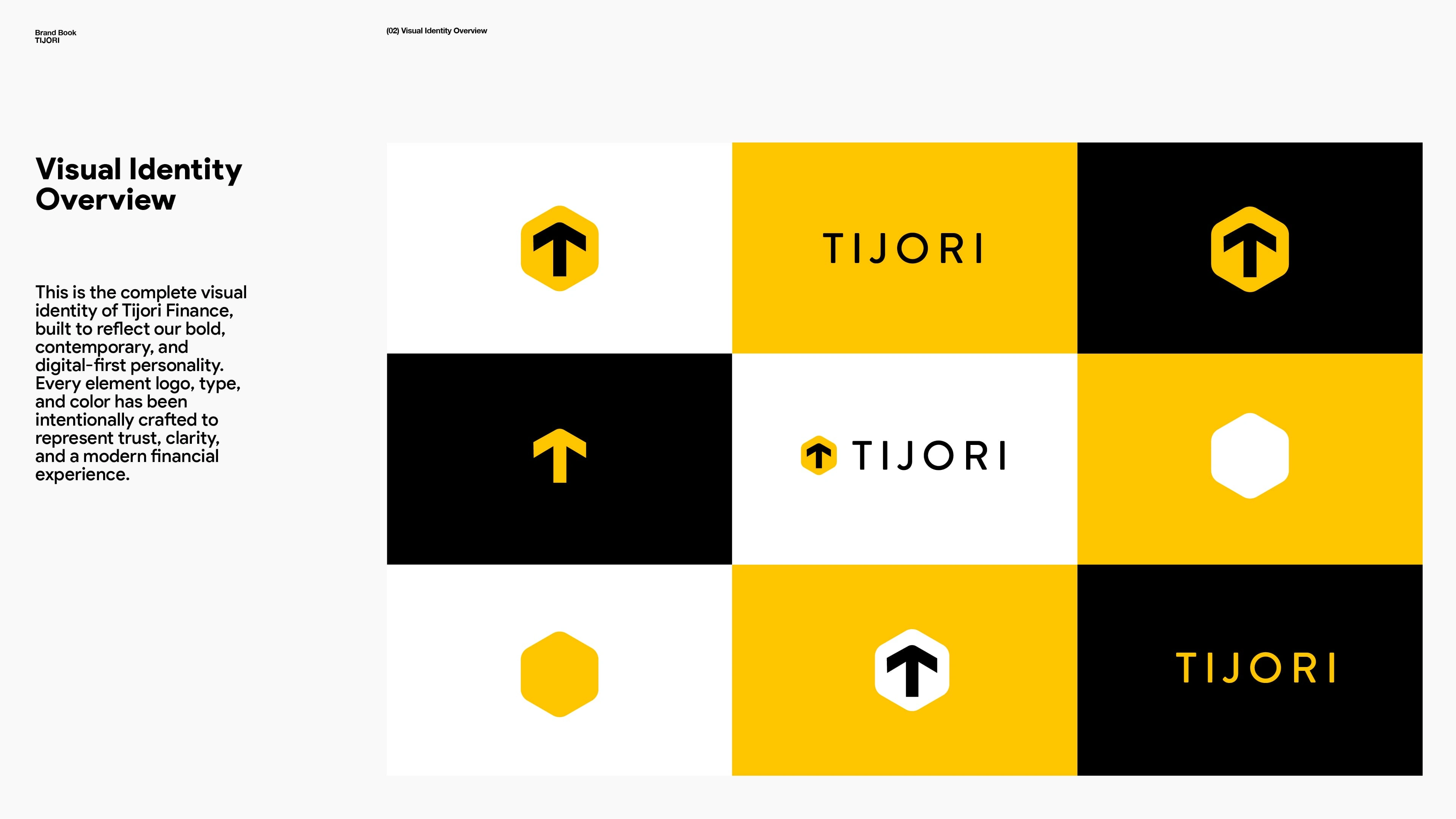
The Identity:
Logo: Upward arrow cradled in a hexagon, communicating growth inside security
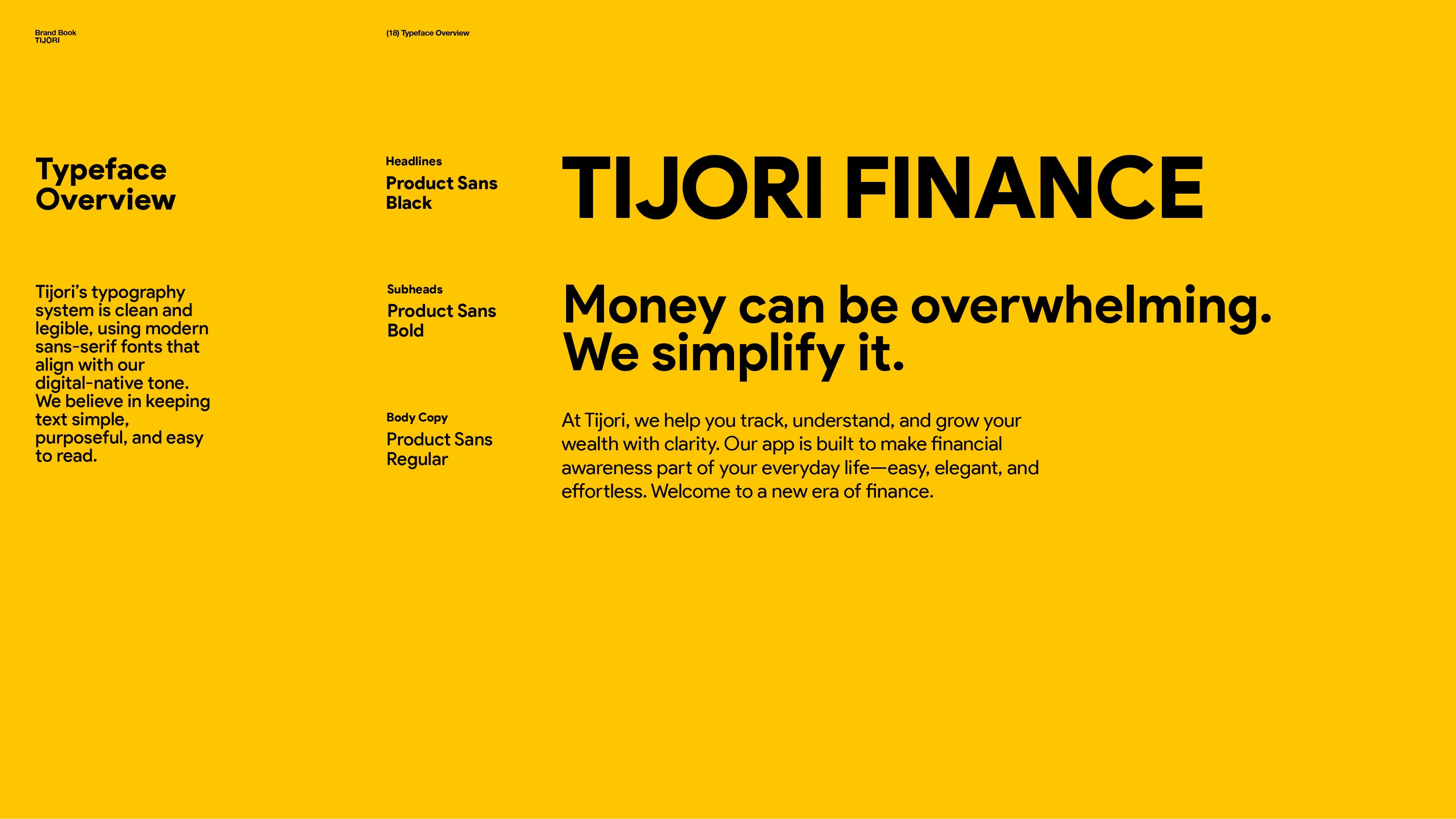
Typography: Geometric, balanced, clean
Color Language: Bright yellow for energy, deep black for grounded trust
header
The Outcome:
A perception shift, Tijori now stands tall as a bold, credible, and trusted brand-one that speaks clearly and inspires confidence at a glance.
Live Site: tijorifinance.com
Like this project
Posted Jun 17, 2025
Tijori’s Redefined brand identity reflects trust, clarity, and growth - crafted to stand out in fintech with bold visuals and a meaningful design system.
Likes
21
Views
247
Timeline
Jun 2, 2025 - Ongoing
Clients
Tijori