Gabit Branding and design
Praveen N
3 collaborators
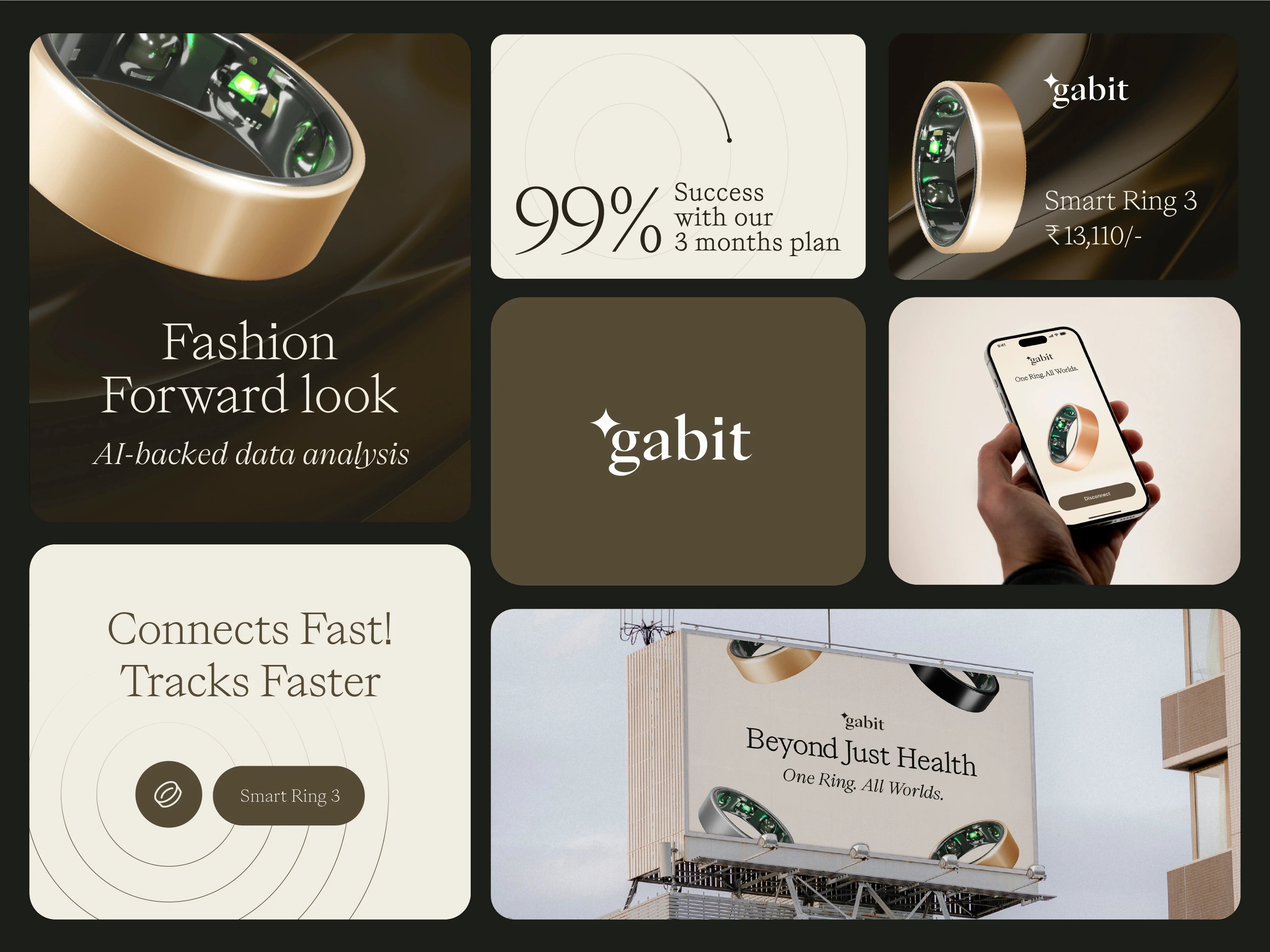
Gabit Brand Redesign
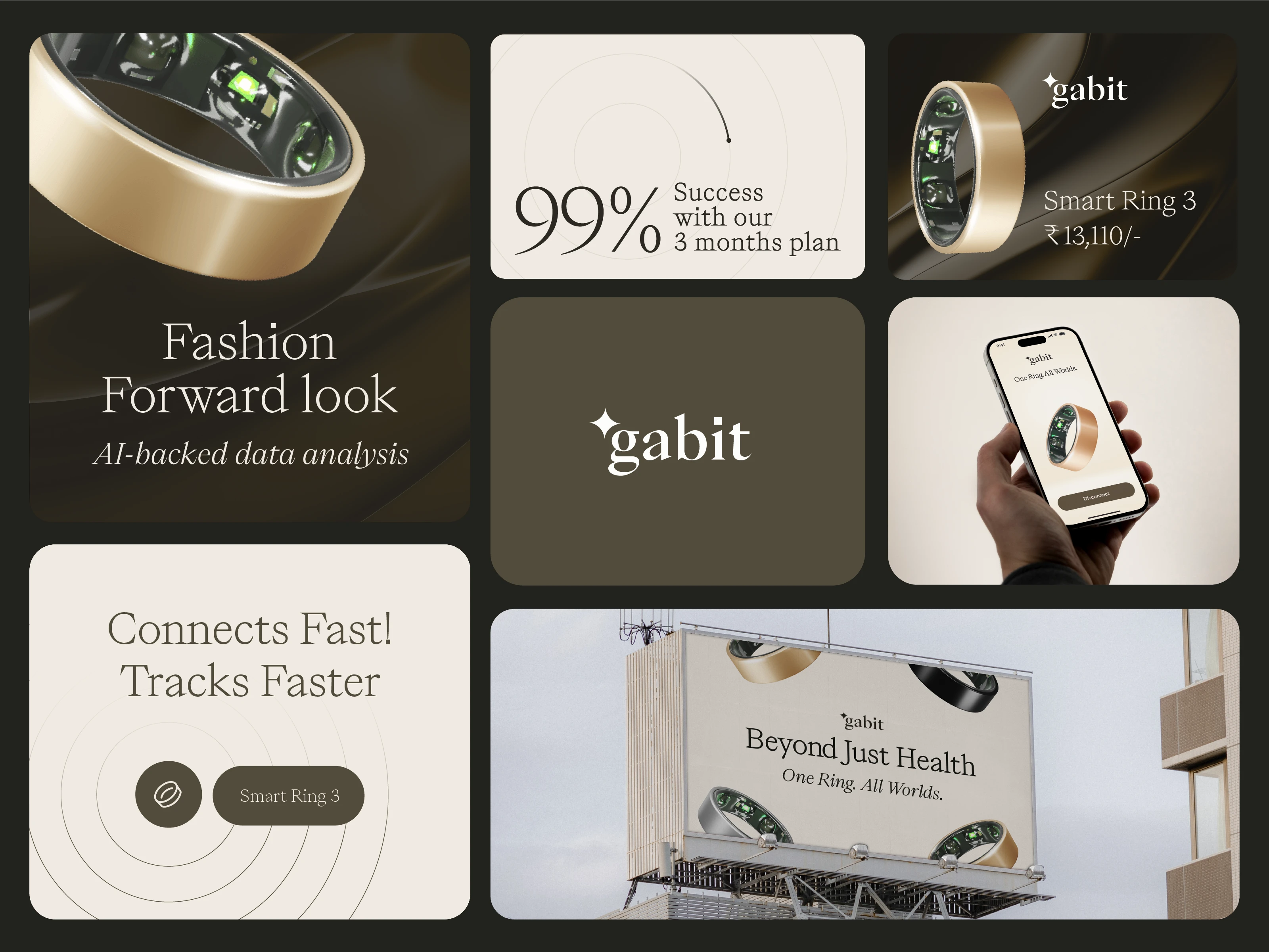
Wellness. Worn Simply.
Gabit is evolving — from a wellness tracker to a smart ring that blends health, habit, and simplicity.
Why the Redesign?
We’re moving beyond just tracking. Gabit is now about living well effortlessly. A sleek, minimal ring that helps you stay in tune with your body, build better habits, and feel good every day — without distractions.
What’s New?
Visual Identity: A clean, calming aesthetic with soft neutrals and nature-inspired tones. The new logo is circular — symbolizing balance and continuity.
Tone of Voice: Friendly, calm, and clear. No jargon, no pressure. Just helpful nudges to support your journey.
Product Experience:
Lightweight, stylish smart ring
Tracks sleep, movement, mood, and recovery
Pairs with an intuitive app for personalized guidance
Designed for everyday wear — no screens, no noise
The New Gabit Promise:
“Wellness that fits your life — and your finger.” Gabit is now your quiet companion for smarter habits and deeper self-care.
Would you like this turned into a visual brand one-pager or landing page copy?
Like this project
Posted May 15, 2025
Gabit Brand Redesign Gabit is evolving — from a wellness tracker to a smart ring that blends health, habit, and simplicity . Why the Redesign?
Likes
6
Views
51
Timeline
Apr 3, 2025 - Apr 30, 2025