Omini Academy Branding


I was given the specific and crucial role of developing a highly detailed visual directive for our branding project. We meticulously curated stylescapes, comprehensive brand guidelines, and intricate design systems, all of which played an integral role in shaping the brand's identity and ensuring its effective and unified representation across various media and touchpoints.
Logo Design
The stakeholders were resolute in their desire to steer clear of conventional university symbols like logos, emblems, shields, or architectural depictions. Their vision was anchored in a forward-thinking, minimalistic approach. Notably, this vision preceded the era of smartphones and responsive web design, emphasizing the importance of adaptability in a rapidly evolving digital landscape.
In response, we embarked on the concept of a responsive logo—a concept intricately linked to the broader notion of "responsive web design." The crux of this idea is to ensure that customers can enjoy a consistent brand experience, regardless of the device they use, be it a desktop or a smartphone.
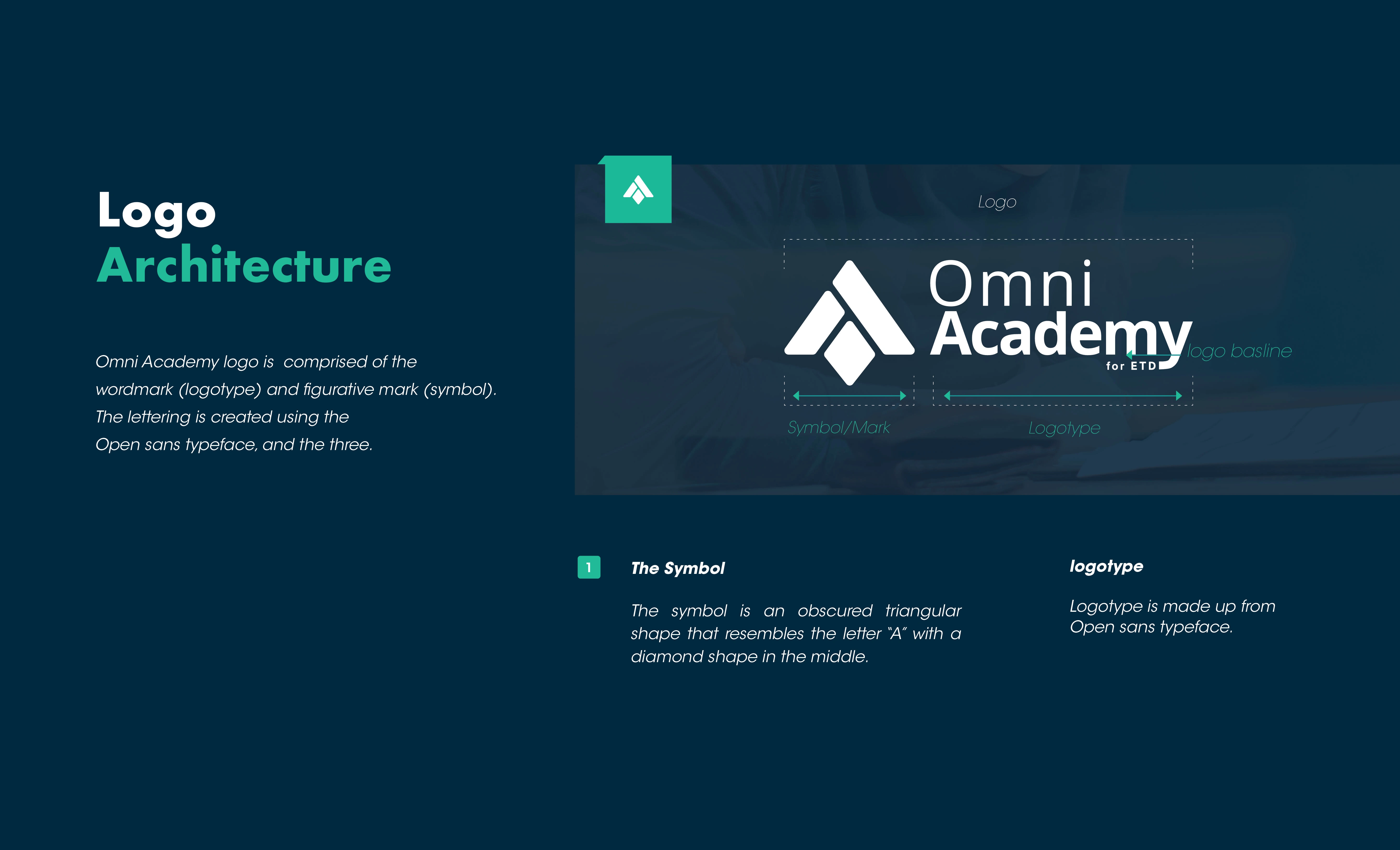
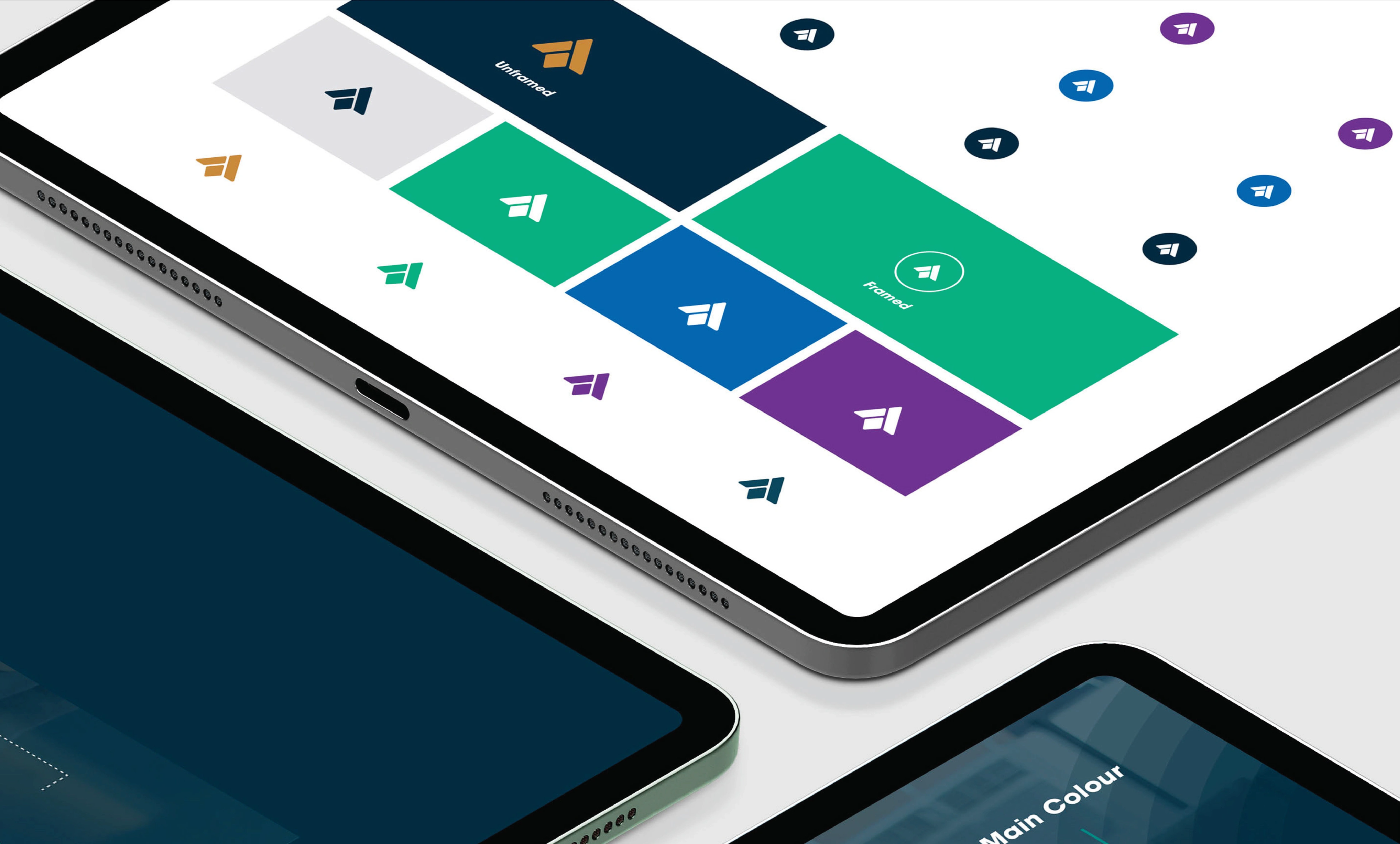
The creative process involved a straightforward yet purposeful construction. We carefully selected the letter "A" from "Academy" to serve as the focal point. This letter was ingeniously infused with a diamond shape, positioned between two slanted pillars. This diamond not only added a touch of elegance but also symbolized a graduation cap, an iconic representation of academic achievement when viewed from the top. This logo was designed with adaptability and versatility in mind, allowing it to seamlessly integrate across various materials and contexts, embodying the essence of a modern, forward-looking academic institution.
The Logomark
Colour System

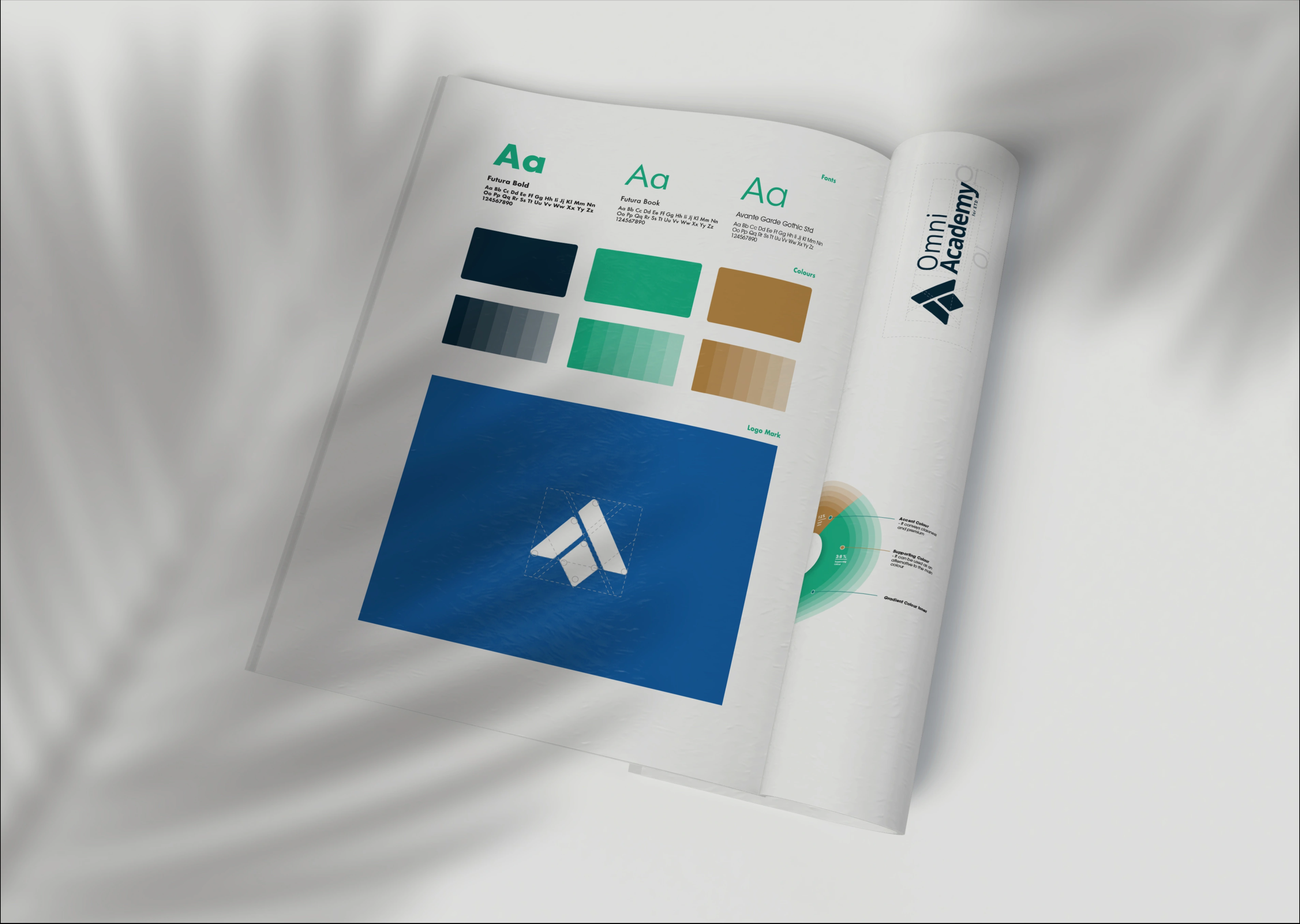
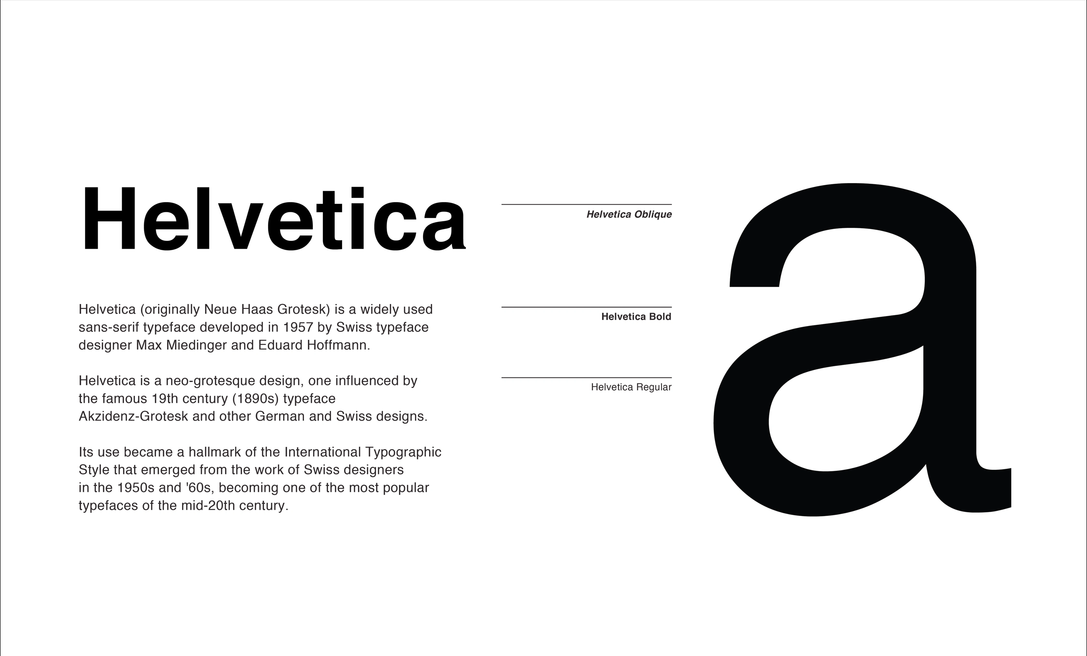
Typography


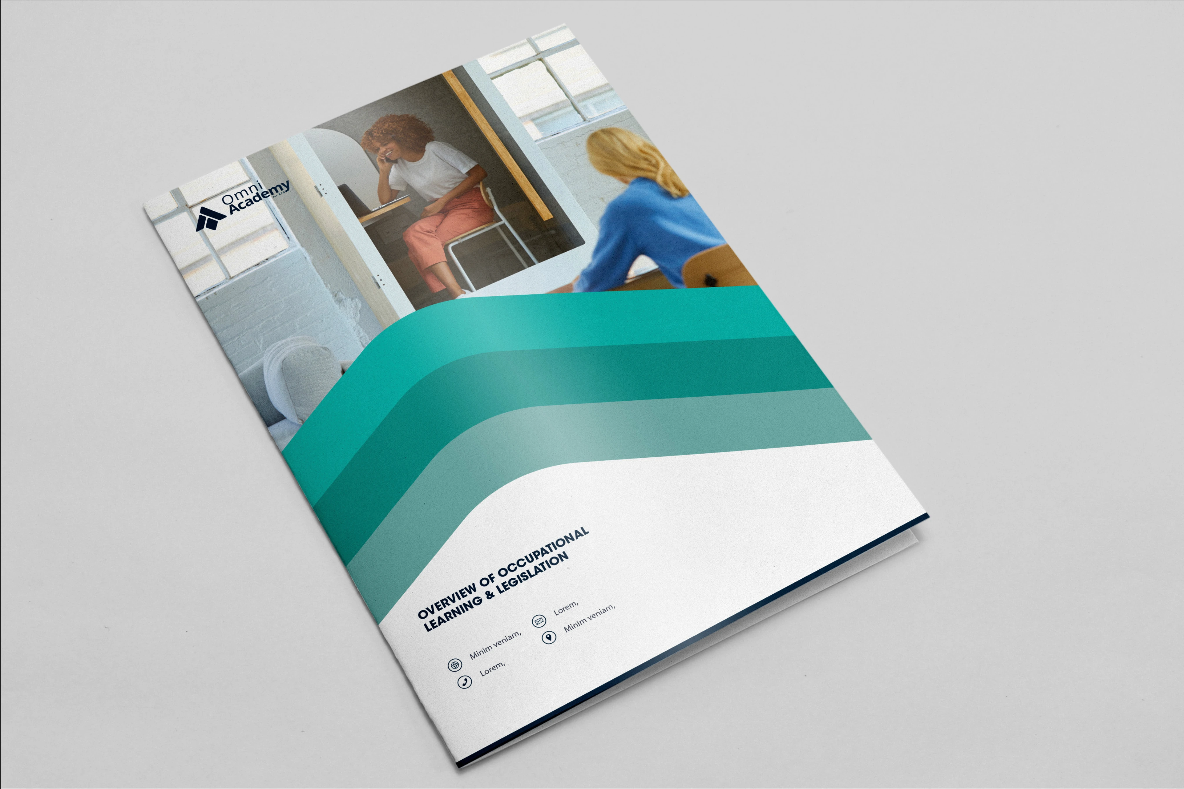
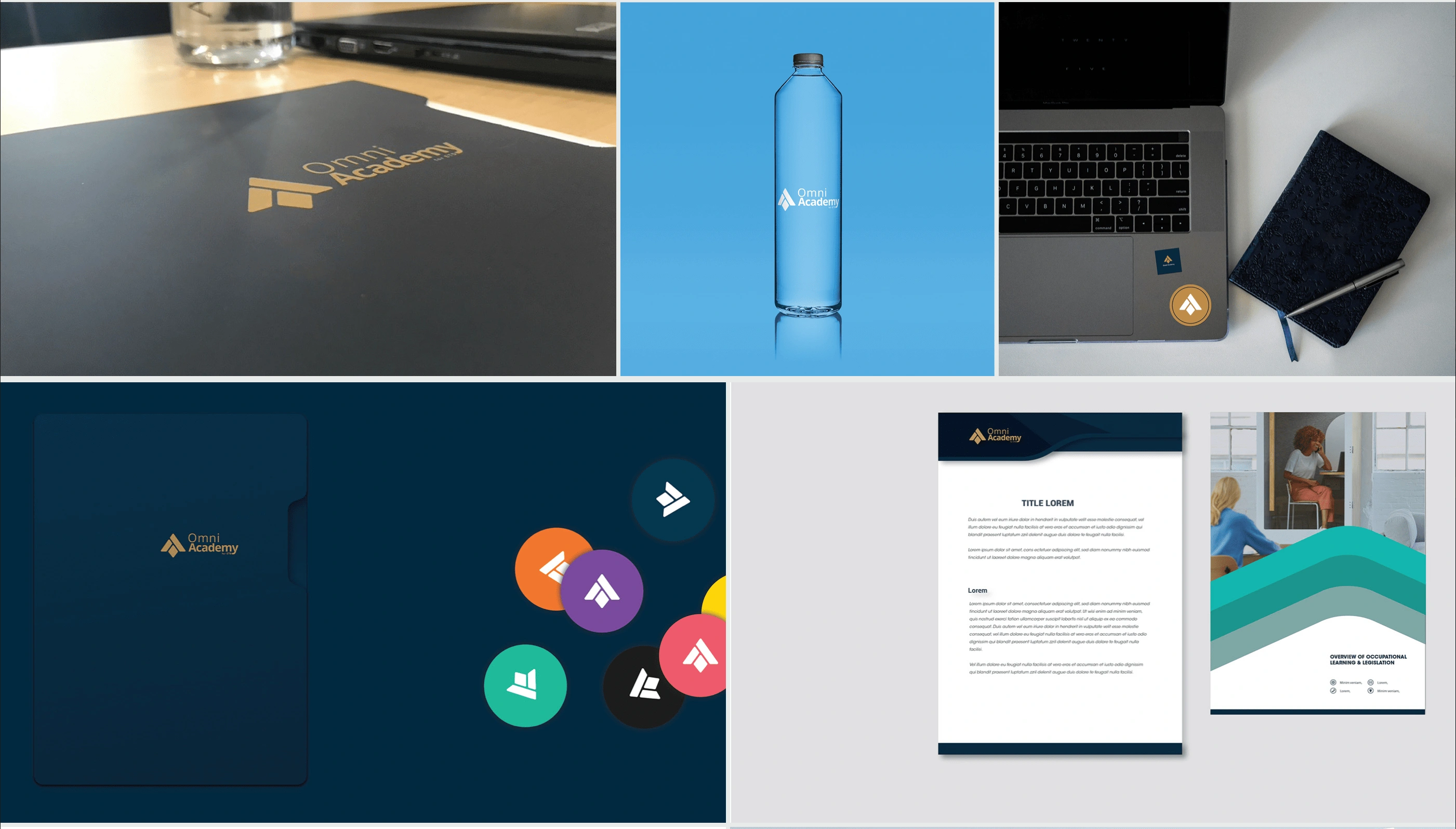

Branding
Like this project
Posted Oct 4, 2022
I was assigned the responsibility of creating a comprehensive visual direction for the branding project. This entailed crafting a range of essential brand asset
Likes
0
Views
55
Clients
Omni HR Consulting

