Breaker Mate App Identity Design
Michael Moyo
Overview:
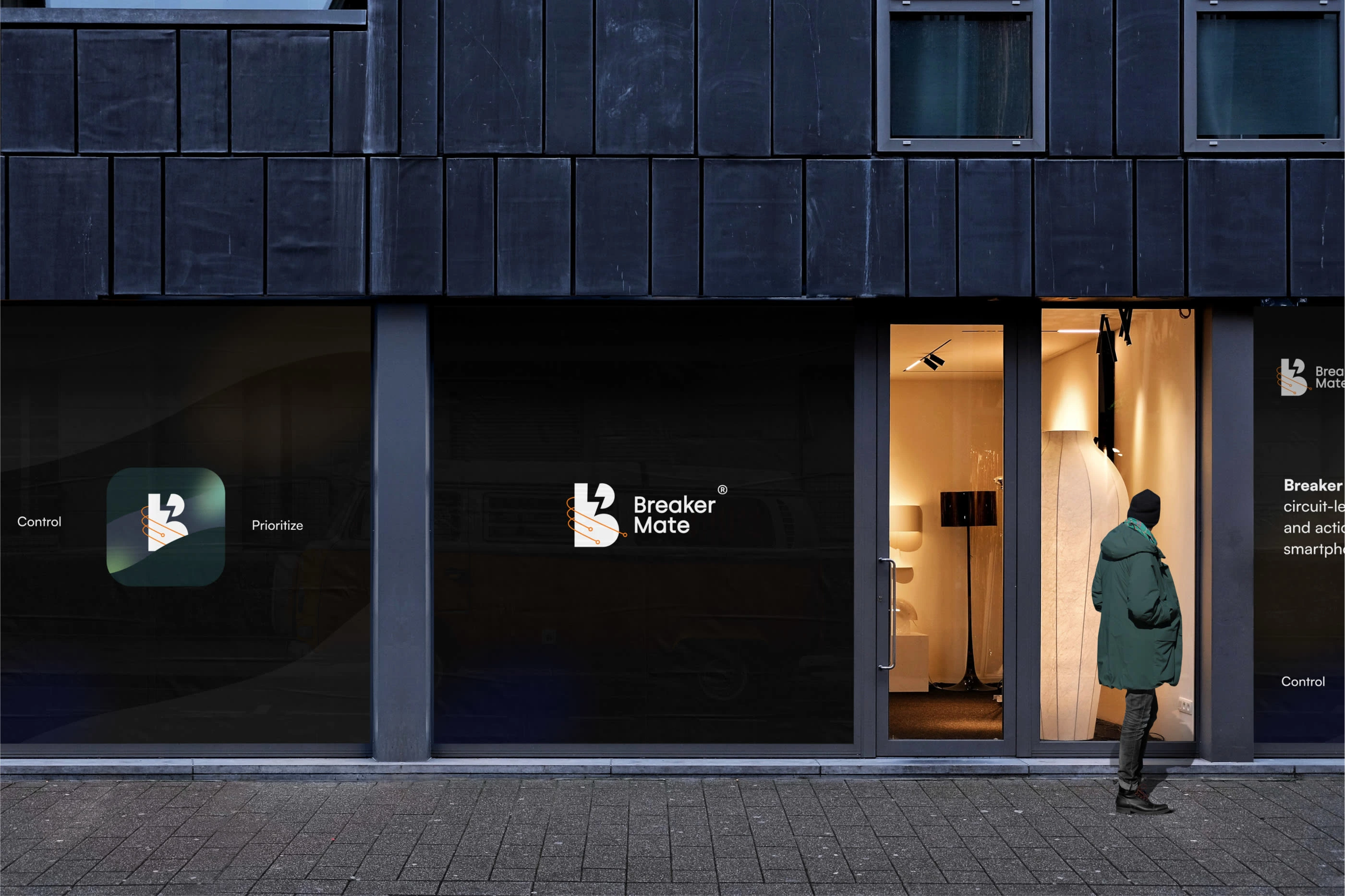
Renewable Systems Innovation is an innovative early-stage launching of a new type of smart home appliance that will allow our users to control and prioritize power usage from a secondary power source during a power outage. Renewable Systems Innovation allows homeowners to retrofit smart breakers in a traditional electric breaker box. Breaker Mate App will provide homeowners with circuit level-management, real-time monitoring and actionable insights.
We started with brand positioning, where I tried to understand what value the Breaker Mate project holds while analyzing its competitors. Then we narrowed down our research, to identify the corresponding elements that will match up with the company image and use adjectives to describe it (Retrofit, Responsive, Serious, durable, agile, friendly, ).
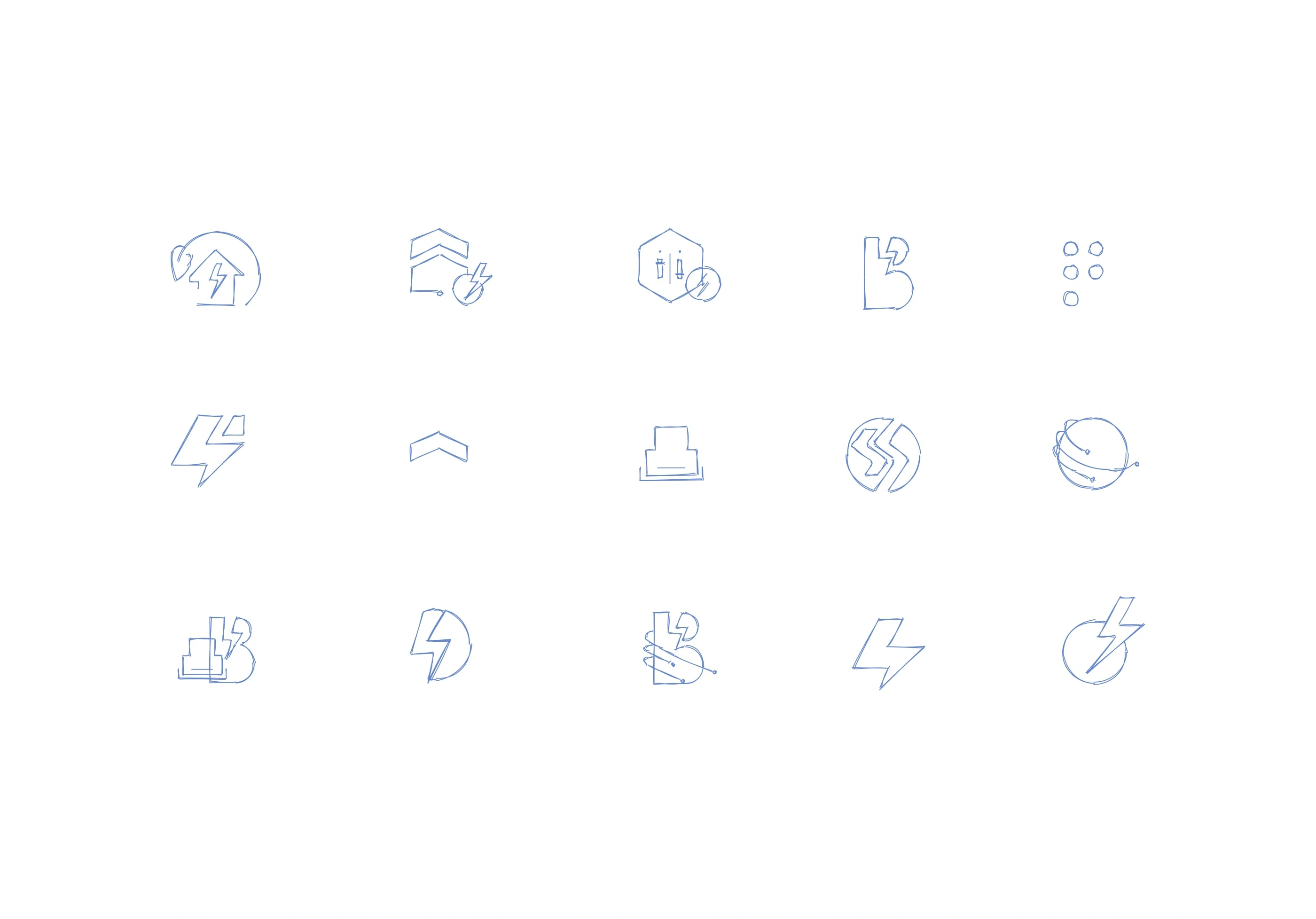
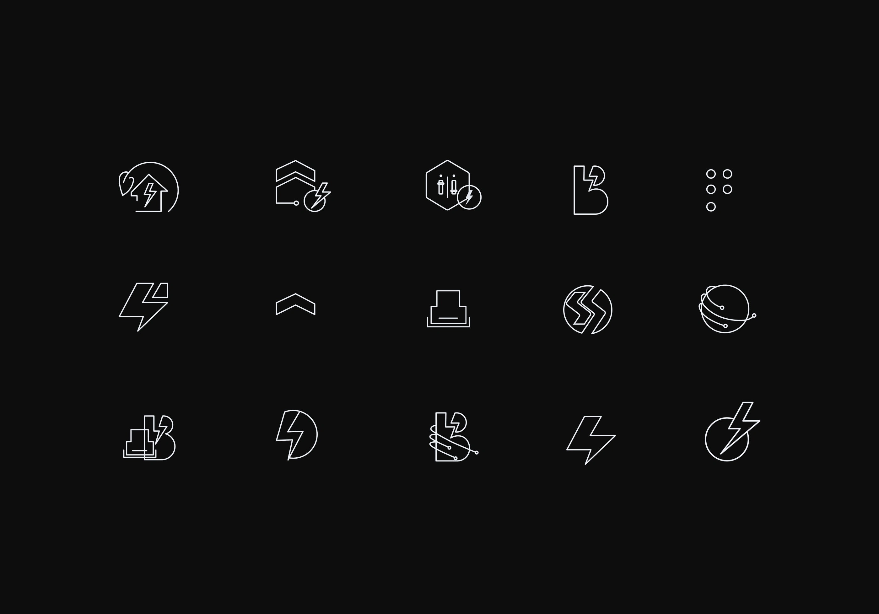
Next, we narrowed down our research, to identify the elements that will match up with the company image. This process starts with sketching abstract elements and shapes. After that, we explore additional directions while enhancing others.
Challenges
Symbolism and Abstraction:
Finding the right balance between symbolic representation and abstraction was tricky. The logo should convey the app's purpose without being overly complex or confusing. Striking the right visual metaphor or symbol that is both meaningful and recognisable took several iterations.
Uniqueness and Brand Differentiation:
Standing out in a competitive market can be challenging, especially with numerous energy and technology-related apps. Creating a logo that captures the essence of the Breaker Mate App while differentiating it from similar offerings requires careful exploration and research to avoid similarity with existing logos.
Solution:
To overcome these challenges, it was crucial to conduct thorough research, brainstorming, and iteration processes. Seeking feedback from stakeholders, and potential users.
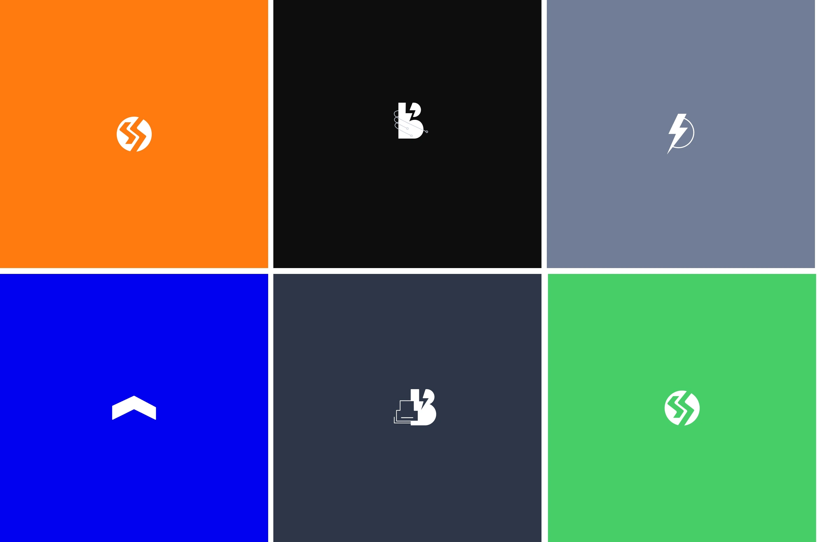
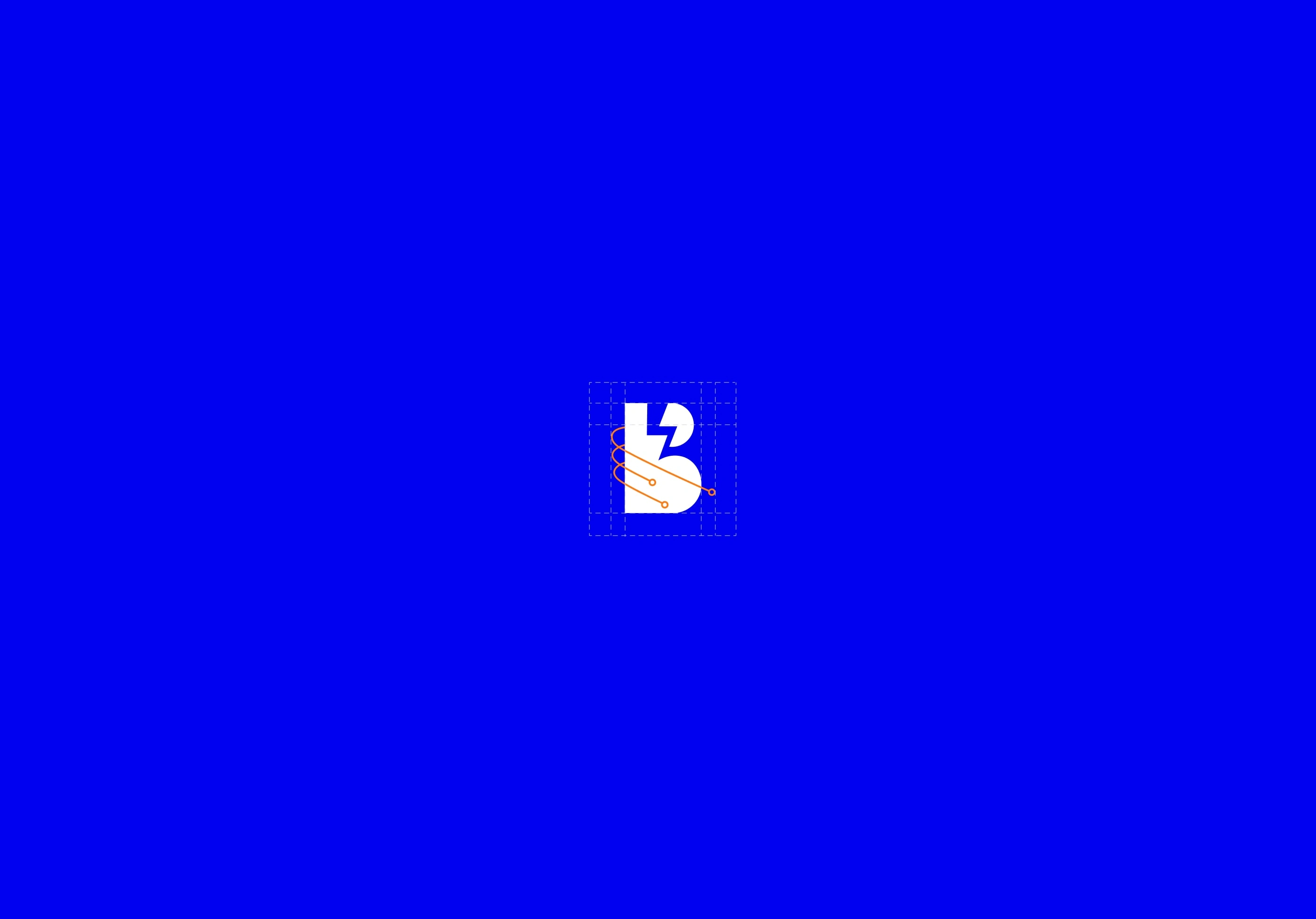
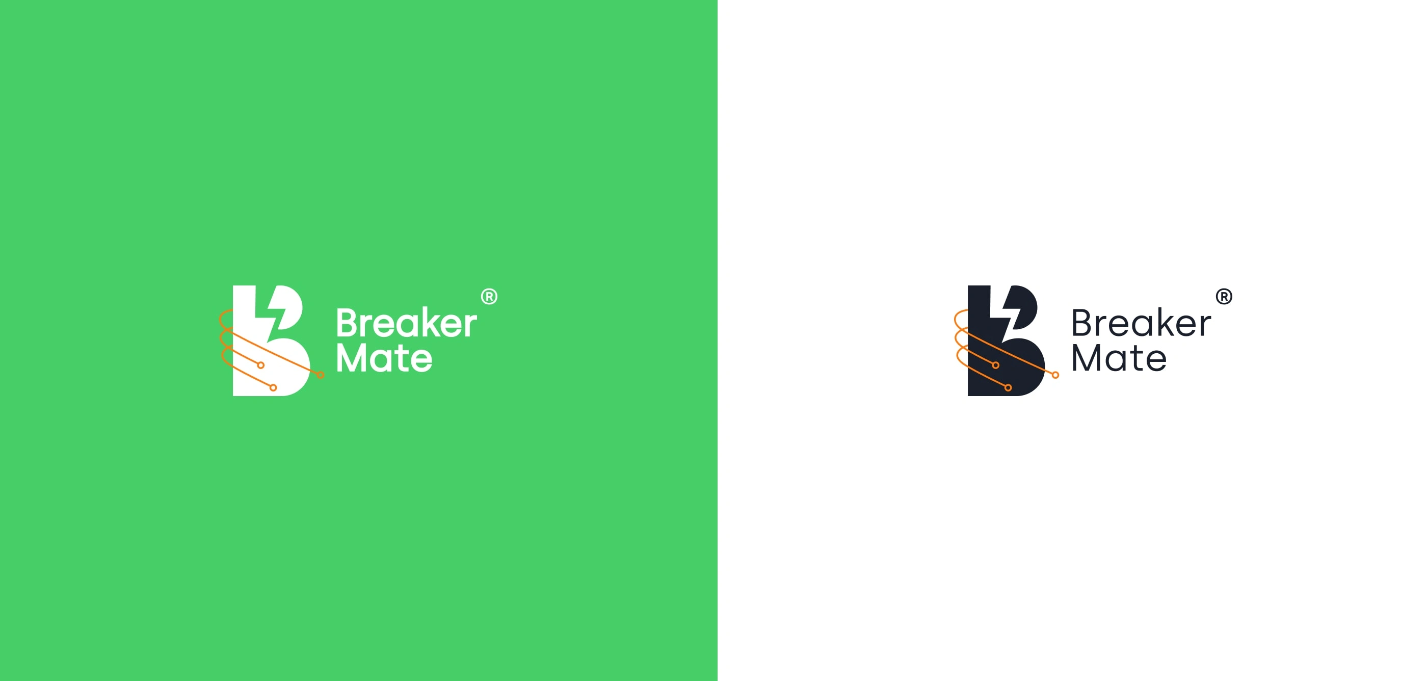
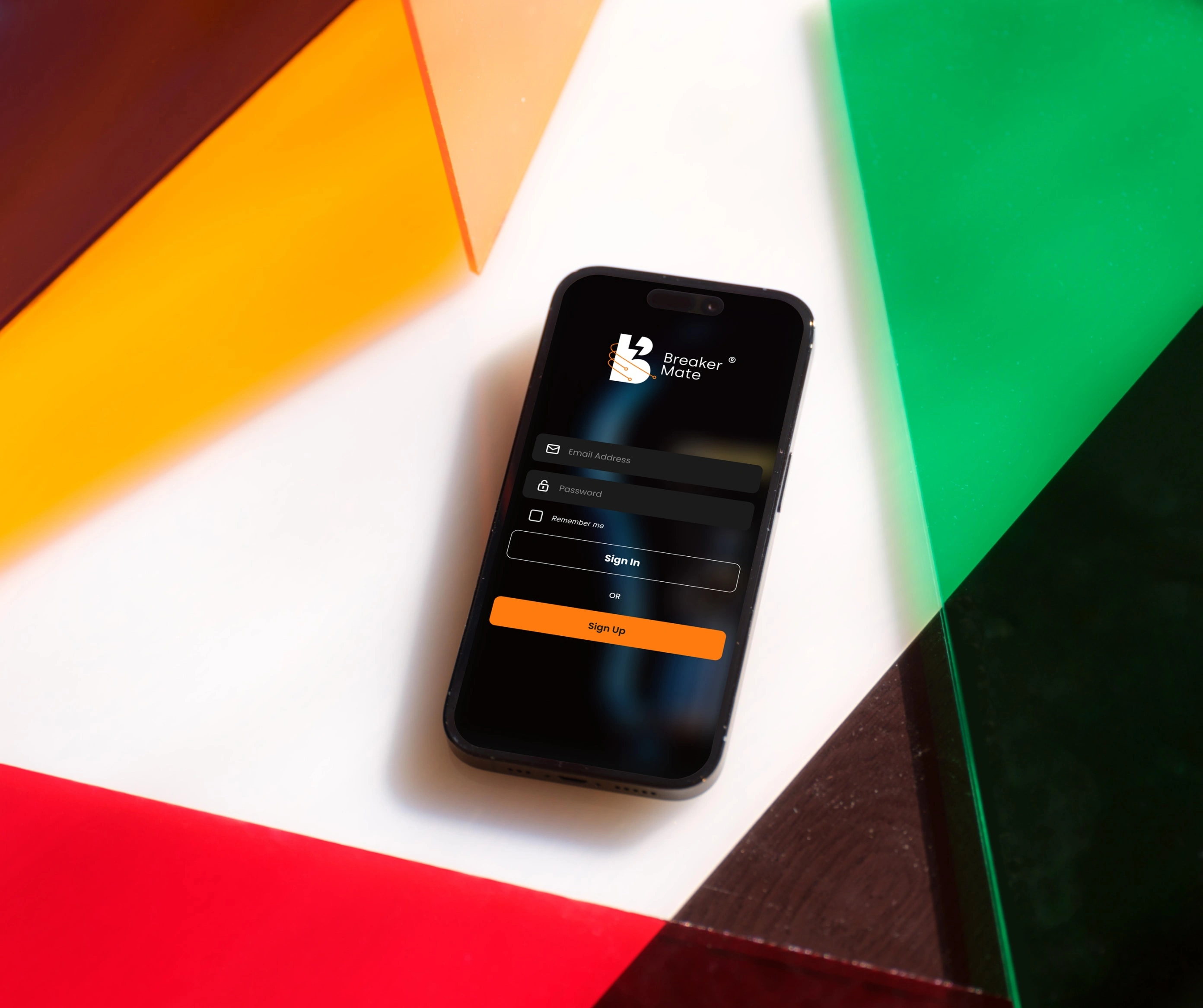
We created a modern and clean logo that represents the app's functionality and energy management focus. Incorporated circuit symbols and an abstract representation of electricity to convey the core concept. We chose a colour palette that combines vibrant and energetic colours with more subdued and calming tones to represent the balance between energy and efficiency.

Thank you for your time :)
Like this project
Posted Jul 4, 2023
Identity design for An innovative early-stage startup was launching a new type of smart home appliance to allow their users to control and prioritise power.