Home Parket
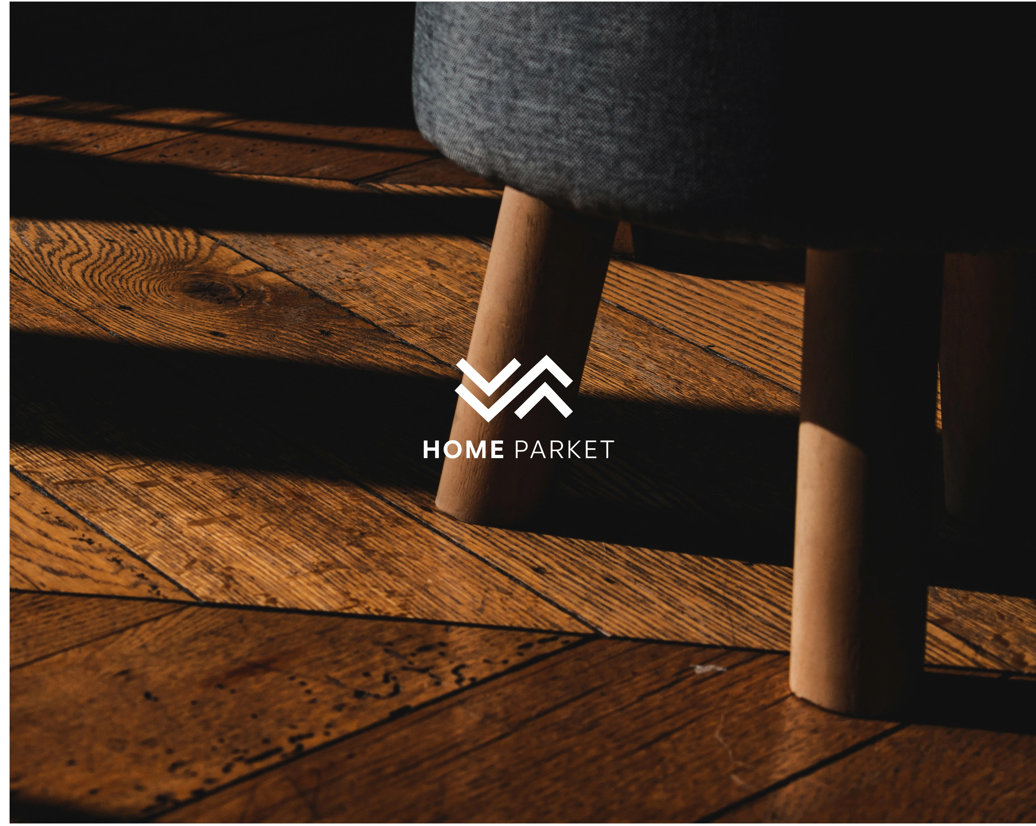
About Home Parket: Home Parket is a start-up specialising in producing and installing high-quality, durable, and stylish wood floors that can enhance the beauty and value of any home or commercial space.
Brief: Brand and web designer to develop our brand identity and visual language across the website and digital marketing assets. We are aiming to bring consistency across the website and all marketing touchpoints.
Identity design approach: My task was to design a brand identity system that accurately represents the motivation and values of the Home Parket Team. We base the visual identity system on the language of Durability, Quality, Elegance and Stylish.
Identity Design
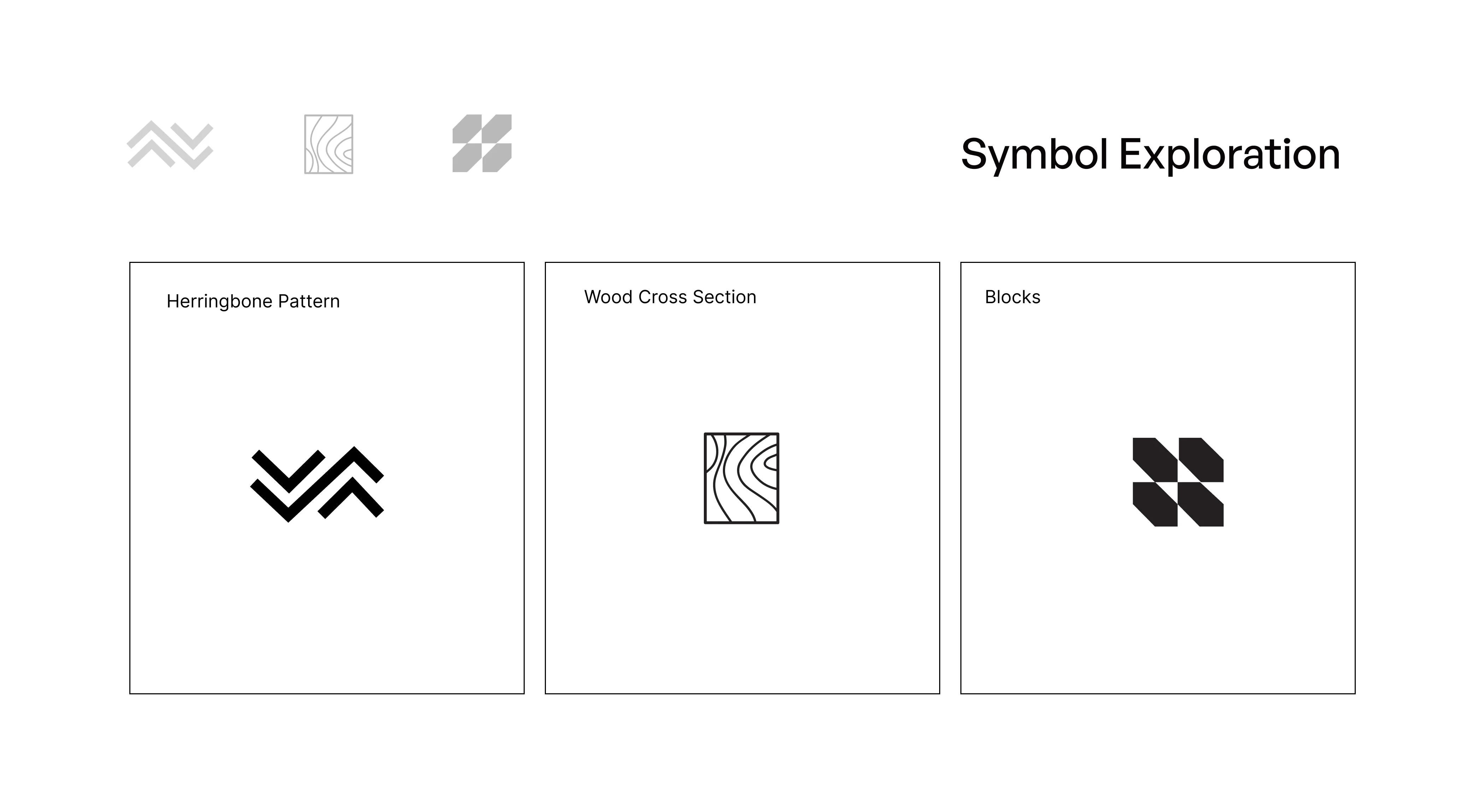
Herringbone:
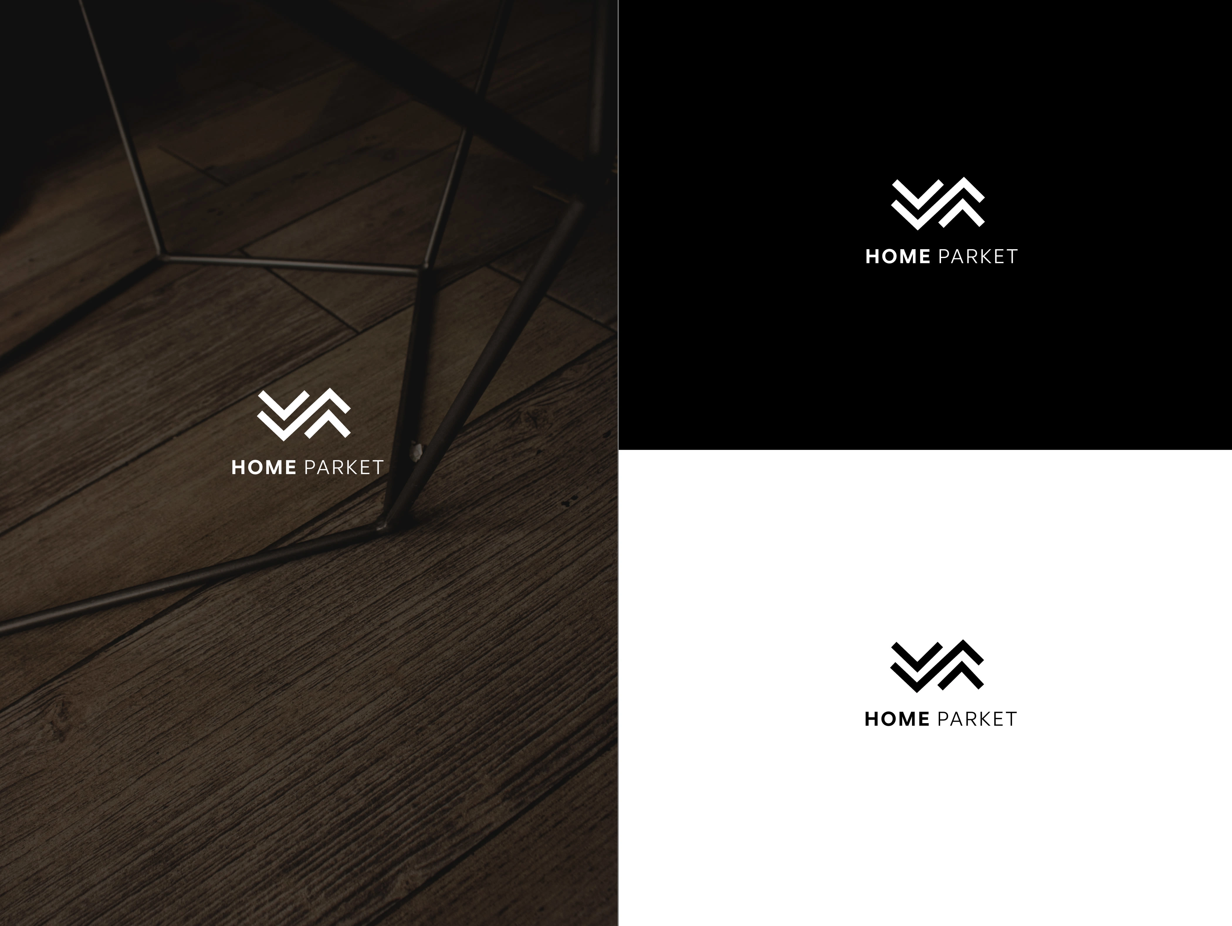
"broken" zig-zag graphic simulating the herringbone pattern. The herringbone is an arrangement of rectangles used for floor tilings and road pavement. The logo mark was made after playing around with the graphical element.
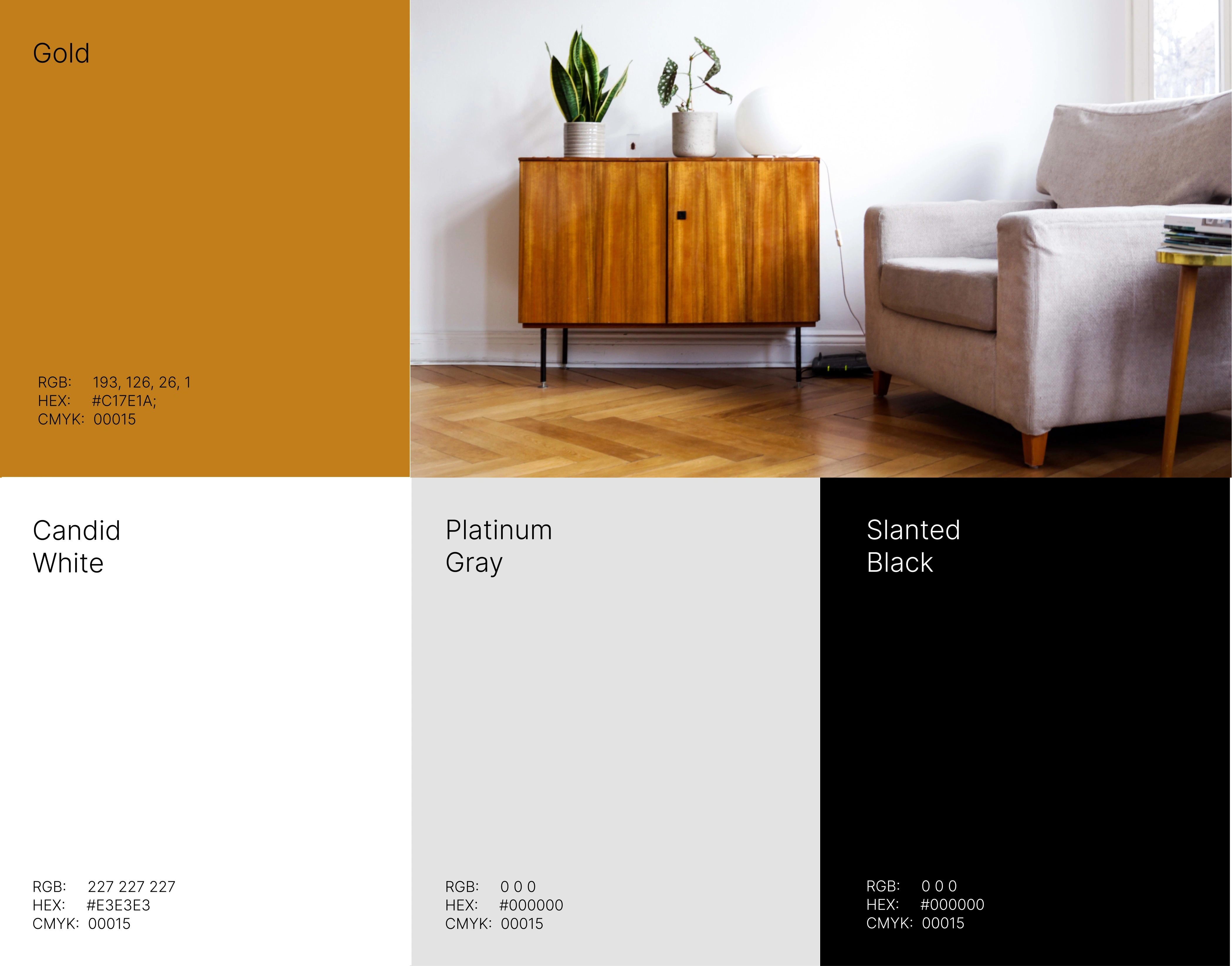
The choice of colour always depends on the context, purpose and situation in which this element is used. However, the default colours should be White, Black and Platinum Grey.
Logo
Mockups
Colours and Typography
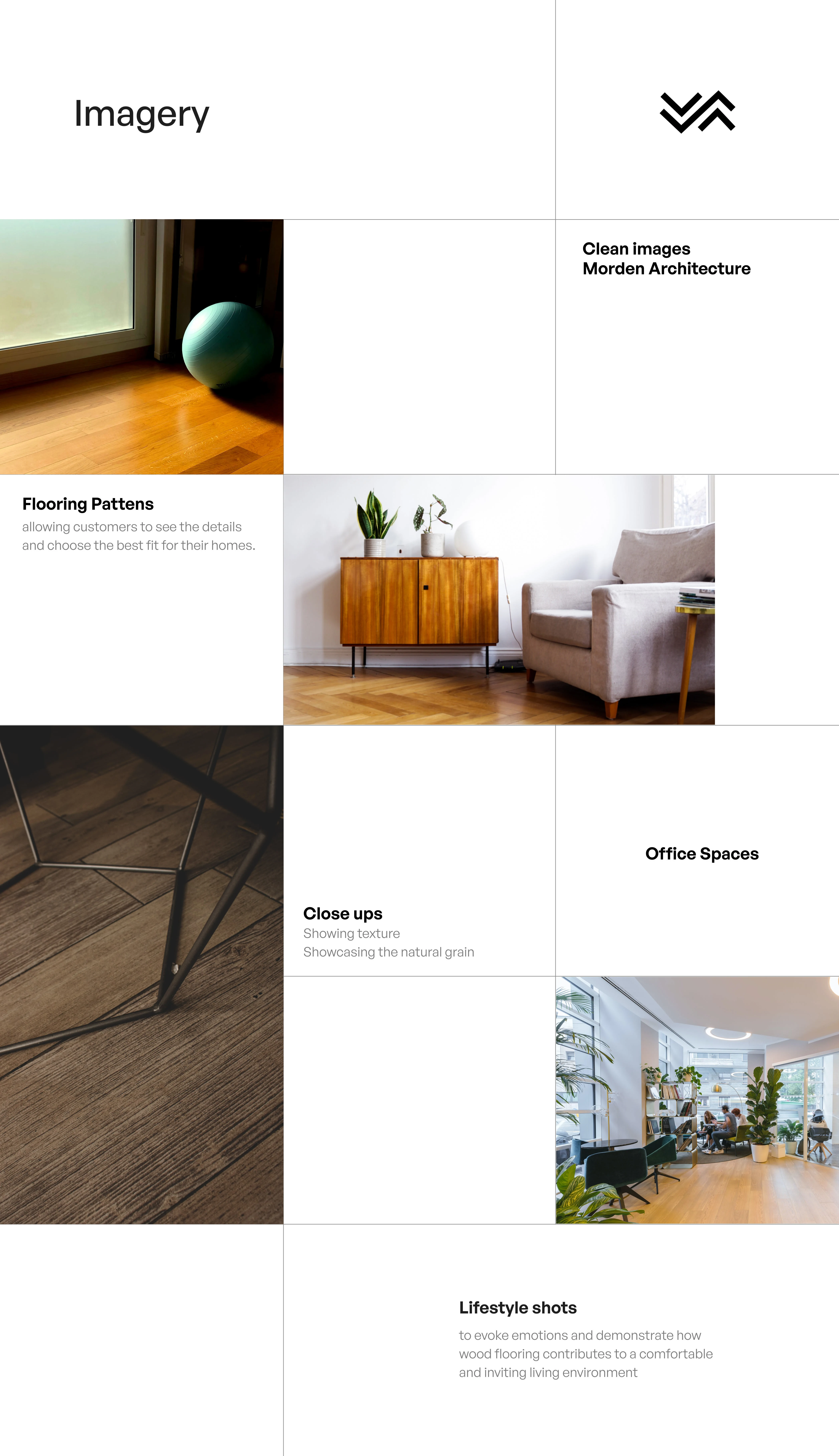
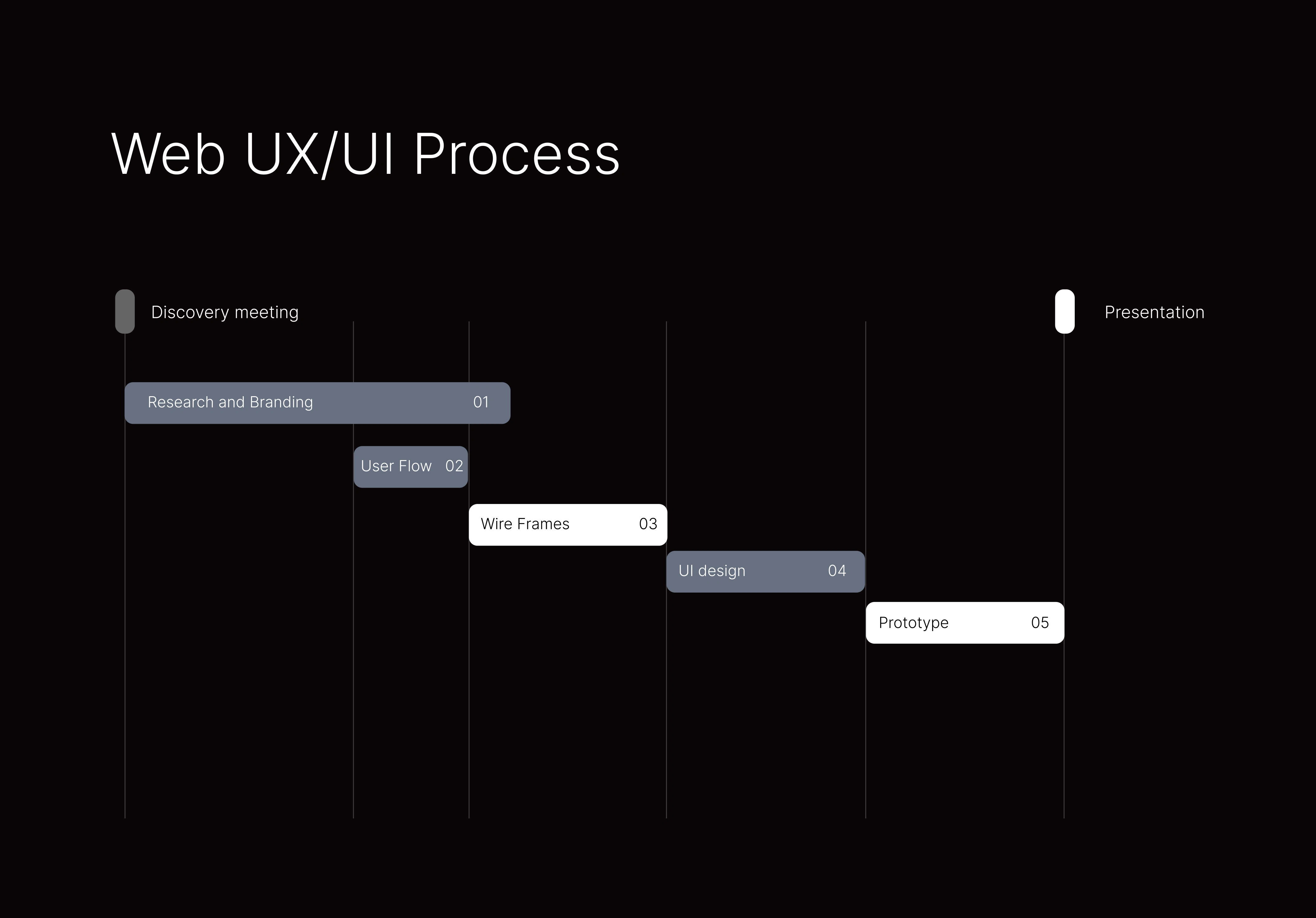
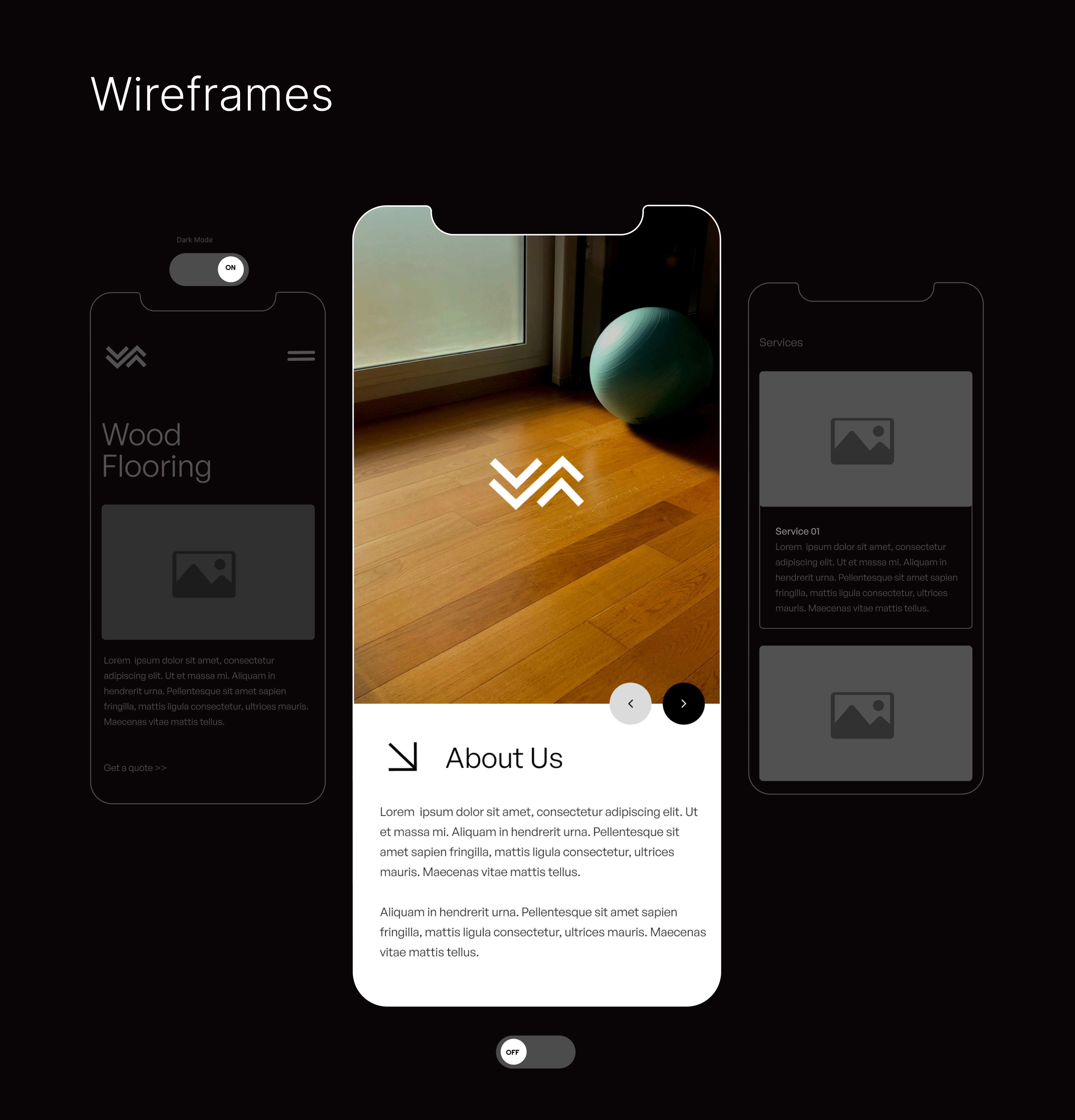
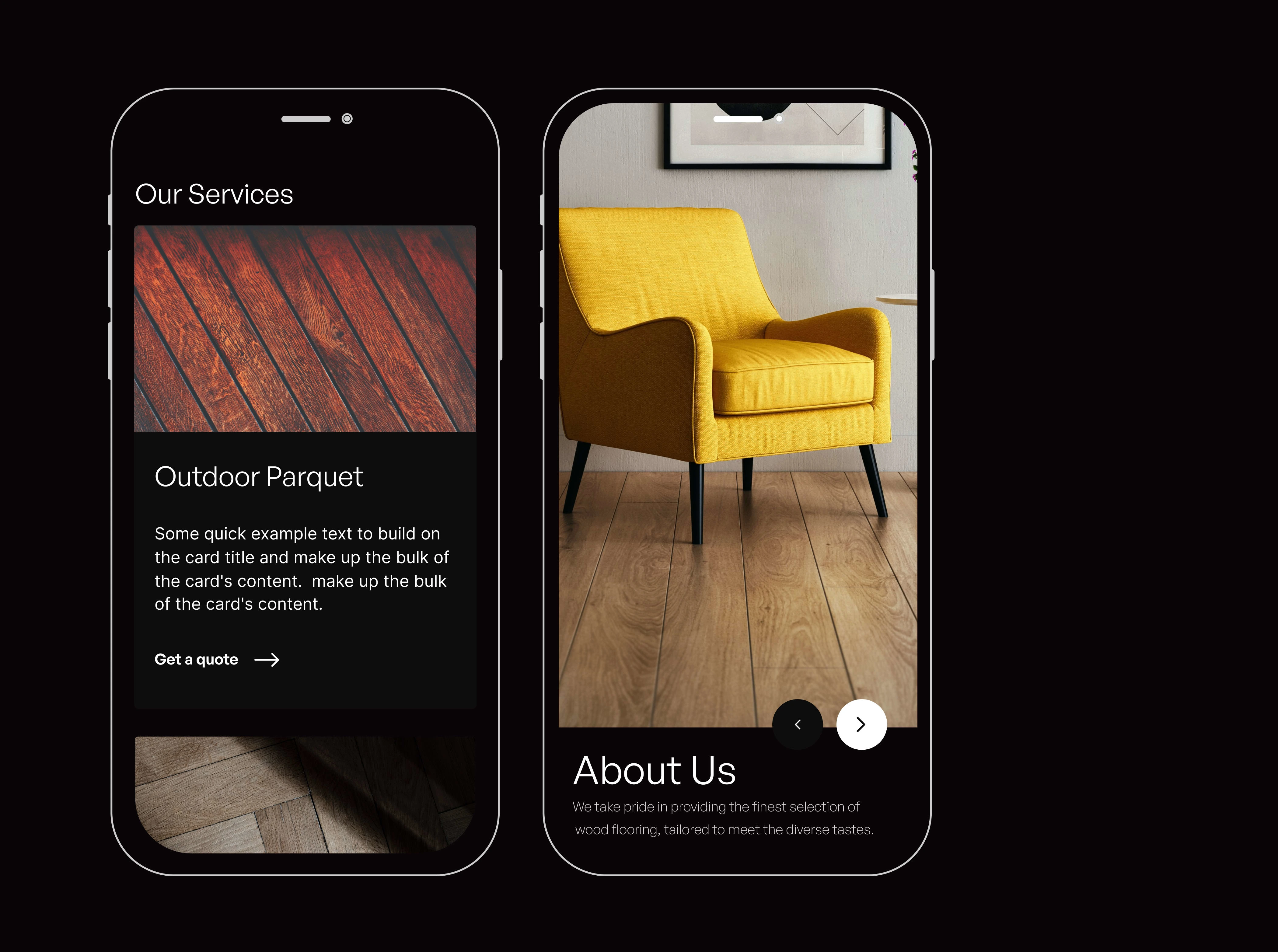
Web UI

How pixels did you scroll? Thousands I guess LOL.
Thank you for your time :)
Like this project
Posted Aug 18, 2023
I had the privilege of working on a transformative project with a dynamic wood flooring startup to create a compelling brand identity and an engaging online pre

