Game-App UX/UI
Organisation Overview
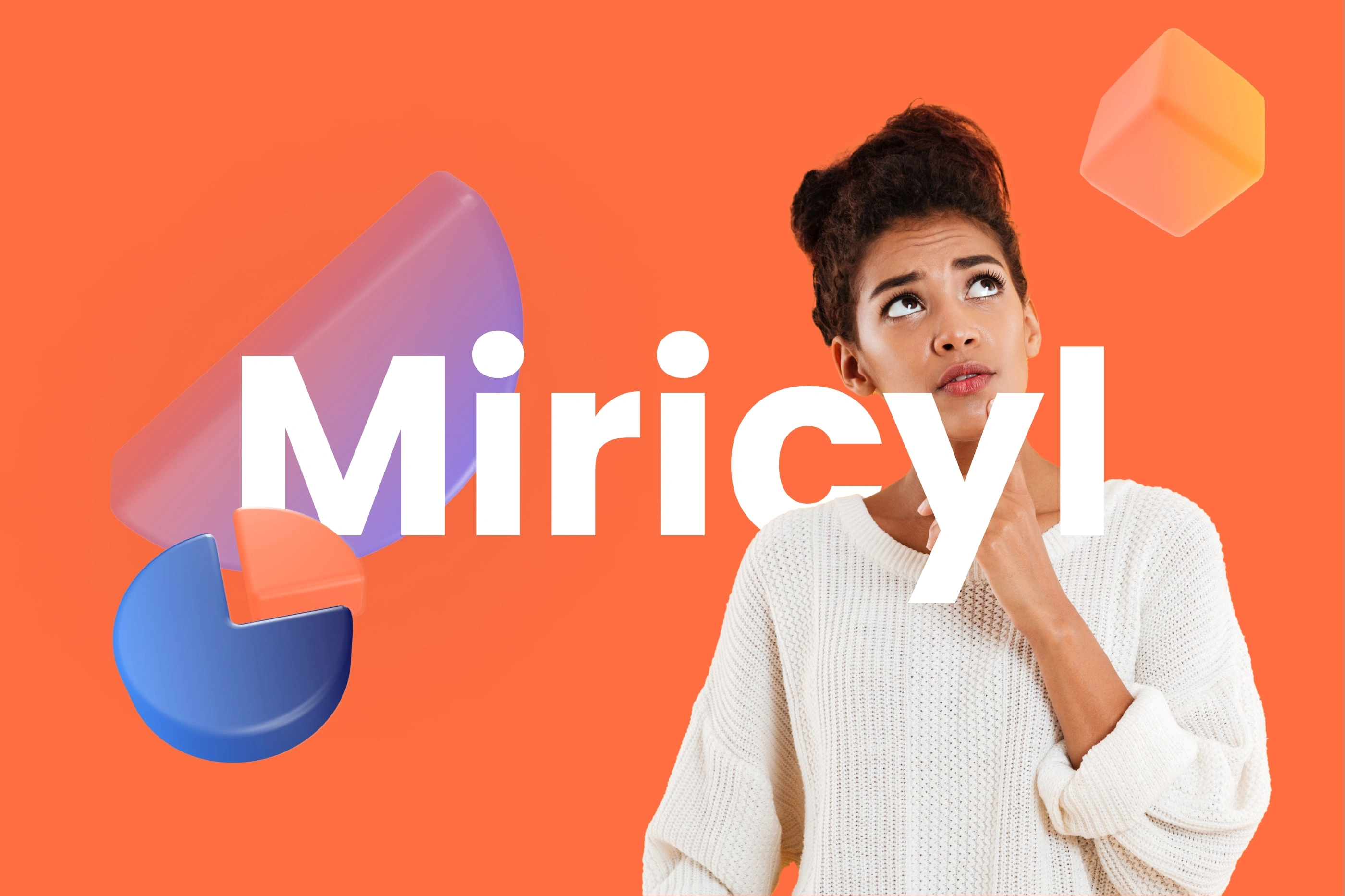
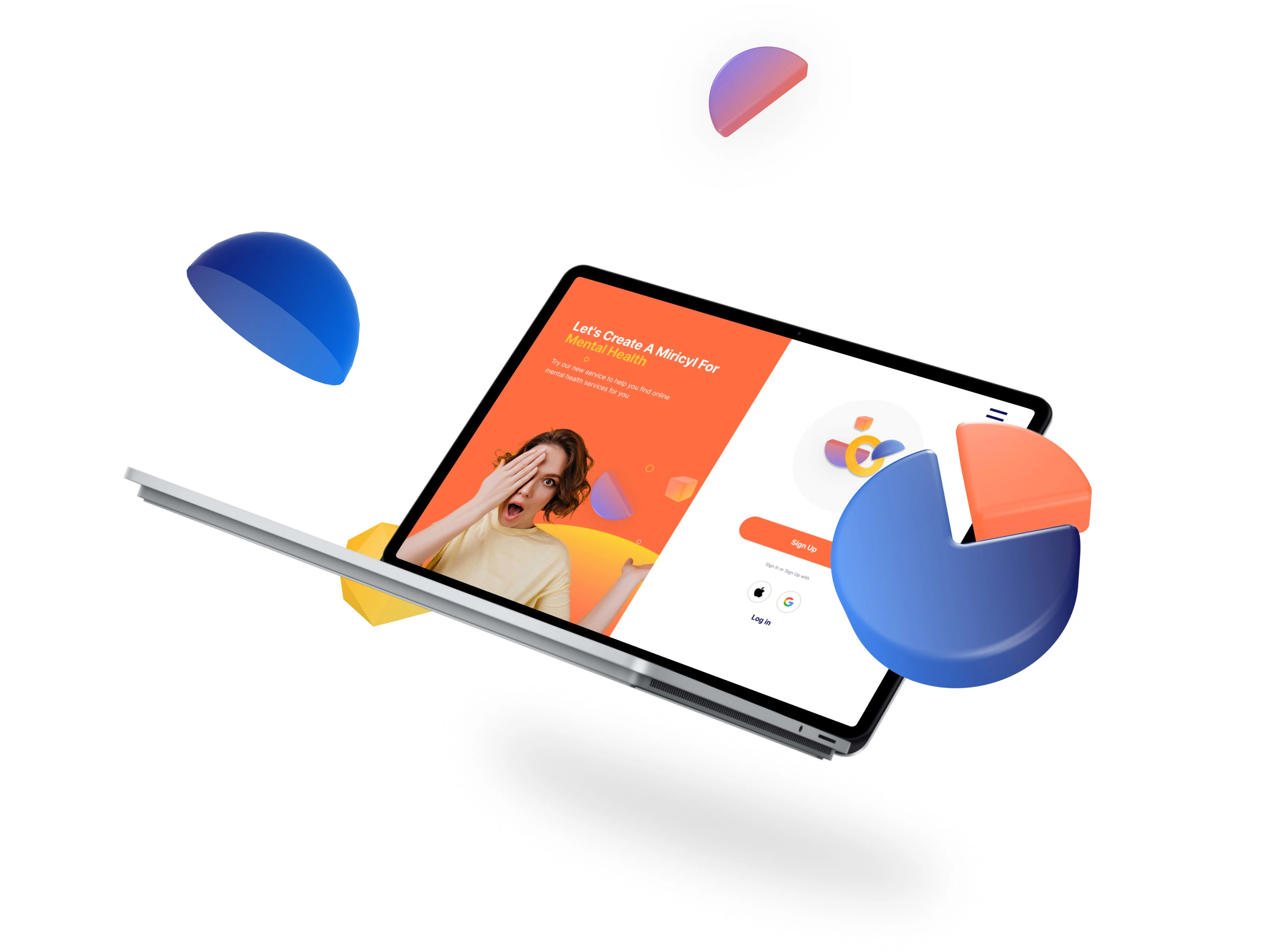
Miricyl, which stands for Mental Illness Research in Children and Young Lives, was established in 2017, with the aim of helping young people who experience mental illness and bridging the £100m gap in funding for mental health research.
Brief
Truth or Dare Game
Project Summary: A digital ‘Truth or Dare’ game accessed from the website. Here we frame ‘problems’ young people typically face as ‘Truths’ (I feel lonely,
I use social media too much, I don’t like speaking in public) and match them to self-help techniques which are framed as ‘dares’ (use mindfulness meditation to help calm anxiety and develop self-awareness).
Project Intent: There is little research to match self-help techniques to young people and no one-stop shop to look for the techniques. The aim of our challenge is to help young people manage their mental illness and conduct research at the same time.
Project Audience: The users of the solution will be young people aged 16-25 and/or with a friend/carer. MVP Considerations: personalization, gamification (but not in a competitive way that would put off young people who are vulnerable), humour and creating a sense of community by allowing users to share on social media and upload their own truth or dare (would need to be moderate).
Method
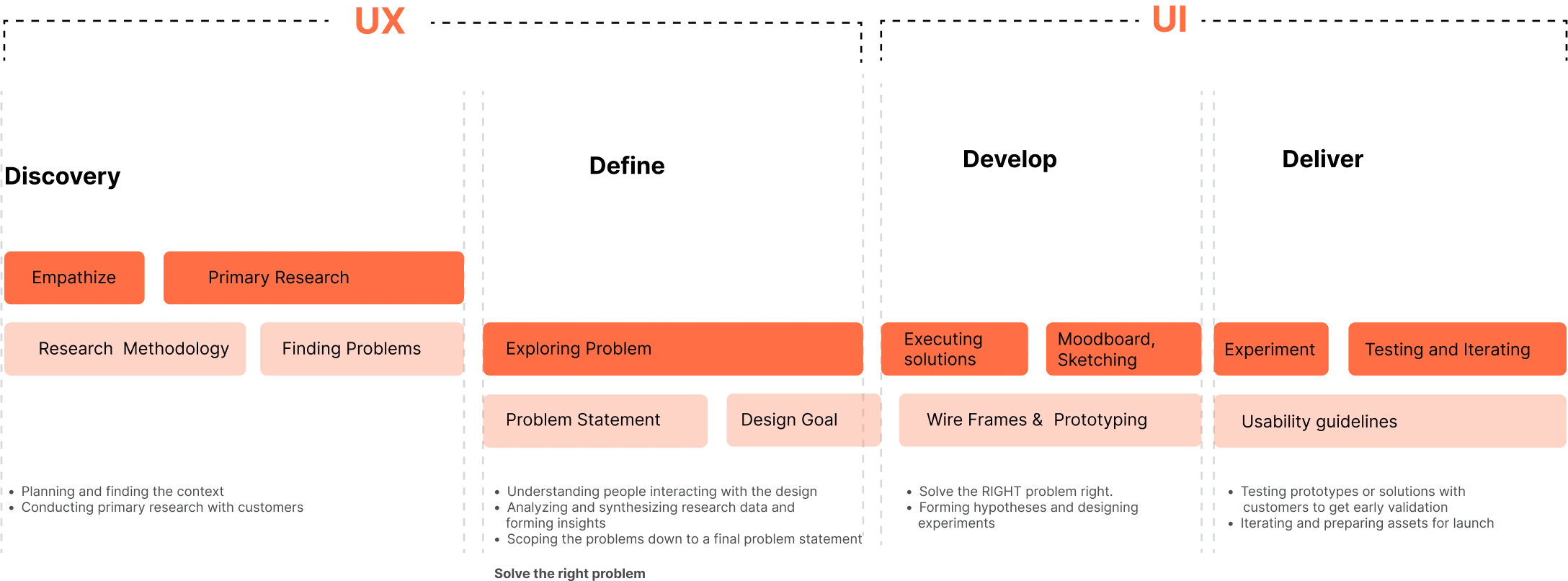
The main idea in The Double Diamond is that the problem is just as important as the solution. There are two distinct activities in this design process: problem-finding and problem-solving and It’s a huge paradigm shift for designers to become problem-finders or researchers.
The strength of the double diamond comes from using the duality of divergent and convergent thinking. Divergent thinking is free-flowing, It helps you explore multiple angles while you working. Some people argue that it enables creativity. Convergent thinking is more focused and linear it scopes down projects to the conquerable and deliverable
Solutions/Features
Gamification elements to make the experience of using the app more engaging and enjoyable for users.
Self Assessment features
Progress Tracking
Submitting ‘truth and dares’
Rewards
Visual Design
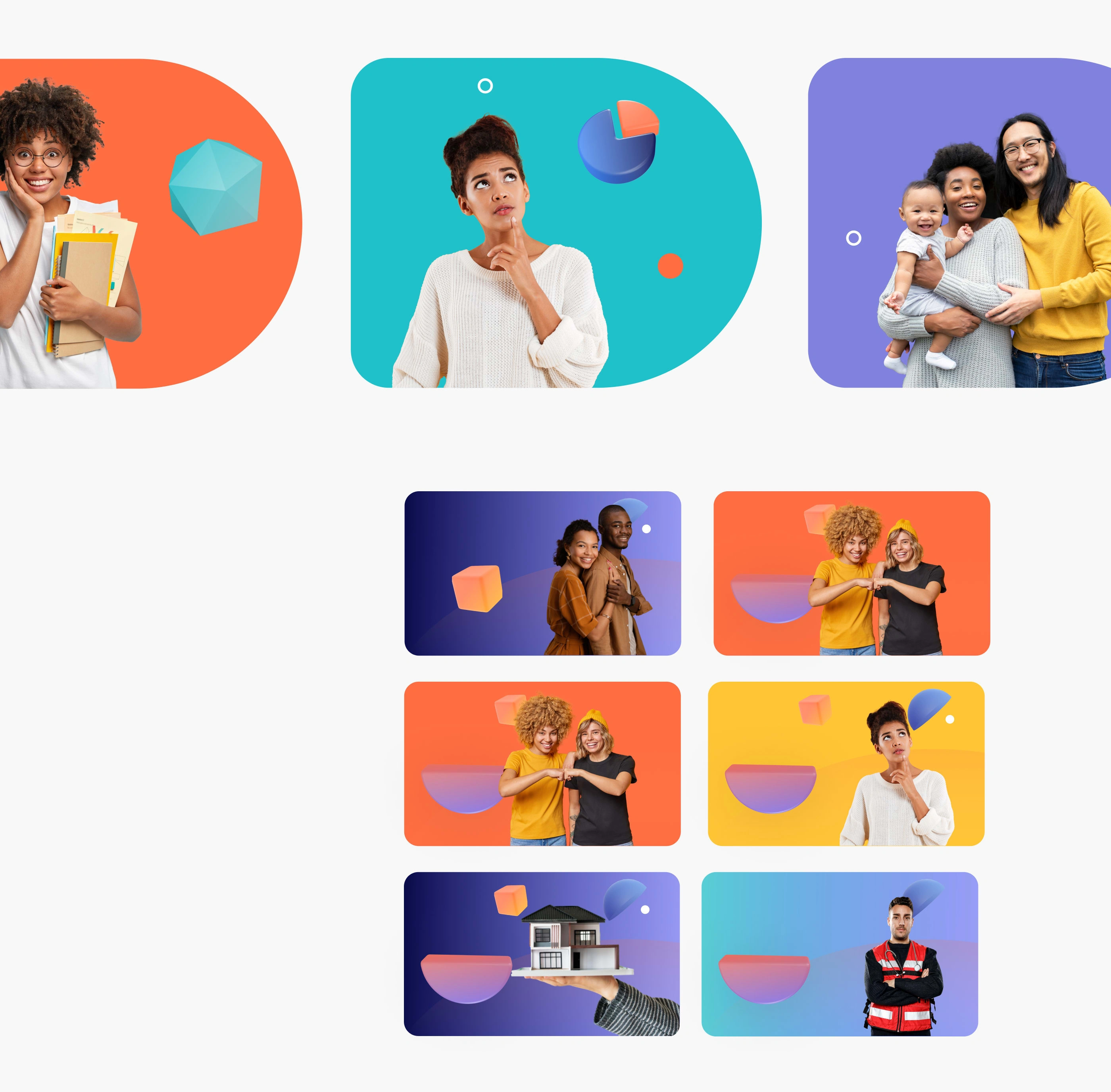
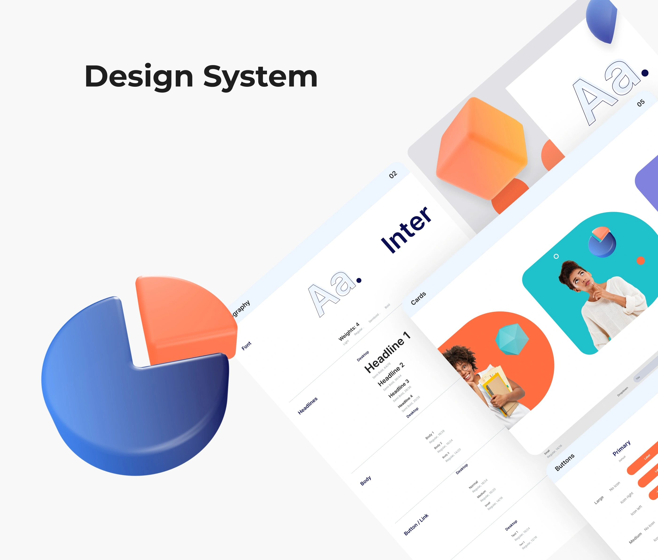
aims to improve a design’s/product’s aesthetic appeal and usability with suitable images, typography, space, layout and colour. We also used colourful design elements to create a cohesive visual language that conveys playfulness and vibrancy. In terms of imagery, we did not want to portray the feeling of depression or anxiety.

Like this project
Posted Jul 2, 2023
Led a comprehensive UX/UI and visual identity design project for a mental health brand, resulting in a modern and cohesive brand image across all touchpoints.
Likes
0
Views
53
Clients
Miricyl

