Dropspot Investor Deck | Market Monopoly Challenge

Ivan Kalkaev


I designed Dropspot's investor pitch deck during their Genius X accelerator program, helping them challenge Cardano's 96% marketplace monopoly with bold visual positioning that matched their disruptive strategy.
At a Glance
Genius X accelerator acceptance - first tokenized blockchain business accelerator
100+ artists onboarded through Creator Launchpad program
1,300+ listeners on breakthrough Twitter Space event
Multiple Project Catalyst proposals - 600K ADA, 180K ADA, 100K ADA applications
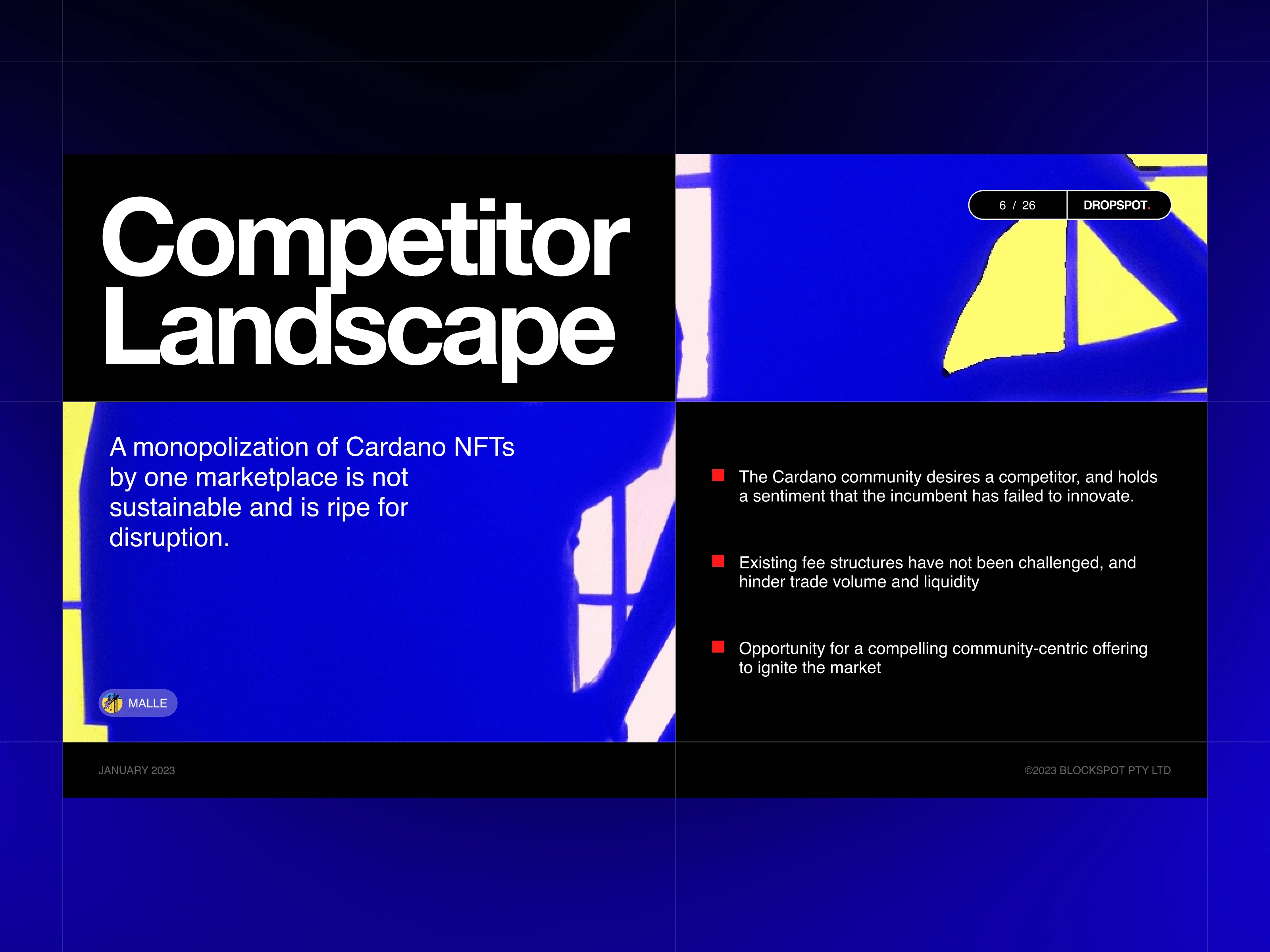
96% market monopoly challenged with differentiated positioning strategy
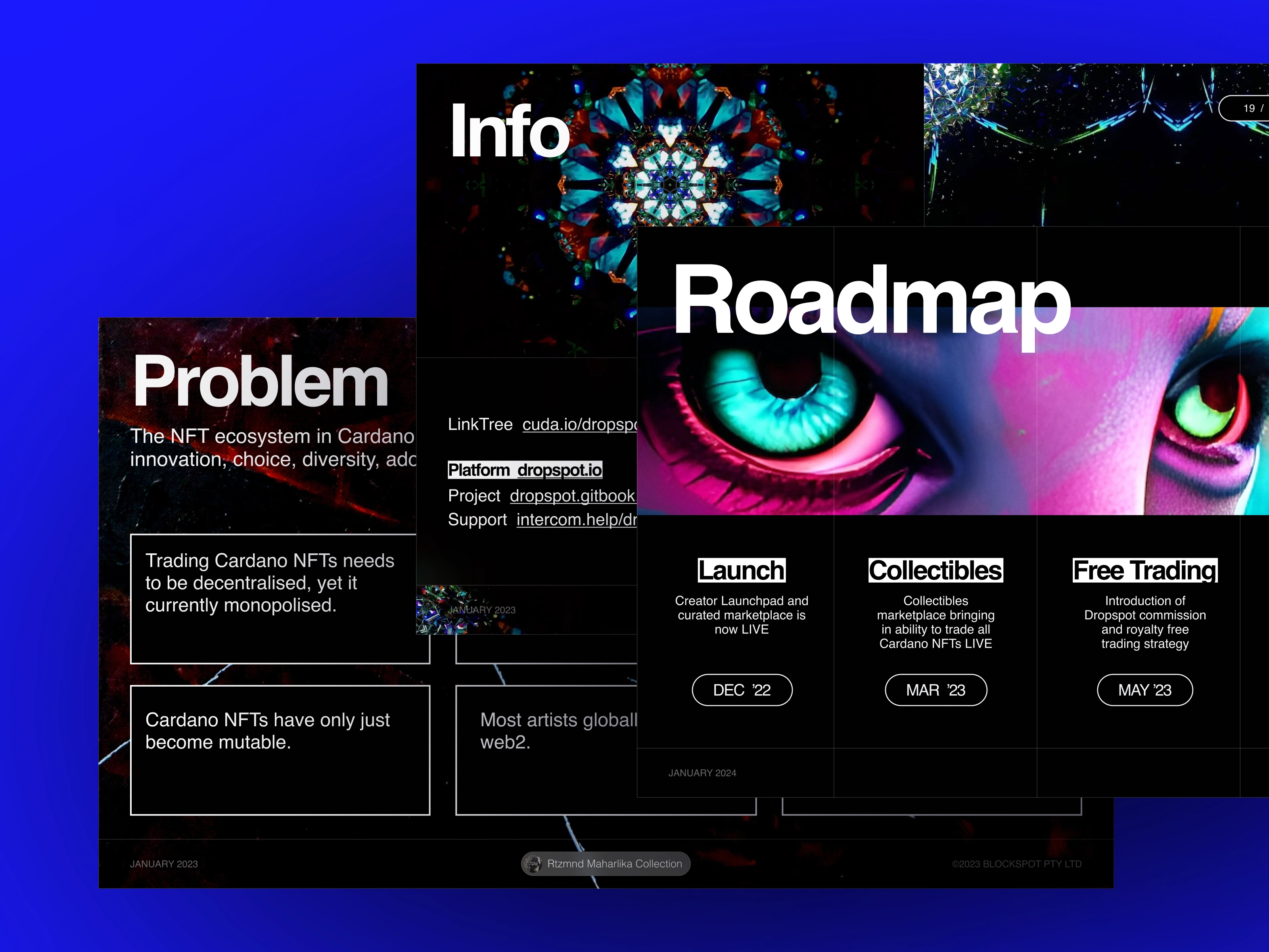
Context & Challenge
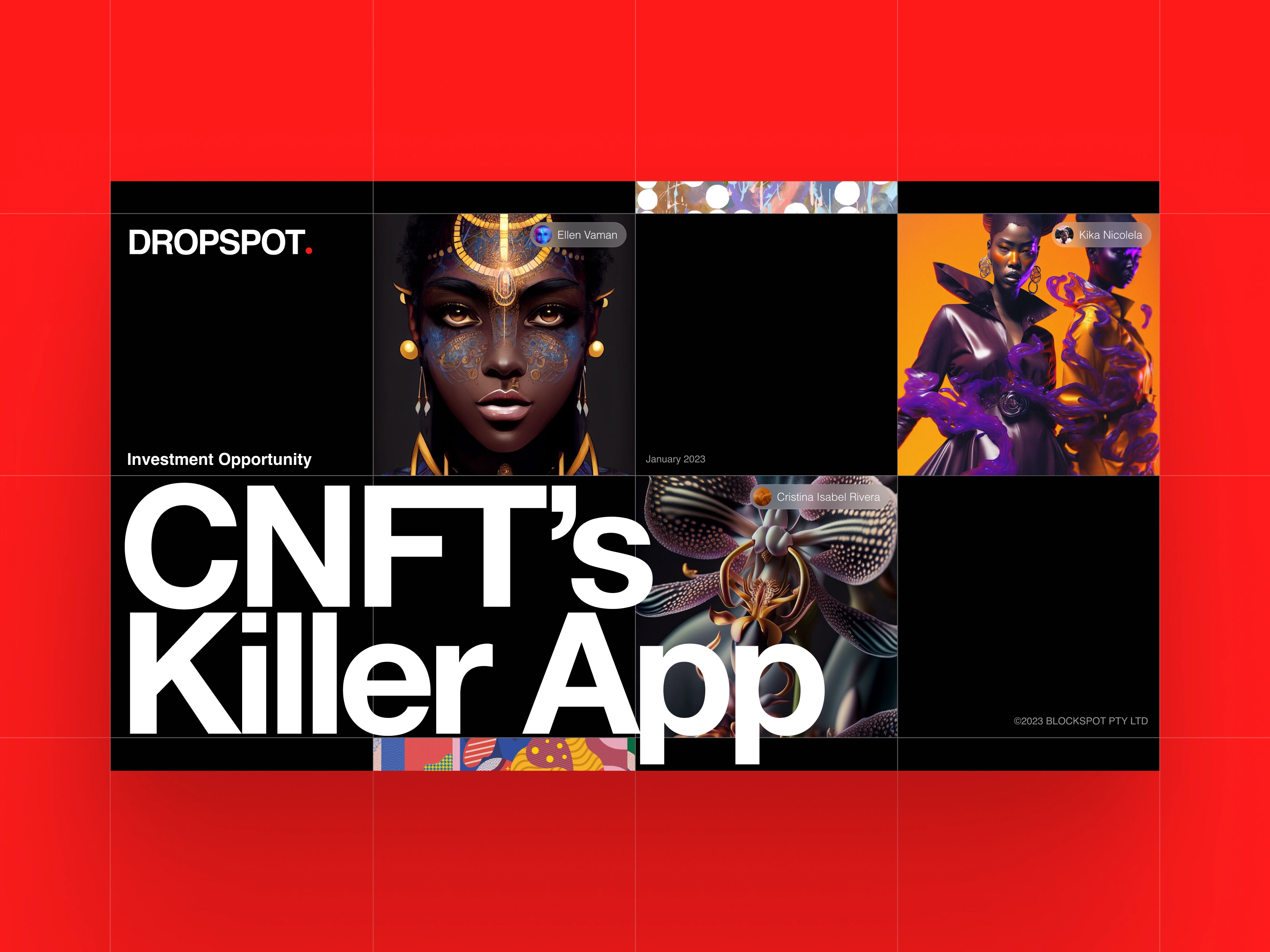
When Dropspot approached us in July 2023, they were mid-accelerator at Genius X but needed investor materials that could break through Cardano's brutal reality: one marketplace controlled 96% of NFT trading. They had genuine innovations - Liquid Offers, Staked Offers, Smart Contract Minting Engine - but needed a pitch deck that positioned them as the inevitable challenger, not just another marketplace.
Solution & Strategy
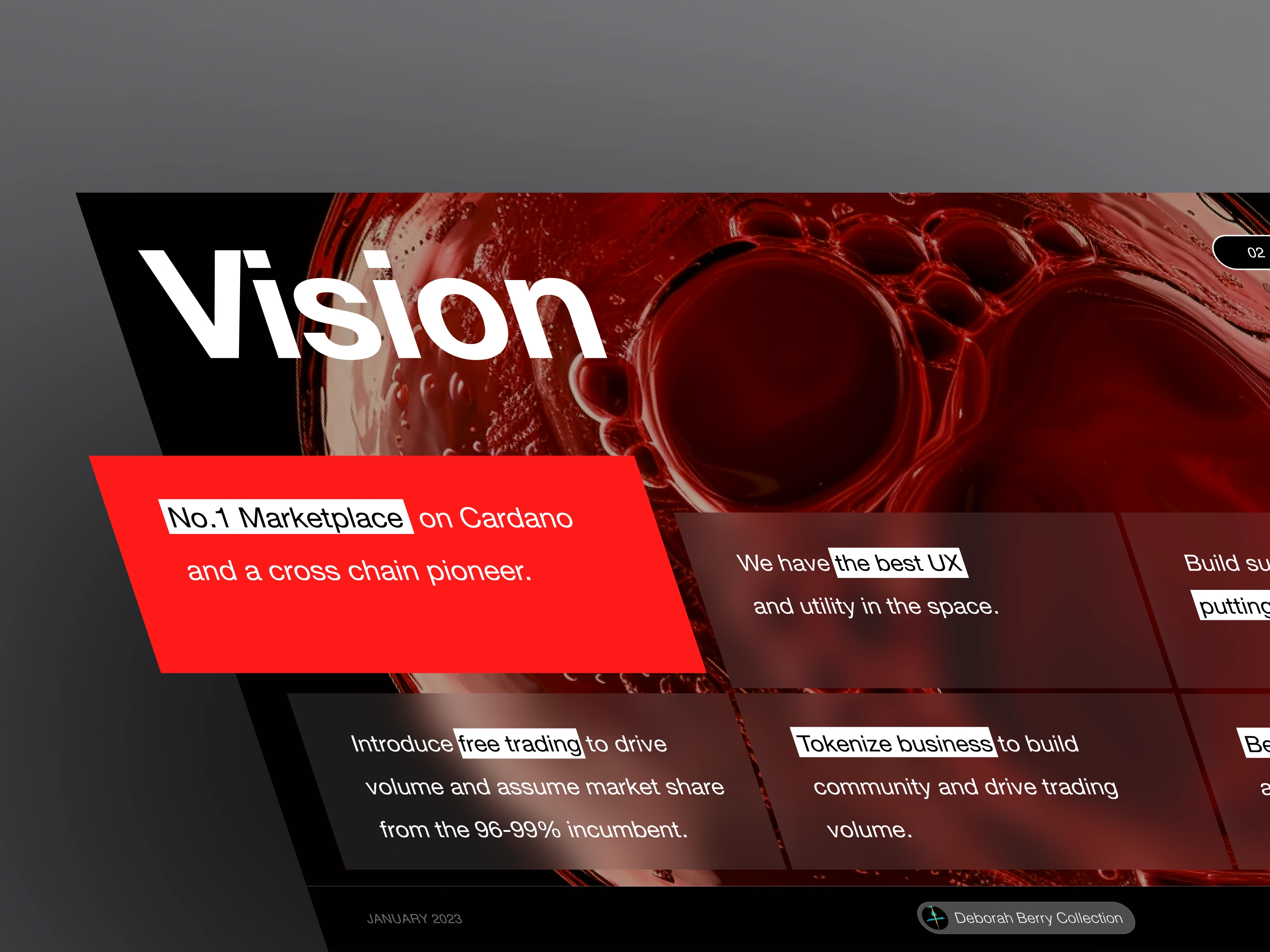
Shaped visual rebellion with Neo-brutalist boldness + Swiss precision for organized hierarchy
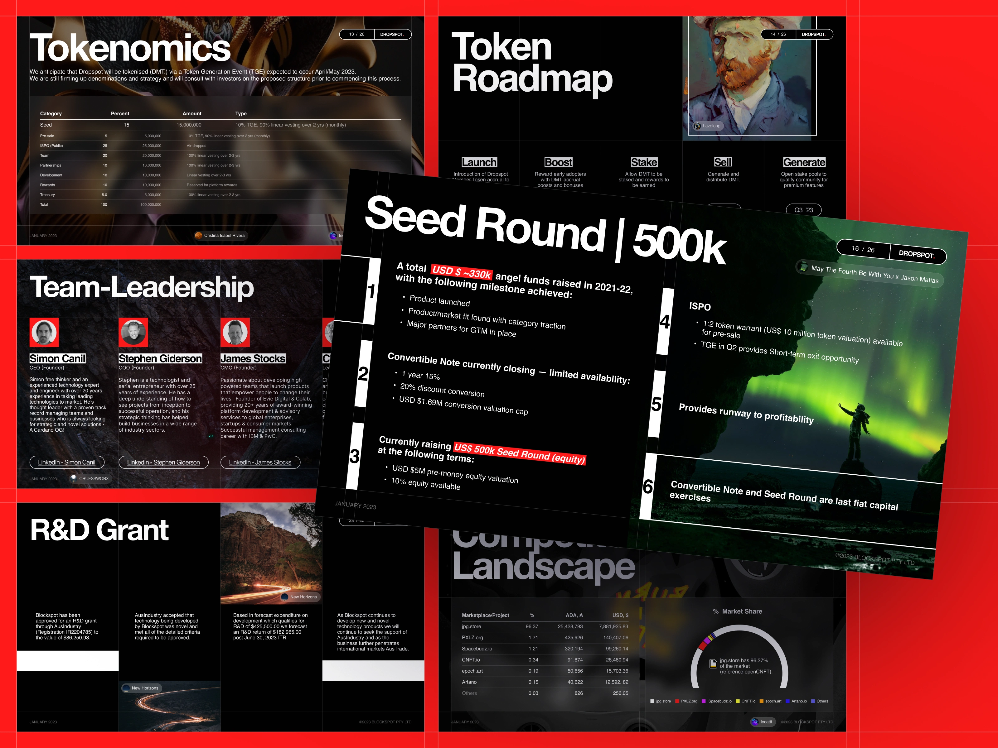
Built modular storytelling architecture for multiple stakeholder types - VCs could focus on market opportunity, creators saw cultural authenticity, accelerator mentors understood technical innovation
Designed dark palette with acid-bright accents - rebellious for Web3, professional for institutional capital
Created comprehensive pitch ecosystem for demo days, Project Catalyst applications, investor meetings
Applied Neo-brutalist aesthetics for market differentiation against corporate competitors
Structured content in scannable modules allowing different audiences to focus on relevant value props
Positioned challenger advantage as key differentiator instead of hiding disruptor identity
This unique visual style not only attracts attention but also communicates Dropspot's innovative, forward-thinking ethos, appealing to the cutting-edge creators and collectors in the NFT space.
By using a classic layout as our base, we created a sense of intuitive usability that welcomes both NFT newbies and seasoned pros.
The visual strategy fused three design languages: UI elements for navigation clarity, Swiss typography for institutional credibility, and Neo-brutalist aesthetics for market differentiation. This wasn't aesthetic choice - it was strategic positioning that helped Dropspot attract the right audience - innovators and risk-takers who challenge established markets.
By breaking the content down into distinct, digestible chunks, we made it easy for users to scan, understand, and engage with the information they need. Each module has its own clear hierarchy and purpose, but they all work together to create a cohesive, compelling whole.
Good typography isn't just easy on the eyes – it's good for business, too. By choosing a font that's both highly readable and visually distinctive, we've made sure that Dropspot's content takes center stage, keeping users engaged and informed.
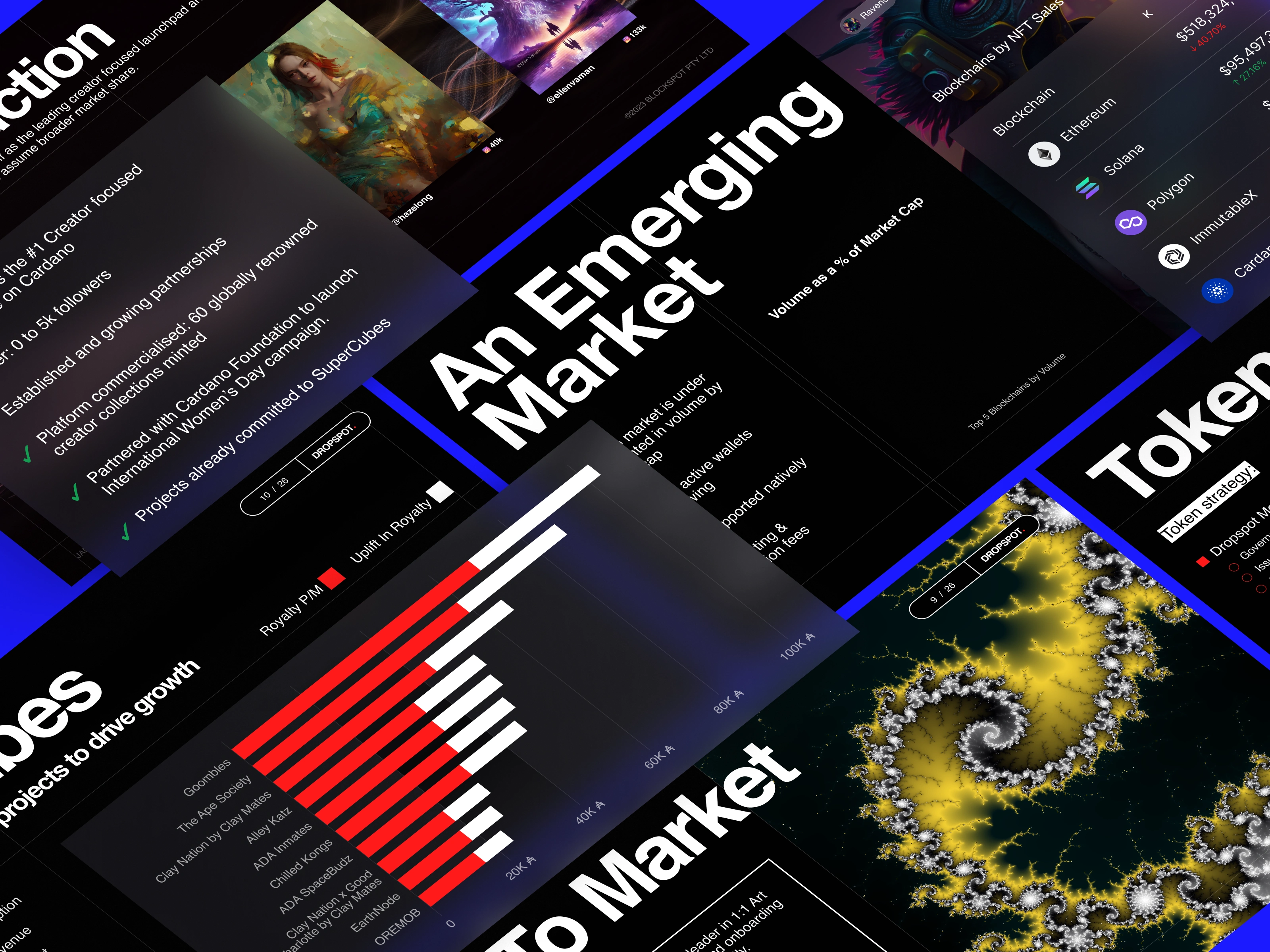
In the end, our work with Dropspot wasn't just about making something that looked cool (although, let's be real, it does look pretty damn cool). It was about crafting a visual language that tells a story, a design that doesn't just attract attention but communicates values, ethos, and identity.
Results & Impact
Genius X accelerator completion with investor network access
100+ artists launched through Creator Launchpad
1,300+ Twitter Space listeners - community breakthrough event
Multiple funding applications positioned for Cardano ecosystem support
Competitive positioning established as credible monopoly challenger
What I Did With Their Budget (Plain English)
Designed pitch materials supporting accelerator program completion
Created visual system working across investor meetings and community events
Built storytelling framework making marketplace disruption feel inevitable
Positioned them as confident challenger with authentic Web3 connection
Why It Worked
The design matched their "David vs Goliath" positioning perfectly. By blending professional structure with authentic NFT culture aesthetics, we created materials that spoke to multiple audiences simultaneously. The modular approach let investors focus on market opportunity while creators saw cultural authenticity.
Most importantly: we didn't hide their rebel positioning - we weaponized it. In a market dominated by one player, being the bold alternative became their competitive advantage.
🎨 Building something that needs to stand out? Let's make it impossible to ignore.
Like this project
Posted May 2, 2024
Bold visual strategy for Dropspot NFT platform → Genius X selection, 100+ creators onboarded, 1.3k Twitter Space breakthrough


EZ Wallet UX Design: A Journey of Innovation and Intuition
Revamping a Crypto Payment Widget with Stellar UX/UI Design
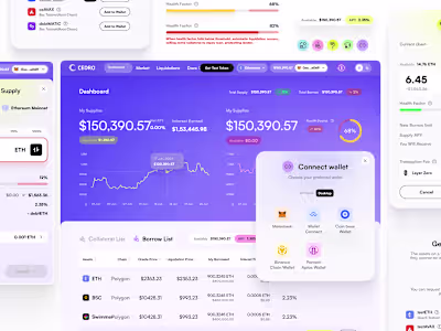
Crypto Lending Web3 App UX/UI
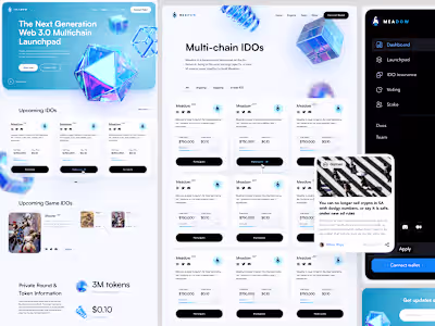
Multichain Web3 Projects Crypto Launchpad