Kakeru Finance: DeFi Web App + Design System

Erick Nolasco

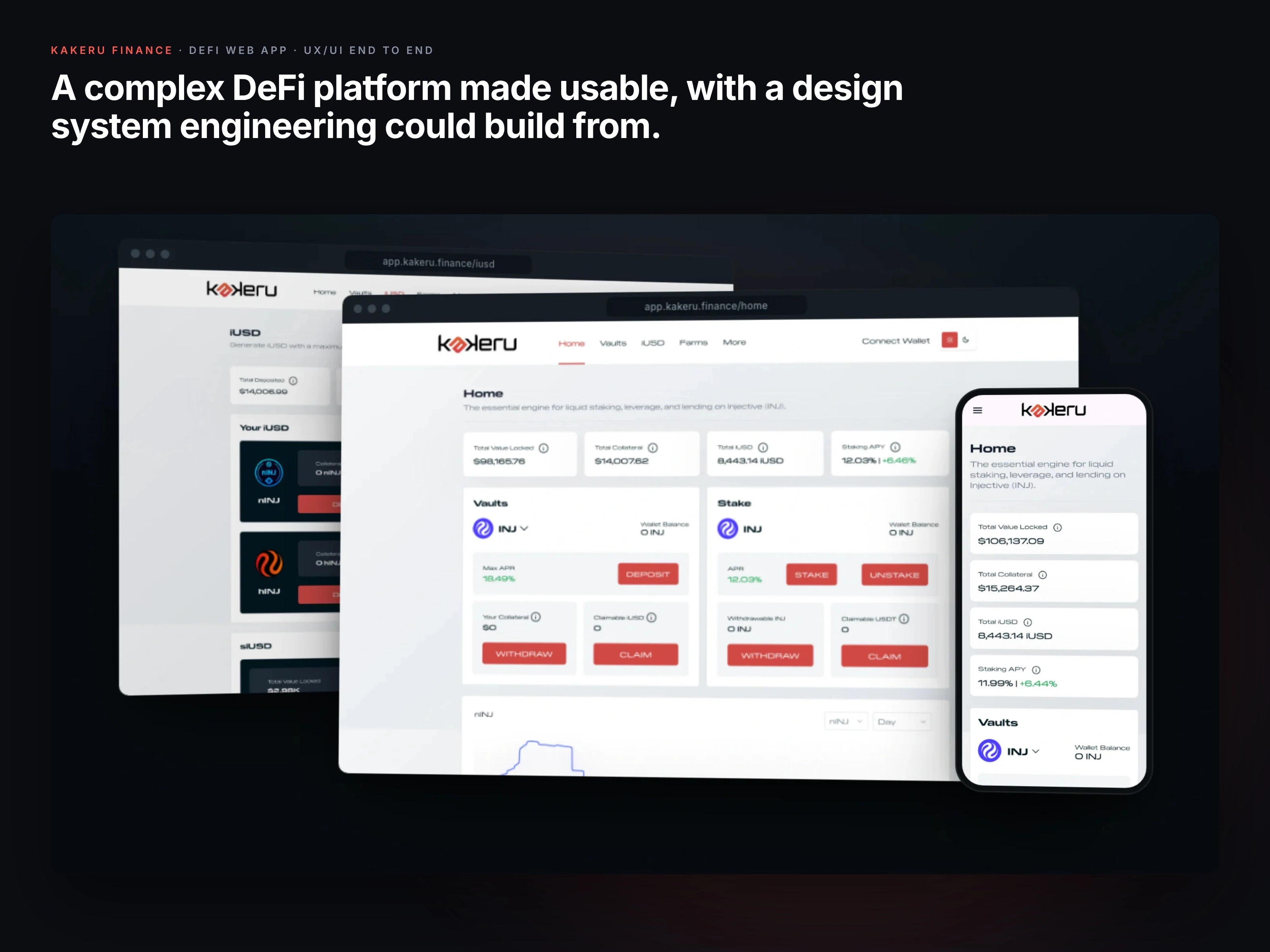
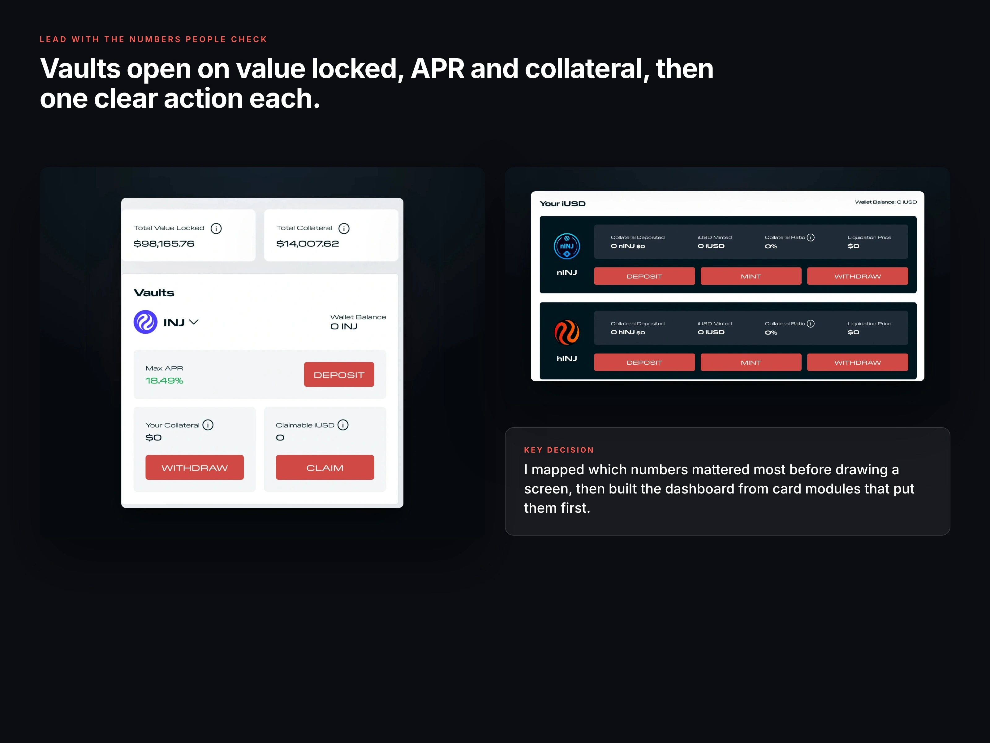
Vaults lead with the numbers people check, then one clear action each.
Making a DeFi app make sense to actual people.
Kakeru Finance was a staking, leverage and lending platform on the Injective blockchain. The mechanics underneath were complicated, and the site they had, built by a series of developers before me, made them feel even more so. I designed the product end to end and handed engineering a design system they could build from.
Role: UX/UI designer, end to end
Scope: Journey mapping, wireframes, final UI, design system, handoff
Platform: Responsive web app (DeFi)
Status: Shipped in 2025; Kakeru wound down later that year
01 · Understand it before simplifying it
I sat down with the product and engineering teams to learn the mechanics first, because you cannot simplify what you do not understand yourself. Then I mapped every core action under the three jobs people come to do: stake and farm, manage collateral, and collect rewards.
02 · Lead with the numbers people check
Four numbers decide almost every visit: total value locked, APR, claimable rewards and wallet balance. I ranked them, then built the dashboard from card modules that put them first, each paired with the one action it leads to.
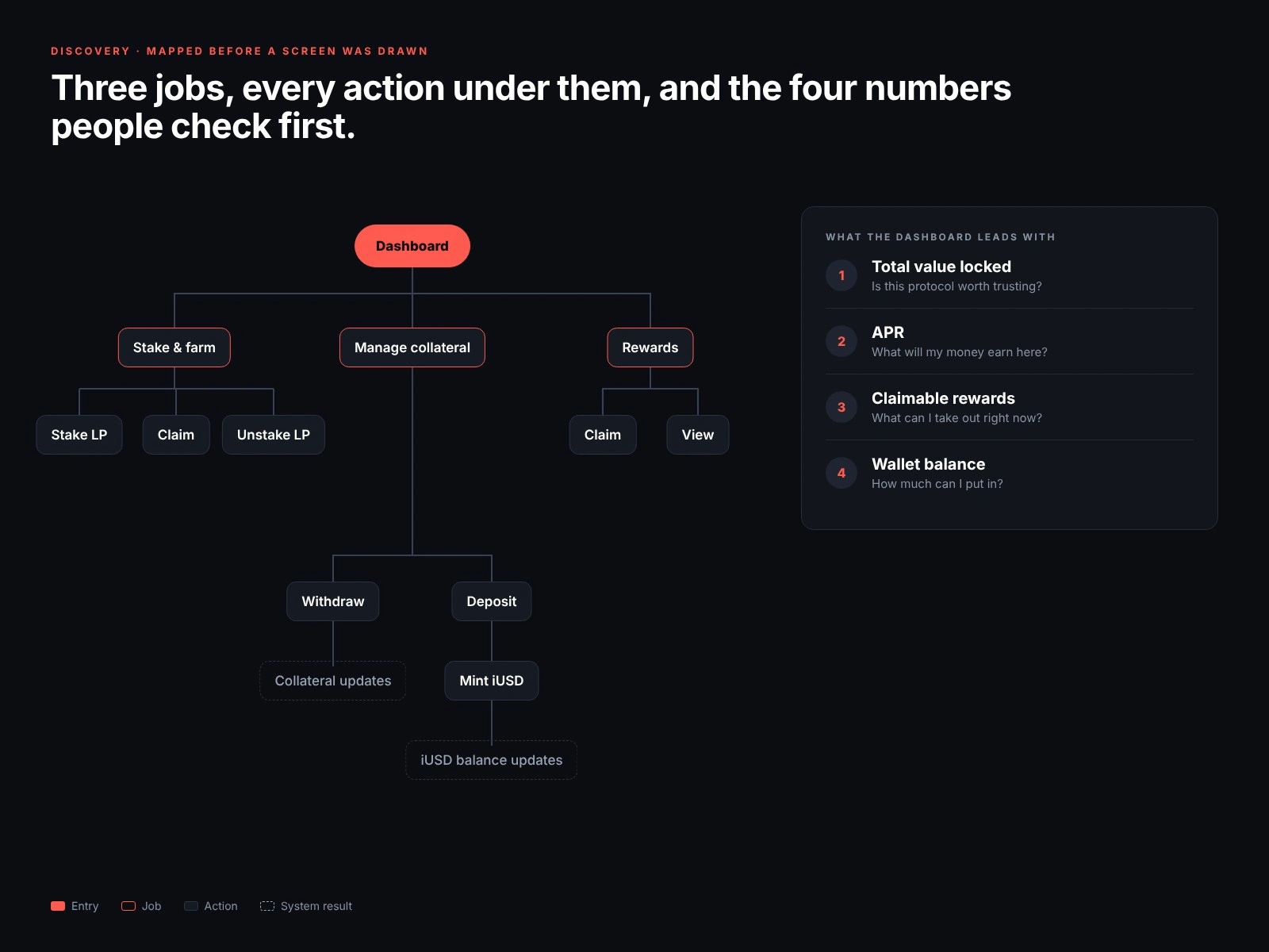
Every core action, mapped before a screen was drawn.
03 · Low fidelity first
I wireframed the busiest flows before any color went in. Staking became four steps, from picking a farm to seeing the converted position, with a review screen that restates the conversion before anything touches the wallet.
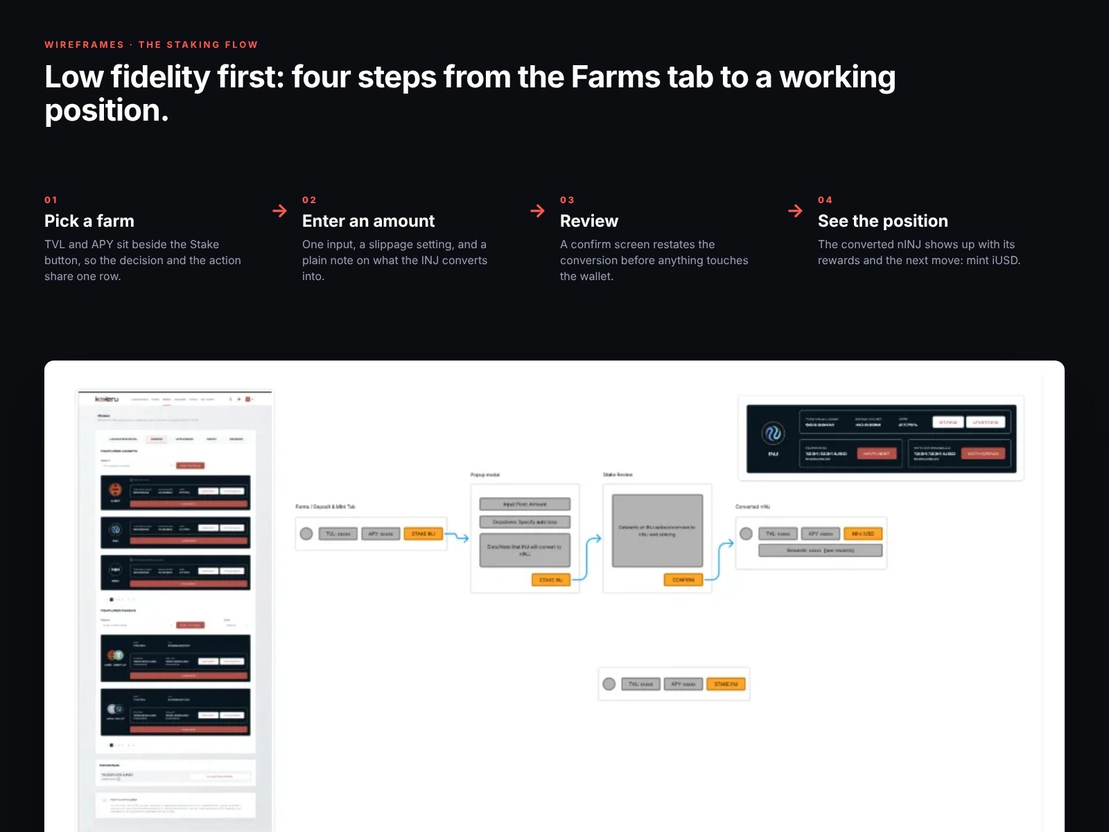
The staking flow in four steps, over the original wireframe.
04 · Data, made scannable
Performance views got one price line, a token and period picker, and a plain table of holdings underneath. Nothing to decode.
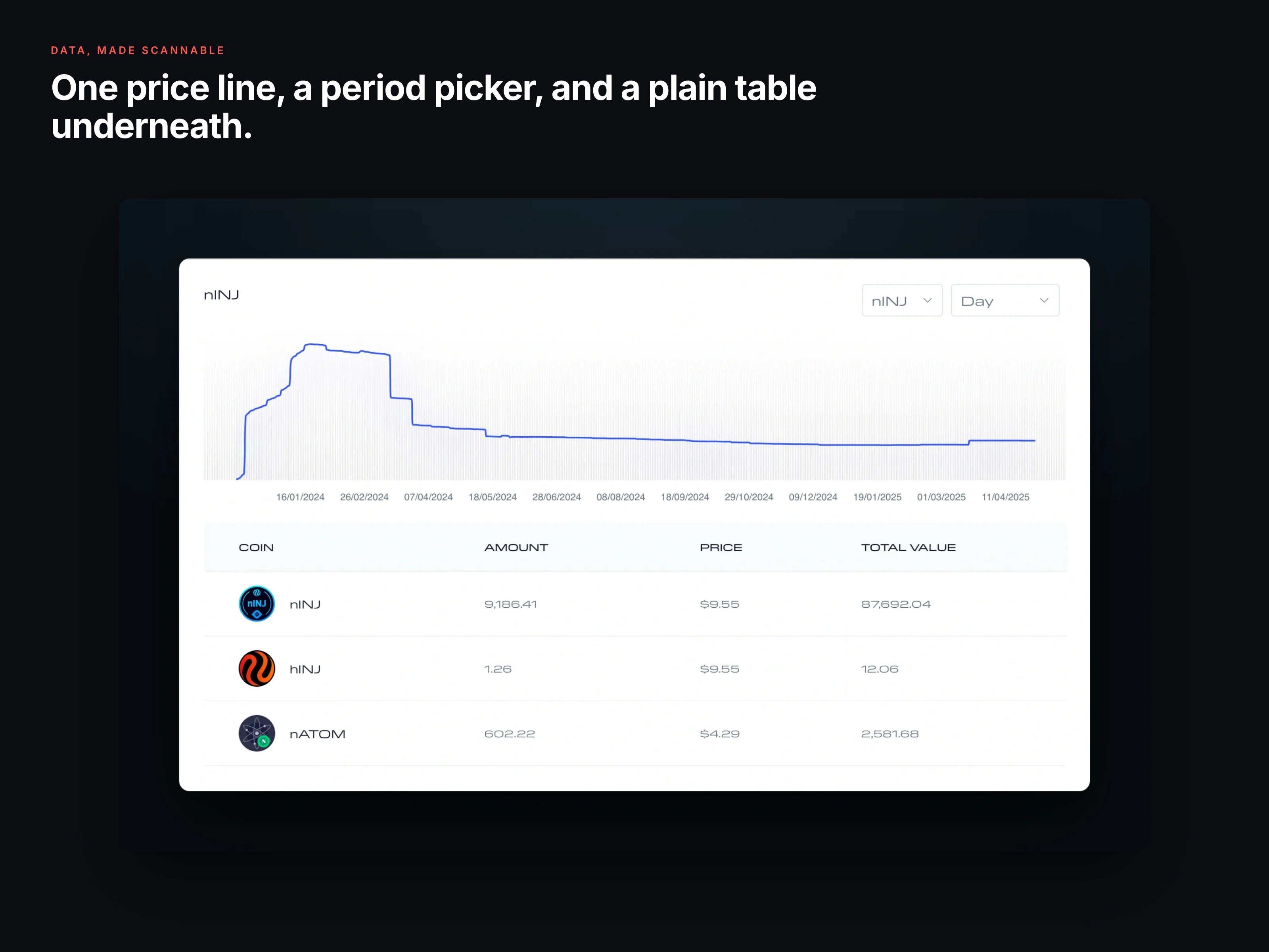
Holdings: one price line, a period picker, and a plain table underneath.
05 · Built for the phone too
The whole app was responsive. On a phone the header numbers stack as cards, and every action gets a full-width button sized for a thumb. Color does the reading at a glance: red for actions that move money, green for APR.
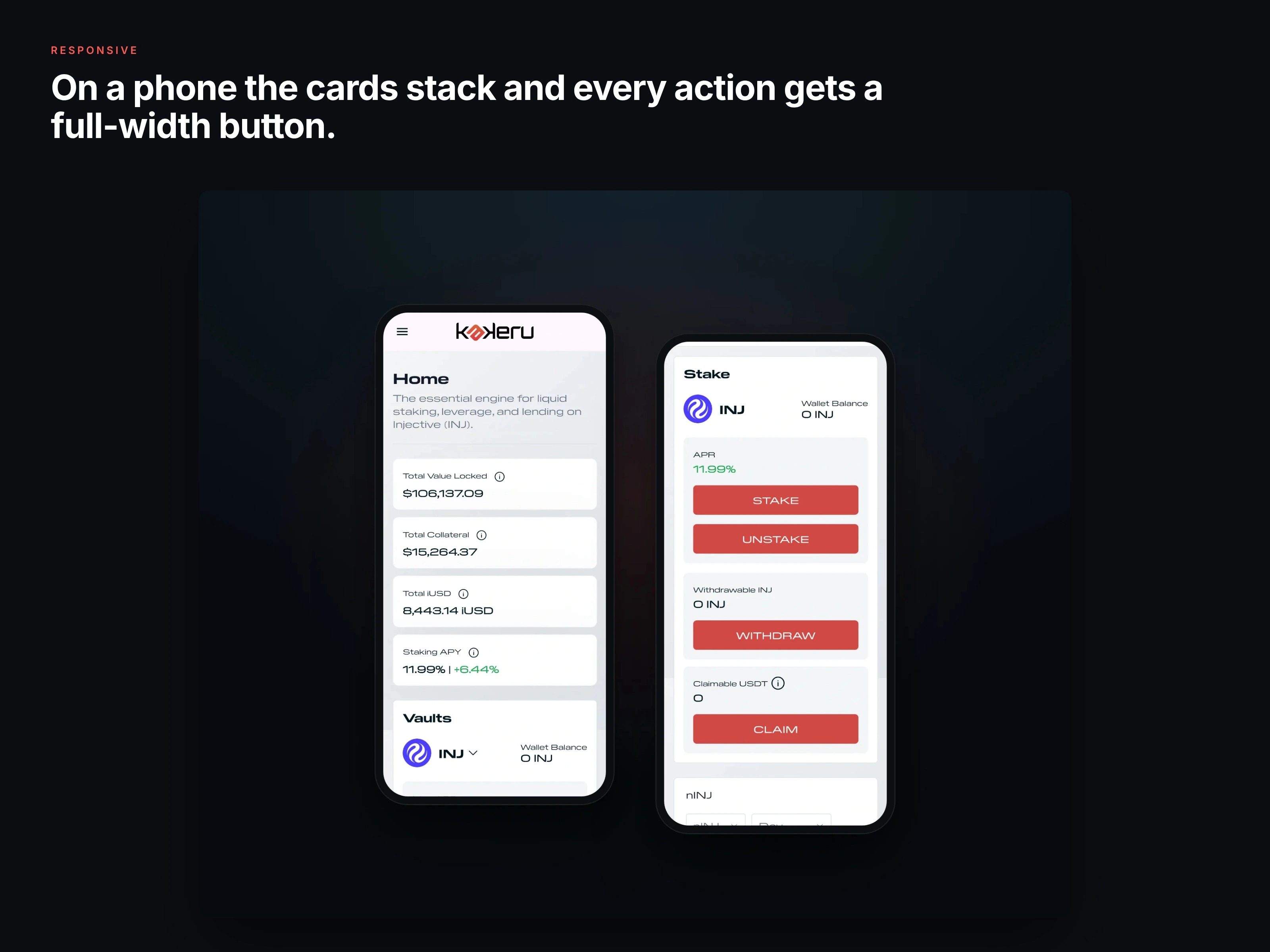
On a phone the cards stack and every action gets a full-width button.
06 · A system engineering could build from
Underneath it all sat one design system: color, Pilat Extended type, token icons, and reusable components like stat cards, APR rows, vault cards, dropdowns and data tables. That consistency is what kept a data-heavy product from feeling chaotic.
A calm background, and bold color only where it counts.
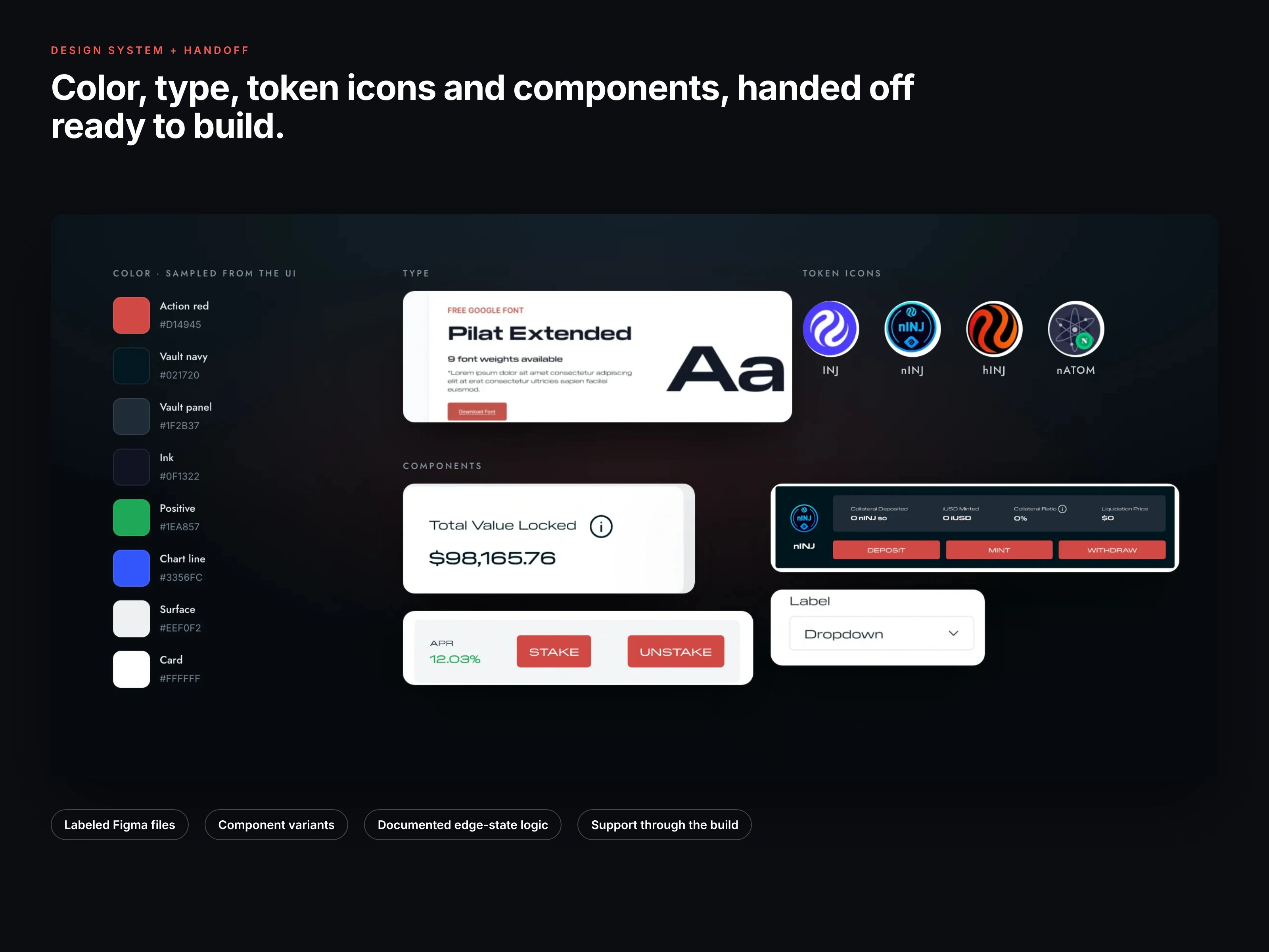
The system: color, type, token icons and components, all from the shipped UI.
What the handoff included
Figma files ready to build from
Labeled layers and component variants
Documented logic for the trickier states
Support through the build
Outcome
Complex staking and vault actions became easy to follow, and the documented system gave the team a foundation they kept consistent through the build. Kakeru wound down later in 2025; the work stands as an end-to-end product and design-system delivery.
Want the full story, including the flow maps and responsive layouts? Read the full case study.
Like this project
Posted Oct 27, 2026
End-to-end UX/UI for a DeFi staking and lending app: dashboard, responsive UI and a design system handed to engineering.
Likes
0
Views
0
Timeline
Dec 31, 2024 - Dec 30, 2025