Amazon & Walmart employee stock apps: 80K+ downloads

Erick Nolasco


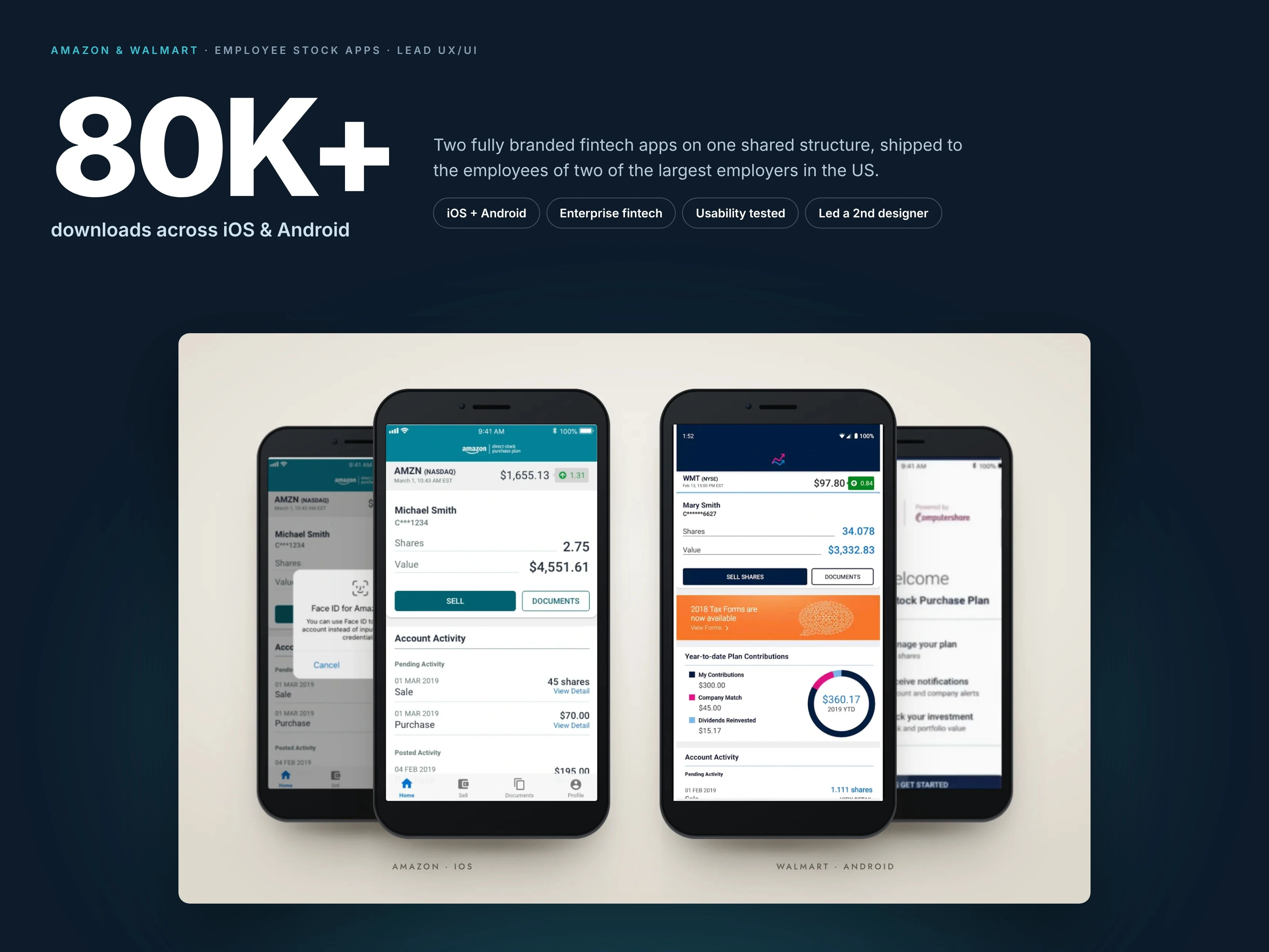
Two of America's largest employers. One app structure. 80K+ downloads.
Computershare runs employee stock plans for some of the largest companies in the world. Amazon and Walmart needed real mobile apps so employees could manage their shares from a phone. As lead UX/UI designer on a Scrum team, I took both from flows to shipped iOS and Android apps.
Role: Lead UX/UI designer, directed a second designer
Client: Computershare, for Amazon and Walmart
Platforms: iOS and Android
Result: 80K+ downloads across both apps
01 · The problem
Employees could only manage their stock through a dated desktop portal, and earlier attempts at an app had never shipped. The new apps had to handle real money, satisfy two demanding brand teams, and feel simple to people who rarely think about shares.
02 · One structure, two brands
Instead of reskinning one app twice, I designed two fully branded apps on one shared structure. Each one feels like it belongs to its company, while the flows and logic underneath are the same.
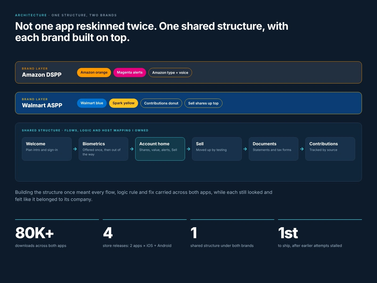
One shared structure, with each brand built on top.
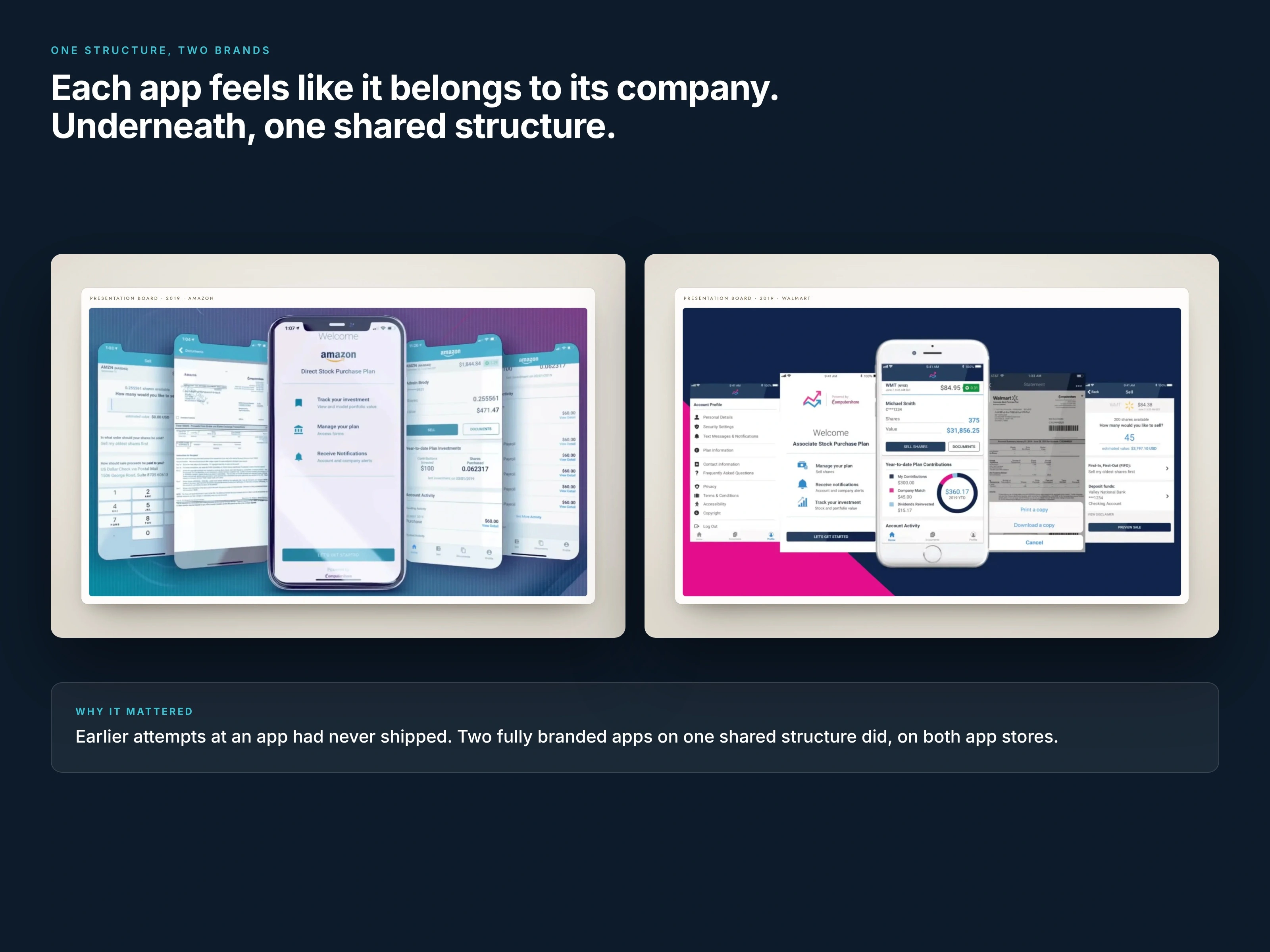
Two fully branded apps on one shared structure: Amazon on iOS, Walmart on Android.
03 · Test the riskiest flow first
Selling shares was the flow we were least sure about, so it was the one we put in front of people before the build. In moderated sessions on clickable prototypes, we watched whether someone new to stock plans could sell on their own.
Selling lived only in the bottom nav. Testing moved it to a primary button on the home screen.
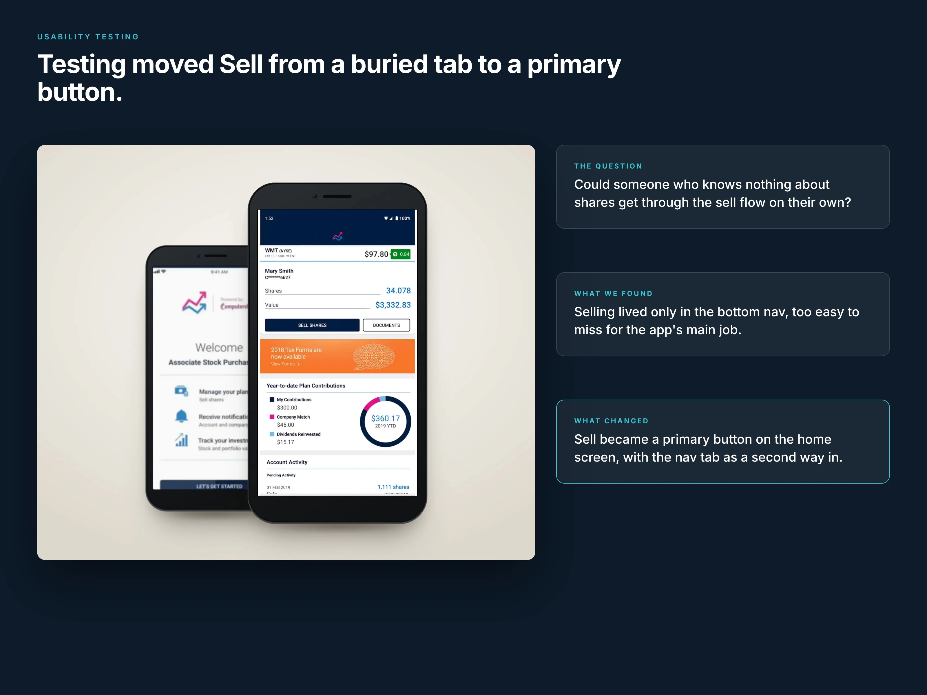
Testing moved Sell from a nav tab to a primary button.
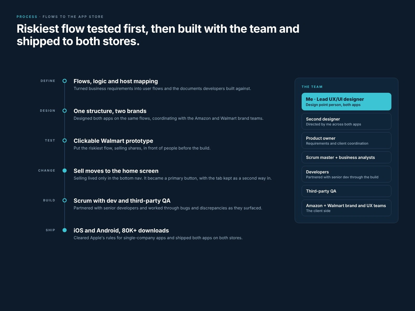
From flows and logic docs to both app stores, and the team behind it.
04 · Trust, built into the details
These apps move real money, so trust had to be designed in. Alerts sit above the account, and each one asks for exactly one action: certify, view forms or view details.
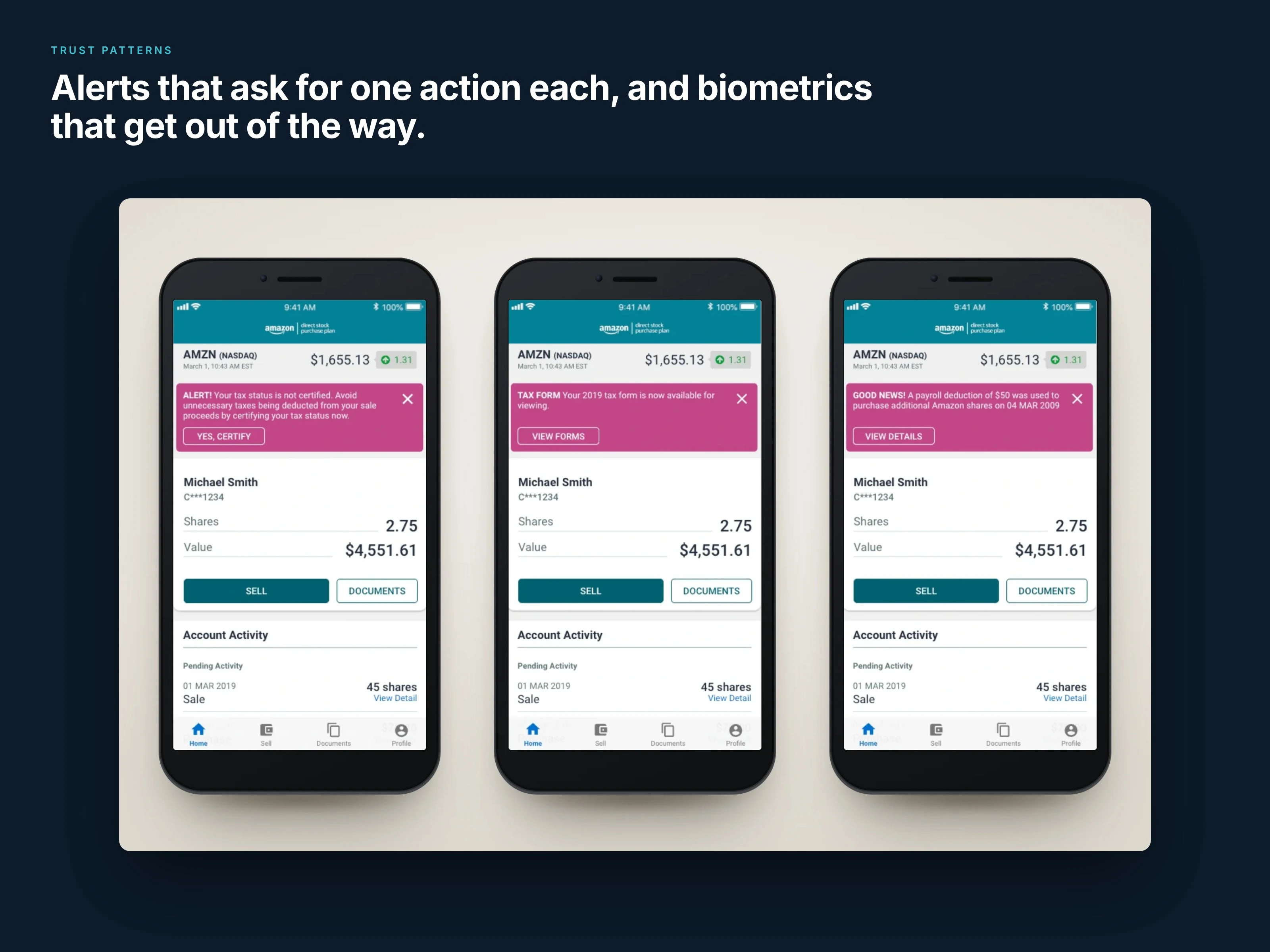
Alerts sit above the account, each with exactly one action.
Security works the same way. Biometric login is offered once at first sign-in, then keeps everything locked down without getting in the way of the actions people came for.
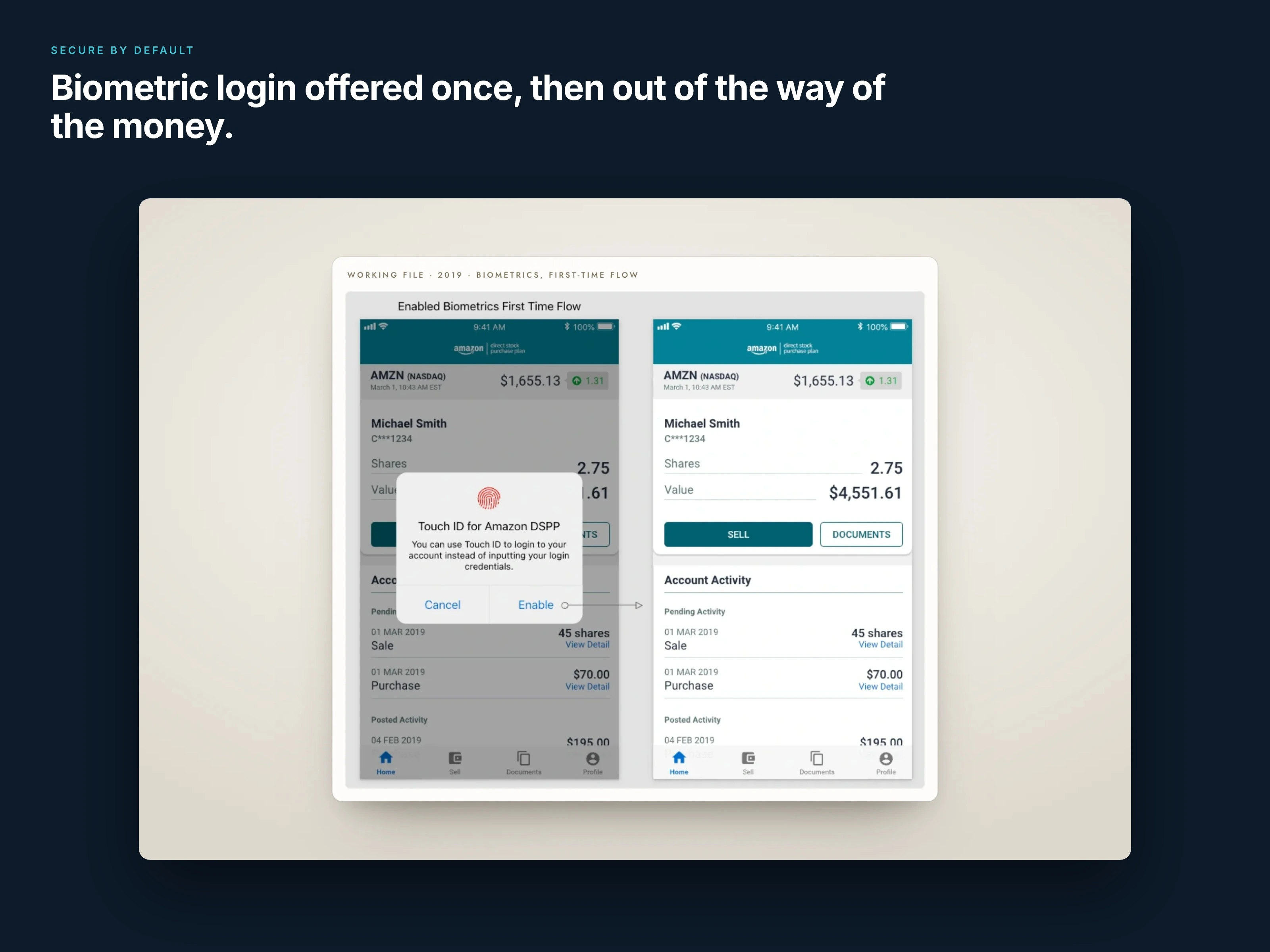
Biometric login is offered once, then gets out of the way.
Outcome
Shipped on iOS and Android, with 80K+ downloads
Two fully branded apps from one shared structure
A sell flow tested with users before the build
Want the full story, including the original presentation boards? Read the full case study.
Like this project
Posted Oct 27, 2026
Led UX/UI for two fully branded fintech apps on one shared structure for Computershare. Usability-tested and shipped on iOS and Android: 80K+ downloads.
Likes
0
Views
0
Clients
Computershare