Musterhall: SaaS landing page, design + build

Erick Nolasco


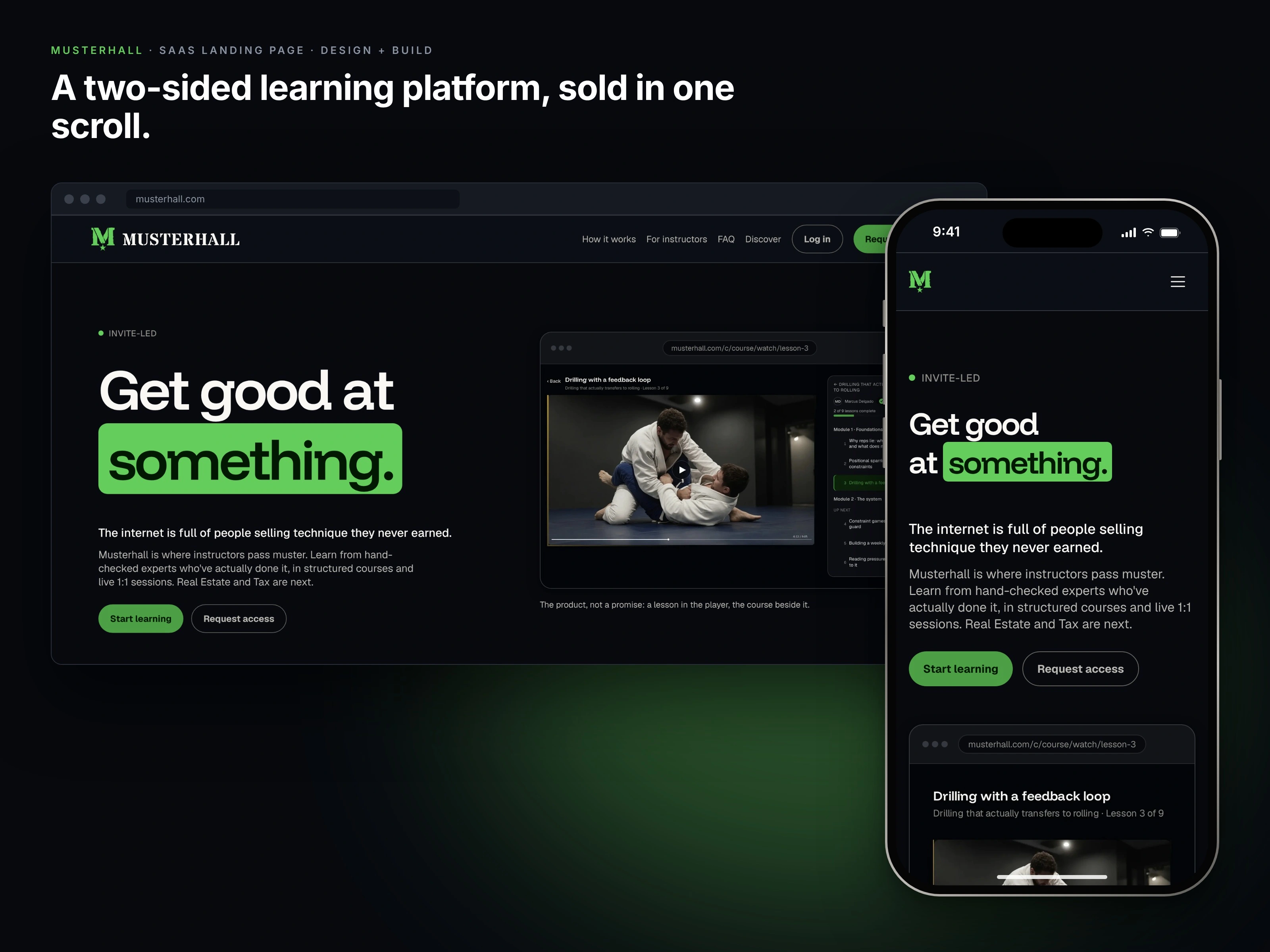
Most course platforms sell influence. Musterhall sells proof.
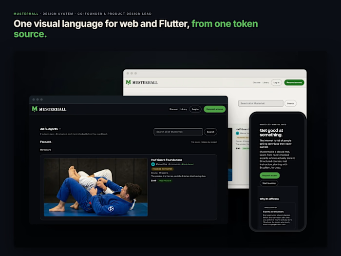
Musterhall is a two-sided learning platform where every instructor is hand-checked before they teach. I co-founded it and lead product design: I set the brand language, built the token design system, then designed and built the launch site on top of it.
Role: Co-founder, product design lead
Scope: Landing page design + build, on the Musterhall design system
Platform: Web, desktop + mobile
Status: Pre-launch; screens show demo content
01 · The problem
A new marketplace has to win over two skeptical audiences at once. Learners have been burned by courses sold on follower counts. Experts are deciding whether to put their name on a platform nobody has heard of yet. Neither group trusts a promise.
The page had to show the product, not describe it.
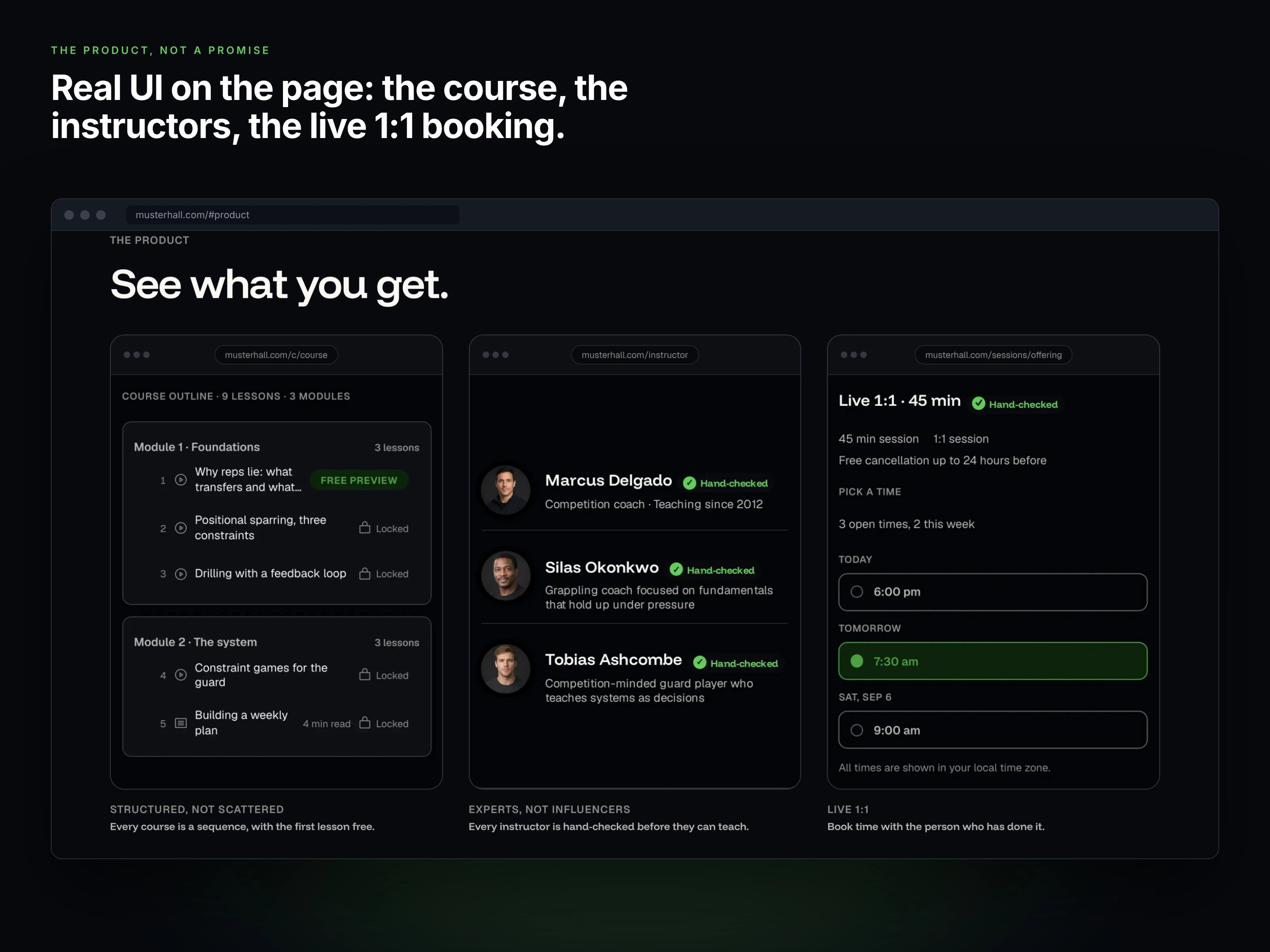
The product on the page: course outline, hand-checked instructors and live 1:1 booking, shown as real UI instead of stock imagery.
02 · Show, don't promise
So the page leads with the real product: the course player, the outline, hand-checked instructor profiles and live 1:1 booking. No stock photos and no vague claims. Every screen is real UI, built from the same tokens as the app.
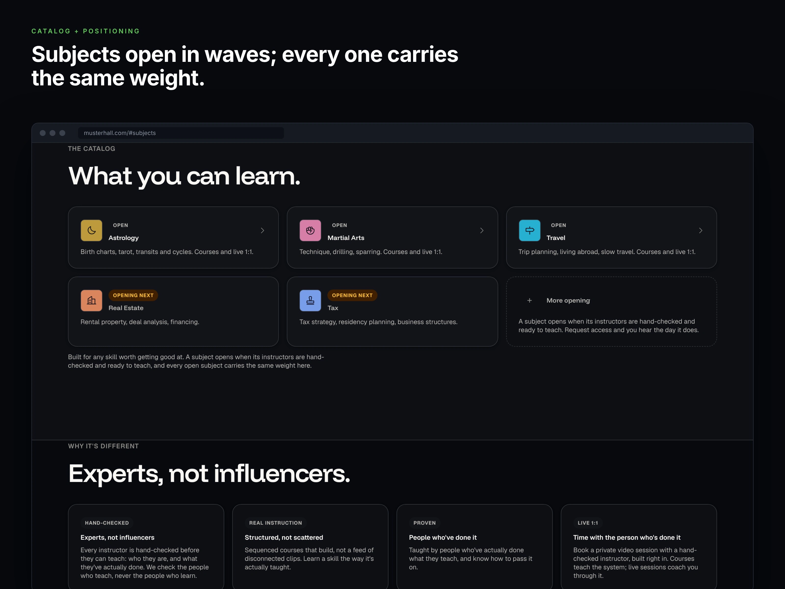
Catalog and positioning: subjects open in waves, and every one carries equal weight.
03 · Two audiences, two loops
Learners and instructors need different answers, so the page runs as two loops that share one story:
For learners: find the real thing, buy it once, get coached live
For instructors: pass muster, publish your system, keep what you earn
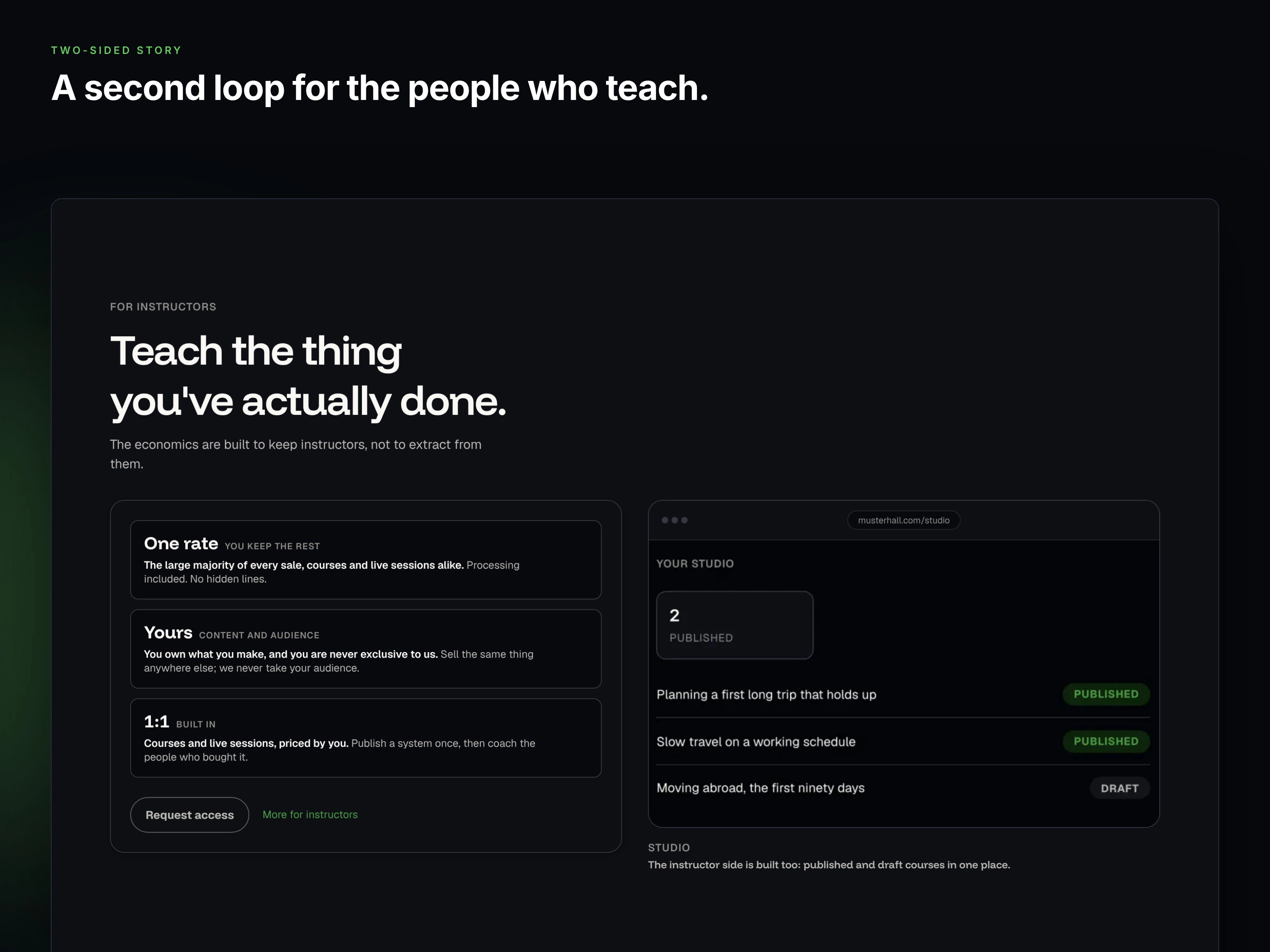
A second loop for the people who teach: the economics, ownership and a studio preview.
04 · Mobile-first, on one system
Most first visits happen on a phone, so I designed and built the page mobile-first, on the same design tokens as the product. Color, type and components stay consistent from the first tap to the app. One green carries identity and action, and every color pairing is checked against WCAG 2.1 AA.
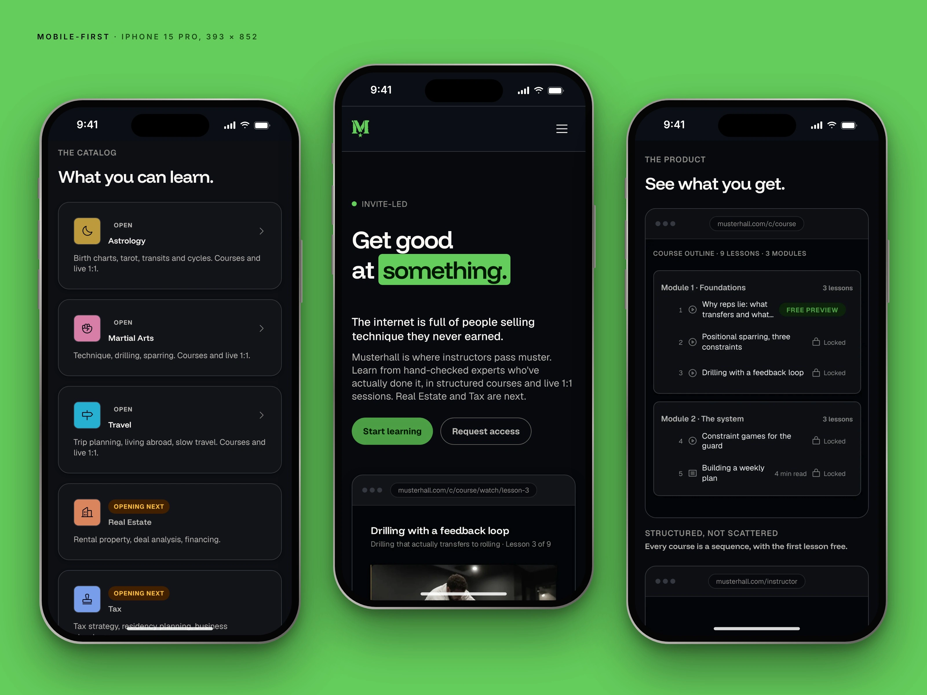
Mobile-first: the same page on iPhone, from the same tokens.
05 · One clear ask
Every path ends in the same place: one request-access form that works for both audiences, with a one-tap choice between learner and instructor.
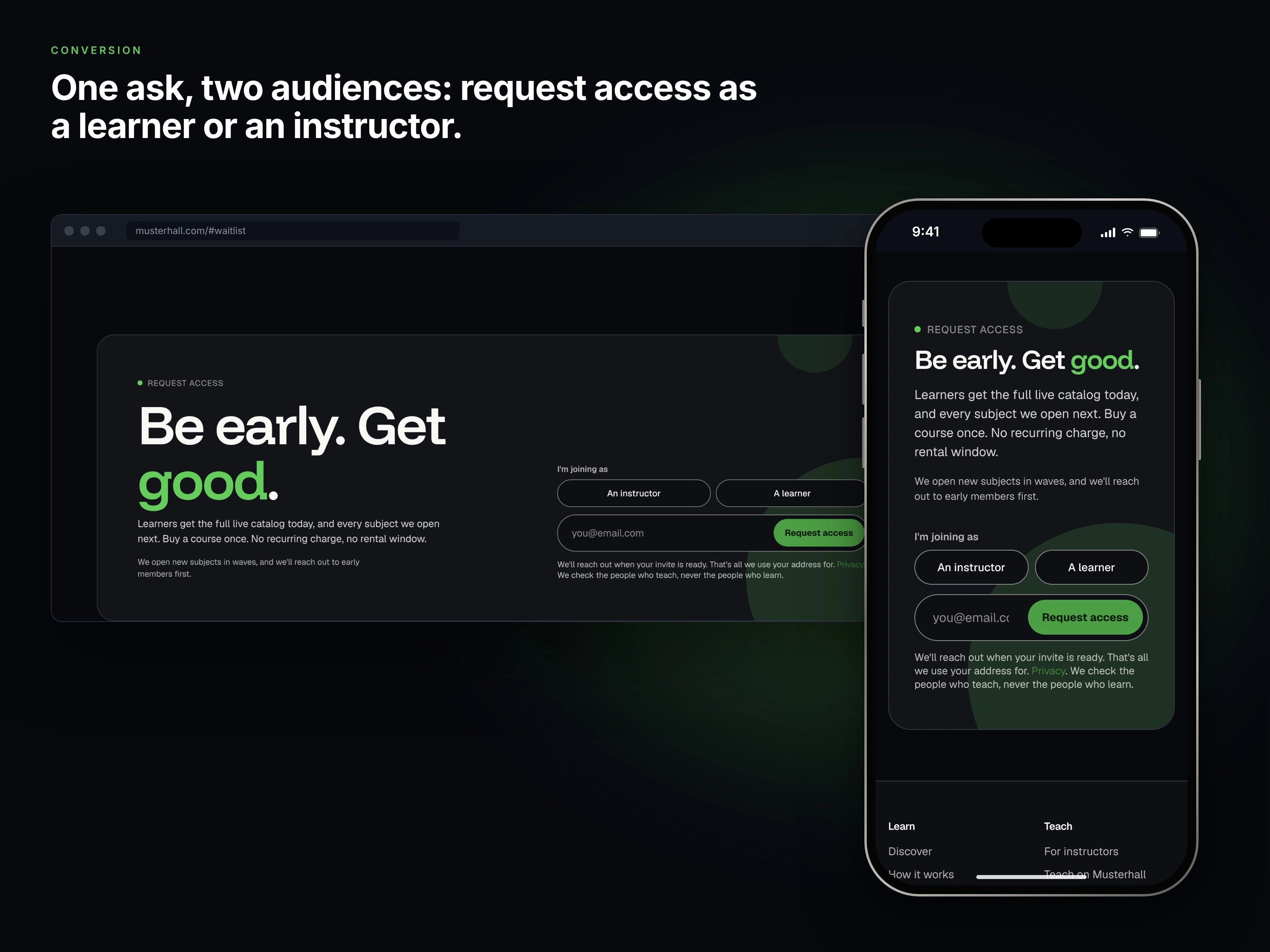
One ask, two audiences: request access as a learner or an instructor.
The full lander, top to bottom: designed and built by me.
Outcome
A launch-ready site that explains a two-sided marketplace in one scroll
Real product UI in place of stock imagery and promises
One token system shared with the app, so the team can keep shipping
Want to see the system underneath? Read the design system case study.
Like this project
Posted Oct 27, 2026
Designed and built the launch site for a two-sided learning platform, on a token design system I created. Mobile-first, real product UI, WCAG-checked.
Likes
0
Views
0