Mookie's Mushrooms: Brand Identity + Waitlist Site

Erick Nolasco

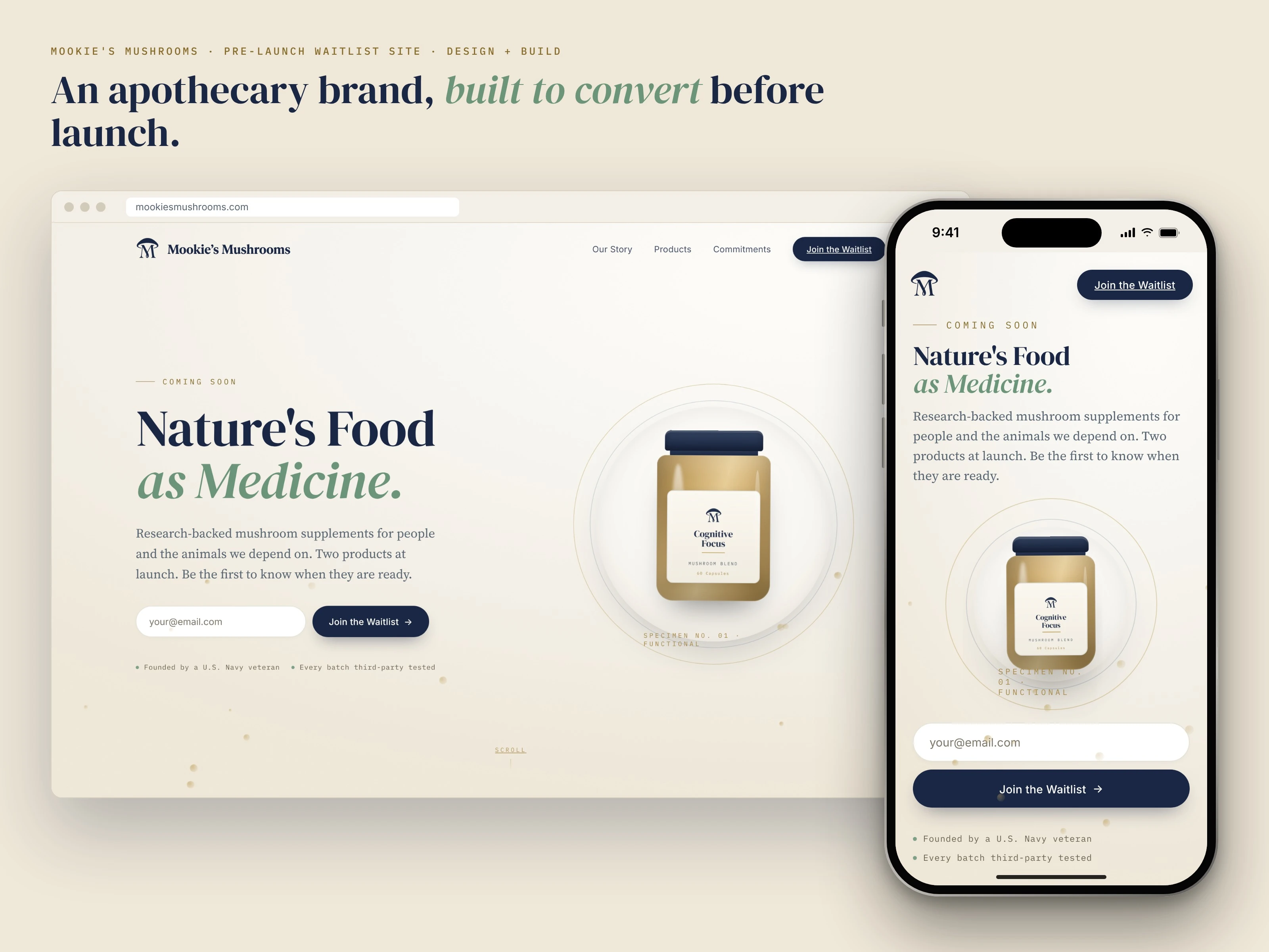
A supplement brand that had to earn trust before it had a product.
Mookie's Mushrooms is a functional-mushroom brand from a Navy veteran founder. As design lead and product owner, I took it from brief to a signed-off identity, then designed and built the pre-launch waitlist site on the same system. An Amazon launch comes next.
Role: Design lead and product owner
Scope: Brand identity, logo system, packaging, waitlist site design + build
Surfaces: Web, Amazon, packaging, social
Status: Pre-launch; hero copy is stand-in text
01 · The brief pulled two ways
The founder wanted earthy and warm. A supplement also has to feel careful and exact. An apothecary is where those meet: natural ingredients, measured with precision. That became the direction for everything that followed.
The competitor research backed it up. We compared the four brands the founder flagged, Root + Bones, RYZE, Four Sigmatic and Om Mushrooms, on price, format, Amazon presence and look. None of them sold to farmers, and the brand he admired cost about twice his target, so the identity had to read premium at a mid-tier price.
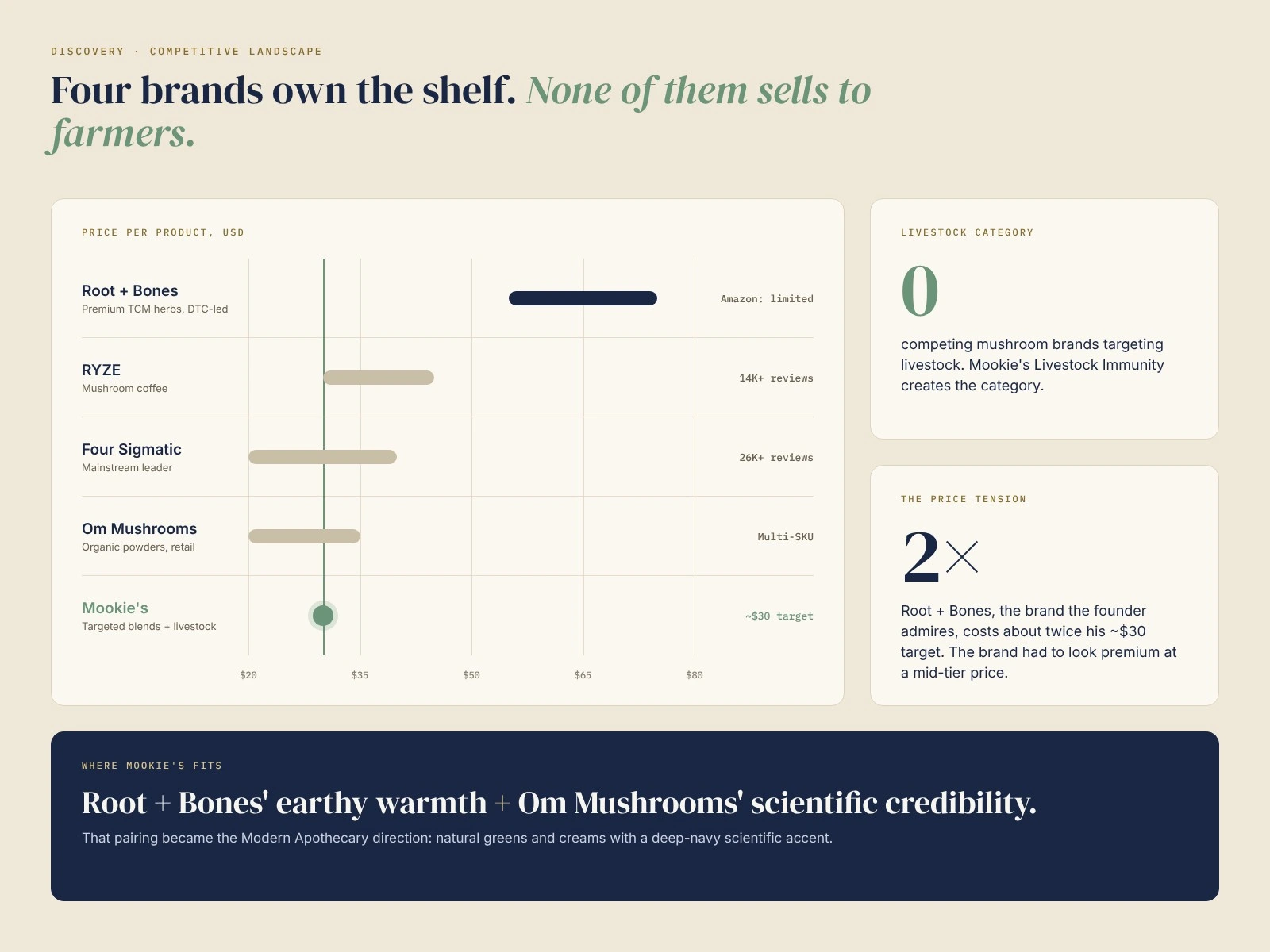
The competitive landscape: price, reach and the gap Mookie's fills.
02 · One drawing, every surface
The mark is a mushroom cap over a serif M, drawn once and recolored for each surface. On the jars, only the glass tint changes between products, so the line reads as one family on a shelf or an Amazon grid.
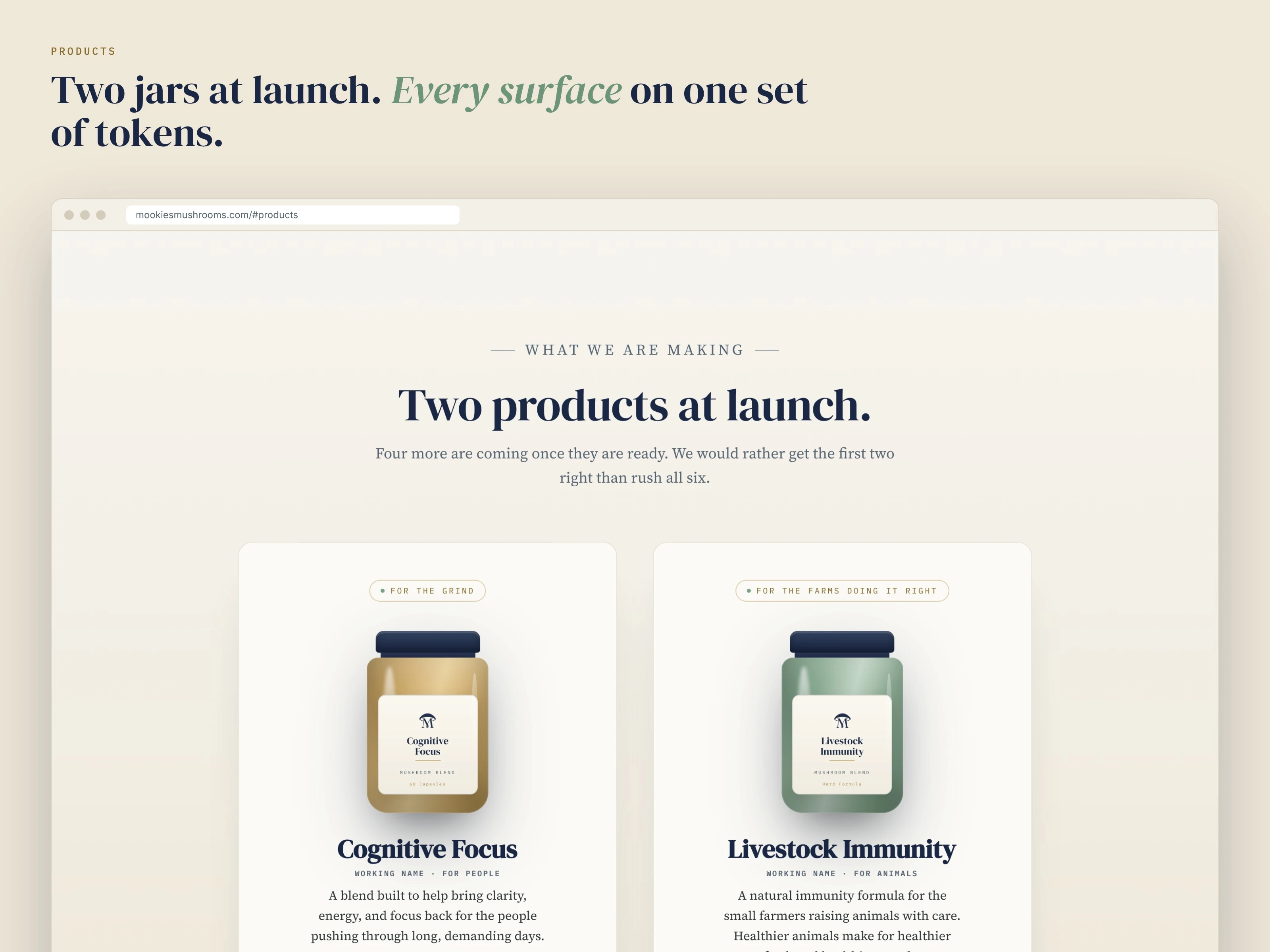
Two jars at launch, one jar language: only the glass tint changes.
03 · The founder is the trust anchor
A new supplement brand starts from skepticism. Visitors join because of the person behind it, so the site leads with the founder's story in his own voice. I also moved the founder's Pomeranian off the logo and into that story, since a dog on a supplement jar can read as a pet product on Amazon.
Research shaped who the site speaks to. We mapped eight audience segments and the founder ranked them. Biohackers, athletes, high-stress professionals and farmers made the launch tier, with farmers moved up because Livestock Immunity has no competition.
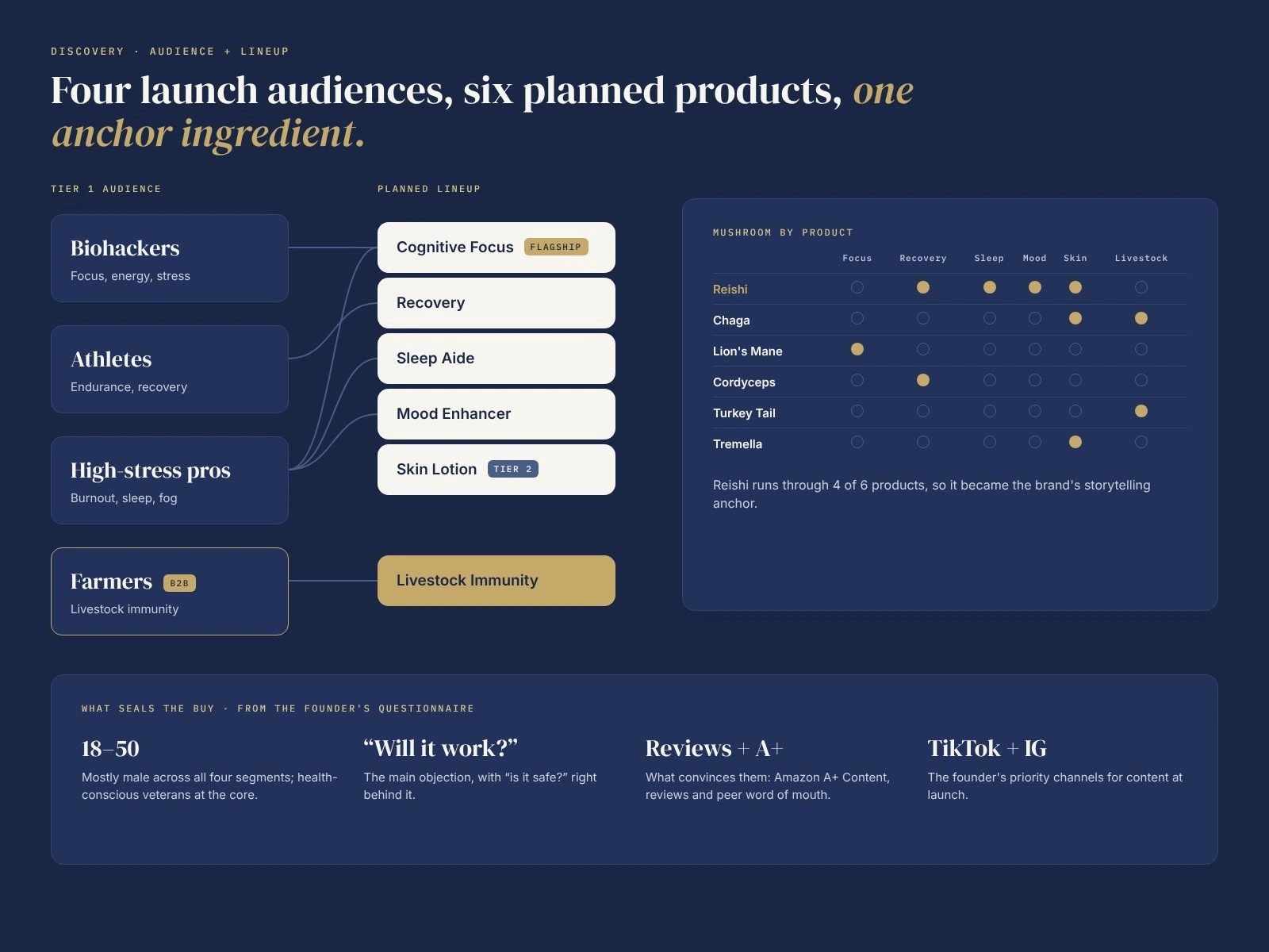
Launch audiences, the planned lineup, and the ingredient that ties it together.
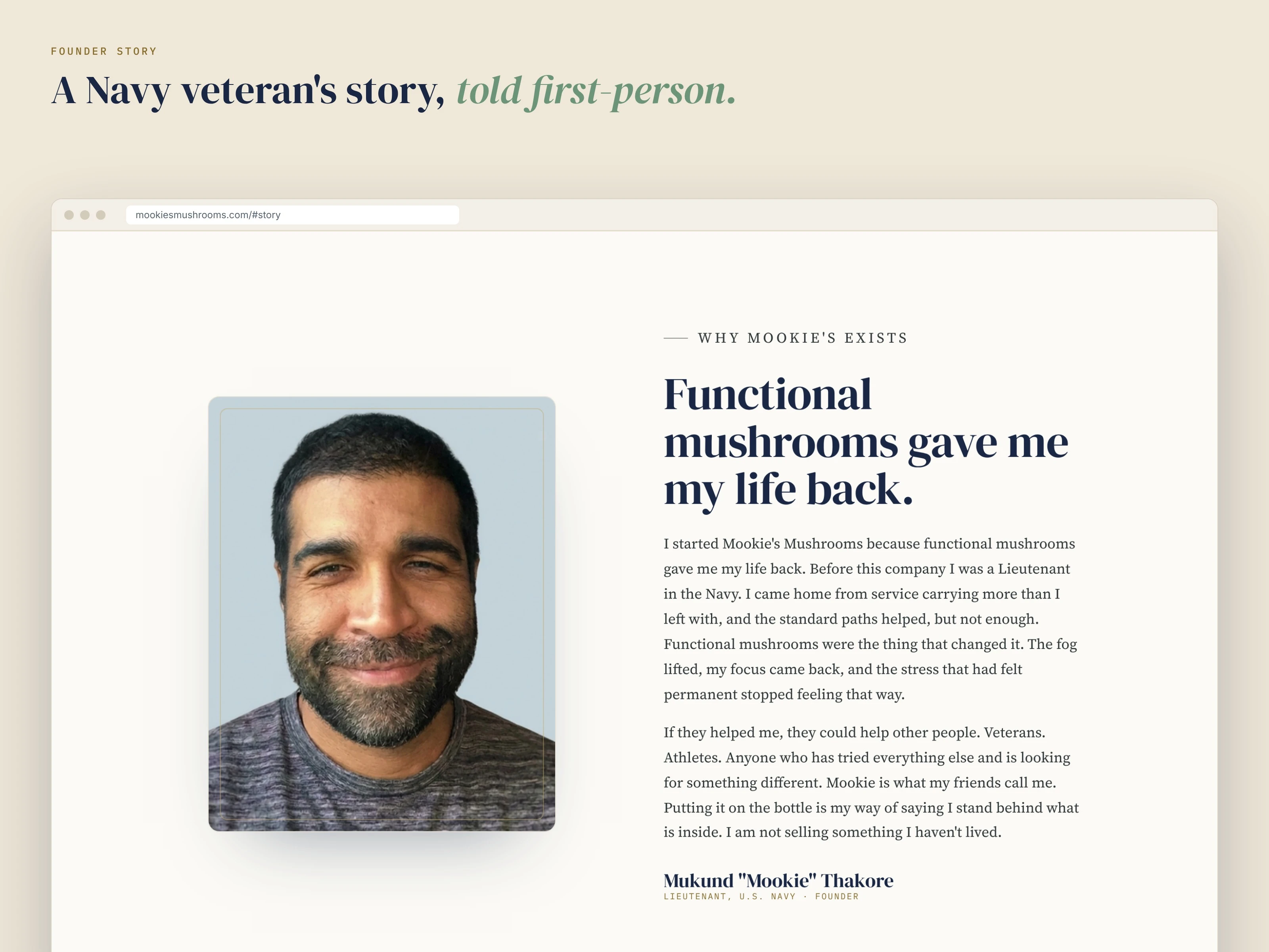
The founder story, told first-person.
04 · Color is a surface decision
No single color passes for body text on both the cream and navy sections, so each component gets its text colors per surface. I measured every pairing, darkened a grey that missed AA, and added a text-safe gold for small type on cream.
Pick the surface first, then the color.
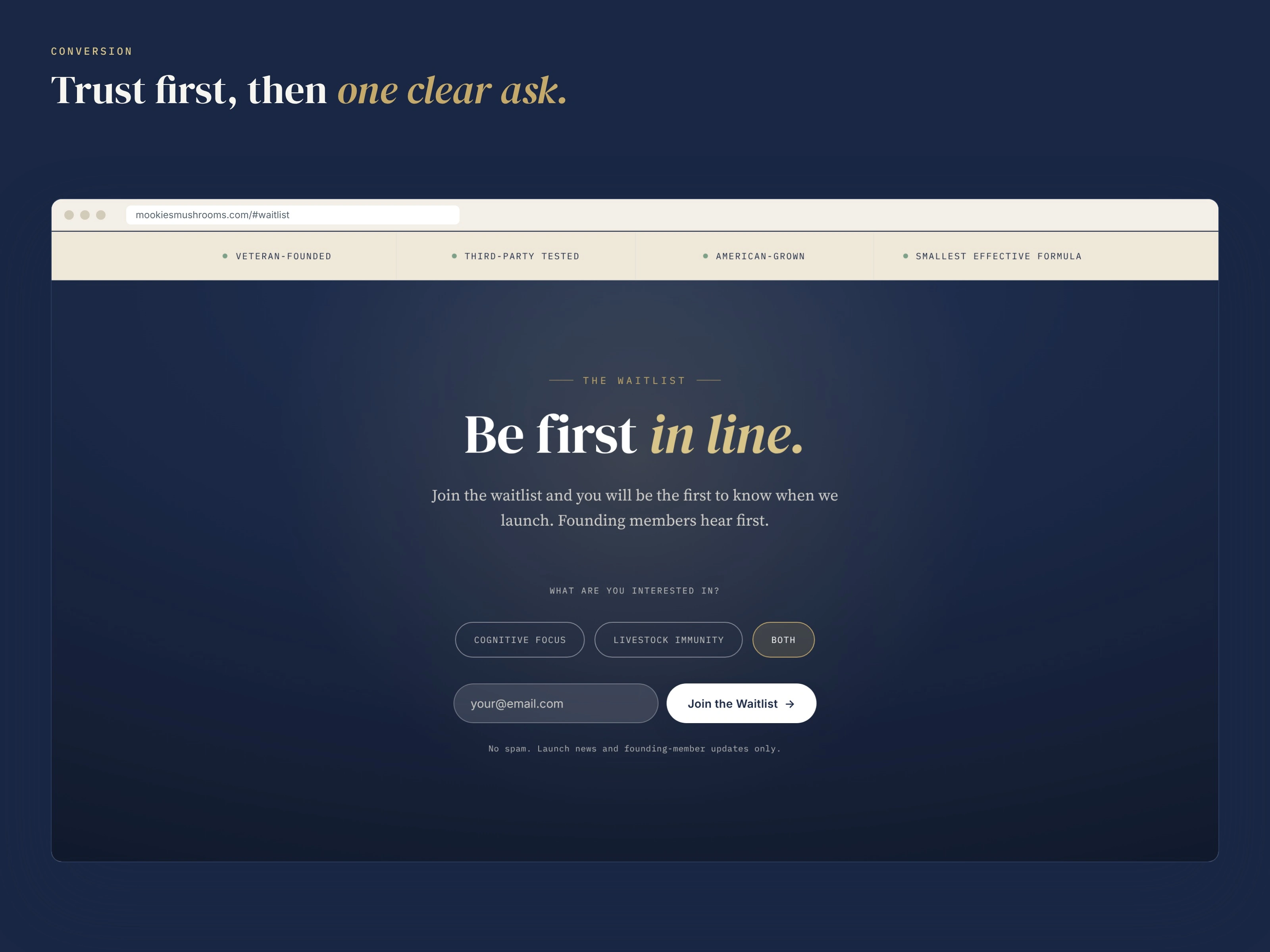
Trust first, then one clear ask.
05 · One page, two jobs
Before launch, the page has one goal: turn a skeptical visitor into an email. The form asks for one required field plus an optional interest toggle, with inline validation. After launch, every call to action can swap “Join the Waitlist” for “Shop on Amazon” without a rebuild.
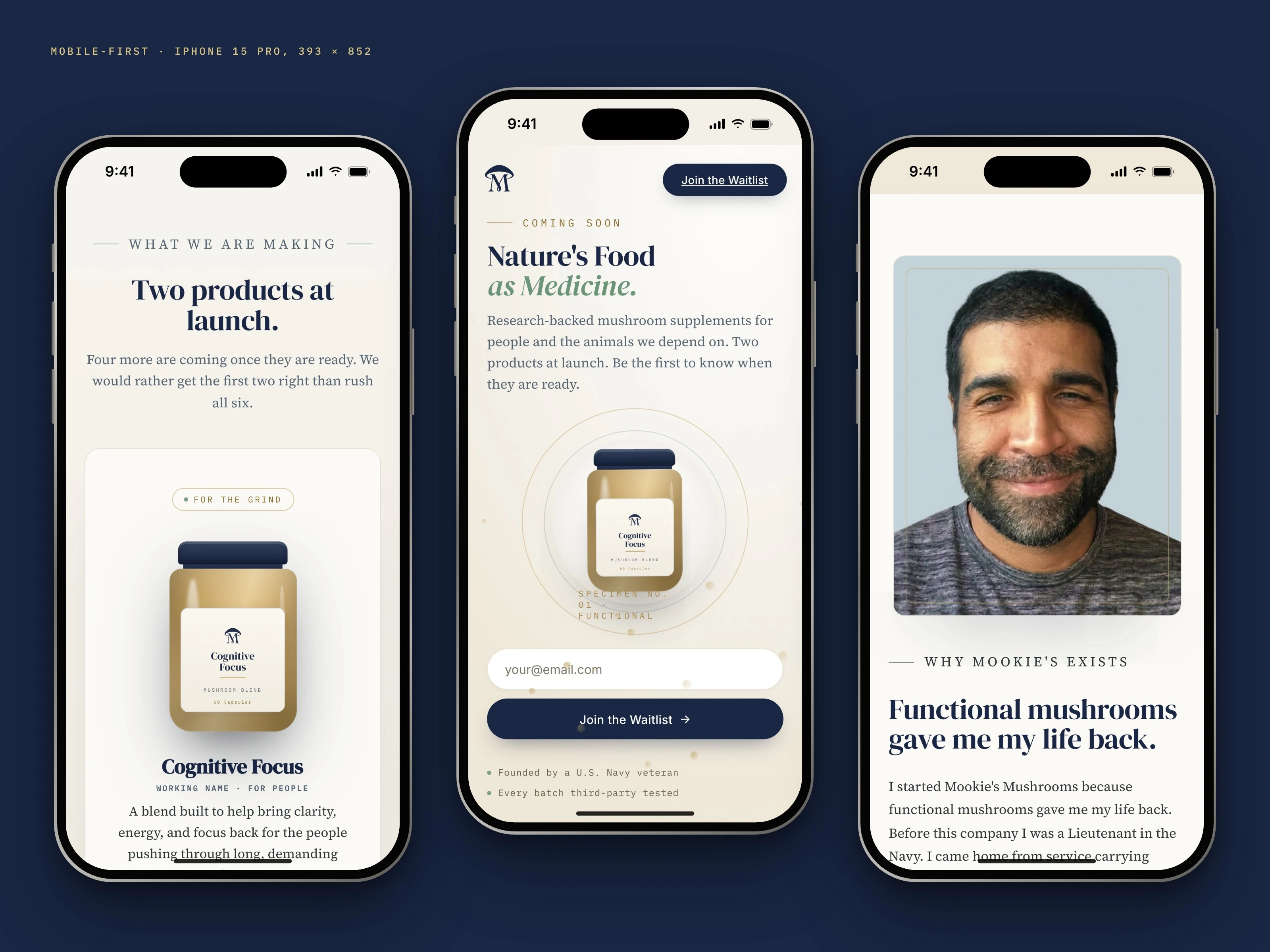
Mobile-first: products, hero and founder story on iPhone.
I built the site in code, mobile-first. Motion has a reduced-motion fallback, and the page still renders with JavaScript turned off.
The full waitlist site, top to bottom: designed and built by me.
Outcome
Identity and logo system signed off by the founder
Waitlist site designed, built and audited against WCAG 2.1 AA
Every surface on one set of tokens, ready for the Amazon launch
Want the full story, including packaging and the Amazon layouts? Read the full case study.
Like this project
Posted Oct 27, 2026
Brand identity, packaging system and a pre-launch waitlist site I designed and built for a veteran-founded mushroom supplement brand.
Likes
0
Views
0