The Wakilisha Collection: E-commerce Redesign

Erick Nolasco


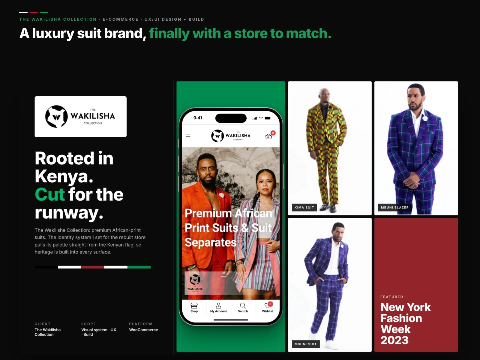
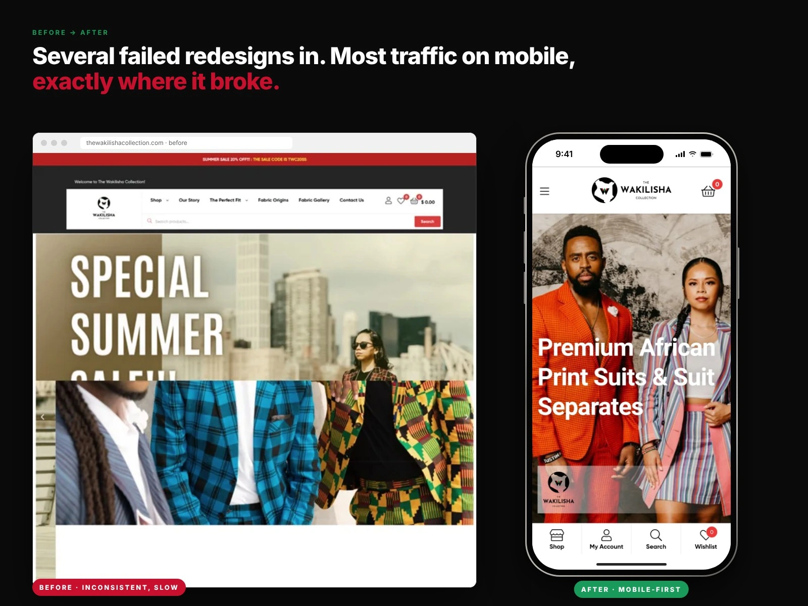
Before: the old desktop homepage. After: the rebuilt store on mobile, where most of the traffic lived.
A premium suit brand whose website kept letting it down.
The Wakilisha Collection sells high-end suits cut from African-print fabrics, with sourcing rooted in Kenya. The clothing was premium. The website was not. After several developers and failed redesigns, I rebuilt the store on a clean, mobile-first foundation in six weeks.
Role: UX/UI design and build
Scope: Journey mapping, IA, visual system, storefront, checkout
Platform: WordPress, WooCommerce, FunnelKit
Timeline: 6 weeks
01 · The store worked against the brand
Colors and fonts shifted from page to page, which watered down a label meant to read as luxury. The navigation left people guessing. Most traffic was on mobile, and that was exactly where the site was slowest and features broke outright. The checkout was the worst of it: a glitchy cart and a long multi-step flow.
02 · Find where people drop off
Before designing anything, I mapped how a real customer moves from first landing to final payment and flagged every point where people gave up. I studied how stronger names in the space, Indochino among them, made buying feel easy. Then I rebuilt the navigation around how people actually shop, with dropdowns for the store sections and the story behind the fabric.
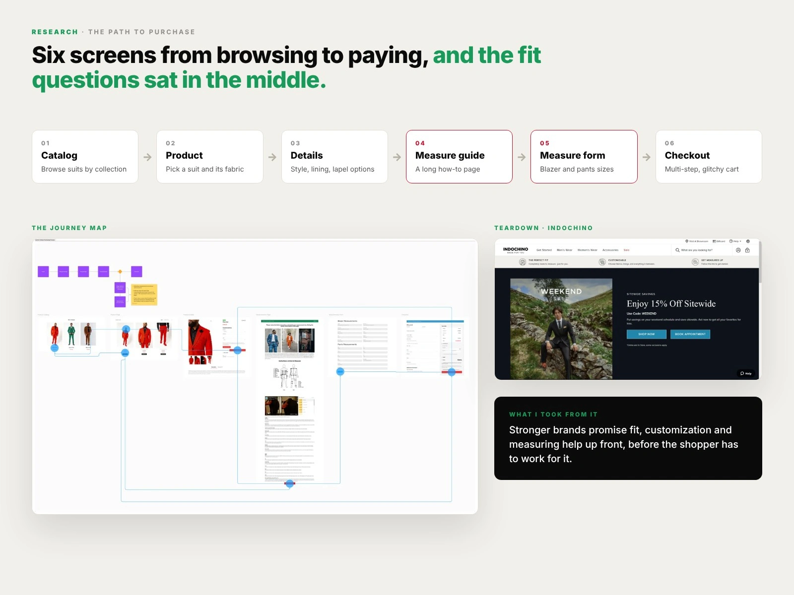
The old path to purchase, the journey map, and the Indochino teardown.
03 · Heritage, built into the palette
I pulled the palette from the Kenyan flag so the brand's roots were part of the design instead of an afterthought. Each color got one job: black carries the brand, green drives action, red marks the moments that matter.
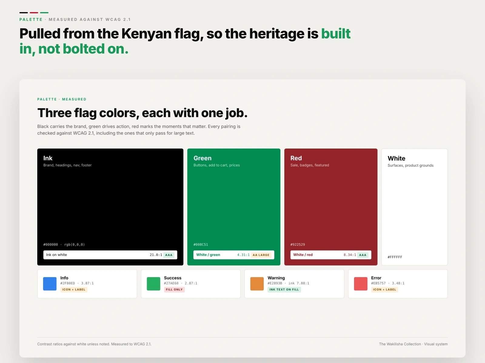
Three flag colors, each with one job, and every pairing checked against WCAG 2.1.
Re-measured in 2026, the palette mostly holds up. Black and red clear AAA on white. White on the green buttons lands at 4.31:1, which passes for large bold text only, so a slightly deeper green would carry small labels too. The state colors are too light for text on white, so they work as fills paired with an icon and a label.
04 · Type with some weight
Bold Inter at every level stays readable on a phone and holds its own next to loud prints. I pulled everything into one style guide so the brand would hold together no matter who worked on the site next.
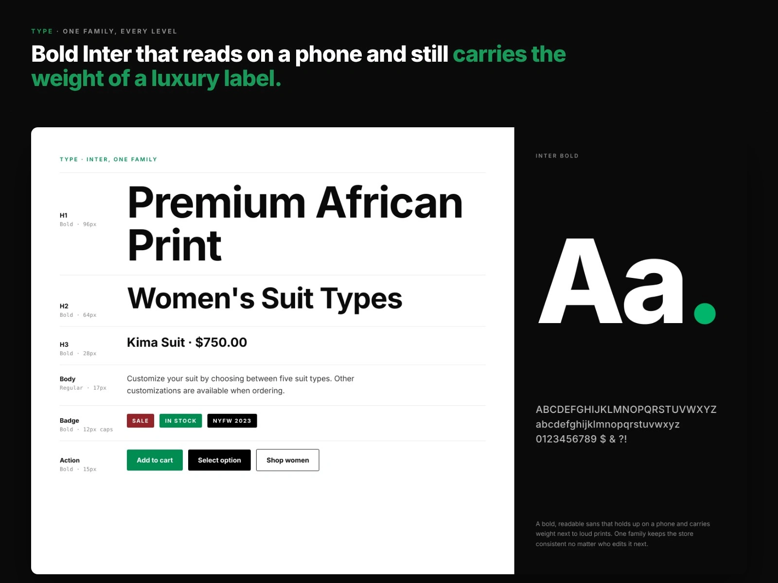
Inter at every level, set in the store's real copy.
05 · One page instead of many
The checkout got the most attention, because that is where the old store bled customers. I replaced the multi-step flow with a one-page checkout built on FunnelKit, with clear step indicators, a cart that updates as you go, and trust signals beside the payment form.
Fix the step where people leave before you polish the ones where they browse.
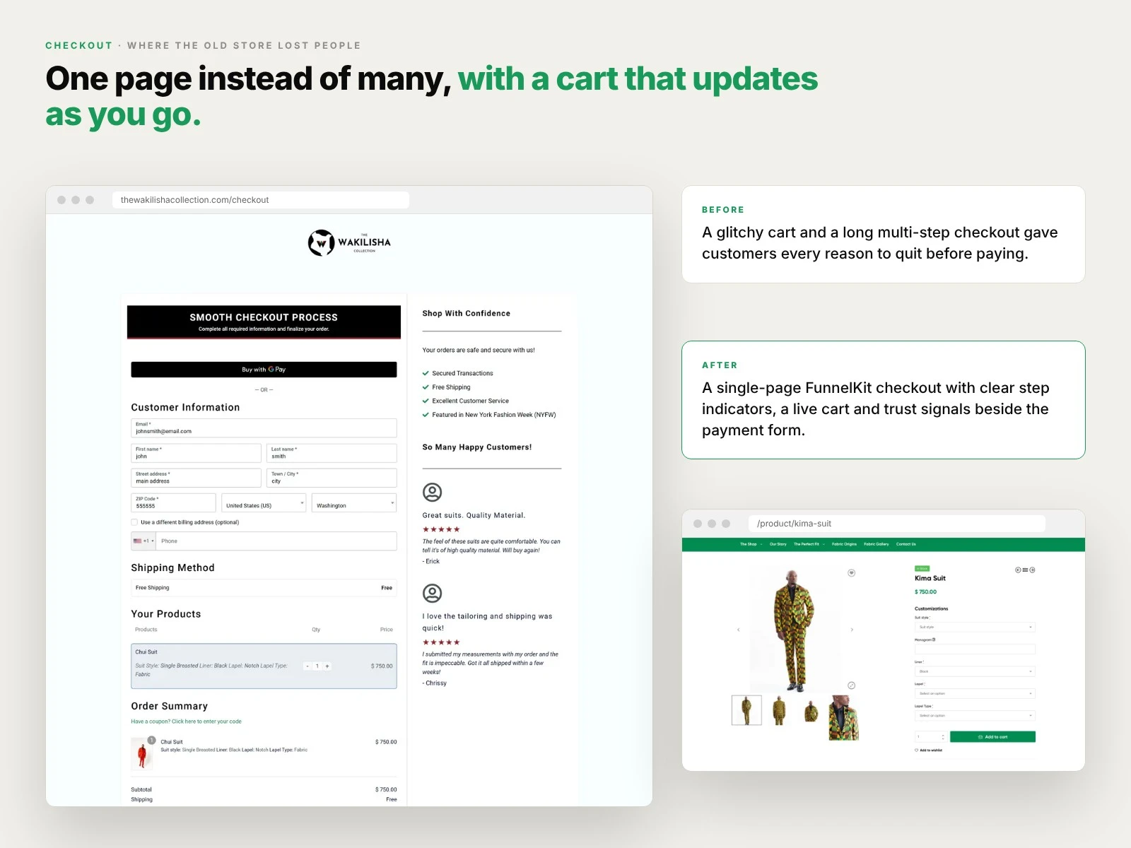
The one-page checkout, with the product page it starts from.
Outcome
An identity that holds together on every page
A store that works properly on a phone
A one-page checkout in place of a multi-step one
Want the full story, including the journey map and competitor teardown? Read the full case study.
Like this project
Posted Oct 27, 2026
Mobile-first redesign and rebuild of a luxury African-print suit store, with a new visual system and a one-page checkout.