Strategic Rebrand for a Yoga Center Ready to Scale
Antonio Soriano Gómez
From Yoga Studio to Wellness House: Repositioning Asana
Context
Asana, an established yoga center, had evolved beyond traditional yoga practice—incorporating Soma Therapy, Restorative Yoga, specialized workshops, and retreats. But their brand hadn't kept pace. They needed alignment between who they'd become and how they presented themselves to the world.
My Role
Lead Brand Strategist & Designer. I owned the entire process from competitive analysis and positioning through visual identity development and brand system creation.
Process
Research
Conducted a comprehensive competitor analysis within Asana's local market. The finding was clear: a sea of rational, nearly identical positions. Every competitor was saying the same thing the same way—leaving a significant opportunity for emotional differentiation.
Conceptualization
Developed a brand archetype framework combining the Idealist + Servant archetypes to create what I called "The Inspirer"—a brand that envisions a better world and works alongside you to make it reality.
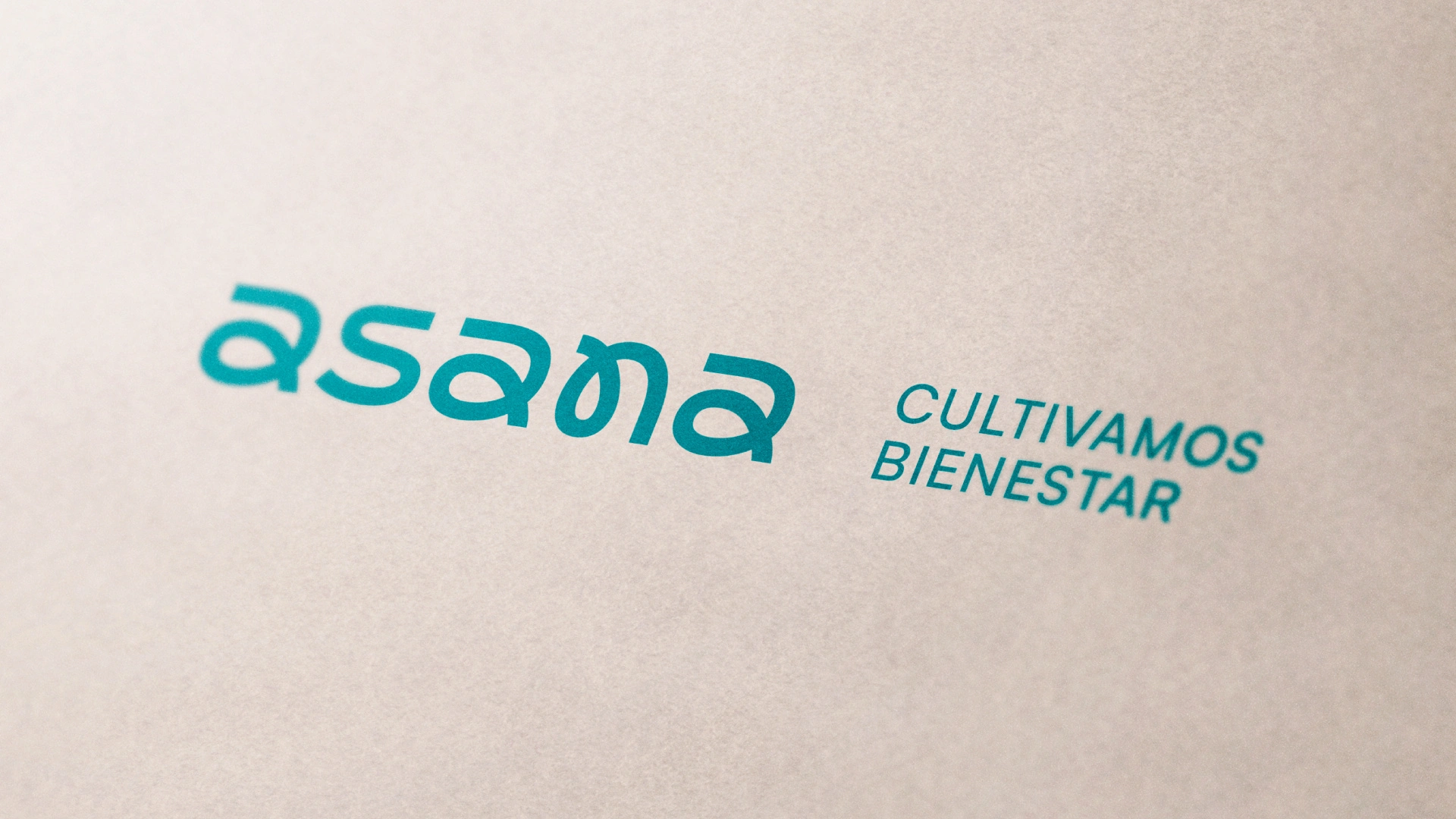
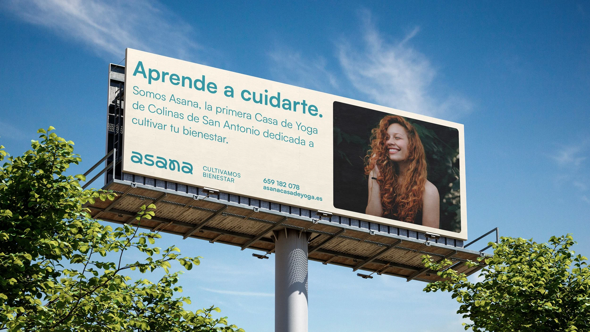
This became the foundation for a distinctive positioning captured in the tagline: "We Cultivate Well-Being." It speaks of putting heart and wisdom into inspiring others to take sovereignty over their own wellness journey.
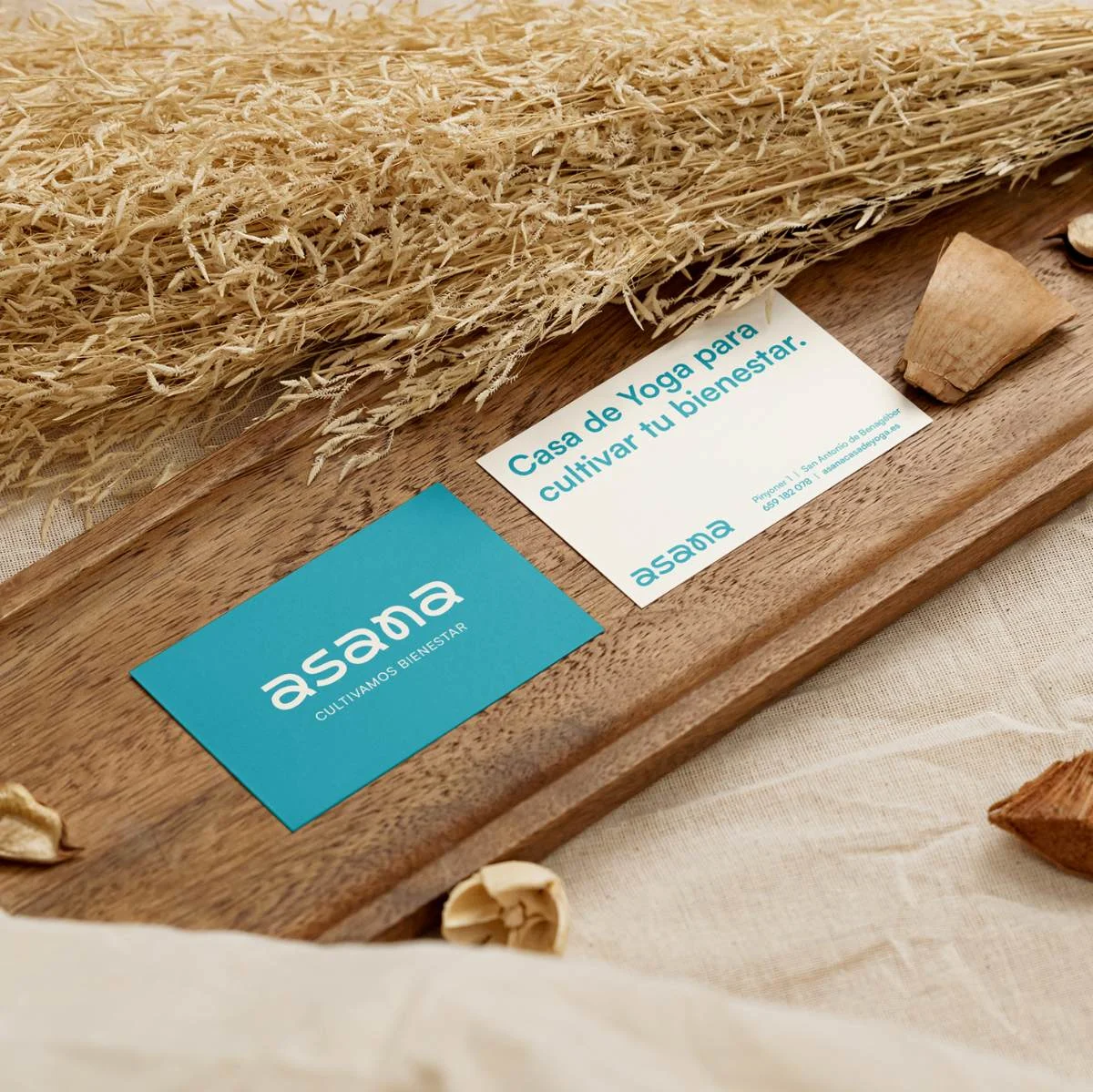
Complemented this with a descriptor rooted in Asana's physical reality—a small wooden house: "Yoga House to Cultivate Your Well-Being."
Execution
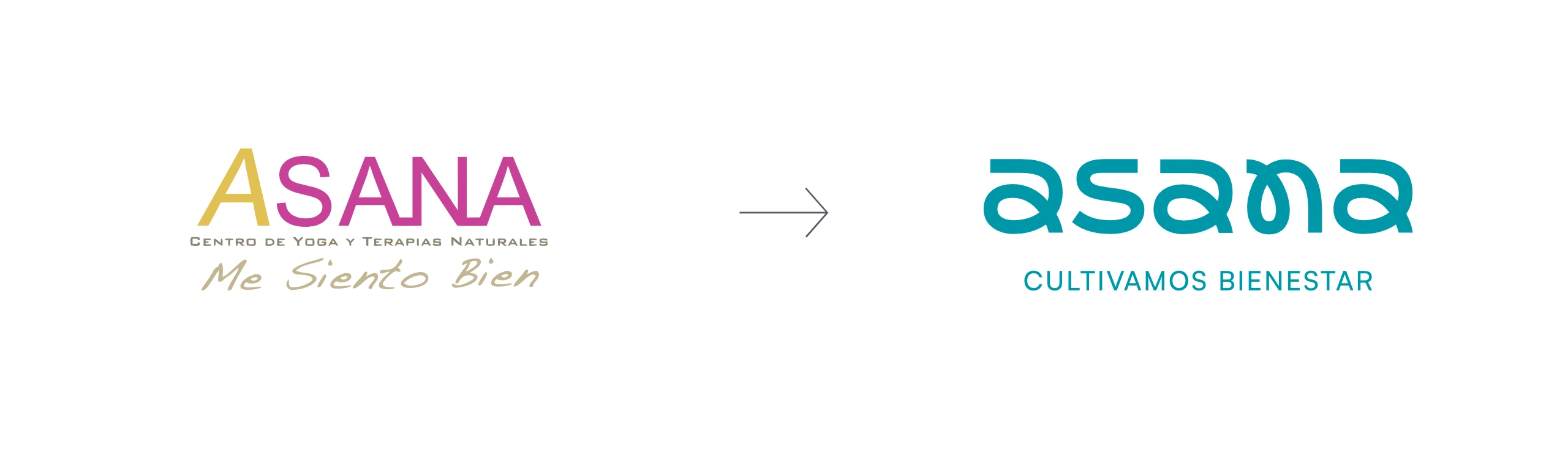
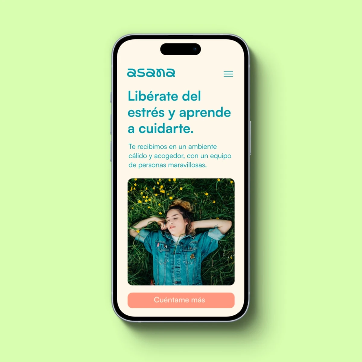
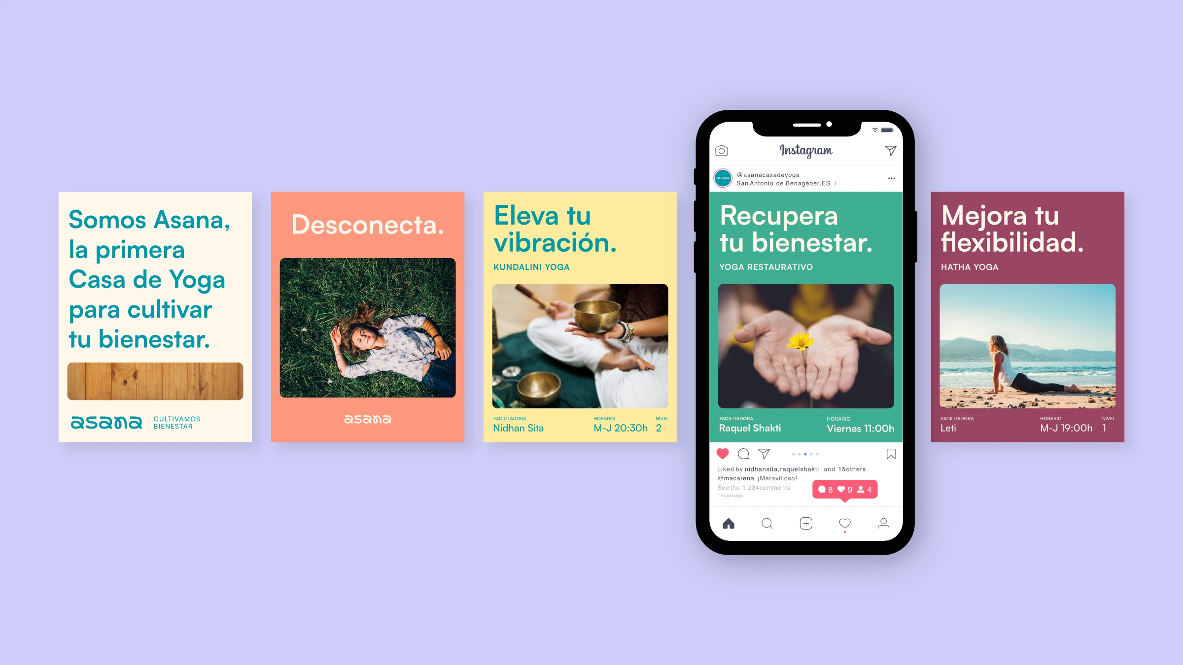
The visual identity draws from Asana's name—each yoga posture influencing body, mind, and energy. After competitive analysis, I chose a typographic approach (no symbol needed to stand out). The custom glyphs are abstract representations of asana postures, creating dynamism, flexibility, and fluidity.
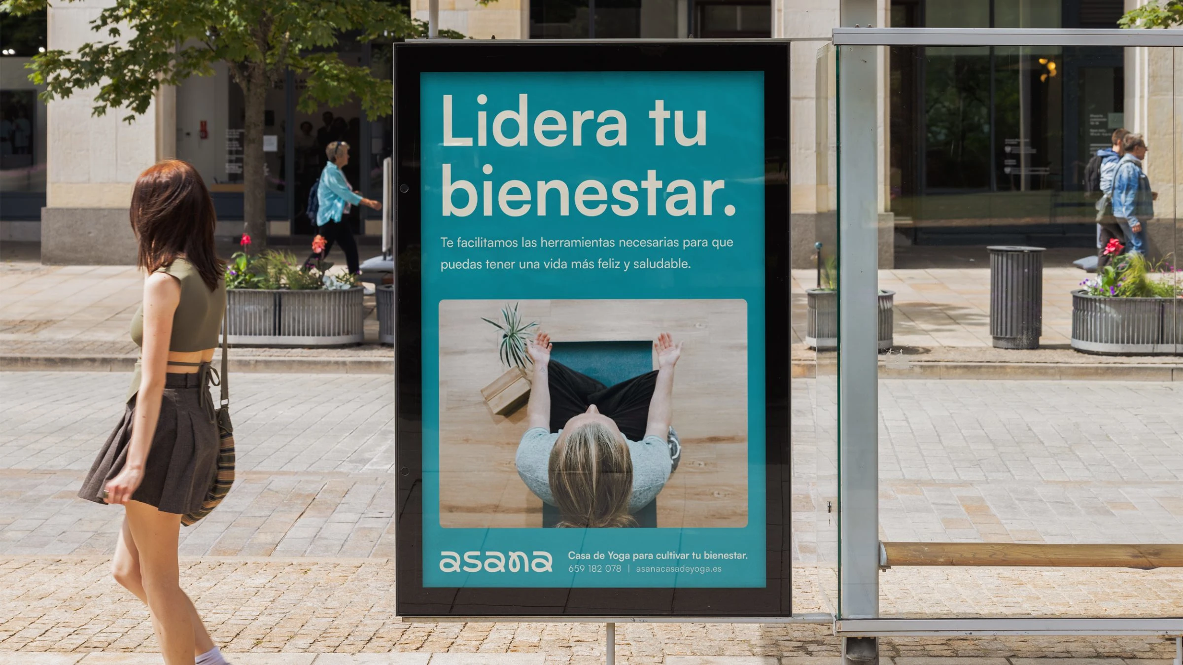
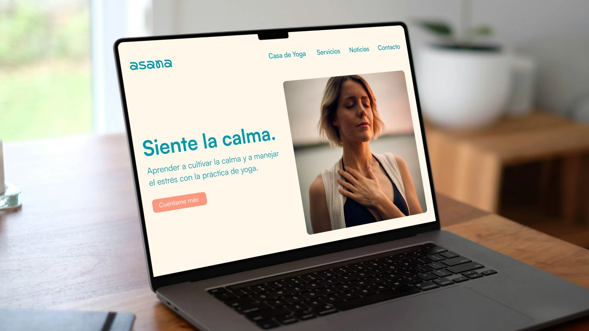
Color strategy: Turquoise as primary (peace, clarity, awareness) with terracotta as complement (earth, vitality, home).
For the brand system, I considered who would manage it daily. Designed a simple rectangular window with rounded corners—a functional structure that empowers Asana's team to maintain brand consistency without design expertise.
Deliverables
Competitor analysis
Positioning strategy
Tagline
Tone of voice
Visual identity
Complete brand system
Brand applications (business cards, merchandise, social media templates, outdoor advertising)
Results
Impact
Created a differentiated position in a saturated local market. The new brand framework gave Asana clarity to communicate their expanded offering while retaining existing clients and attracting a new aligned audience.
Reflection
This project reinforced a principle I apply to every engagement: brand systems must be designed for who will use them. The most sophisticated strategy fails if the client can't execute it. Building in operational simplicity made this brand sustainable.
Let's Talk
Scaling your business but your brand hasn't caught up? Let's build a strategic foundation that grows with you.
Like this project
Posted Jan 19, 2026
Repositioned a yoga center in a saturated market through archetype-driven strategy, distinctive tagline, and a brand system designed for real-world use.