Strategic Brand Repositioning and Logo Redesign for NGO
Antonio Soriano Gómez
Panorama
Tribute Earth began as a documentary project aimed at highlighting the connection between humanity and nature. Over time, it transformed into a nonprofit organization dedicated to restoring balance and consciousness through ancestral knowledge, science, and technology. This evolution required a strategic brand repositioning to align its identity with its new purpose and effectively communicate its mission.
Challenges
As Tribute Earth shifted from a media project to a foundation, it needed a clear and compelling brand identity. The challenge was to create a platform that resonated with modern audiences while preserving indigenous wisdom and ecological consciousness. Additionally, the brand had to differentiate itself within the nonprofit space, ensuring that its message of harmony and sustainability was both impactful and recognizable.
Strategy & Solution
To reposition the brand, we conducted an in-depth diagnosis, analyzing its current perception and defining a strategic framework. The new identity needed to bridge traditional and contemporary elements, fostering a sense of unity between nature, culture, and innovation.
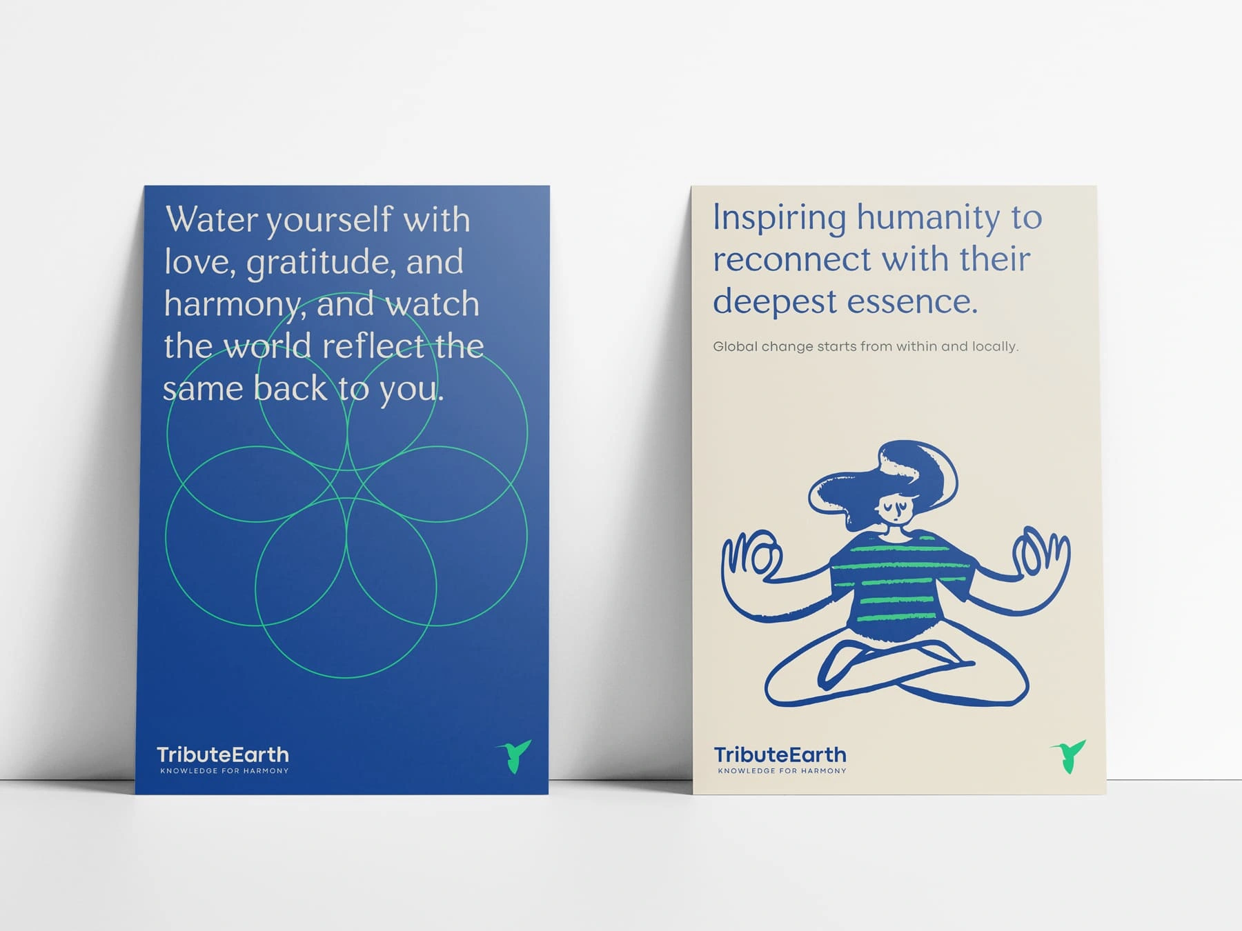
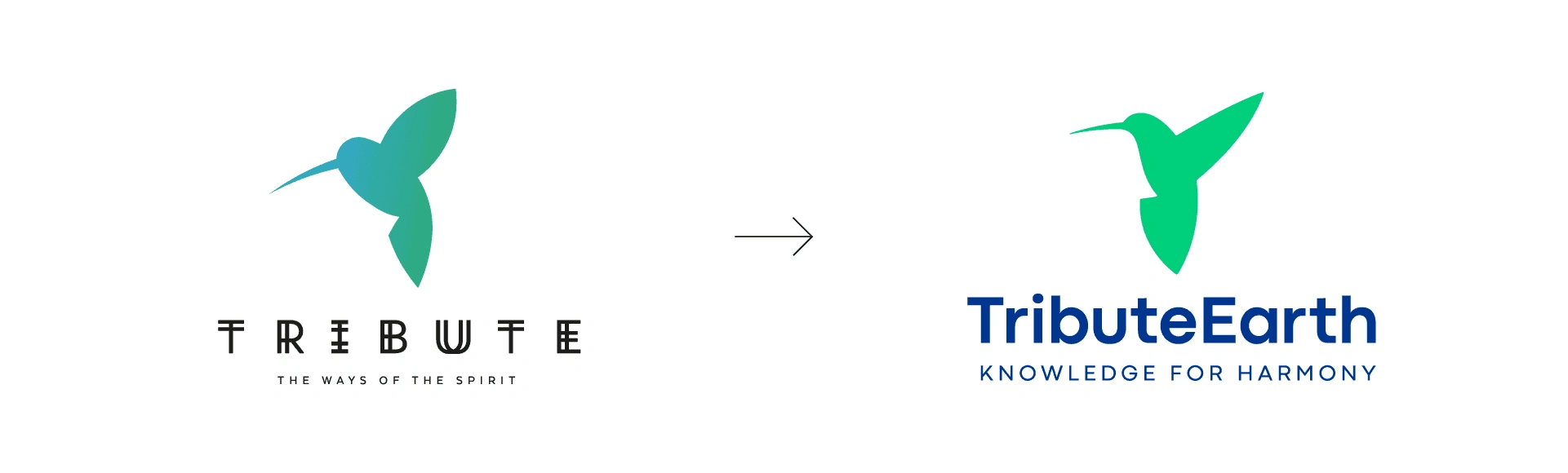
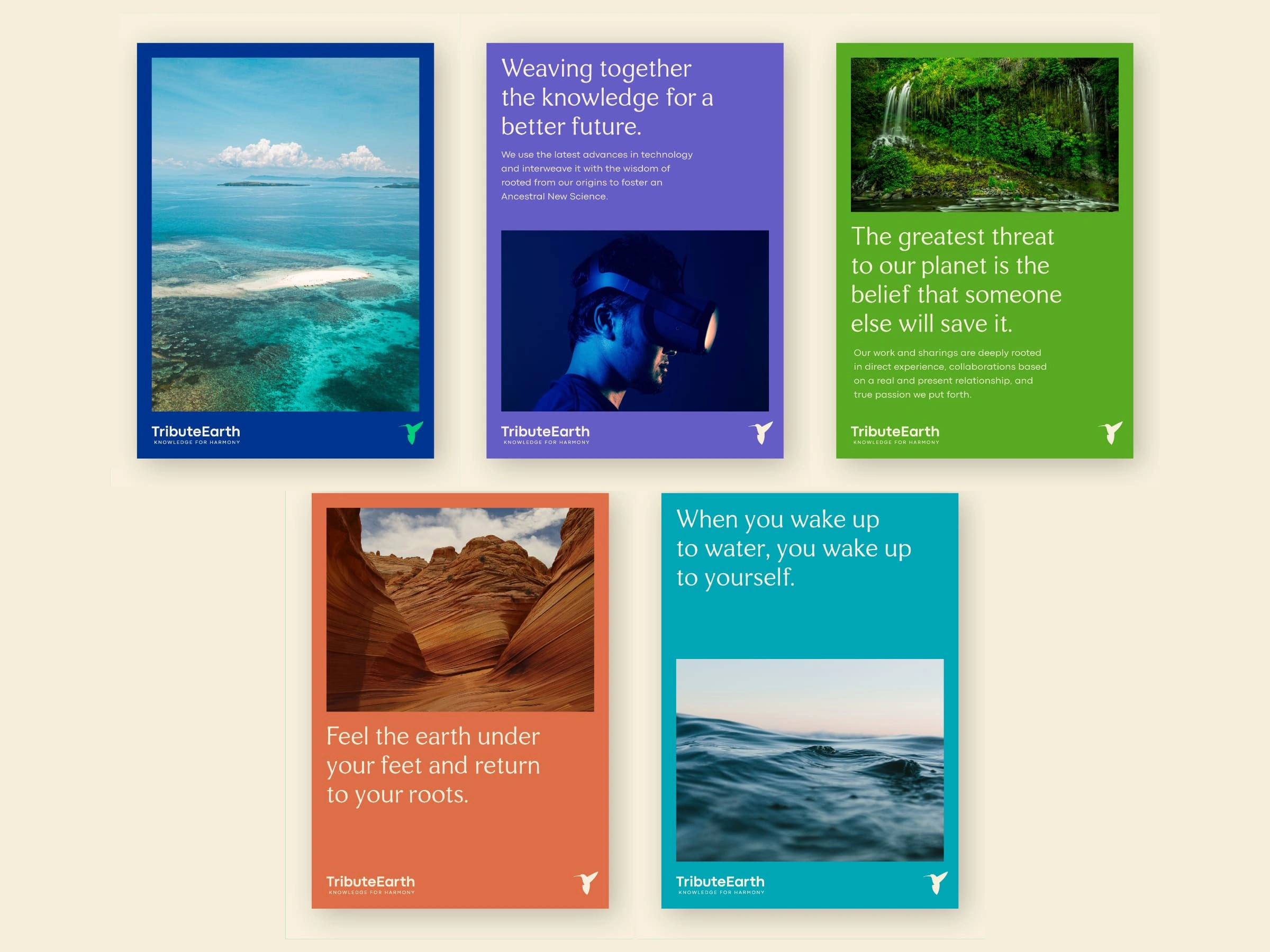
The brand platform was built around the core purpose: "Restoring balance and unity consciousness, promoting a life in harmony with nature and oneself." This purpose was translated into a refreshed verbal and visual identity that conveyed inclusivity, inspiration, and depth. The hummingbird, a symbol of resilience and spirituality, was maintained as the central icon, reinforcing Tribute Earth’s ethos.
A distinct tone of voice was established, integrating indigenous expressions with their translations to emphasize cultural authenticity and wisdom. The visual identity was refined with an updated color palette and graphic system, visually connecting the brand’s core focus areas: medicinal plants, water, land, and technology.
Key Deliverables
Brand Diagnosis & Strategy: A comprehensive analysis of Tribute Earth's positioning and identity.
Brand Platform Development: Defining the foundation’s purpose, values, and positioning.
Tagline Creation: "Knowledge for Harmony," encapsulating the brand’s mission.
Verbal Identity: A tone of voice that is inclusive, educational, and deeply rooted in cultural heritage.
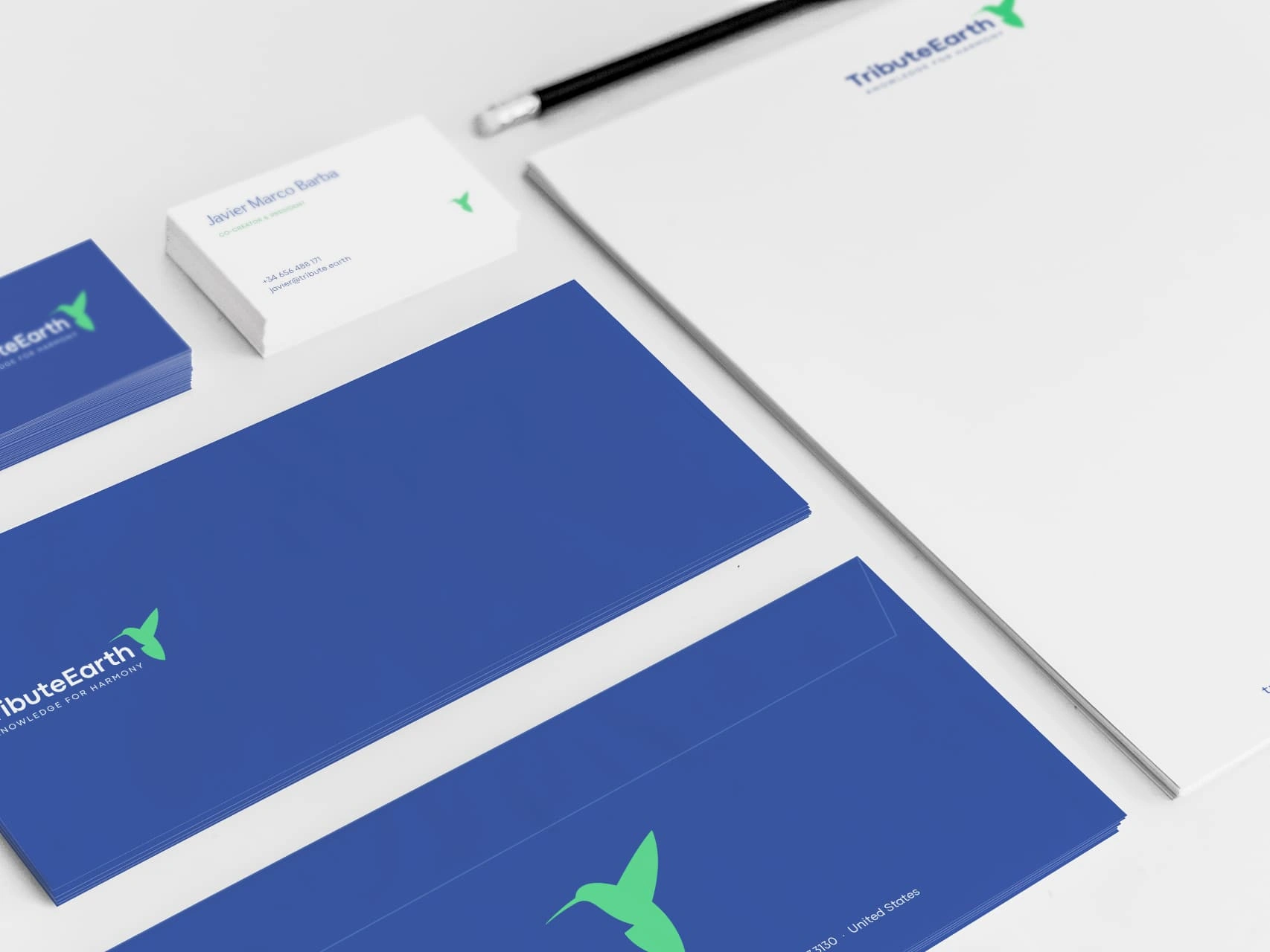
Visual Identity: Updated design elements, including refined colors, typography, and graphical assets.
Brand System: A structured approach to communicating the foundation’s key initiatives.
Brand Applications: Adaptations of the new identity across various media and materials.
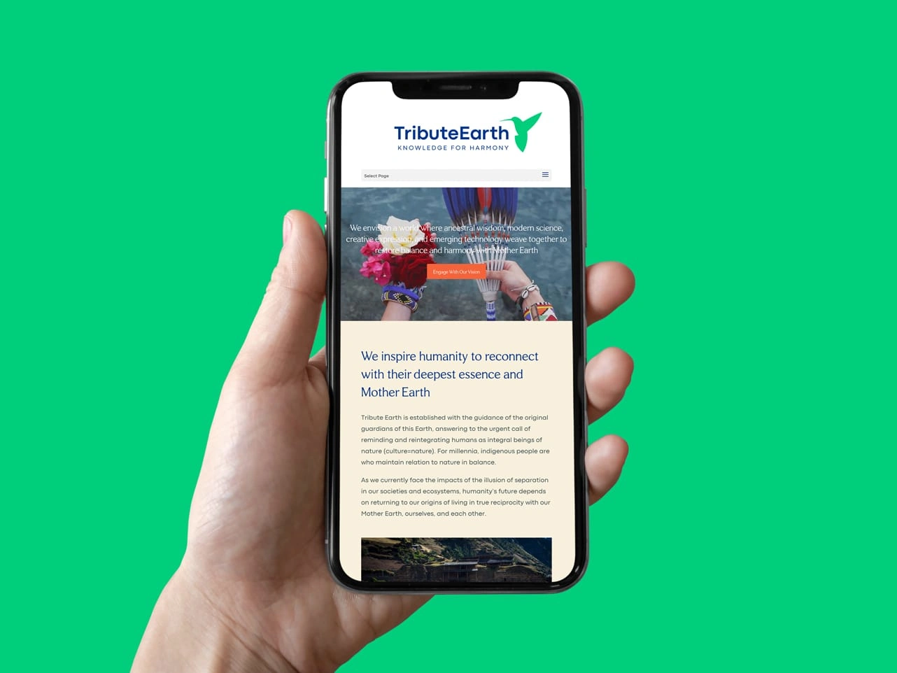
Website Design & Development: A digital presence reflecting the new brand direction.
Impact
This transformation allowed Tribute Earth to establish a strong, cohesive identity that resonates with a global audience. By balancing ancestral wisdom with modern innovation, the brand now effectively communicates its mission, strengthens its credibility, and enhances its engagement with supporters, partners, and communities.
The repositioning not only aligned Tribute Earth’s brand with its evolving purpose but also provided a solid foundation for future growth, enabling the organization to inspire action and drive meaningful change in environmental and cultural preservation.
Like this project
Posted Feb 12, 2025
Tribute Earth repositioning from a documentary to a nonprofit, uniting ancestral wisdom with science through the new position and a strong visual identity.