Kasi Express Visual Identity
About Project
I collaborated with Kasi Express to develop a bold and future-focused brand identity that reflects the company’s vision for innovation in logistics, transportation, and mobility. The goal was to create a strong visual presence that embodies efficiency, movement, and connectivity, ensuring Kasi Express stands out in the competitive courier and transportation industry.
Logo Concept
I developed multiple logo concepts centered around motion and connectivity. Arrowheads, road-inspired elements, and a bold letter "K" were sketched to represent Kasi Express’s role in streamlining transportation and logistics.
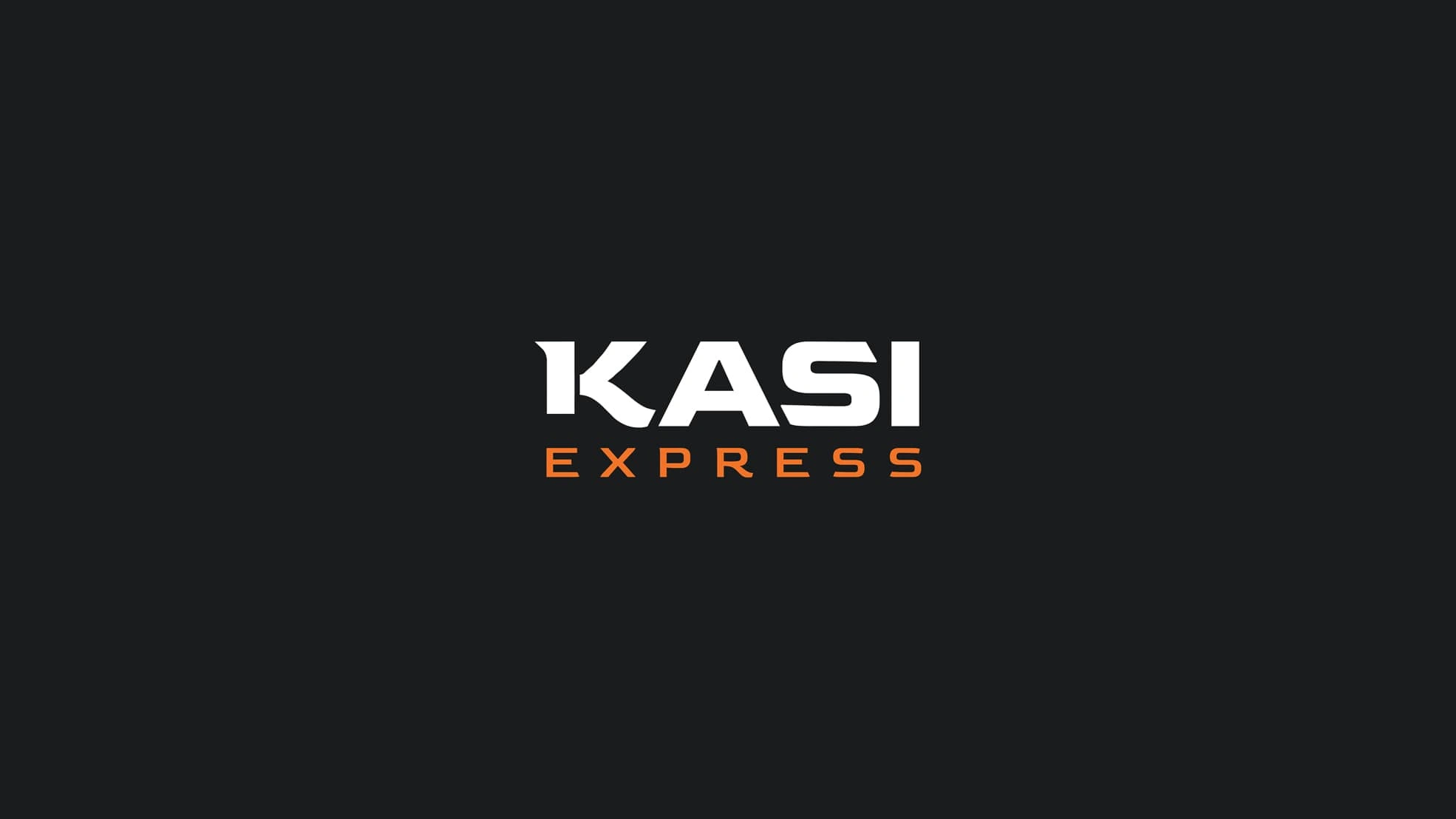
The final logo design integrates a stylized "K" with directional arrow motifs, emphasizing movement and seamless transit. Negative space within the letter "A" subtly incorporates road lane imagery, reinforcing the brand’s mobility-driven mission. The overall design is sleek, modern, and instantly recognizable.
Logo
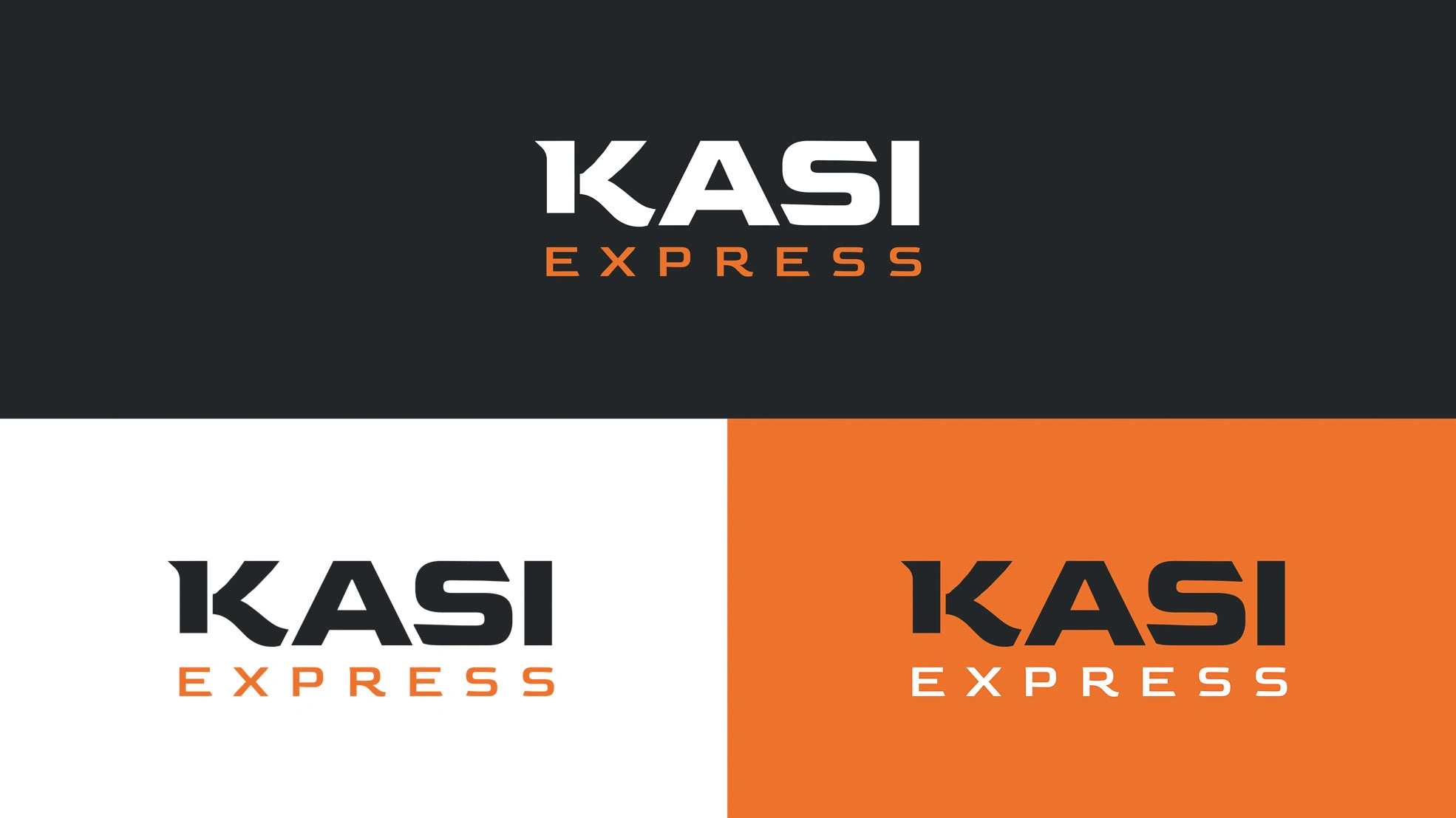
Logo Versions
Primary Color Palette & Typography
I crafted a dynamic color palette featuring bold hues of blue and orange, symbolizing trust, energy, and innovation. The typography complements the visual identity with a clean, futuristic typeface that reinforces the brand’s forward-thinking approach.
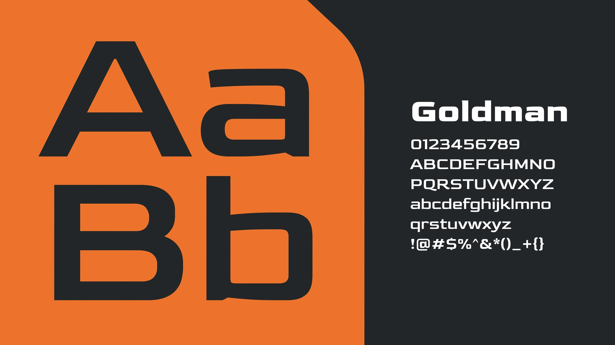
Typography
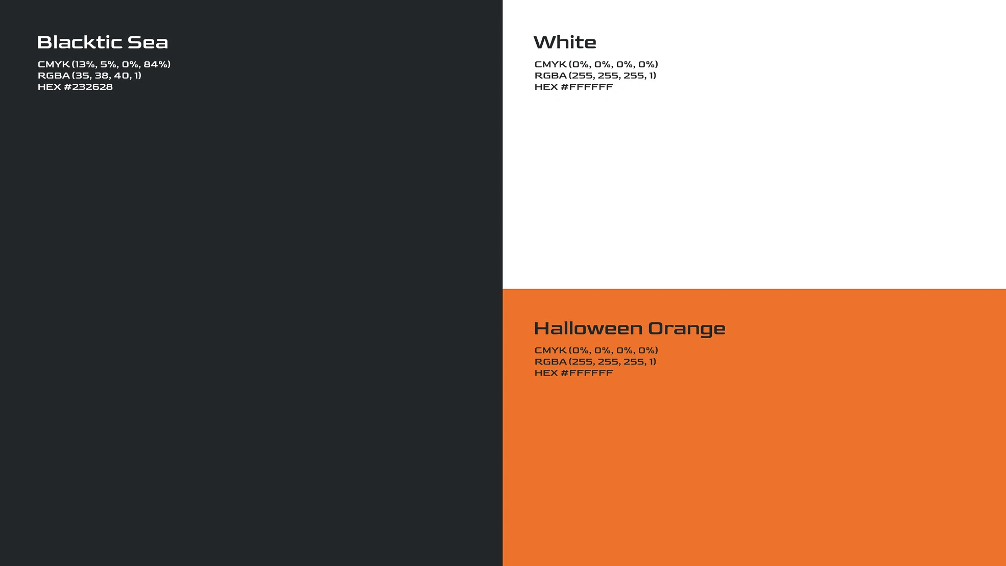
Colour
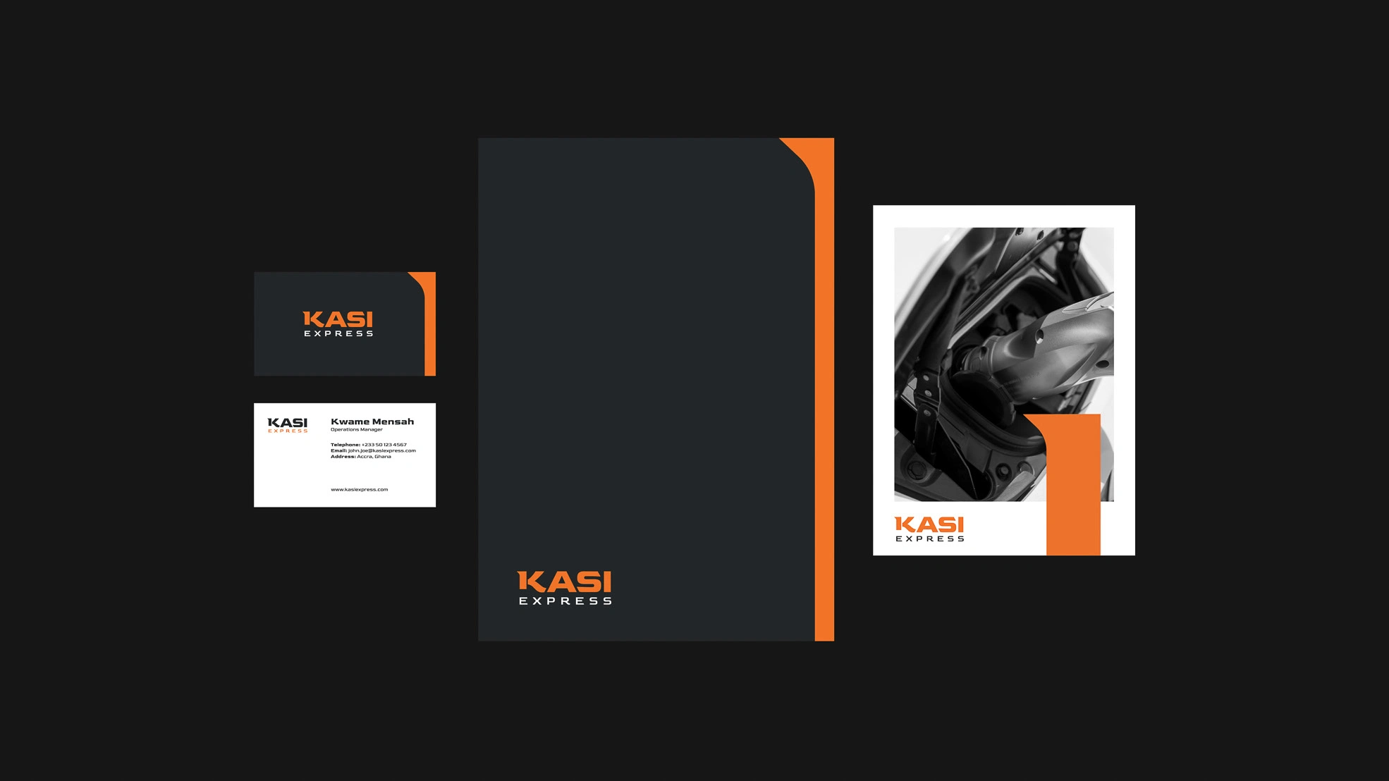
Stationery
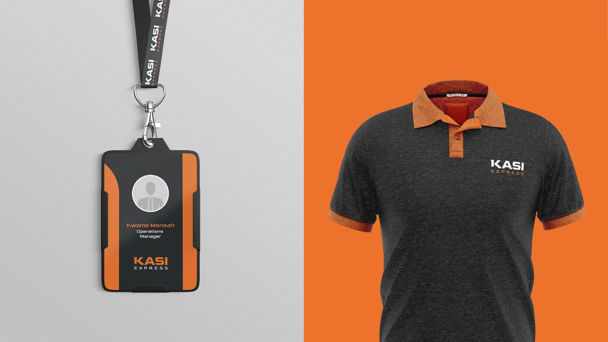
Shirt and Name Tag
Brand Design Presentation
A comprehensive brand presentation was developed, outlining the logo application, color guidelines, typography usage, and brand positioning. This ensures consistency across marketing, digital, and physical brand assets.
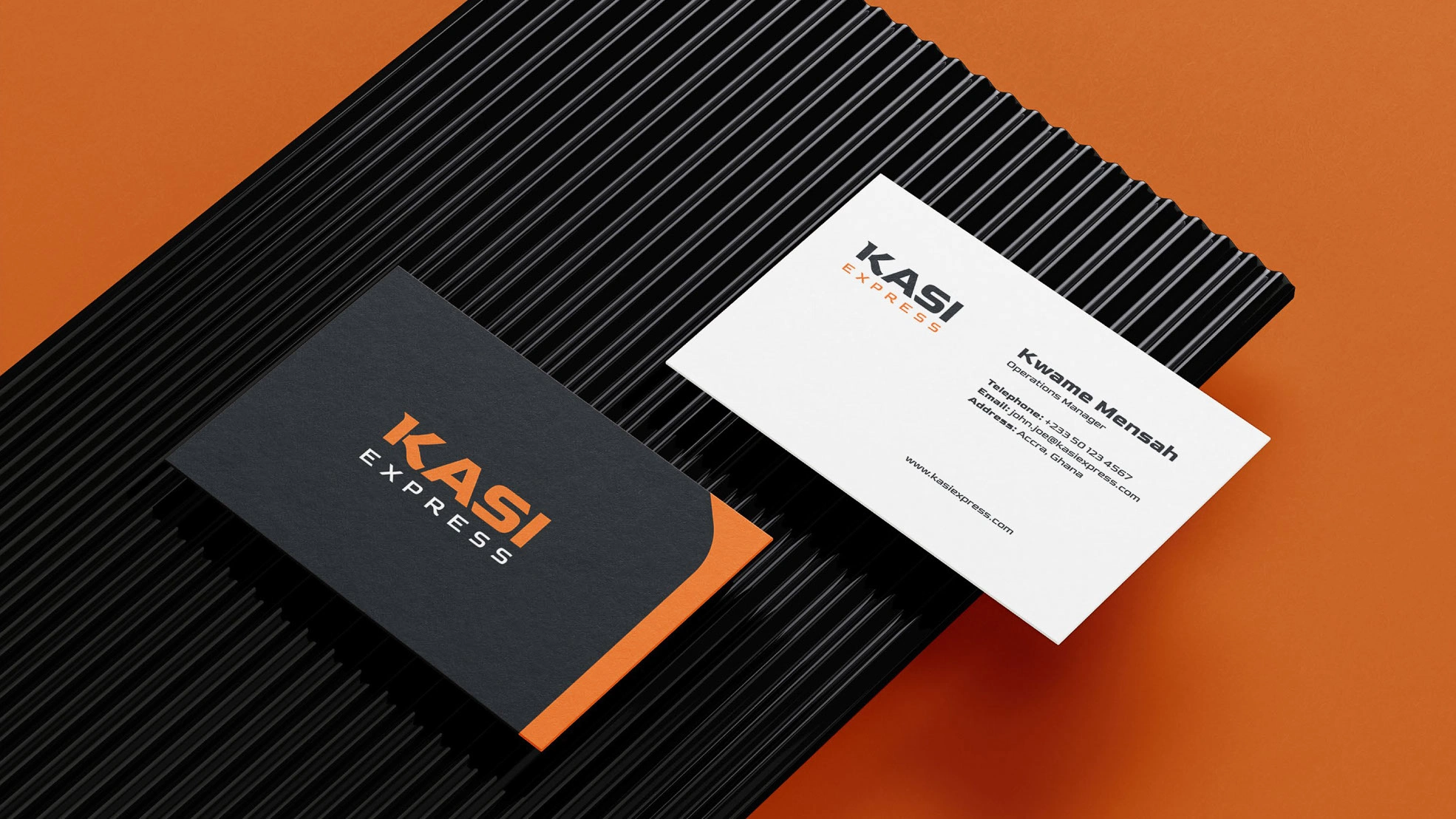
Call Cards
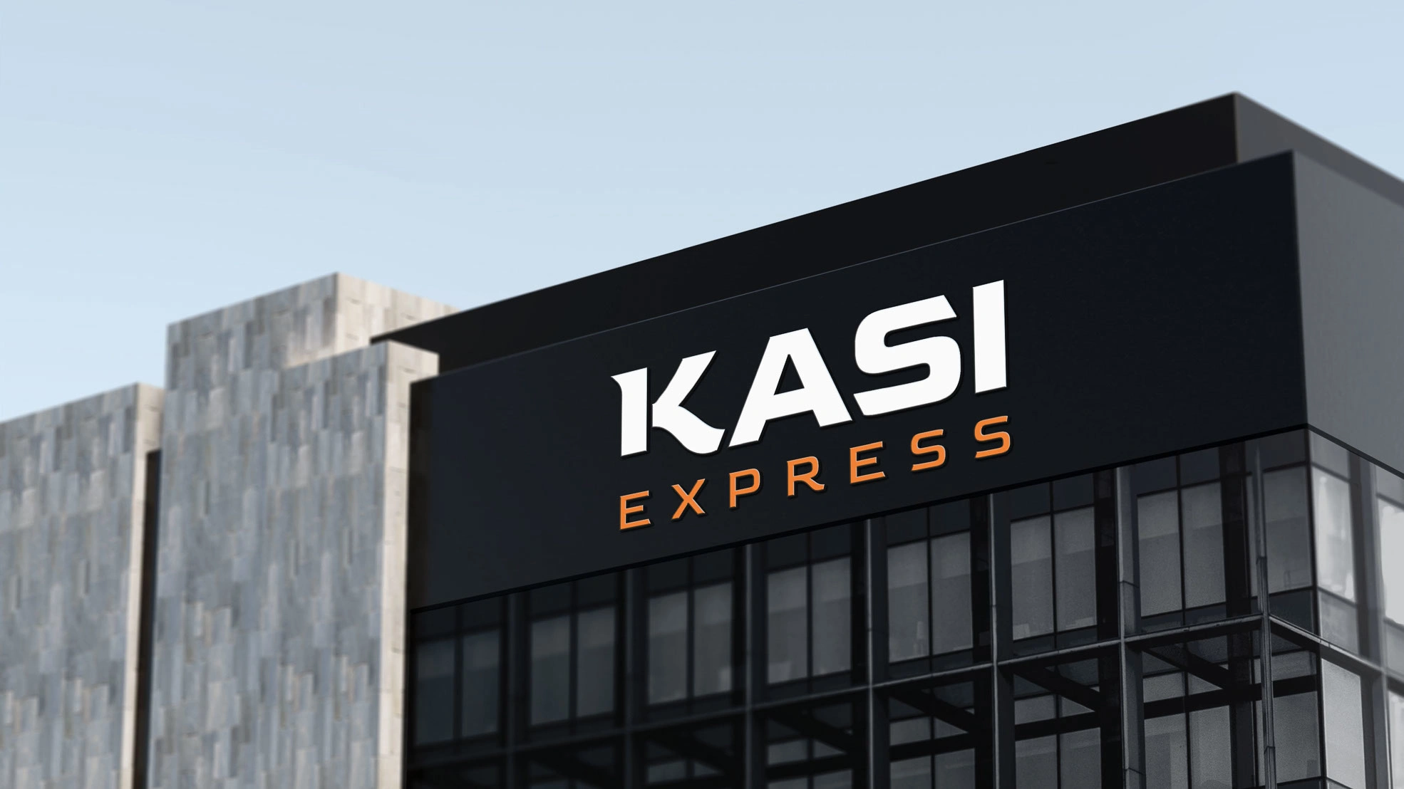
Signage

Imagery
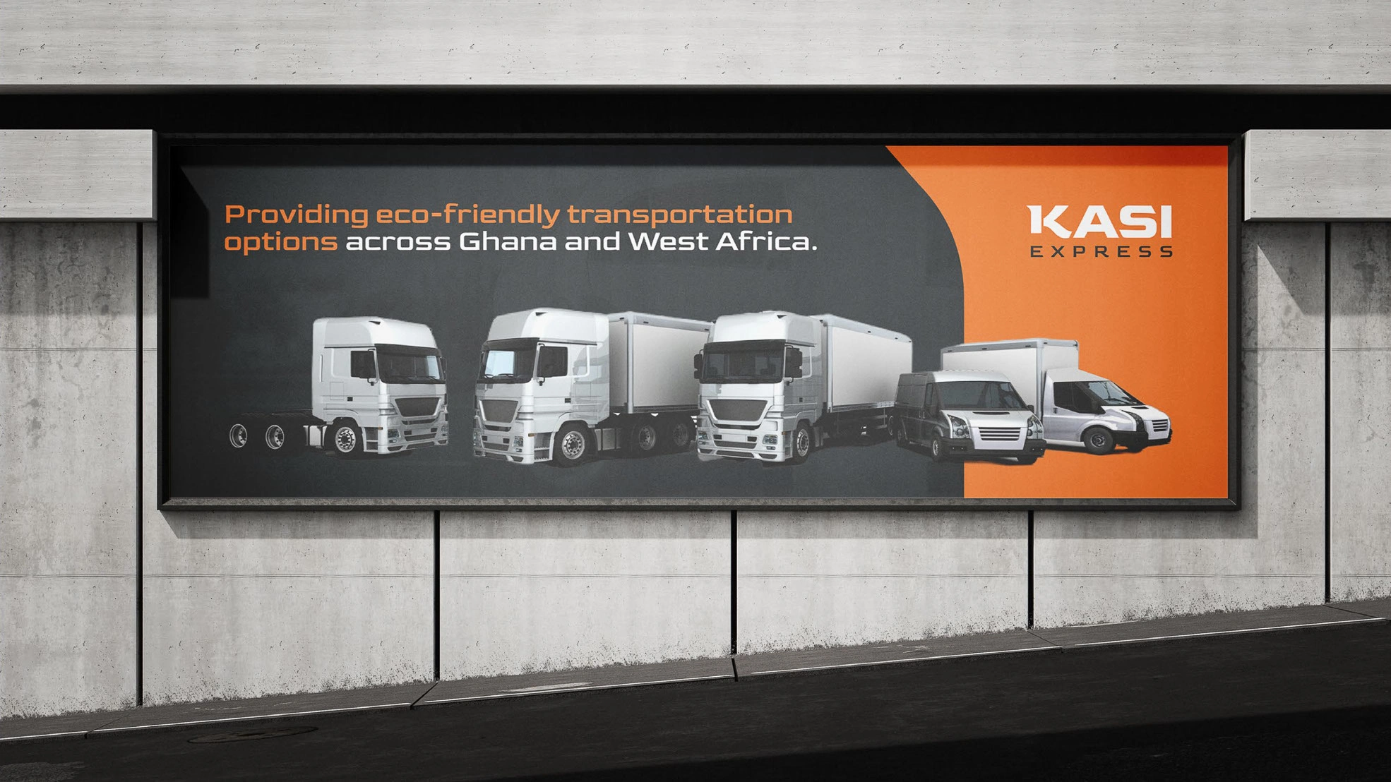
Billboard
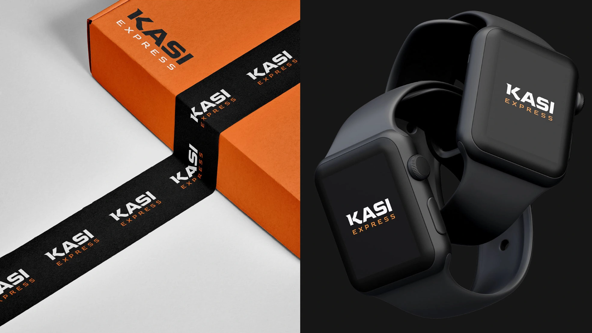
Brand Mockups
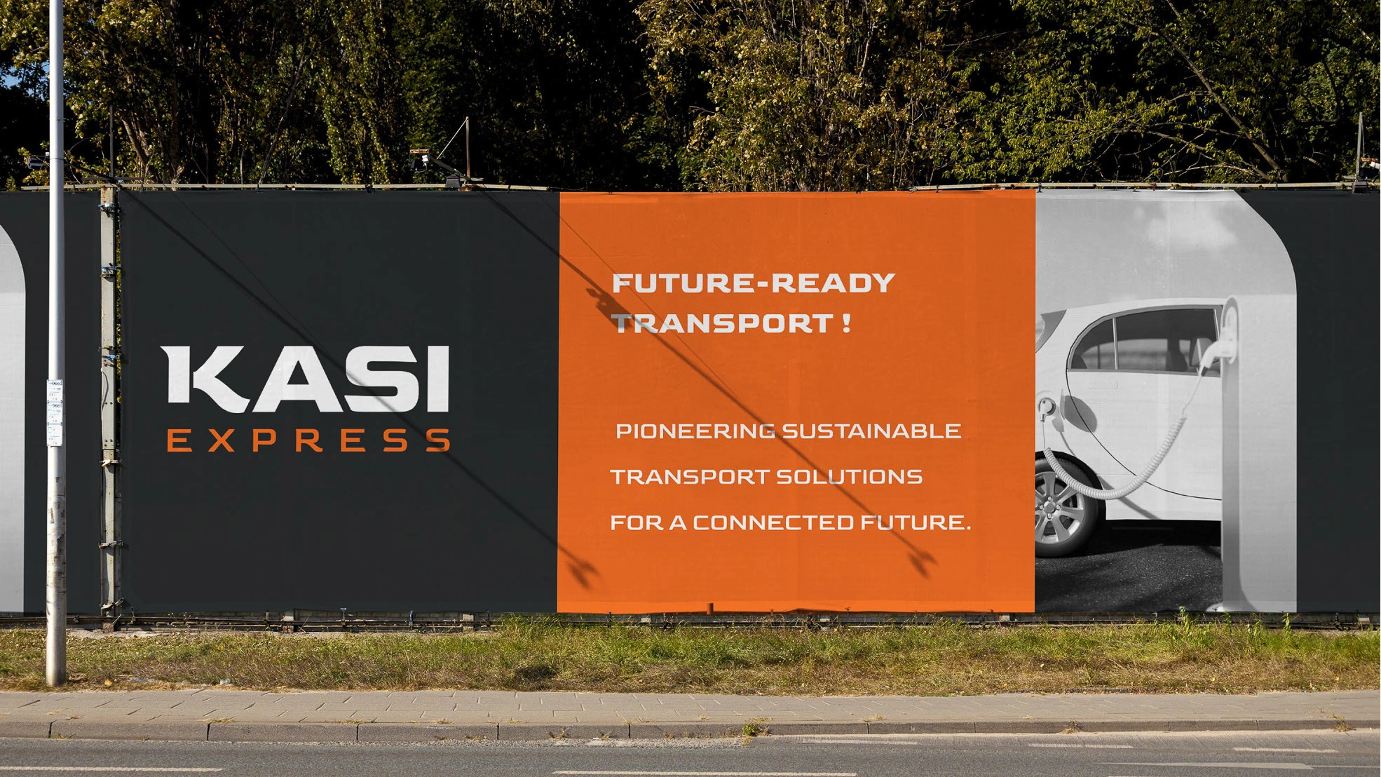
Outdoor Signage
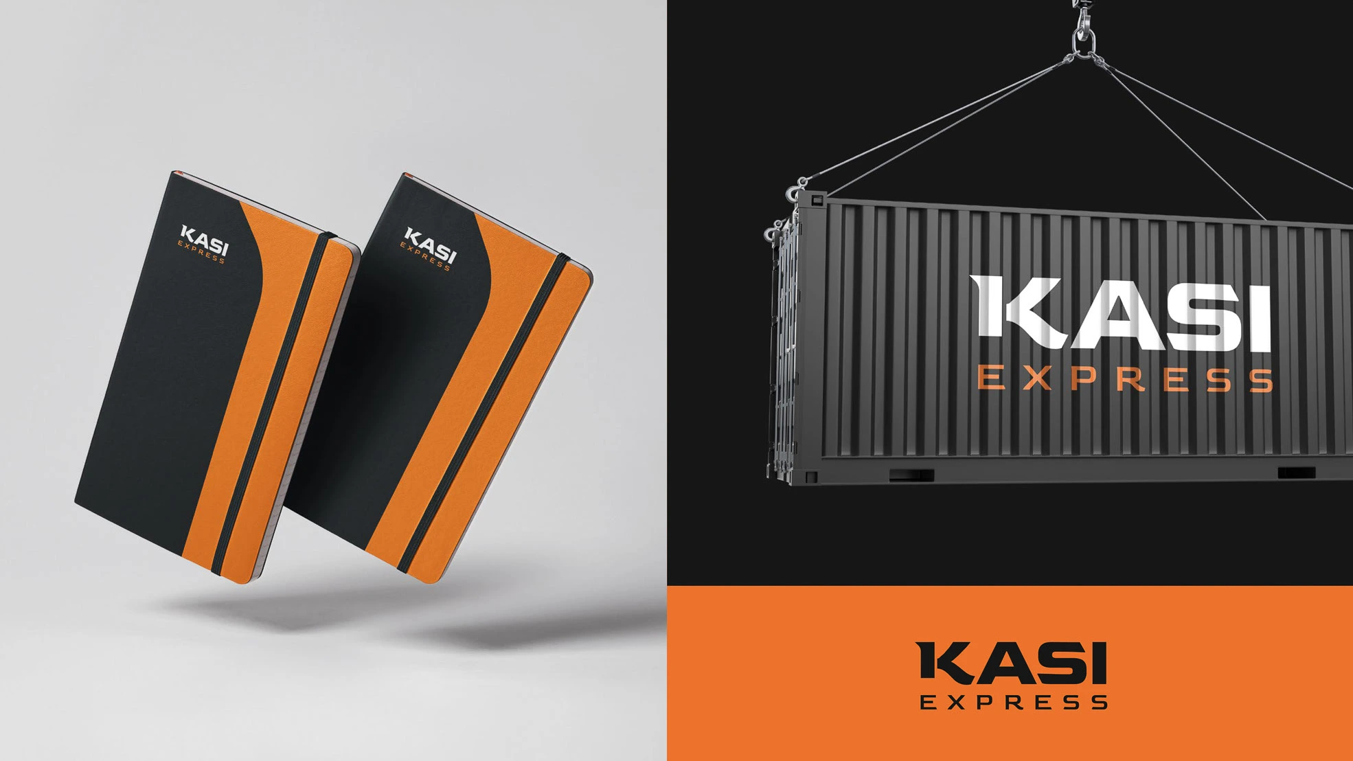
Notebook and Container

Brand Application
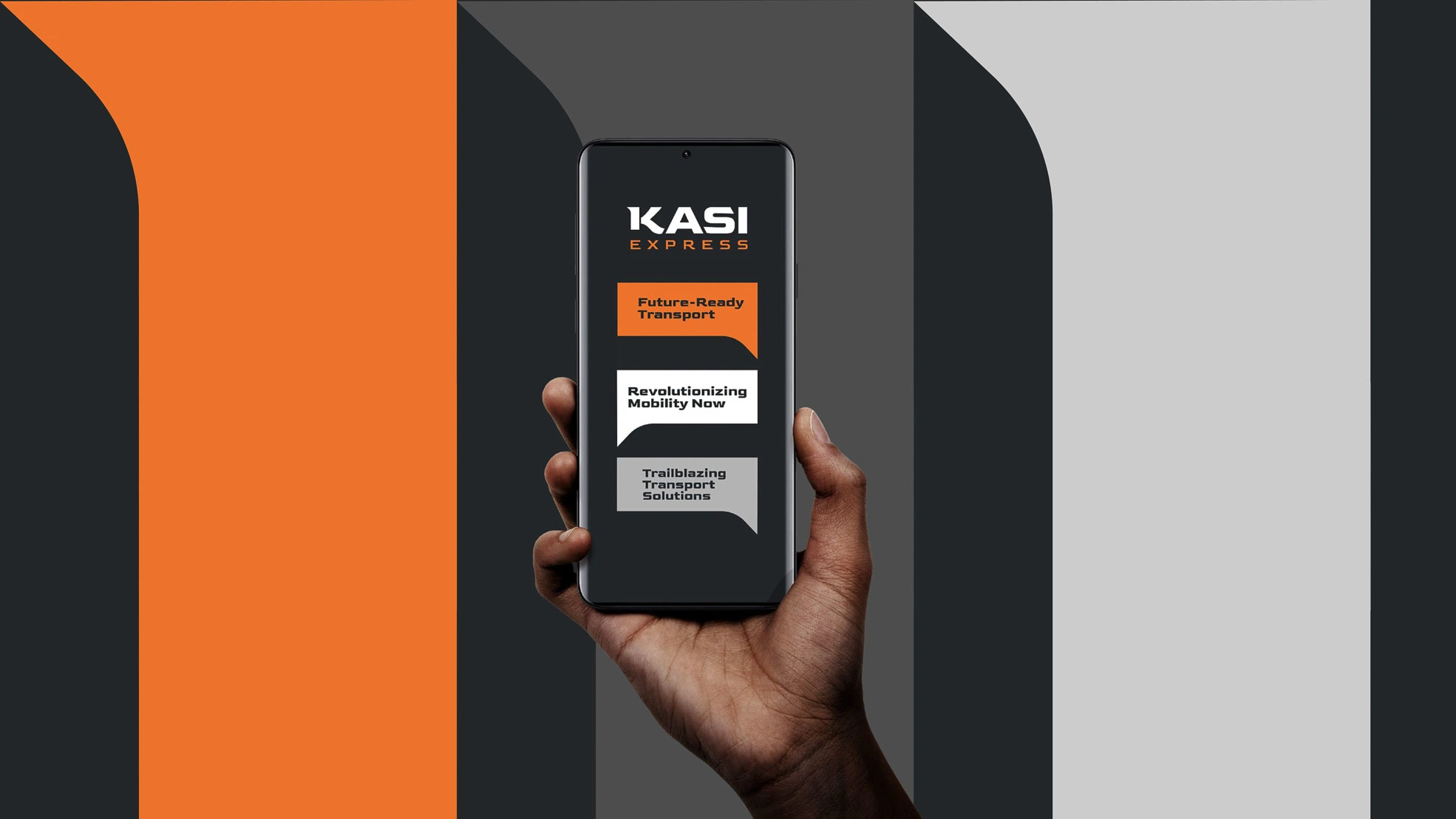
Brand Application
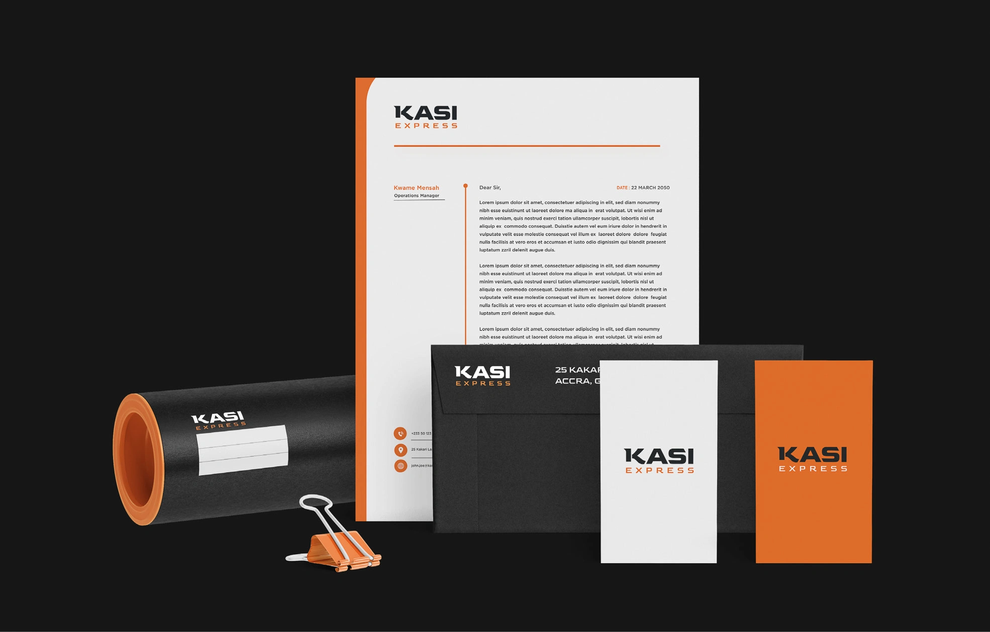
Stationery
Like this project
Posted Feb 11, 2025
Kasi Express engaged us to develop a new brand identity that captures their dynamic nature and focus on mobility and transportation.


