BOON Packaging, 3D Mockups & Web Development
Muhammad Asad Khan
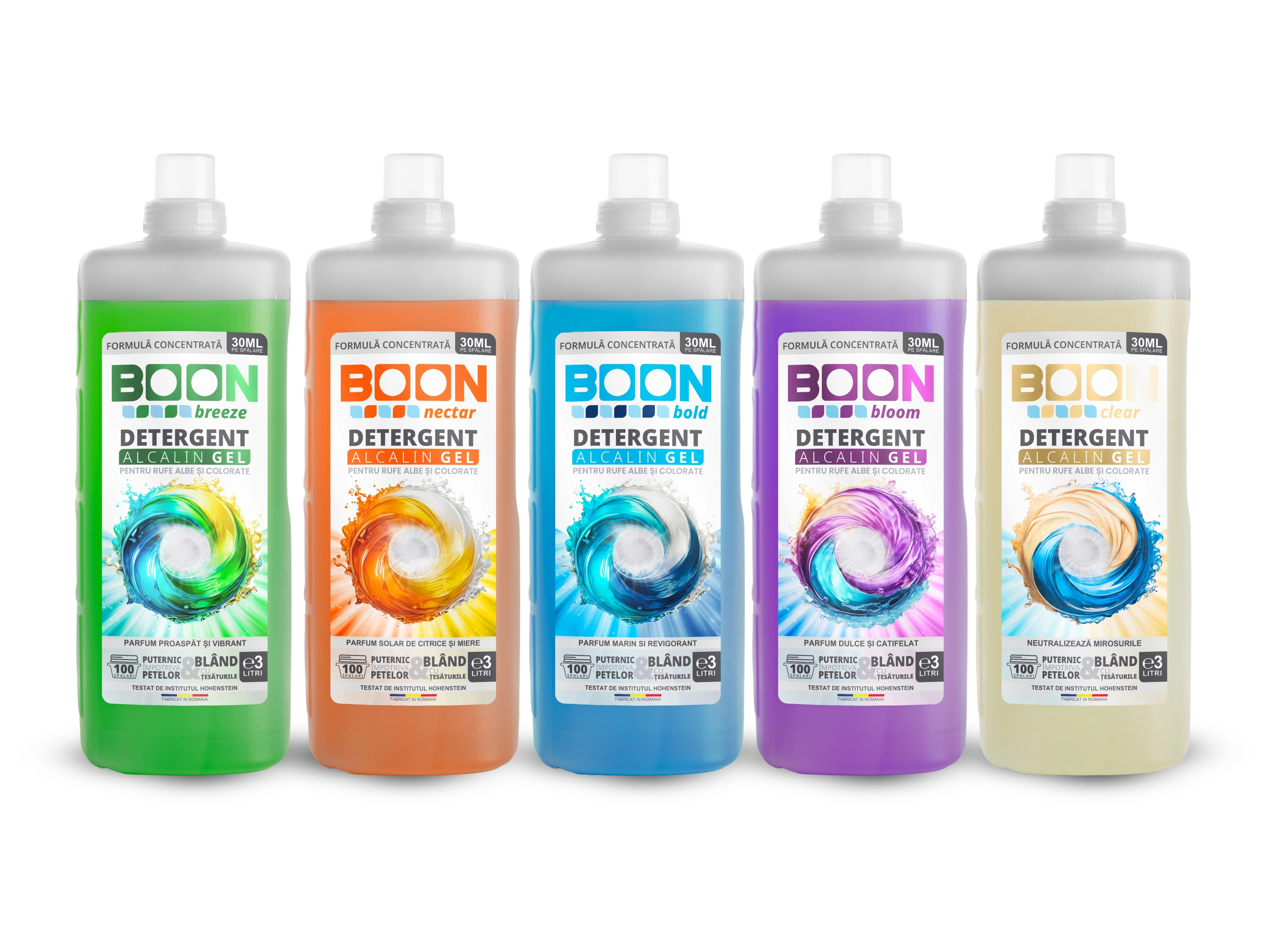
BOON is a household cleaning brand spanning detergents, sprays, and personal care products, the kind of range where it's easy for a brand identity to fragment, different bottle shapes, different shelf contexts, different use cases, all needing to somehow read as one company.
I led the design work across packaging, developing a system that could flex across bottle sizes and product categories while keeping color coding, typography, and layout structure consistent enough that a customer could spot a BOON product from across the aisle. 3D mockups let us check how labels wrapped around different bottle and bag shapes before anything went to print, since what works flat in a design file doesn't always translate cleanly onto a curved surface.
Social media assets followed the same visual language, so the brand looked the same whether someone encountered it in a store or scrolling a feed.
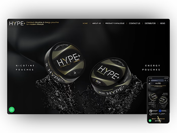
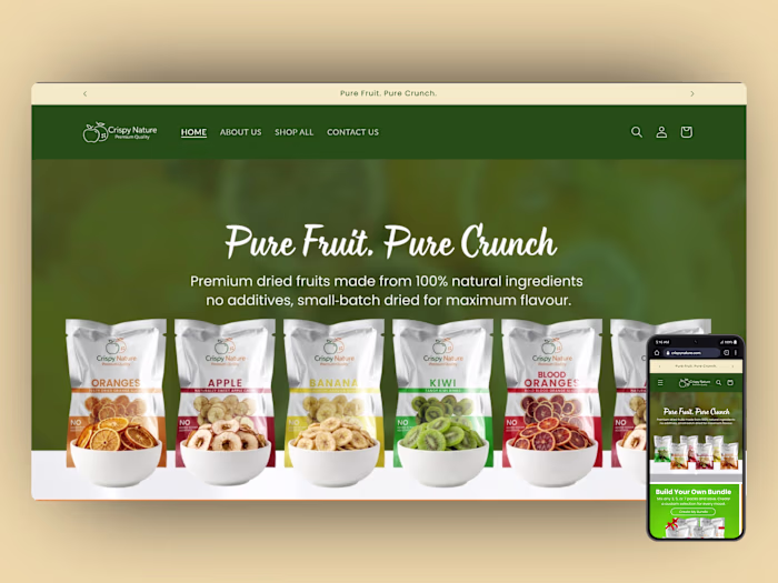
For the website, I partnered with a developer on the WordPress build, I led the design direction and visual execution, working alongside someone handling the technical implementation, the kind of collaboration that let the project move faster without compromising on the design quality.
Ongoing Partnership
This is a repeat client. The initial project covered the core product range, but BOON continues to expand and I continue to design for them. Most recently (May 2026), I designed packaging for two new fragrance detergent products, extending the existing system to accommodate a new product category while keeping the brand cohesive. New SKUs and product lines are added as the business grows.
Like this project
Posted Jun 25, 2026
Packaging, 3D mockups, and social media design for a household cleaning brand. Led the design and partnered on development for the WordPress site.
Likes
4
Views
8
Timeline
Jan 1, 2025 - Jun 1, 2026
Clients
BOON