Cabō Home - Brand Identity, Email Marketing, Packing Design
✨ The Brand:
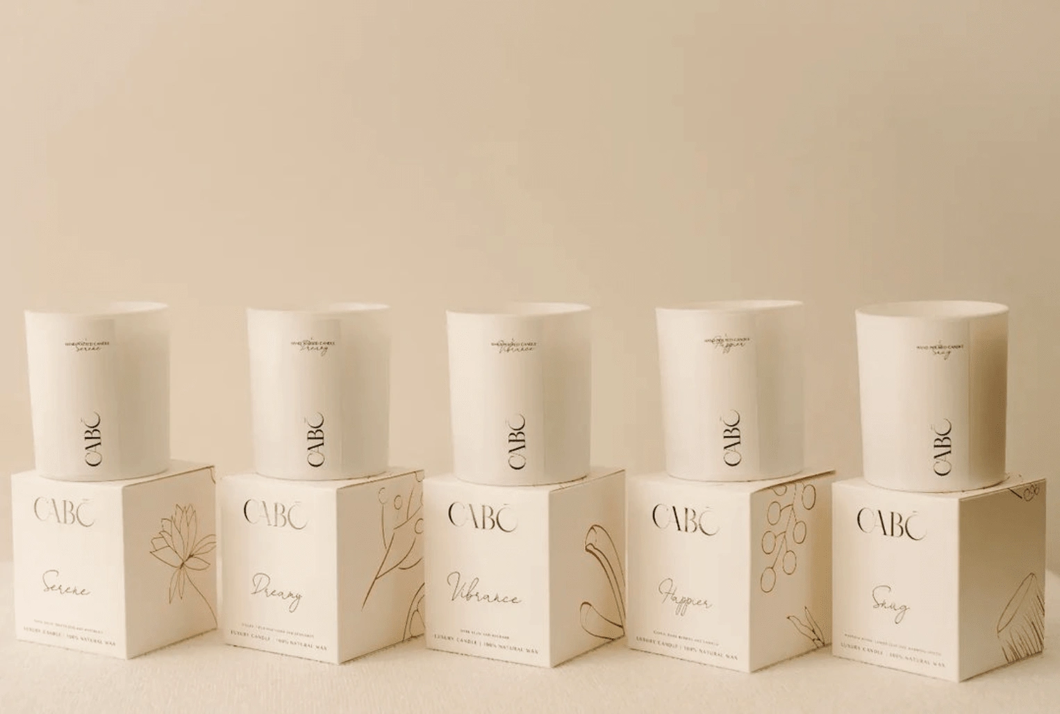
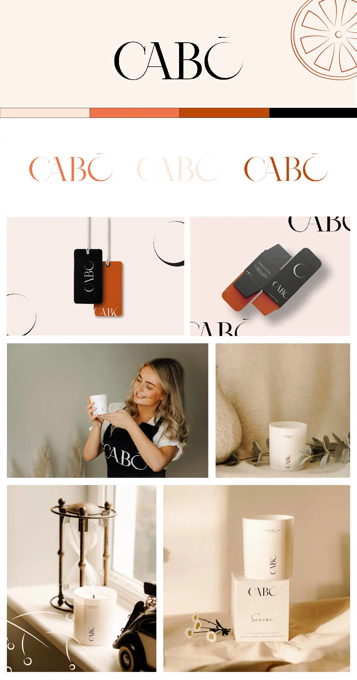
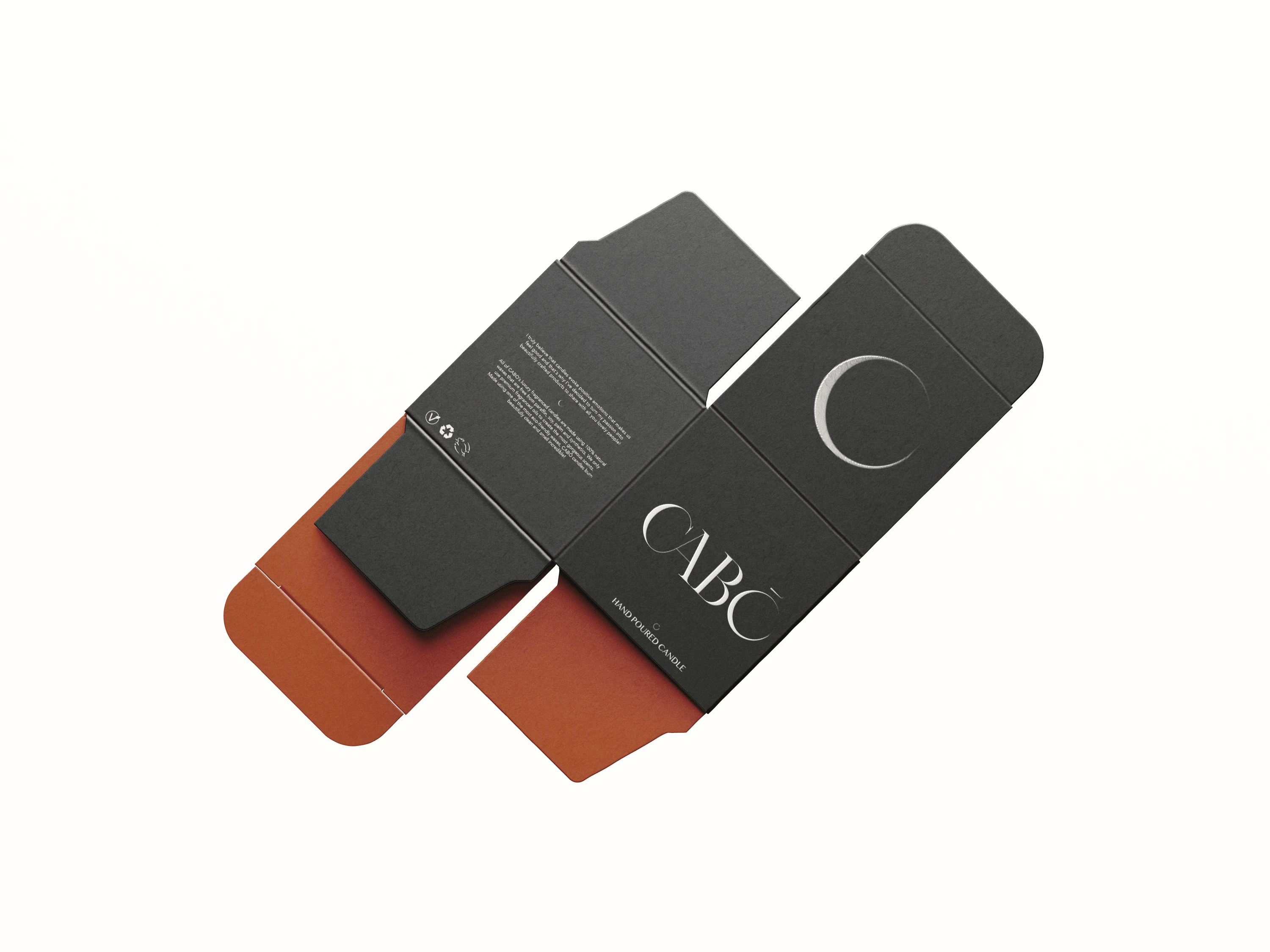
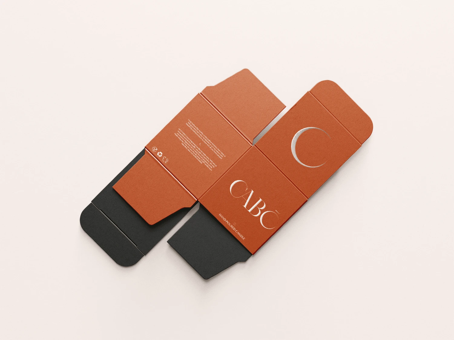
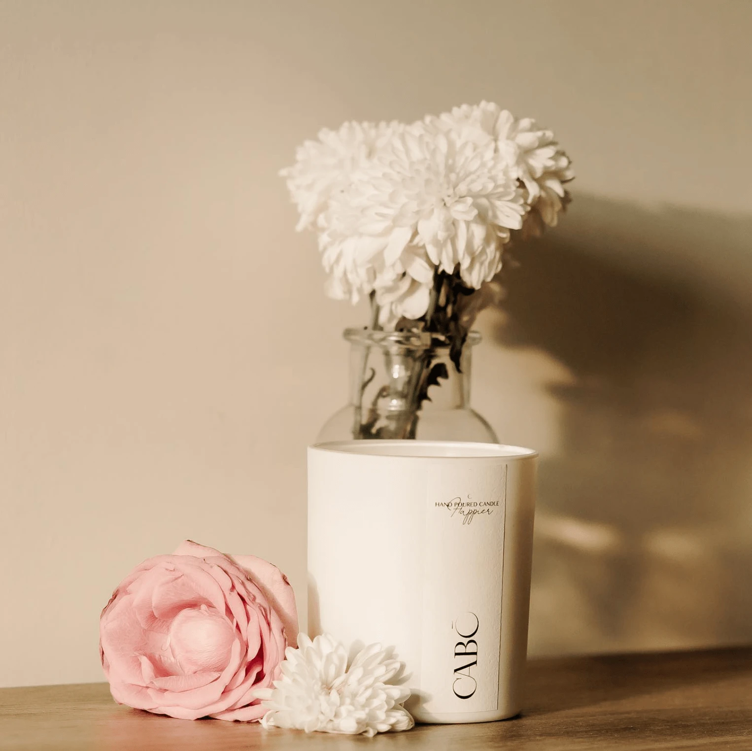
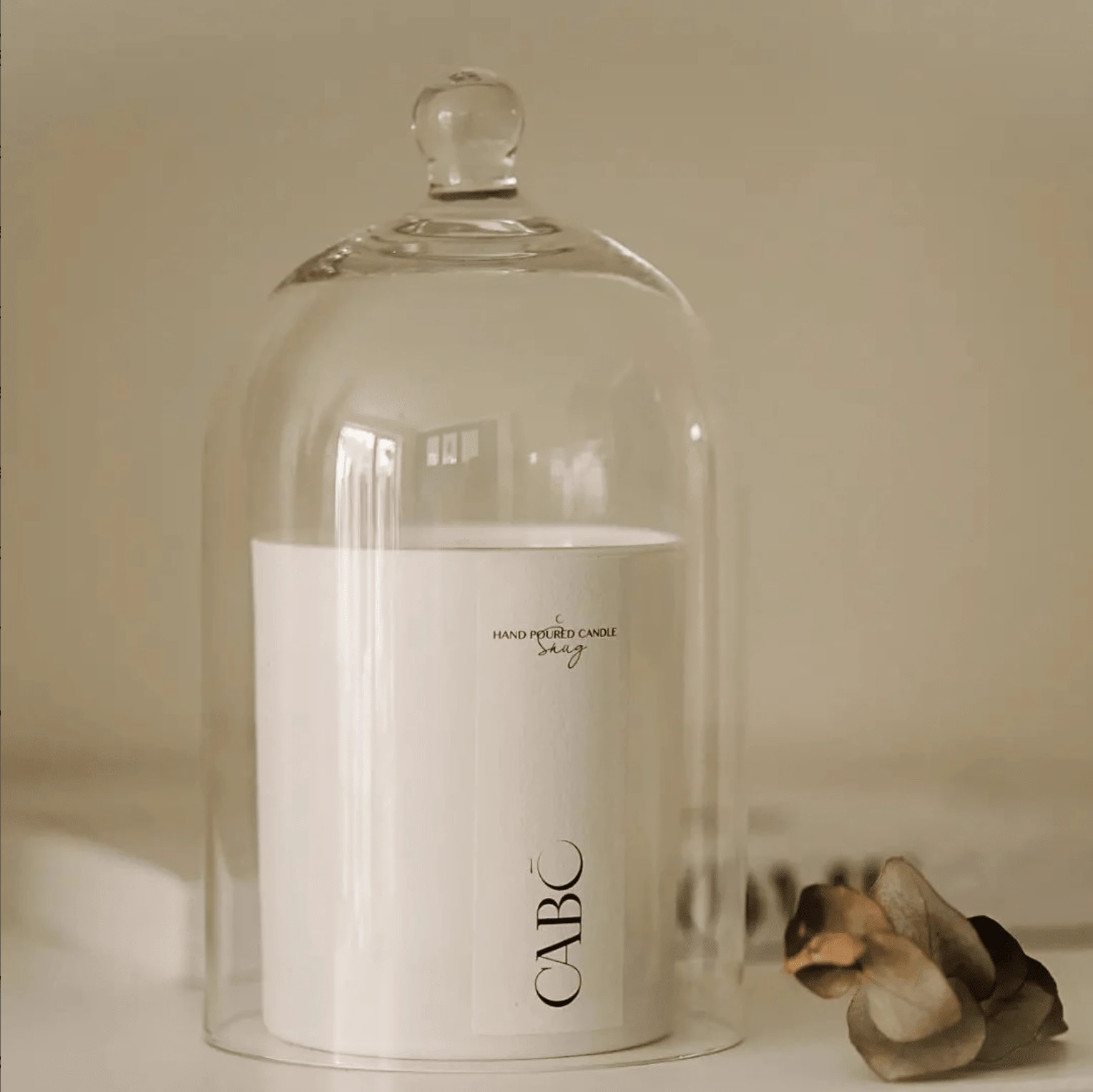
Tara is based in the UK and was looking for a brand identity for her hand poured candle business. She needed a unique brand that reflected the quality of her candles with a sophisticated touch. After exploring an array of fonts we created this beautiful logo. The 'O' in Cabo was designed to reflect the view of a candle from above and also resemble the shape of the moon, a nod to the calm, and relaxing nature of the brand.
Like this project
Posted Aug 30, 2024
A simply stunning brand identity design project for Cabō Home. Cosy and inviting, this brand represents elegant scents and quality products perfectly.

