Soap - Brand Identity Design
Seadhna Treacy
✨ The Brand:
A brand identity design project for the all-natural bath and body brand, Soap. Based in Cornwall UK the client wanted a brand identity that felt like home. The recipes used to create the products were her Grandmother's and so we decided that a fun, modern take on 50's (vintage) brand design would be unique whilst still capturing the roots of the brand.
🔍 The Design:
I used a vibrant green (a nod to sustainability) and purple colour palette with a bubble handwritten font that gives a nod to the product itself and also has a personal, homemade feel to it. All recycled, paper and cardboard packaging continues the theme of sustainability and simple, illustrations for decoration and clarity of the product.
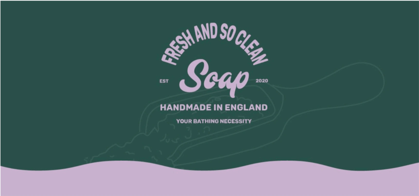
Soap - Brand banner with logo and salt scoop illustration
The Deliverables:
+ Main logo & Alternate files
+ Secondary logo & Alternate files
+ Submark logo & Alternate files
+ Colour palette and brand fonts
+ ‘File types & how to use them’ document
+ Full Brand Guidelines document
+ Thank you cards
+ Packaging design x3
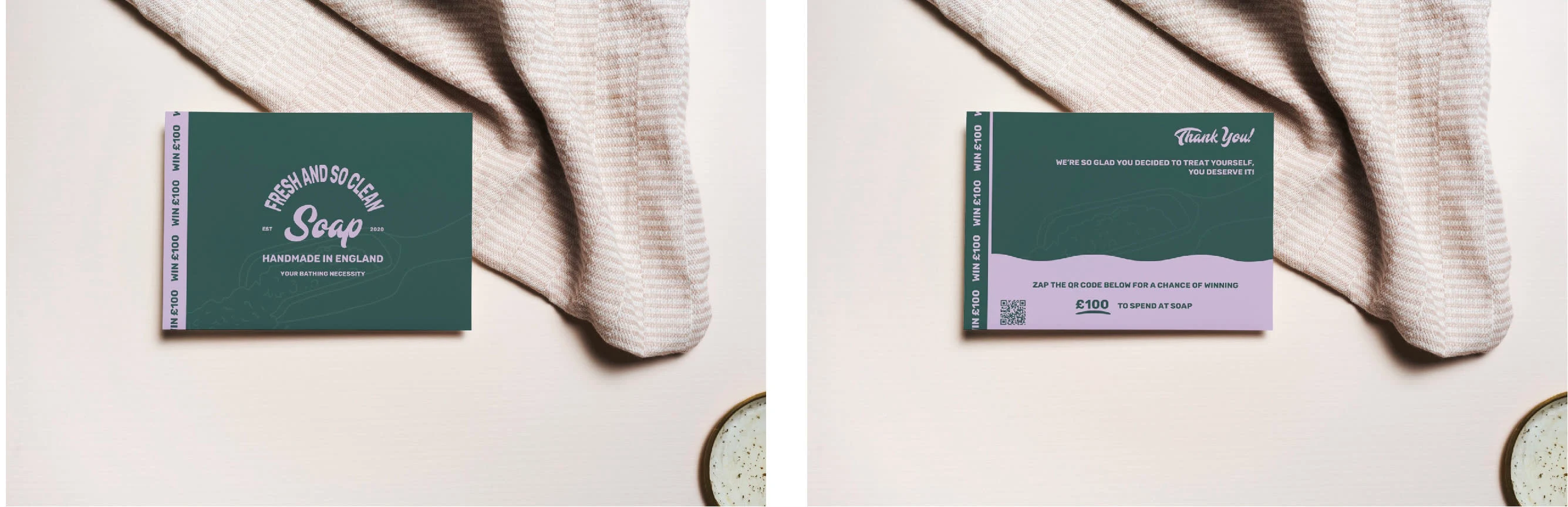
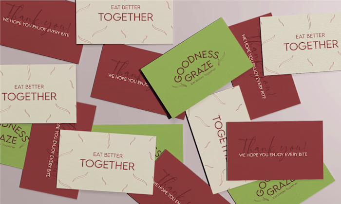
Soap - thank you cards
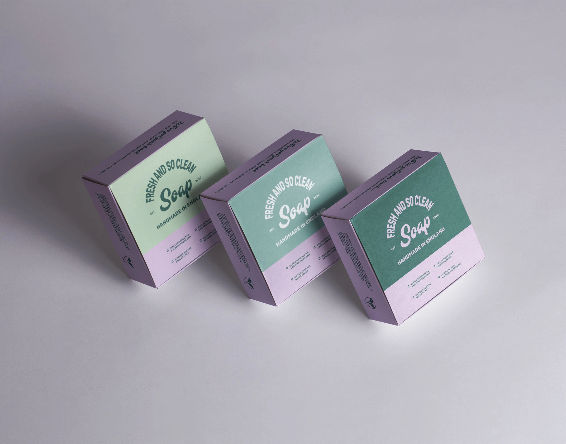
soap - square box packaging design
Soap main logo and alternate logos
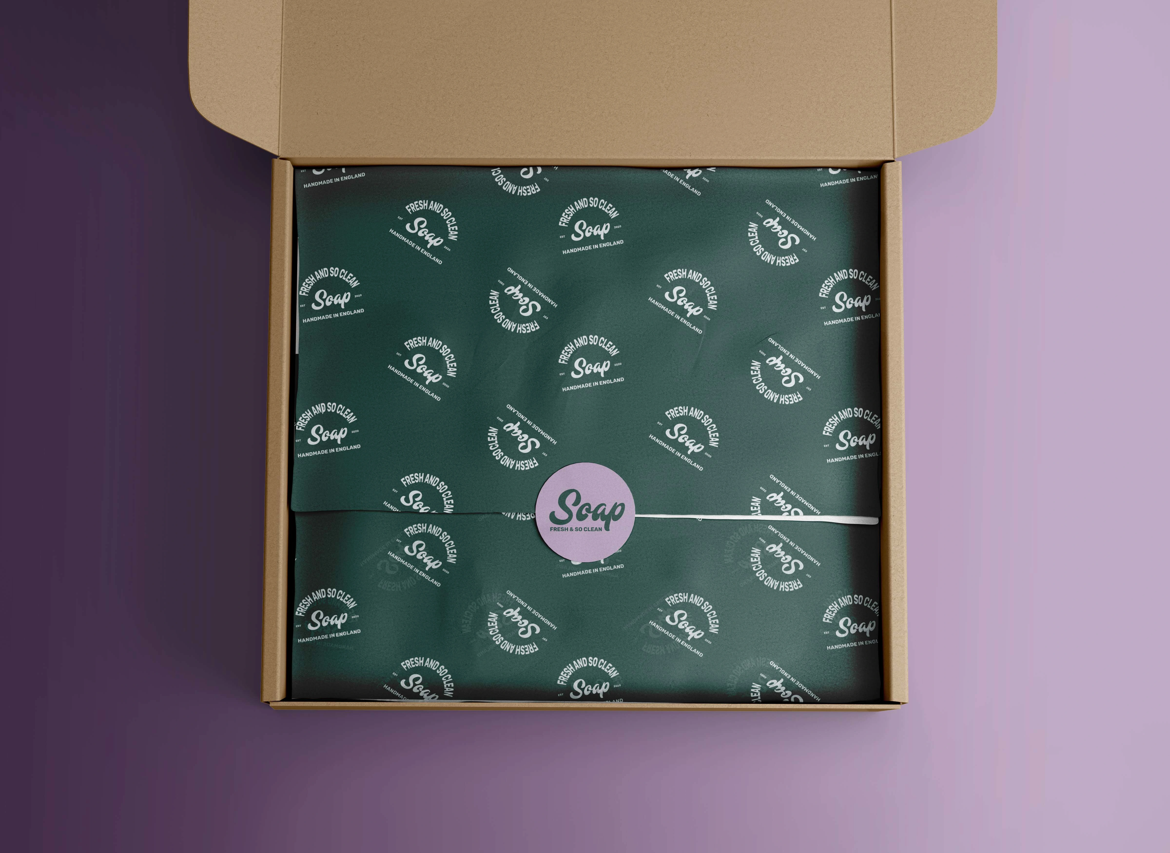
Soap postage packaging design, tissue paper and sticker.
Like this project
Posted Sep 14, 2022
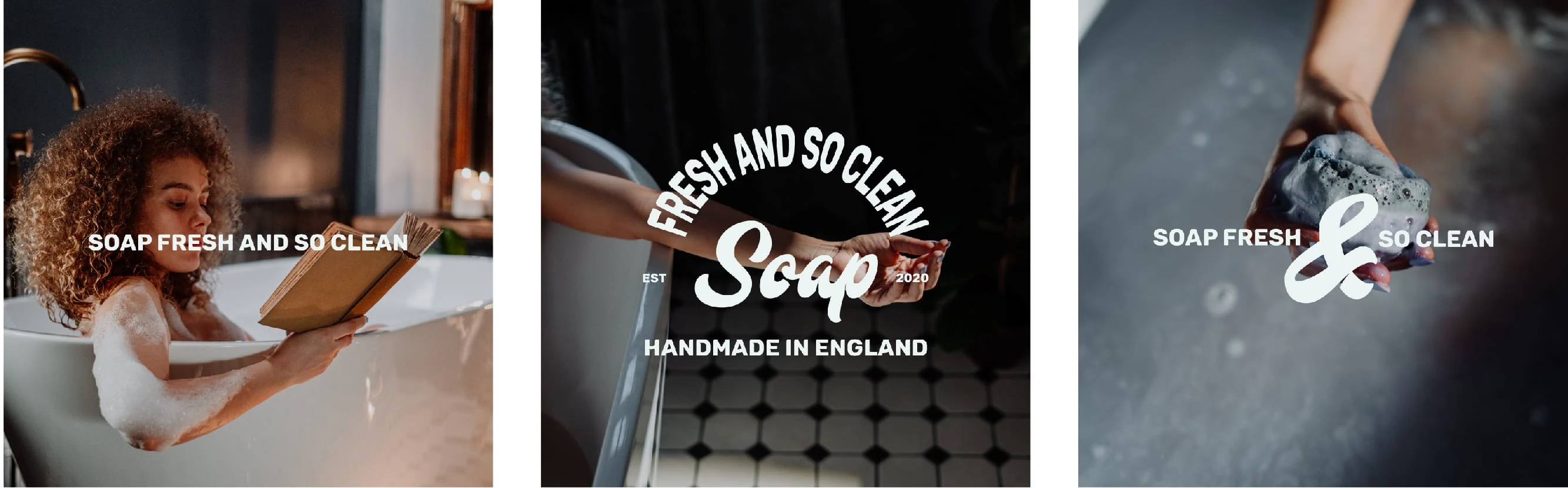
A brand identity design project for the all-natural bath and body brand, Soap. A natural and playful brand identity that inspires relaxation and self-care.