Design Trends 2025: Glassmorphism, Neumorphism & Styles You Need to Know
Design Trends 2025: Glassmorphism, Neumorphism & Styles You Need to KnowImmersive and Interactive ExperiencesThe Rise of 3D ElementsAdvanced Micro-interactions and AnimationsReinventing the CursorLayout and Color: Boldness and StructureBento Grids for Modern LayoutsBold Typography and Vibrant ColorsThe Evolution of Dark ModeThe New Materialism: Glassmorphism and NeumorphismGlassmorphism: The Frosted-Glass EffectNeumorphism (Soft UI)The Human Touch: Organic and Personalized DesignAbstract and Organic ShapesAI-Driven PersonalizationConclusionReferences
Design Trends 2025: Glassmorphism, Neumorphism & Styles You Need to Know
The digital landscape is constantly evolving, and staying current with the latest design trends is crucial for creating modern, engaging user experiences. As we look ahead to 2025, several key trends are shaping how interfaces will look and feel, from immersive 3D elements to bold typography. Whether you're looking to hire Figma designers or enhance your own skills, understanding these trends is essential. Modern design tools now include AI features to boost your workflow, making it easier than ever to implement cutting-edge styles.
This article will dive into the most important design styles you need to know. For designers looking to implement these trends, mastering advanced Figma techniques is essential. We'll explore everything from the latest glassmorphism effects to interactive 3D elements that are transforming how users interact with digital products.
Immersive and Interactive Experiences
In 2025, design is moving beyond flat interfaces towards more immersive and interactive experiences that captivate users. This shift is driven by advancements in technology that make 3D and complex animations more accessible. Gone are the days when websites felt like static brochures. Today's users expect dynamic, engaging experiences that respond to their actions and draw them into the content.
The push towards immersive design isn't just about flashy effects. It's about creating meaningful connections between users and digital products. When done right, these interactive elements guide users through their journey, making complex tasks feel intuitive and enjoyable.
The Rise of 3D Elements
3D visuals are becoming integral to UI design, adding depth and realism that transforms static pages into memorable experiences. This includes interactive 3D objects, 360° product views, and dynamic environments that encourage user exploration. Think about the last time you shopped online and could rotate a product to see it from every angle. That's just the beginning.
Modern websites are incorporating 3D elements in creative ways. Hero sections now feature floating objects that respond to mouse movements. Product showcases use realistic 3D models that users can customize in real-time. Even abstract 3D shapes are being used to add visual interest to otherwise plain layouts.
The beauty of 3D design in 2025 is that it's becoming more performance-friendly. Thanks to WebGL and improved browser capabilities, these elements load quickly and run smoothly, even on mobile devices. This means designers can add depth without sacrificing user experience.
Advanced Micro-interactions and Animations
Micro-interactions and scroll-triggered animations are no longer just decorative details; they are essential for guiding users and providing feedback. Every click, hover, and scroll becomes an opportunity to delight users and communicate information. A button that subtly changes shape when pressed tells users their action was registered. A progress bar that fills with a satisfying animation makes waiting feel less tedious.
Kinetic and expressive typography is also on the rise, using motion to capture attention and convey brand personality. Words don't just sit on the page anymore. They slide in, morph, and dance to create emphasis and emotion. Headlines might break apart and reassemble as users scroll. Key phrases could pulse gently to draw the eye.
The key to successful micro-interactions is restraint. Too many animations can overwhelm and distract. The best designs use motion purposefully, enhancing the user experience without getting in the way of functionality.
Reinventing the Cursor
Designers are transforming the standard cursor into an interactive tool that enhances navigation and provides real-time feedback, making the user experience more intuitive and enjoyable. Custom cursors can change shape, color, or size based on what they're hovering over. They might leave trails, create ripple effects, or even reveal hidden content.
Some websites use the cursor as a spotlight, illuminating content as it moves across the page. Others transform it into a magnifying glass for detailed product views. Creative agencies often use custom cursors to showcase their design skills and create memorable first impressions.
While custom cursors can add personality, accessibility remains crucial. Designers must ensure their creative cursors don't hinder usability, especially for users with motor impairments or those using assistive technologies.
Layout and Color: Boldness and Structure
Visual organization and color palettes are seeing a push towards more structured, yet visually vibrant, layouts. These trends help brands stand out while maintaining clarity and usability. The days of playing it safe with neutral colors and predictable layouts are fading. Brands are embracing bold choices that make strong statements while still prioritizing user needs.
This balance between creativity and functionality defines modern web design. Layouts need to be intuitive enough for first-time visitors yet interesting enough to keep users engaged. Color choices must be accessible while still expressing brand personality.
Bento Grids for Modern Layouts
Inspired by Japanese lunch boxes, bento grids are becoming a popular way to organize information in a modular, visually appealing layout. This trend provides structure and clarity, allowing different types of content to coexist harmoniously on one screen. Picture a dashboard where each section has its own defined space, yet everything flows together seamlessly.
Bento grids work particularly well for complex interfaces that need to display varied information. A project management tool might use bento boxes for tasks, calendars, and team updates. An e-commerce site could showcase products, reviews, and recommendations in distinct but connected modules.
The flexibility of bento grids makes them perfect for responsive design. Boxes can stack, resize, or rearrange based on screen size without losing their visual appeal. This adaptability ensures consistent user experiences across devices.
Bold Typography and Vibrant Colors
Minimalism is being complemented by bold, experimental typography and vibrant color palettes. Saturated gradients, strong contrasts, and expressive fonts are used to create energy, establish visual hierarchy, and draw attention to key elements. Typography is becoming a design element in its own right, not just a way to convey information.
Designers are mixing font weights dramatically within single headlines. Ultra-thin letters might sit next to bold, chunky ones. Serif and sans-serif fonts combine in unexpected ways. Variable fonts allow for smooth transitions between weights and styles, creating dynamic text that responds to user interactions.
Color choices are equally adventurous. Neon accents pop against dark backgrounds. Gradient overlays add depth to flat designs. Even traditionally conservative industries are embracing vibrant palettes to appear more approachable and modern.
The Evolution of Dark Mode
Dark mode is now a standard expectation, not just a trend. In 2025, the focus is on creating nuanced dark themes with subtle color variations that ensure readability and visual harmony, rather than just inverting colors. Smart dark modes adapt to ambient lighting conditions and user preferences.
The best dark modes go beyond simple color inversion. They adjust contrast ratios for optimal readability. Images and graphics are optimized to look natural against dark backgrounds. Accent colors are carefully chosen to maintain brand identity while ensuring accessibility.
Many sites now offer multiple theme options beyond just light and dark. Sepia modes reduce eye strain for reading. High-contrast modes help users with visual impairments. Some even offer customizable themes where users can adjust colors to their preferences.
The New Materialism: Glassmorphism and Neumorphism
While not brand new, these textural trends continue to evolve, offering sophisticated ways to add depth and tactility to interfaces. Both styles create visual interest without relying on heavy graphics or complex illustrations. They work particularly well in modern, minimalist designs where subtle details make big impacts.
These techniques require careful implementation. Overuse can make interfaces feel gimmicky or dated. The key is using them strategically to enhance user experience and create visual hierarchy.
Glassmorphism: The Frosted-Glass Effect
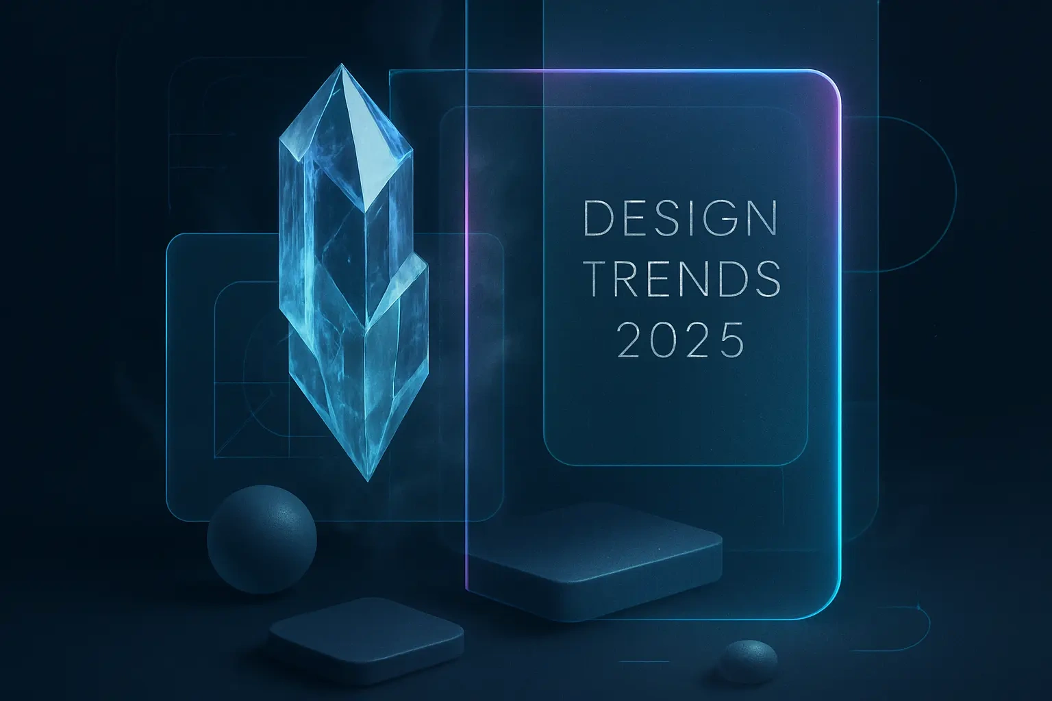
Glassmorphism uses a frosted-glass effect with transparency, blur, and a subtle border to create a sense of depth and hierarchy. This style is often used for card-based layouts and overlays, giving the interface a light, airy feel. Think of how macOS uses translucent panels that reveal blurred content beneath them.
The technique works by combining several CSS properties: backdrop blur, transparency, and subtle shadows. When done well, glassmorphic elements seem to float above the content, creating clear visual separation without harsh borders. This makes it perfect for modals, navigation bars, and card components.
Accessibility considerations are crucial with glassmorphism. The transparency and blur effects can reduce contrast, making text harder to read. Designers must carefully balance aesthetic appeal with legibility, often using slightly darker backgrounds or increased text weight to maintain readability.
Neumorphism (Soft UI)
Neumorphism, or Soft UI, creates a subtle, tactile experience where UI elements appear to extrude from or be pressed into the background. It uses soft shadows and highlights to create a clean, minimalist, and almost 3D-like aesthetic. Buttons look like they're molded from the same material as the background, creating a cohesive, sculptural interface.
This style works best with simple color schemes, typically using a single hue with various shades. The magic happens through careful shadow work. Elements use two shadows: one lighter than the background (simulating light) and one darker (simulating shadow). This creates the illusion of depth without traditional borders.
While visually striking, neumorphism faces criticism for accessibility issues. The subtle contrast between elements and backgrounds can make it difficult for users to identify interactive components. Successful implementations combine neumorphic aesthetics with clear visual cues like color changes or icons to ensure usability.
The Human Touch: Organic and Personalized Design
As technology becomes more integrated into our lives, design is trending towards more human-centric and natural aesthetics. Users crave authenticity and connection in their digital experiences. This shift reflects a broader cultural movement away from cold, corporate designs towards warmer, more approachable interfaces.
The challenge lies in scaling human touches across digital platforms. How do you make a website feel personal to millions of users? How do you add organic elements without sacrificing performance? These questions drive innovation in both design and technology.
Abstract and Organic Shapes
Breaking away from rigid grids, designers are using abstract and organic shapes to add fluidity and visual interest to layouts. These natural, flowing forms create a more approachable and dynamic feel. Blob shapes, wavy lines, and irregular patterns soften the digital experience, making it feel less mechanical.
Organic shapes serve multiple purposes. They can guide the eye through content, create visual breaks between sections, or simply add decorative flair. Background patterns might use flowing shapes to add texture without distraction. Hero sections could feature abstract forms that morph and move with user interactions.
The trend extends to photography and illustration styles too. Masks and frames use organic shapes instead of standard rectangles. Icons incorporate flowing lines and natural forms. Even data visualizations are moving away from rigid charts towards more fluid, artistic representations.
AI-Driven Personalization
Artificial intelligence is enabling hyper-personalized experiences. Websites and apps are increasingly adapting their content and layout based on user behavior and preferences, making the experience more relevant and engaging for each individual. This goes far beyond simple recommendations or targeted ads.
AI analyzes user patterns to adjust everything from color schemes to navigation structures. A news site might reorganize its layout based on which sections you read most. An e-commerce platform could change its homepage design to highlight categories you frequently browse. Even font sizes and spacing might adjust based on how users interact with content.
The ethical implications of such personalization require careful consideration. Users need transparency about how their data is used and control over their personalized experiences. The best implementations allow users to adjust or disable personalization features while still benefiting from AI-driven improvements.
Conclusion
Design trends in 2025 represent a fascinating balance between technological advancement and human connection. From the ethereal beauty of glassmorphism to the tactile appeal of neumorphism, from bold typography to AI-driven personalization, these trends offer exciting possibilities for creating memorable digital experiences.
The key to successful implementation lies in understanding that trends are tools, not rules. Each project requires thoughtful consideration of which trends serve its goals and users best. A financial app might benefit from the clarity of bento grids and subtle neumorphism. A creative agency could push boundaries with custom cursors and kinetic typography.
As you explore these trends, remember that great design always prioritizes user needs. The most beautiful interface fails if users can't accomplish their goals. Test your implementations across devices and with diverse user groups. Ensure accessibility remains a priority, not an afterthought.
The future of design is bright, bold, and more human than ever. By understanding and thoughtfully applying these trends, designers can create experiences that not only look stunning but truly connect with users on a deeper level. Whether you're redesigning an existing product or starting fresh, these trends provide a roadmap for creating interfaces that feel current, engaging, and memorable.
References
Like this project
Posted Jul 6, 2025
Stay ahead of the curve. Explore the top UI/UX design trends for 2025, from immersive 3D and bento grids to the evolution of glassmorphism and neumorphism. Get inspired for your next project.

