Brand identity & interactive website for media personality
Contents
👉 Interactive case study
Click here for a full breakdown of the entire project (including a video demo) 👇
📝 The brief
Who: The Insight Podcast has become a destination for expert yet accessible advice from leaders in the field of psychology, health, education and science.
Yes, but: The show lacks a cohesive brand identity and a digital "home"
Content and episodes are hosted on desperate platforms
The audience is split across many channels
This means: These issues hurt the professionality and scalability of the show. Let's do something about that!
✅ The solution
After careful analysis, evaluation and market research, here's what we proposed to the client:
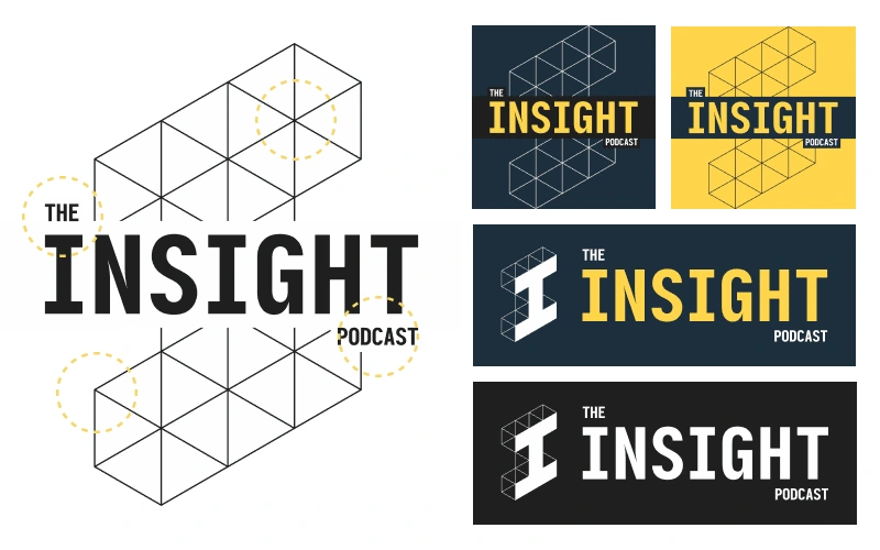
Development of a unique, compelling and unmistakable brand expression
Development of a website to help scale the brand and centralise content
Emphasis on accessibility, functionality and performance for the new web site.
Simplify the end user experience & surface the show's back catalogue in a single location.

We set out to craft a logo that thematically captures everything the show stood for.
🧭 The process
We worked in close collaboration with the client and were in constant contact, sharing ideas and feedback. This included regular meetings, workshops and asynchronous input.
Here's a breakdown of what we covered:
Initial discovery including goalsetting and intended outcomes
Outline of key criteria, success and performance metrics
Onboarding to our dedicated client portal
Developed, iterated and revised branding elements
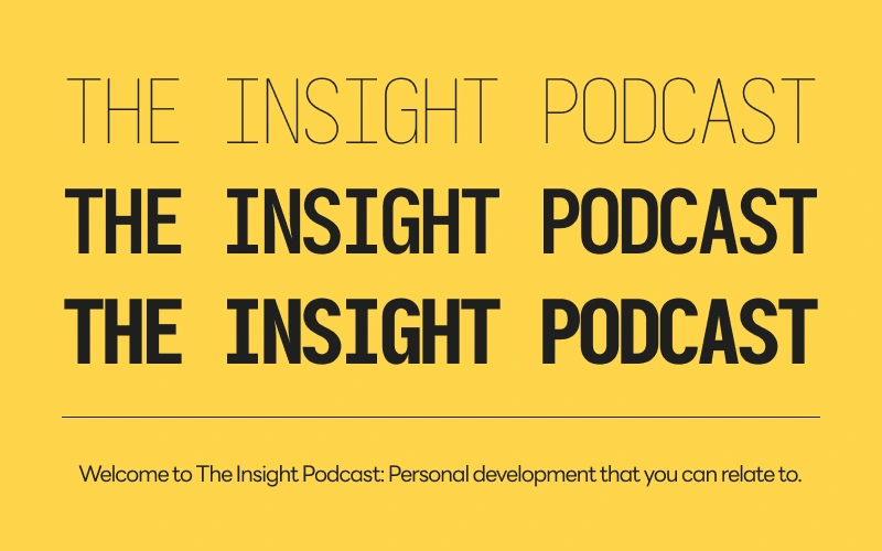
Designed full suite of brand components including logo (and variants), colour palettes, optimised typography, cover art, social media graphics and more
Produced website mockups (based on agreed information architecture)
Built website and robustly tested responsiveness against multiple breakpoints
Migrated back catalogue of existing content to the new site
Benchmarked performance and optimised site for speed, accessibility and sustainability
Developed a brand style guide and site operation guide
Continued to monitor post-go live

Readability was a key requirement when selecting typefaces.
📊 Outcomes & Optimisations
A deeper dive into what we produced:
🏃 Performance: Site optimisation has resulted in page speeds of 541ms and a ranking of Grade A/99 (Pingdom) and 96/100 (PageSpeed Index).
🧑 Accessibility: The colour palette conforms to WCAG 2.1 standards (high contrast ratio) and fonts have been optimised for visibility across devices and sizes.
🌱 Sustainability: The site is powered by sustainable energy and has a carbon footprint of only .22G of C02), meaning it is cleaner than 76% of websites globally (Carbon Rating: B).
🚀 Future plans
For the second stage of this project, we'll continue collaborating together to develop marketing and monetisation opportunities with the aim of scaling the show and reaching new audiences.
Like this project
Posted Jun 29, 2024
We strategically planned, designed and executed a brand identity uplift and produced a dynamic website to enable key growth and transformation outcomes.


