Redesigning the brand and website for a startup podcast network
Contents
👉 Interactive case study
Click here for a full breakdown of the entire project 👇
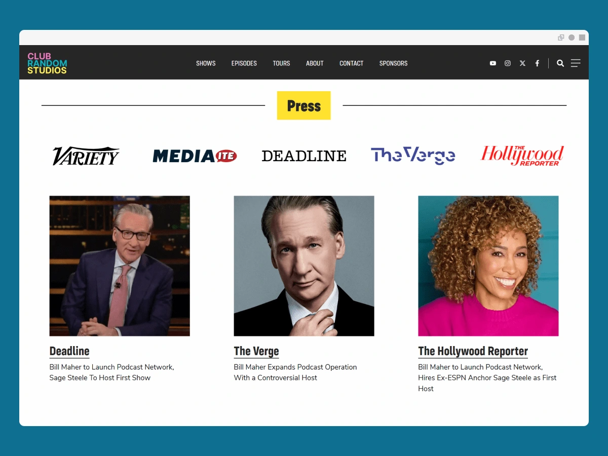
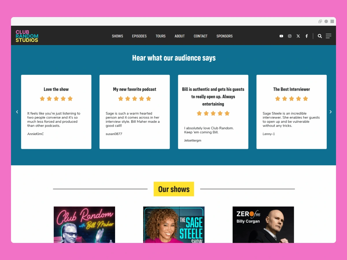
📝 The brief
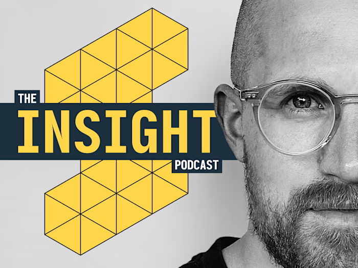
Who: The Insight Podcast has become a destination for expert yet accessible advice from leaders in the field of psychology, health, education and science.
Yes, but: The show lacks a cohesive brand identity and a digital "home"
Content and episodes are hosted on desperate platforms
The audience is split across many channels
This means: These issues hurt the professionality and scalability of the show. Let's do something about that!
✅ The solution
After careful analysis, evaluation and market research, here's what we proposed to the client:
Development of a unique, compelling and unmistakable brand expression
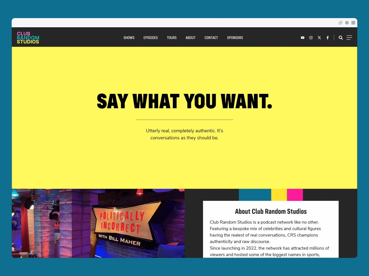
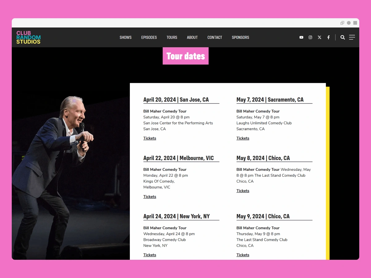
Development of a website to help scale the brand and centralise content
Emphasis on accessibility, functionality and performance for the new web site.
Simplify the end user experience & surface the show's back catalogue in a single location.
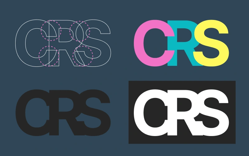
Stripping everything back to the most fundamental elements and introducing block text that is easier to read.
🧭 The process
We worked in close collaboration with the client and were in constant contact, sharing ideas and feedback. This included regular meetings, workshops and asynchronous input.
Here's a breakdown of what we covered:
Initial discovery including goalsetting and intended outcomes
Outline of key criteria, success and performance metrics
Onboarding to our dedicated client portal
Developed, iterated and revised branding elements
Designed full suite of brand components including logo (and variants), colour palettes, optimised typography, cover art, social media graphics and more
Produced website mockups (based on agreed information architecture)
Built website and robustly tested responsiveness against multiple breakpoints
Migrated back catalogue of existing content to the new site
Benchmarked performance and optimised site for speed, accessibility and sustainability
Developed a brand style guide and site operation guide
Continued to monitor post-go live
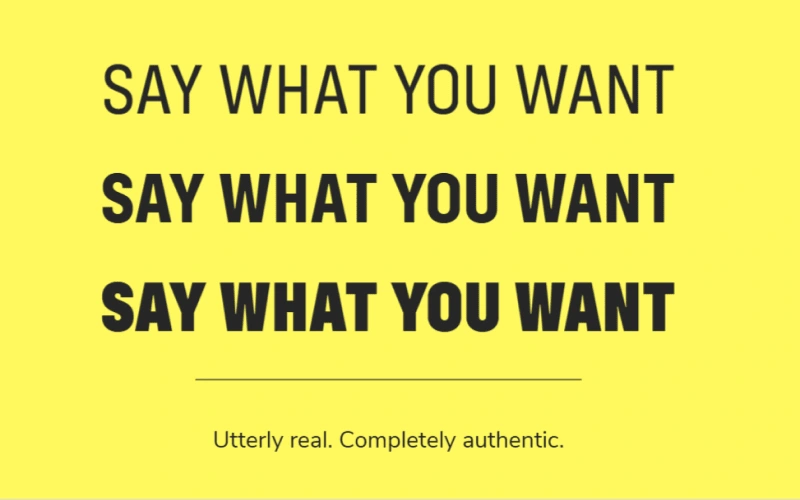
We went with a classic pairing of a block font for headings and a regular weight font for body text.
📊 Outcomes & Optimisations
A deeper dive into what we produced:
🏃 Performance: Site optimisation has resulted in faster load times and a ranking of Grade A/93 (Pingdom) and 94/100 (PageSpeed Index).
🧑 Accessibility: The colour palette conforms to WCAG 2.1 standards (high contrast ratio) and fonts have been optimised for visibility across devices and sizes.
🌱 Sustainability: Optimisation of hosting, page size and overall load times have resulted in a reduction of website carbon utilisation (from 5.51g to 0.43g per visit).
🚀 Future plans
Elements of the solution design have been successfully utilised in later projects.
Like this project
Posted Jun 29, 2024
A dynamic look for an electric new podcast network.

