Built with Kittl

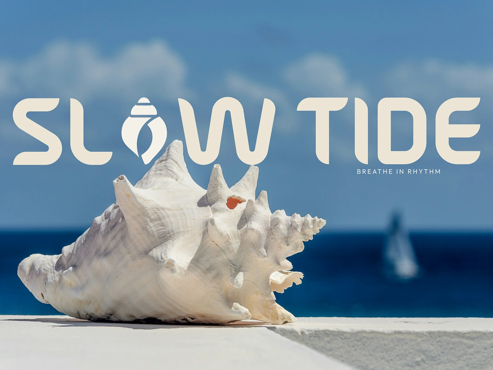
About The Project
Slow Tide Brand Strategy
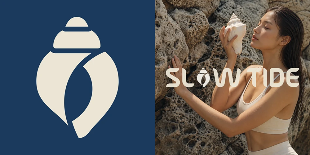
The shell mark and wordmark grounded in real coastal moments.
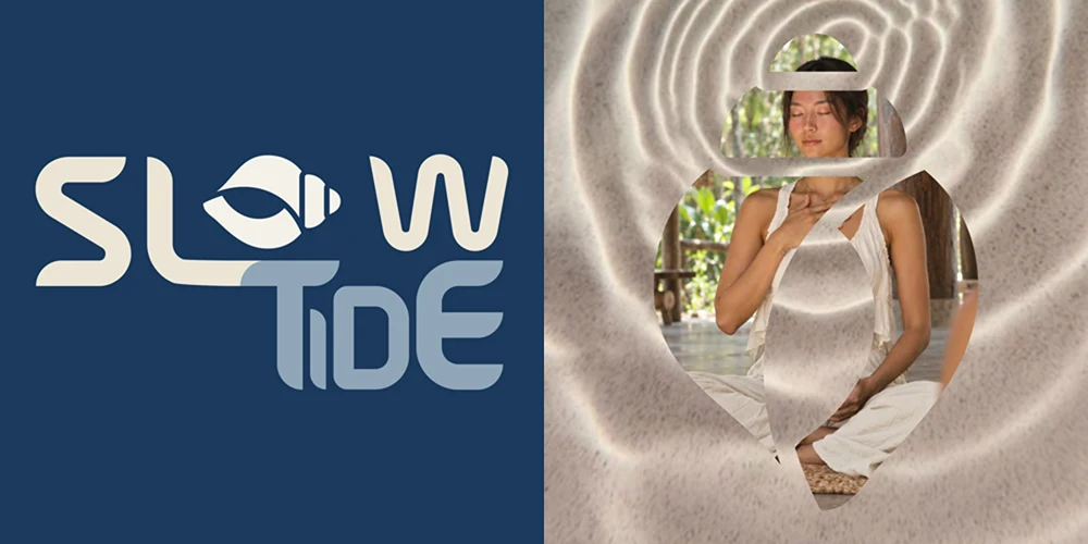
Stacked logo version paired with a shell-framed moment of stillness, connecting the mark to its coastal essence.
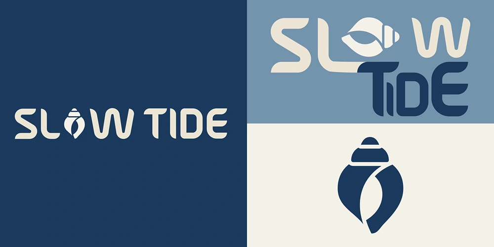
Logo system and core palette, a shell-inspired mark with calm ocean blues and soft neutrals.
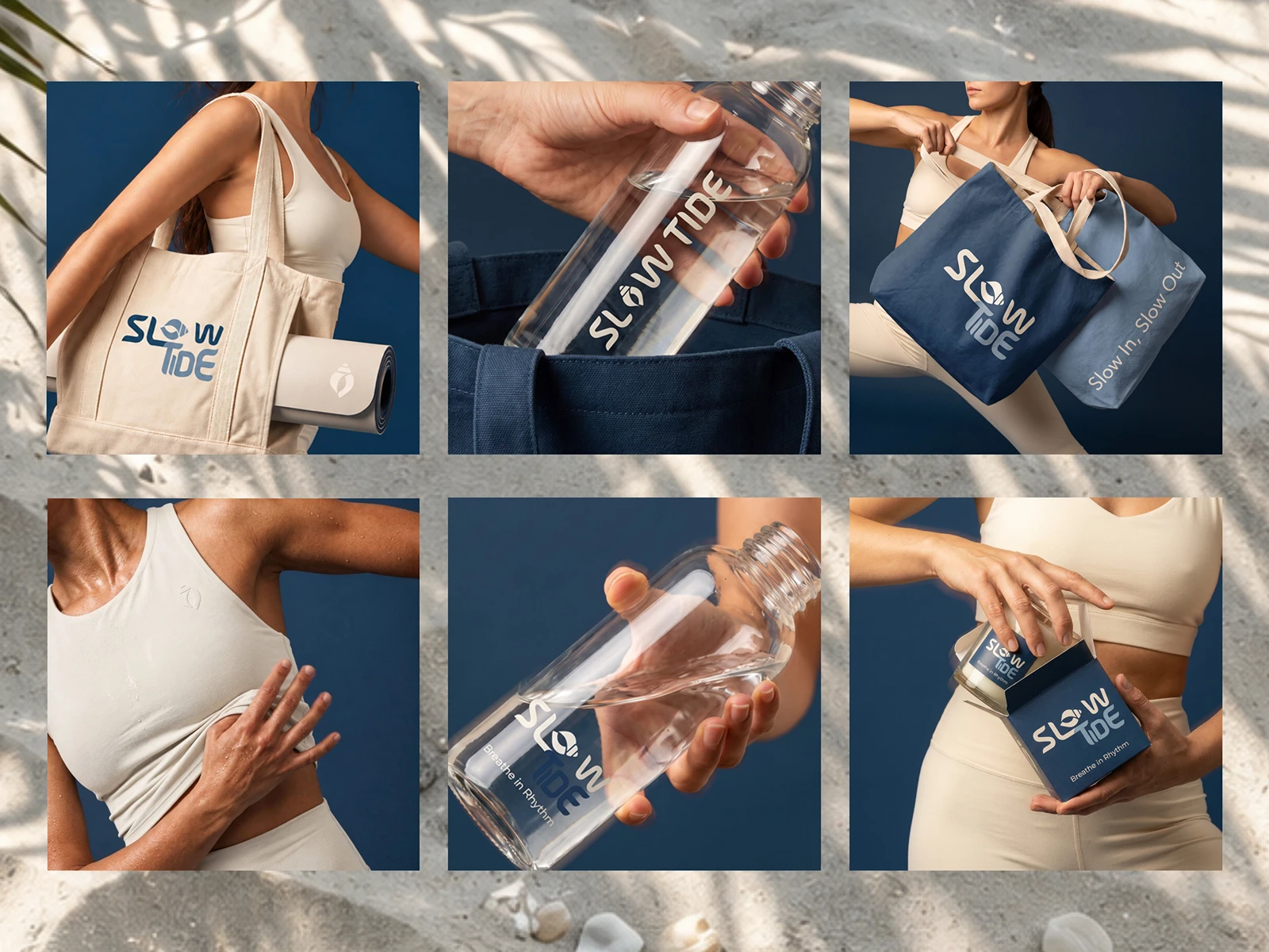
Everyday essentials carrying the brand’s quiet rhythm, from totes and bottles to soft apparel and packaging.
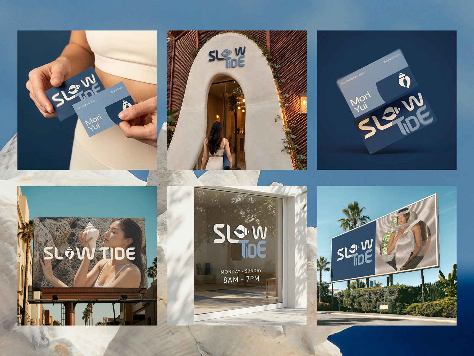
Brand touchpoints in motion, from Business cards and serene storefronts to bold coastal billboards.
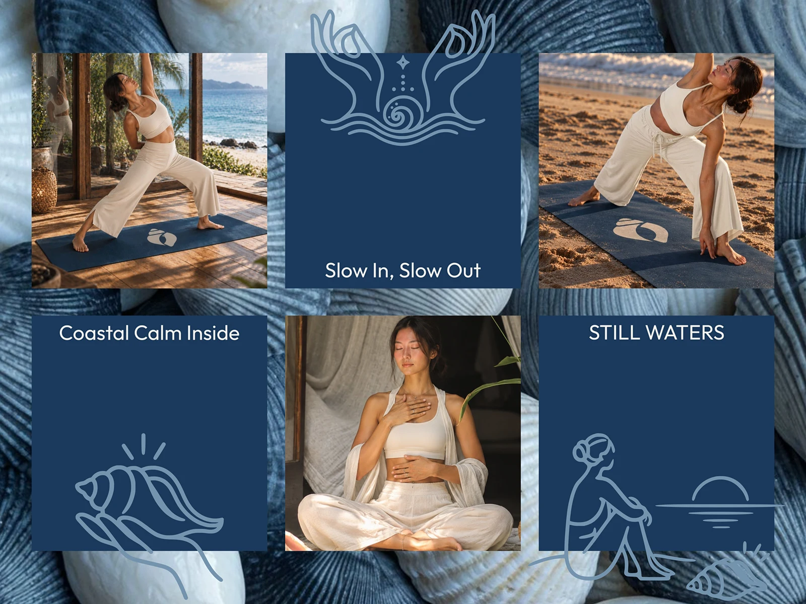
Soft spoken taglines that capture the brand’s quiet rhythm, coastal calm, still waters, and the gentle pace of slow breath.
Thanks so much for taking a look at my work!
If you've made it this far and like my work, I'd be so grateful for your appreciation
Available for branding & packaging projects
Feel free to reach me https://cal.com/rajtanwar/15min
LET'S WORK TOGETHER!
0 likes · 7 views · Sep 24, 2026
A coastal wellness brand inviting you to breathe in rhythm with the tide.


