Built with Kittl
DINK & DRIP - Where the serve meets the sip.

Pradumna Singh Tanwar


The Concept
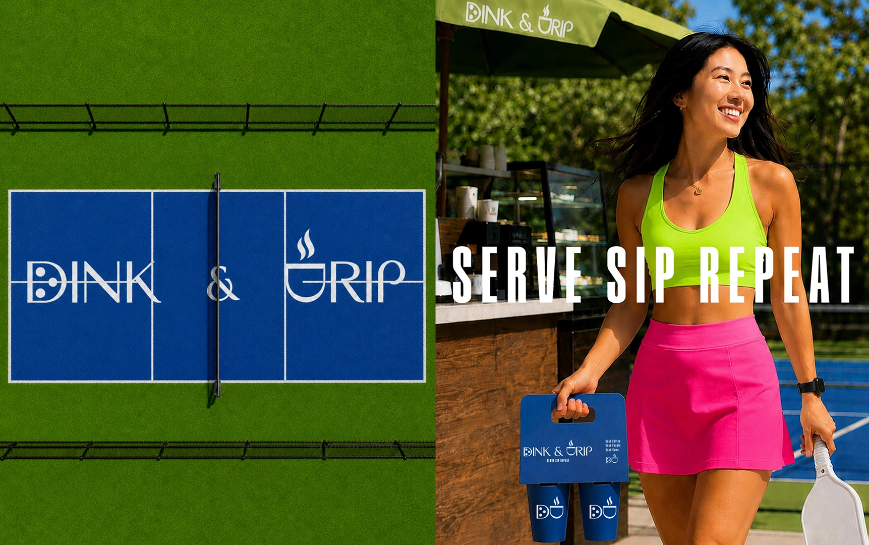
Dink & Drip lives at the intersection of two rituals, the serve and the sip. A brand that blends coffee and pickleball, built for a generation that treats the court like a social club and coffee like a pre game ritual.
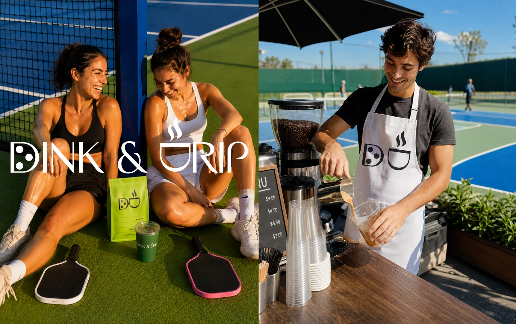
Two rituals, one brand. Built for people who treat the court like a social club and coffee like a pre game ritual.
The Challenge
Build an identity flexible enough to run a full café and court experience, spanning signage, packaging, merch, and lifestyle content, without losing a cohesive visual thread across all of it.
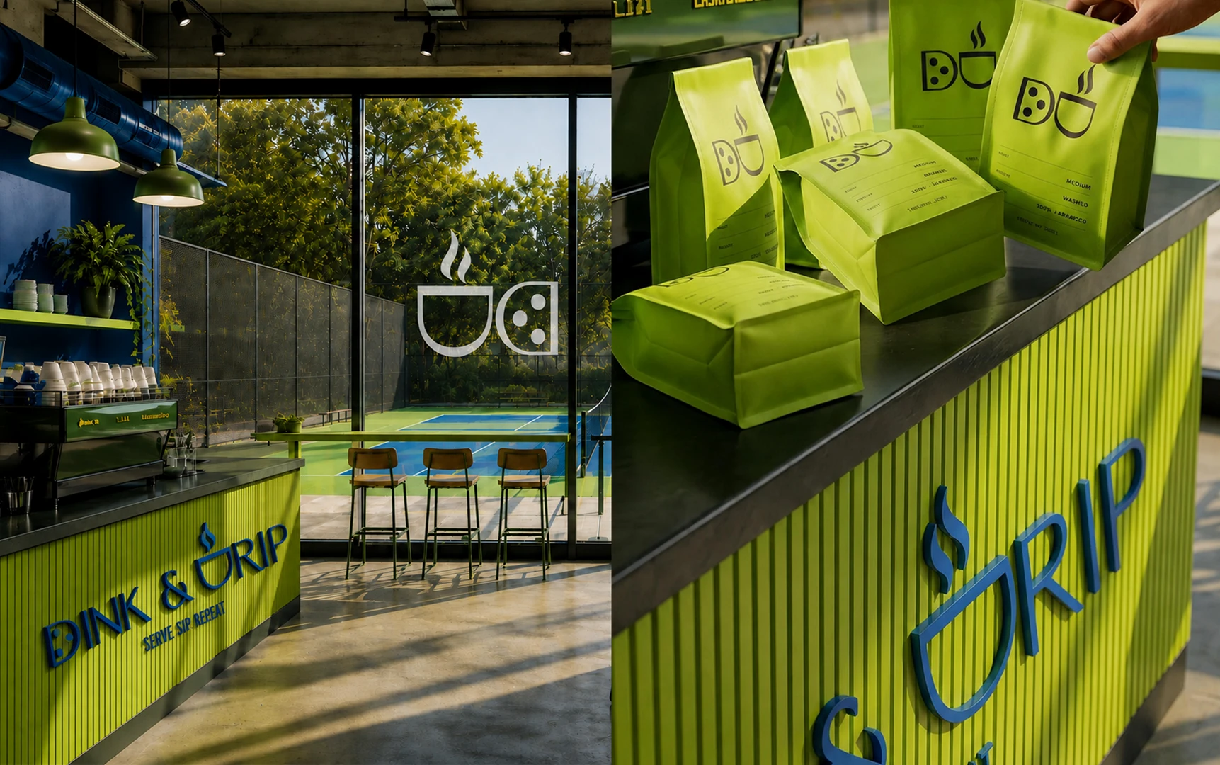
One system, every touchpoint. Signage, packaging, and space, all speaking the same visual language.
The Mark
A custom wordmark and icon system where the brand's two worlds are baked into the letterforms themselves. Both marks start from the same D, one becomes a paddle, the other is rotated and topped with a curl of steam to become a cup. One letter, two rituals, recognizable at cap embroidery scale or painted across an entire court.
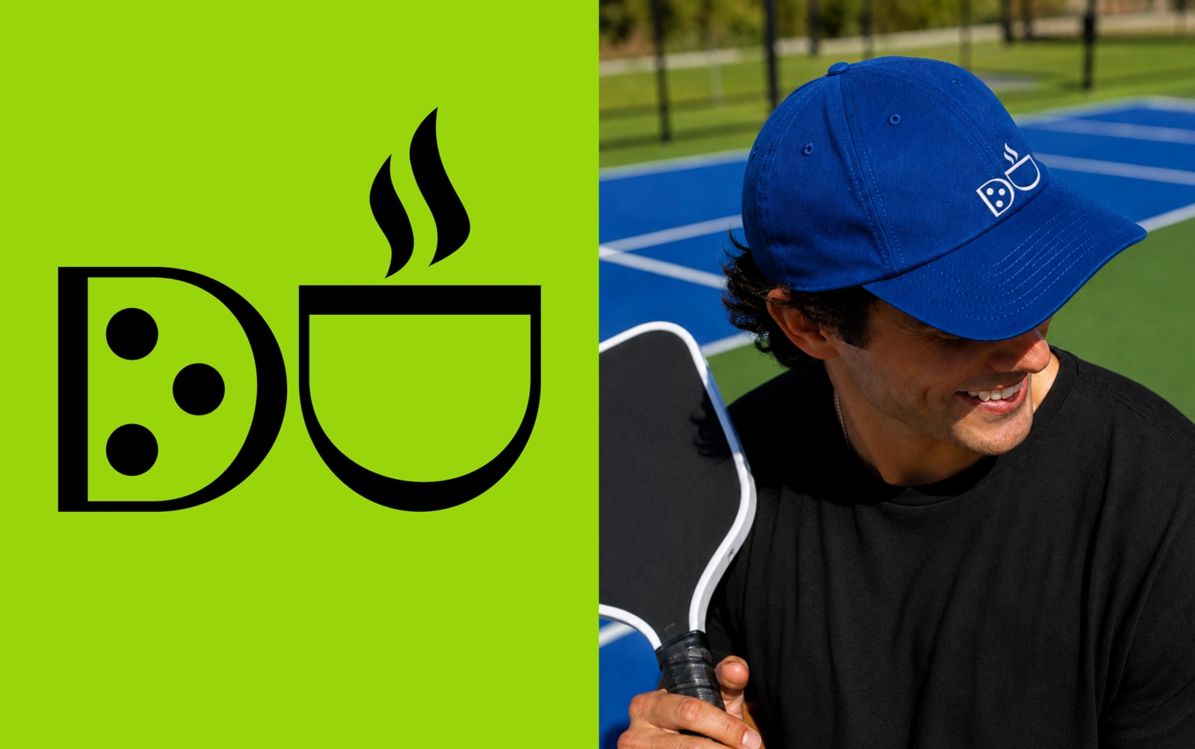
The D does double duty. One half a paddle, the other a cup with a curl of steam.
The System
Color: Cobalt, chartreuse, and forest green, energetic, sporty, unmistakably on court
Typography: A high contrast editorial serif for warmth, paired with the icon for a sportier, condensed application
Tagline: Serve. Sip. Repeat. A two word pun that does double duty as brand voice
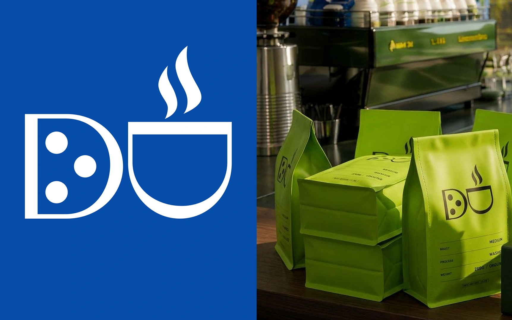
Cobalt, chartreuse, and forest green. An editorial serif paired with a sportier icon mark.
The Applications
From storefront signage and barista aprons to coffee packaging and a literal court branded logo takeover, the identity was built to move fluidly between physical retail, product, and lifestyle content, proving the concept works as hard on a coffee bag as it does on a pickleball court.
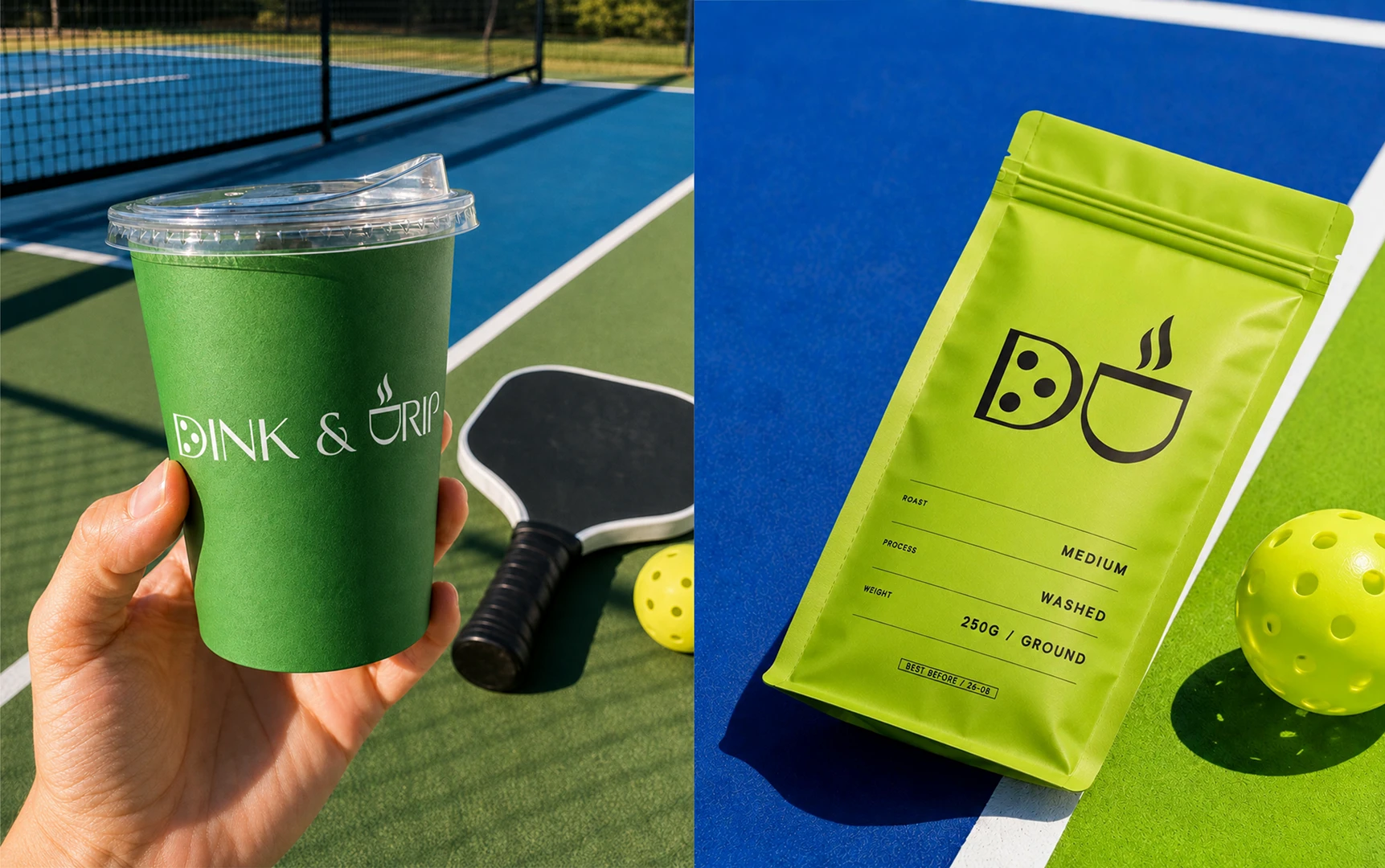
From a coffee bag to a pickleball court, the mark holds up everywhere it lands.
Results
A brand system that does not just illustrate the coffee and pickleball idea. It is the idea, down to the letterforms.
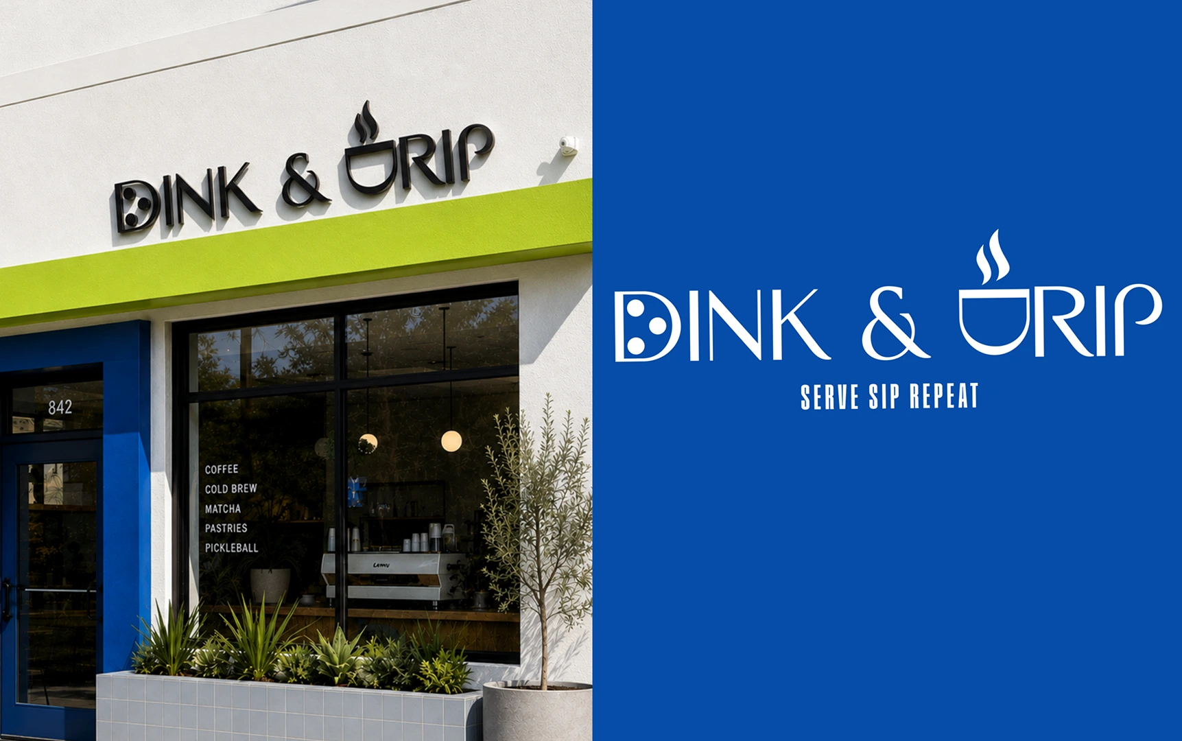
Not just an idea about coffee and pickleball. The idea itself, down to the letterforms.
This one was self initiated, no client, no brief, but the process was not a shortcut. I approached it the way I approach paid work: solve for the whole system, not a single asset, and follow the idea all the way through, from naming logic to a literal court takeover, until every touchpoint carries the same thread.
If your brand needs that kind of thinking behind it, I would love to talk.
Like this project
Posted Aug 31, 2026
Brand identity for a coffee meets pickleball concept, from naming logic to a literal logo takeover on the court itself.