Built with Kittl
Luxe Floral - Brand Identity for a Contemporary Lifestyle Label

Pradumna Singh Tanwar


About Luxe Floral
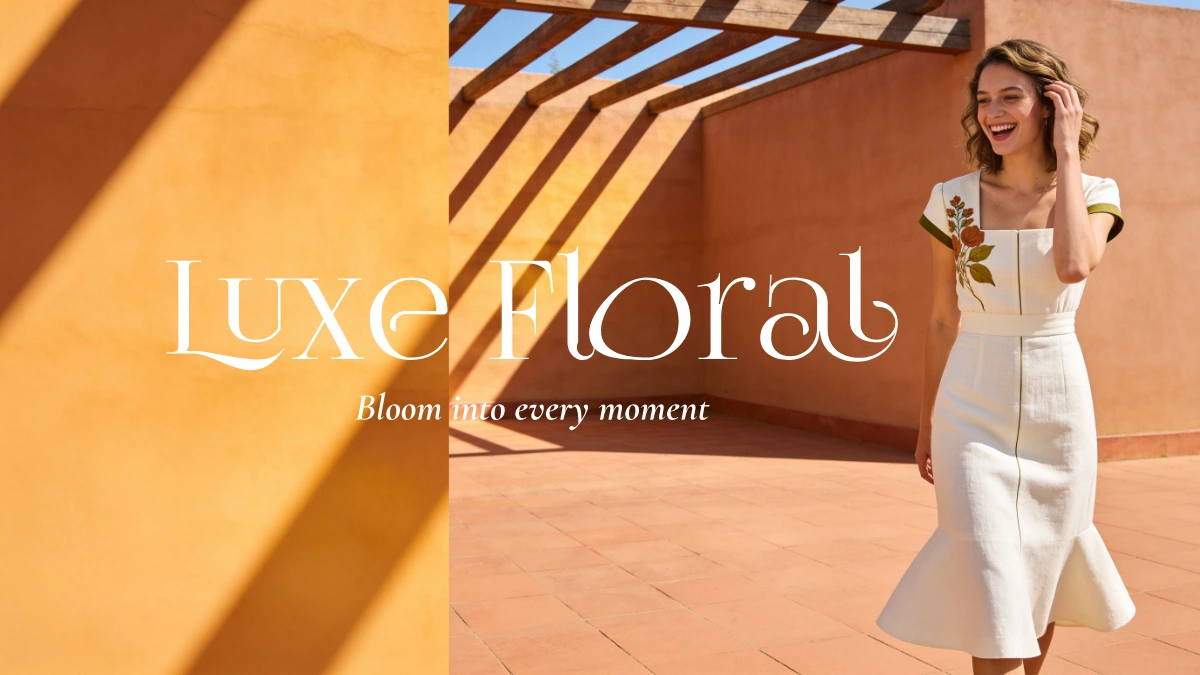
Luxe Floral is a contemporary clothing and accessories brand that transforms botanical artistry into enduring fashion for everyday life. Drawing from boho, European, tropical, and classic influences, the brand celebrates nature through refined design, premium craftsmanship, and understated elegance - reimagined for how modern women actually dress, live, and move through their day.
Rather than committing to one single aesthetic or season, Luxe Floral moves fluidly across occasions - vacation, daily wear, office, date night, celebration - while staying anchored to one philosophy: botanical beauty, expressed with restraint. Every piece, from ready-to-wear to bags, is designed to feel curated, considered, and effortlessly wearable.
The Challenge
The floral fashion market is saturated with two extremes: overly literal, all-over floral prints that read as costume rather than clothing, or minimalist brands that strip botanical influence out entirely in the name of "quiet luxury." Few brands hold the middle ground - expressive without excess, botanical without becoming decorative.
The challenge was to build a brand identity flexible enough to move across multiple style languages - boho, European, tropical, classic - without losing a consistent point of view, and disciplined enough that even bold prints still read as premium rather than loud.
The identity needed to translate cleanly across a full wardrobe: dresses, co-ords, suiting, swimwear, and bags - for a customer who wants variety without sacrificing taste.
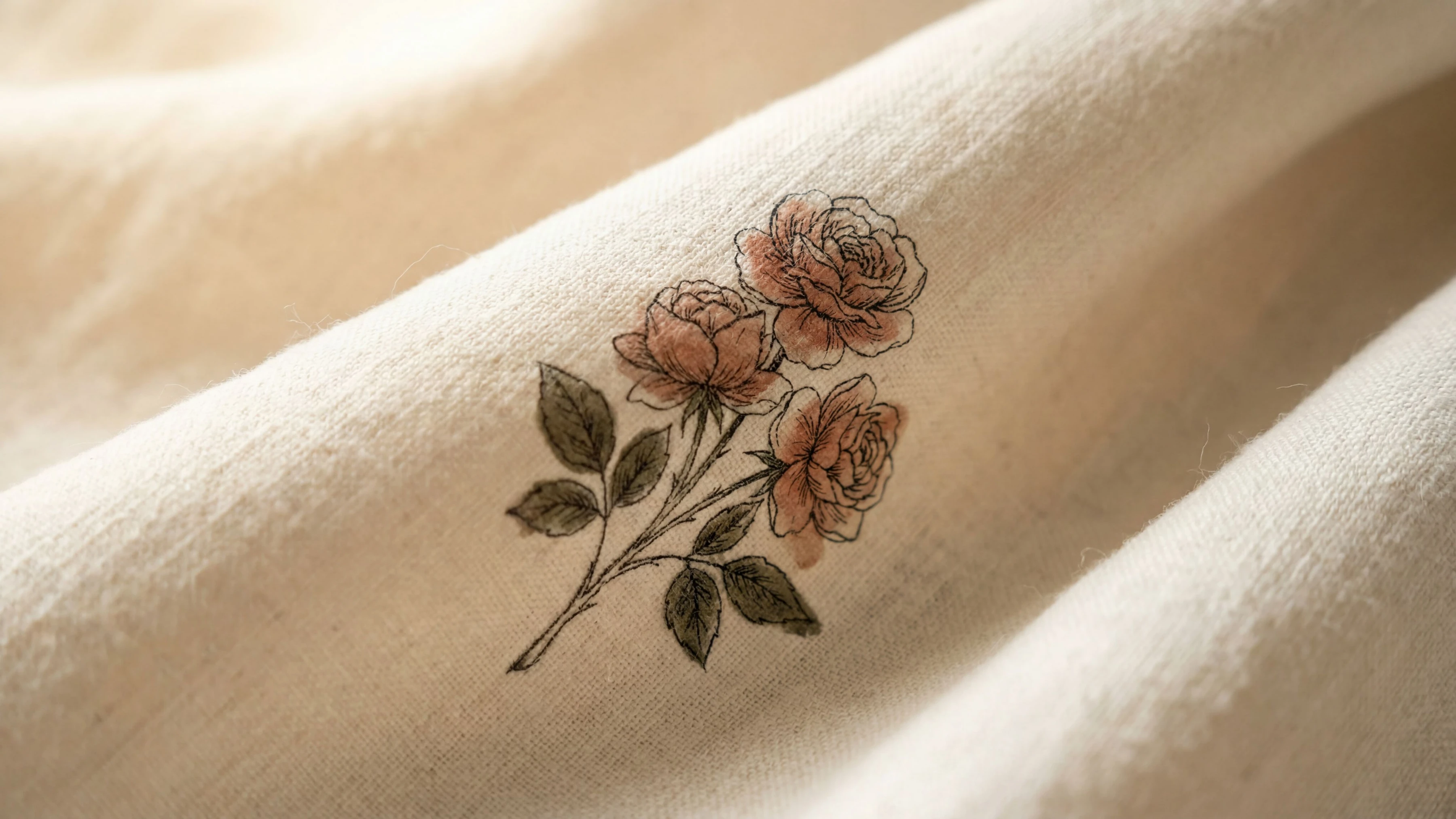
A single hand-illustrated botanical cluster - proof of the brand's 'hero placement' philosophy: botanical, never busy.
The Solution
The identity system was built around one governing rule: botanical, never busy.
Whether a print is a single placed floral moment on open negative space, or a tonal all-over pattern in restrained illustrated linework, every design follows the same discipline-muted, cohesive color families, hand-illustrated rather than photo-realistic florals, and natural matte fabrics over anything glossy or synthetic-looking. This is what lets the brand move across boho, European, tropical, and classic references while still feeling like one label.
The wordmark stays independent of any single print direction-a refined serif logotype with botanical-inspired curves, deliberately without illustrated flowers, so it works as a clean signature across every category and collection to come.
The result is a brand that can flex across mood and occasion while remaining instantly recognizable as Luxe Floral.
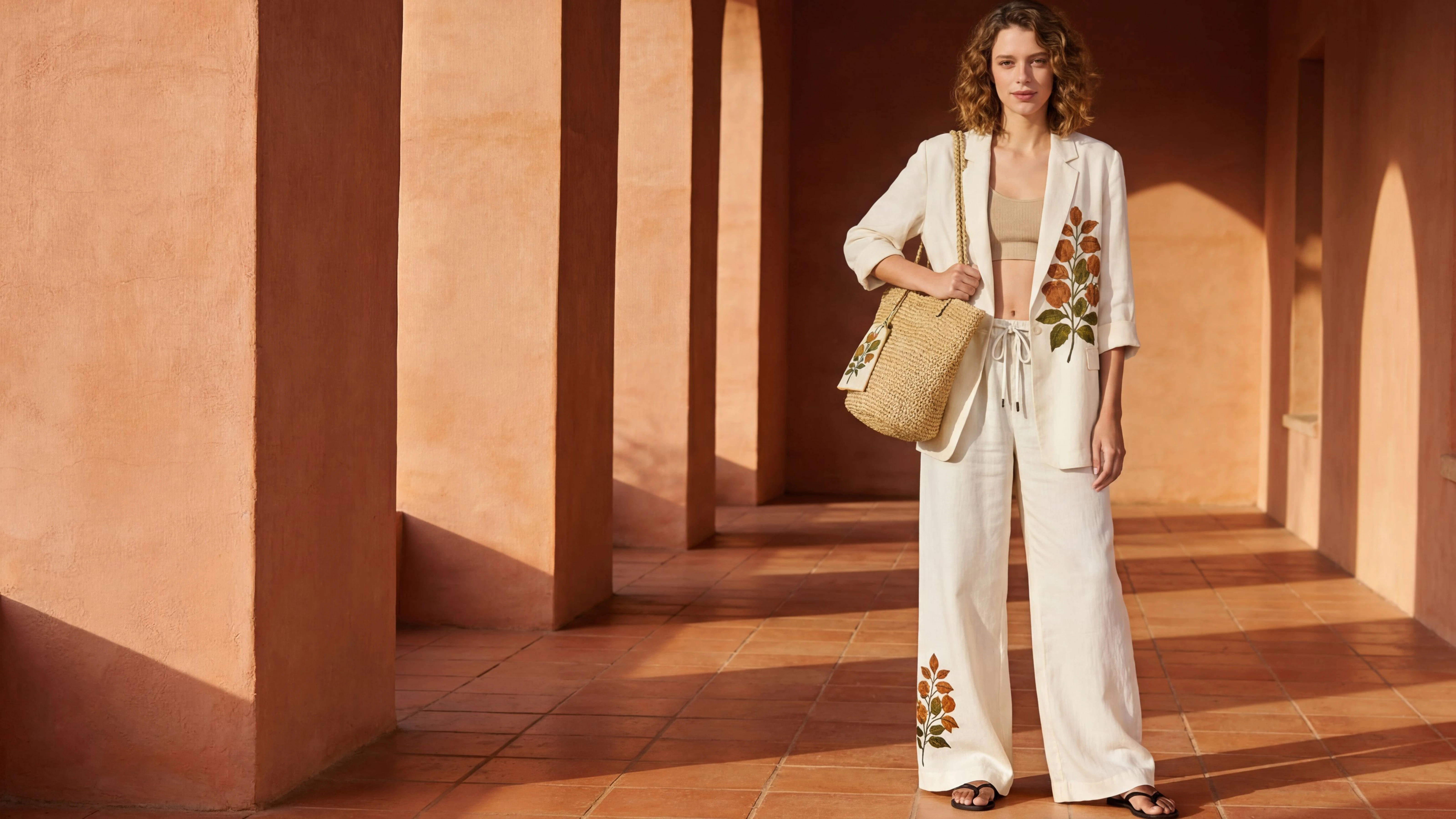
One rule, one placement - the floral moment does the talking, the rest stays quiet
Identity Strategy
Logo
The identity includes three core lockups - a primary wordmark, a secondary stacked version, and a circular sticker/badge mark - each built in both full black and full white for maximum flexibility across packaging, embroidery, stamping, and single-color print applications. This restraint-first approach to the logo system means it can sit cleanly on any print or color story the collections introduce, without ever competing with the product.
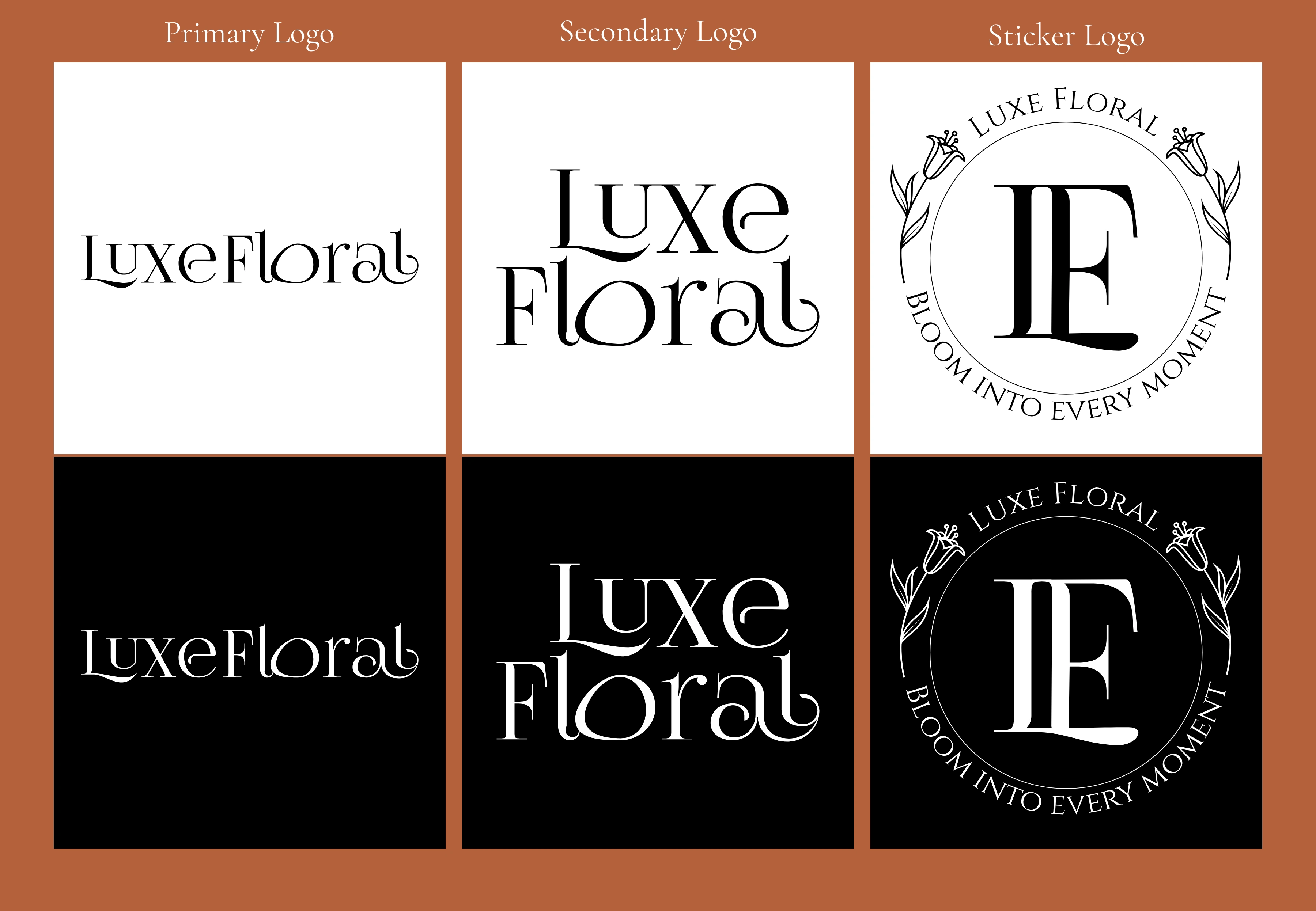
One system, endlessly flexible - primary, secondary, and sticker marks in full black and white.
Color Palette
The palette is intentionally restrained to three tones, each versatile enough to carry the brand across its full stylistic range: Terracotta Clay, a warm grounded anchor that moves naturally between boho, tropical, and European moods; Ivory Linen, a warm neutral base that keeps every collection feeling calm and considered; and Deep Olive, the botanical anchor, muted rather than seasonal.
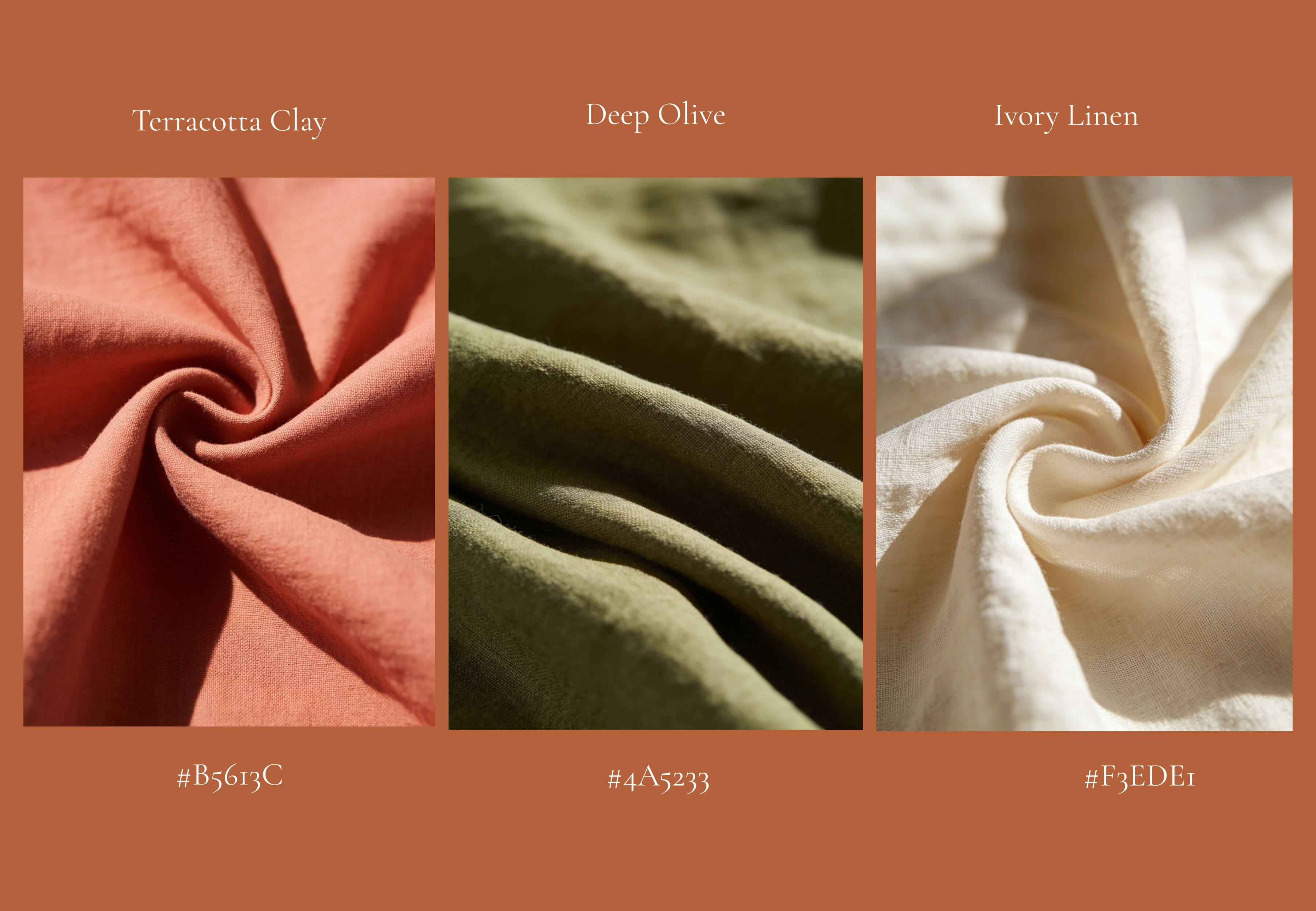
Terracotta Clay, Deep Olive, Ivory Linen - a palette drawn from fabric, not just a screen.
Typography
The wordmark is set in a customized, hand-vectorized adaptation of Cinzel Decorative - its Roman-inspired structure and ornamental detail reinforce the brand's editorial, heritage-leaning character, reserved exclusively for the logo itself.
Cormorant Garamond carries the brand's expressive typographic moments: taglines set in a delicate italic, and headlines or section titles set upright for clarity. Montserrat, a clean geometric sans-serif, handles everything functional - body copy, product tags, and packaging details - ensuring legibility wherever the text needs to work hardest, without introducing a third competing style.
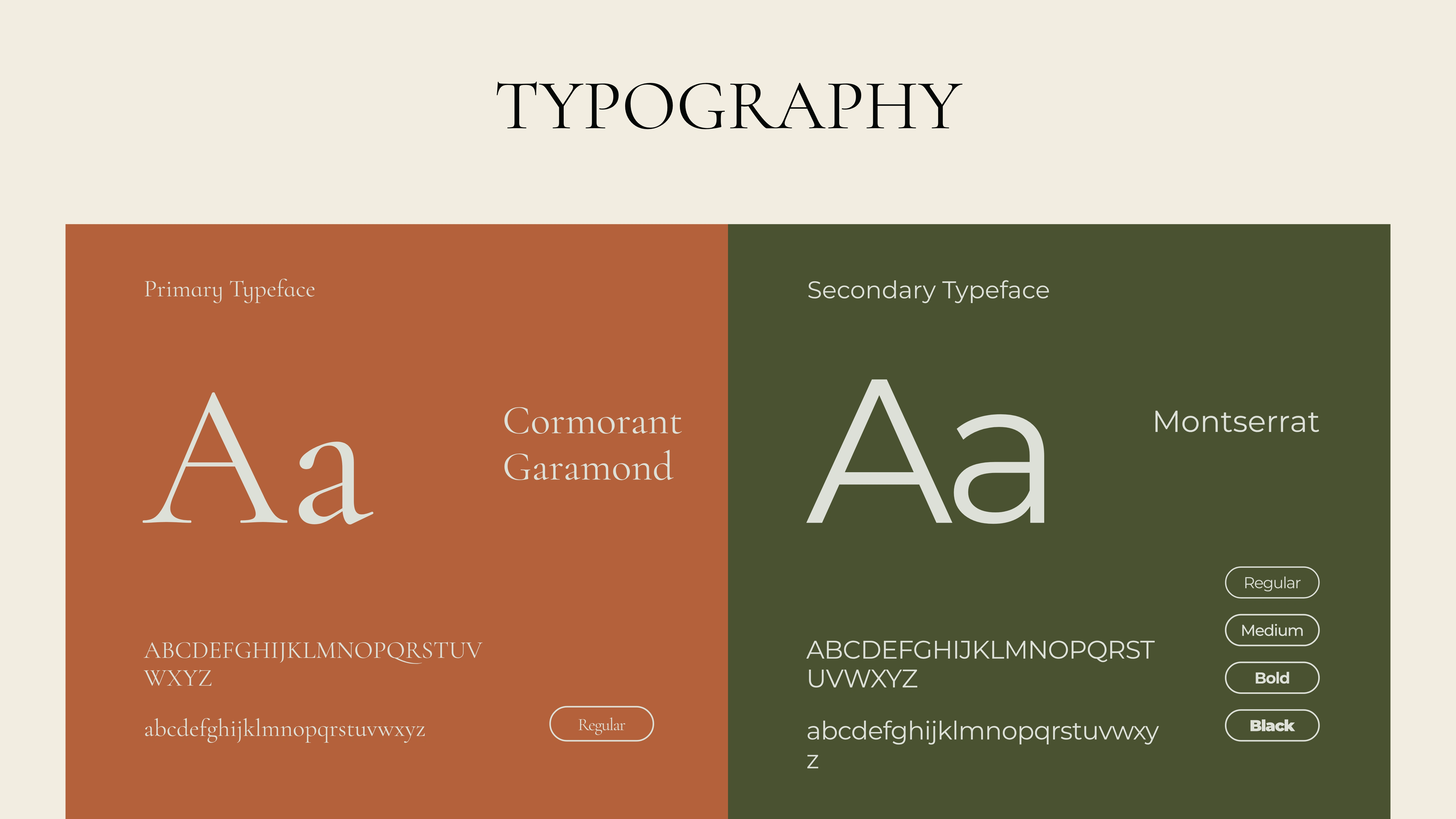
Three roles, one restrained system: Cinzel Decorative for the mark, Cormorant Garamond for voice, Montserrat for clarity.
Brand in action
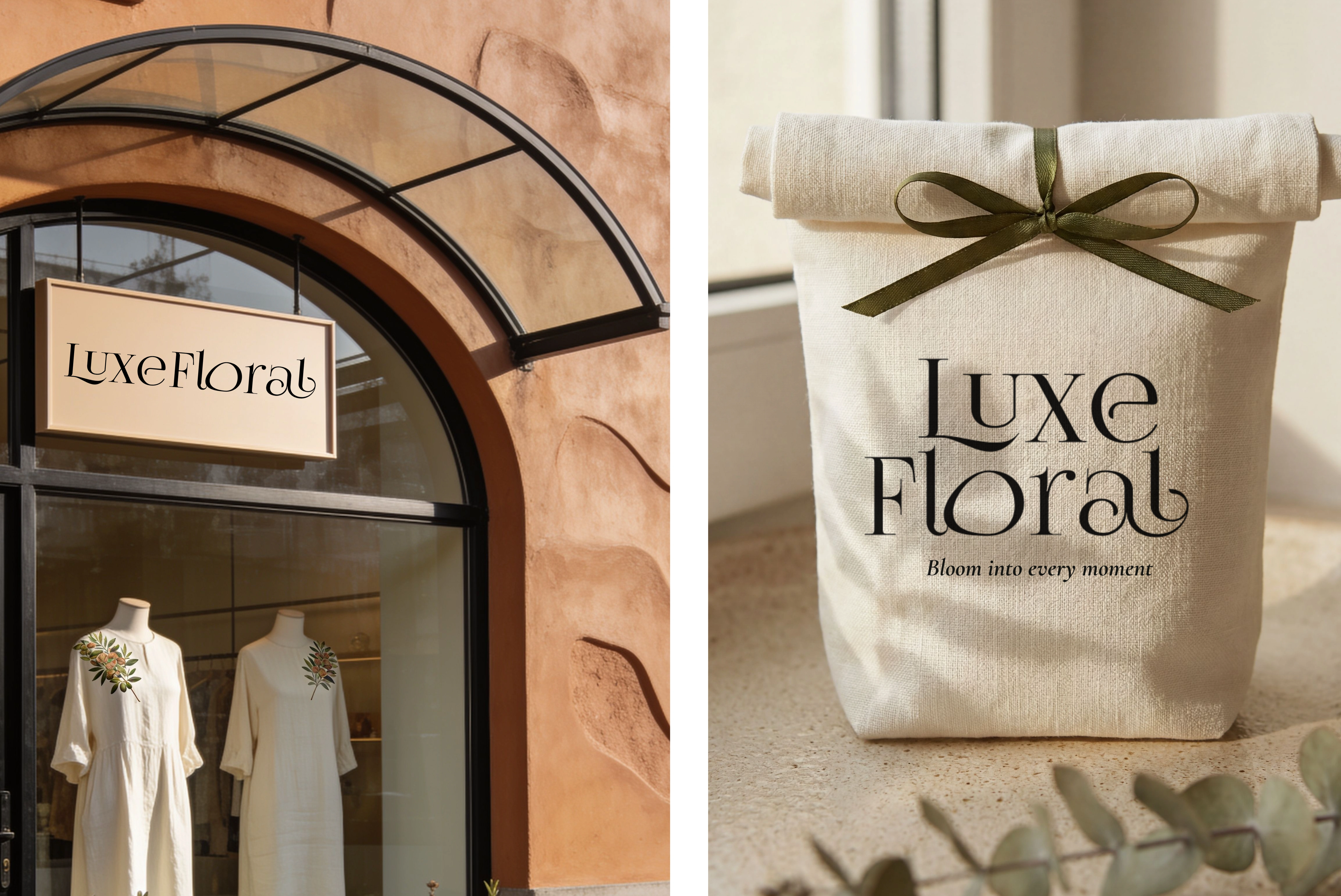
From storefront to sendoff - the same quiet confidence, wherever the brand shows up.
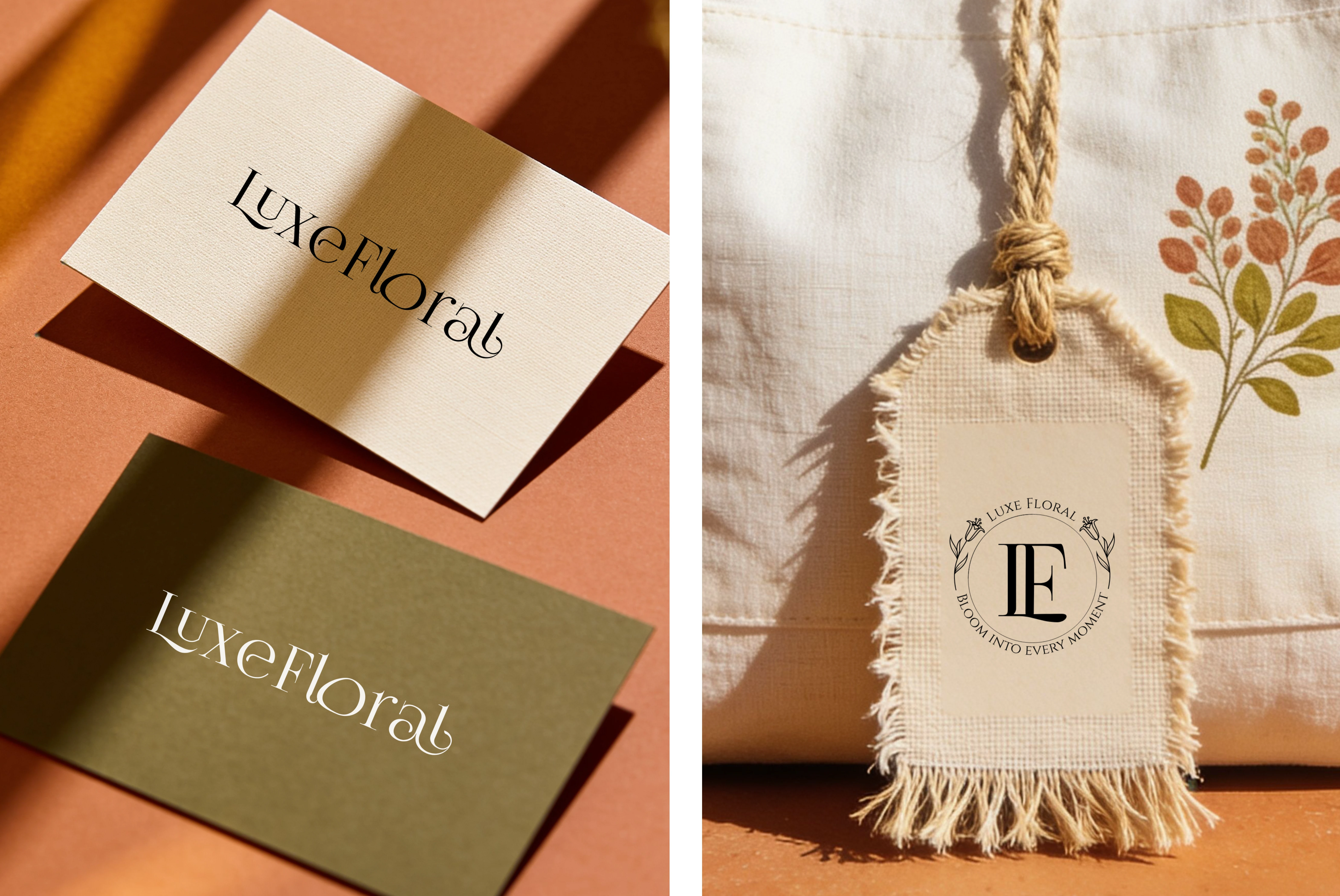
Two tones, one identity - the palette holds whether it's in your hand or on your wrist.
Visual Direction
The photography embraces editorial storytelling over conventional product photography - natural light, uncluttered composition, and a single garment or botanical detail as the visual focus in any given frame. Across boho, European, tropical, and classic references, the throughline is restraint: rich texture and considered styling stand in for visual excess, establishing Luxe Floral as a premium lifestyle brand rather than a seasonal trend piece.
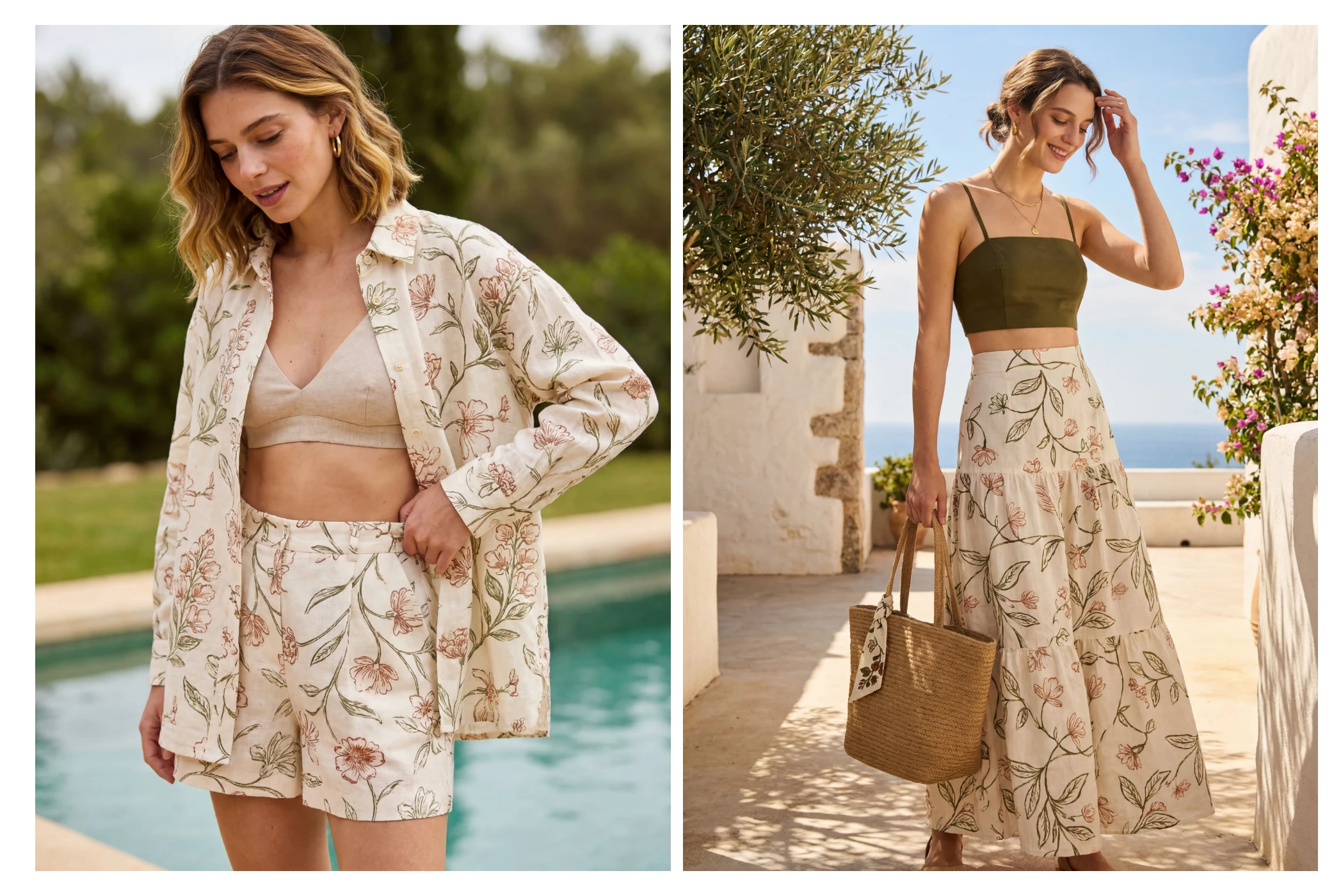
Two shores, one signature - botanical print carried from poolside to coastline.
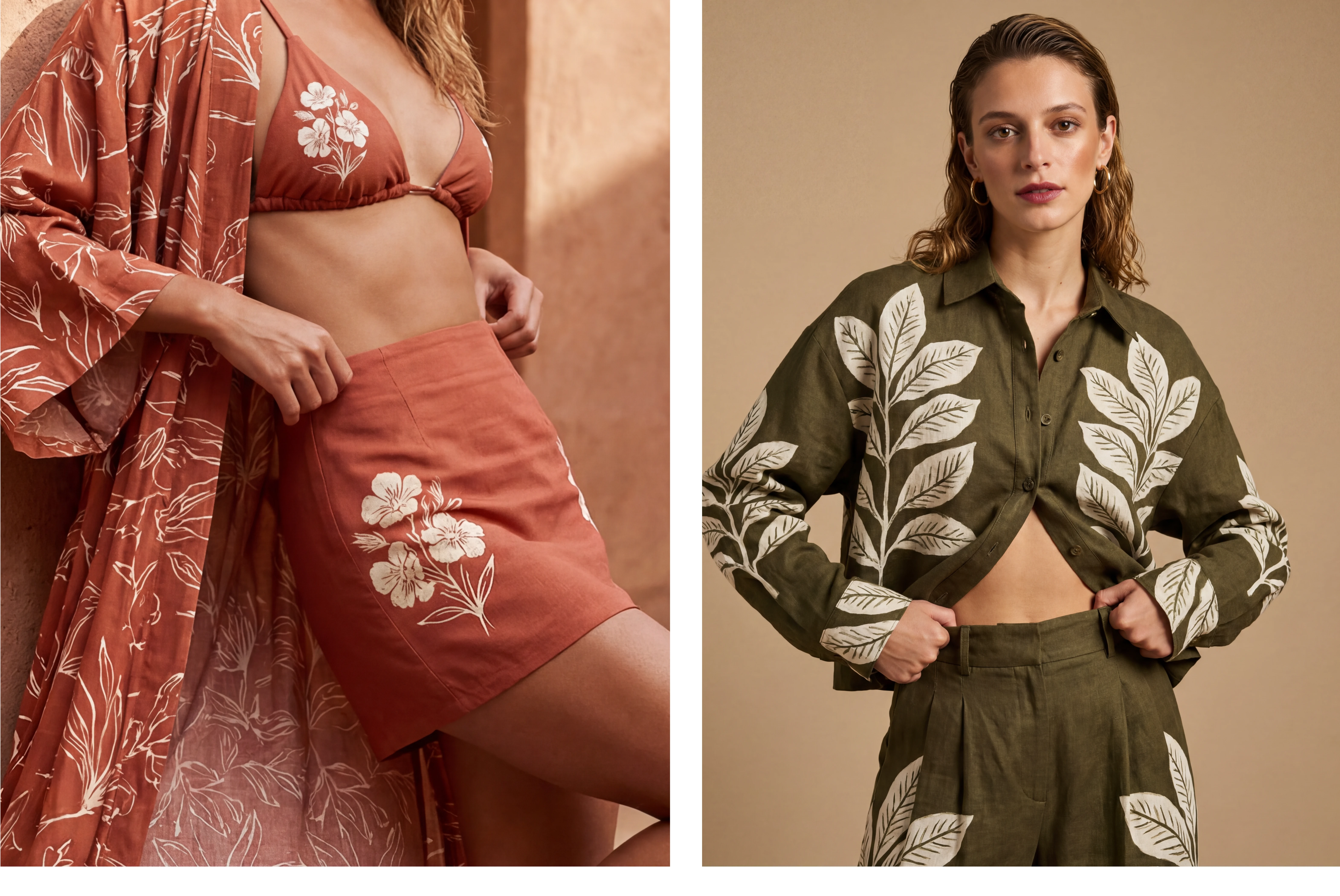
Up close: where the botanical detail becomes the jewelry.
The Result
Luxe Floral began as a question: could a botanical identity feel considered rather than decorative - expressive without ever becoming loud? The answer became a full system, one built to move as fluidly as the women who wear it, from a quiet morning to a bold evening, without ever losing its signature.
This is the kind of thinking I bring to every brand I work with: strategy first, restraint as a design principle, and a system built to last longer than a single season.
Interested in building something this considered together? Let's talk.
Like this project
Posted Jul 5, 2026
Logo, palette, print system, and campaign visuals built on restraint.