Dreamlamp - App🏫
The preschool of your dreams where you will learn everyday life lessons
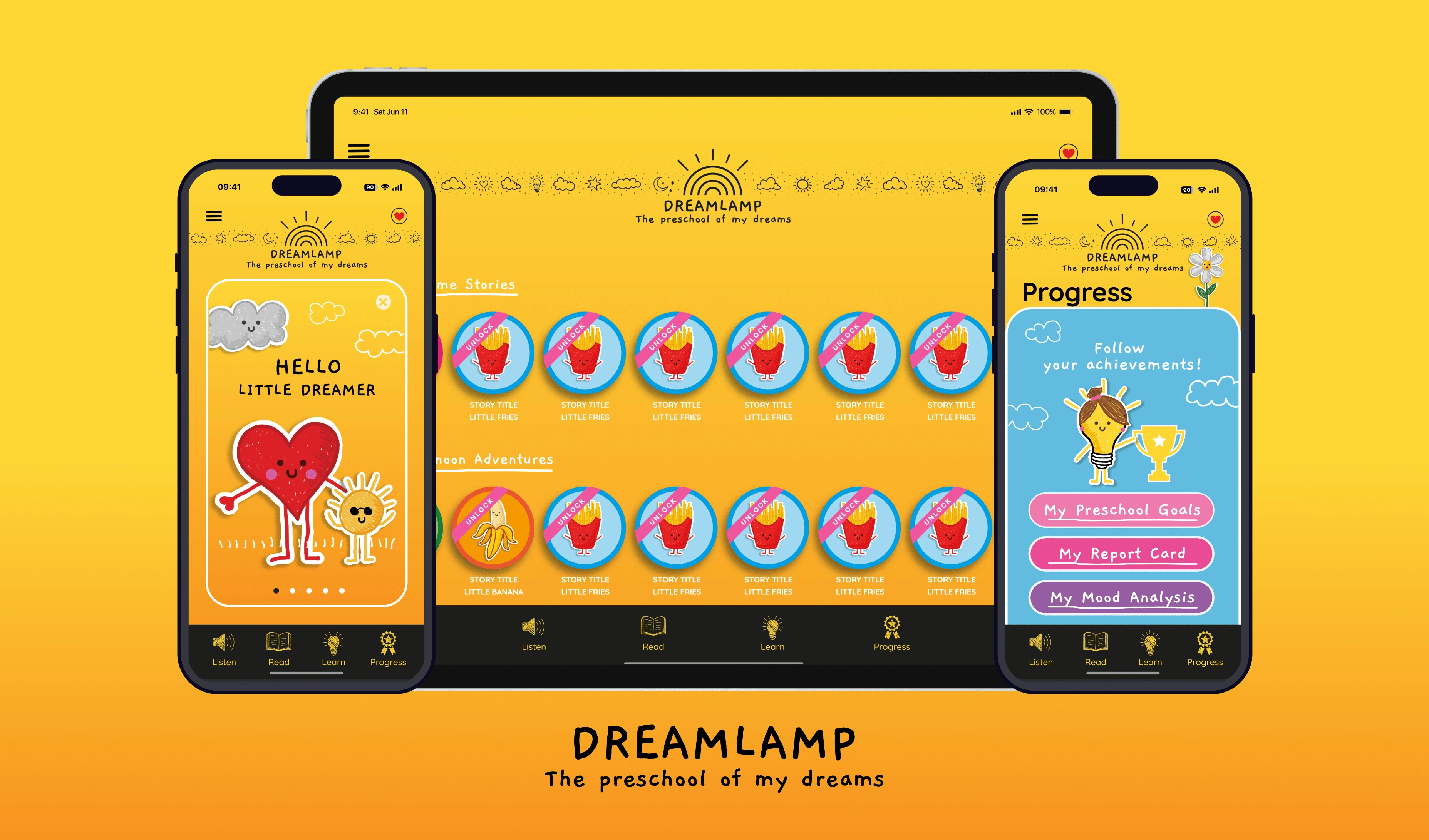
Dreamlamp Cover
Role
UX Designer
UX Researcher
Tools
Figma - FigJam,
Google Suite,
Adobe Illustrator
Responsibilities
User Research,
Identify Missing Flows,
Refining Design,
Prototyping
Team
1 Designer (Me),
1 Product Manager,
4 Engineers
Overview
Dreamlamp is a learning app for toddlers and preschoolers. My responsibility was to complete the designs for the mobile and tablet experience. I had the assets and inspirational screens provided by the stakeholders. My primary task was to identify any gaps in user flows and complete the designs for all possible flows. We targeted two screens size mobile and tablet.
My Approach
We followed a lean approach to tackle the challenge. Starting with understanding the stakeholder's vision and ideas. Then, we crafted user flows to identify gaps in the current defined experience. I conducted experiments to test and refine ideas. Created a layout system that facilitated design for different screen sizes.
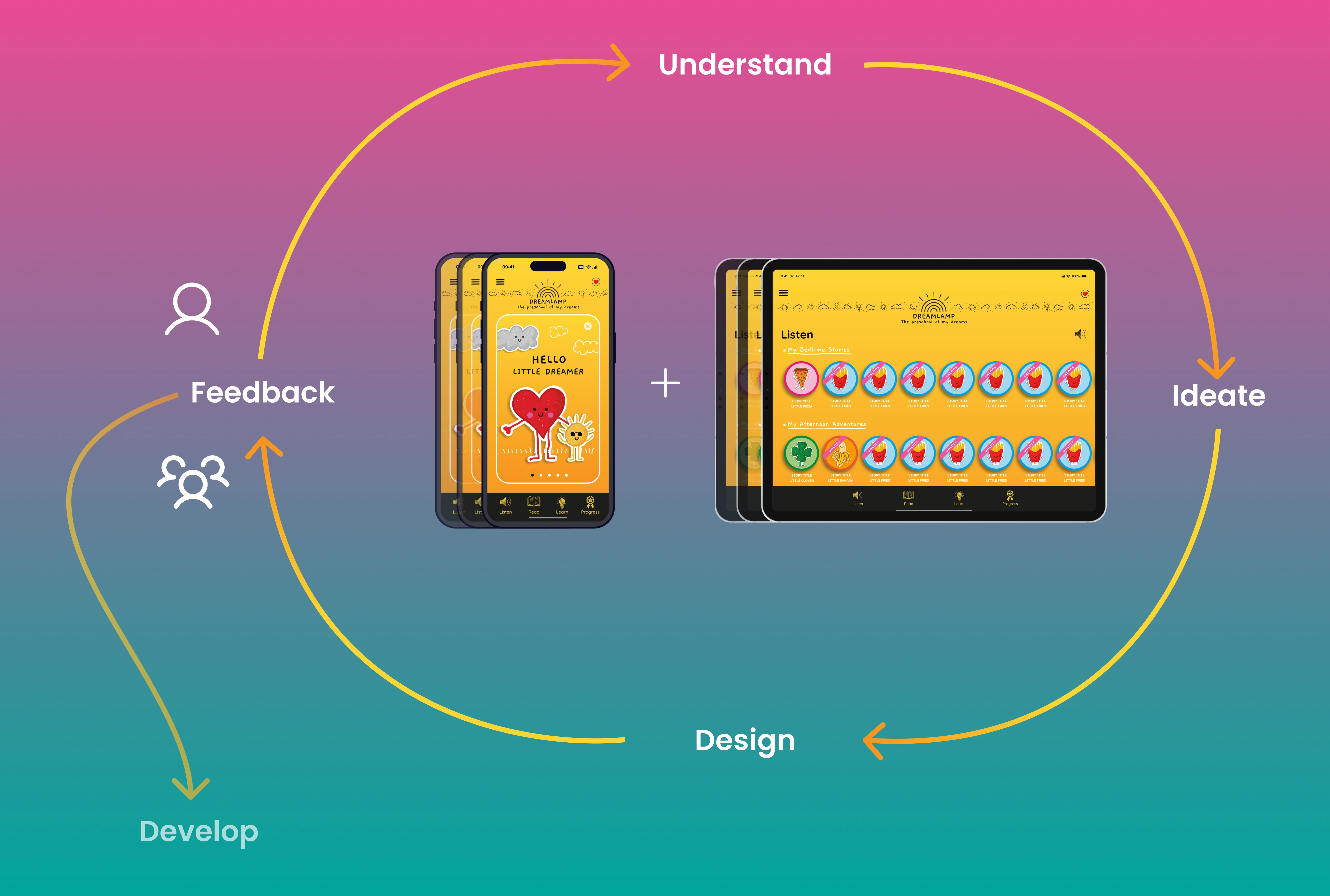
Approach
Experimenting with layouts
In response to identified user flow gaps, we undertook a thoughtful exploration of screen layouts catering to different device sizes. For mobile devices, we prioritized a streamlined single-column layout, emphasizing central content placement. Transitioning to tablets, we adopted a three-column format with the core content retained in the center column, flanked by side columns housing illustrations to optimize negative space. To ensure a seamless and consistent user experience, we implemented a scaling mechanism for complex components.
Mobile to tablet layout switch
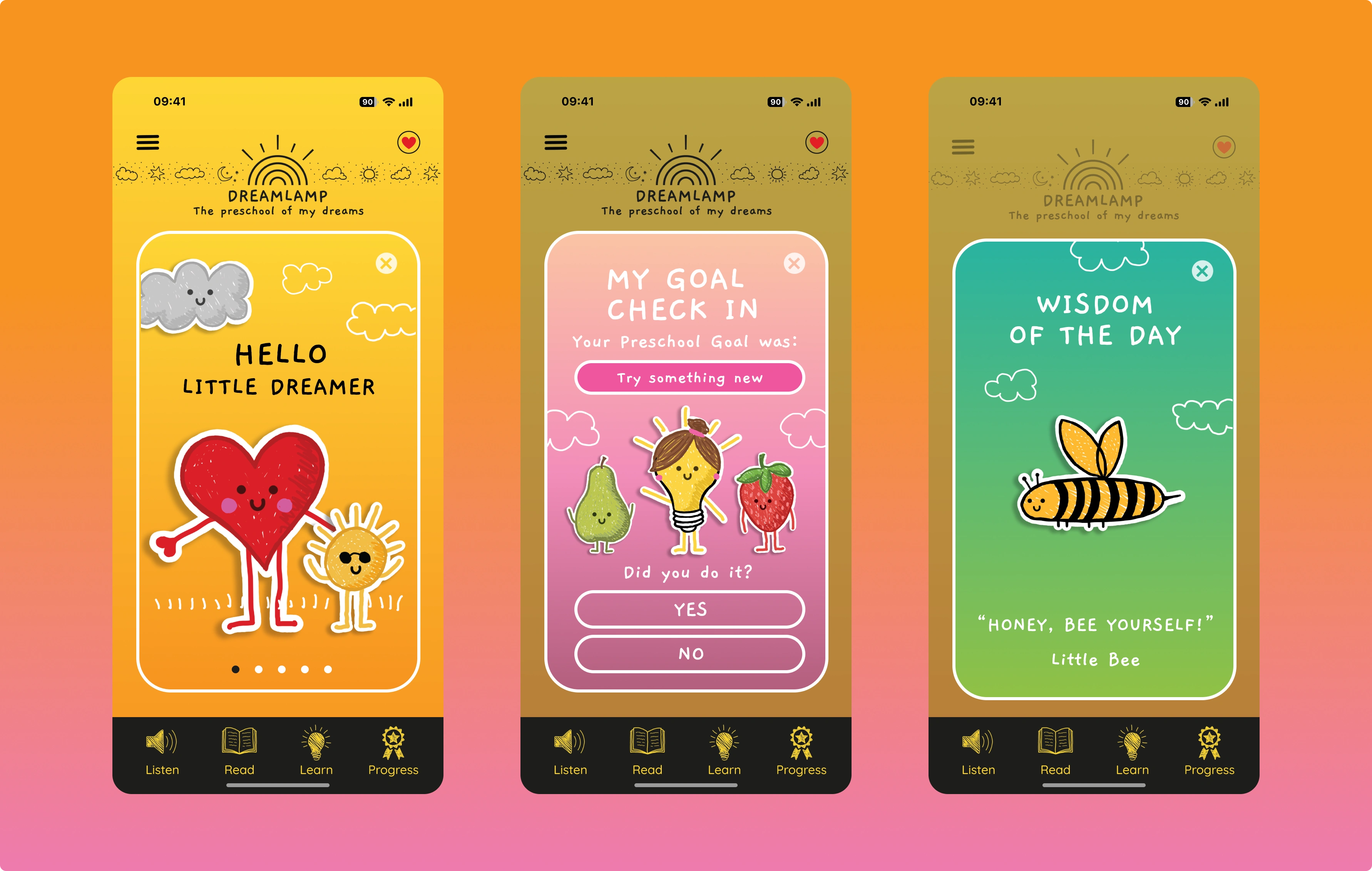
Some designed work
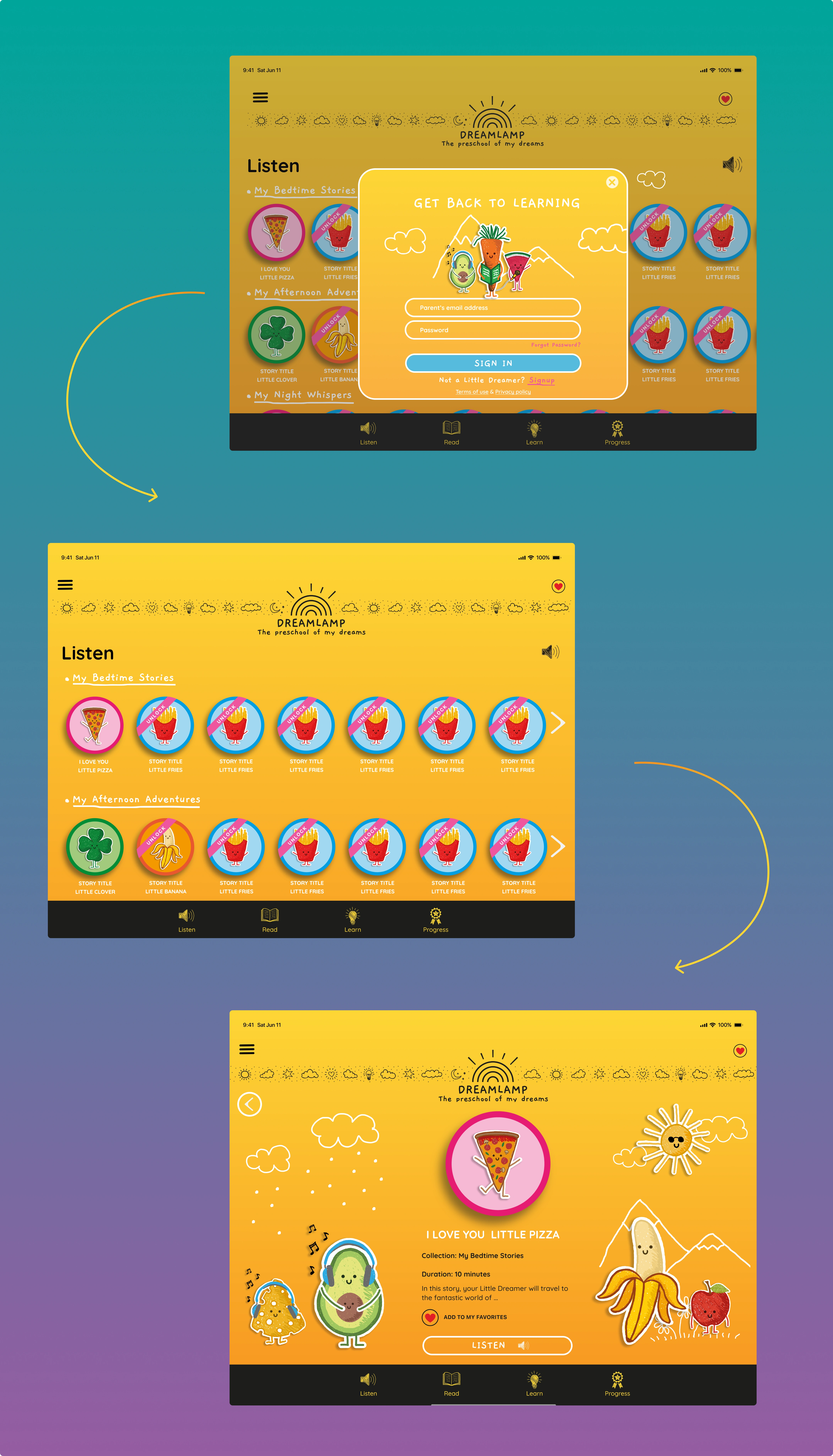
Tablet designs
If you want a more details on this project, then
Ready to transform ideas into exceptional user experiences? Let's connect and elevate your ux or product designs!
Like this project
Posted Oct 9, 2023
Dreamlamp is a learning app for toddlers. My responsibility was to convert the design inspirations to functional designs through strategic refinement.

