CINIMAX - UX Case Study 📽
Crafting an intuitive process for the reservation of seats digitally
Showcase-Cinimax
Role
UX Designer
UX Researcher
Tools
Figma - FigJam
Google Suite
JamboardWhimsical
Responsibilities
Ideation
User Research
User Interviews
Wireframing
Usability Studies
Prototyping
Problem
Reserving seats of choice is not possible with the current solutions.
Solution
Design an app that makes the seat reservation process easy and intuitive.
Overview
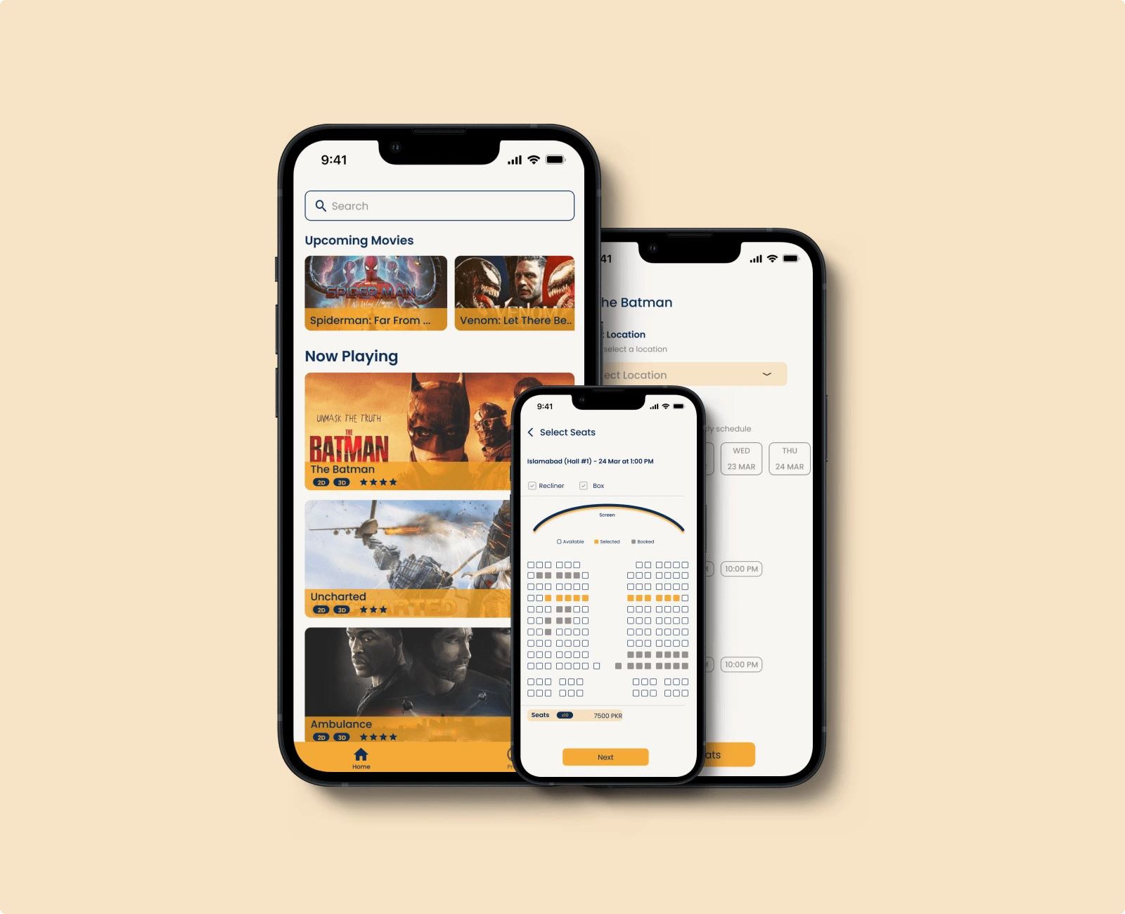
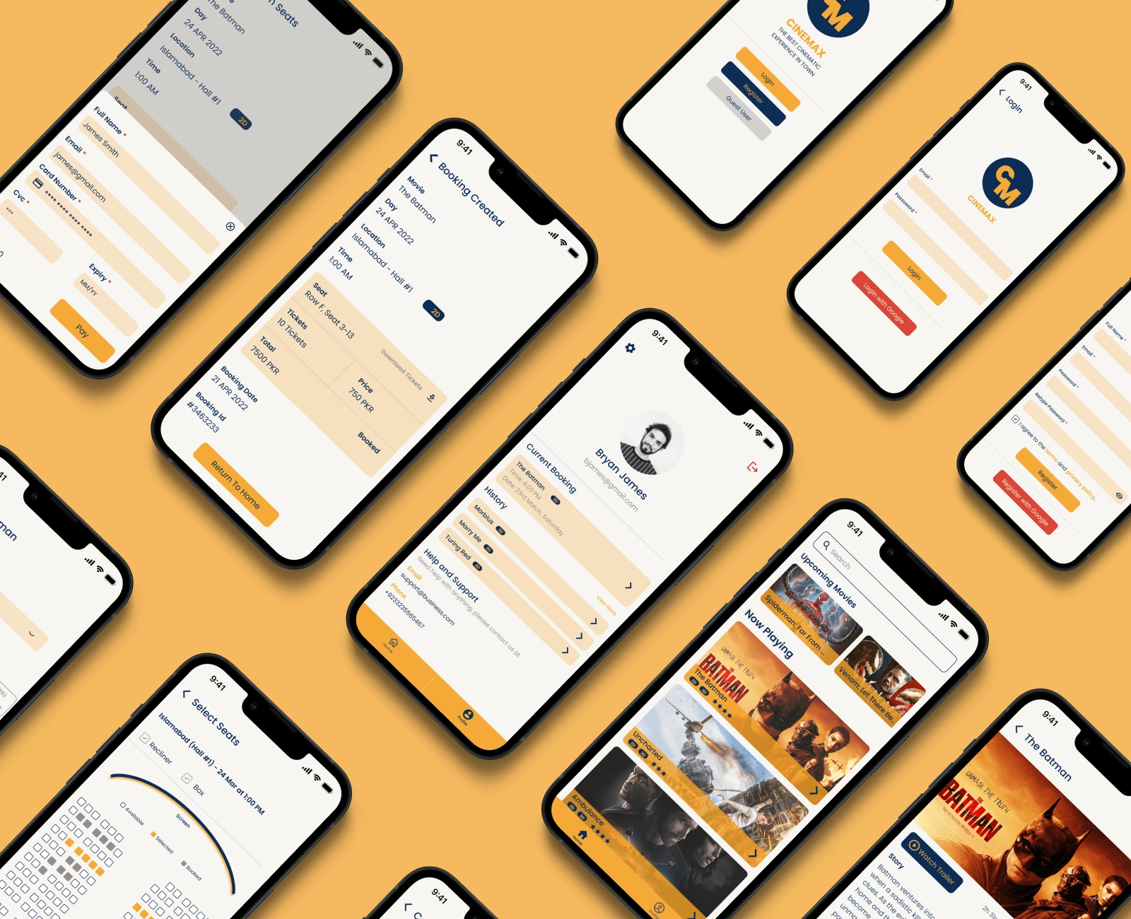
I designed a user-friendly app that not only provided digital tickets and booking history but also simplified the seat selection process. I designed an intuitive interface that allowed moviegoers to view real-time seat availability and visualize the theater layout.
Wireframes
After finalizing the planned features, I sketched out initial screens on paper to visualize the app's views. Using the digital wireframes I added more depth to explored layouts, element positioning, and overall screen organization. Through this iterative process, I was able to experiment, improve, and fine-tune the designs.
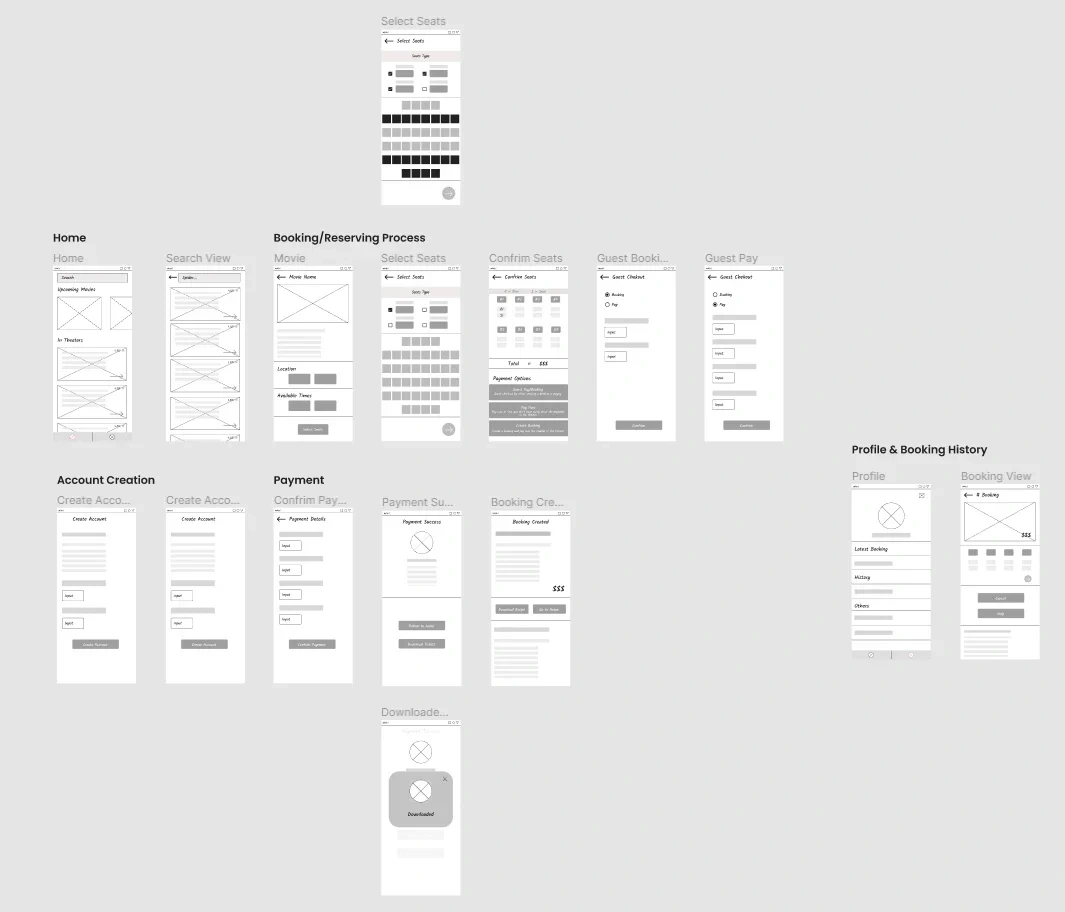
Digital Wireframes
App Design
I started refining the UI for the app after testing my designs with users and getting information from a usability study on a low-fidelity prototype. I created the UI for all screens in the core flow.
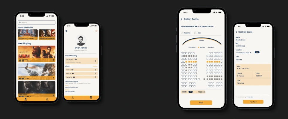
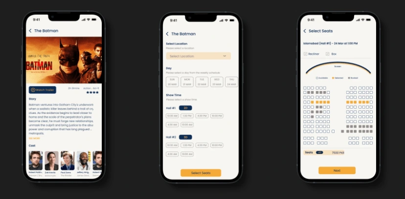
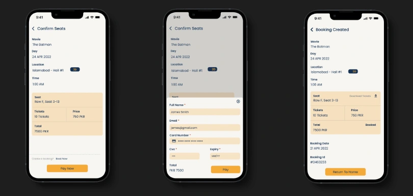
End To End Flow - Reserving Seats
By consistently working on the designs, I successfully completed the core flow of seat reservations, which encompassed the entire process from listing to selecting and reserving seats
If you want a more details on this project, then click here!
click here!
Ready to transform ideas into exceptional user experiences? Let's connect and elevate your ux or product designs!
Like this project
Posted Jul 18, 2023
Crafting an intuitive process for the reservation of seats digitally by designing an app that makes the seat reservation process easy and helpful.

