Mutable AI's Landing - Redesigned 🔮
Abdullah Qureshi
Redesigning the Mutable AI's landing page to enhance and elevate the user experience.
Cover Image
Disclaimer: I want to clarify that this project was undertaken solely as a learning exercise, and I have no affiliations or prior work experience with Mutable AI. The main purpose was to explore ways to improve the website and conduct a UX audit. While I don't have any direct association with Mutable AI, the analysis and insights presented in the audit are based on genuine efforts to enhance the user experience.
Role
UX Designer
UI Designer
Tools
Figma
Pitch
Responsibilities
UX Audit
Wireframing
Design System,
UI Design
Prototyping
Overview
Re-designing the website for simpler navigation, clear content hierarchy, and improved visual design.
Highlights
Re-organized site content based on its significance while improving visual design for many elements.
Maximizing user engagement, the re-designed website eliminated the need for new page openings, ensuring an uninterrupted access to valuable information.
Problem
The current landing page faces challenges in establishing a clear content hierarchy, navigation, and information about the products of the company hindering a good experience.
Solution
Establishing a clear content hierarchy, simpler navigation, and improving the visual design.
Content Hierarchy
Reorganize content on the page so that it presents important information clearly.
Simpler Navigation
Remove nested navigation, new page openings and retaining the user on the landing.
Visual Design
Work on improving the visuals of the elements to make them more aesthetic.
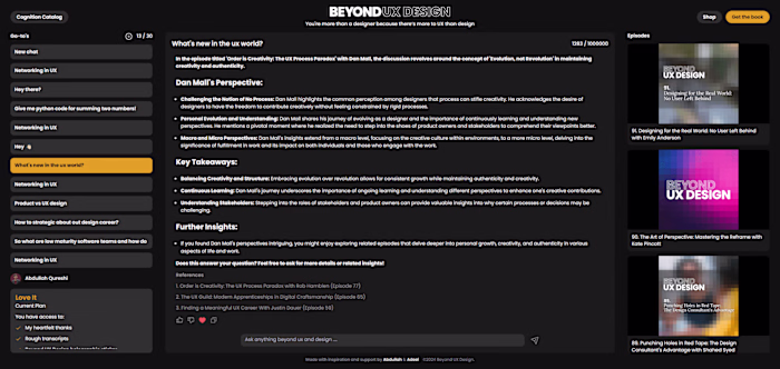
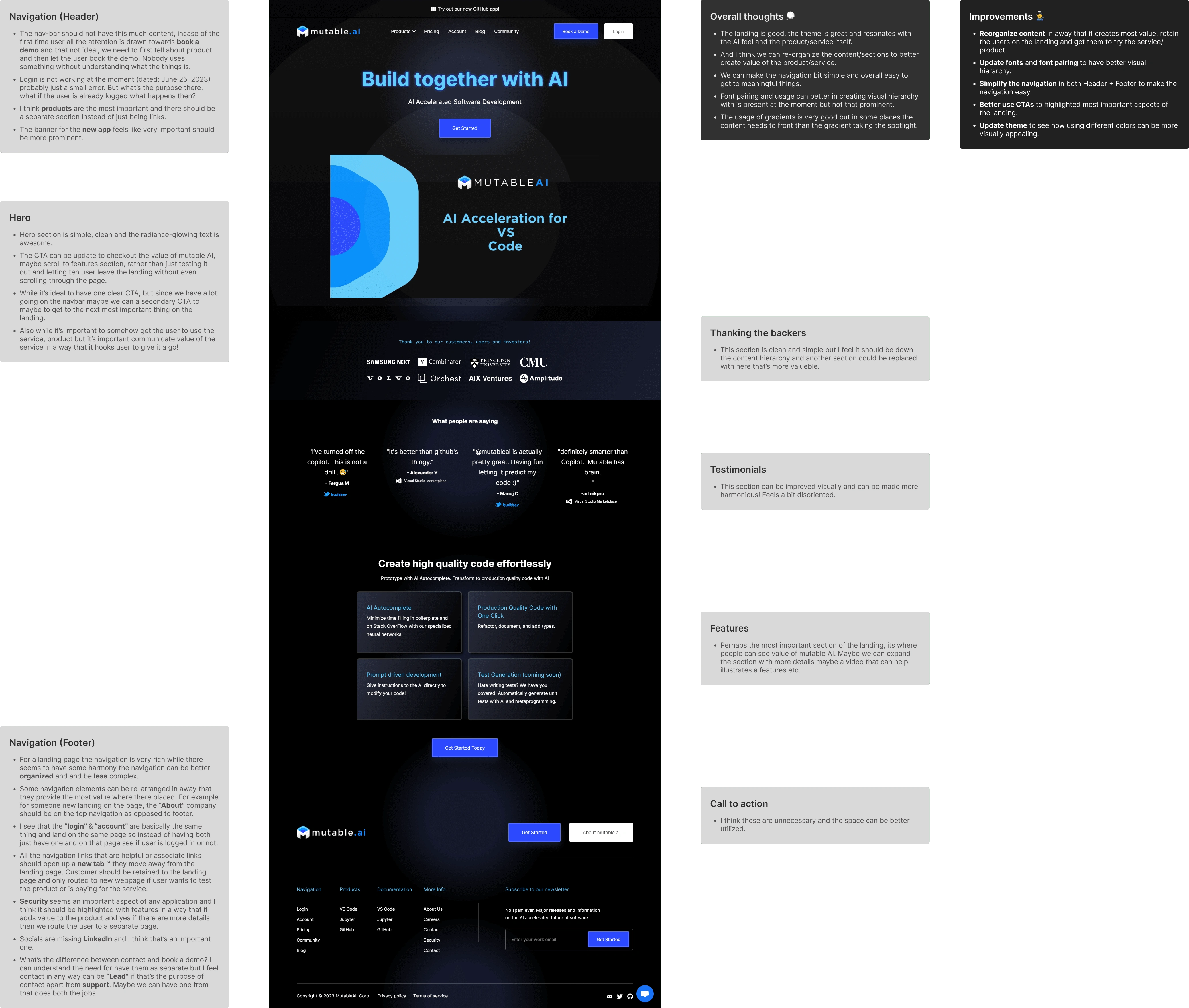
UX Audit
I conducted a UX audit of Mutable AI's current landing page to find areas for improvement and enhance the overall user experience. My focus was on how a new user, particularly someone knowledgeable about the subject, would understand the landing page and find what they're looking for.
UX Audit Image
Summarized Insights
Reorganize content in away that it creates most value, retain the users on the landing and get them to try the service/product.
Have a better visual hierarchy by updating fonts.
Simplify the links in both Header + Footer to make the navigation easy.
Better use CTAs to highlighted most important aspects of the landing.
Wireframing
After the UX audit was complete, I started with masking the current landing UI and from there worked on three variations for landing, these variation had changes in content hierarchy and information present on the site.
I tried to see how the flow of information could be the most effective, keeping that in mind the following hierarchy made the most sense initially.
Hero -> Features -> Products -> Backers & Users -> Contact
Wireframes
Design
I had three things in mind while working on the designs
Rearranging sections in the content hierarchy
I used the existing hierarchy to identify gaps and helped with identifying missing information. A few new sections were added while re-arranging some sections to better present important information with the goal of retaining the user of the landing.
Making the navigation simpler
I removed the nested links in the navigation and removed unnecessary links from both the header and the footer.
Visual enhancement
I revamped key page elements, making them visually striking while maintaining brand identity coherence, elevating the overall landing's aesthetics.
Presentation Video
Landing Page Design - Full
Features Section
Created products and pricing sections in the landing as they felt important to retain the user on the landing and provide information that could get them to try out the Mutable AI's magic.
Products Section
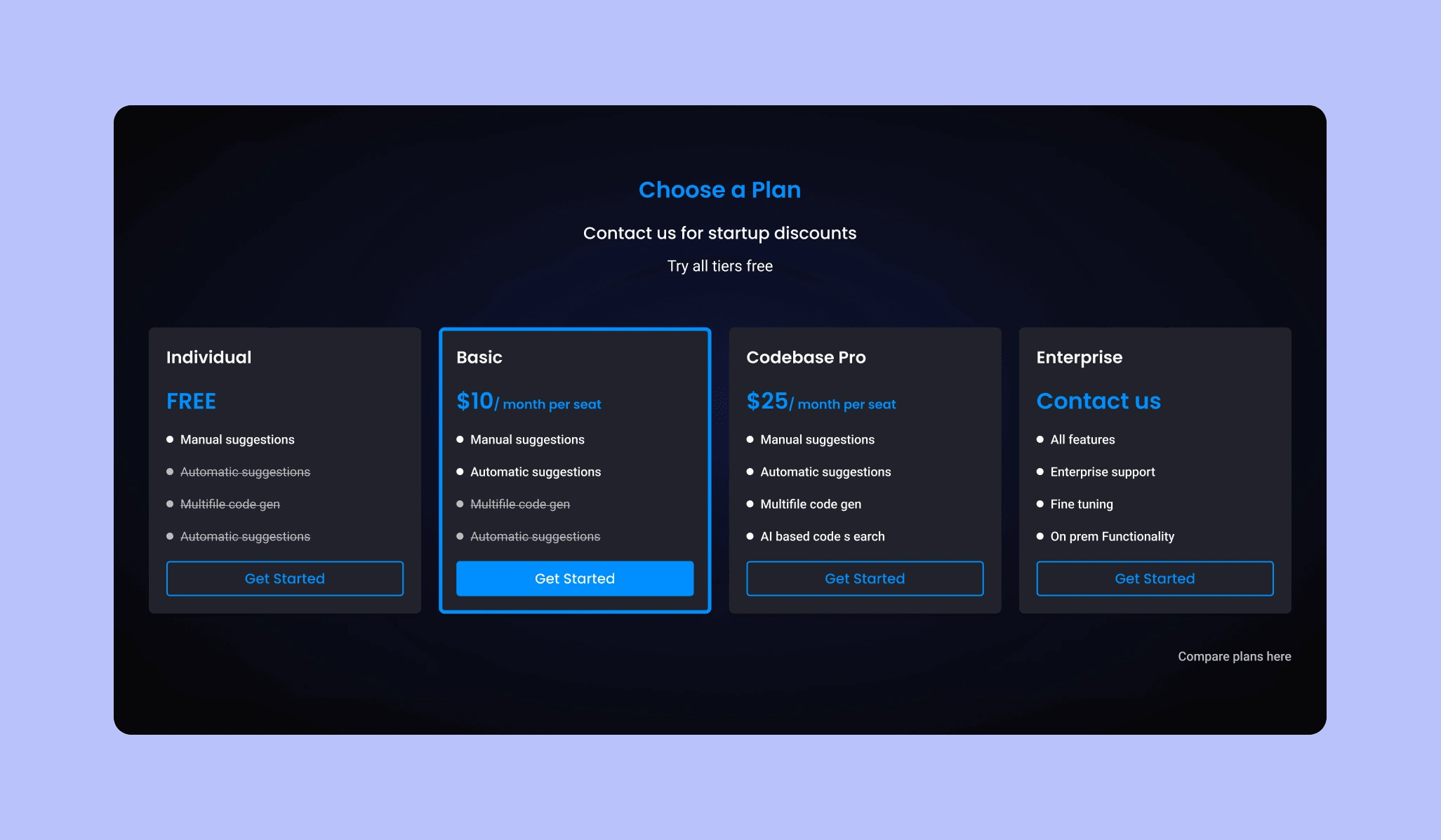
Plans Sections
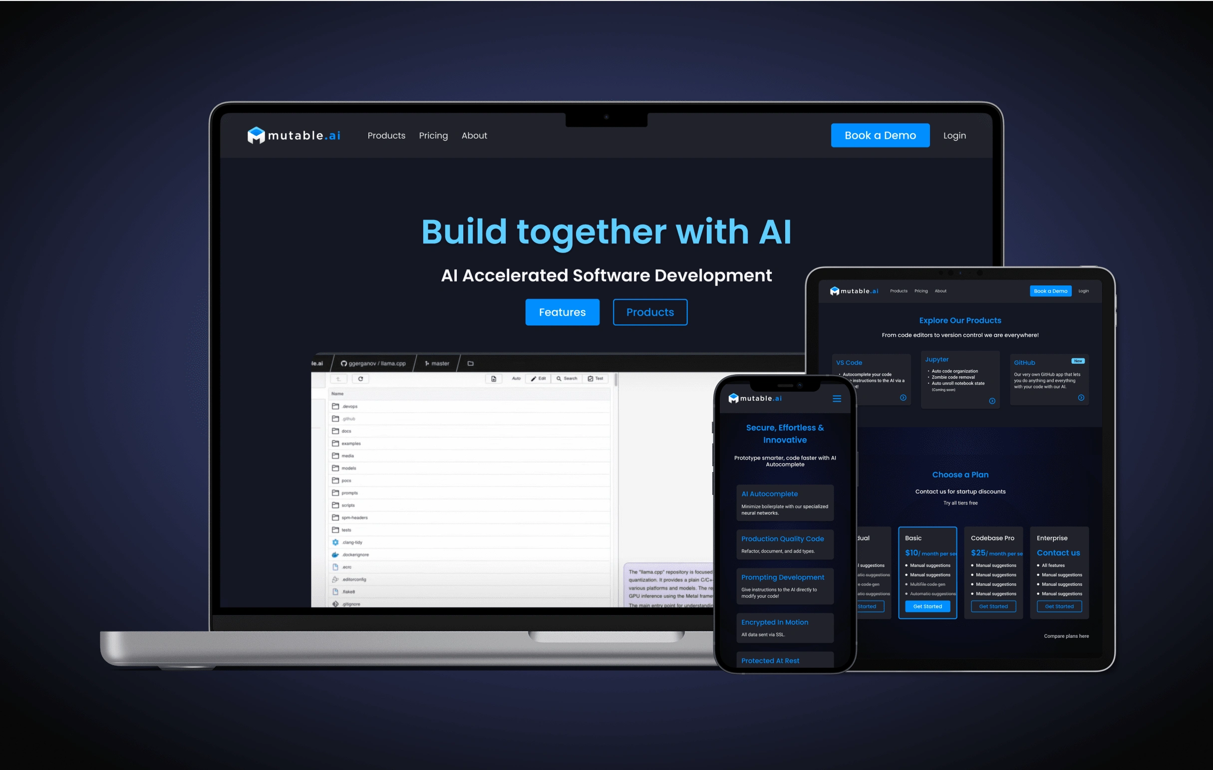
Result
Re-designed landing with simpler navigation, clear content hierarchy, and improved visual design for some elements alongside tweaking the current theme.
Organized site content based on its significance with improvement in visual design for many elements.
Efforted to maximize user engagement by eliminating the need for new page openings, ensuring uninterrupted access to valuable information.
Want to see my design efforts, then click here!
click here!
Ready to transform your idea into a exceptional website? Let's connect and elevate your website experience!
Like this project
Posted Jul 29, 2023
Re-designed a landing page with simpler navigation, clear content hierarchy, and improved visual design. Aiming to maximize user retention on the landing.
Likes
0
Views
46