Personal Brand Design & Strategy for a Holistic Therapist
Antonio Soriano Gómez
From Abstract Expertise to Unified Brand: Positioning a New Kind of Therapist
Context
Javier Marco Barba is a new kind of therapist—one foot in ancestral wisdom, the other in modern science. He had accumulated years of experience across multiple healing modalities: transformation processes, alignment techniques, unity consciousness work.
The problem? All this knowledge existed as a cloud of abstract concepts. No unified offering. No clear structure. No way to communicate his value to people who needed him.
My Role
Lead Brand Strategist & Designer. I led the full engagement: from business model clarification through brand platform development, narrative creation, and visual identity design.
Process
Research & Diagnosis
Conducted an in-depth brand diagnosis to understand Javier's unique positioning opportunity. The wellness space is crowded with vague promises. The challenge was translating complex, sometimes esoteric concepts into accessible language without losing their essence.
Conceptualization
Developed positioning centered on personal empowerment connected to well-being. The core idea: Javier empowers individuals to overcome healing and transformation processes, inspiring them to live regeneratively within unity consciousness.
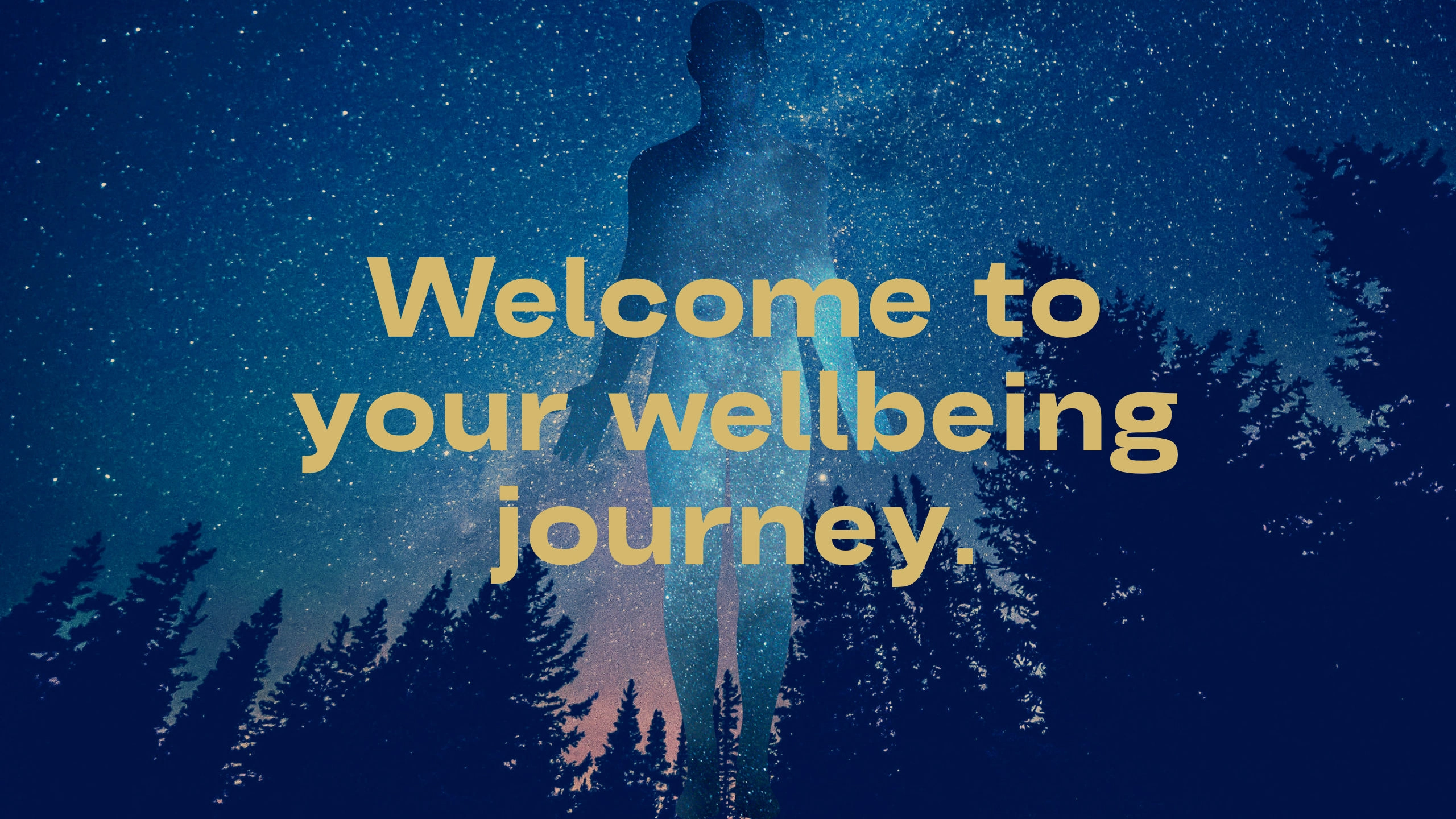
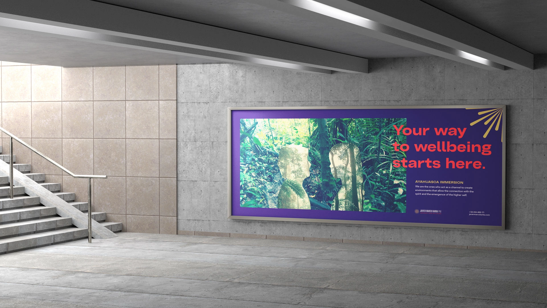
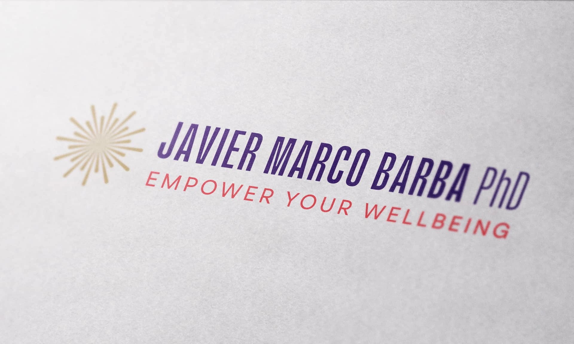
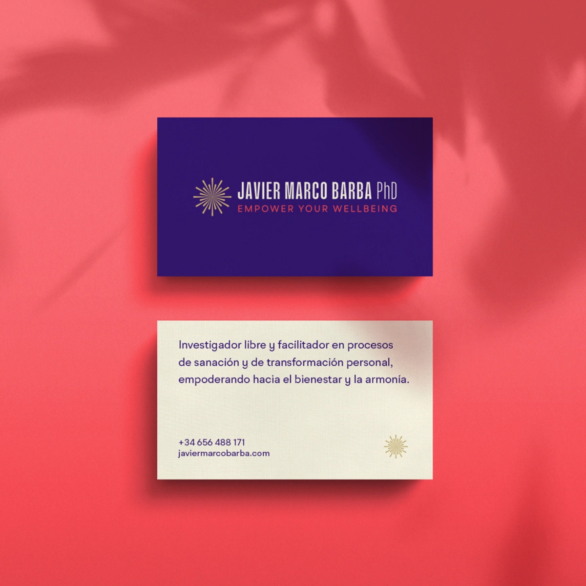
This crystallized into the tagline: "Empower Your Wellbeing."
From this foundation, I built a complete brand narrative that made abstract concepts concrete. The verbal framework positions JMB as a free thinker and facilitator of healing and personal transformation—language his audience can immediately grasp.
Business Model
Translated the cloud of therapies and techniques into a structured, understandable service offering. This wasn't just branding—it was bringing a business down to earth so it could actually grow.
Visual Identity
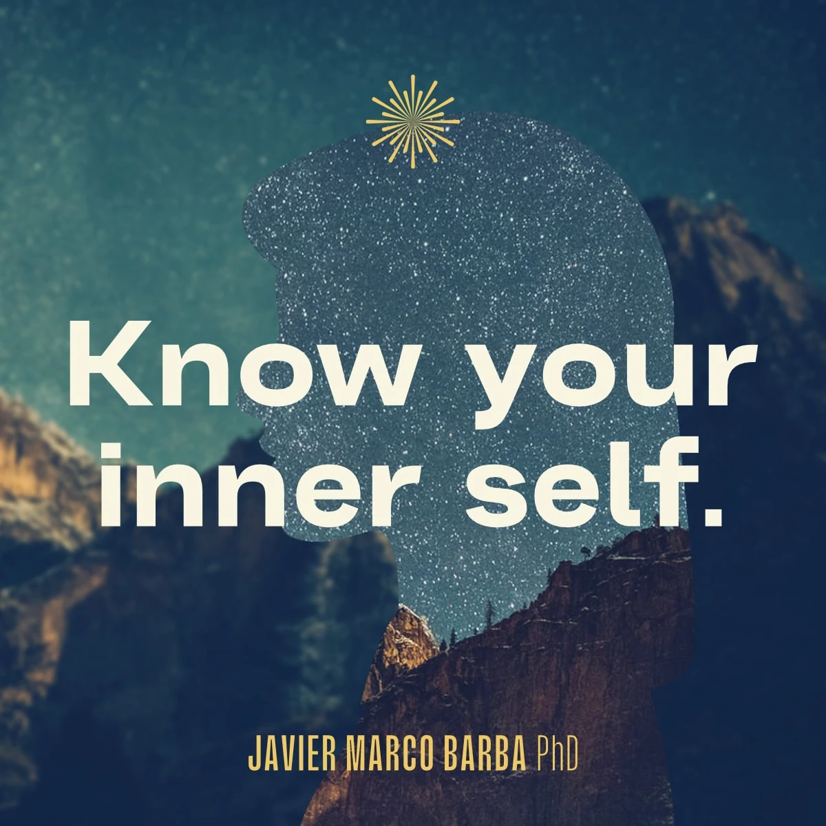
Built the identity on four conceptual pillars aligned with positioning: expansion, infinity, transformation, and inner self.
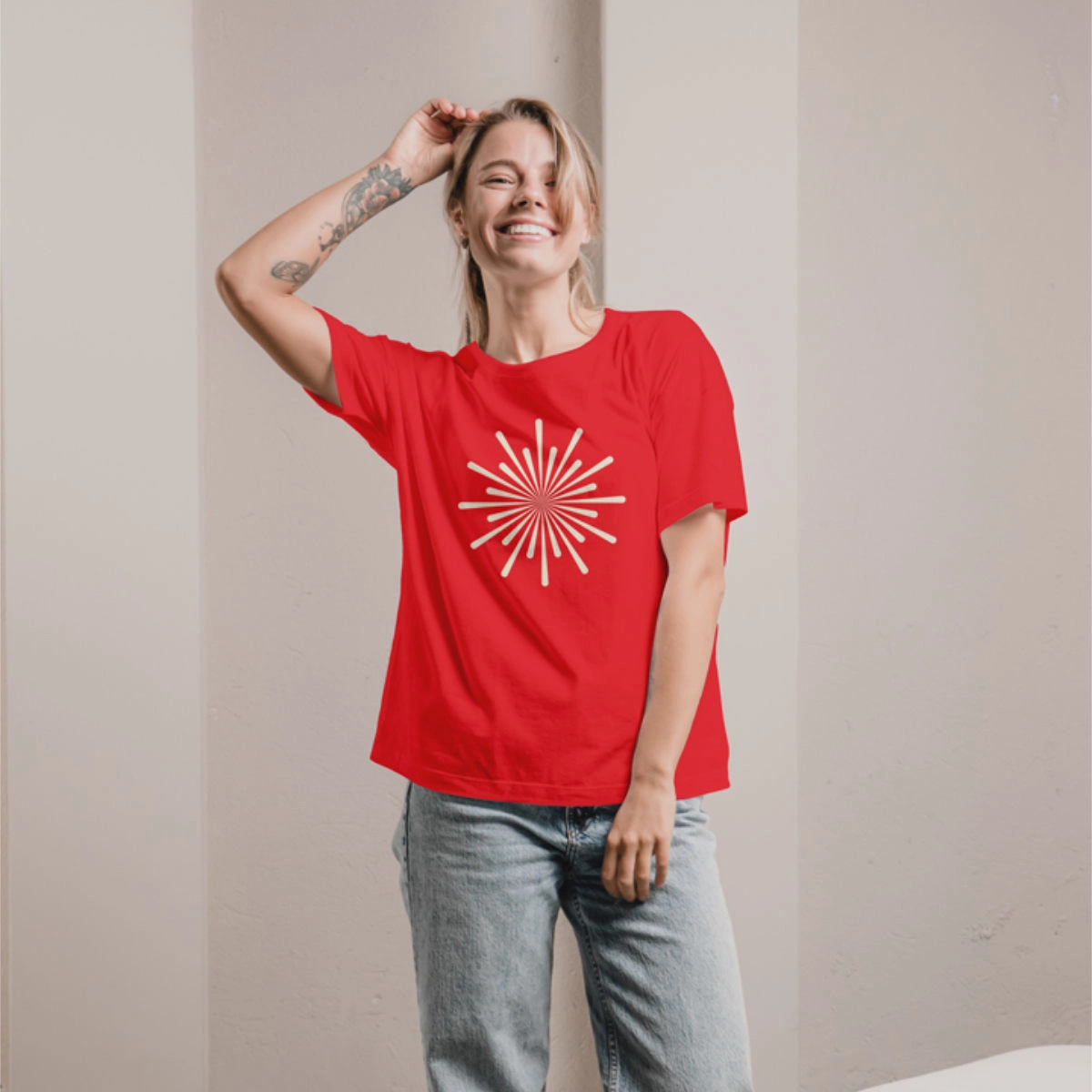
The symbol: a vibrant explosion emerging from infinity—powerful and immediate.
Typography strategy: compressed typeface for name/title (enabling a short JMB version), expanded font for high-impact headlines reinforcing the essence of expansion.
Color palette designed for meaning: violet (spirituality), red (energy), gold (power).
Brand system: sharp-edged rectangular frames for images, red headlines overlaying visuals, violet backgrounds grounding all communications. The symbol reinforces expansion across every touchpoint.
Deliverables
Brand diagnosis
Business model design
Brand platform
Brand narrative
Tagline
Visual identity system
Corporate website
Results
Impact
Transformed scattered expertise into a unified, marketable personal brand. Javier now has a clear structure to organize his offerings, compete in the wellness market, and grow sustainably.
Reflection
This project demonstrated how strategy must sometimes go beyond brand into business fundamentals. The most beautiful identity means nothing if the offering underneath is unclear. By clarifying the business model first, the brand work had solid ground to stand on.
Let's Talk
Building a personal brand around complex expertise? Let's create clarity that connects with your audience.
Like this project
Posted Jan 19, 2026
Built a personal brand unifying ancestral wisdom and modern science into a clear business model, positioning, and visual identity for a holistic therapist.