Built with Framer
Grabbit Mobile App Landing Page Design
Akinbo Oluwakemisola
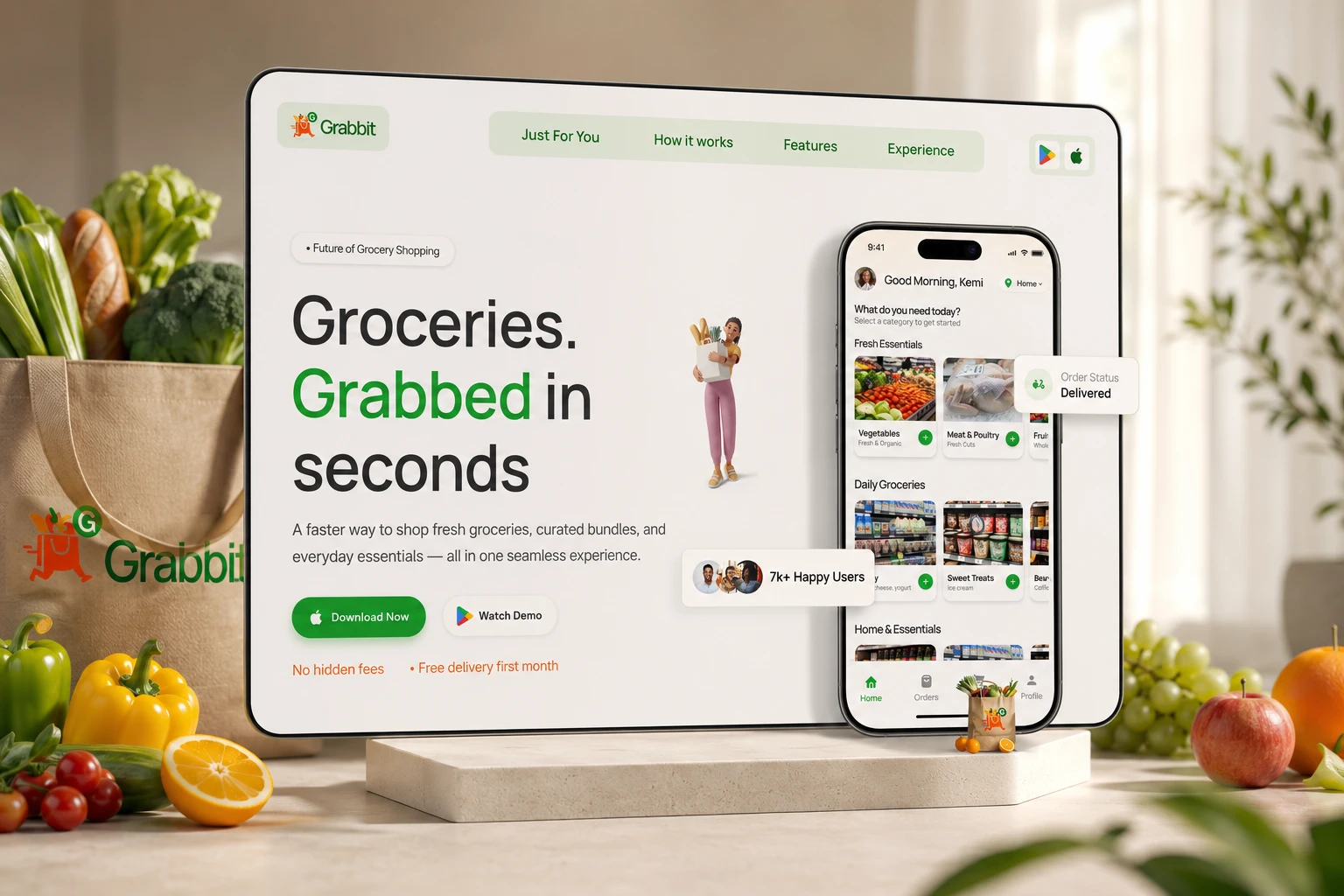
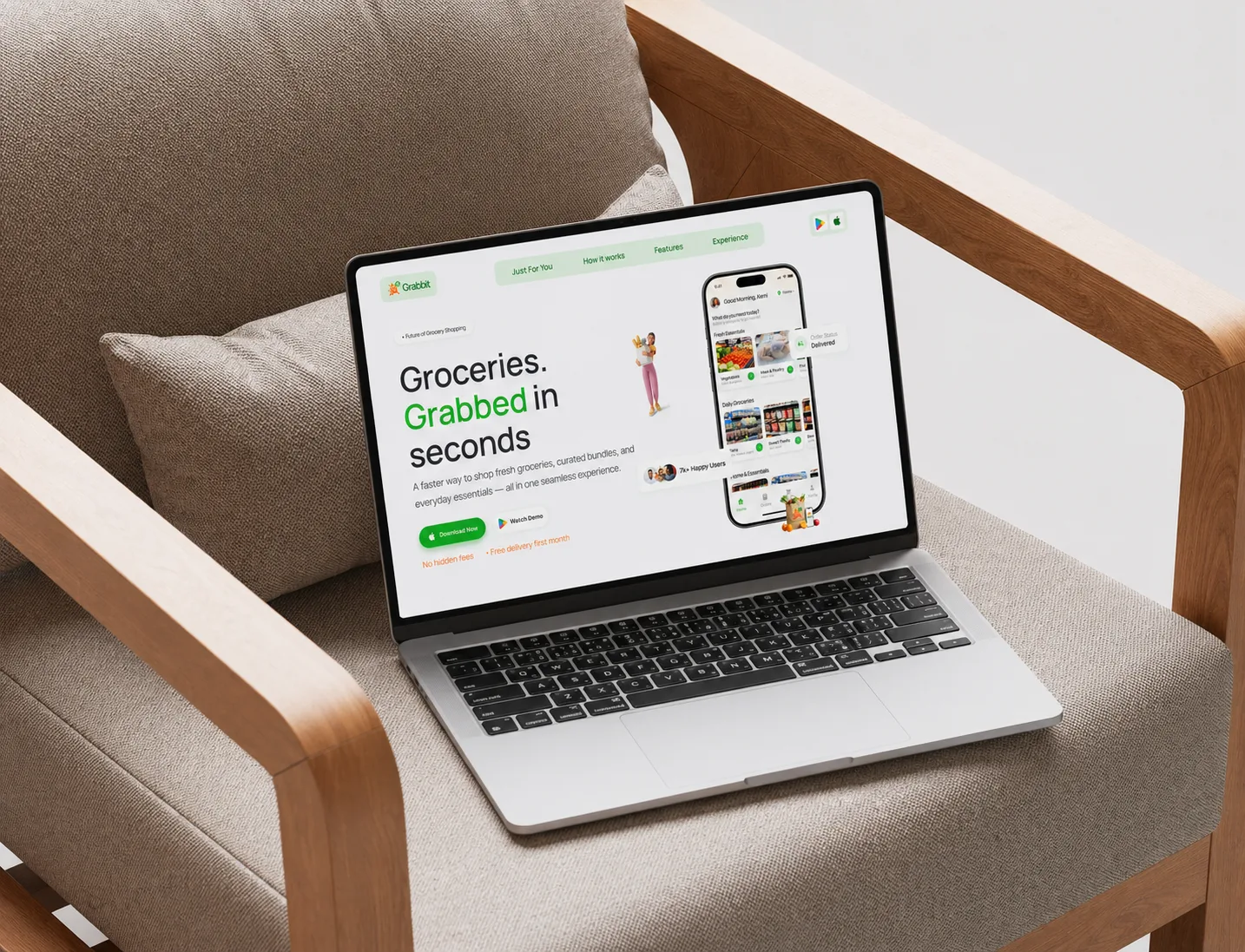
Grabbit Mobile App – Framer Landing Page Design
A landing page isn’t just a visual layer. It’s part of the product experience.
This landing page designed and developed for Grabbit a grocery mobile to do more than look good.
It was built to make the product feel clear, intuitive, and worth downloading within seconds.
View Live website here 👉 https://grabbit.framer.website/
The objective
The goal was simple, to design a landing page that helps users quickly understand:
What Grabbit is
How it works
Why it is worth trying
Guide users toward one clear action "Download the App"
The Challenge
Most landing pages fail at the first interaction.
Users land on the page… and have to figure things out.
What is this product?
Who is it for?
What should I do next?
That moment of confusion leads to hesitation and this hesitation leads to drop-off.
Instead of focusing on aesthetics alone, the approach was centered on one core question:
👉 “Does this website make the product easier to understand?”
Every design decision was made to reduce friction and improve clarity
Key Decisions
Smooth Scrolling; A Guided Experience
The scrolling experience was designed to feel continuous and intentional.
Rather than jumping between sections, users are guided through a clear narrative from introduction → understanding → action.
✨ Micro-interactions
Subtle animations and interactions were introduced to:
Provide immediate feedback
Reinforce user actions
Make the experience feel responsive and alive
These small details help build confidence as users move through the page.
🧭 Smart Navigation
The navigation adapts to the user’s position on the page. Active states highlight the current section, helping users to:
Stay oriented
Navigate easily
Avoid feeling lost
🎯 Conversion-Focused Structure
Each section was intentionally designed to move users closer to action.
The layout ensures that:
Information is revealed progressively
Cognitive load is reduced
Calls-to-action feel natural and timely
Outcome
The landing page is not separate from the product. It is the first experience users have with it.
And if that experience isn’t clear, users won’t stay long enough to explore further.
This project reinforced a simple but powerful principle that Clarity drives decisions. Not complexity.
Like this project
Posted Apr 27, 2026
Designed a landing page for a mobile app, developed it on framer enhancing its appeal and user experience.