
pro
Akinbo Oluwakemisola
UI/UX & Website designer • Figma | Framer | Wix Studio
- 5.00
- Rating
- 46
- Followers
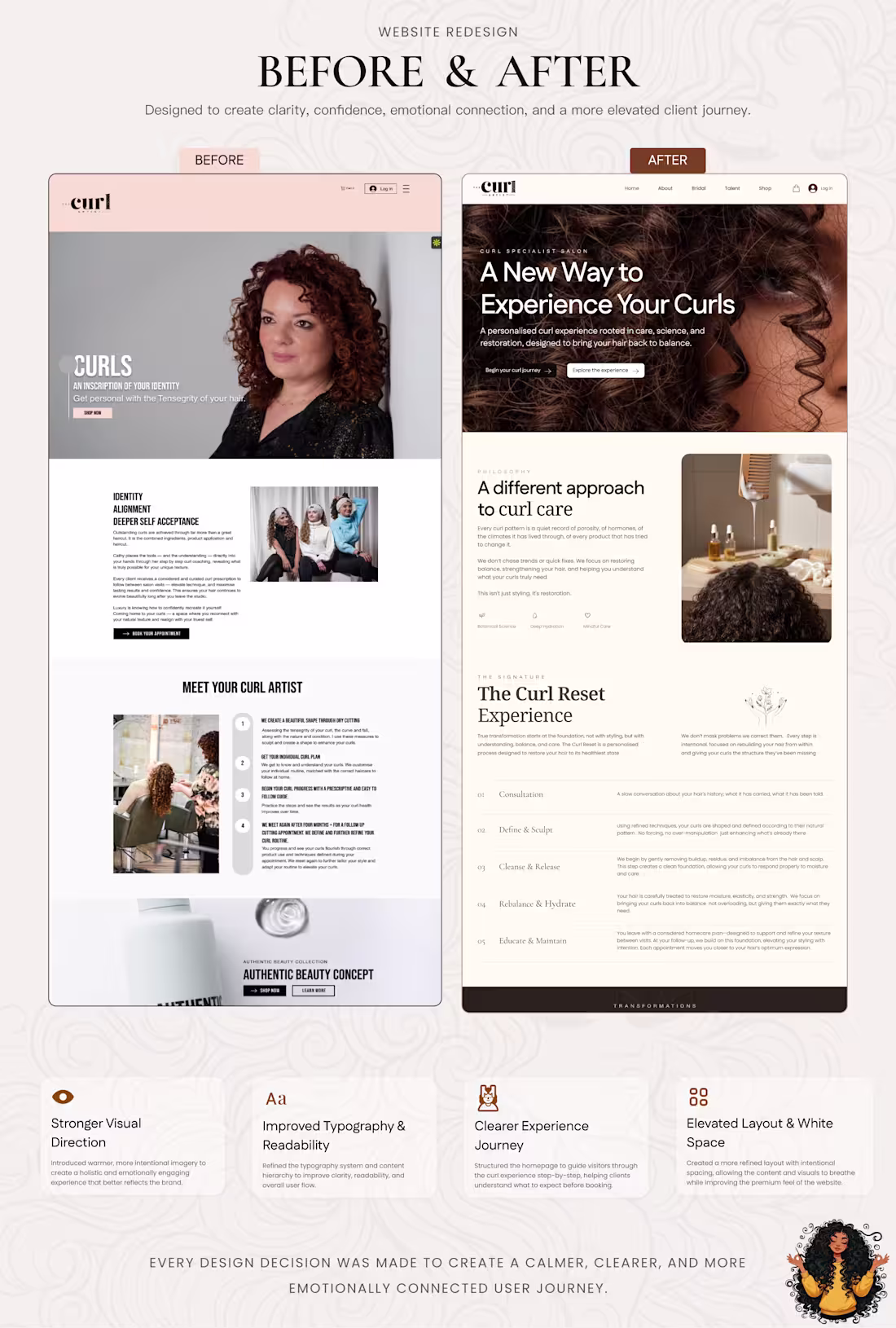
Before and after: The Curl Artist website redesign.
The goal was not simply to make the website look more modern. It was to help visitors immediately understand the value of the salon, feel confident in the experience, and move more naturally towards booking.
I improved the visual hierarchy, typography, imagery, content structure, and overall customer journey—while giving The Curl Reset experience a stronger place within the brand story.
The result is a clearer, calmer, and more elevated digital experience that better reflects the expertise and intentional care behind the business.
2
3
61
A quick look at some of the digital experiences I’ve designed.
Different industries. Different audiences. Different visual directions.
But every project is built around the same goal: helping the business communicate its value clearly, earn trust quickly, and guide users toward action.
I design websites that do more than look good. They position the brand and support the business behind it.
2
5
218
A website is often the first space a potential client walks into.
For this corporate workspace concept, the goal was simple: show the work clearly, build trust, and make the next step obvious.
You can view the live site below
https://aurora-aterlier.lovable.app
2
60
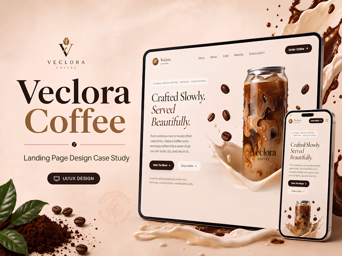
Premium Coffee Brand Website Design for Veclora Café
1
5
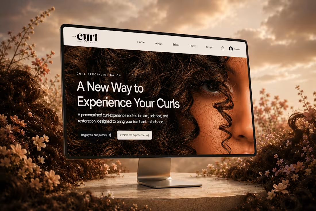
Curly Hair Salon Website Redesign & E-commerce UX
1
5
Grabbit Mobile App Landing Page Design
1
6
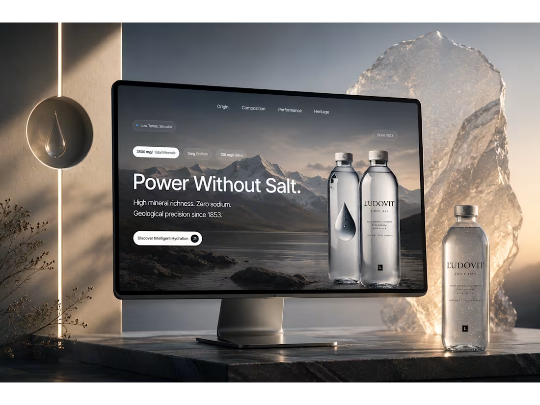
Ľudovit Intelligent Hydration: Framer Redesign
1
6
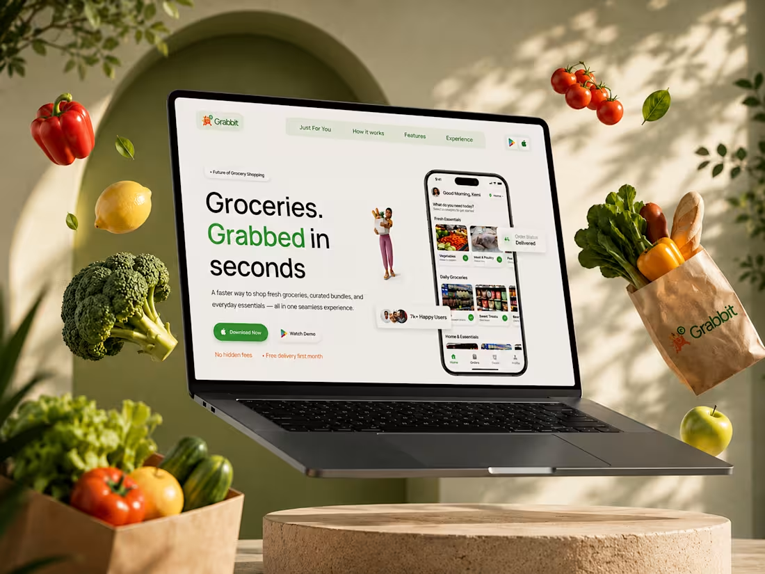
Grabbit: A Personalized Grocery Shopping Mobile App Design
2
7
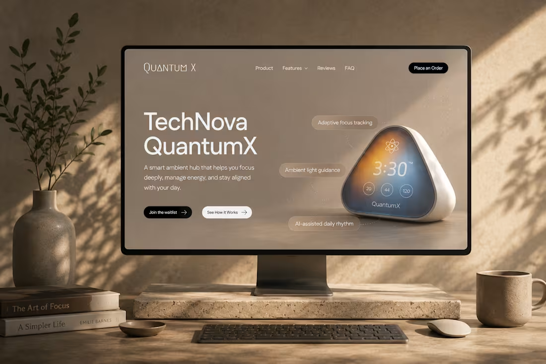
Quantum X Landing Page Design
2
3
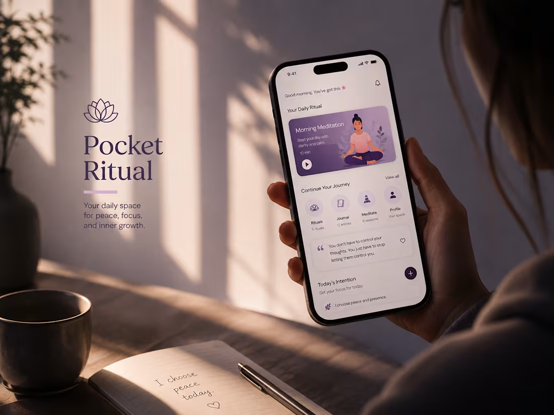
Pocket Rituals App Landing Page Design
1
54
A Mindful Wellness App Design for Pocket Ritual
2
7
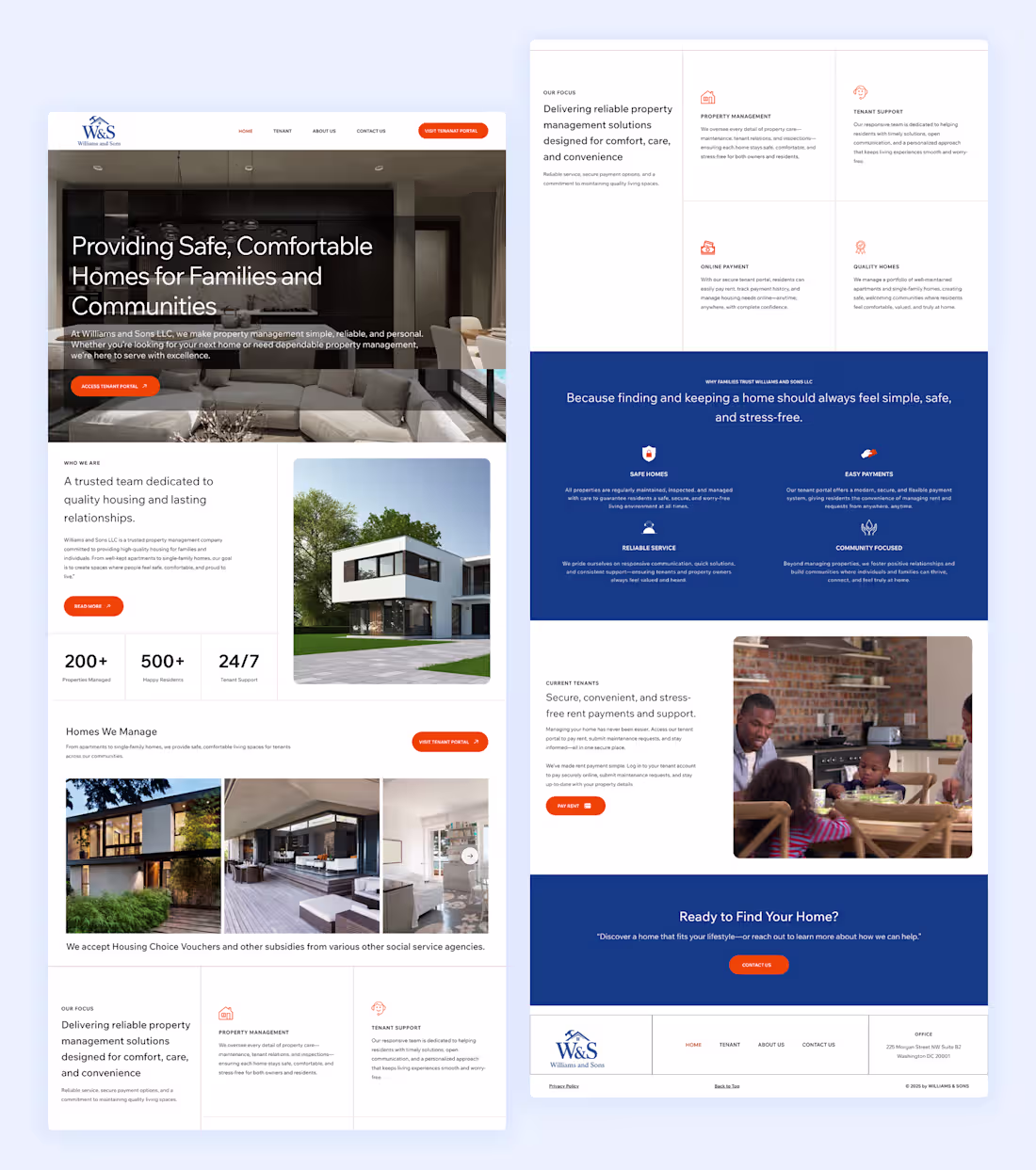
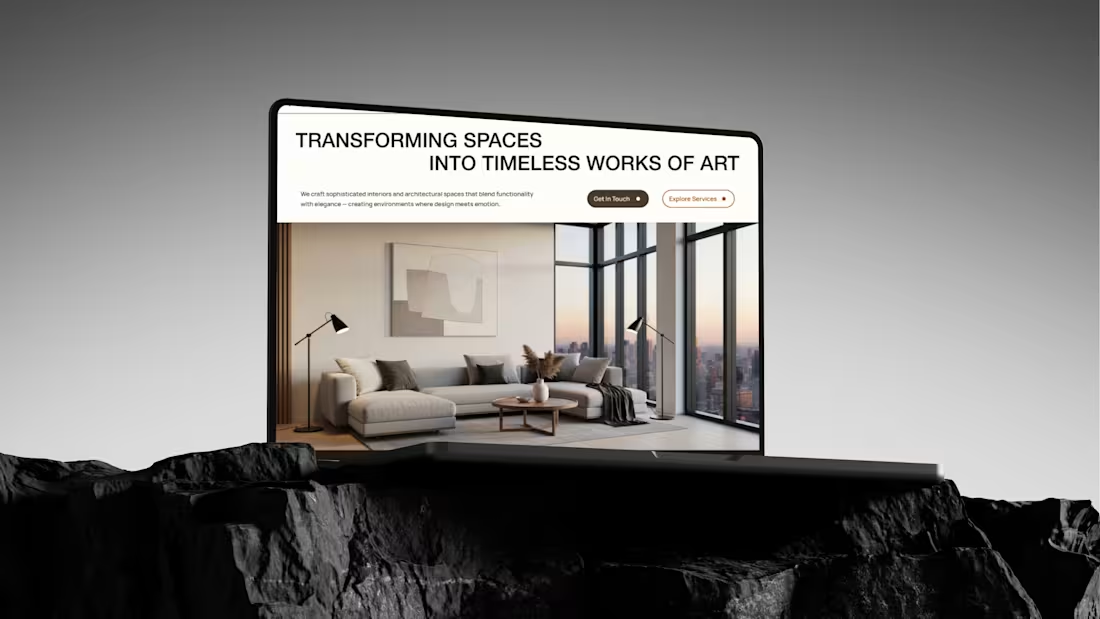
High-End Property Management Website Design and development
1
5
Harmony Studio Website design
3
7
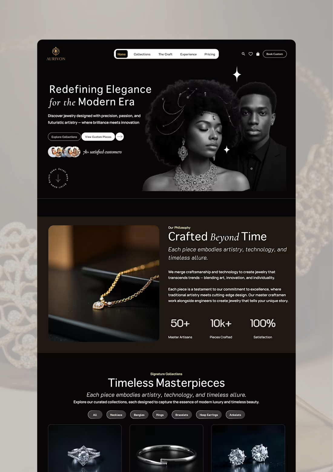
AURIVON; LUXURY JEWELRY WEBITE DESIGN AND DEVELOPMENT
3
7
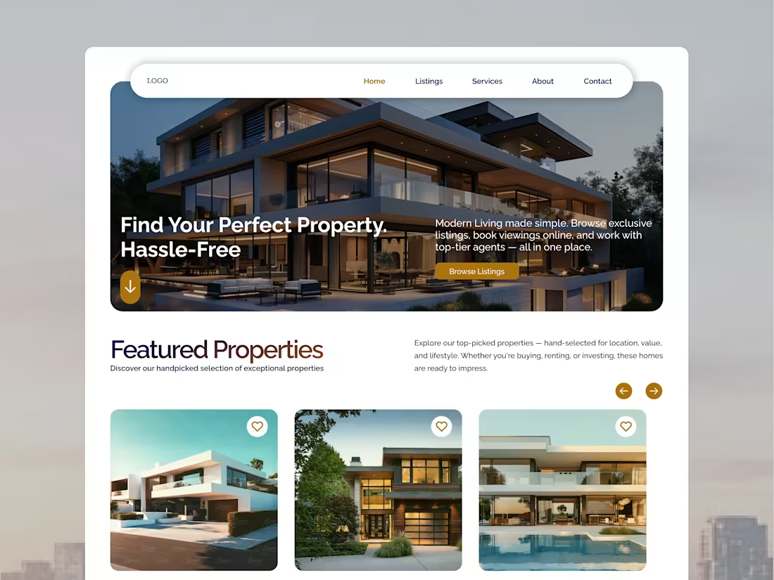
Real Estate Website Template Design
1
6
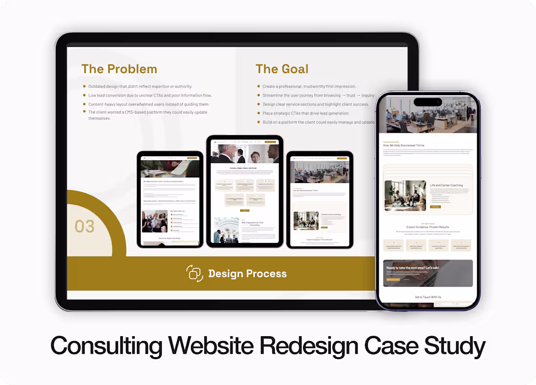
Consulting Website Redesign that Boosted Trust & Engagement
1
4