Built with Framer
Pocket Rituals App Landing Page Design
Akinbo Oluwakemisola
Mobile App Landing Page Design and Framer Development for Pocket Ritual
View Live site https://pocketritual.framer.website/
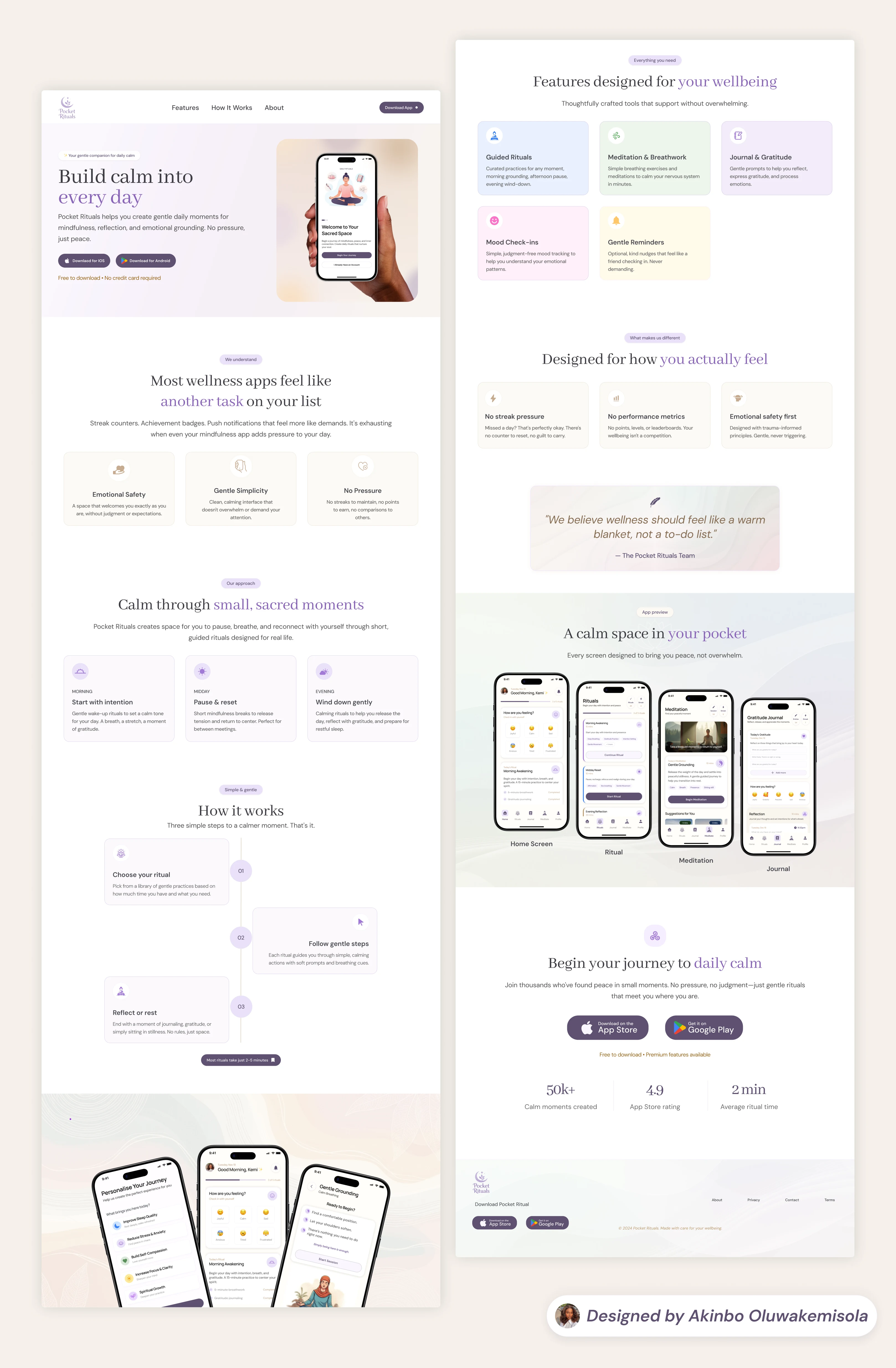
Designing Calm Before the Download
I designed the Pocket Ritual landing page to serve as the first emotional touchpoint for the app. While its functional goal was to drive app downloads, its primary design goal was more subtle: to make visitors feel calm the moment they arrived.
The landing page was treated not as a marketing asset, but as an extension of the product experience itself.
The Challenge
Most app landing pages prioritize urgency—bold headlines, aggressive CTAs, dense content, and performance-driven messaging. For a wellness product like Pocket Rituals, this approach would contradict the app’s core value.
The challenge was to design a page that:
Encourages downloads without pressure
Communicates value without overwhelm
Feels emotionally safe across devices
Preserves calm while still converting
Design Goal
Create a landing page that:
Evokes calm before users read a single line of copy
Reduces visual and cognitive load
Sets clear emotional expectations for the app
Feels consistent across mobile, tablet, and desktop
Calm was treated as a UX outcome, not a visual style.
Full landing page preview
Design Approach
1. Visual Language
A soft lavender-led color palette was chosen to reduce visual tension
Gentle gradients and light backgrounds replaced harsh contrast
Generous spacing allowed content to “breathe”
Rounded elements softened interaction points
These choices were intentional—to slow the user down rather than push them forward.
2. Typography & Layout
Calm, readable typography with clear hierarchy
Short lines of copy to reduce mental effort
No dense text blocks or competing focal points
Clear flow from section to section without visual noise
The layout guides users gently rather than directing them forcefully.
3. Copy Strategy
The copy avoids urgency, fear, or productivity language.
Instead, it focuses on reassurance, presence, and simplicity.
Rather than telling users what they must do, the copy communicates what they can experience.
4. Mobile Responsiveness
Special attention was given to mobile responsiveness to ensure calm was preserved on smaller screens.
Spacing and hierarchy were adapted to prevent crowding
CTAs remained visible but never dominant
The visual rhythm stayed consistent across breakpoints
The goal was for users to experience the same sense of ease, regardless of device.
Outcome
Feedback from users who visited the landing page revealed a consistent emotional response:
they felt calm simply by viewing the page.
Several visitors described the experience as:
“Soothing”
“Quiet”
“Grounding”
The landing page successfully aligned expectation with experience, building trust before download and reinforcing the app’s positioning as a gentle, pressure-free wellness tool.
Key Insight
Calm can be a conversion strategy when designed intentionally.
By reducing friction, visual noise, and urgency, the Pocket Rituals landing page demonstrates that emotional alignment can be just as powerful as traditional marketing tactics.
Like this project
Posted Jan 12, 2026
The Pocket Rituals landing page was intentionally crafted to reduce visual noise helping visitors feel grounded and reassured before ever downloading the app.