Built with Framer

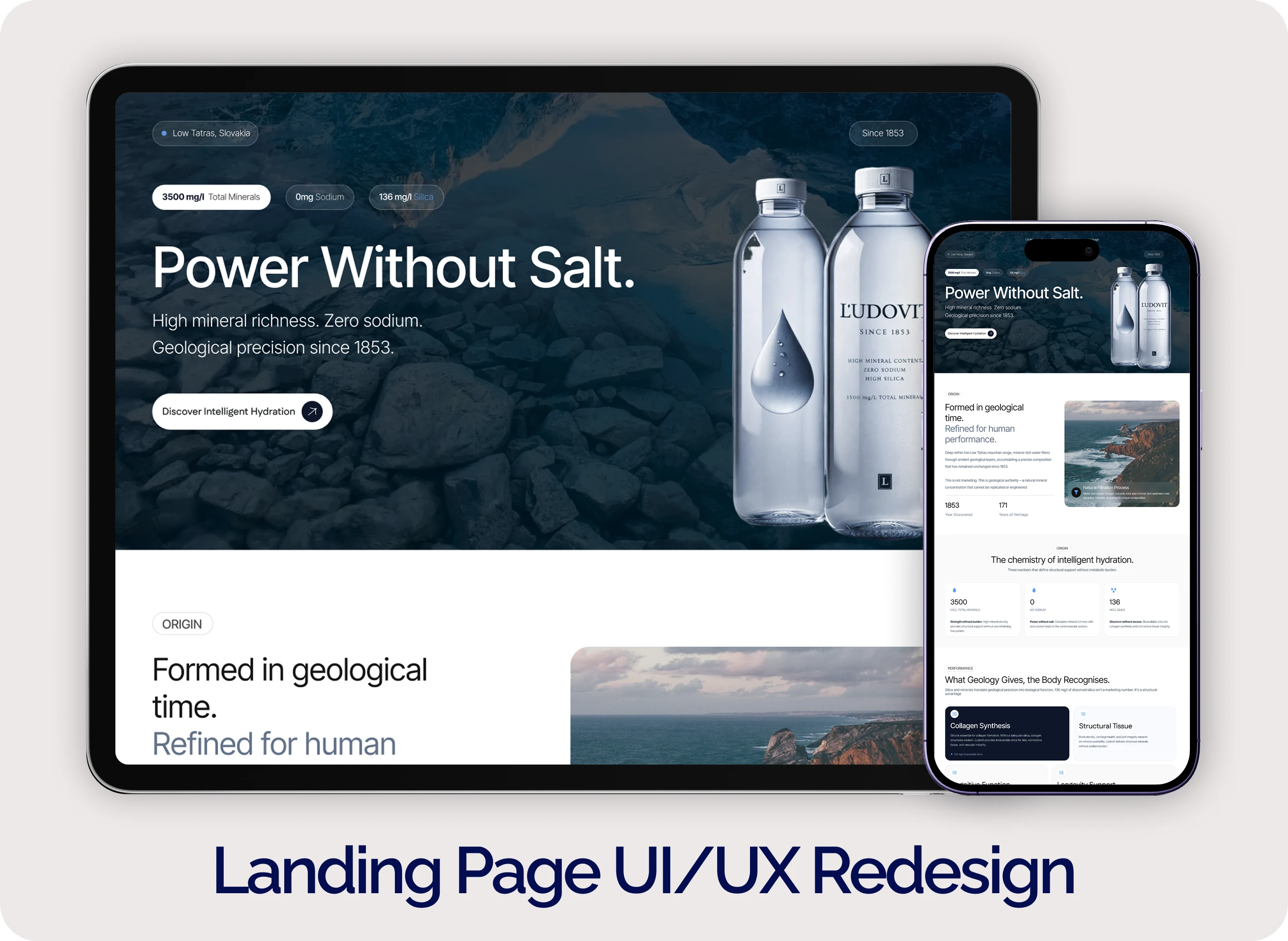
Ľudovit — Intelligent Hydration Landing Page Redesign
Ľudovit is a mineral water brand with a legacy dating back to 1853.
Despite its strong foundation high mineral density, zero sodium, and rich silica content the existing website didn’t communicate its value clearly. It felt more like a static poster than a structured experience.
This project focused on transforming the website into a narrative-driven, authority-first landing page.
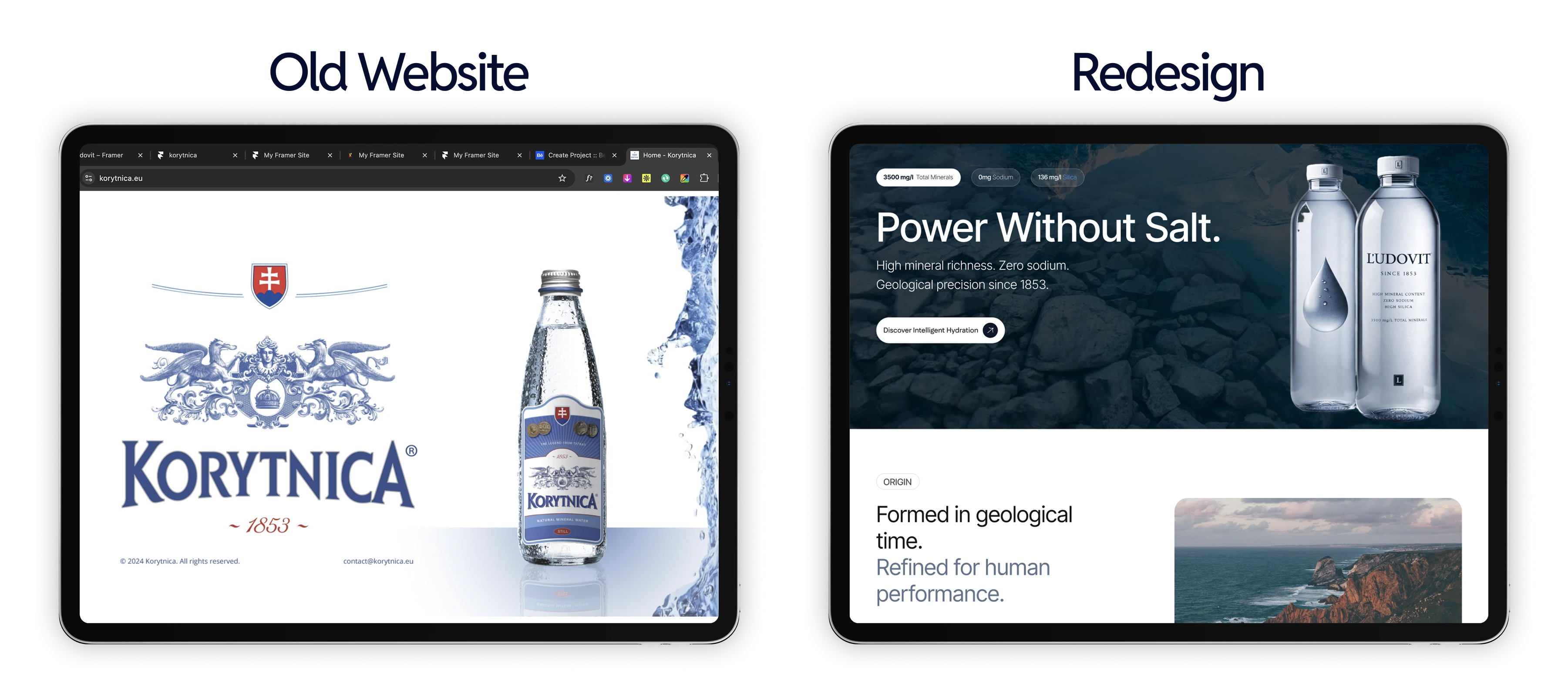
View live site here https://korytnica.framer.website
The Problem
Heritage (1853 legacy) was underutilized
Product differentiation wasn’t clearly explained
Website lacked structure and user guidance
Messaging relied on generic marketing instead of facts
Result:
Users couldn’t fully understand why the product was different or valuable.
The Goal
Communicate authority and credibility
Translate complex mineral science into clarity
Create a structured user journey
Position Ľudovit as intelligent hydration, not just water
My Approach
1. Narrative Architecture
Designed the page as a guided experience, not just sections:
Origin → Composition → Performance → Heritage → Philosophy → Experience
2. From Marketing → Meaning
Replaced vague claims with fact-based communication:
~3500 mg/l mineral density
Zero sodium
136 mg silica
3. Science → Human Benefit
Connected product composition to real outcomes:
Structural health (bones, skin)
Cognitive clarity
Long-term wellness
4. Heritage as Authority
Elevated 1853 from a date → a credibility system
(including historical recognition and European legacy)
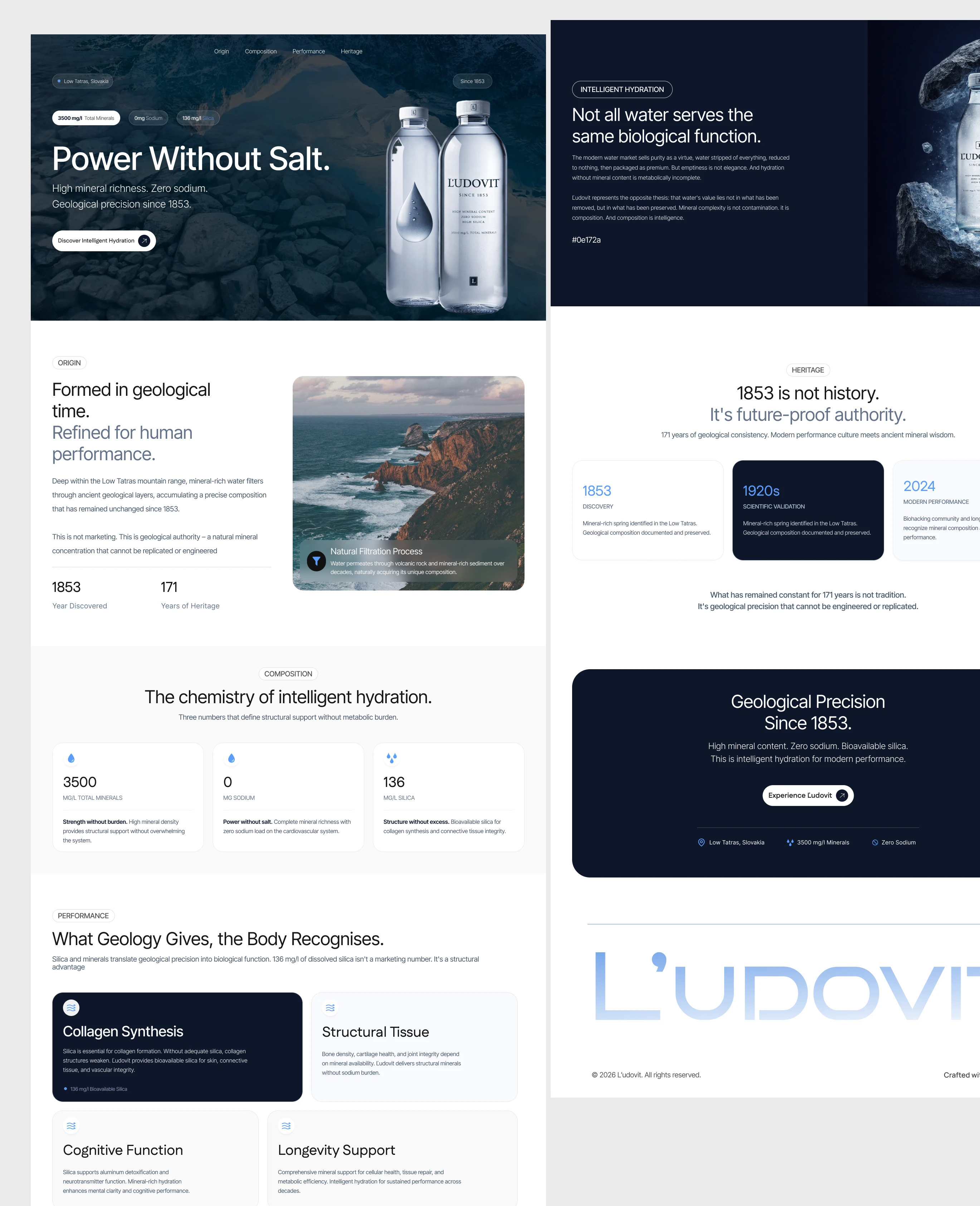
Key Screens
Hero Section
“Power Without Salt.”
Clear positioning with premium visual focus
Composition Section
Clean data-driven layout explaining mineral density
Heritage Section
Timeline-based storytelling for 1853 authority
Performance Section
Science translated into human benefit
What Changed
Before
poster-like layout
generic messaging
weak differentiation
visual first
After Redesign
Structured narrative experience
Fact-based clarity
Strong product positioning
Meaning-first design
Outcome
This redesign made a landing page that:
Educates before it sells
Builds trust through clarity
Communicates scientific and historical depth
Positions Ľudovit as a premium, intelligent hydration brand
This project reinforced a key idea that good design doesn’t just make things look better.
It helps people understand why it matters.
DESIGN DIRECTION
Deep mineral blue + stone tones
Editorial layout with generous spacing
Serif headlines + clean sans-serif body
Subtle animations (Framer-based)
Minimal, high-end visual language
1 like · 13 views · Mar 31, 2026
Redesigned Ľudovit landing page to turn heritage, mineral science, and zero sodium into a clear, structured experience that builds trust and drives action.


