Unified Investment Tracking App Design & Branding

Shivangi Agarwal


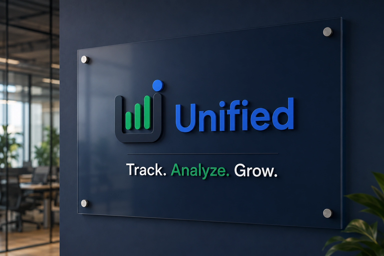
Unified:
A Multi-asset investment tracking platform.
Overview
Personally I have been investing in cryptocurrencies and stock market for past 3 years. Initially it wasn't a hassle since holdings were less, transactions were lesser. Easier to track! As my trading activity increased, tracking everything became more difficult. I had to document every transaction in Excel and create separate calculations just to understand my overall portfolio. It was not only time consuming but inconvenient especially for someone like me, as excel was my kryptonite.
Hence the idea of Unified came to life.
"One Portfolio, One dashboard & One View. "
I used stitch to create a core and then used Figma to refine the app design.
Core features:
Create a dashboard that shows everything at a glance, (Net worth, Assets allocation, Invested + Current amount, Tax summary and Recent transactions.)
With this no investor will have individually calculate everything and go around numbers all day.
I emphasized on having a tax section because tax rules on cryptocurrency gains can be overwhelming in India and the entire process can be very challenging for someone who is not pro or not as well equipped with taxation laws, rules, etc.
Asset allocation promptly showed me how many eggs are in each basket.
Other than dashboard I thought it would be better to have an option to see all these pages individually as well hence I created separate tabs for each asset. Stocks, Cryptocurrency and Mutual Funds.
There is an insights page as well, that explains how their whole investment portfolio is doing.
The AI Insights panel gives simple alerts, such as warning that too much money is in stocks or suggesting profit-taking after Bitcoin has risen.
The Risk vs Return chart shows which investments give higher returns and which ones are more risky or volatile.
The Sector Exposure section shows where the user’s money is invested by industry—for example, Finance 35%, Technology 25%, Energy 25%, and Web3 15%.
Here are some images from the app.
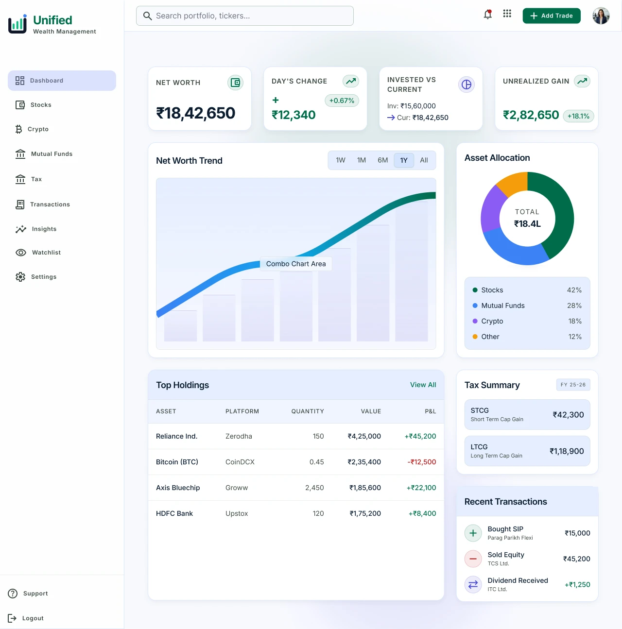
Dashboard
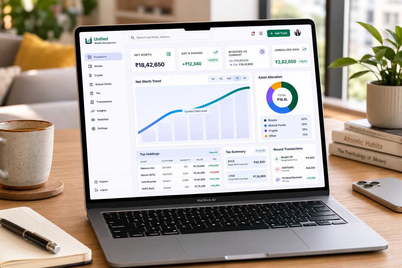
Mockup
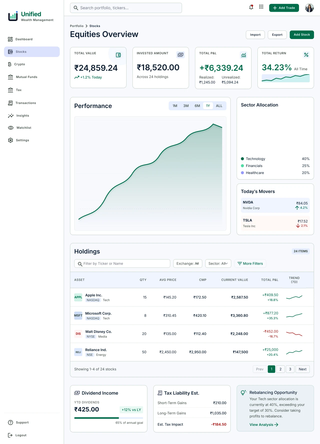
Stocks page
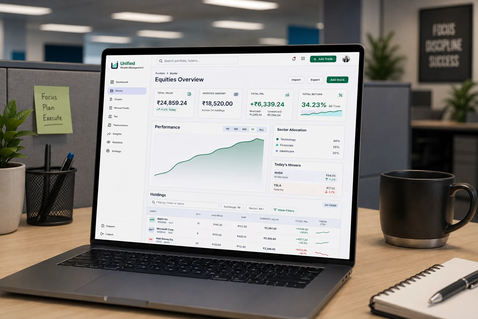
Mockup Stocks
Overall the design choice was simple, financial data can be too much information sometimes, it was important to show everything neatly and in a way that eases the user not confuses it.
Design Choices:
Green has been prominently used as it is linked with wealth and blue is linked with trust, stability, and reliability, important feelings when users are viewing their money and investments.

Like this project
Posted Jul 10, 2026
Designed app UI and brand identity for an investment tracking app.
Likes
0
Views
13