SafeSpaceEra Therapy Website Design
Shivangi Agarwal
Overview:
SafeSpaceEra is a Framer website built for individual therapists and mental health clinics. The goal was to build a therapy site that feels nothing like a therapy site. No stock photos. No pastel gradients. No generic copy. A site that makes the visitor feel seen before they read a single word.
The Problem
Most websites made for therapy consultants and clinics, fail at the one thing therapy is supposed to do make people feel understood. They're clinical, cold, and templated. A person already struggling to ask for help lands on a page that feels like a hospital waiting room and leaves without booking.
Section 1: Hero
A group of hand-drawn sketch illustrated characters, all smiling. On hover, each character reveals a thought bubble with an emotion it feels "I just want to feel okay again", "I'm not good enough." The visitor sees themselves in the crowd before they read a word. The headline "Everyone's smiling. Not everyone's okay." lands after the interaction, not before. A custom cursor has been used for this section.
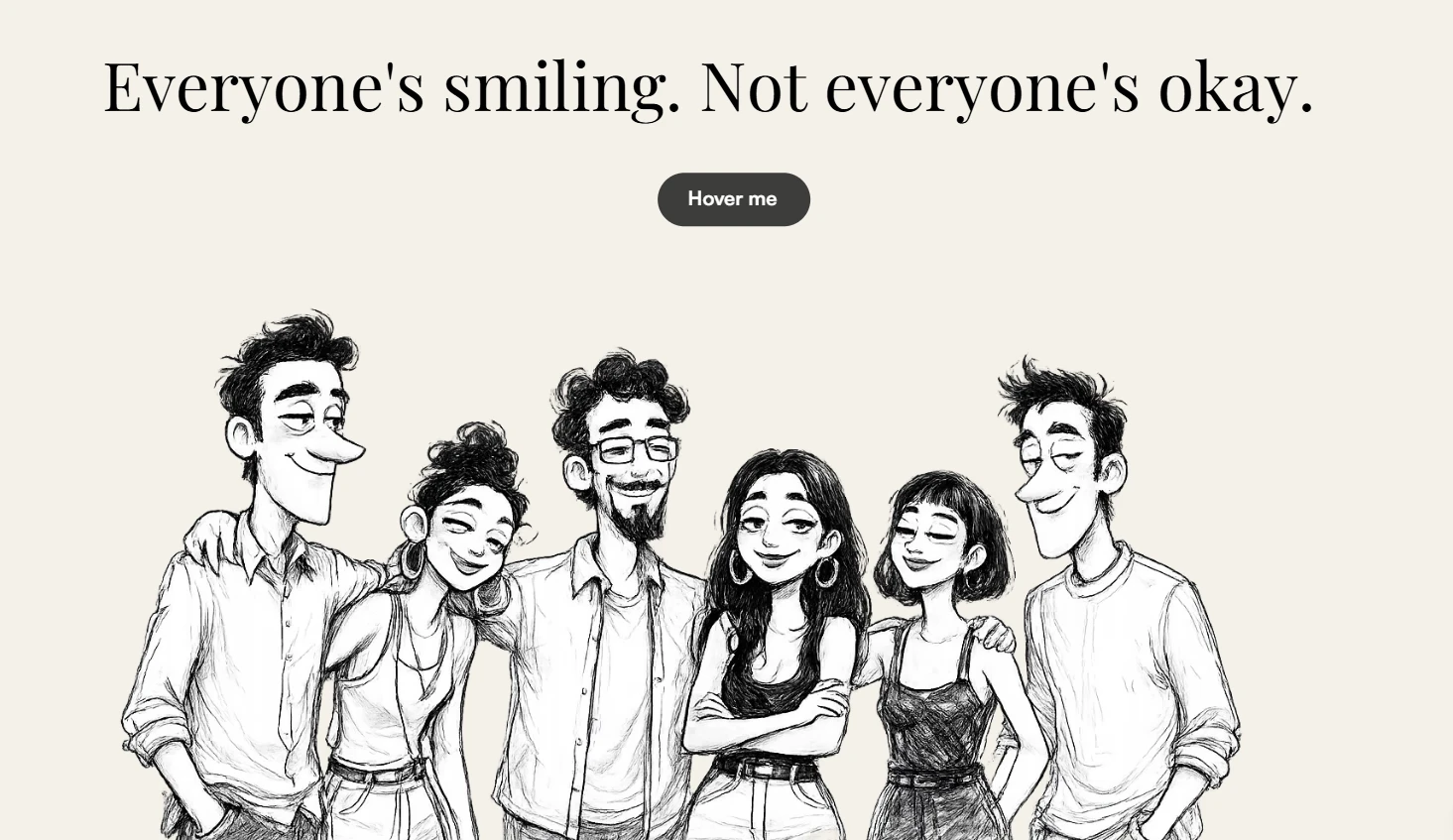
Screenshot from actual website
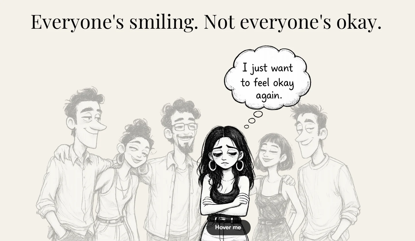
Screenshot from actual website (Interaction state)
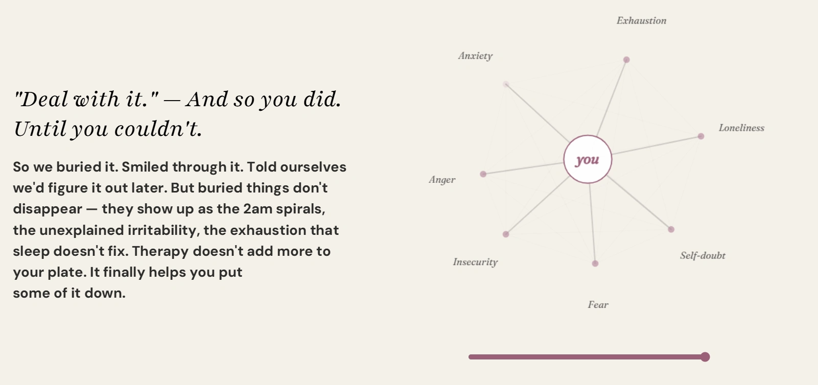
Section 2 — Naming the Pain
A slider-triggered interactive tangle diagram built on HTML Canvas. Seven emotions, Anxiety, Shame, Fear, Loneliness, Self-doubt, Exhaustion, Anger connected in a chaotic web with diagram-style annotation lines. As the visitor drags the slider, the tangle resolves into a clean spiral. The metaphor is visceral. No explanation needed.
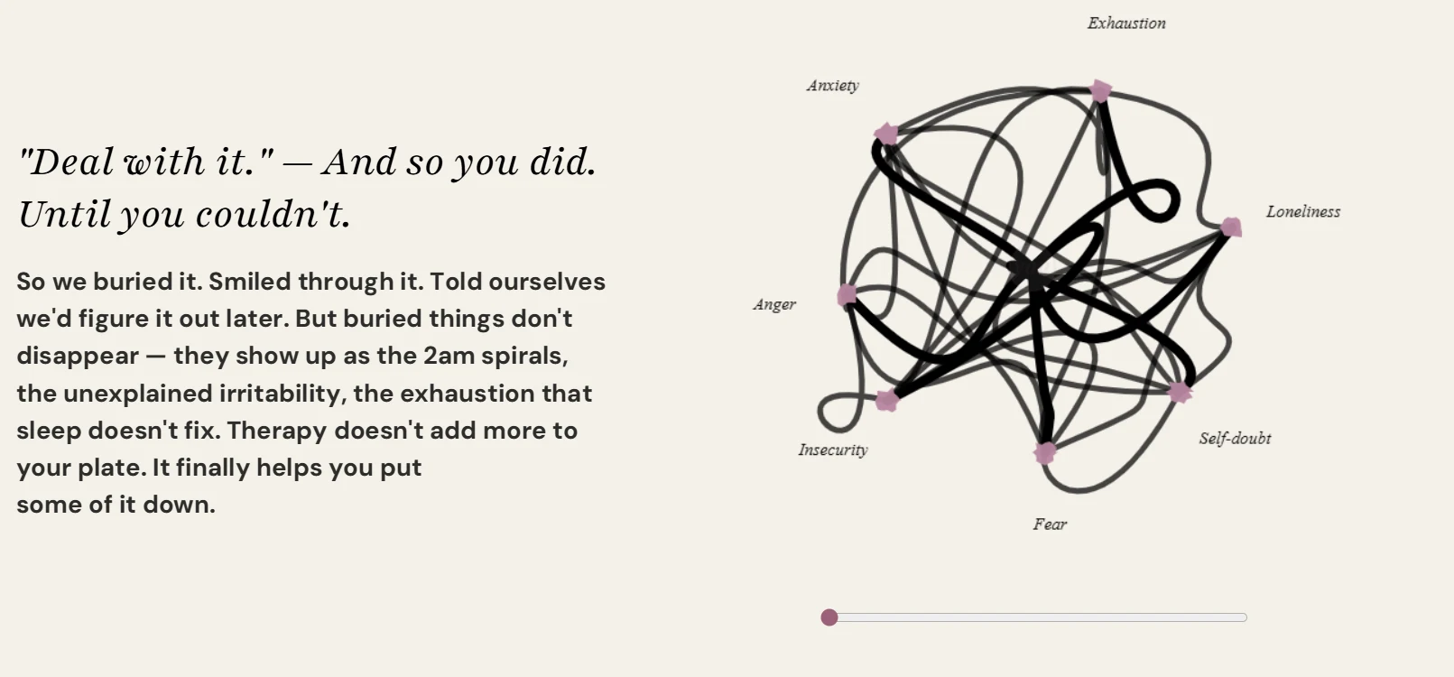
Screenshot from actual website (Rested state)
Screenshot from actual website
Section 3 — How It Works
A scroll-triggered progress bar timeline animation that reveals four steps one by one. Deliberately simple after the intensity of the previous section — the emotional complexity earns the right to be clear and calm here.
Section 4 — Meet the Team
Illustrated therapist portraits on dark cards. Real headshots were deliberately avoided to maintain the hand-drawn visual world established in the hero. Consistent, intentional, on-brand throughout.
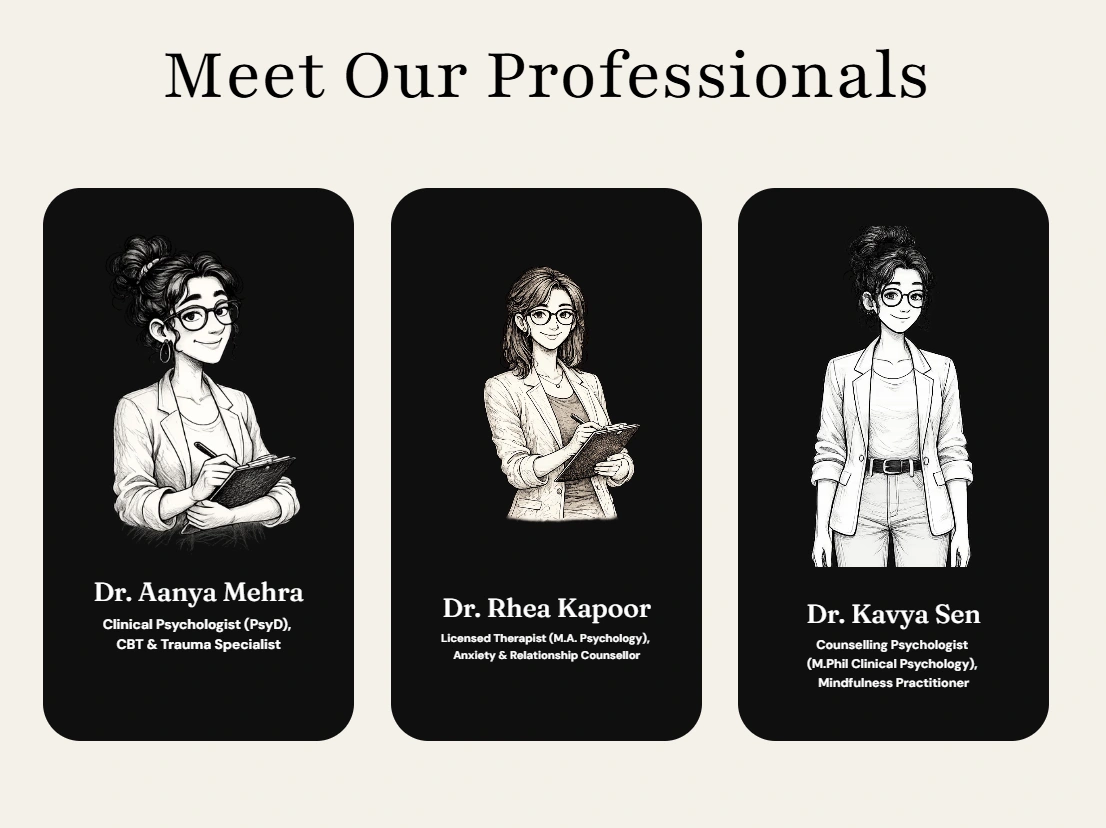
Screenshot from actual website
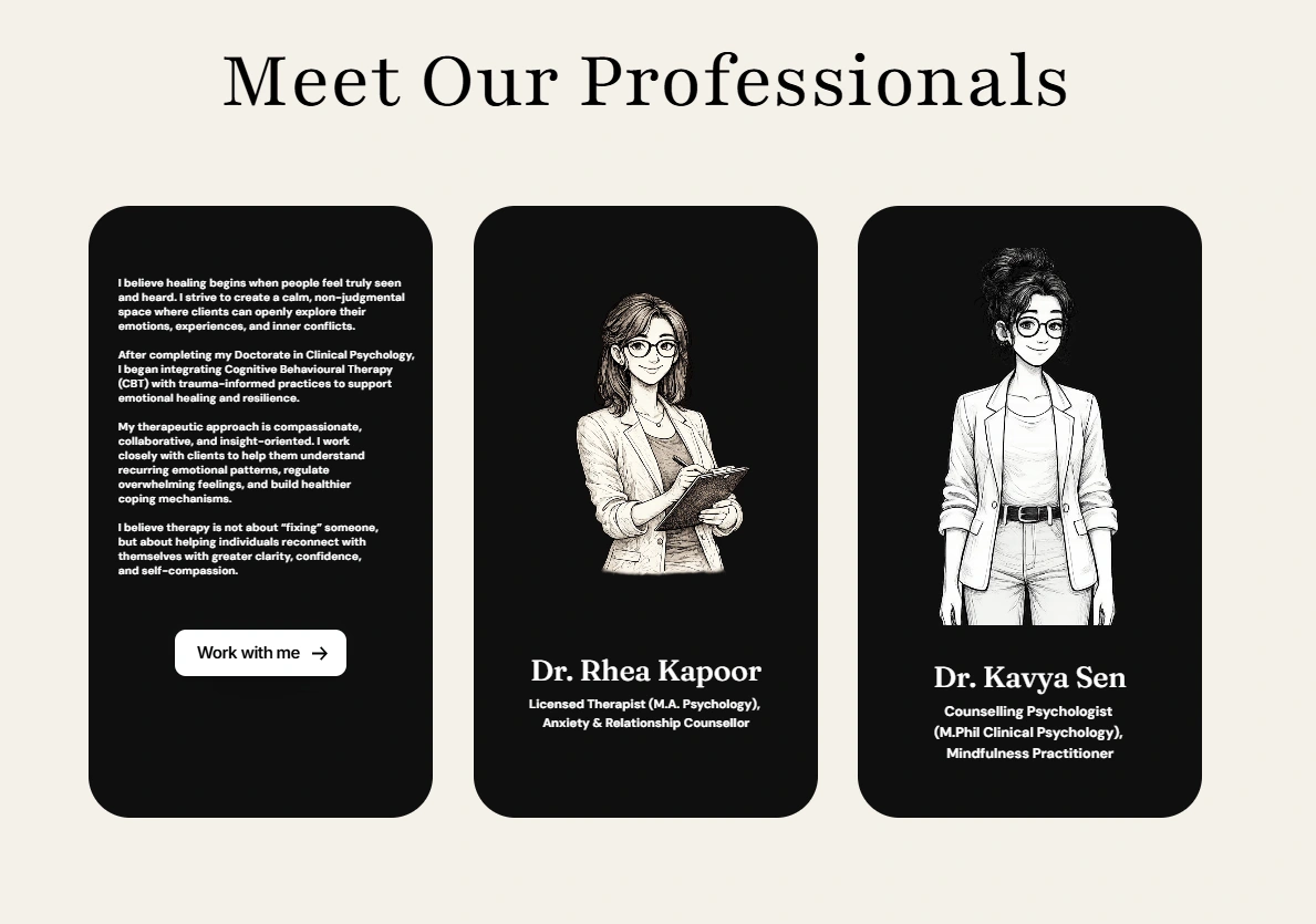
Screenshot from actual website
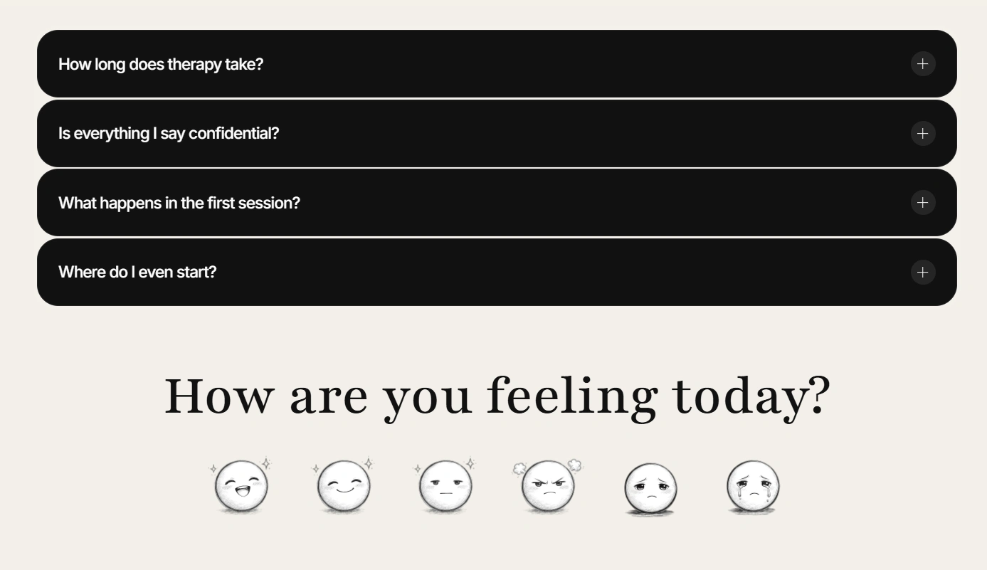
Section 5 — FAQ
Four questions addressing the real hesitations people have before booking — not logistical ones, emotional ones. Where do I even start? What happens in the first session?
How Are You Feeling Today
A single question before the CTA. No button yet. Just a moment of pause that mirrors what a therapist would actually ask. Builds trust before asking for commitment.
Design Decisions
Typography
Playfair Display for headlines, DM Sans for body. The editorial serif brings warmth and weight; the clean sans brings clarity and readability.
Color
Parchment
#F5F0E8 for the hero, white for alternating sections, rose #C084A0 used sparingly as the single accent on CTAs, interactive elements, and diagram highlights only.Illustration
Hand-drawn sketch style throughout. Chosen to feel human, imperfect, and warm the opposite of stock photography and the visual language of every competing therapy site.
Animation philosophy
Every animation earns its place. Nothing is decorative. The hover reveals emotion. The scroll untangles chaos. The timeline simplifies complexity. Each interaction is the content, not a layer on top of it.
Like this project
Posted May 14, 2026
Where design meets empathy — a fully animated Framer website built for mental health professionals who want more than just a pretty page.
Likes
0
Views
0