Crude — Natural Skincare Brand & Packaging

Hibye Studio


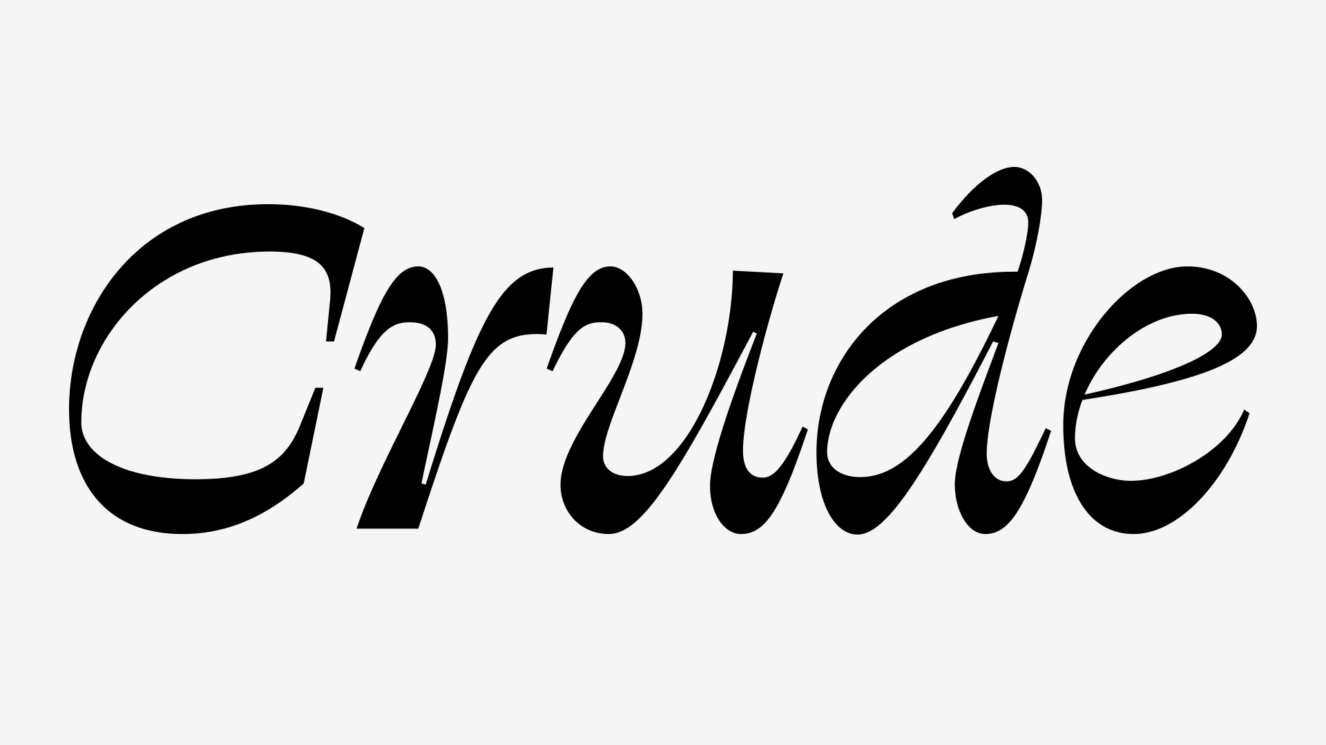
A natural skincare brand built on the idea that beauty products should be as honest as the ingredients inside them. The identity needed to communicate purity, simplicity, and a premium feel without overdesigning.
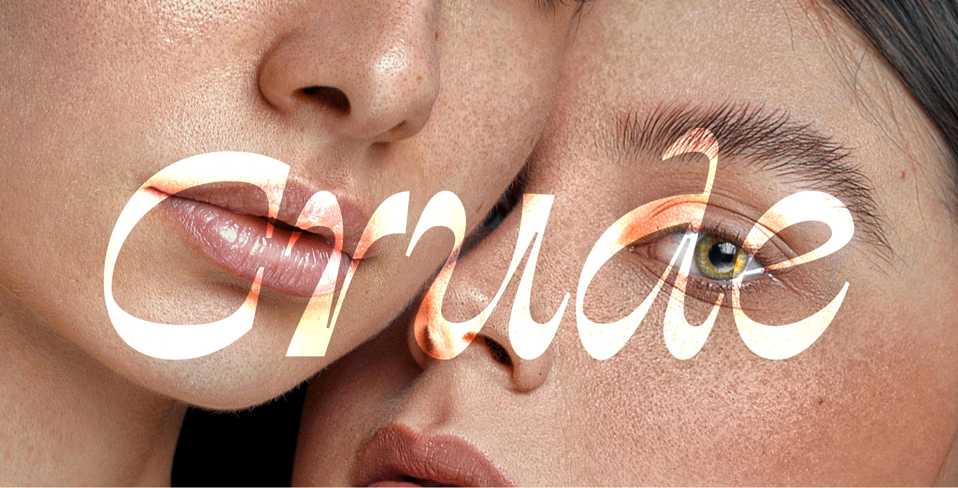
Crude celebrates the pure, unrefined essence of nature in skincare. Our mission was to harness the intrinsic power of natural elements to create products that nourish the skin while embracing its natural beauty. Each product is a testament to clean, sustainable beauty practices.
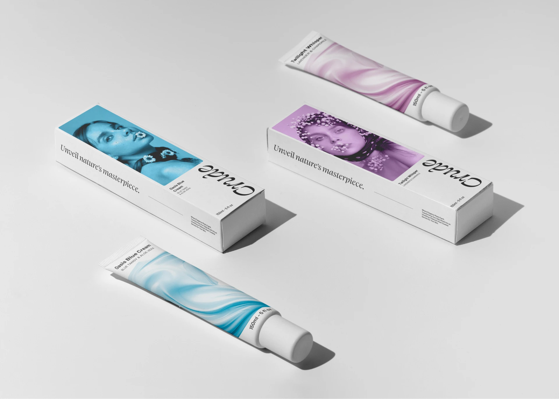
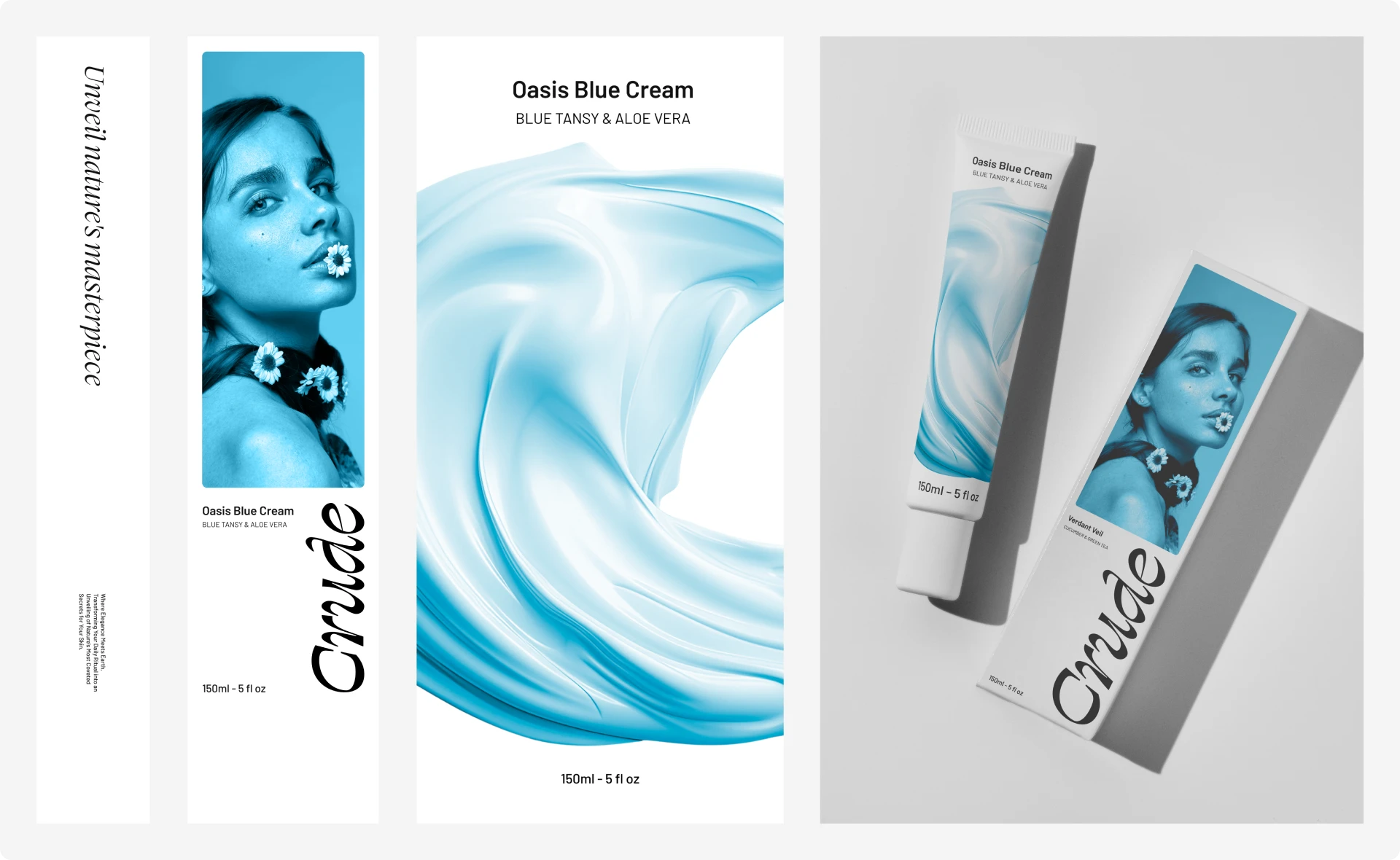
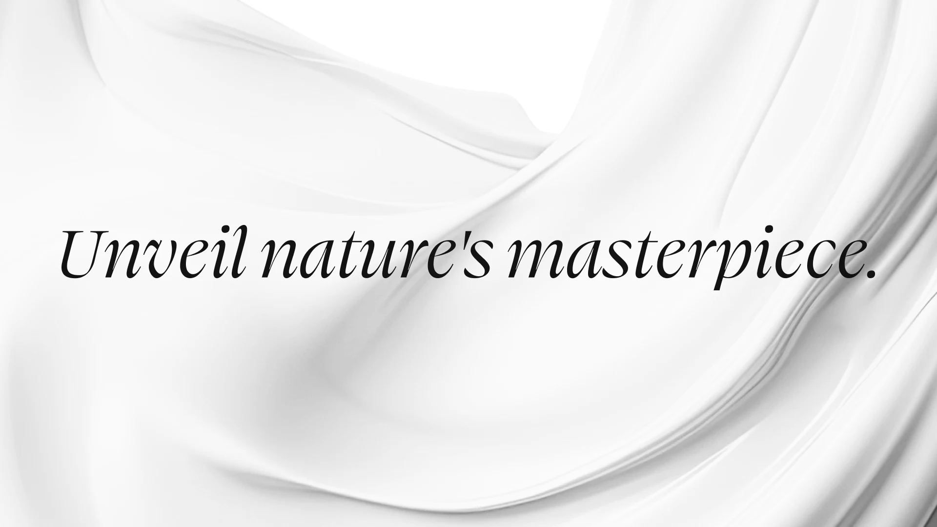
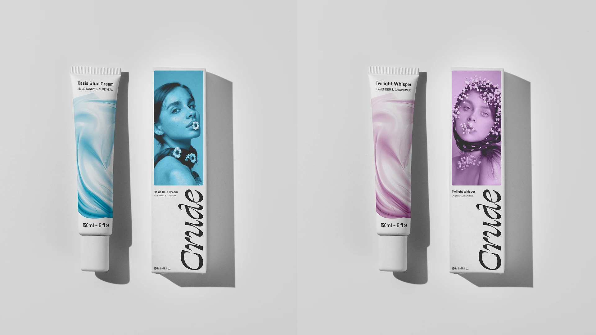
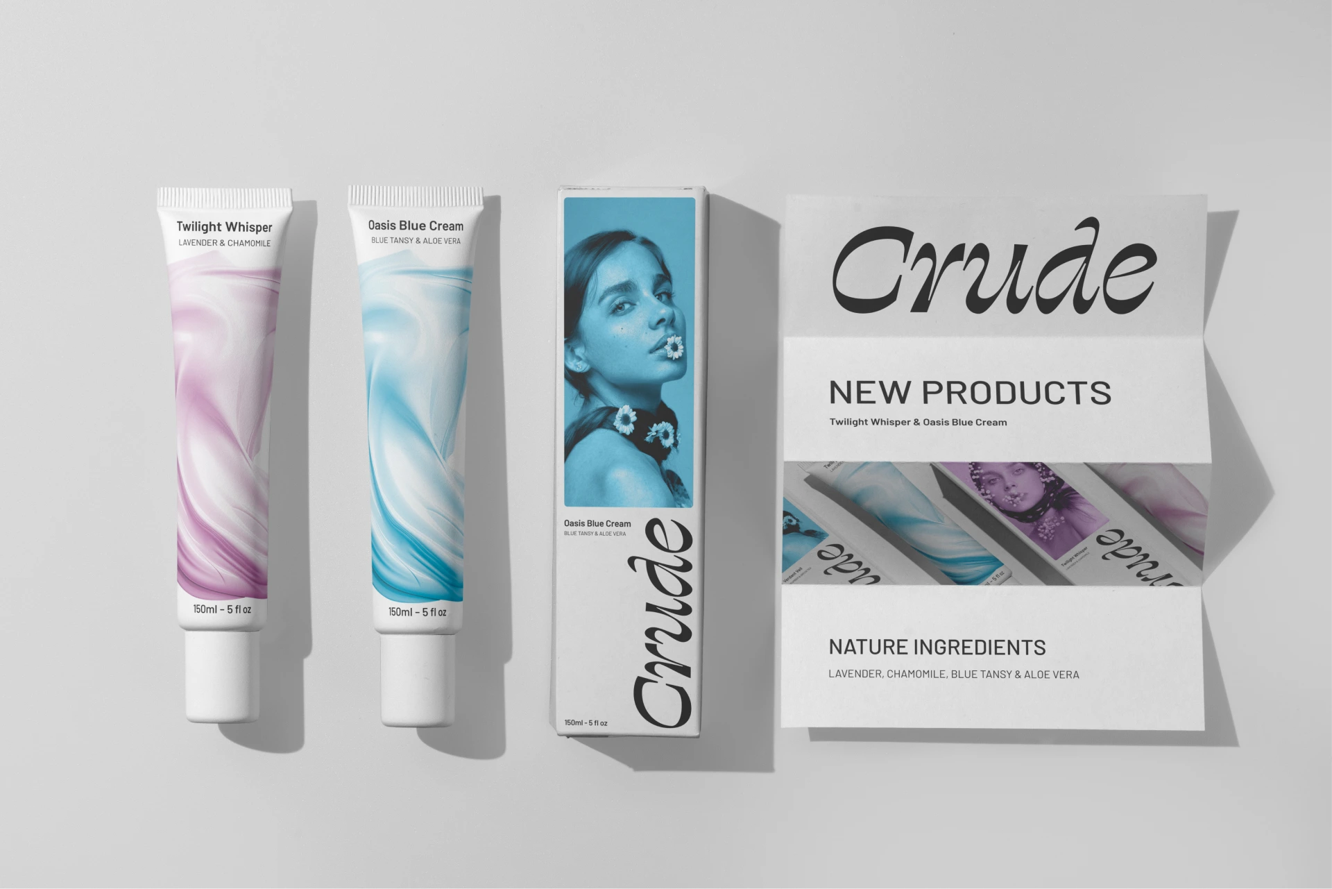
The visual system strips away everything unnecessary. Muted tones, generous white space, and refined typography let the product quality speak for itself.
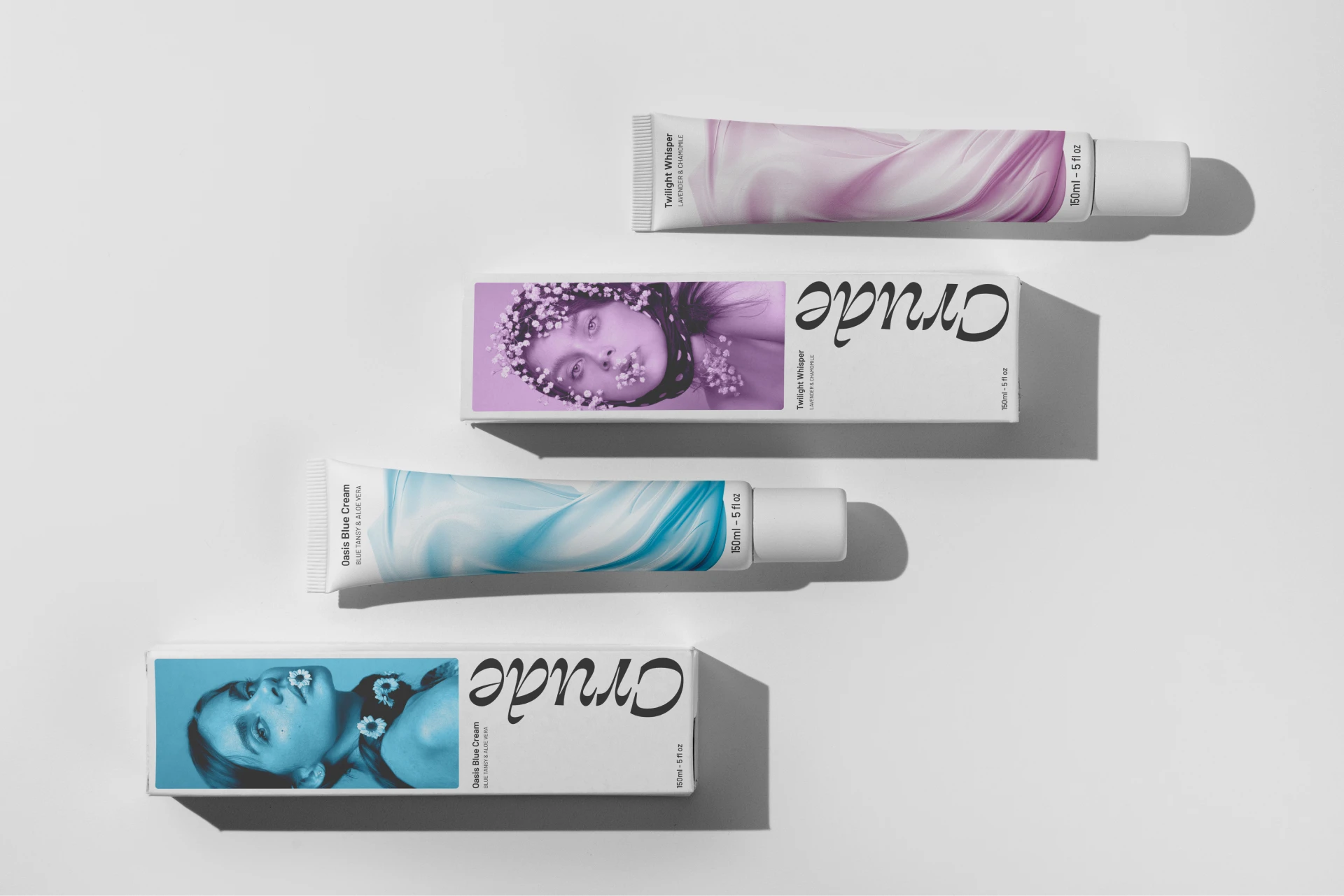
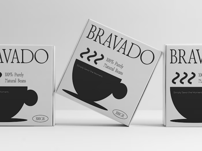
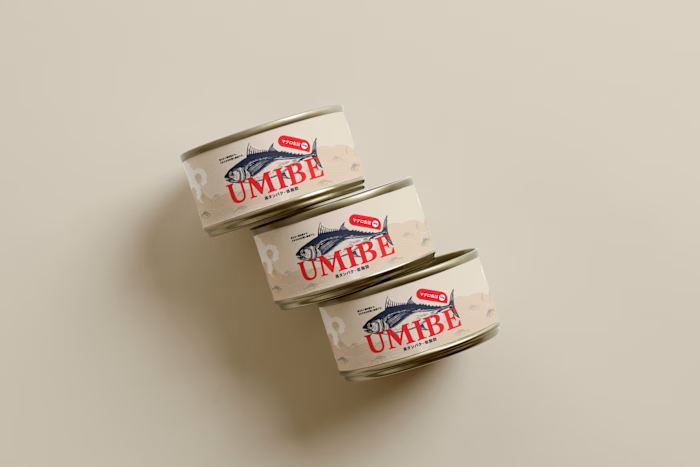
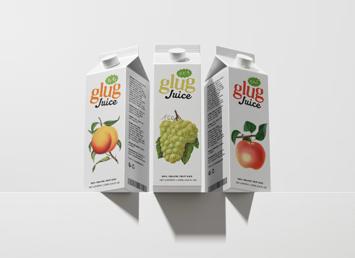
Packaging was designed to feel like something you want to keep on your shelf. Clean labels, tactile materials, and a layout that communicates ingredient transparency at a glance.
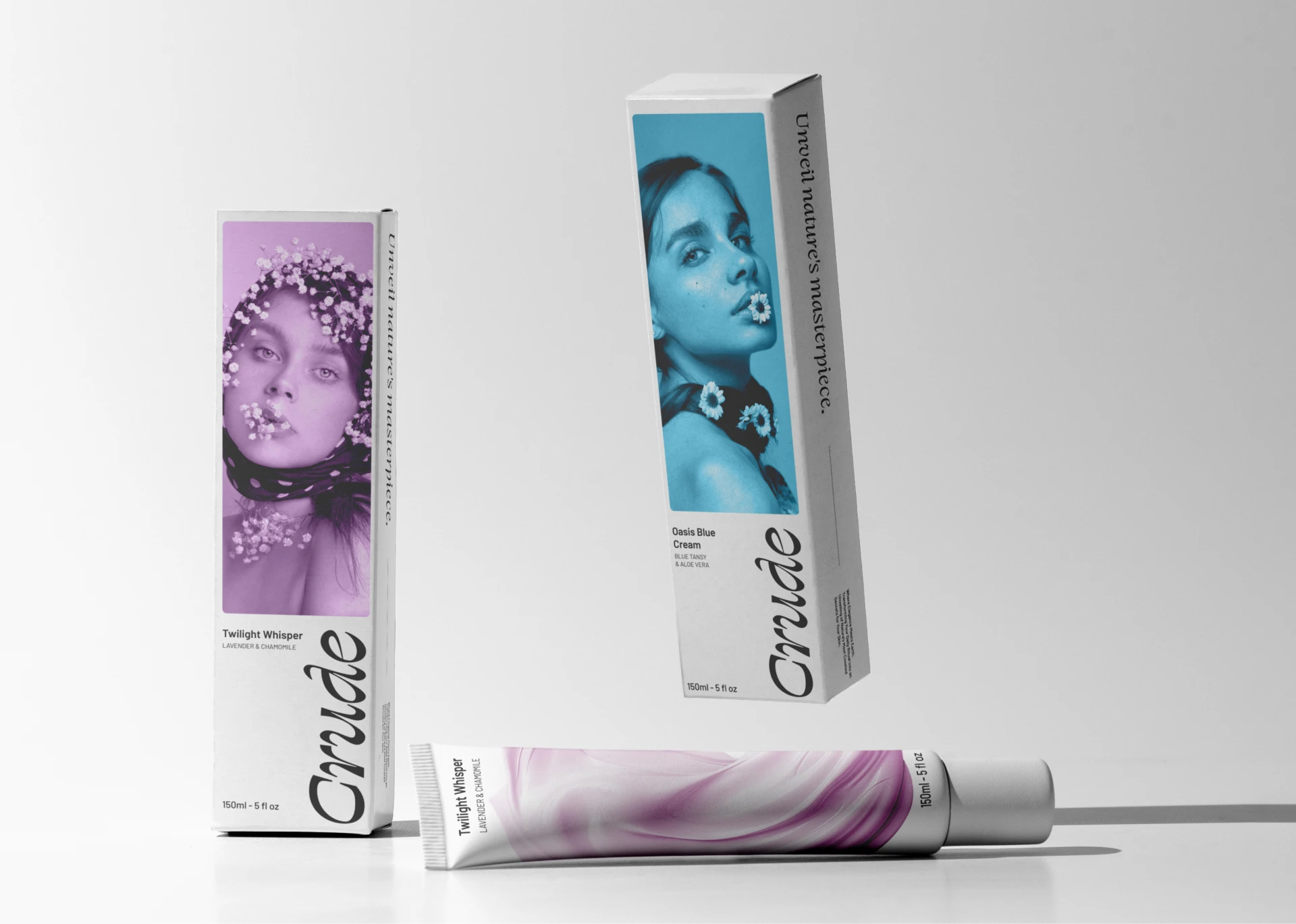
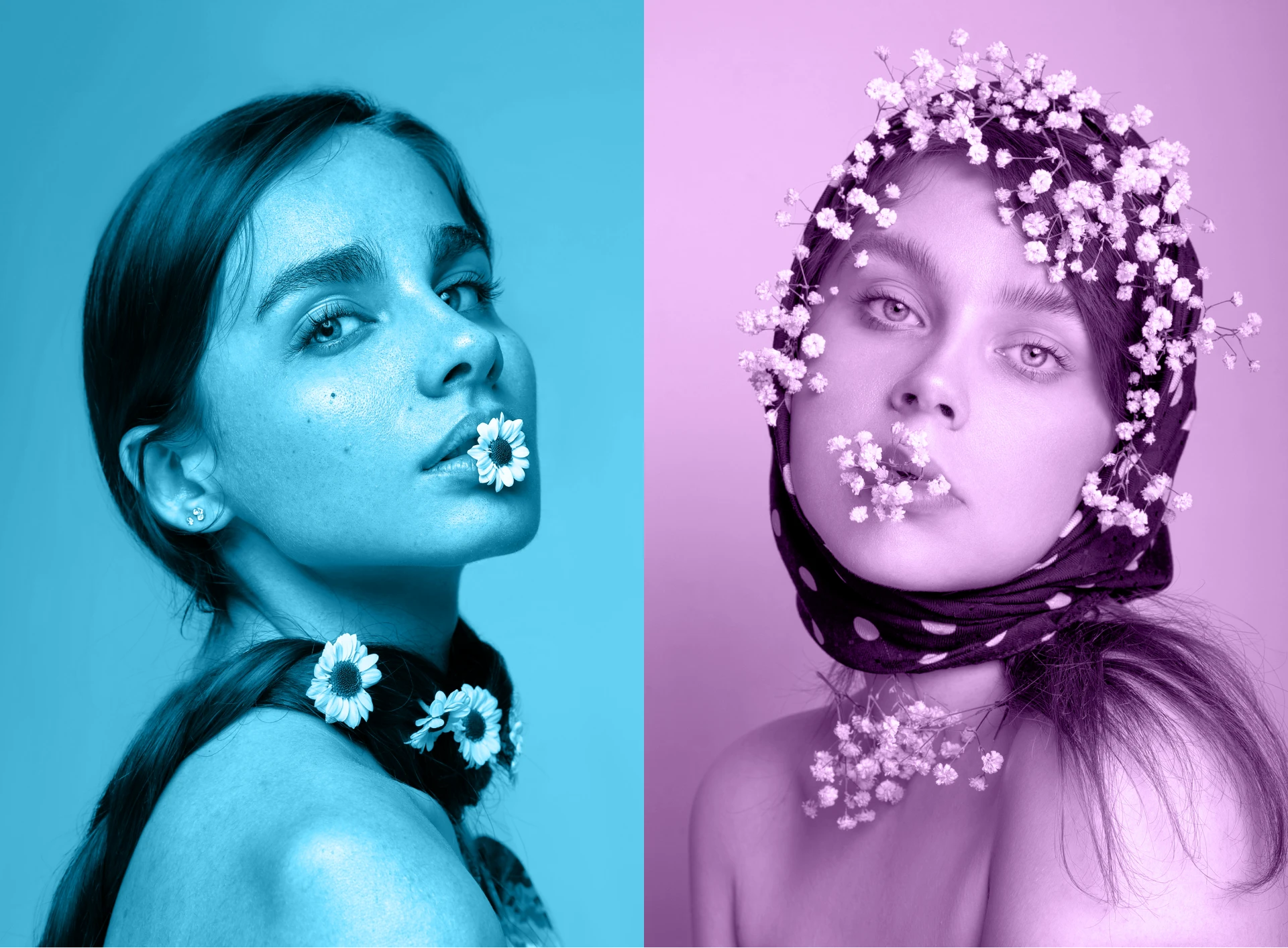
The system scales across the full product line. Face creams, body lotions, and serums all share the same visual DNA while maintaining individual product identity.
Deliverables: brand identity, logo suite, packaging design across the full product line, typography and color system, and brand guidelines.
Like this project
Posted Oct 22, 2025
Brand identity and packaging for a natural skincare line. We designed the full visual system, from logo to product packaging, with a focus on clean ingredients and minimal, premium aesthetics.