Bravado — Minimal Coffee Packaging

Hibye Studio


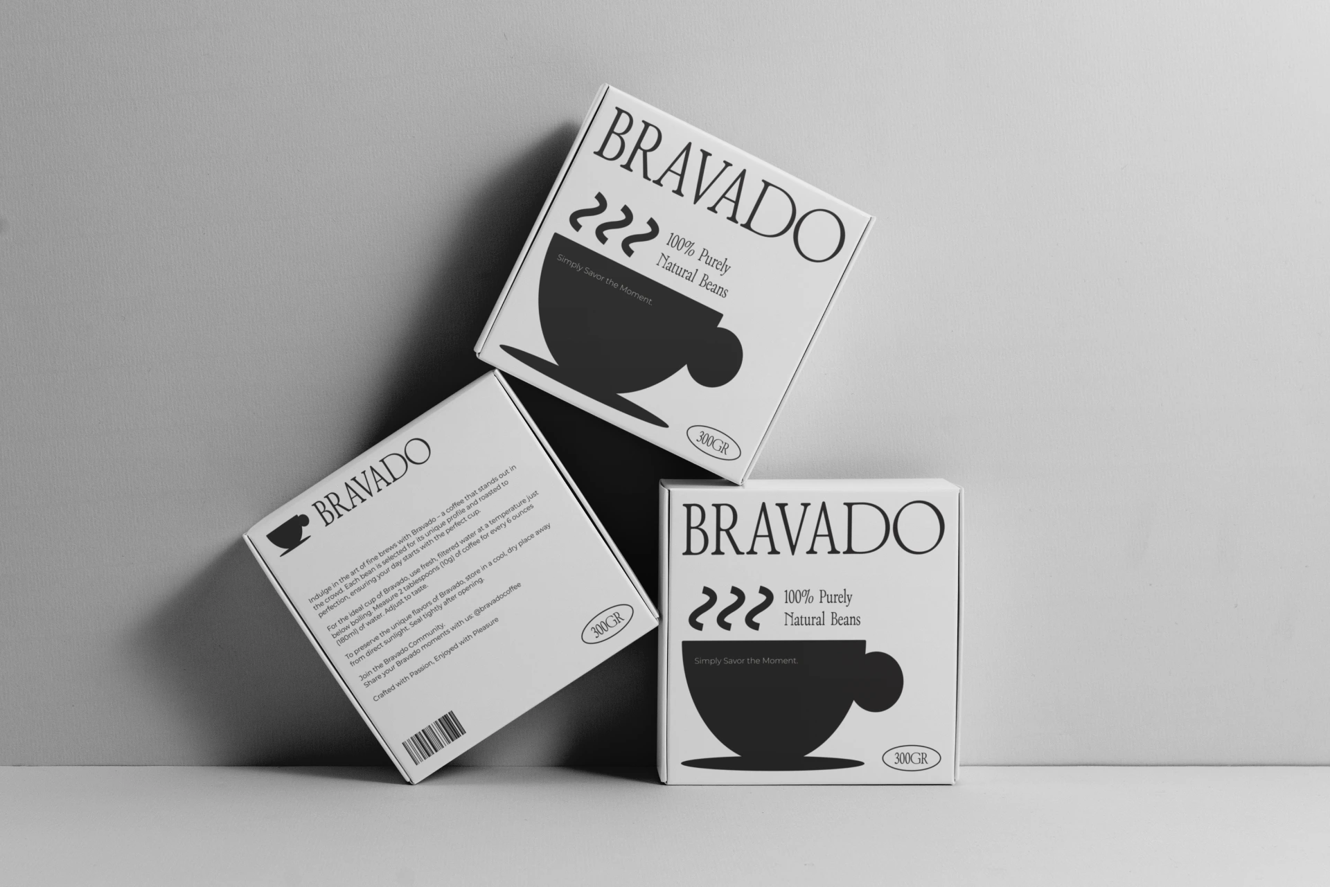
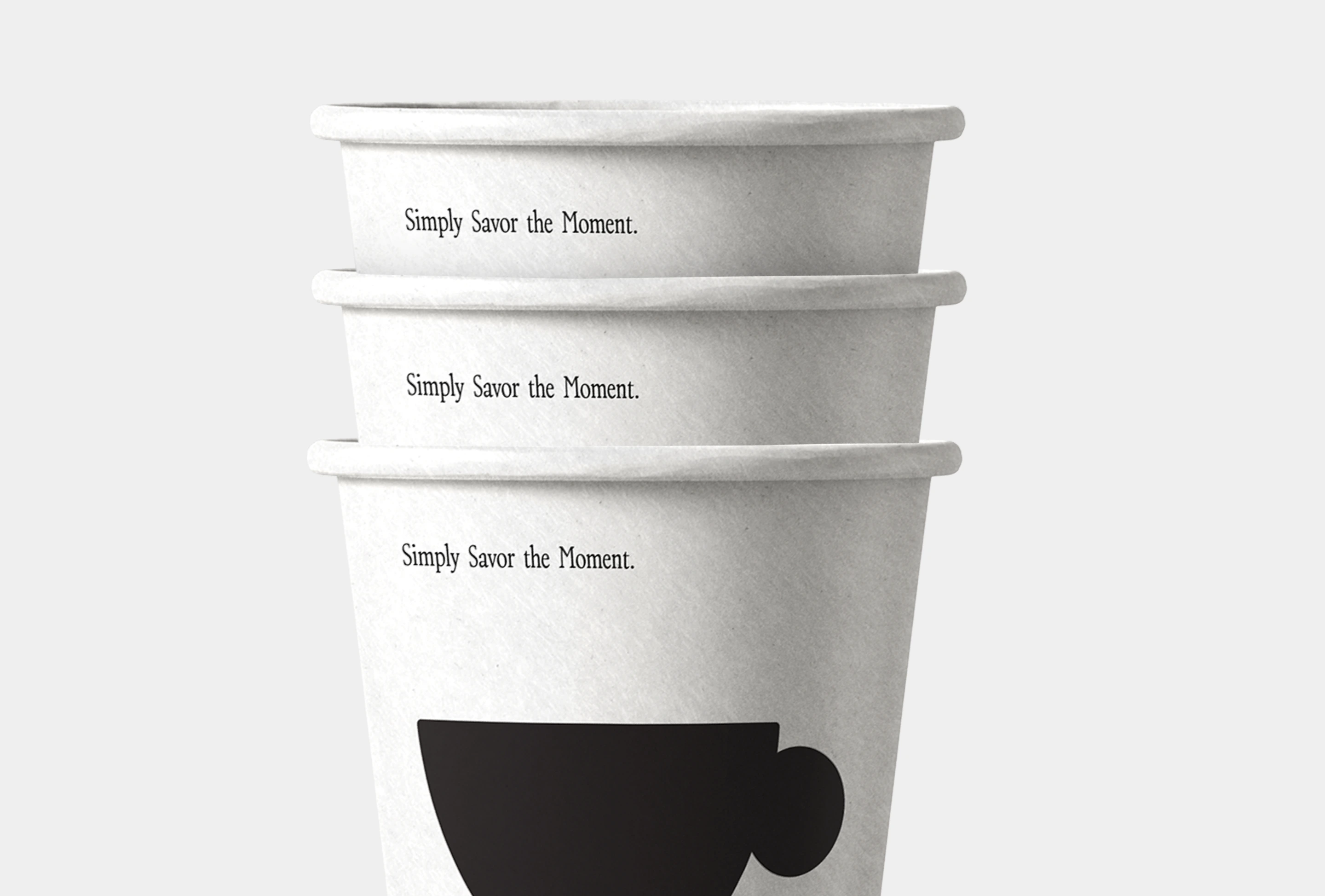
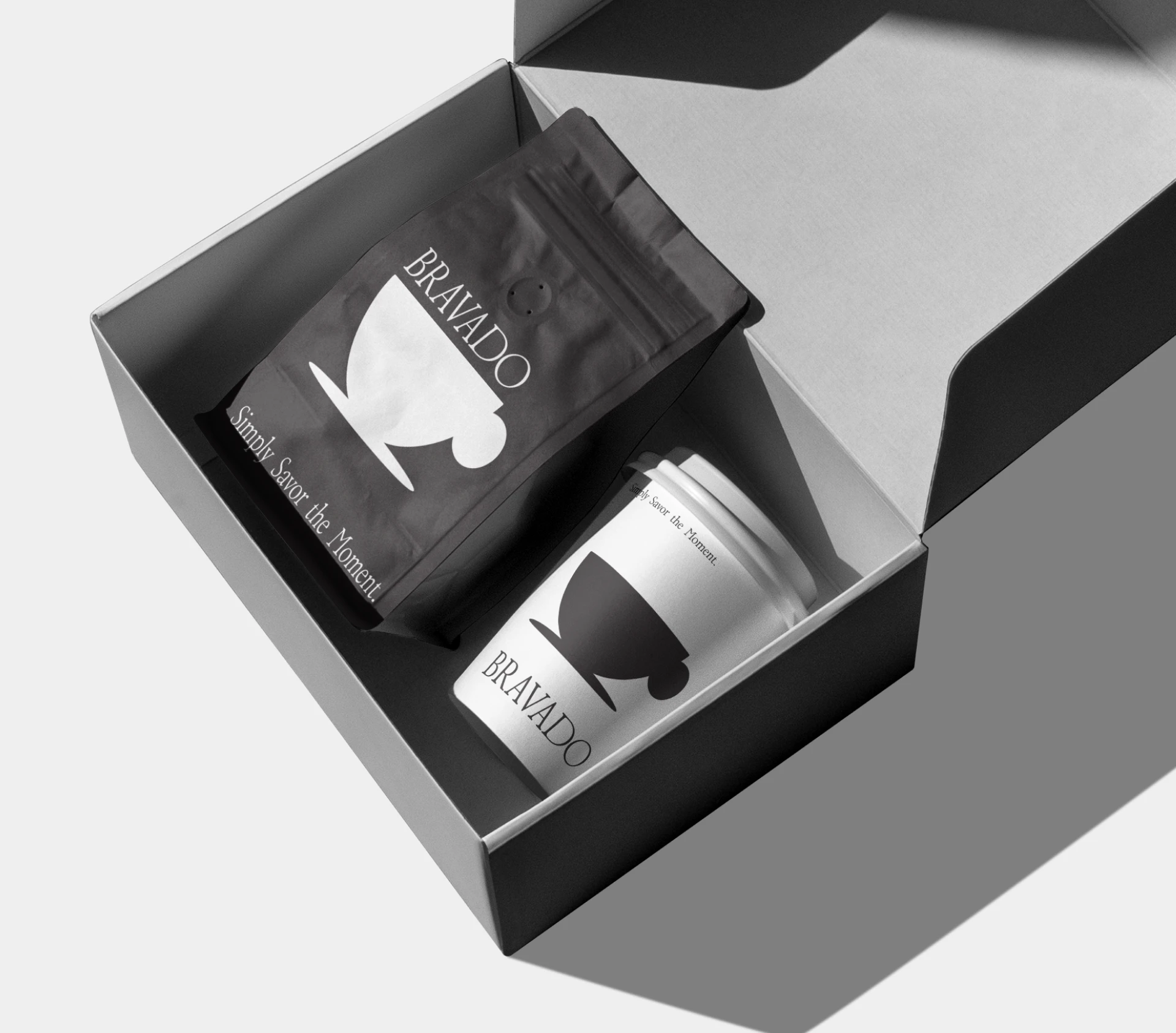
A packaging concept built around restraint. The idea was to strip coffee branding back to its essentials and see how much presence you can create with just typography and a monochrome palette.
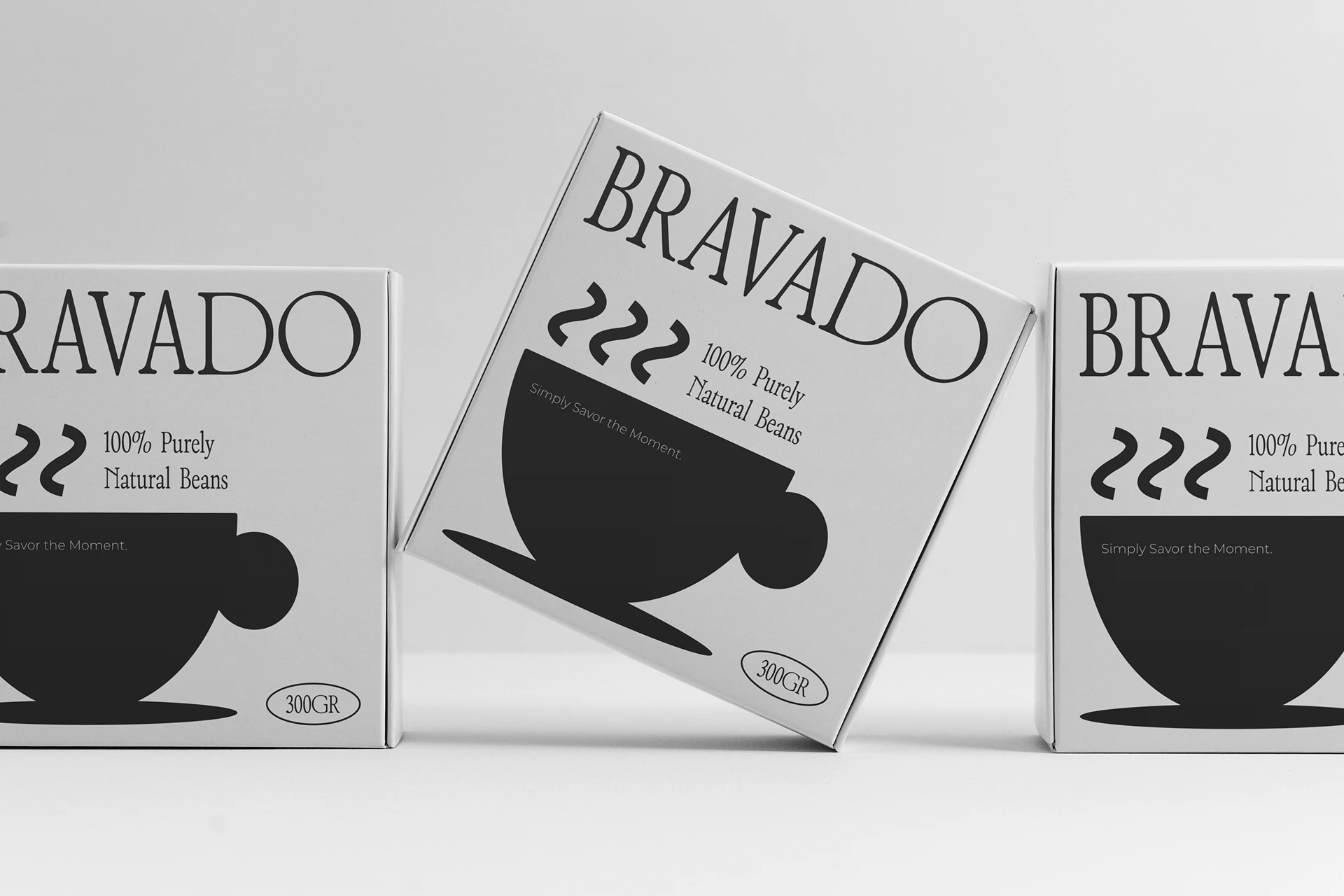
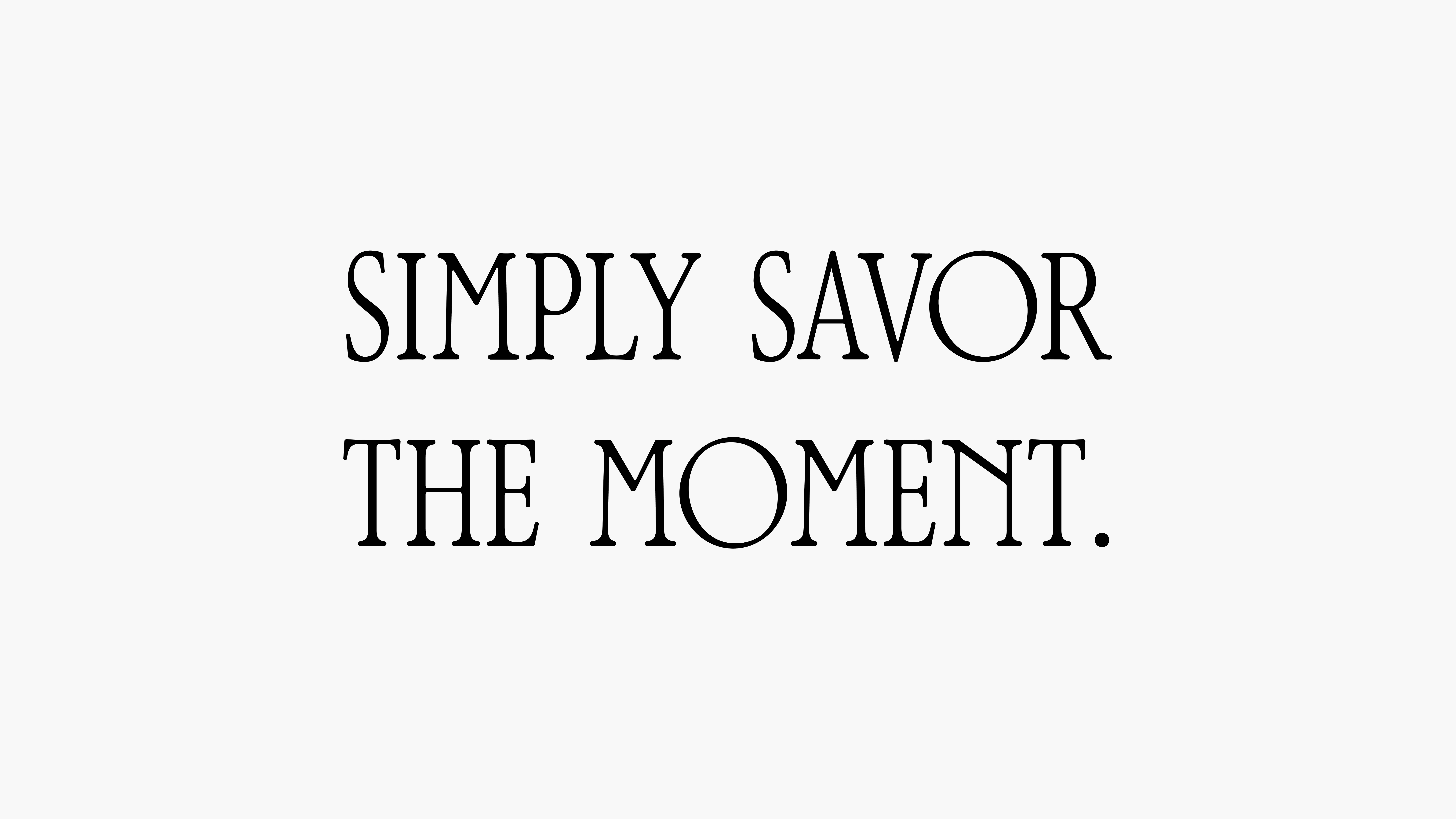
The direction leans heavily on bold type and negative space. No illustrations, no photography, no color accents. Just structure, hierarchy, and confidence.
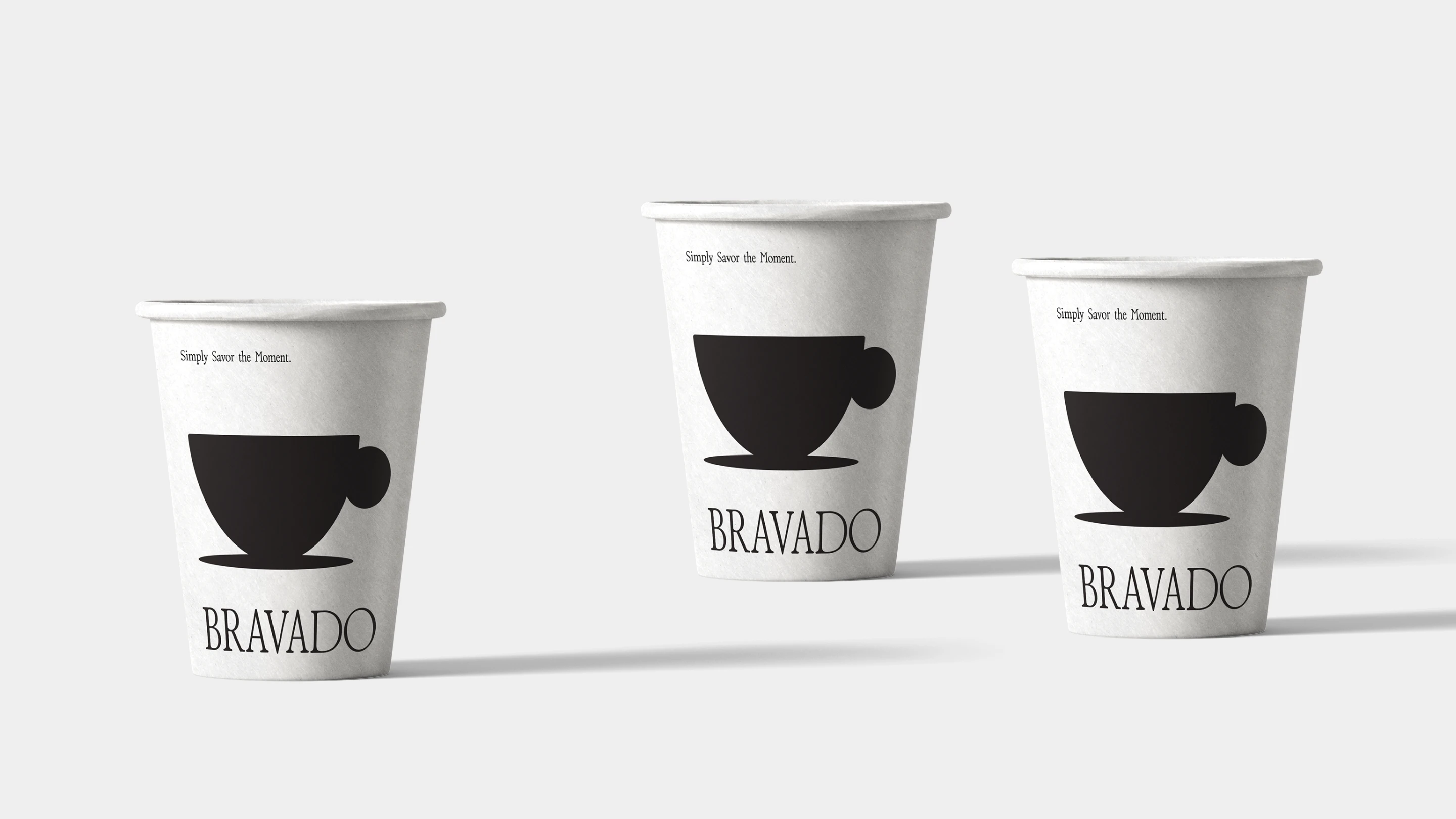
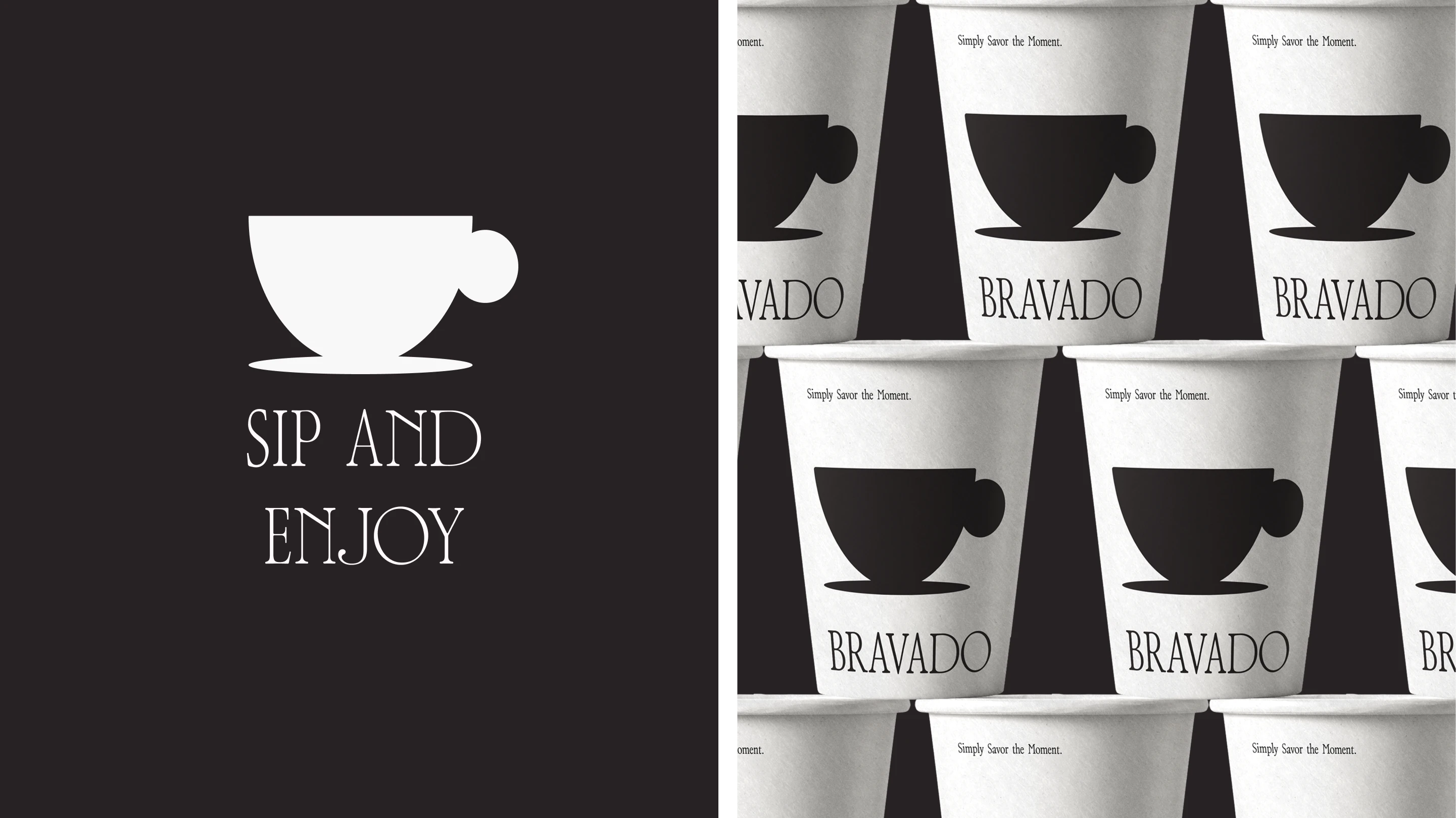
The packaging system was designed to hold its own on a crowded shelf. When everything around it is loud, the quiet approach becomes the loudest thing in the room.
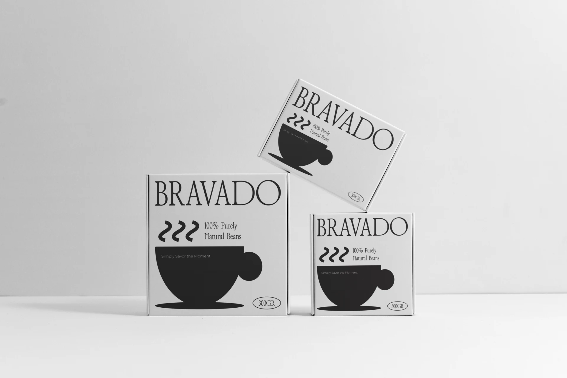
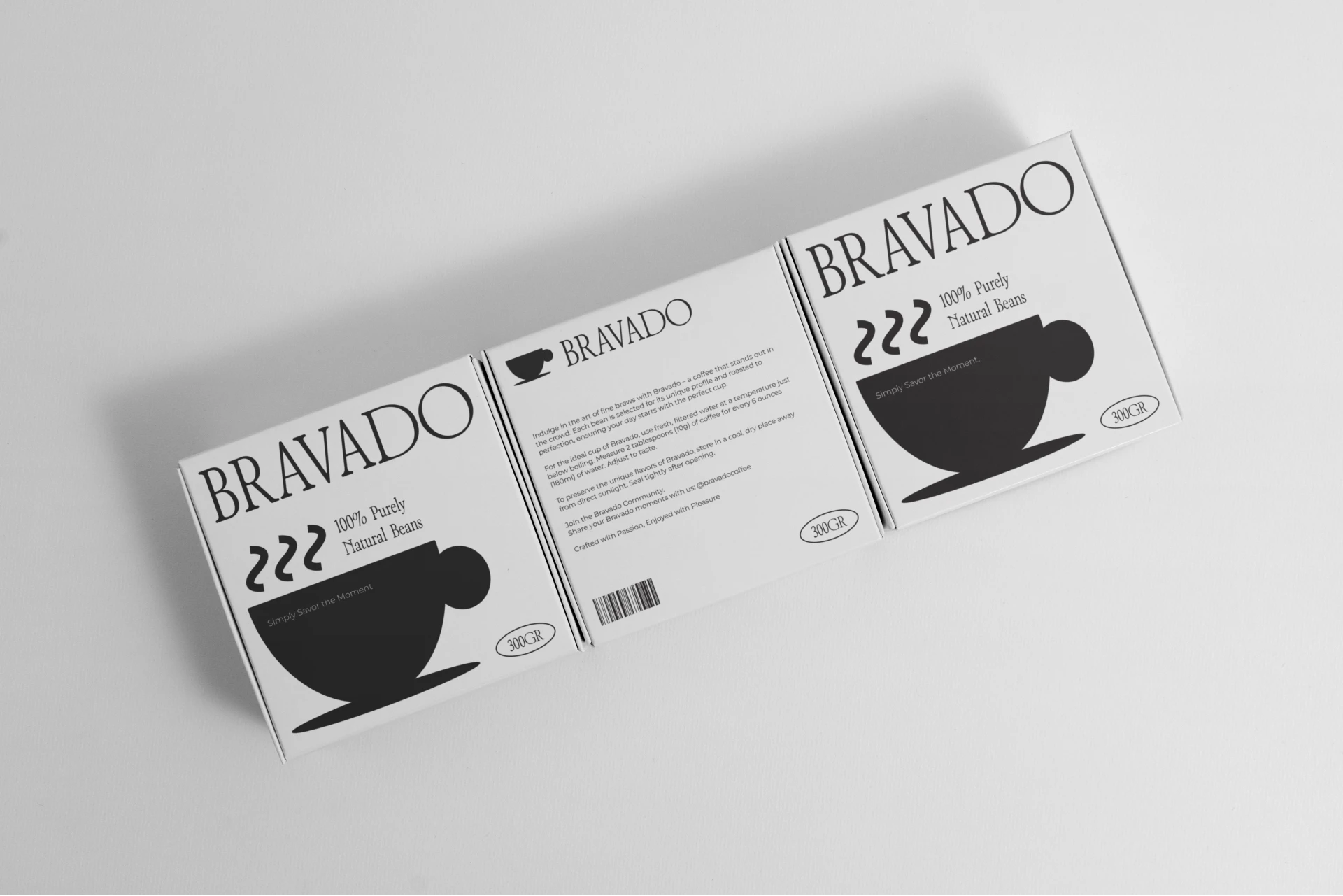
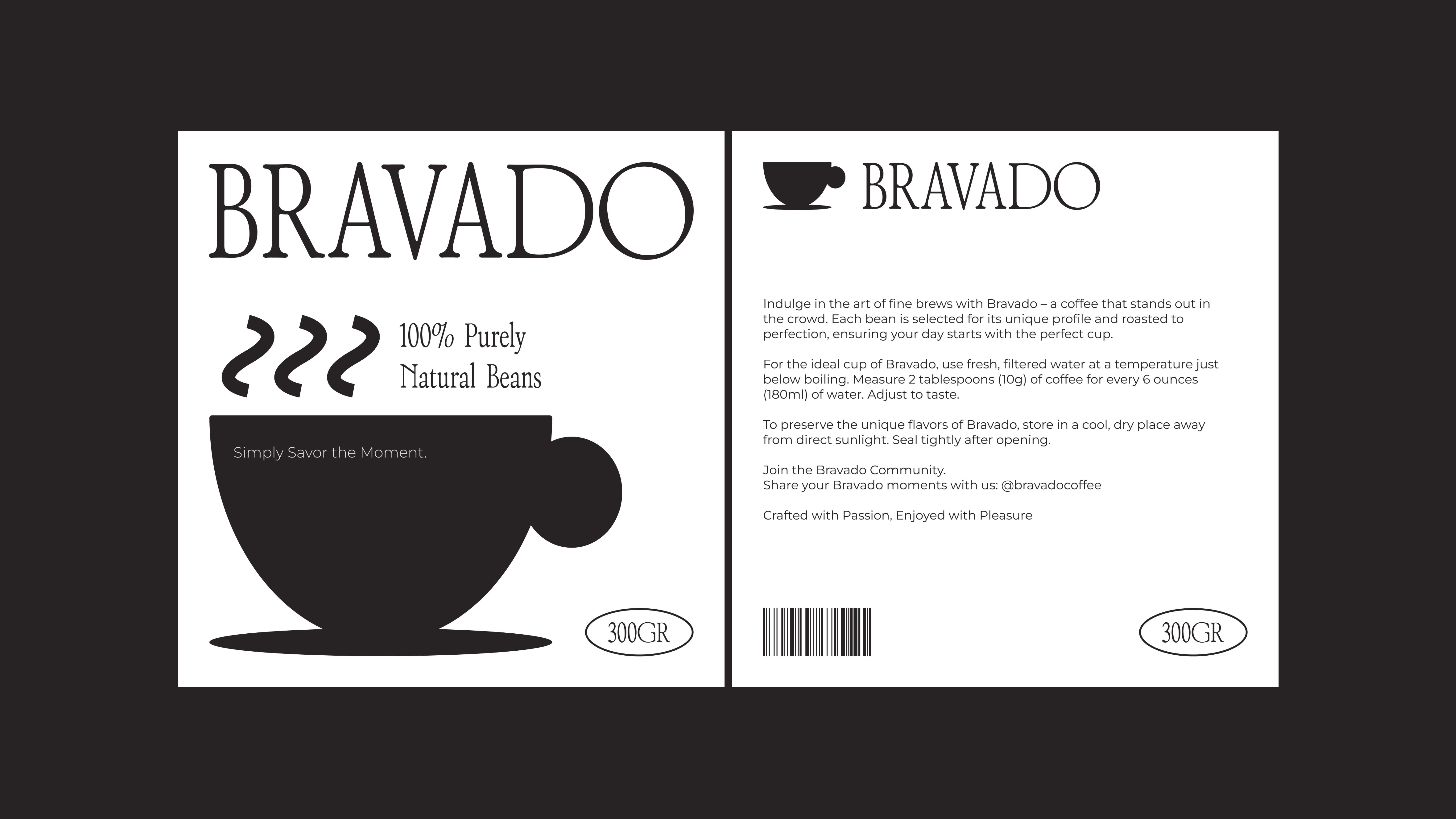
Each SKU variant maintains the same structural grid. The only variable is the roast name and weight, keeping production simple and the brand instantly recognizable.
Like this project
Posted Jun 19, 2026
Designed a clean coffee packaging identity with bold typography, minimal visuals, and a premium monochrome direction for strong shelf presence.