Roadtrippers — Designing a new place data editor app
Context
Roadtrippers is the top app for taking amazing road trips. It’s powered by over seven million places of interest. Each pin on the map has locations, photos, reviews, and all kinds of structured data.
Initially, I advised the founder and leadership team on product, strategy, and M&A.
Immediately following their acquisition by Thor Industries, the world’s largest RV manufacturer, I joined full-time.
I led a new platform team, guiding eight software, data, and AI engineers. And I designed the interfaces we used to audit, correct, and train our data.
Powering the #1 road trip app
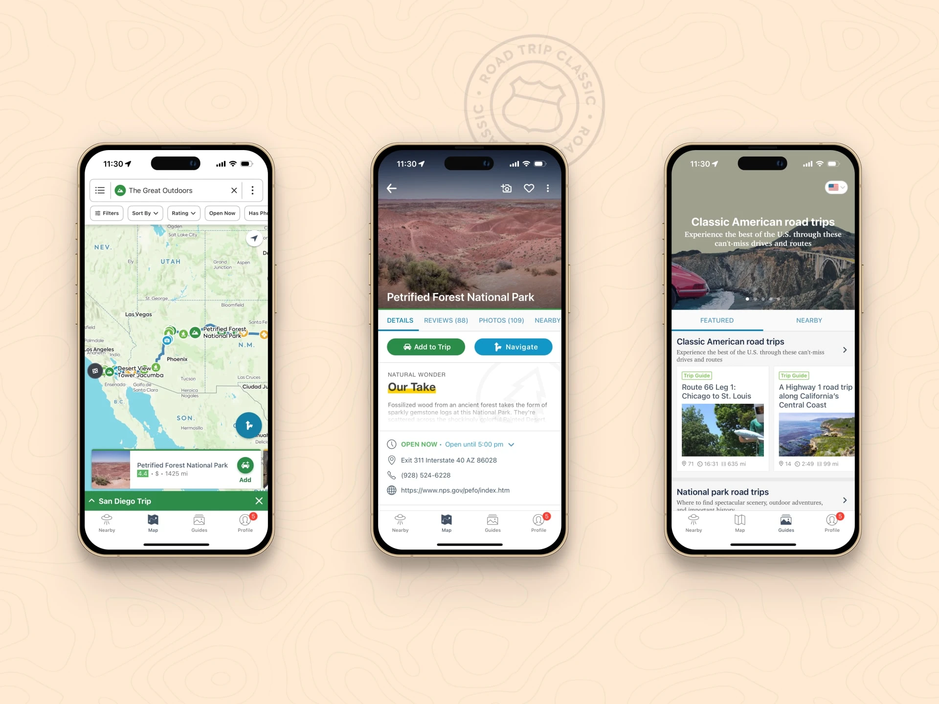
Roadtrippers is the ultimate road trip companion. It will help you route from A to B and discover what you love in between.
The app itself is great, but that I didn’t design
Since 2012 it has helped plan more than 38 million trips, covering more than 42 billion miles.
The app has a smart route planner that helps you find the most interesting places to explore within a set distance from the route to your destination.
It also has editorial travel guides and itineraries to follow, turn-by-turn navigation, and shared planning with your co-conspirators.
The complexities of place data
Powering Roadtrippers is a collection of 7M+ places of interest.
Each pin on the map has hundreds of possible data points whose veracity needs to be continually evaluated, and which needs to be stored and retrieved without issue.
But there is no single source of truth about places and their data. In fact, we relied on many:
What Roadtrippers users said
What partner location data sources said
What open source map data said
What the public internet said
Each pin on the map can have many “places” from many "sources" from which the data is sourced. And each of those will have varying degrees of completeness, accuracy, and timeliness.
How do you do that?
When I joined, there was a complex data ingestion pipeline, and the engineers working on it were being carved out into their own platform team.
There was also only a rudimentary internal interface for manually editing place data. We needed a new app to support this new growing team.
The goals for the app were three-fold:
Create a more robust internal editor for anyone in the organization to be able to audit, suggest, or correct information about a place
Have it support our growing machine learning efforts for making determinations about place data
Preserve optionality that we might commercialize the platform team, it’s data, and this app, in the future
A place data editor for curation and AI training
I designed a new web app for internal correction and training of our place data.
For the sake of speed, I designed it exclusively for desktop, and we built it with React and Rails, previous engineering choices.

Our internal place data editor
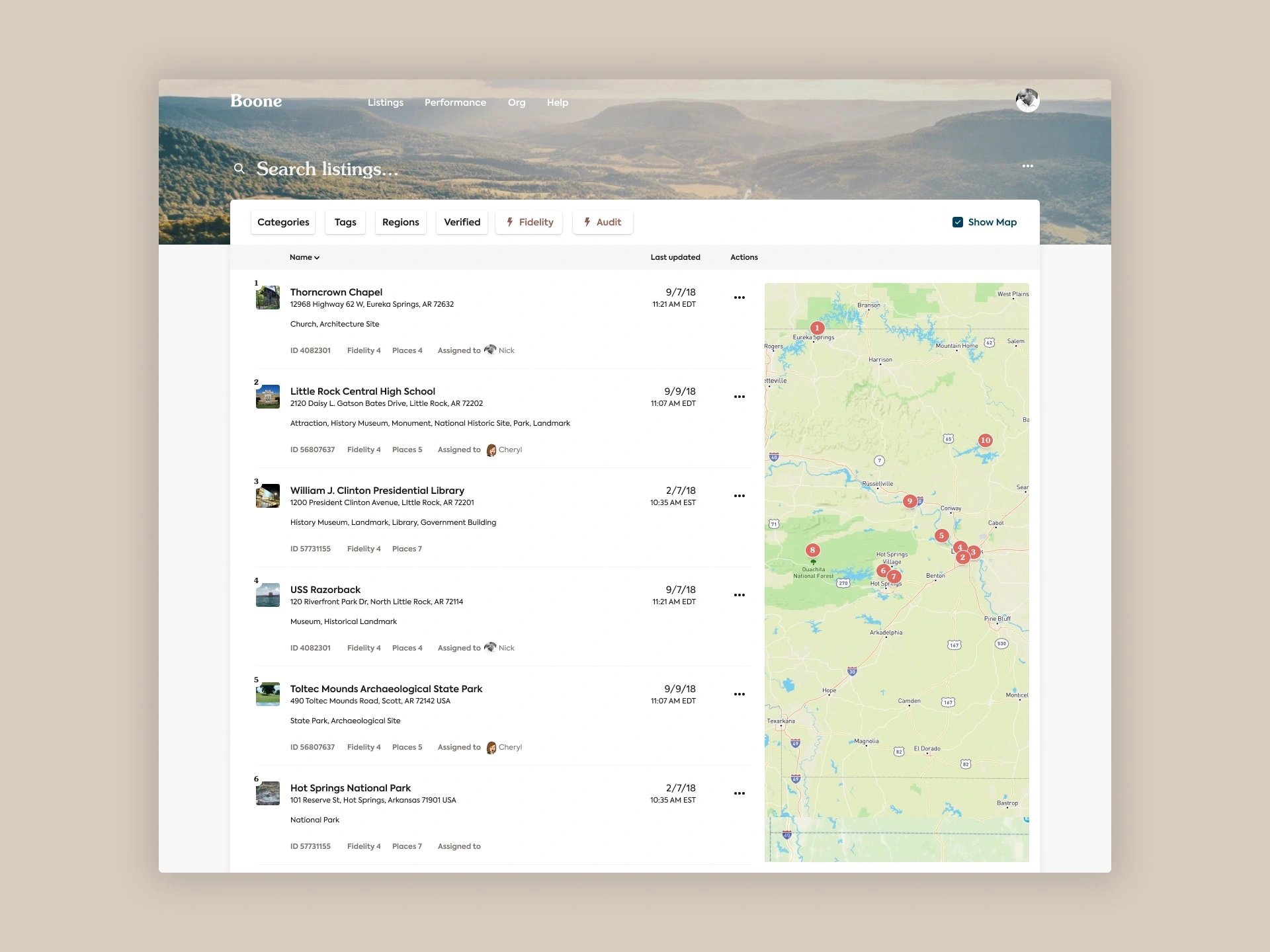
The root view was a Yelp-like list and map combination with a prominent search and a series of filter options.
Viewing a listing
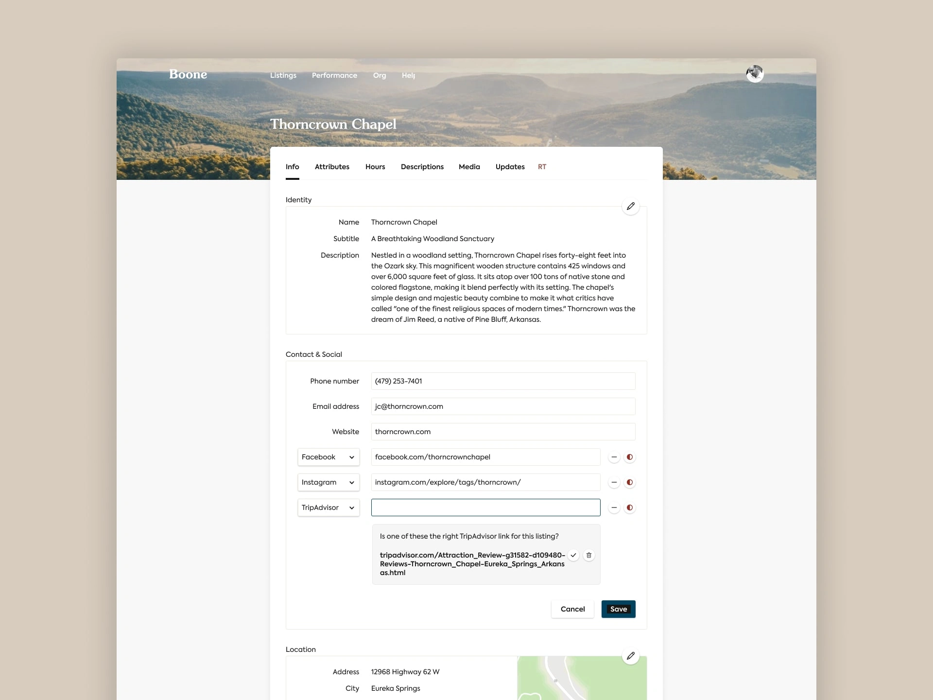
Smart suggestions help fill out a listing
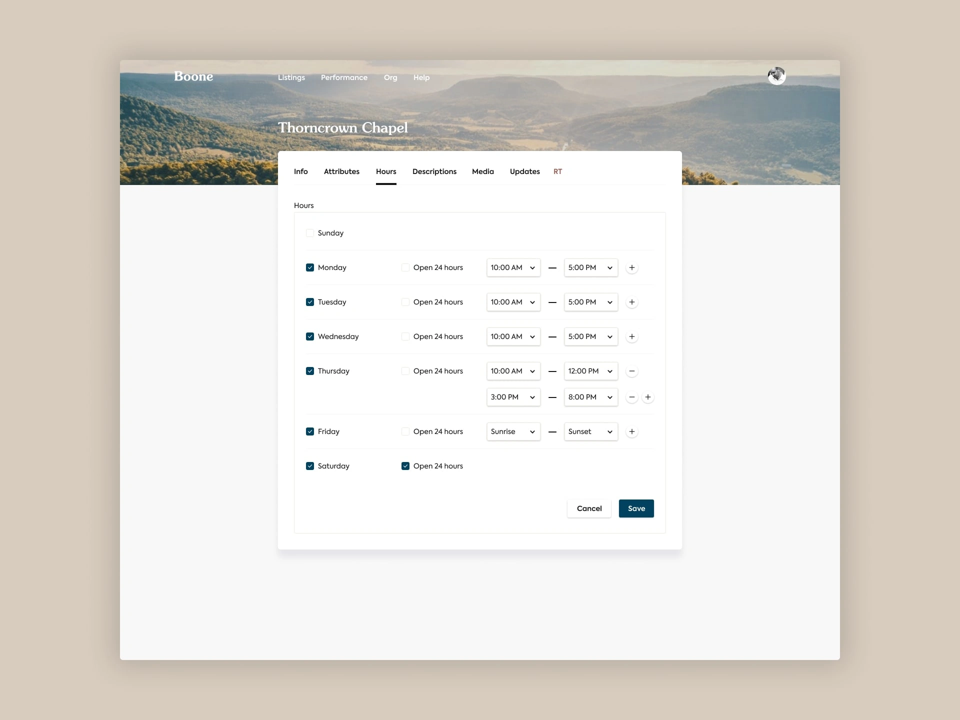
Updating hours of operation
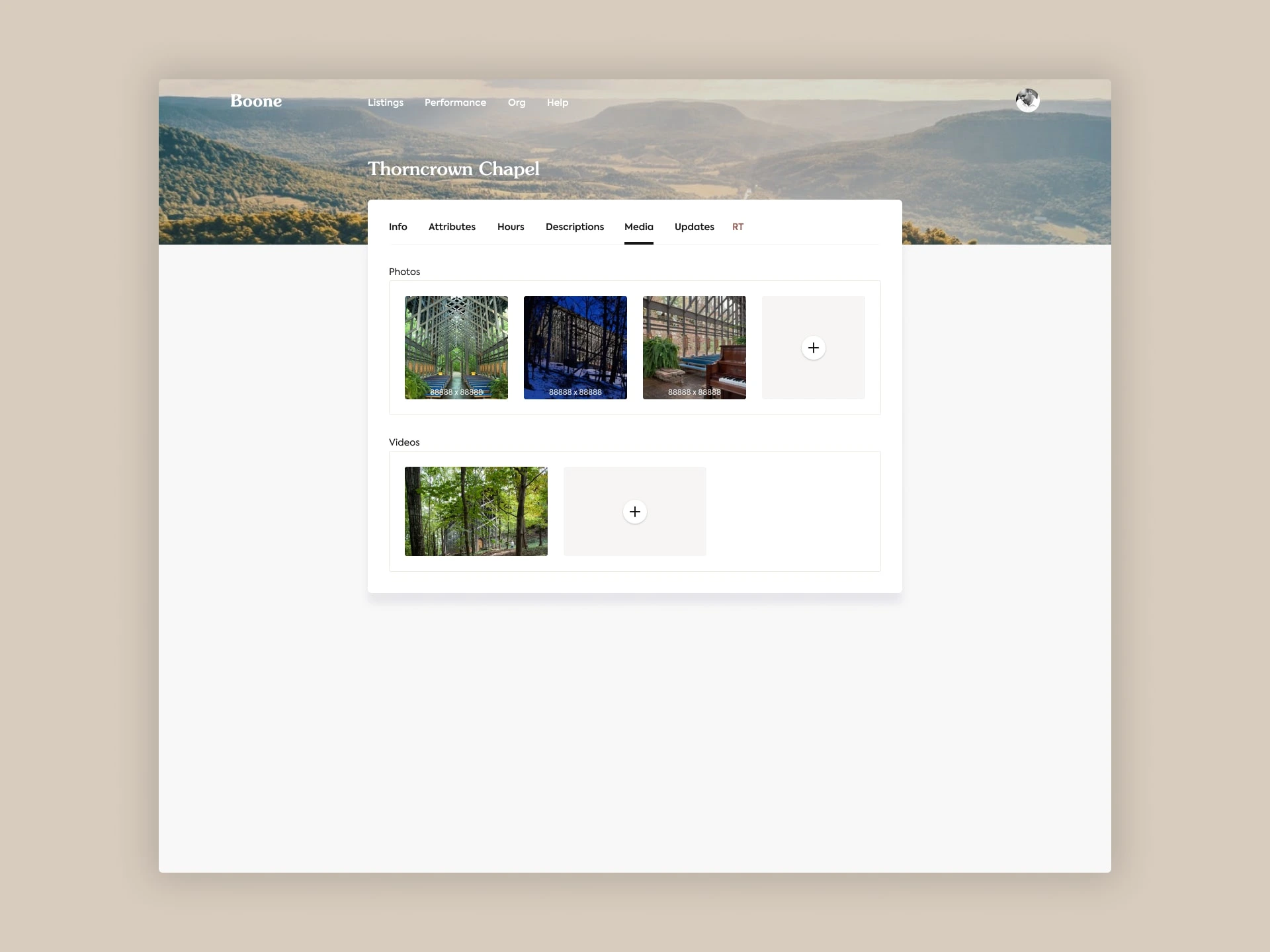
Adding and featuring media
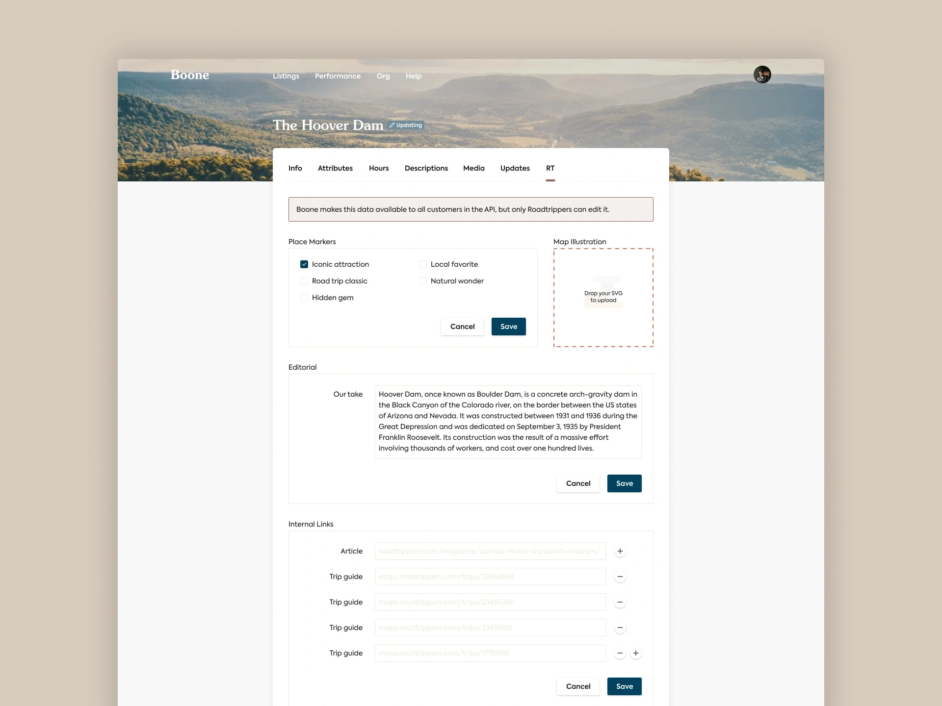
Powering Roadtrippers-only editorial
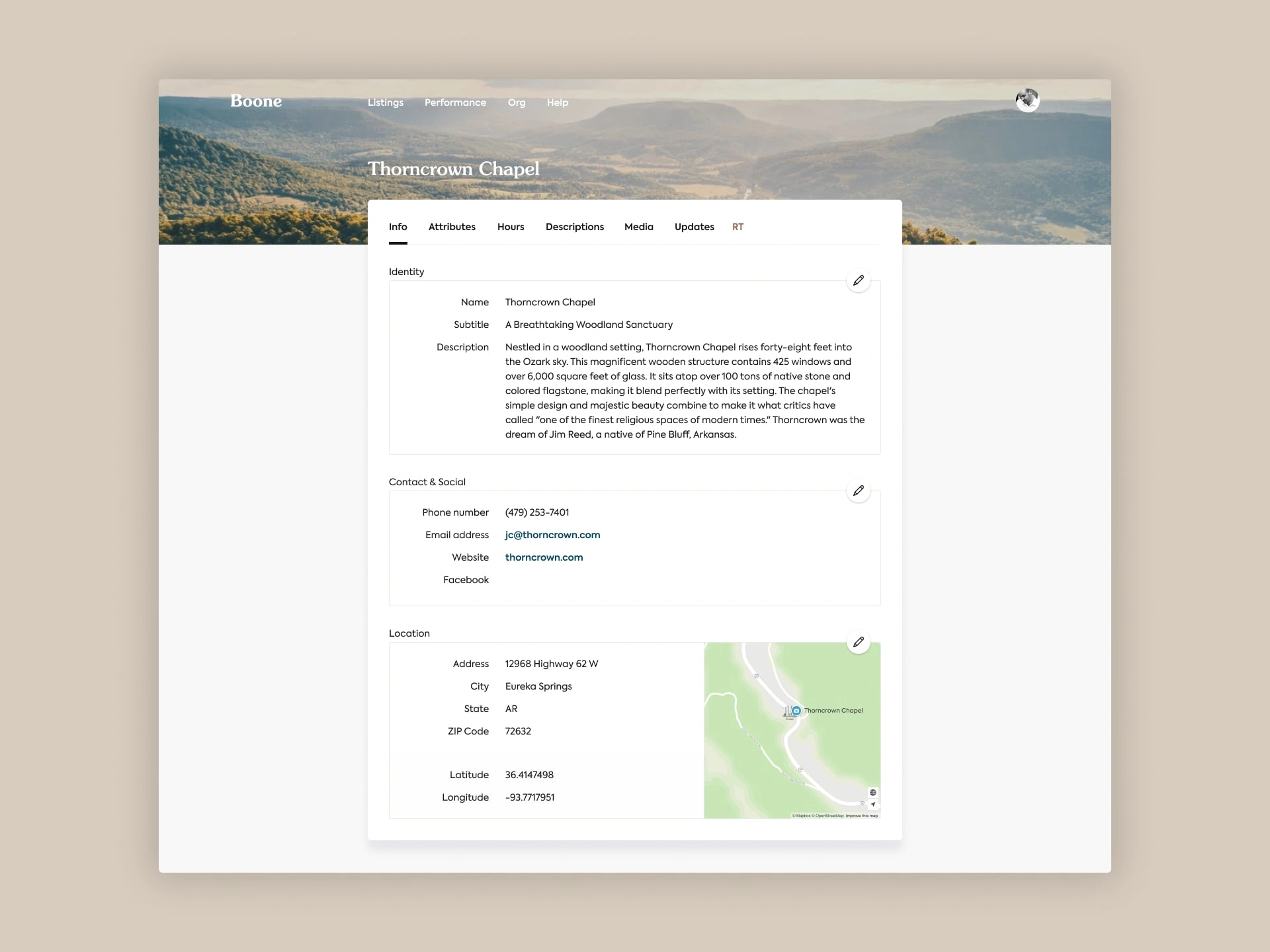
Each listing was broken into a dozen or so buckets: identity, contact information, location, hours, etc.
I decided to have edit buttons on each individual section. It was counterintuitive, but with some quick user testing I found folks were able to move faster through their workflow overall by limiting the scope of each individual saved update.
That way, you could be 100% confident nothing else could be changed but the section you opened up.
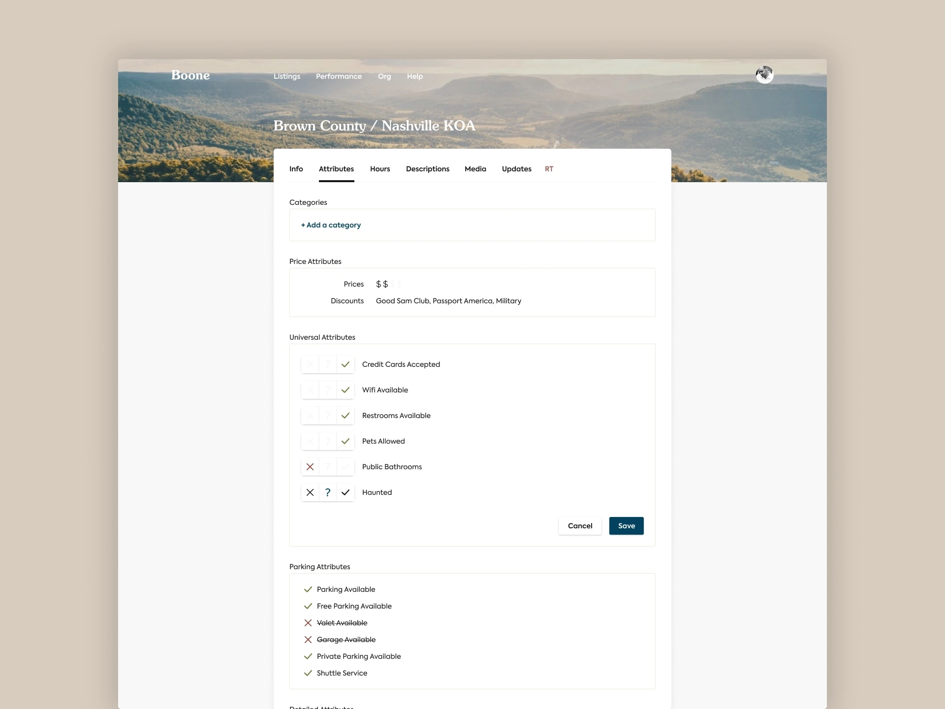
Updating a place’s known attributes
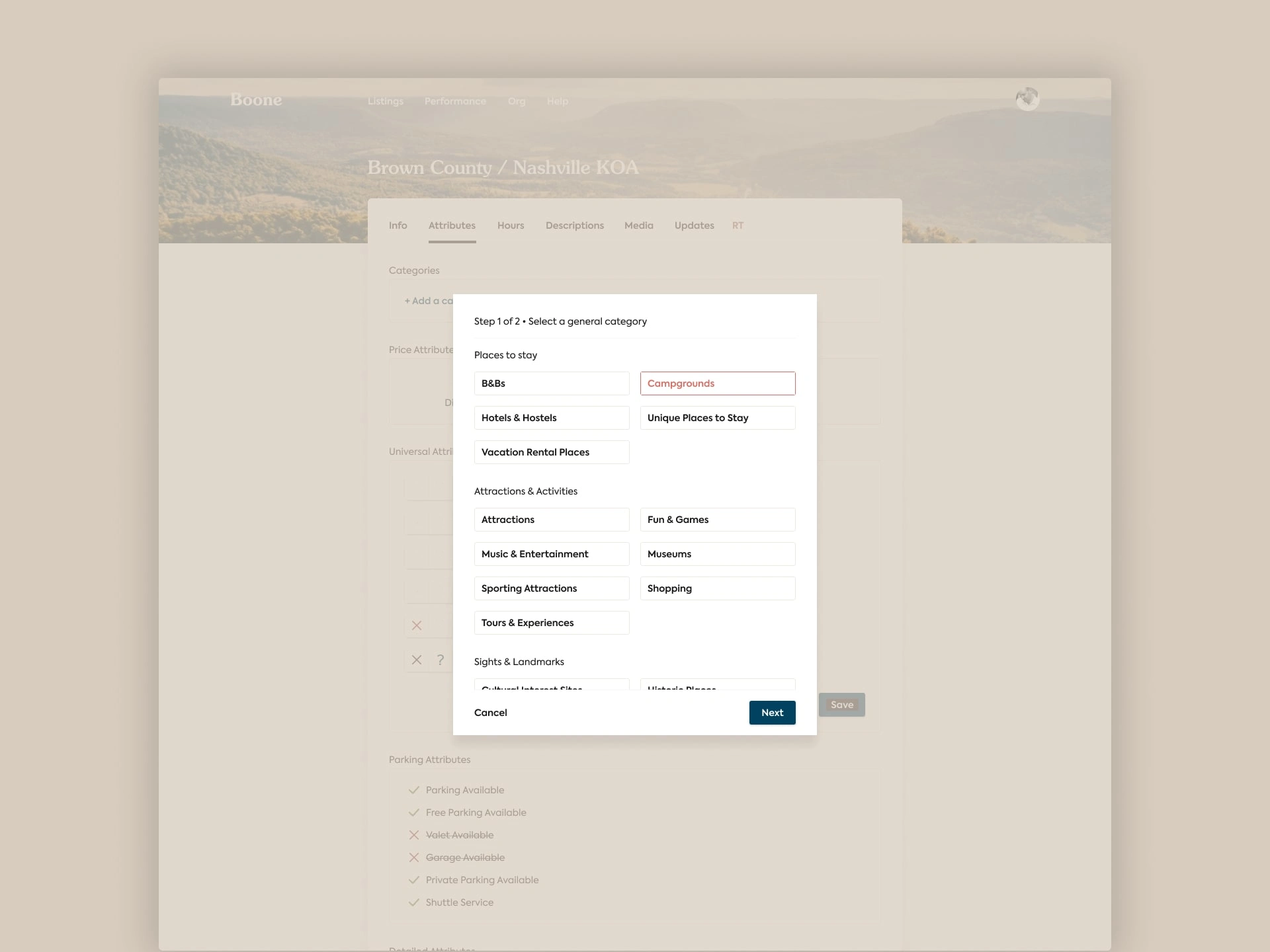
Categorizing a listing for search
The app needed to support an exhaustive list of attributes about a place (with yes/unknown/no options).
It also needed an interface to support the existing, super detailed categorization.
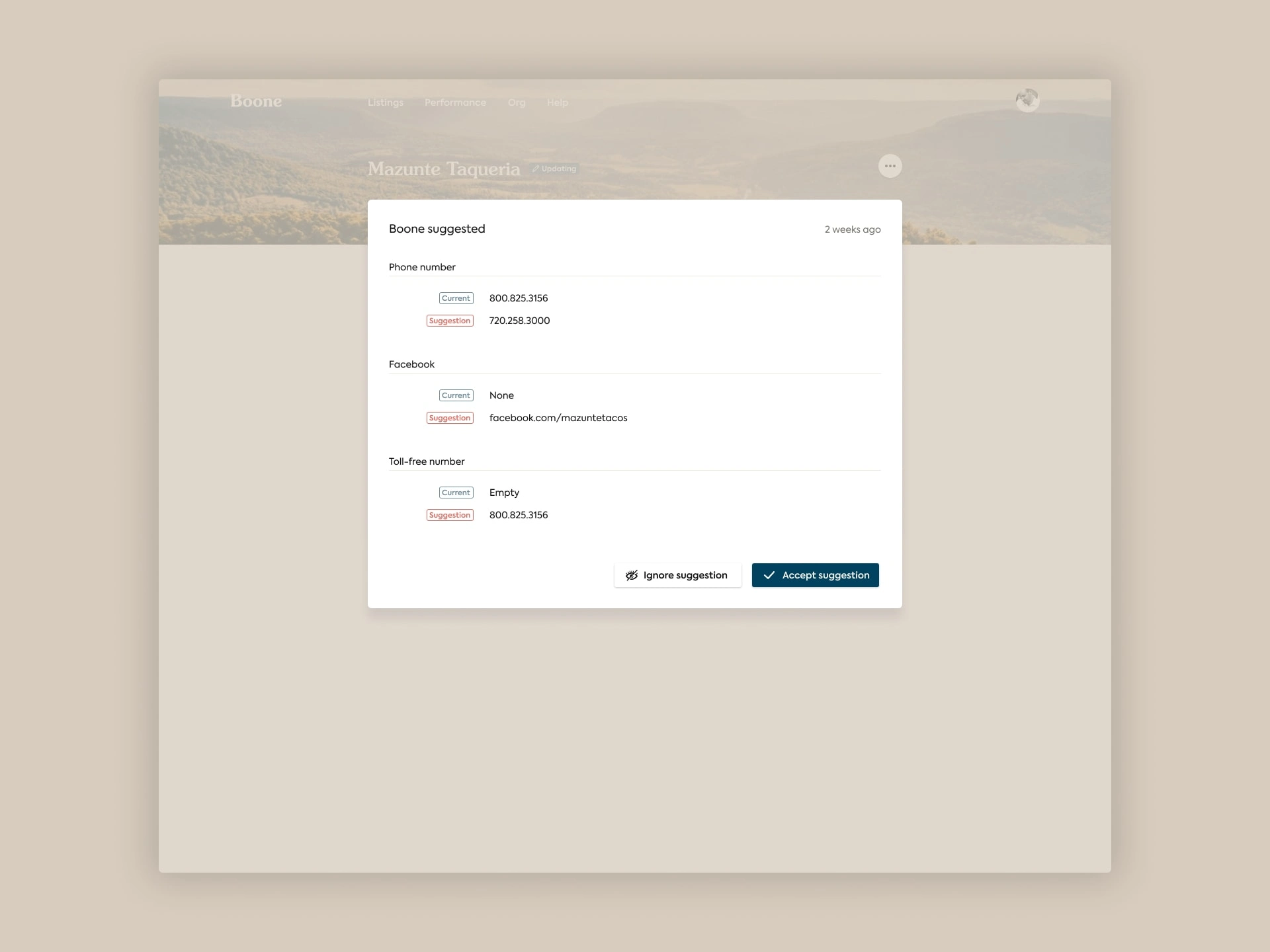
Role tiers and suggestions for better listings
And since there were multiple types of roles within the organization with different levels of authority over the place data, we needed to represent that in the app.
Some roles didn’t make direct edits, but instead were able to submit suggestions for other roles to approve or ignore.
◼️
Like this project
Posted Apr 26, 2024
When you're editing, curating, and training AI models on 7M places of interest in a multi-role system, mid internal tools won't do

