Ahalogy — An app for brands and creators to crush on Pinterest
Context
At Ahalogy we created products for Fortune 500 brands and top social creators to win together on Pinterest. Later we grew into helping those brands identify the right trends, timing, and creators for custom content campaigns. Ahalogy was acquired by Quotient.
I was Head of Design. Initially that meant I was the sole designer on all of it: web app, identity, marketing site, sales collateral. Later, I built a team of product and communication designers to join me.
A web app for serious pinning
Our initial web app, internally named Aperture, was designed to be everything you needed for content marketing on Pinterest.
Most tools just scheduled to post later. They only care about efficiency.
Ahalogy was also in the business of improving a brand’s results. The product needed to address the efficacy of the content and its resonance with the brand’s audience as well.
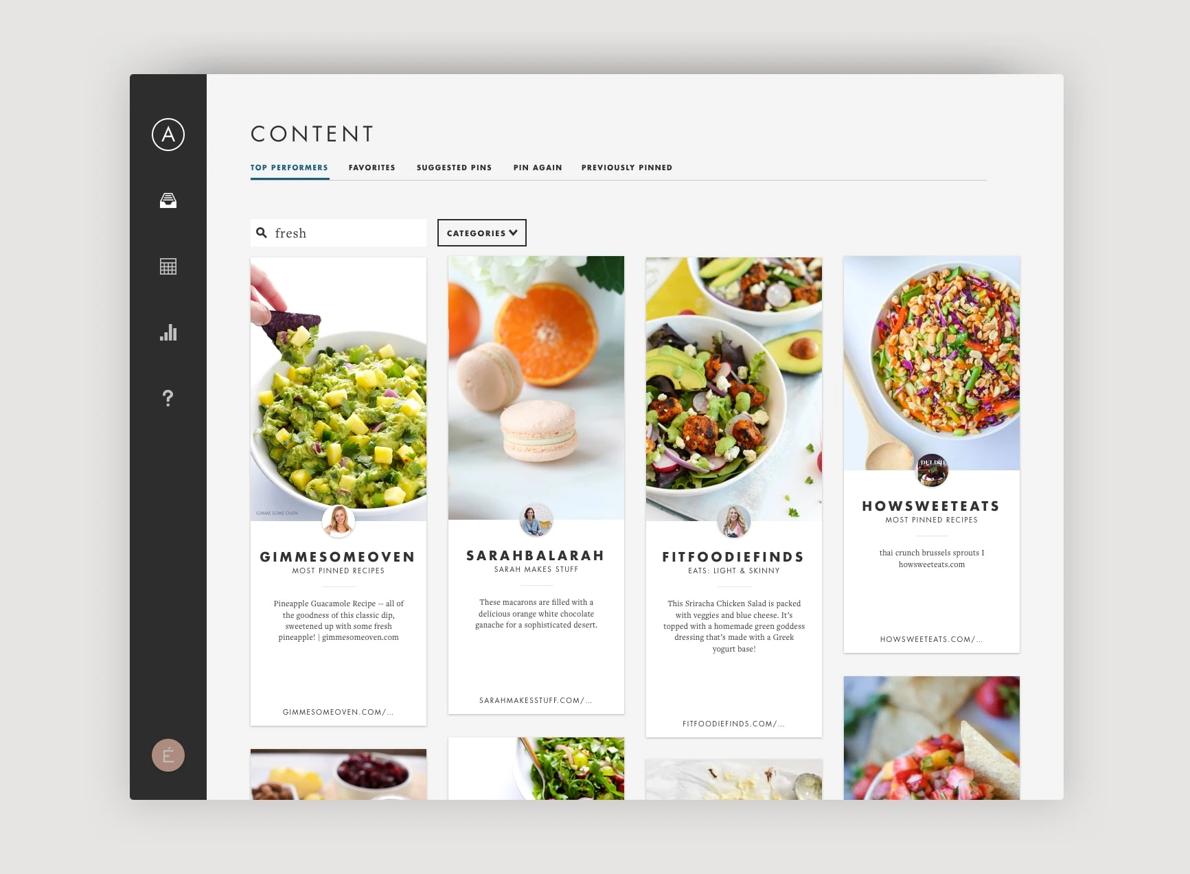
Viewing the Content Network
The app showed pins from the creators who were members of our exclusive content network. We made it simple for brands—whether on their own or via our client service team—to share great content
At the time, the correct Pinterest strategy for an account’s follower growth involved far more pins per day than brands had first-party content.
The solution? Curating and pinning useful content from other high-quality creators.
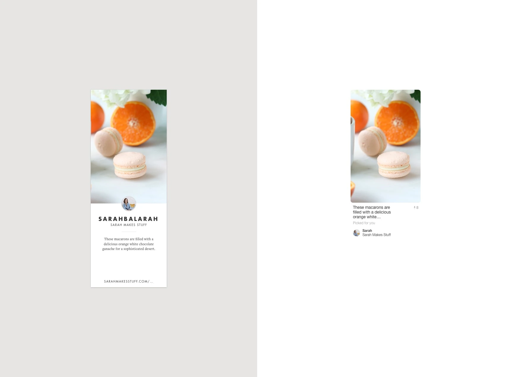
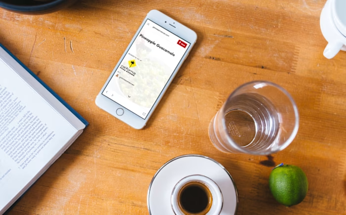
Left: our pin design for creators. Right: on Pinterest
We even needed to redesign the display of Pins themselves, reorienting them from the jobs of the end users and towards those of publishers and brands. That meant things like seeing the full description, being able to scan a grid of Pins for specific partners, and easily linking to both Pinterest and the source.
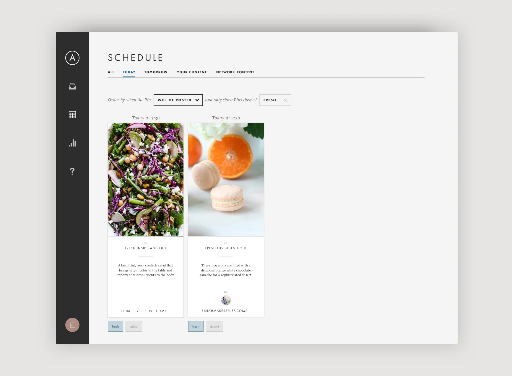
Pins scheduled to post
Beyond features like Pin creation and scheduled posting, we also built stuff like a scheduling algorithm to choose exactly which times to post content, and Liftwords, a predictive AI feature that recommends how to modify the copywriting of a Pin to increase audience engagement.
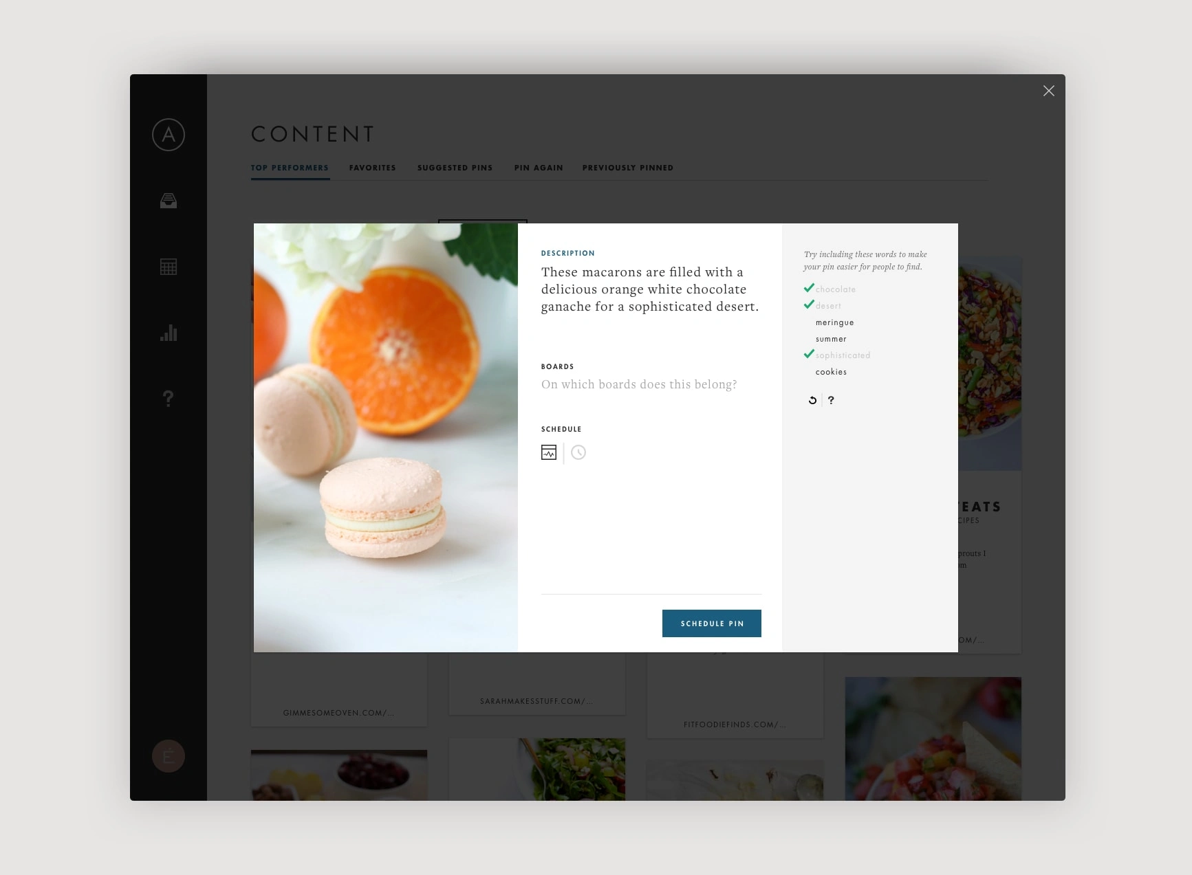
Using Liftwords while editing a Pin to share
And we focused heavily on providing clear, actionable insights from the performance data we collected. Throughout the app, but especially here on Insights, my mantra was:
Obvious always wins.
It led us to pursue more user testing and helped us evolve our charting UI to be both reasonably dense and crystal clear.
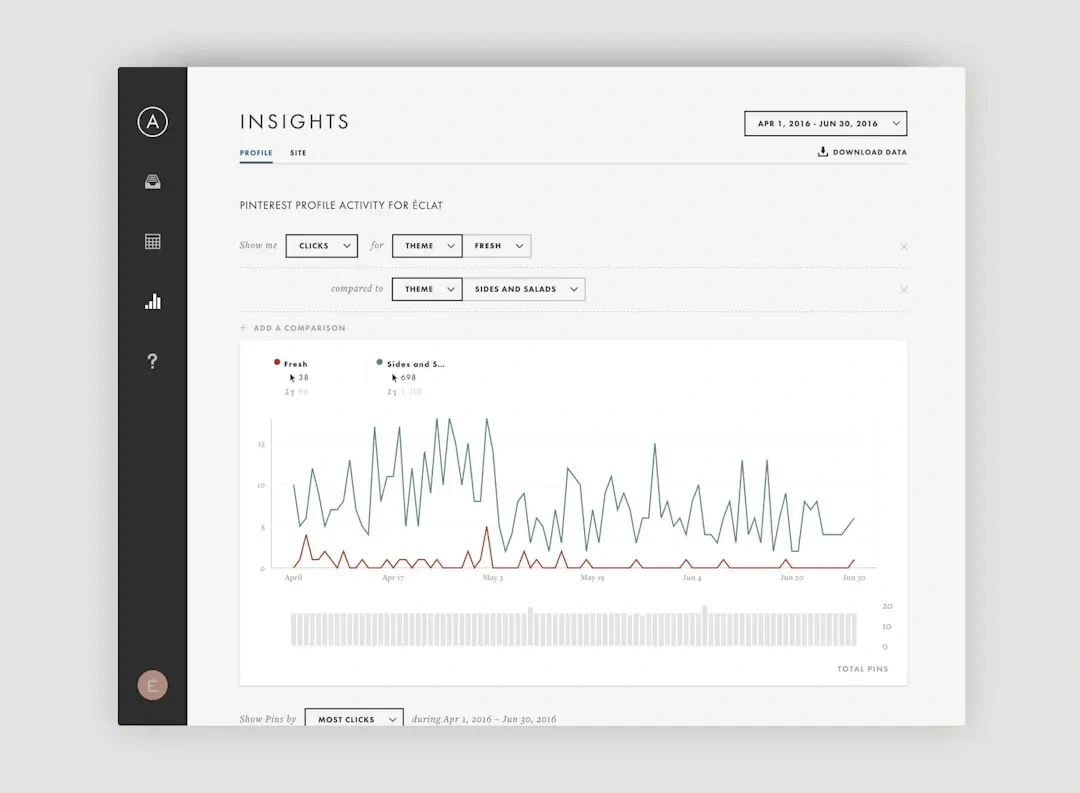
Insights for better decisions
◼️
Like this project
Posted Apr 26, 2024
When Fortune 500 brands, our client service teams, and top social creators needed a tool to help them win together on Pinterest
Likes
0
Views
3
