Ahalogy — A mobile UX for creator sites on Pinterest
Context
At Ahalogy we created products for Fortune 500 brands and top social creators to win together on Pinterest. Later we grew into helping those brands identify the right trends, timing, and creators for custom content campaigns. Ahalogy was acquired by Quotient.
I was Head of Design. Initially that meant I was the sole designer on all of it: web app, identity, marketing site, sales collateral. Later, I built a team of product and communication designers to join me.
A better on-site experience for creators in a snippet
Before there were Instant Articles, there was Ahalogy Mobile. For a while anyway.
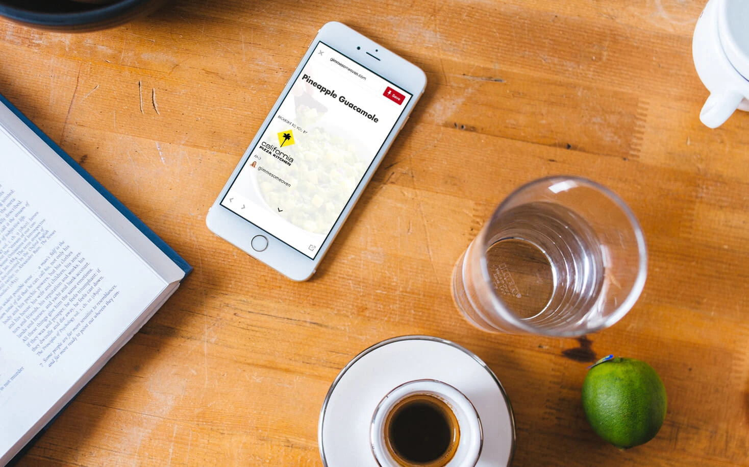
Ahalogy Mobile was a product designed and built for publishers to improve the reading experience of their sites when viewed within a mobile in-app browser.
I worked on the system architecture, designed it, and contributed to its development.
We started realizing our customers’ upside was being capped by the user experience of the pages to which the Pins linked.
Too often, tapping a Pin from Pinterest’s mobile app would fire up a
UIWebView, inside of which you had the slow, ad-laden, painful privilege of viewing the recipe, fashion look, or article.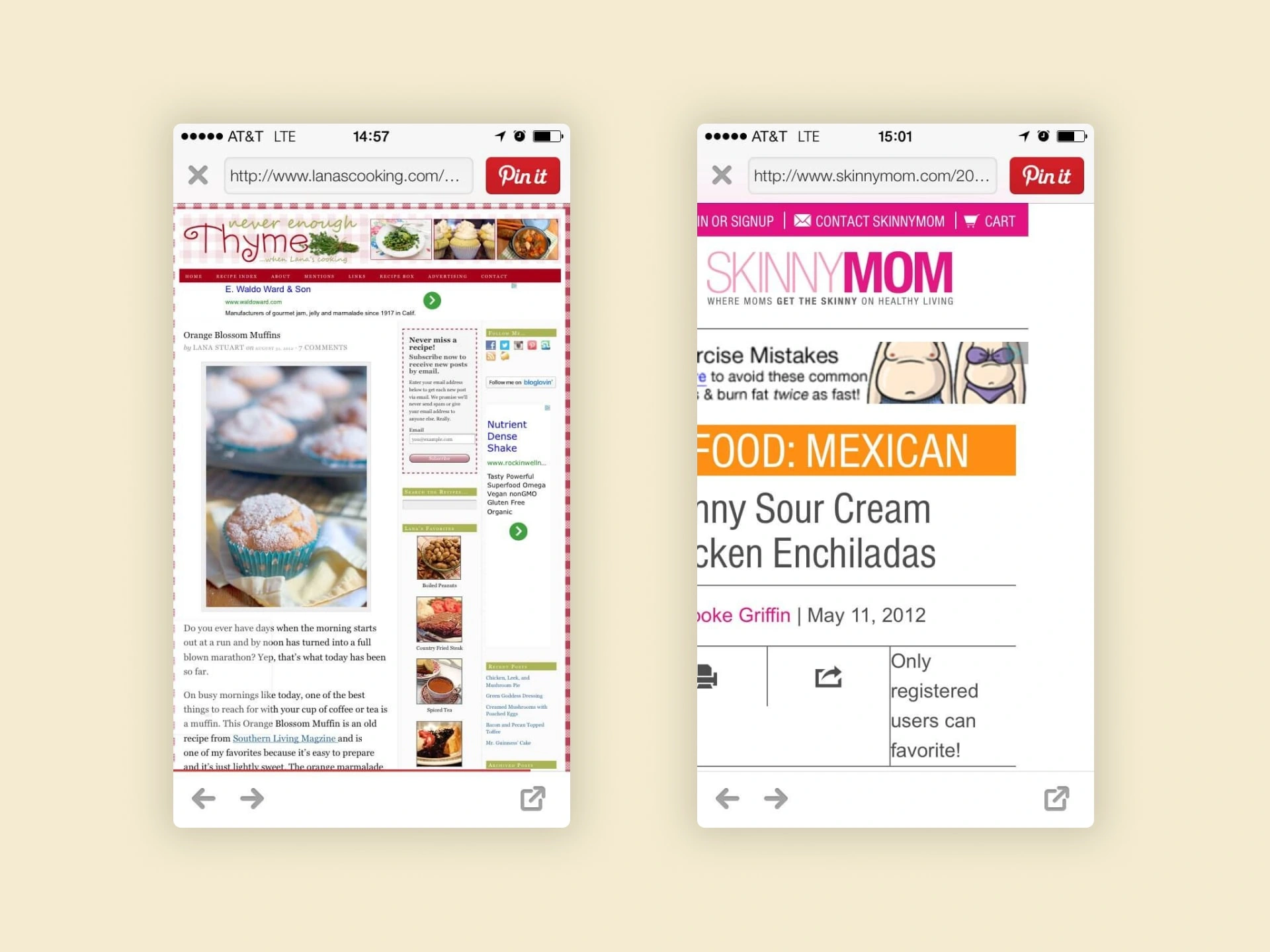
A pinner’s on-site reading experience. Good content, bad presentation.
These smart but small publishers were struggling to adapt to socially discovered content. Their sites were often unresponsive, high latency, and poorly organized.
I wrote more about the systemic problem at the time here:
The Design
This was before Google AMP or anything like it. So we had to build it ourselves.
The design began, of course, with how it worked. We needed to control the presentation of contents across thousands of sites on multiple versions of Wordpress, only on certain devices and from specific referrers, all without changing the sites’ actual themes in any way.
The creators inserted our javascript snippet on their sites. It identified inbound traffic from Pinterest on a mobile device, would stop the DOM from loading, and would display the same content from our servers.
We stored parsed copies of all their old and newly created posts, and made those available from a CDN. That way we could load significantly faster, control the interface for reading, asynchronously insert the right ad at the right point in the article, and recommended the perfect article to read next from any of the publishers in our content network.
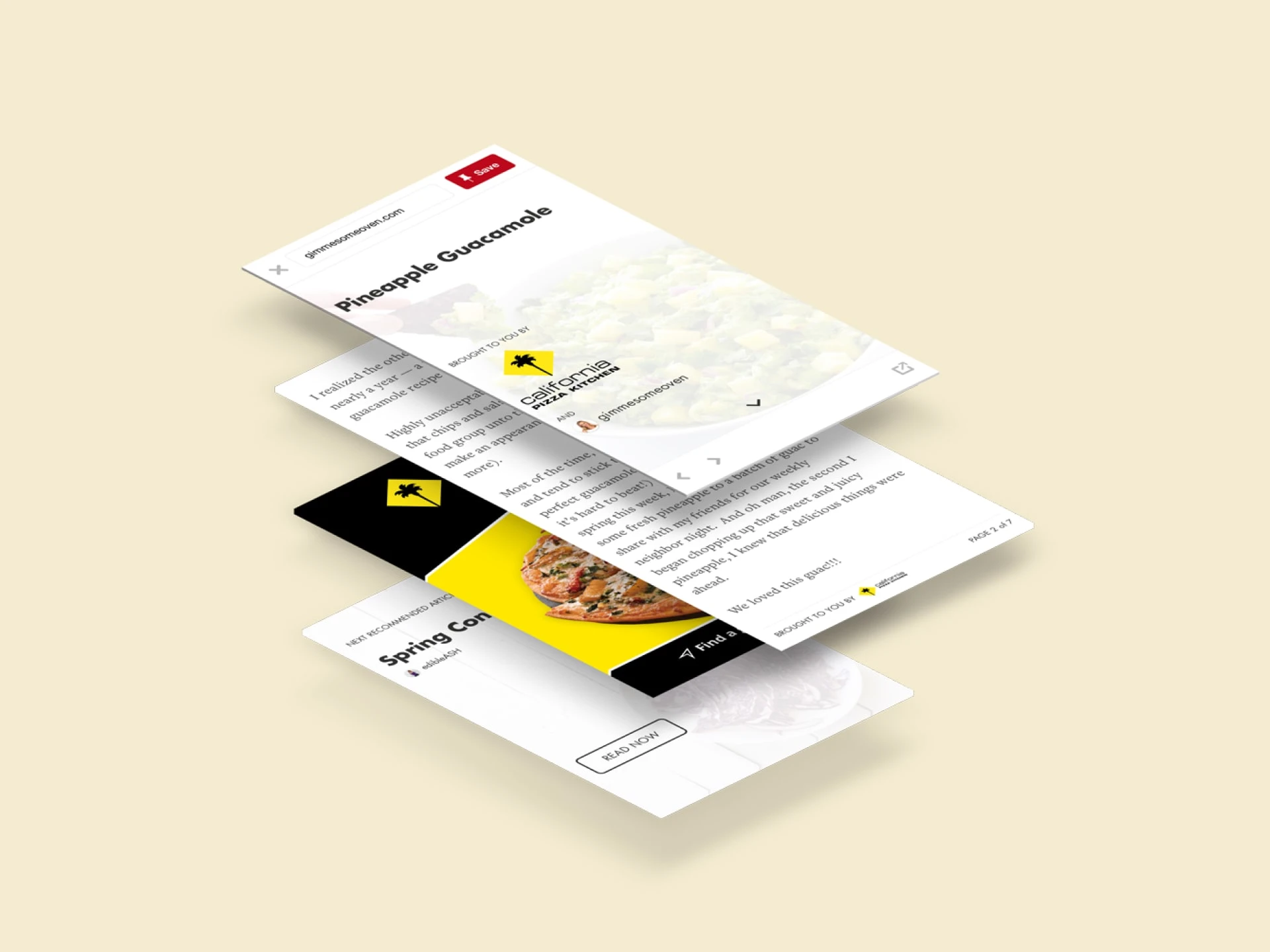
The card stack interface of Ahalogy Mobile
The interface design was based on a card stack structure. We used the semantics of the post to organize it into multiple cards which the reader could scroll and flip through (A few paragraphs, an image and its caption, a list of ingredients are examples of individual cards).
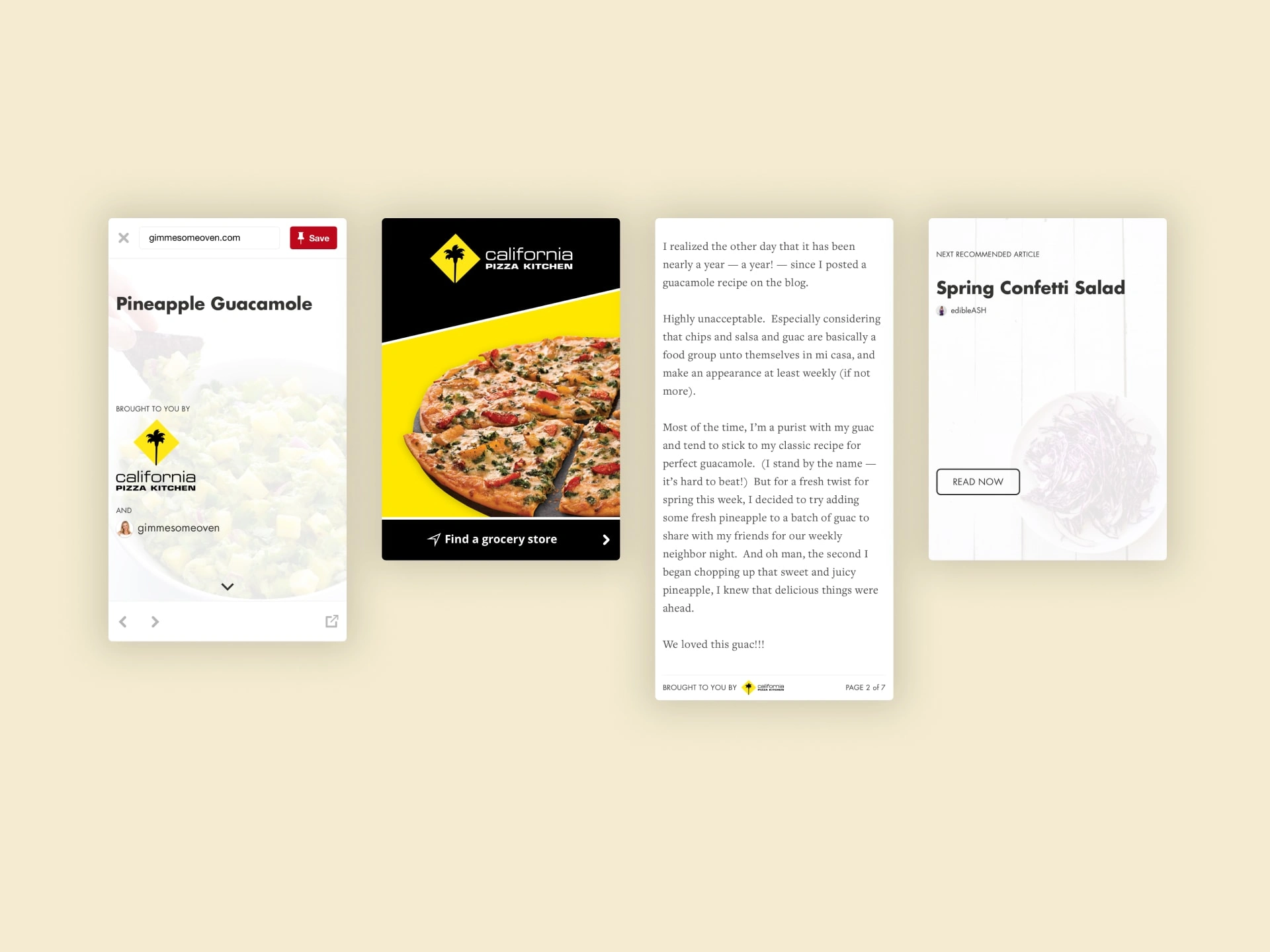
The cover, ad engagement, body text, and next article recommendation
The result was a faster, cleaner user experience we could easily distribute to all of our partner sites.
The average time on site increased 30–100%.
And because the experience was so unique and the single sponsorship per post so engaging (without turning the experience sour), we were selling to top advertisers at a premium CPM. That gets us paid and enables the publishers to build their businesses. It was a win for all involved: readers, publishers, and advertisers.
The Premature Demise
The reason I haven't linked out to any live examples, dear reader, is that the product met its demise mere months after launch. Ahalogy had to pull it from the market because of what we'll call some strategic bullying by another company.
The end notwithstanding, Ahalogy Mobile showed me there’s still innovation left to be done in the rebundling of digital publishers. Google’s AMP tried. Facebook Instant Articles tried. Twitter has gone the other way, penalizing tweets in the algorithm when they link off site.
It might come at the operating system level, or the network level, or an arm-the-rebels approach like we tried. Just so long as someone does something.
◼️
Like this project
Posted Apr 26, 2024
When the websites for your partner creators suck on mobile, you create a whole new UX for Pinterest visitors—with just a one line snippet


