Harper — Creating a pet brand that isn't lame

Context
Harper was a startup I co-founded to be a system-of-record for daily life with your dog. Inspired by my experience bringing home my dog Fitzgerald, I designed an app that brought together everything you needed to be a great dog owner.
It was iPhone App of the Day and invited into Purina’s Pet Care Innovation Network.
We were a team of two. I owned product, app design, a touch of engineering, brand identity, marketing site, filming, editing, growth, and company fundraising.
Designing a pet brand identity that isn’t lame
For some reason, which to this day remains a mystery to me, the pet industry is almost entirely devoid of taste. It’s mostly cutesy copywriting, bad dog puns, and worse design.
There are some exceptions of course, but the bar is low and we needed to clear it.
Target Members
Our primary target members were new Millennial dog parents. From our brand book:
They recently got a dog. It’s their first pup living on their own, though many grew up with them. They live in an urban or residential city neighborhood, often with a partner, and sometimes with kids. They have laptop class jobs and work from home some days. They use consumer apps like Netflix, Spotify, Calm, and TikTok. Most take fitness pretty seriously, using either a training app or a boutique gym. They travel. They’re typically but not exclusively female, and they’re roughly 25–40 years old.
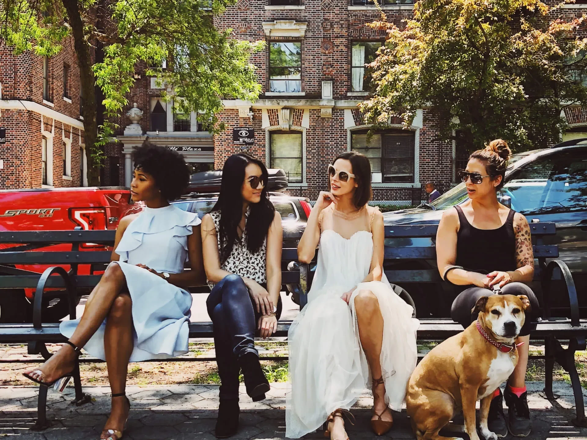
We needed a brand identity and vibe that was at home with Millennials, particularly on Instagram. I was inspired by consumer health brands to help it feel the right kind of high status for that audience.
It couldn’t be too eight-bit and game-like. For the most part this was not a Discord and Twitch kind of audience.
But it also couldn’t feel too premium. It was an app for your dog after all, and the subscription was a modest price point. You needed to sense that from branding.
Wordmark
I started with a tennis ball as our icon. From the perspective of a dog, tennis balls are bright and fun, part of playing a game, and often used as reinforcement for training.
I also believe in the idea of brands owning (or trying to own) an emoji in the minds of their audience. The 🎾 was a perfect fit. Not too on the nose, but IYKYK.

The wordmark on dark

The wordmark on light
Color & Type
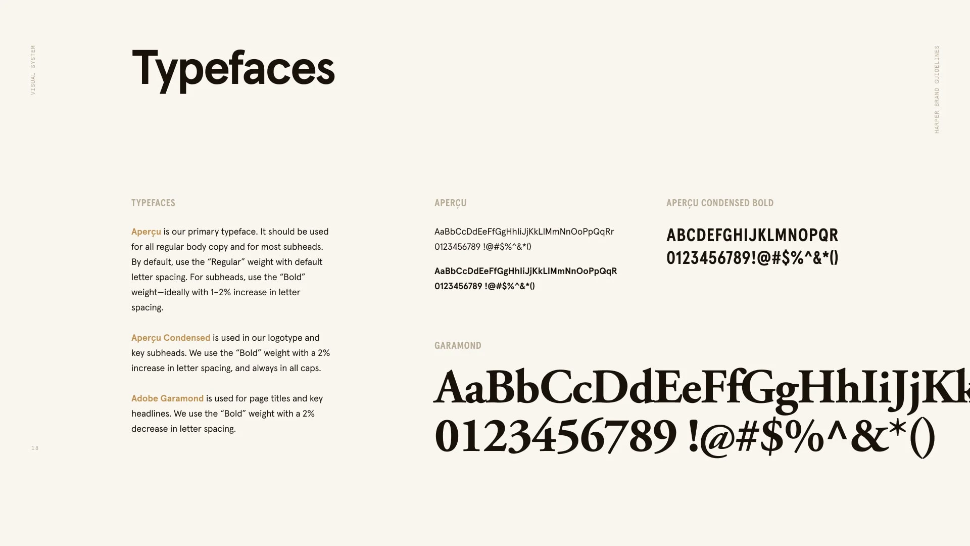
I paired the tennis ball icon with a wordmark using Aperçu (and then later Satoshi).
It’s a popular grotesque sans serif typeface, which makes it feel like it belongs in an app, but one that doesn’t take itself too seriously.
We supplemented that with a secondary condensed sans and serif faces for headlines.
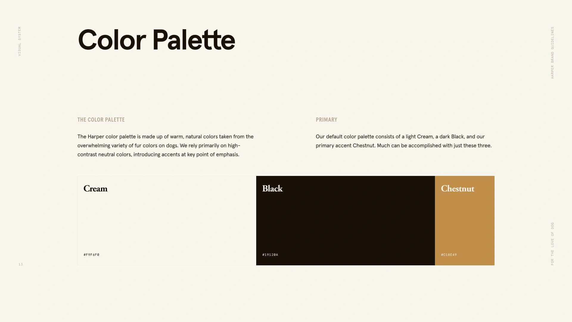
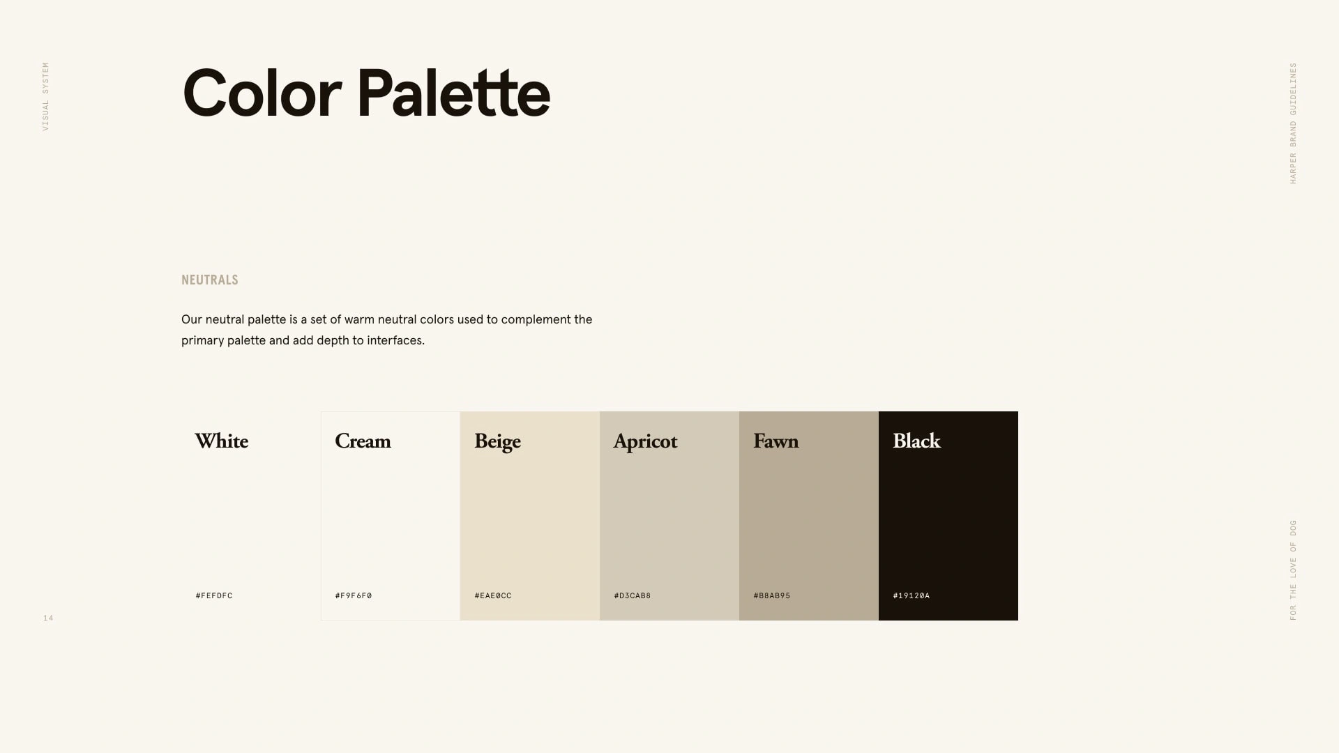
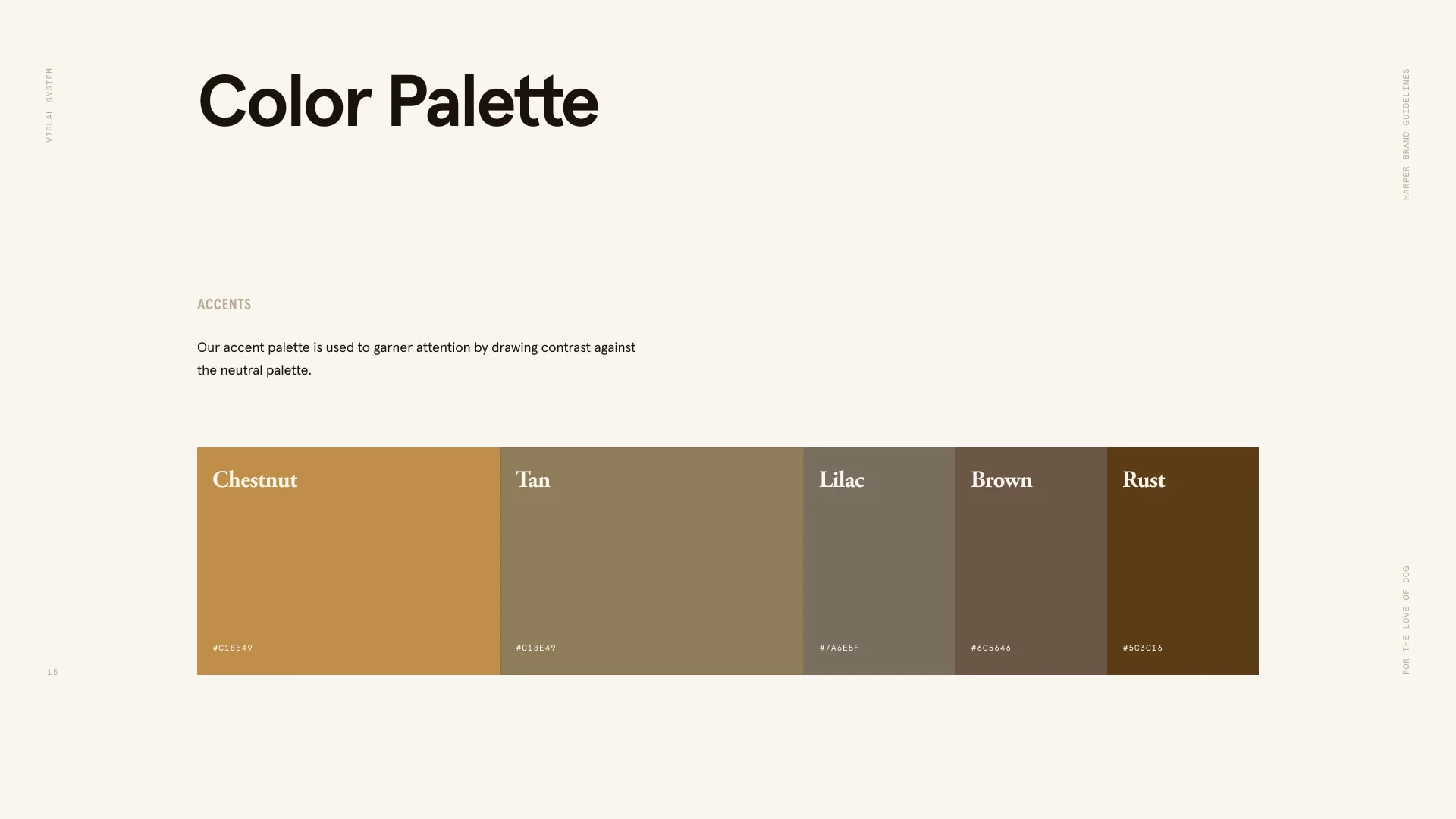
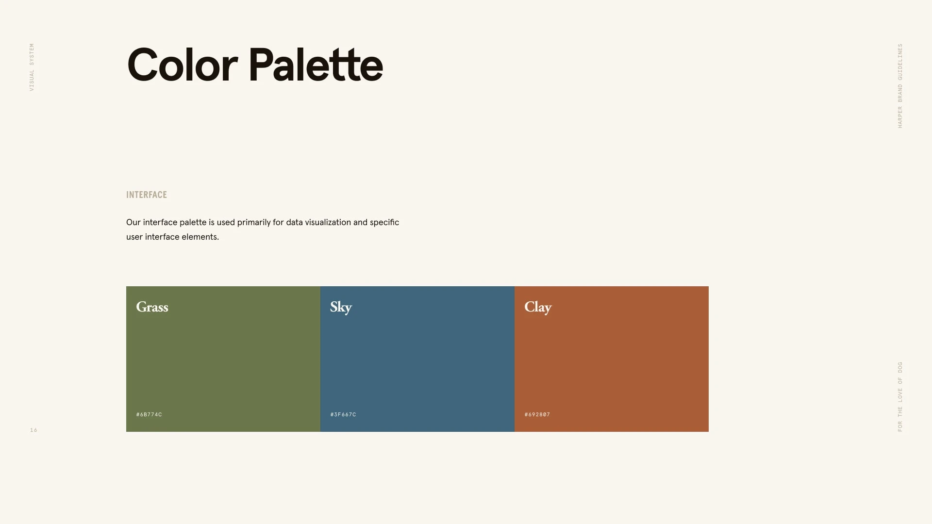
For color, it needed to feel organic to dogs and their environment. No sterile whites, neon greens, or corporate blues.
Instead we used an array of warm tones, beiges, creams, and tans that were all either found directly in dog coats and fur, or from the grass, clay, and sky in their outdoor environment.
Photography & Style
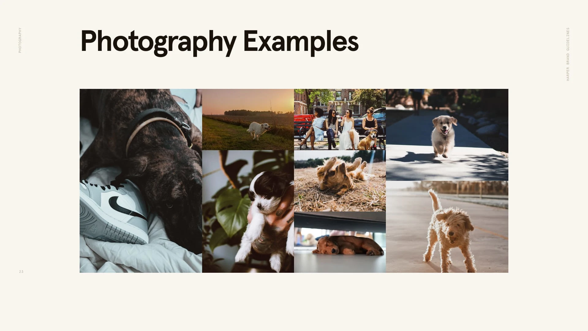
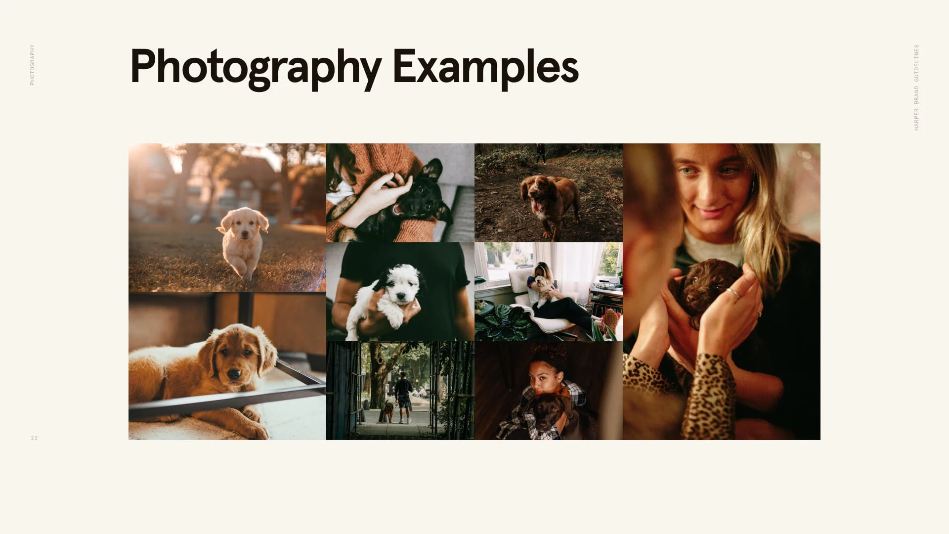
Lastly, we emphasized photography over illustration.
Illustration is useful for taking something big and complex and making it feel smaller and more approachable.
We had to do the opposite. We needed to take what felt like small banal stuff and breathe meaning into it.
Pitch Deck Design
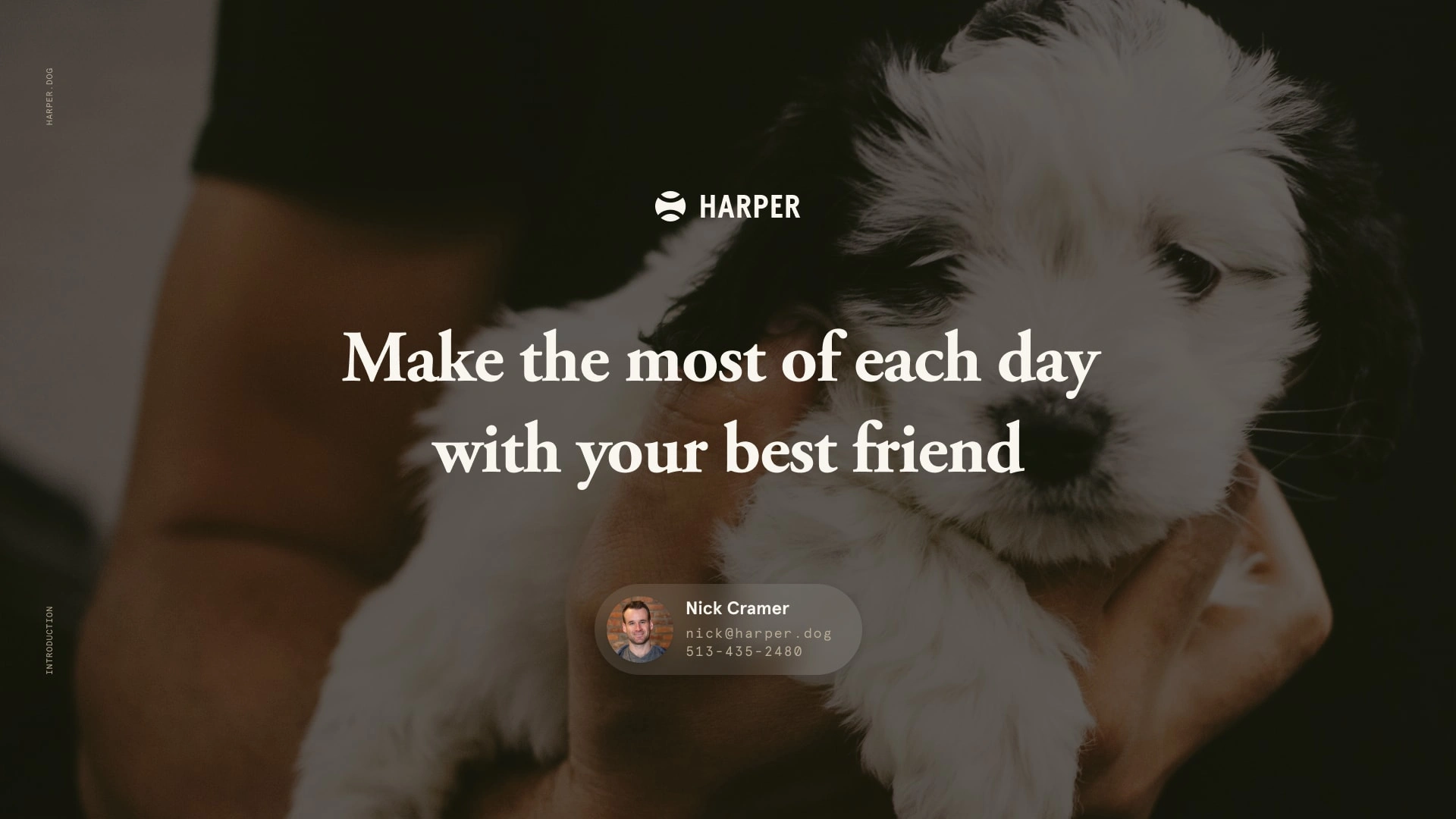
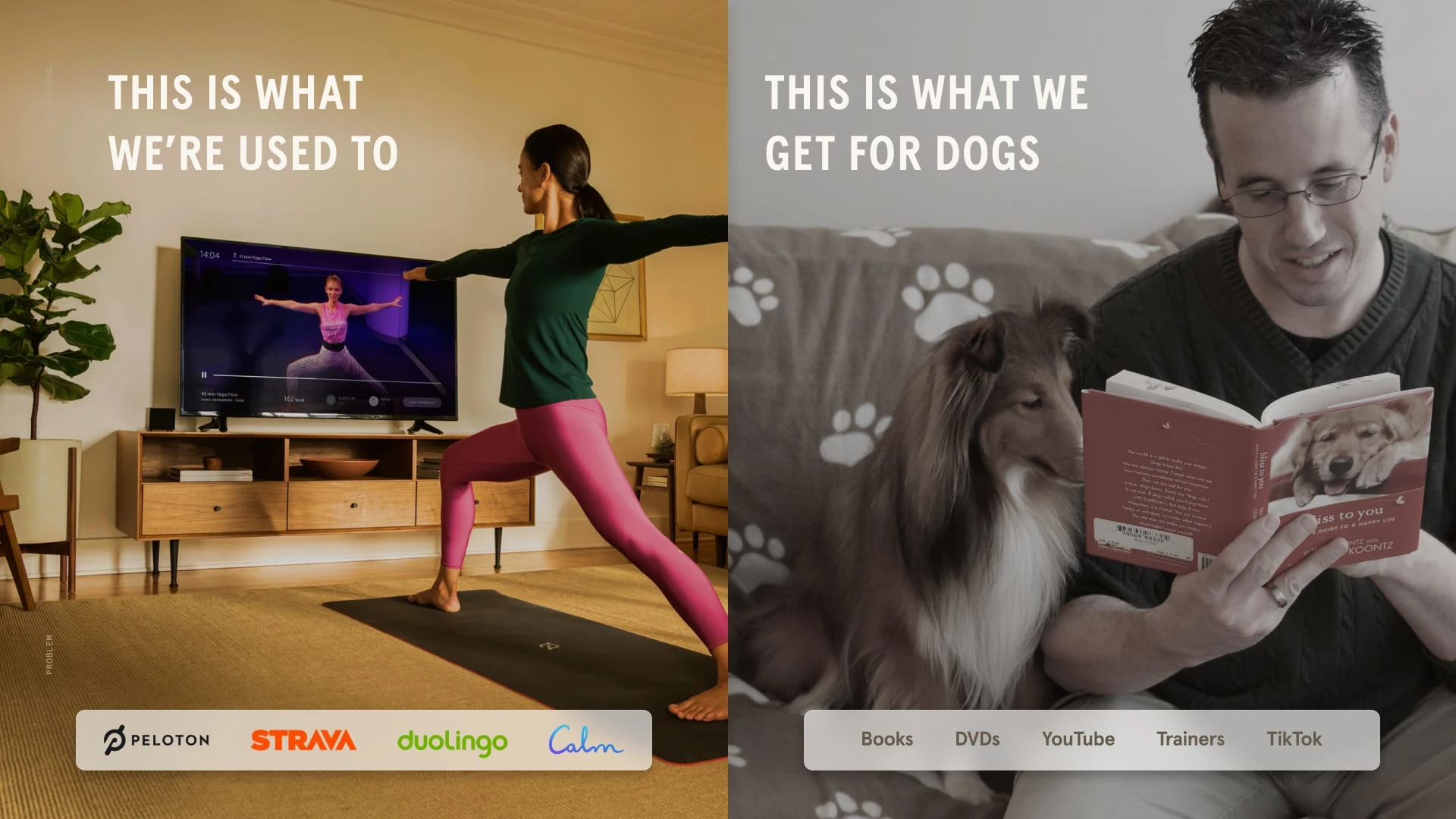
For our presentation materials—like our fundraising pitch deck—I took those brand book elements and created a simple modular system that helped me create and refine slides for the various deck variants required in a fundraising process.


◼️
Like this project
Posted Apr 26, 2024
When you try to create a visual identity for a pet brand without any bad puns or cheesy illustrations
Likes
0
Views
17

