Roadtrippers — Creating a new brand for a place data service
Context
Roadtrippers is the top app for taking amazing road trips. It’s powered by over seven million places of interest. Each pin on the map has locations, photos, reviews, and all kinds of structured data.
Initially, I advised the founder and leadership team on product, strategy, and M&A.
Immediately following their acquisition by Thor Industries, the world’s largest RV manufacturer, I joined full-time.
I led a new platform team, guiding eight software, data, and AI engineers. And I designed the interfaces we used to audit, correct, and train our data.
The travel brand that almost was
As Roadtrippers sales folks went out to sell partnership opportunities, they kept hearing interest from prospects in our place data and consumer interfaces for it.
The company grew interested in commercializing the place data platform—for tourism organizations, consumer brands, and even local businesses.
Our thought was it could generate revenue in a way which wouldn’t cannibalize Roadtrippers, could amortize our costs associated with data engineering and machine learning, and would create opportunities to help travelers across emerging interfaces—car touch screens, voice-based devices, etc.
We knew our value proposition centered around the question:
Imagine a future where your customers and audience look to you first to answer their travel questions. What would that future look like for you?
So we needed a new brand, go-to-market messaging, and a claiming process for local businesses to work within our editor to manage their listings (think Yelp or Yext).
That was something I took on.
Name
We needed a name for the new brand. It had to be something which could stand alone and not require the context of Roadtrippers or our new parent company. But it also needed to fit thematically into the brand portfolio. It also had to look right sitting next to Roadtrippers.
After I ran multiple rounds of the naming process with key folks in the company, we were arriving at an answer. Here’s what I wrote in Notion at the time presenting the choice to the organization:
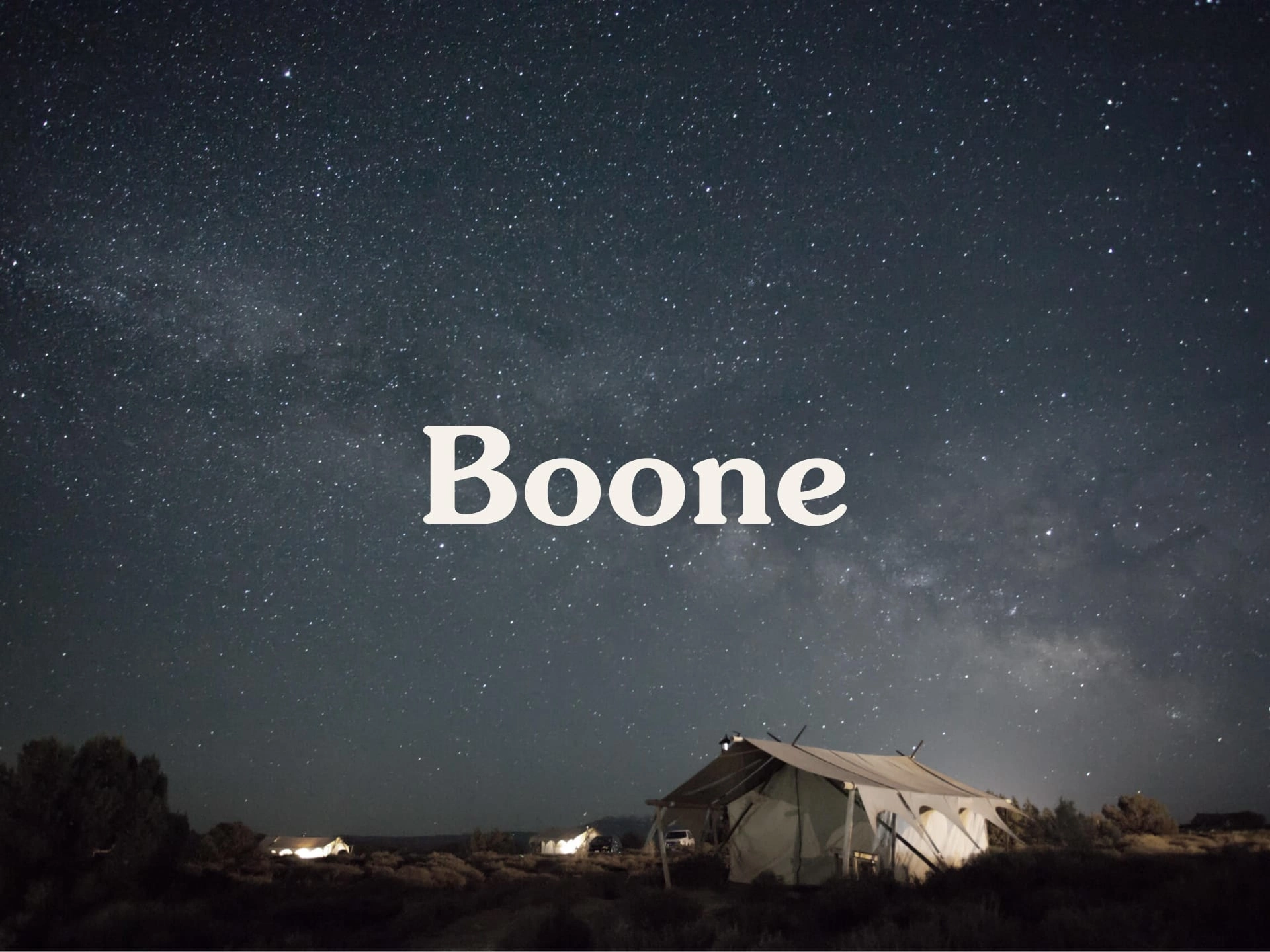
A great many aspects of our business are the same as they were when we started, but some important things are now more clear. We are a place data service in 2018. We explore, we learn, we store, we share. We're modern day pioneers in the digital world. Many brands today relying on artificial intelligence or automation use familiar, personal names: Siri, Oscar, Riley, Benny, Albert. It creates a singular character for the audience to picture in their mind's eye. And we're now focused on North America. We're embedded in RVing, camping, road traveling, and the outdoors. A digital pioneer. A character with a real name. A subtle, modern Americana. Boone.
Branding
Pulling from the same themes which led to the name Boone, I explored a number of color palettes related to the outdoors and Americana.
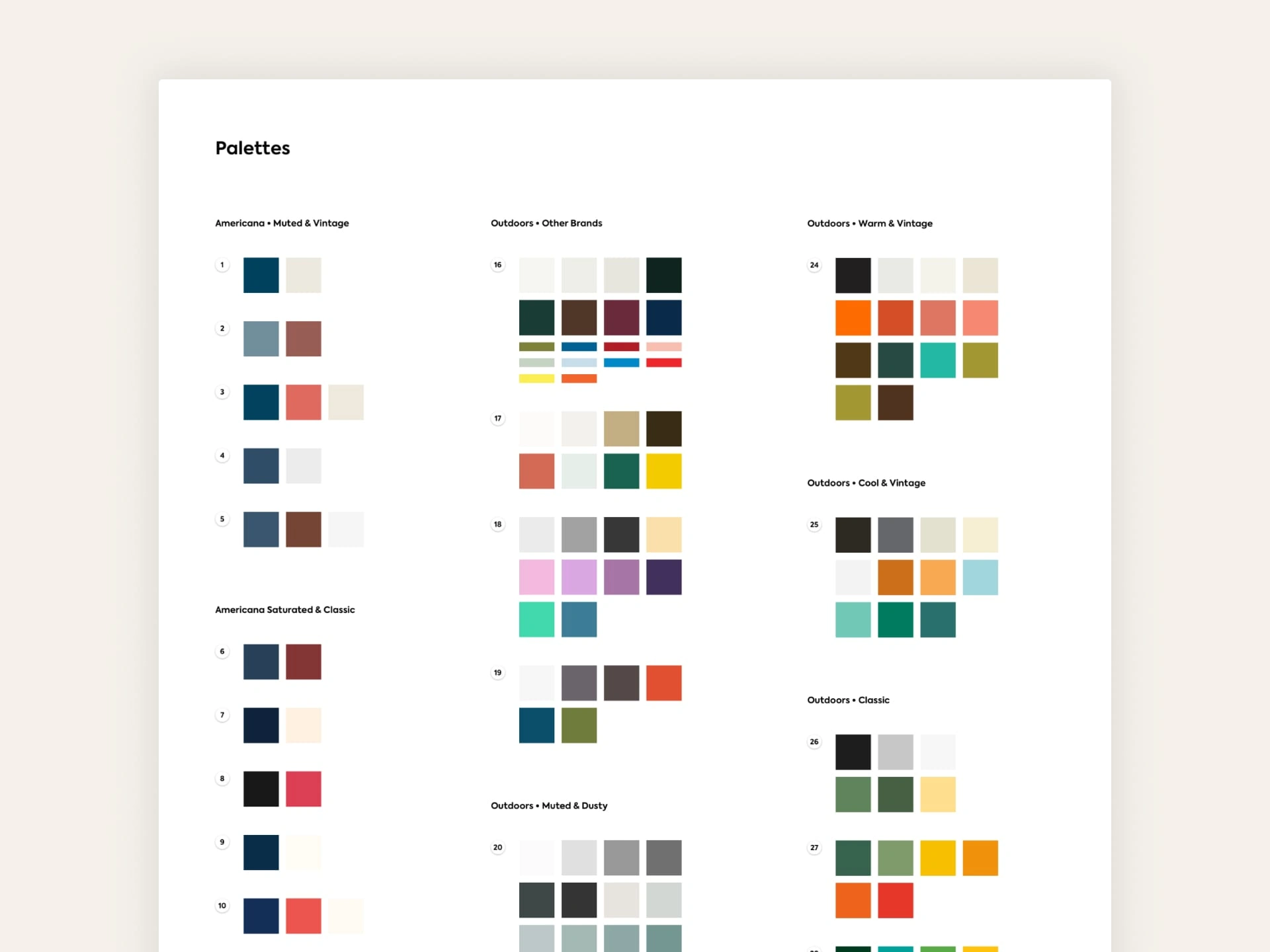
Screenshot of palette exploration and feedback
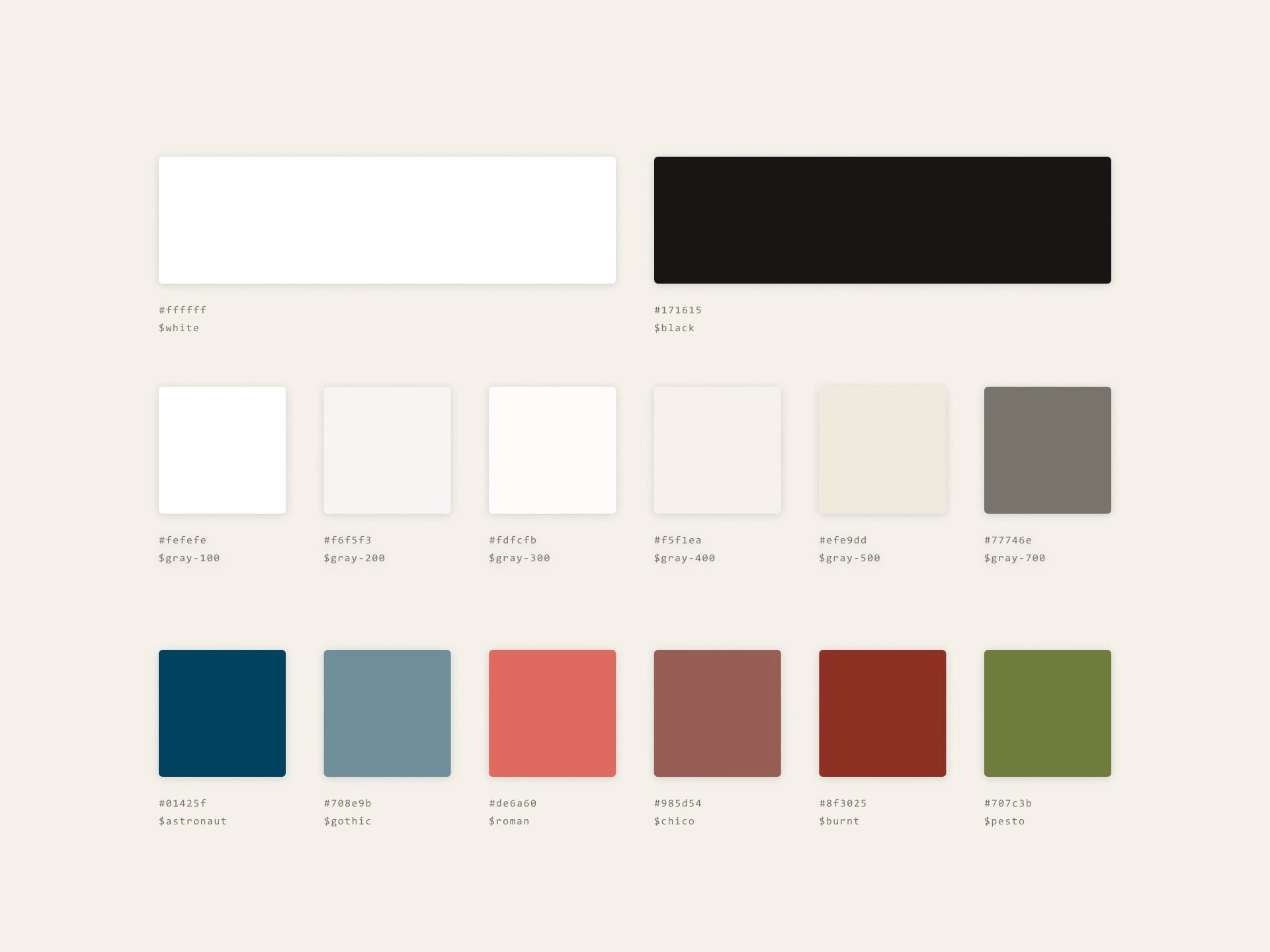
We arrived at an amalgam of those two ideas: a dusty, vintage Americana with support from secondary colors found along classic road trips.
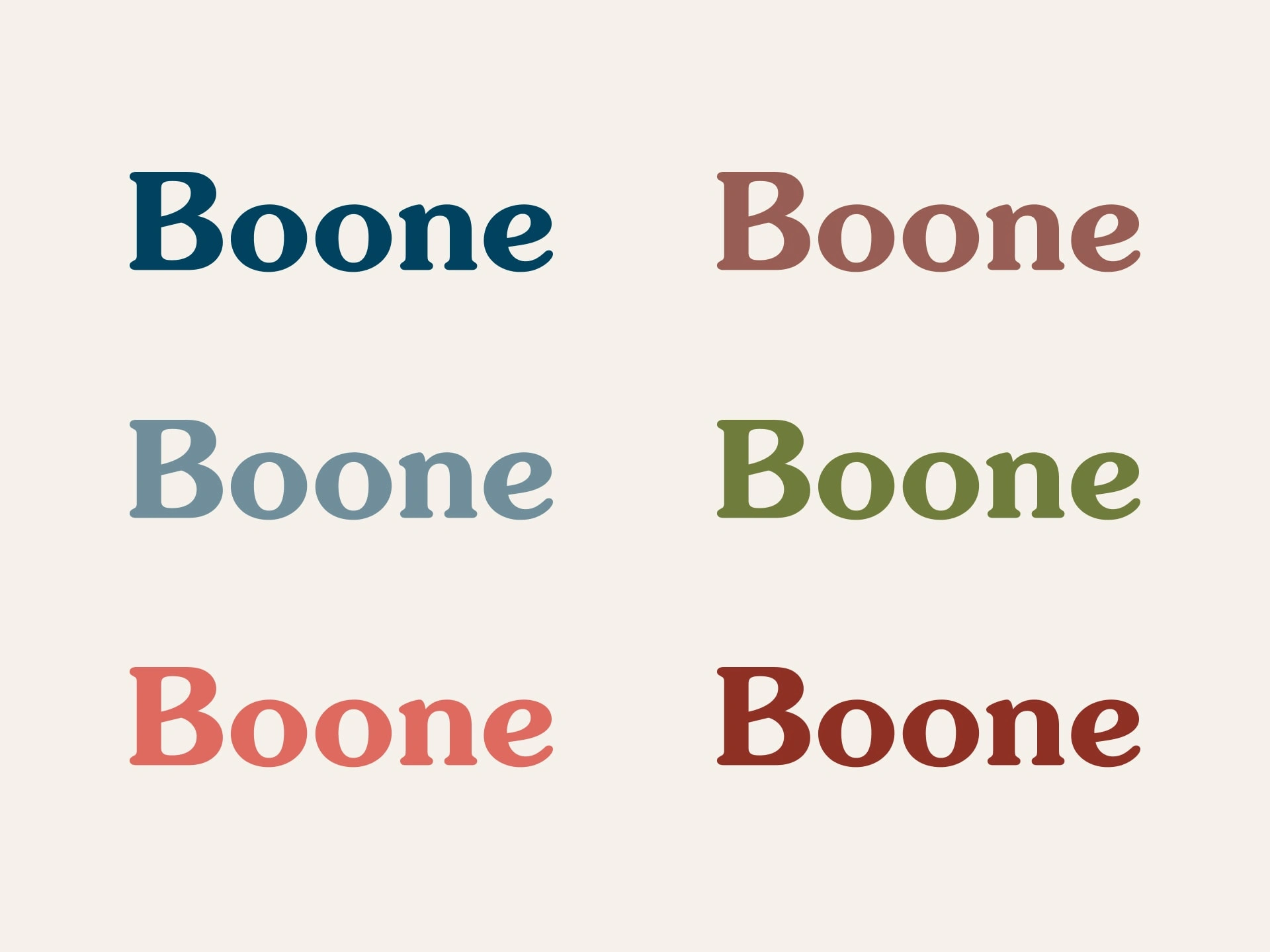
For the wordmark and headline type, I decided on ITC Souvenir. It’s a classic Americana typeface from 1914, once described as “like Times New Roman dipped in chocolate”, and also harkens back to road trips of the 1970s (because of it’s ubiquity that decade).
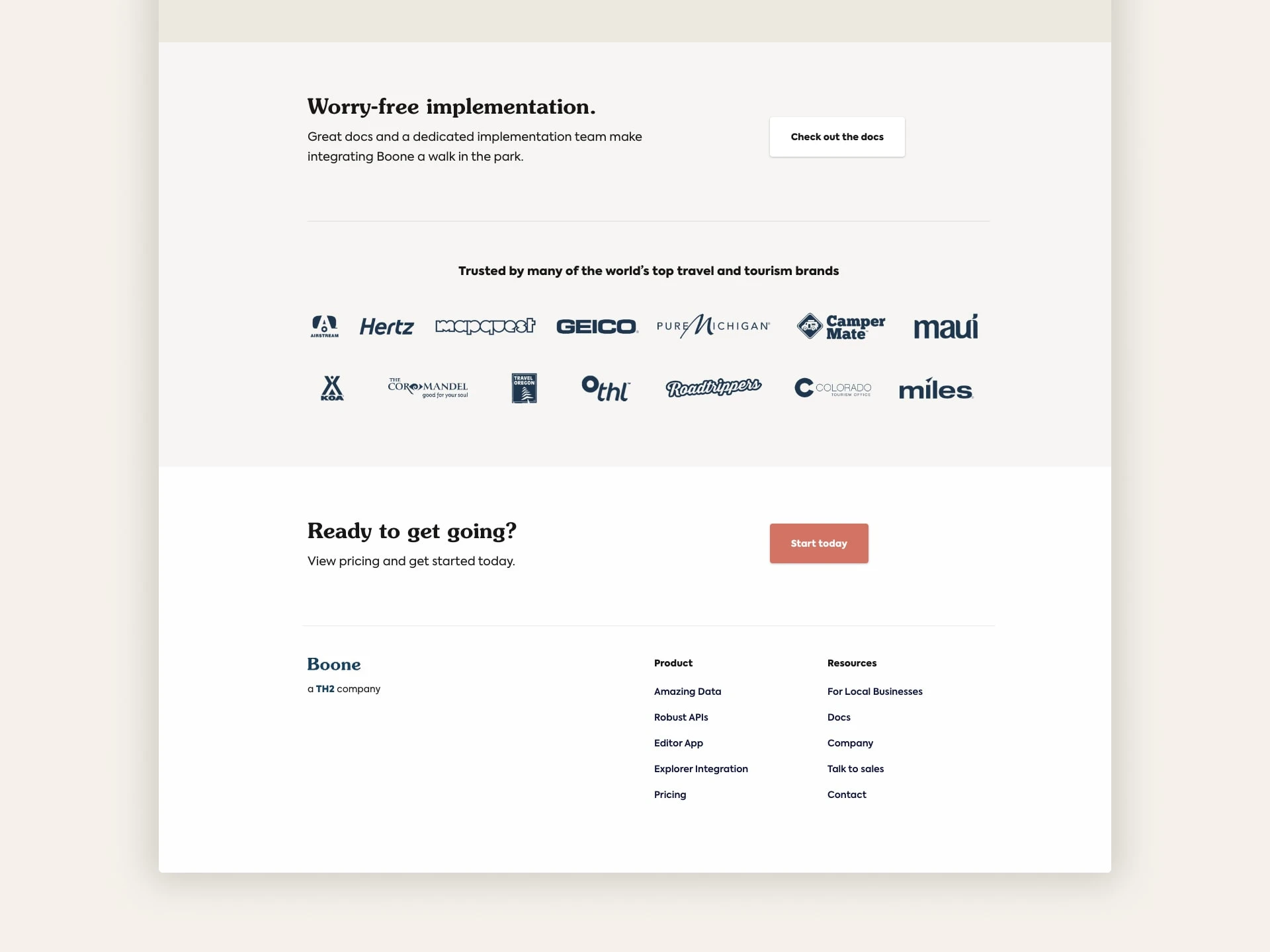
With that out of the way, I designed and built the marketing site to focus on three specific markets:
Destination tourism organizations (DMOs) interested in using place data to promote their region
Travel and travel-adjacent brands looking to use place data for personalized marketing throughout their sales funnels
Local businesses who want to claim, maintain, and promote their business
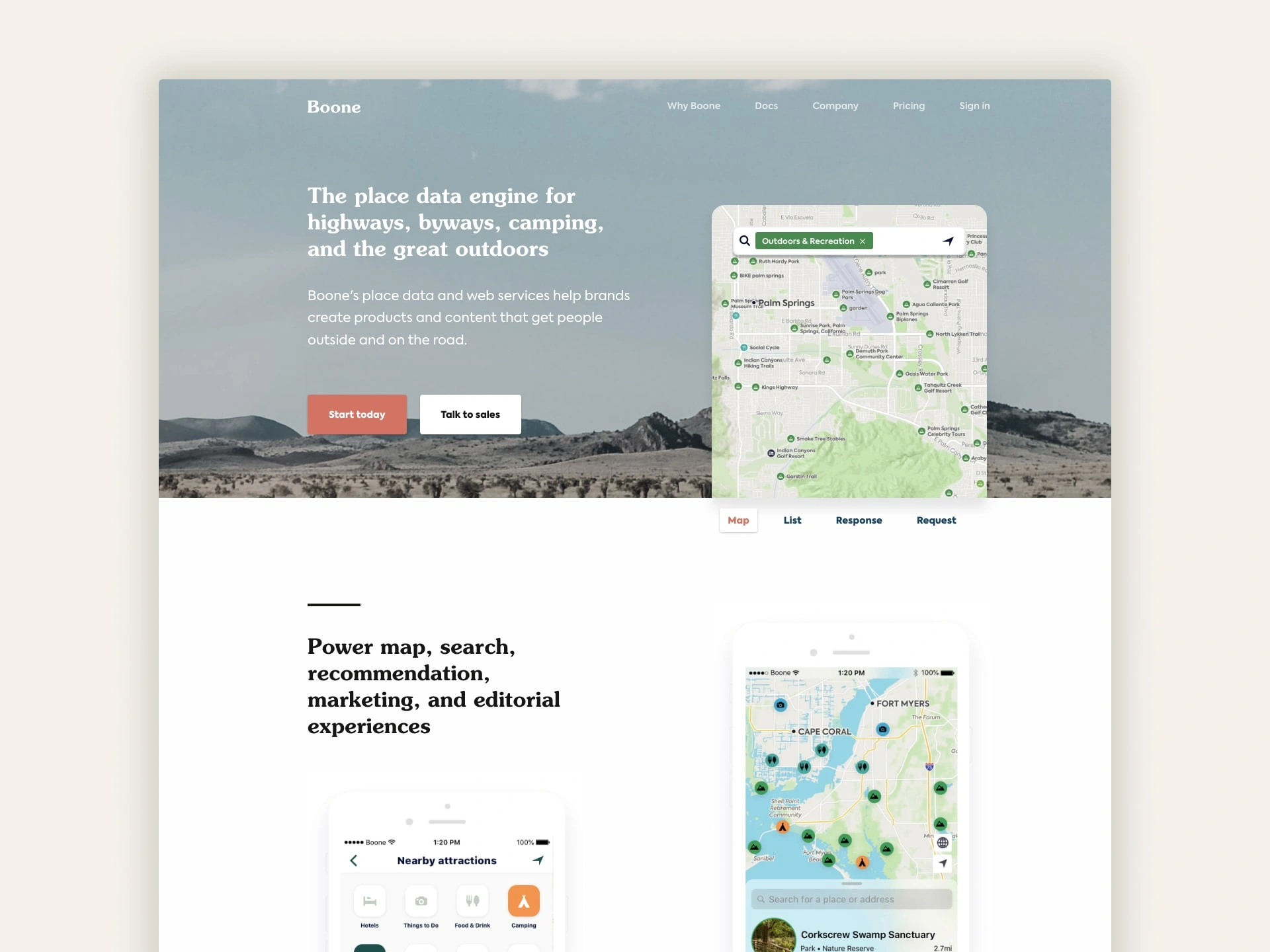
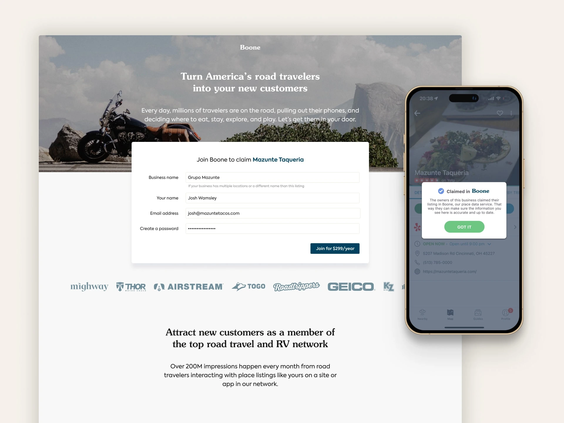
Then we built a way for local businesses to find their listing on Roadtrippers (or another parent company app), claim it, subscribe, and manage it themselves.
Explorer
During our initial customer development, we found significant interest in idea of Boone, but the scope of a full implementation meant we couldn't move quickly.
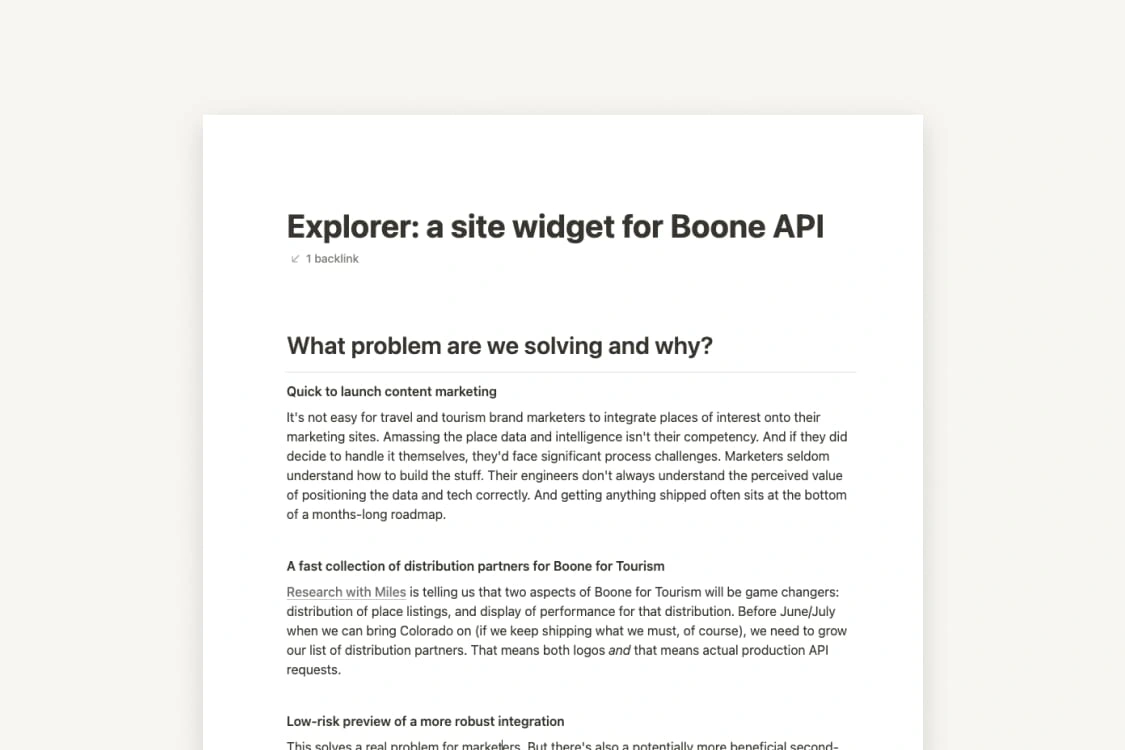
Screenshot of the brief I wrote
As both a sales demo tool and a quick win to show off the data, we set out to build an interface for our place data which could be easily embedded on brand sites.
I designed a javascript widget called Explorer that travel brands could incorporate into their sites and landing pages as a way to both engage their audience with travel content, but also as a cheap test for a larger Boone implementation in the future.
It was a single line of code added to the page, and with simple modifications to the data properties being passed, it was incredibly customizable.
Sites could display places near the user and let them filter by category. It would display the results as either a list, a Pinterest-style grid, or a Roadtrippers-like map. And you could tap a place to see info, hours, and actionable detail.
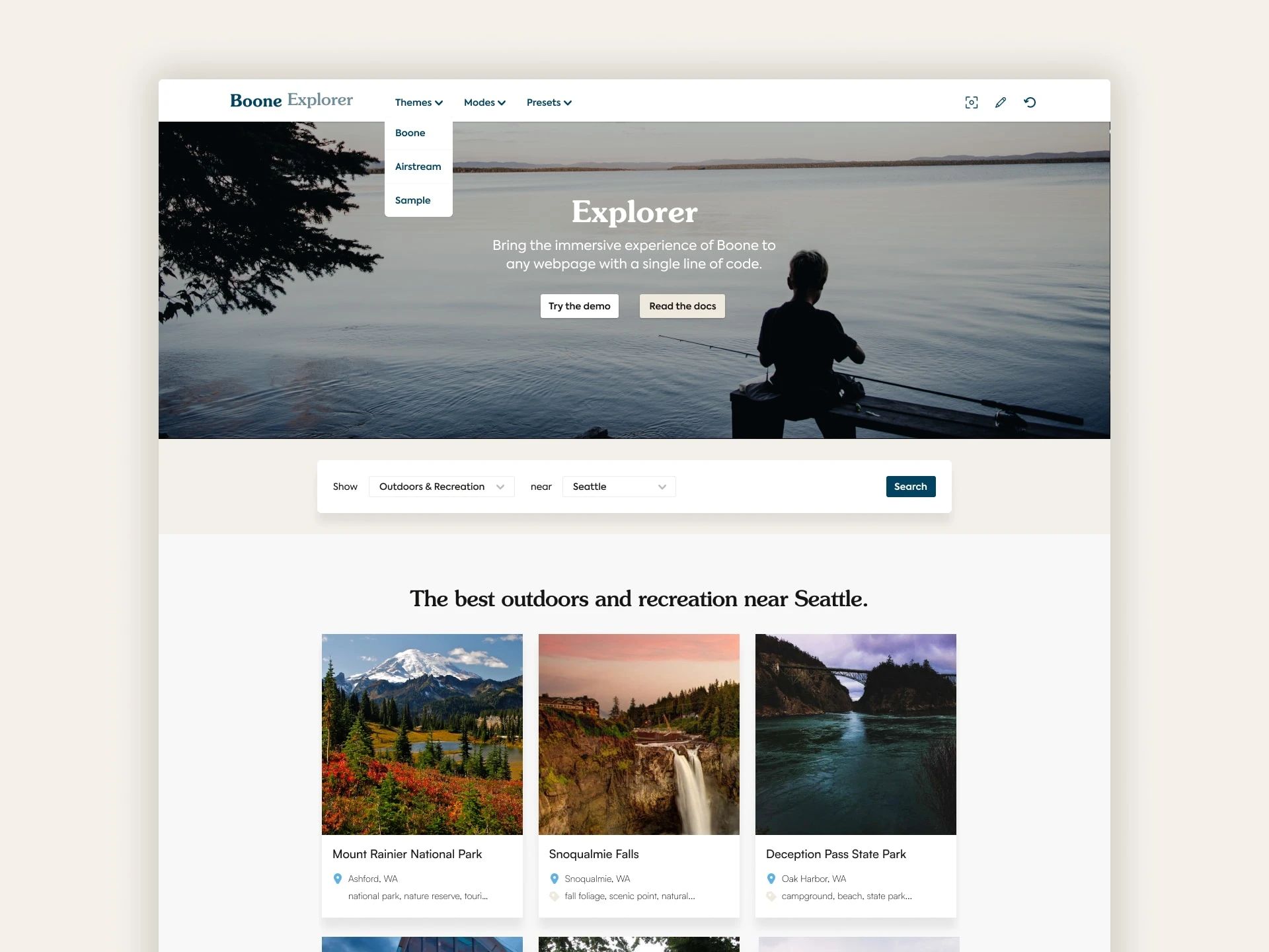
Explorer as a grid
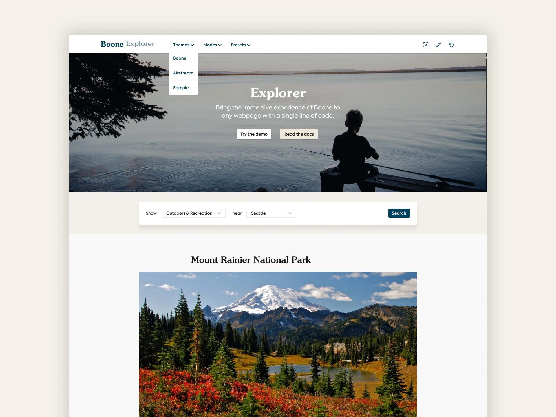
Explorer as an editorial list
Business Stuff
As the general manager, I also handled business and team stuff.
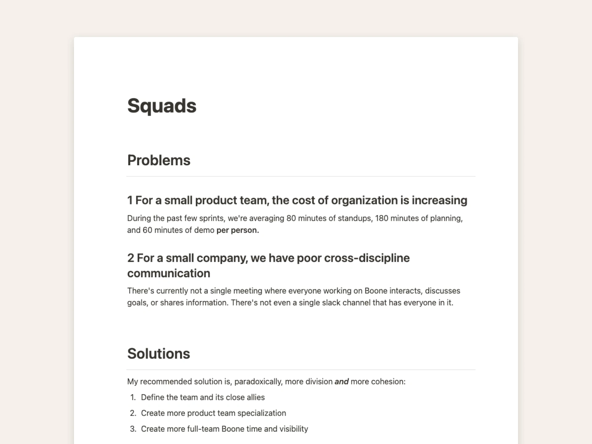
Screenshot of a memo on team process
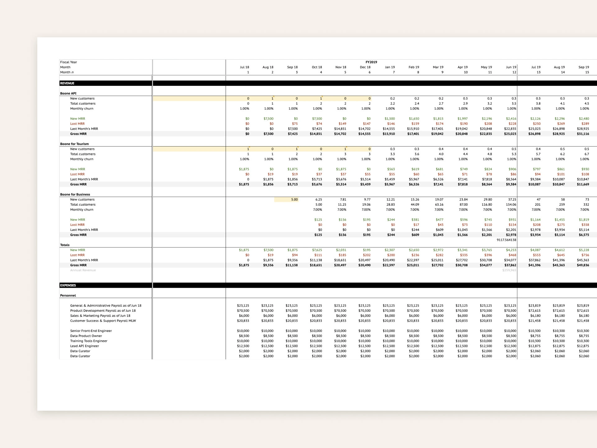
Screenshot of an early draft of our forecast
Along with company leadership, I put together a forecasting model for Boone for budgeting and resource allocation at the parent company level.
And since I designed and managed the product, I also focused on team process and dynamics to keep velocity as high as possible
Results
Sigh. Boone never had a chance to get off the ground.
We faced challenges related to corporate ownership, strategy, and resources. So we got caught in no man’s land: we weren’t scoped like an internal team with a limited focus on one vertical app, and we weren’t going to be capitalized correctly like a new horizontal-business startup needed to be.
Leadership turned over, priorities changed, and budgets shifted, the plug got pulled.
Boone became the platform team once more, returning to support the suite of apps in what is now Roadpass.
Like this project
Posted Apr 26, 2024
When you create a visual identity for a new place-data-as-a-service brand, and then *almost* launch it

