Built with Framer
Notecal • Elevating AI-Powered Note-Taking

Daniel G Bright


Project Overview
This project was crafted to deliver a visually striking, modern, and engaging digital experience that balances aesthetics with usability. Built using Framer, the website reflects a clean and interactive approach to presenting information, capturing attention, and guiding users through a compelling journey.
The goal was to create a fluid, high-performance site that seamlessly blends animation, responsive design, and strategic user engagement, ensuring an optimal experience across all devices.
Design Strategy & Execution
Clean & Minimalist UI with a Strong Visual Identity
The design leans on a minimalist aesthetic while incorporating bold typography, fluid animations, and well-structured layouts. The balance between negative space and content hierarchy ensures a clean yet impactful presentation.
By maintaining a sharp contrast between elements, high readability, and smooth scrolling interactions, the website feels both modern and intuitive.
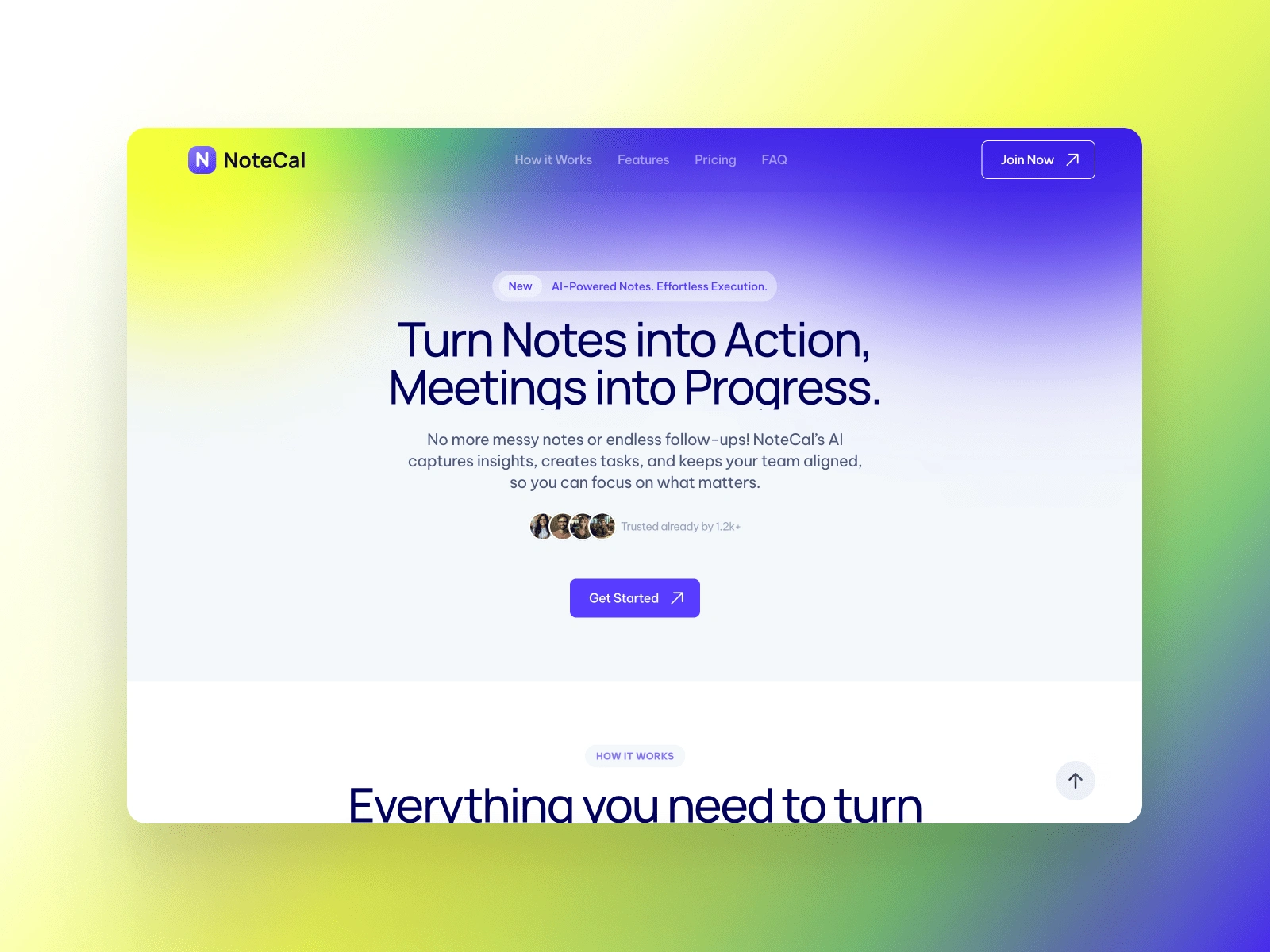
Hero Section
2. High-Performance, Fully Responsive Build
A Framer-powered build ensures that the experience is:
✅ Fast-loading with smooth transitions and minimal lag.
✅ Fully responsive, adapting seamlessly across desktop, tablet, and mobile.
✅ Optimized for interaction, allowing users to navigate effortlessly.
The layout and animations adjust dynamically to different screen sizes, ensuring a consistent and polished look across devices.
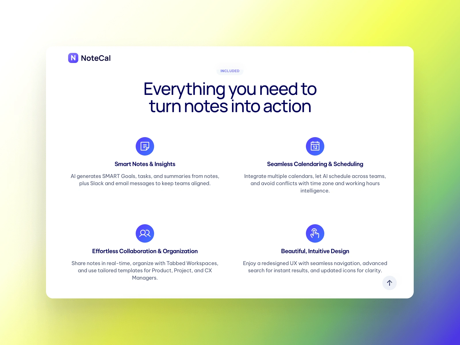
Features
3. Motion & Interaction Enhancements
One of the core design principles was creating engagement through movement. This was achieved through:
🎯 Subtle hover effects that bring elements to life.
🎯 Smooth page transitions that create a seamless browsing experience.
🎯 Scroll-based animations that draw attention to key content without overwhelming the user.
These elements work together to create a dynamic, interactive, and immersive experience.
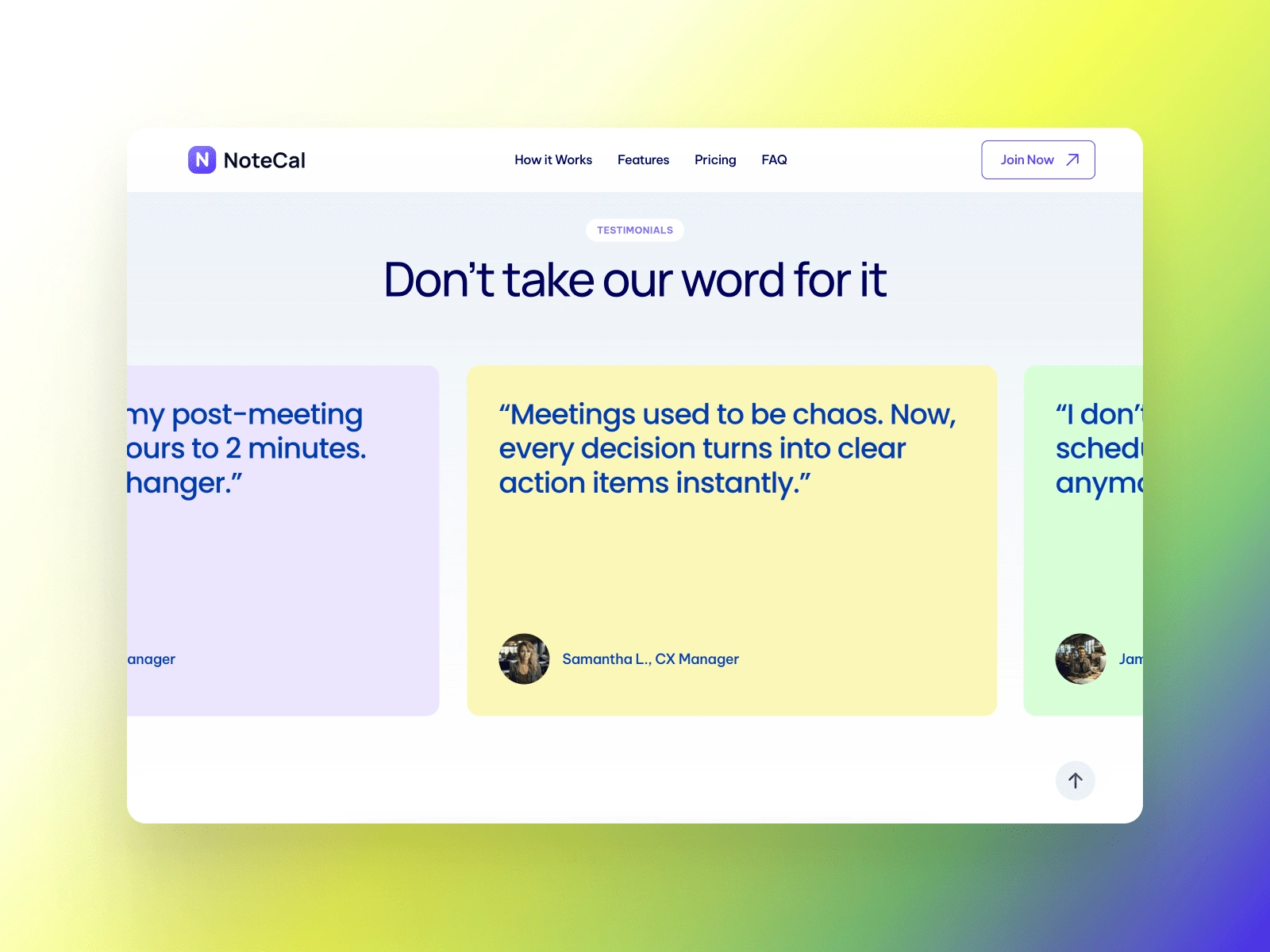
Testimonials
4. Thoughtful User Flow & Navigation
To ensure a smooth user experience, I focused on clear navigation patterns and intuitive interactions:
📌 Strategic CTA placement encourages engagement without being intrusive.
📌 Consistent page structure helps users digest information effortlessly.
📌 Logical content hierarchy ensures key information stands out.
By prioritizing usability, the website feels effortless to explore while keeping users engaged.
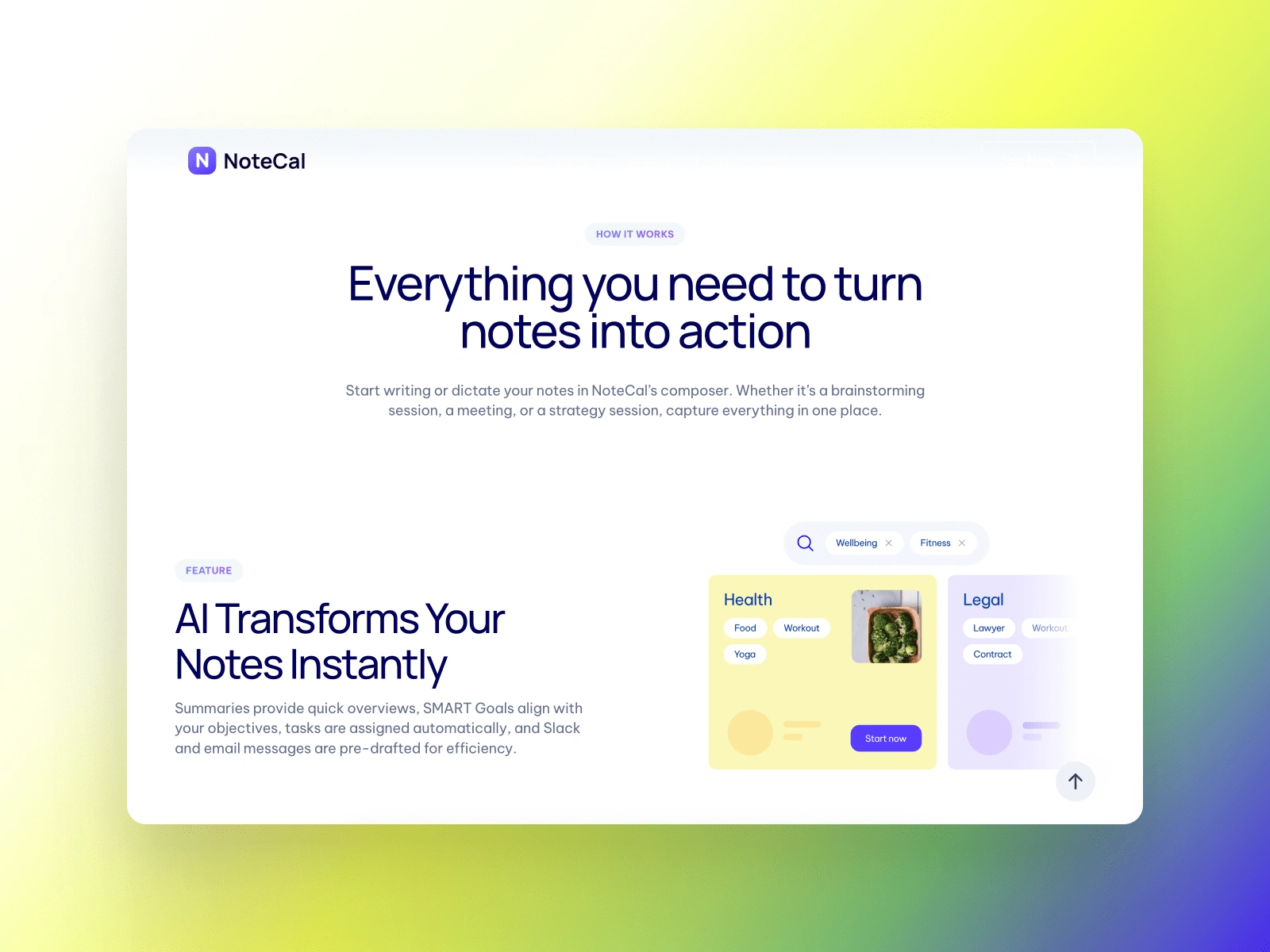
How it Works
Final Outcome & Impact
The final design successfully delivers:
✔️ A visually refined, high-performing website that captivates users.
✔️ A seamless and responsive user experience optimized for all devices.
✔️ Engaging motion design that enhances user interaction.
✔️ A clean and minimal UI that balances form and function.
This project showcases how thoughtful design, motion, and usability can come together to create an engaging and fluid digital experience.
Like this project
Posted Feb 8, 2025
Built a high-performance website for Notecal, an AI-driven notes and product management app, ensuring clarity, speed, and ease of use.
Likes
8
Views
115
Timeline
Jan 28, 2025 - Feb 10, 2025
Clients
NoteCal, Inc.