Built with FLORA
PENUBA Visual Identity
Daniel G Bright

The Setup
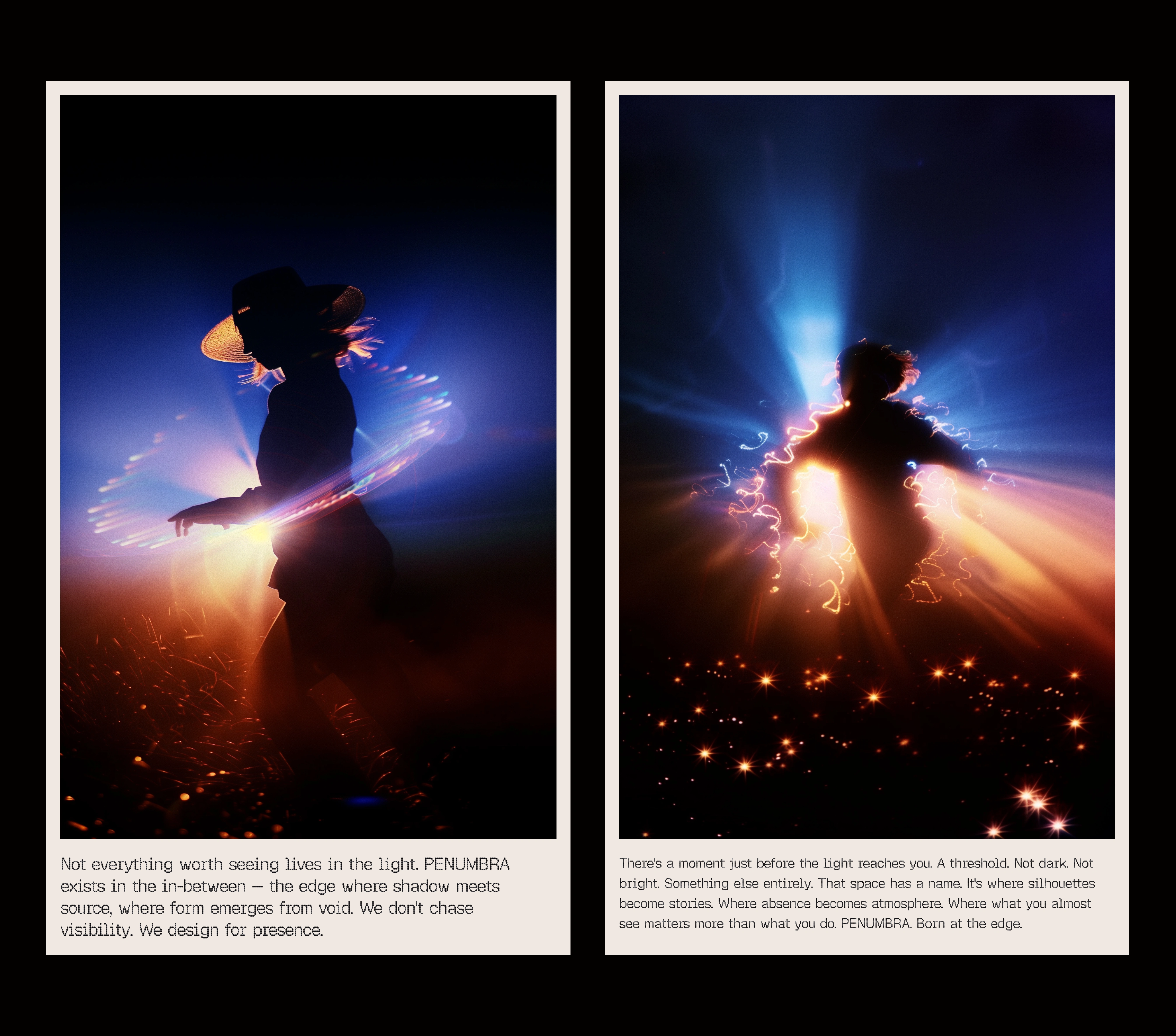
PENUBA is a brand built on the tension between shadow and light — the idea that identity, meaning, and beauty exist in the space between what's hidden and what's revealed. The challenge: build a visual identity for a concept that is, by definition, about ambiguity. How do you make "the in-between" feel tangible, not vague?

Logo
The Tension
Brands that deal in abstraction tend to fall into one of two traps: they either over-explain the concept (killing the mystery with mission statements) or they stay so abstract that no one knows what the brand actually does. The visual language for "duality" and "liminality" is heavily mined territory — think every wellness brand using yin-yang references, every luxury brand using black-and-white photography.
The gap: PENUBA needed to own the shadow-and-light concept with enough visual specificity that it felt like a proprietary visual language, not a mood board reference.
Assets
The Decision
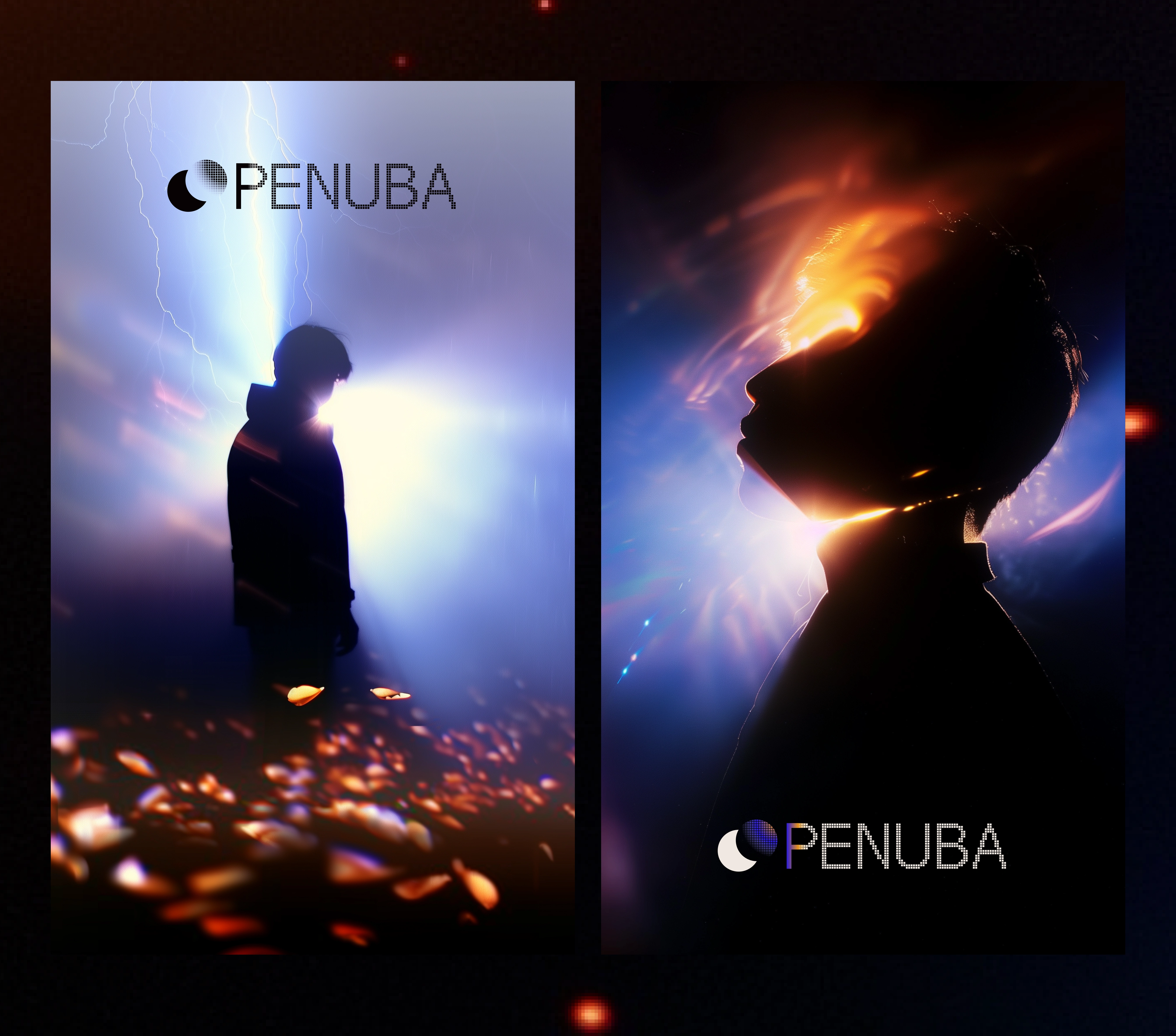
The core strategic choice was to make the brand identity literally about light sources and silhouettes — not metaphorically, but physically. The logo features a human silhouette with a light flare breaking through. The photography uses actual light and shadow as compositional tools. The tagline — "The space between shadow and source" — names the brand's territory with surgical precision.
This was non-obvious because the temptation with a "shadow and light" concept is to go fully dark and moody (noir aesthetic) or fully bright and ethereal (spiritual aesthetic). PENUBA chose neither — it lives in the transition point, the exact moment where shadow meets source. The visual system is warm, not cold. Intimate, not dramatic.
Logo
The System
Logo: A silhouetted figure with a strategic light flare — the mark itself demonstrates the brand concept. The logo isn't representing the idea, it's performing it.
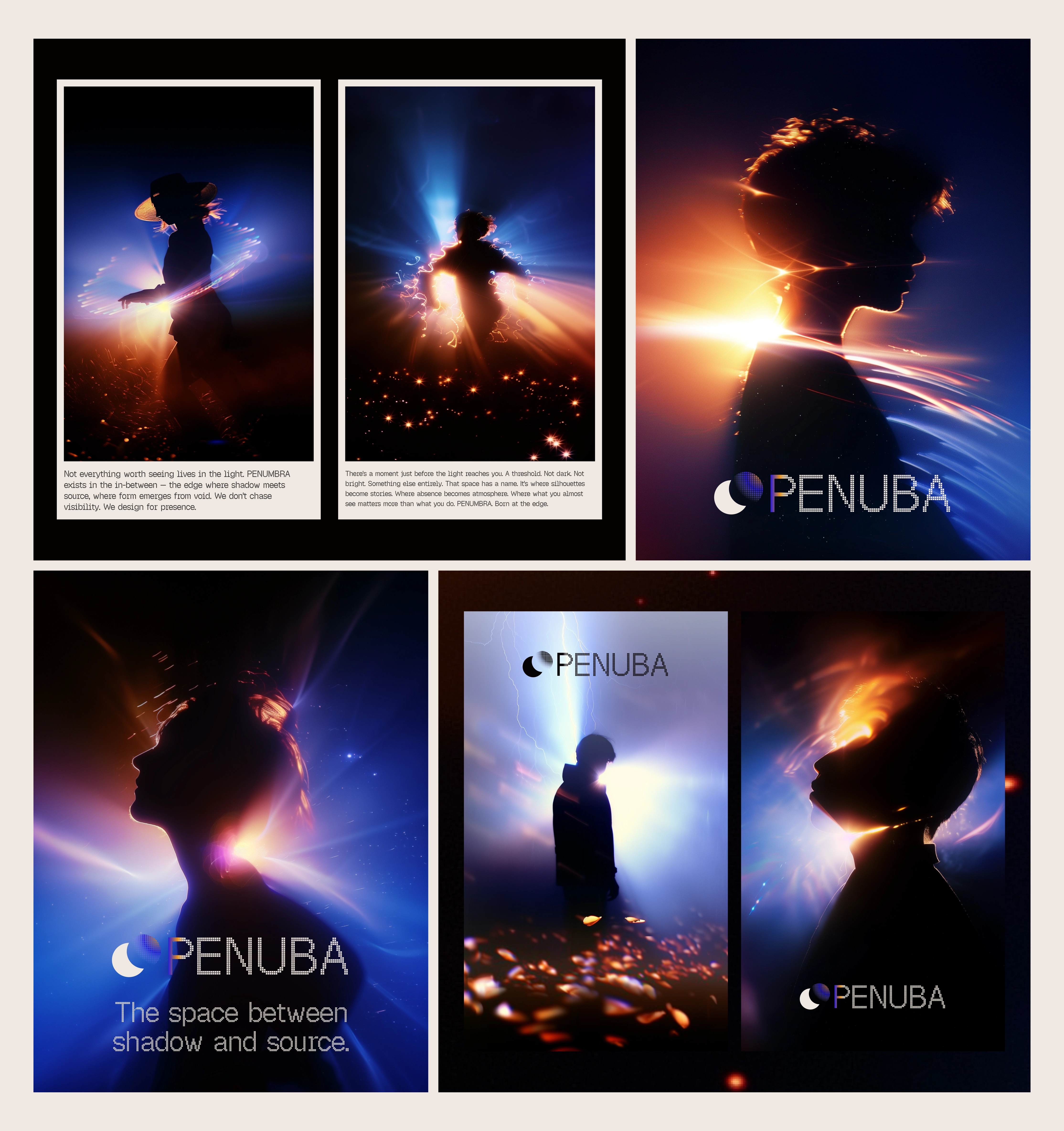
Tagline: "The space between shadow and source." — Five words that lock the brand's territory. Specific enough to be defensible, evocative enough to stretch across applications.
Photography and editorial: Two-figure compositions, natural light and shadow interplay, editorial layouts that balance dense type with breathing space. The imagery feels cinematic without feeling staged.
Poster system: Vertical story layouts that alternate between bold typographic statements and atmospheric photography. Each poster could function as a standalone art piece or a brand touchpoint.
Color direction: Warm tones with deep contrast — the palette avoids pure black and pure white, staying in the rich middle ground that the brand concept demands. Ambers, deep browns, warm grays.
Editorial spreads: Long-form brand storytelling that treats the visual identity as a narrative, not a specification. The layouts read like a fashion editorial — each spread advances the concept rather than just displaying the assets.
Overview
The Takeaway
When your brand concept is about a liminal space, the identity system can't just reference it — it has to inhabit it. PENUBA doesn't describe shadow and light. Every surface is made of it.
Like this project
Posted Feb 28, 2026
Visual identity for PENUBA built on the tension between light and shadow — a brand that refuses to sit in either.
Likes
6
Views
241
Timeline
Feb 8, 2026 - Feb 11, 2026