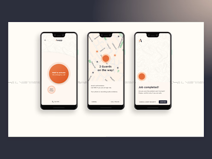
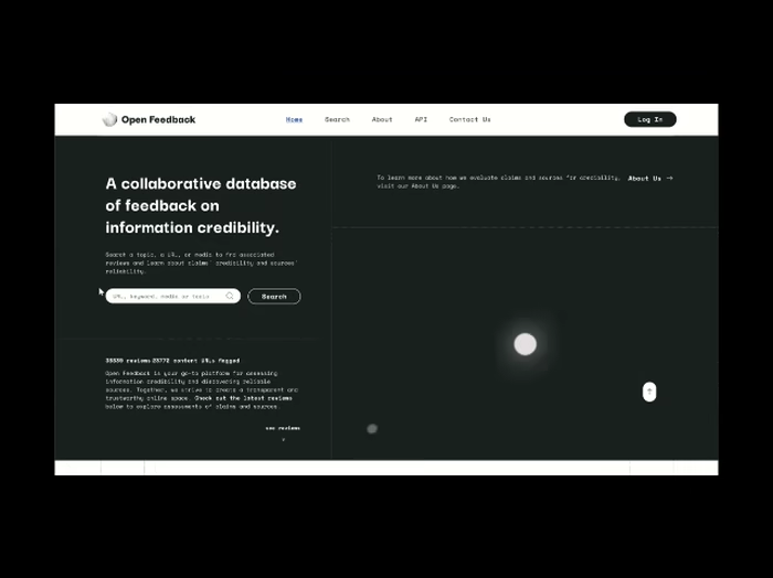
Platform redesign and UI kits creation.
Owerview
Science Feedback is a worldwide network of scientists sorting fact from fiction in science based media coverage. It's a non-profit organisation with the main goal to help readers know which news to trust.
Key Tools: Figma, Framer, Miro, Wordpress
My Role: UI Designer, project manager
Problem Statement
Platform needs redisign in order to get more comprehensible, merge two types of articles: claim and article reviews and move to new Wordpress framework.
We also want to attract new readers.
Solution Design and challenges
Initially platform was quite chaotic so we went throug ideation state to first wireframes and tests. The first main challenge was to remake claim review and preserve screenshots of claims in the review card which is very confusing. Through tests of 2nd version we finaly decided to move it out from version 3 card because of confusion in google searches. Images of false information (screenshots of claims) was appearing in google images from our domain. Now home page looks more readable and more attractive.
Project Evolution
UI V1 before redesign:
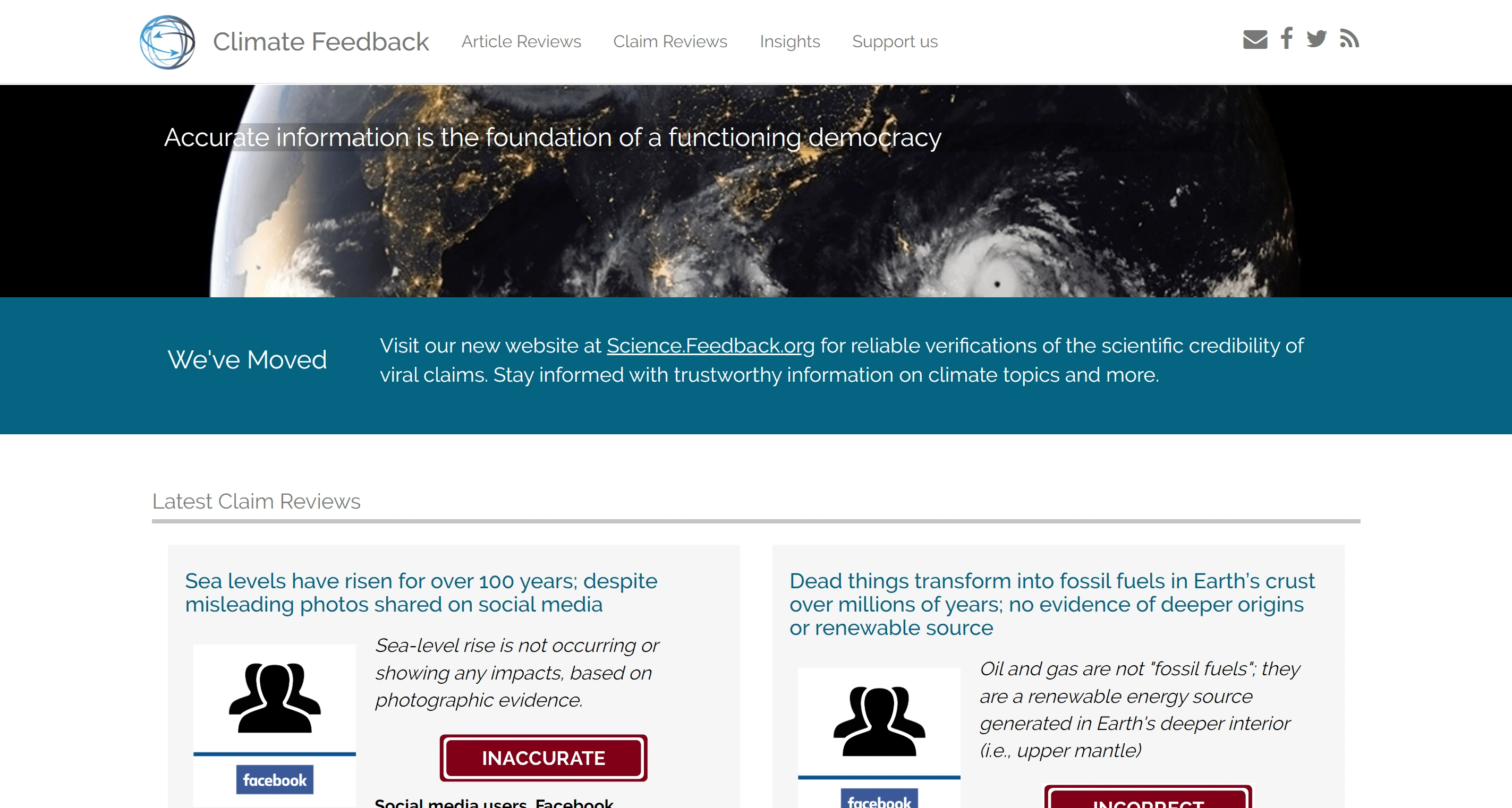
Home page
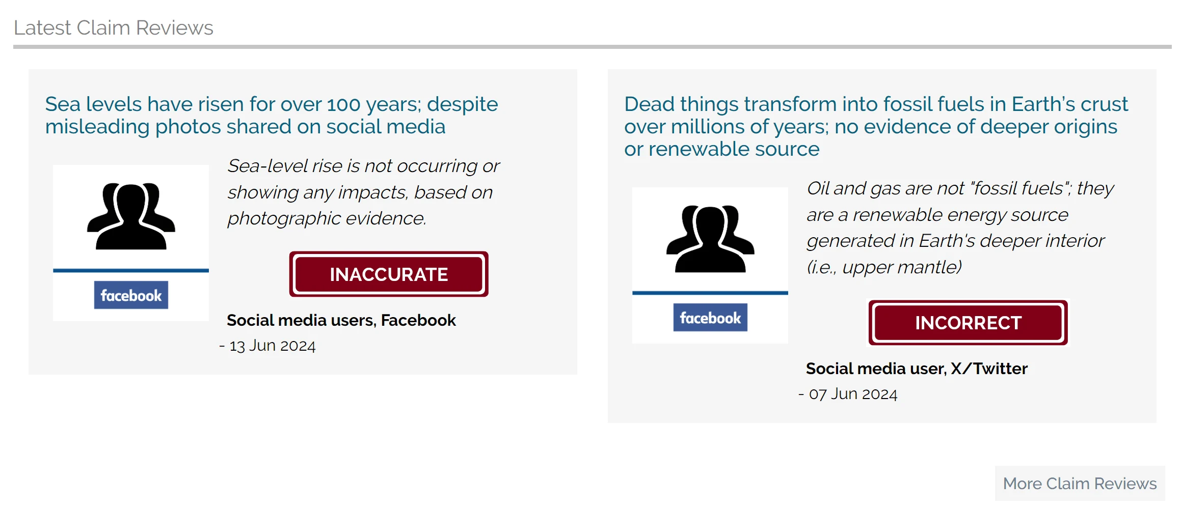
Claim review
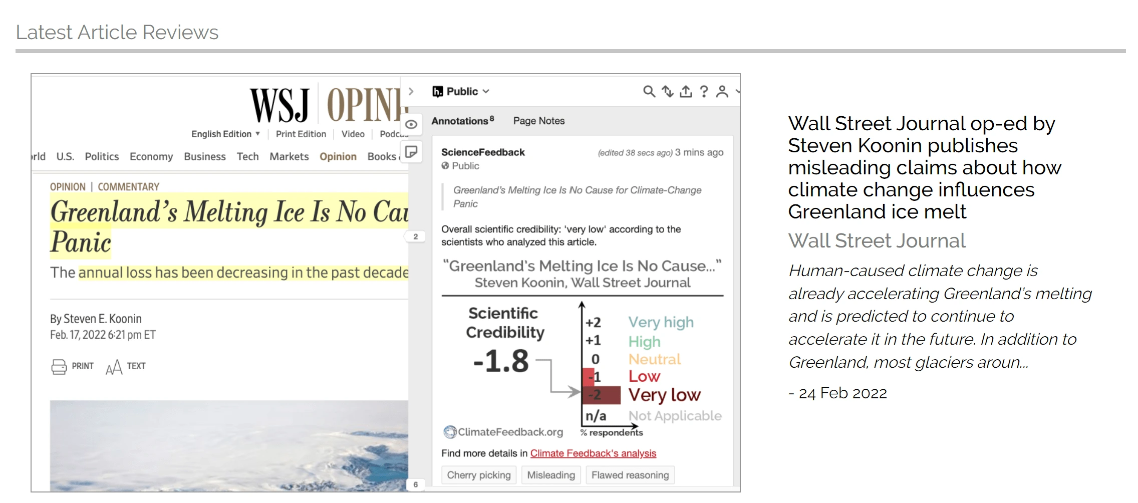
Article review
UI examples V2
Home page v2
Search and menu
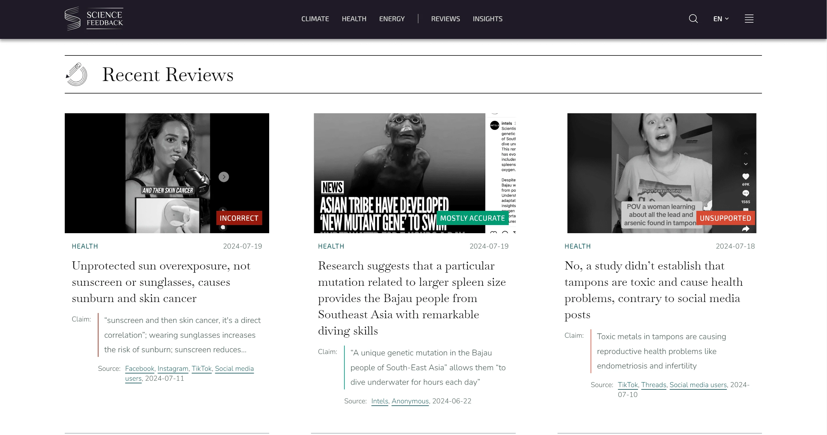
claim cards v2. Each claim has a color which corresponds the verdict
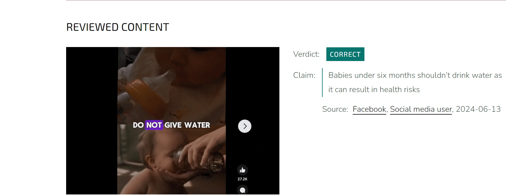
claim inside the article - screenshot without any expl.
UI examples V3
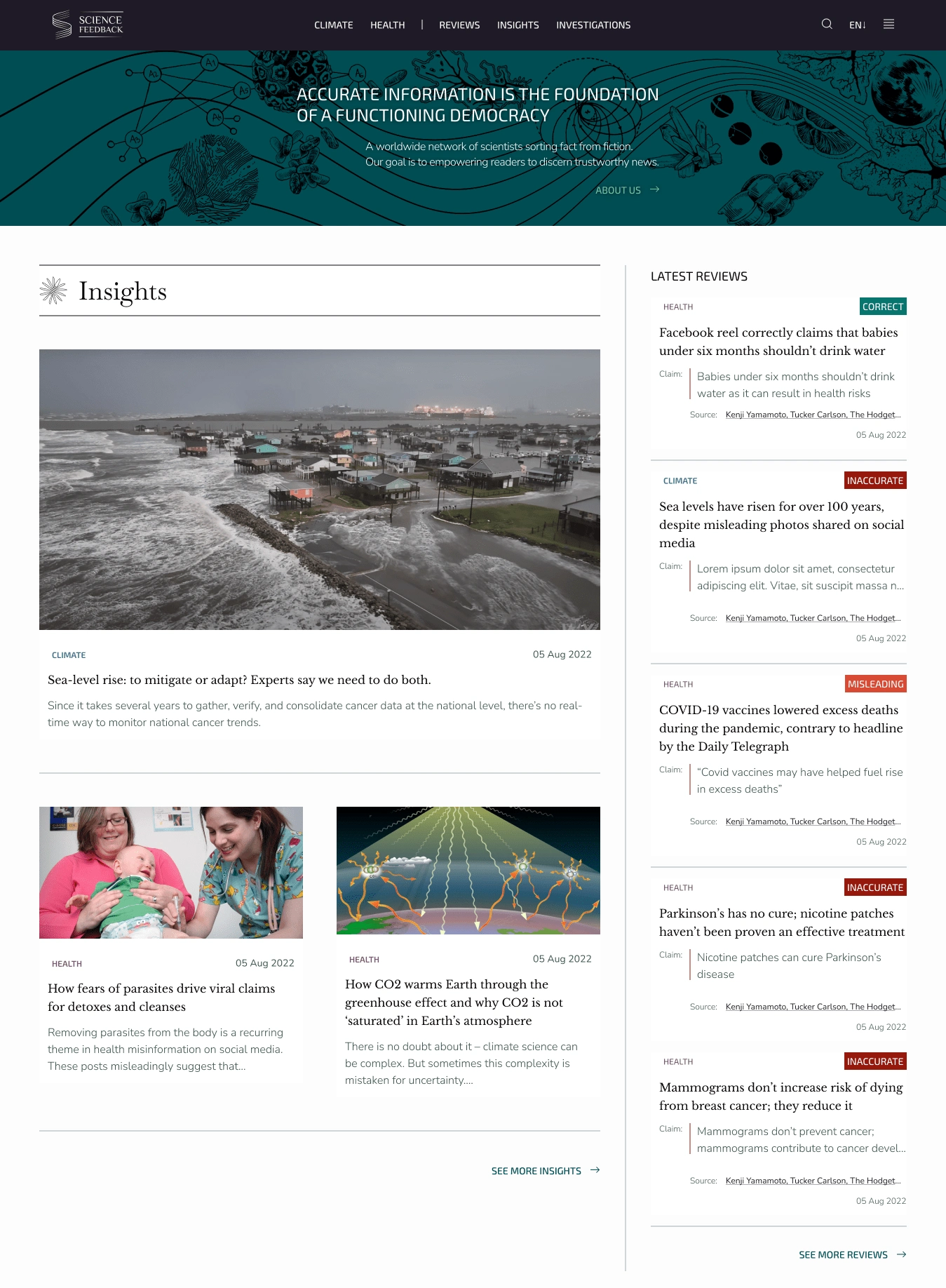
New home page, reviews take second priority on the page
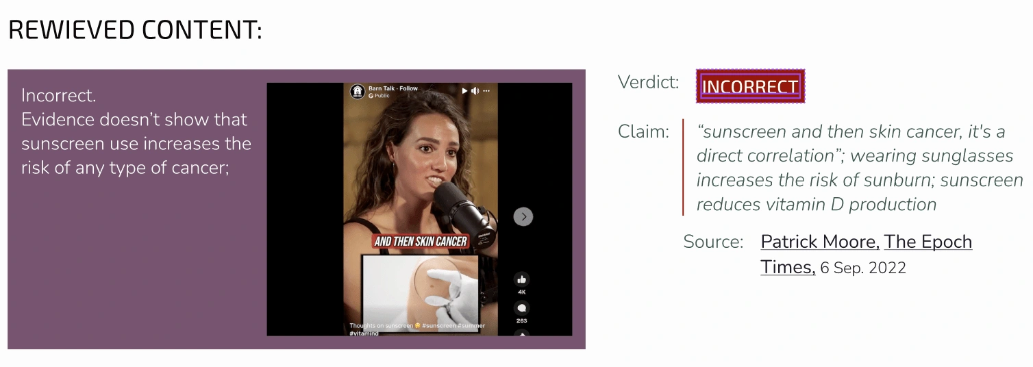
new card image used only inside the article. card shows a clear explanation in order to not confuse users in google images search.
Graphic design
Styles and UI kit
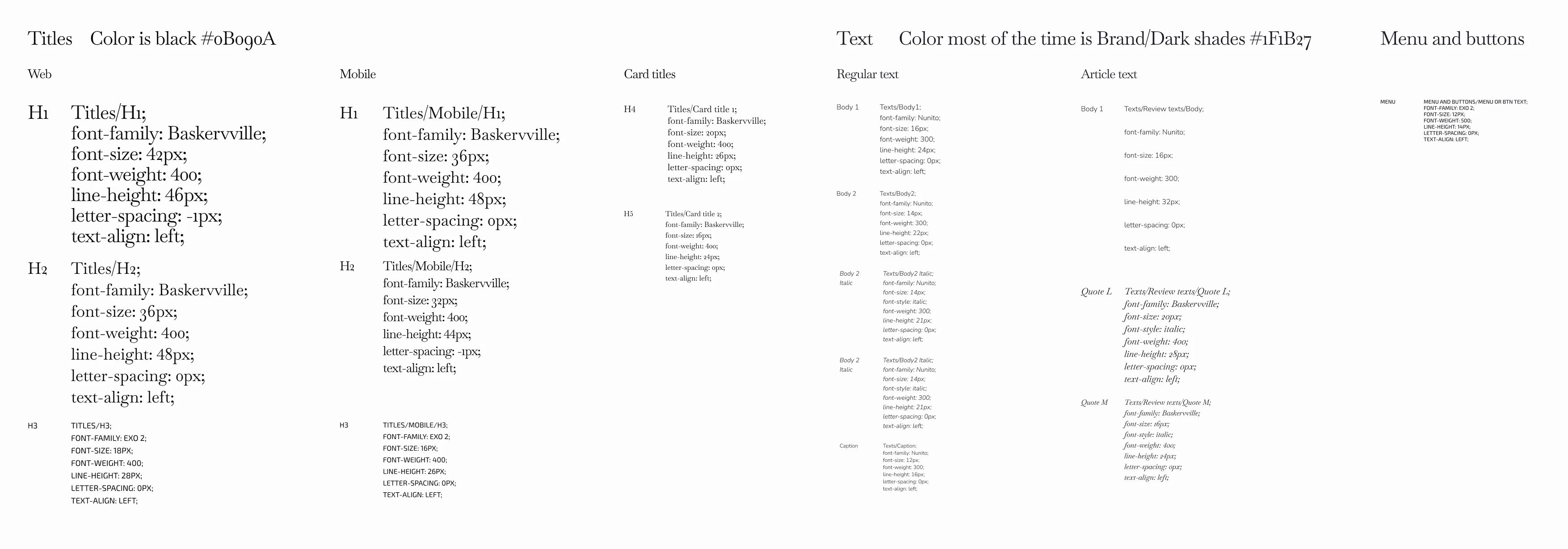
Typography styles
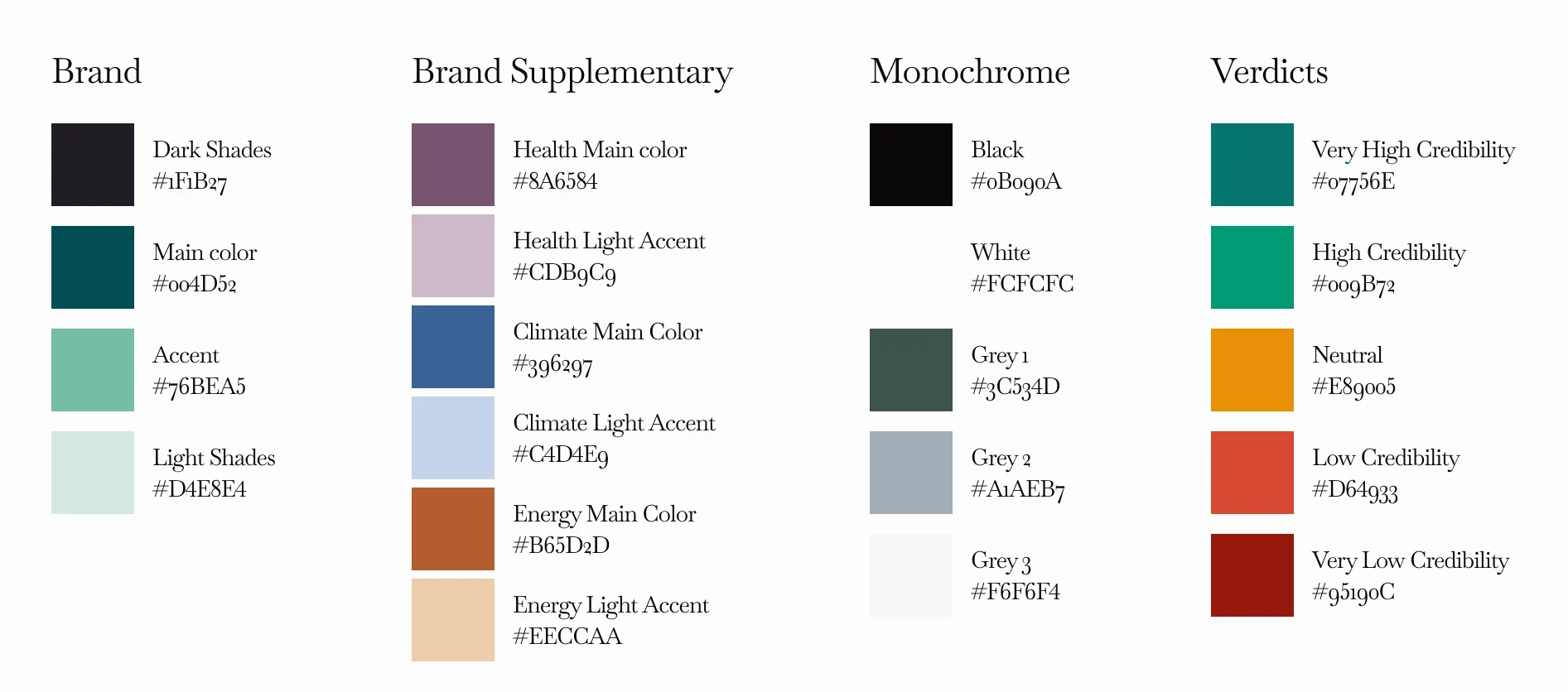
colors
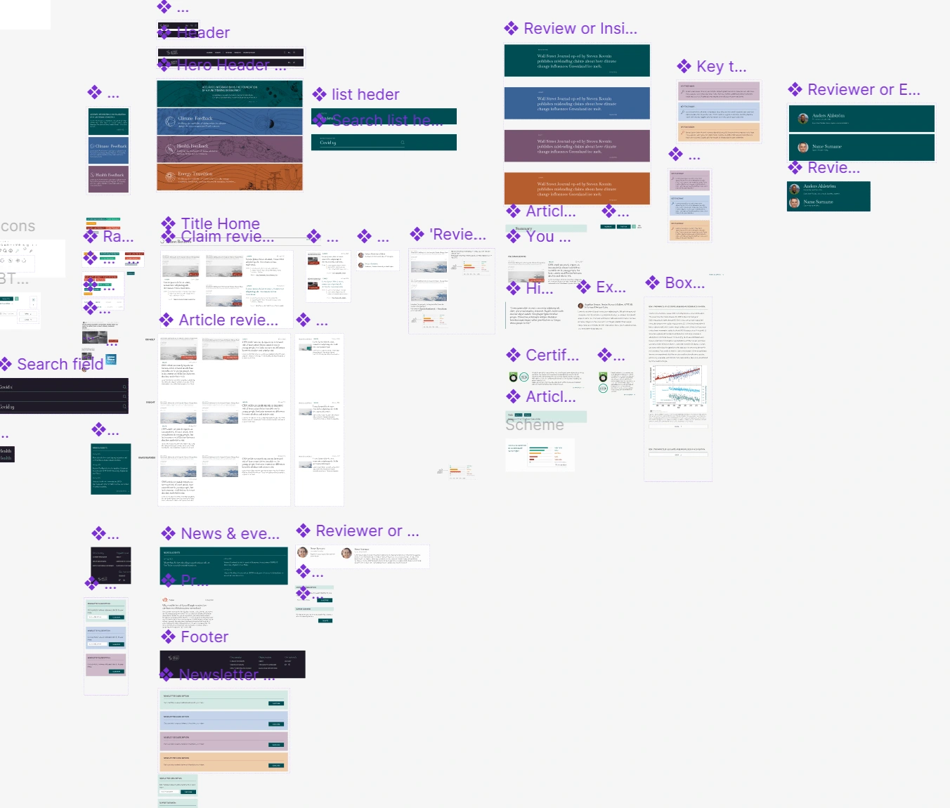
UI kit
Like this project
Posted Dec 7, 2023
Revamped the platform by remaking it's styleguide, layout, user experience and adding a design system for a wordpress template. Follow up an outside tech team.

