SUEZ: Internal management dashboards redesign, UI kits creation

Irina Zubareva

Three users, one water network
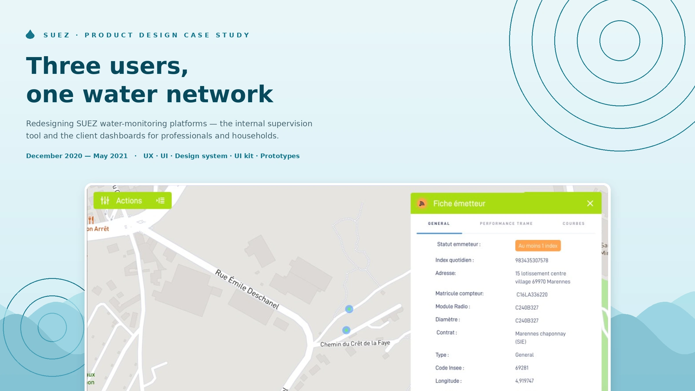
Redesigning SUEZ's water-monitoring platforms — from the internal supervision tool to the client dashboards — turning a tangled legacy system into ergonomic, role-appropriate interfaces.
Role: Product Designer (freelance) — redesign of major functional areas: user journeys, UX, UI, parts of the design system and UI kit, clickable prototypes, and design follow-through during development
Client: SUEZ · Dates: December 2020 – May 2021
Team: alongside a product owner, a project manager and two developers
Platform: Web, desktop-first B2B
Context
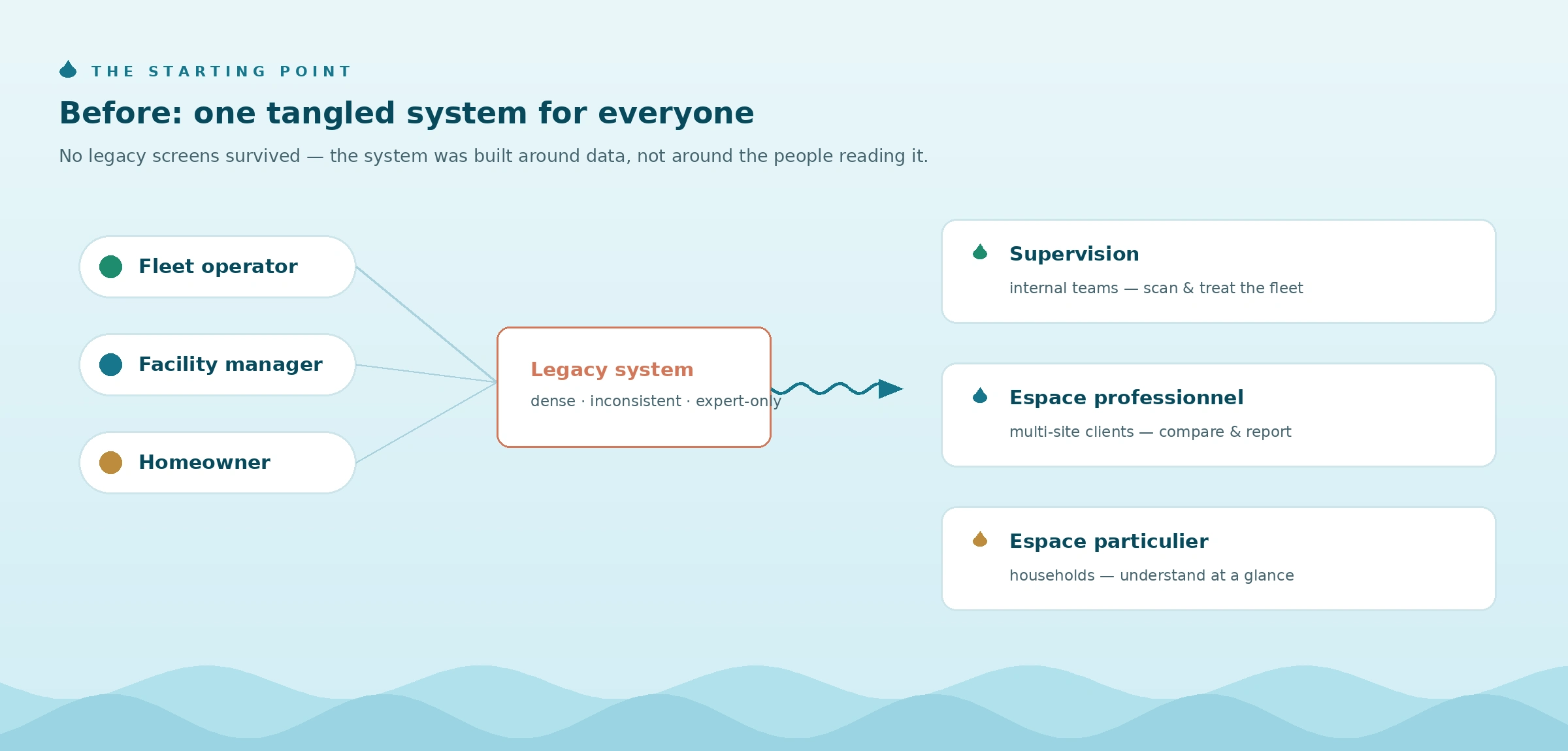
SUEZ operates smart water meters across France — thousands of connected devices reporting consumption, leaks and technical faults. The data served three very different audiences: internal operations teams supervising the meter fleet, professional clients managing multi-site consumption, and individual households watching a single meter.
The existing system had grown into a hard-to-navigate legacy: dense, inconsistent, and built around the data rather than the people reading it. An operator hunting for a faulty meter, a facility manager comparing sites, and a homeowner worried about a leak were all served the same tangled logic.
The brief
Rework the user journeys and make the system genuinely usable — a more ergonomic platform for water monitoring, built on SUEZ's existing identity guidelines. Not a visual restyling: a structural redesign of how each audience finds, reads and acts on water data.
The approach: one system, three levels of expertise
The core design decision was to treat the three audiences as three distinct products sharing one design language — rather than one interface with permissions.
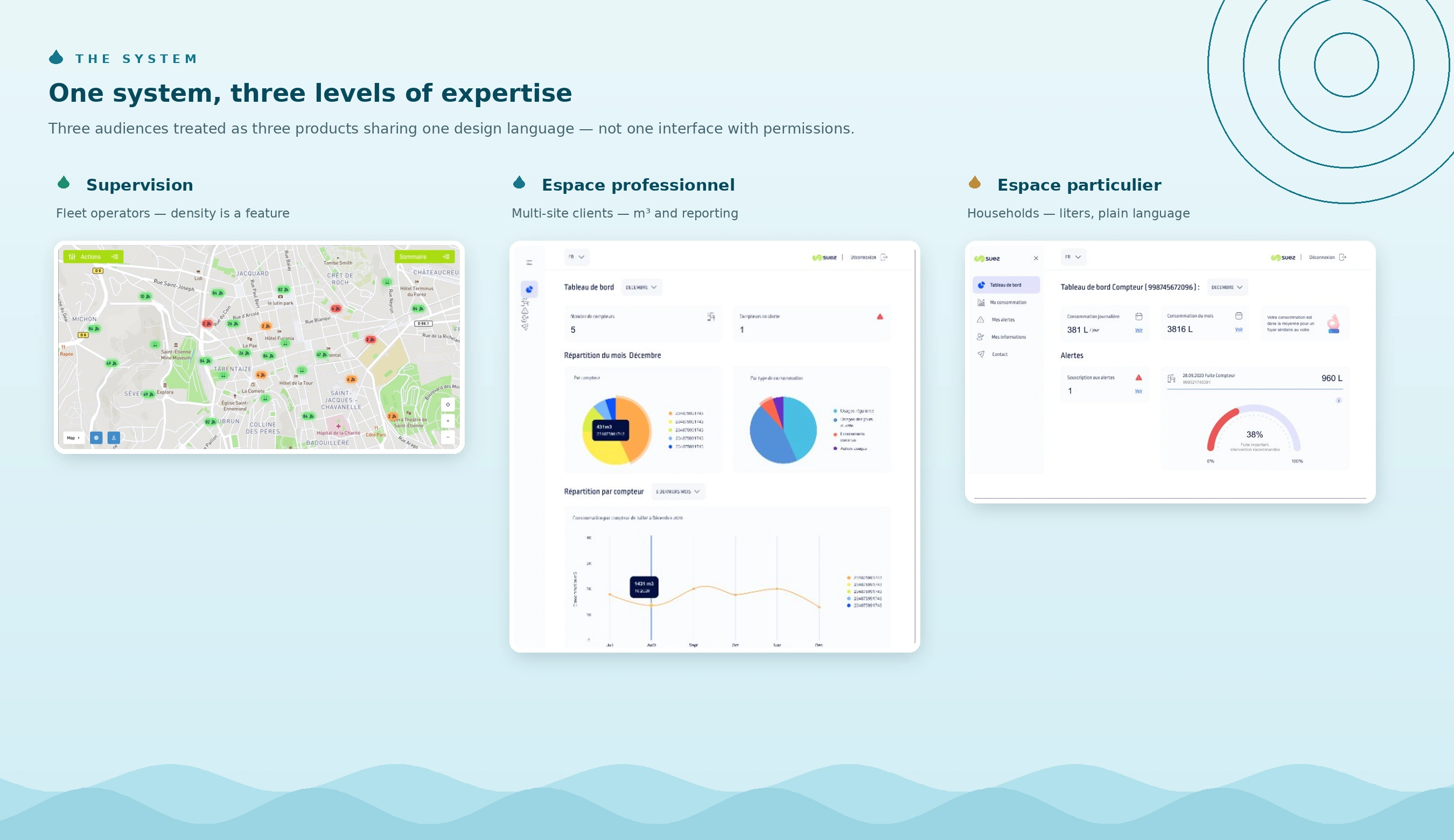
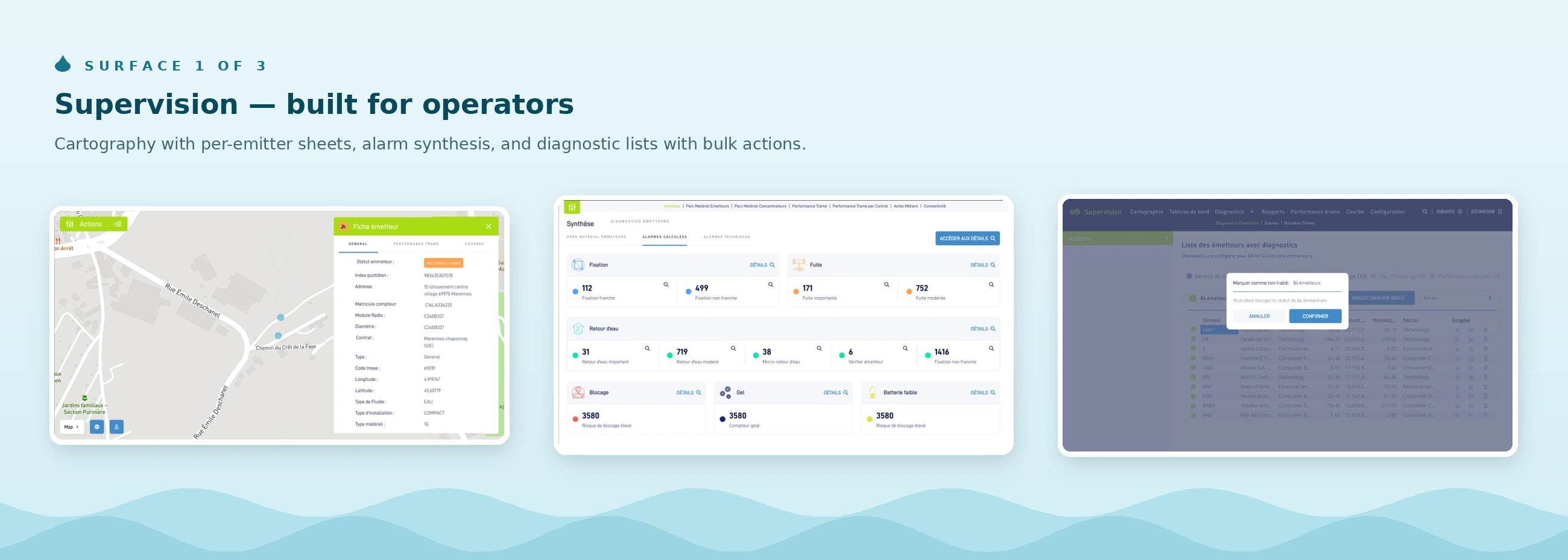
Supervision — built for operators who live in the tool. A cartographic view of the meter fleet with color-coded statuses, per-emitter detail sheets, alarm synthesis (leaks, water returns, frozen meters, battery, connectivity), and diagnostic lists with bulk actions — an operator can select dozens of emitters and mark them as treated in one confirmed action. Density is a feature here, not a bug: the design optimizes for scanning thousands of devices.
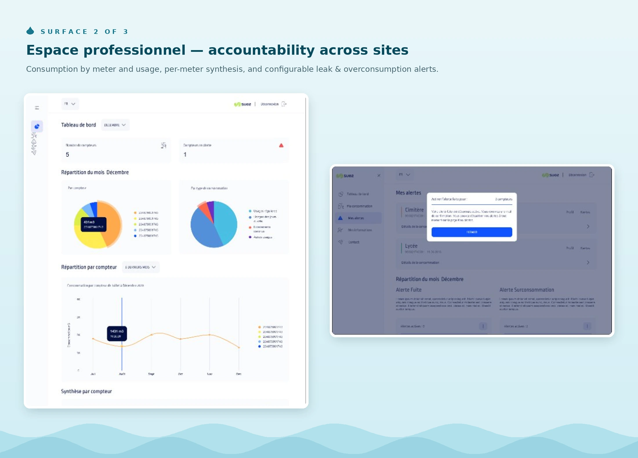
Espace professionnel — built for accountability across sites. Multi-site clients get a dashboard of consumption by meter and by usage, a per-meter synthesis table with trends, and configurable alerts (leak / overconsumption) with thresholds and notification channels. The design assumes a professional reading in m³, comparing sites and reporting to someone.
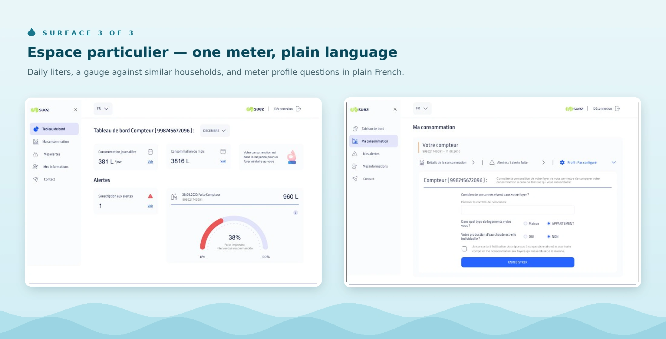
Espace particulier — built for a homeowner who checks once a week. The same data, radically simplified: daily consumption in liters, a comparison gauge against similar households, one meter, plain-language questions to profile the home, and the same leak alerts — because a night-time continuous flow means something very different when it's your house.
Key design decisions
Ergonomics over exhaustiveness. The legacy showed everything everywhere. The redesign gives each journey a hierarchy: what needs action first (alarms, thresholds crossed), then what explains it (curves, history), then everything else behind a click.
Shared patterns, different densities. Alerts, thresholds and consumption charts use the same components across the three spaces — but the internal tool packs them tight for scanning, while the household space spends the same patterns generously. One UI kit, three densities.
Designed inside an existing identity. SUEZ's brand guidelines were a given. The design system work focused on what identity guides don't cover: data visualization rules, status color semantics, table and alert patterns, threshold form conventions.
Design through development. Clickable prototypes served as the specification, and the design was followed through implementation with the two developers — decisions were adjusted against technical reality rather than thrown over the wall.
Outcome
The redesigned journeys shipped with the development team during the engagement. The strongest evidence of the work is structural: a legacy system that required expert knowledge to navigate became three role-appropriate products — an operations tool an agent can scan, a professional dashboard a facility manager can report from, and a household space a non-technical person can understand at a glance — all within one design language and one UI kit.
What this project demonstrates: redesigning large functional areas of a complex, data-heavy B2B system — information architecture, interaction patterns and a scalable UI kit — while collaborating tightly with product and engineering through delivery.
Like this project
Posted Jan 20, 2024
Redesigning SUEZ water-monitoring platforms — from the internal supervision tool to the client dashboards — turning a tangled legacy into ergonomic interfaces.
Likes
0
Views
72
Clients
SUEZ Water Technologies & Solutions