Trackstack
Ville Oké
Trackstack
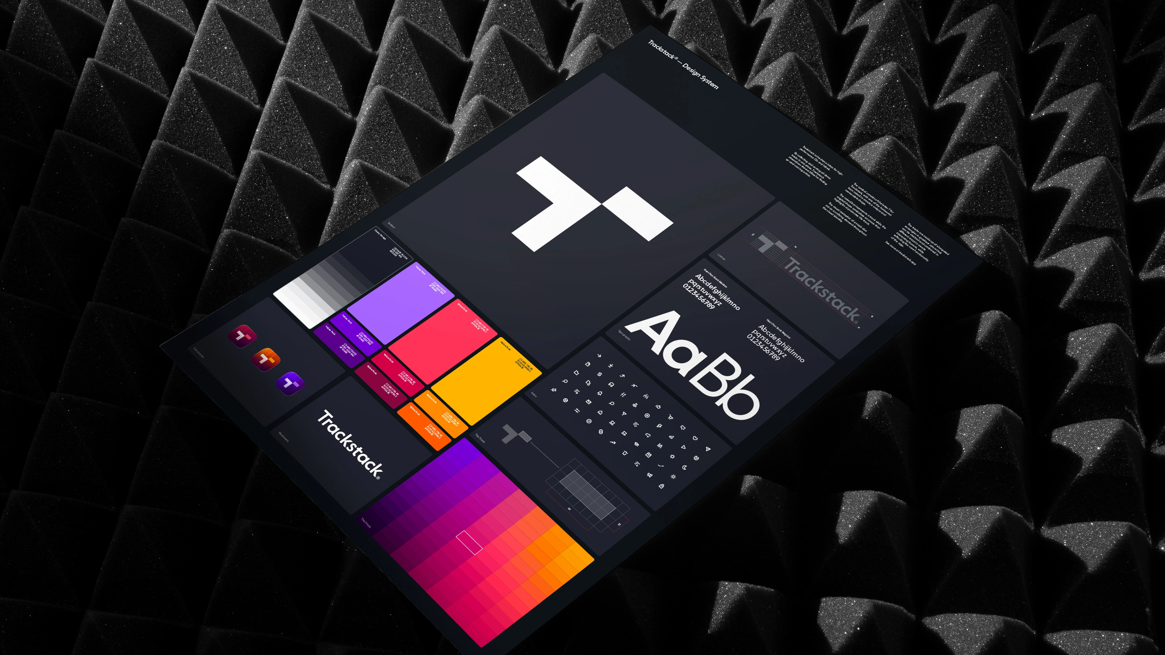
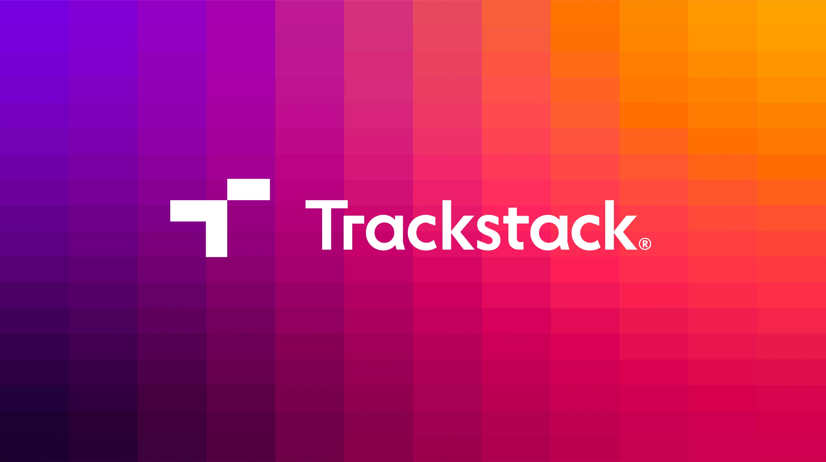
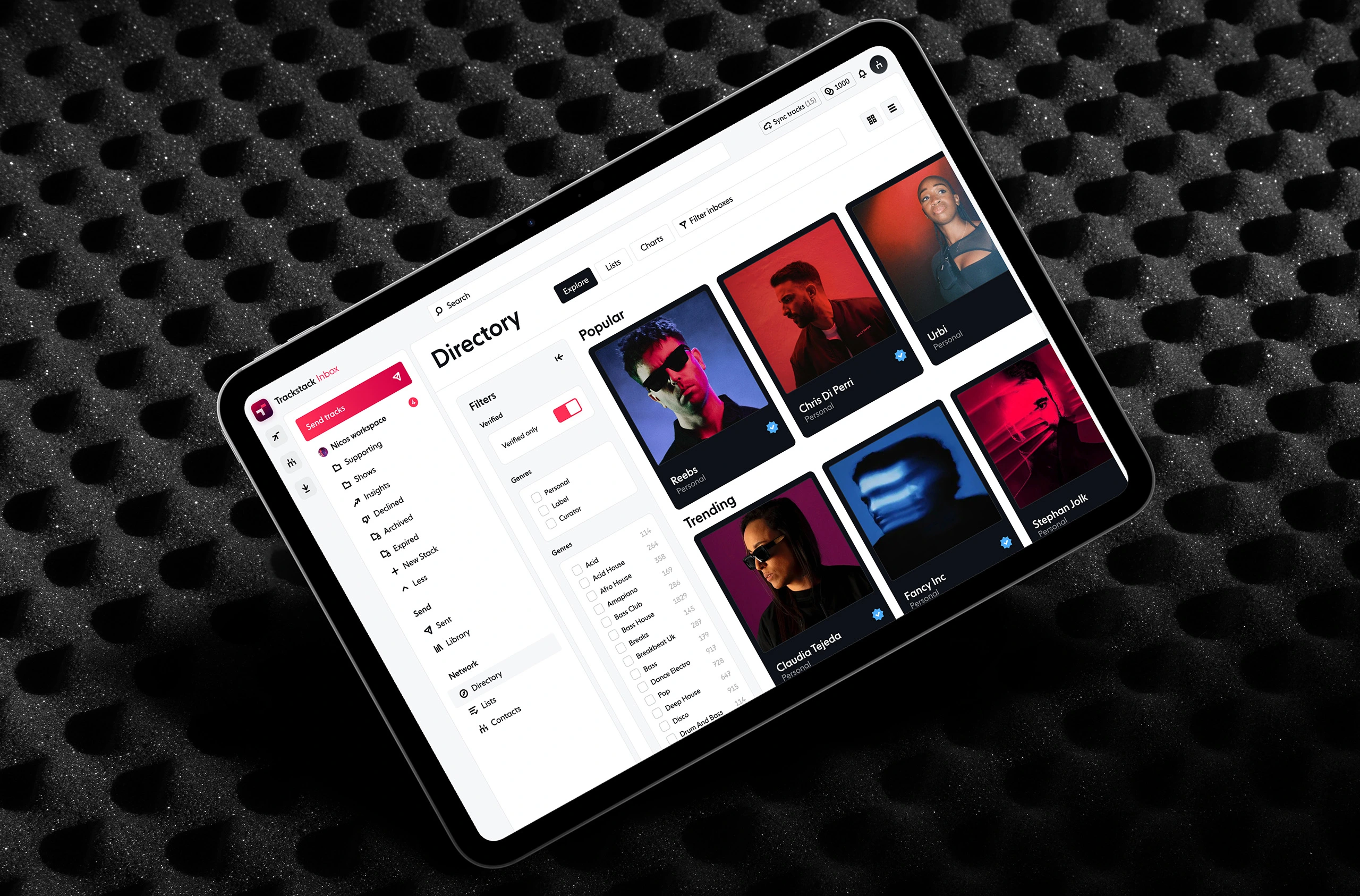
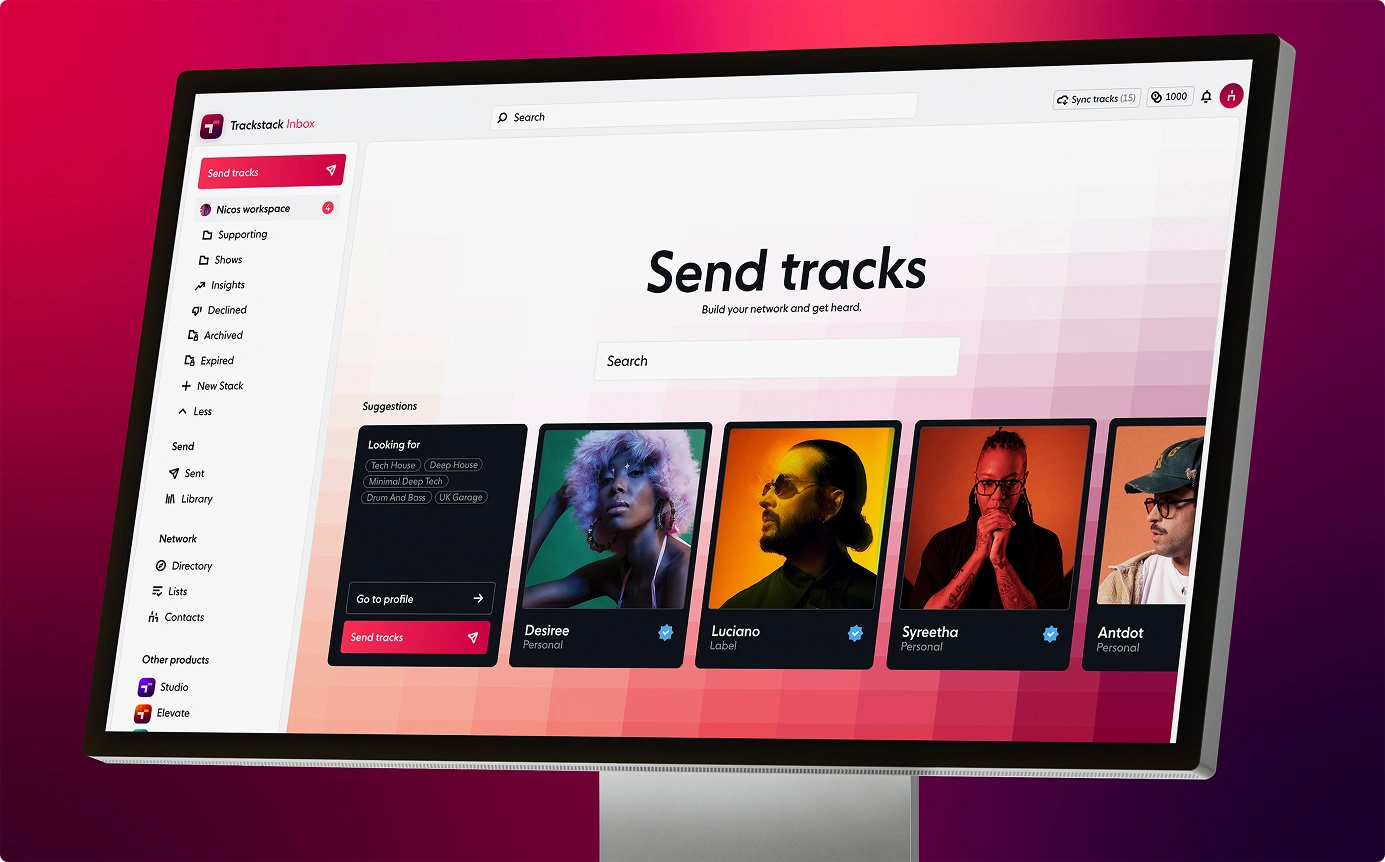
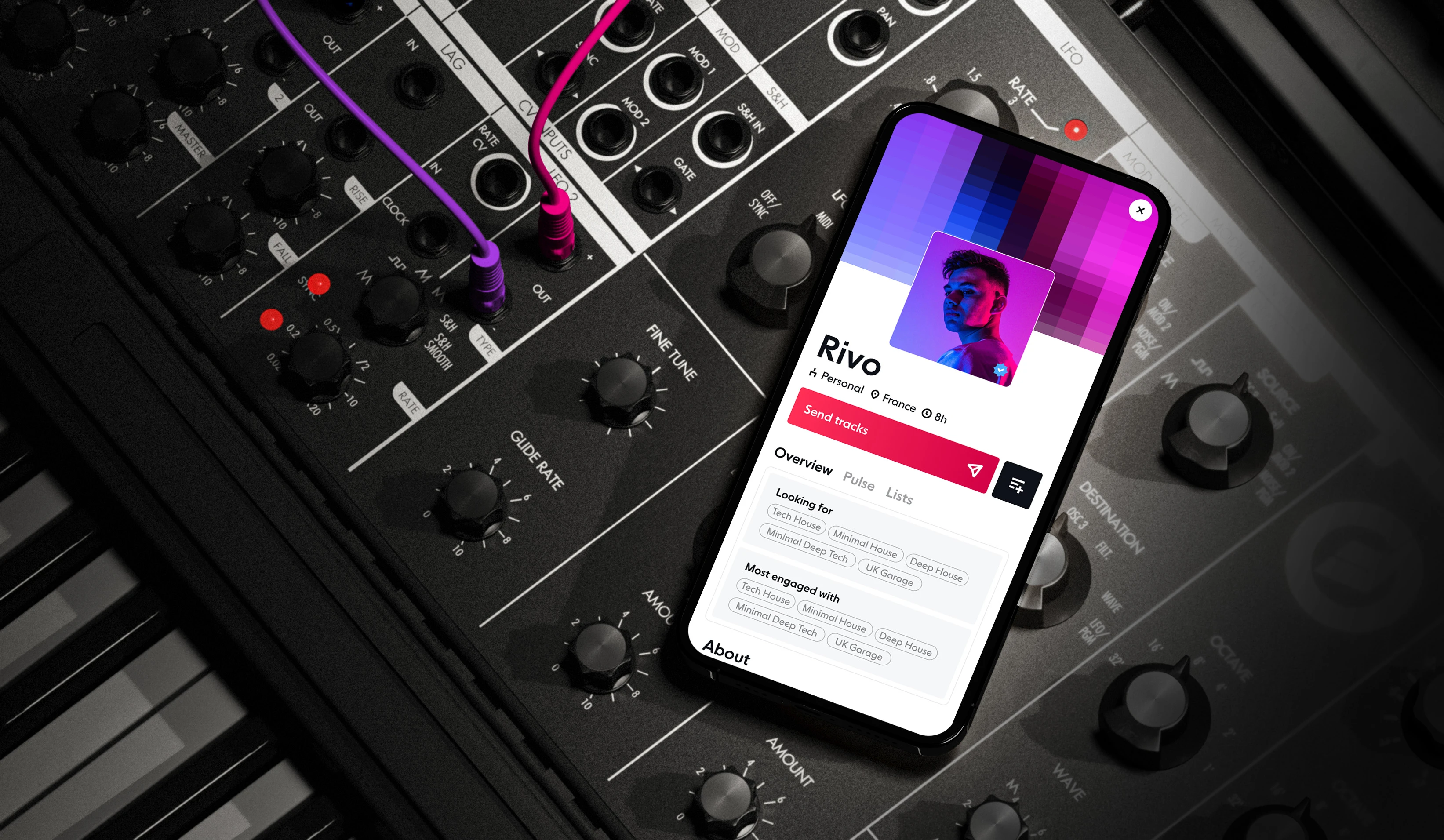
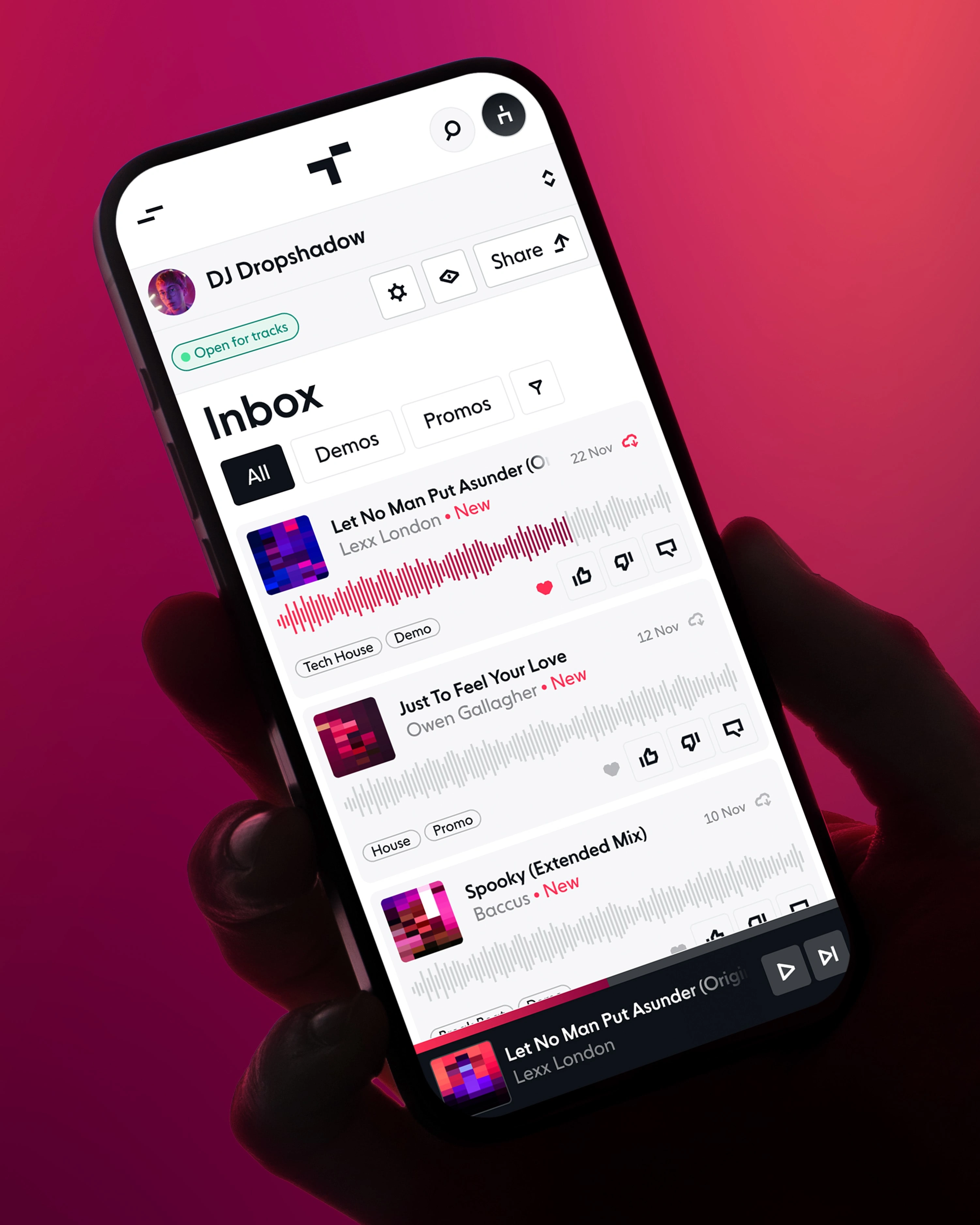
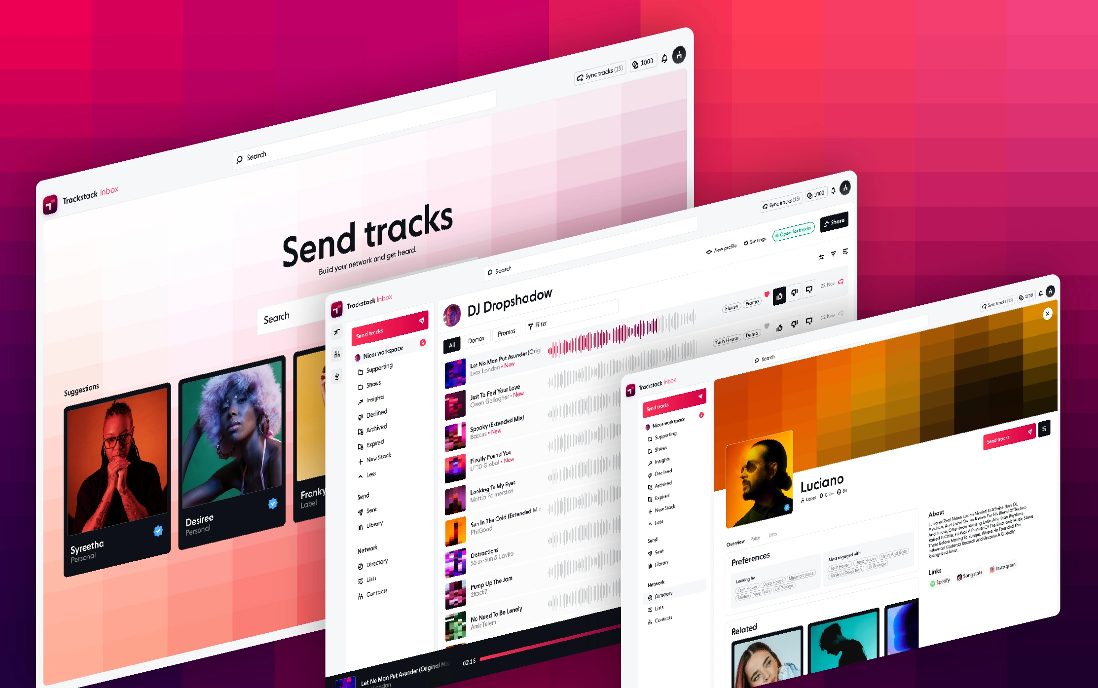
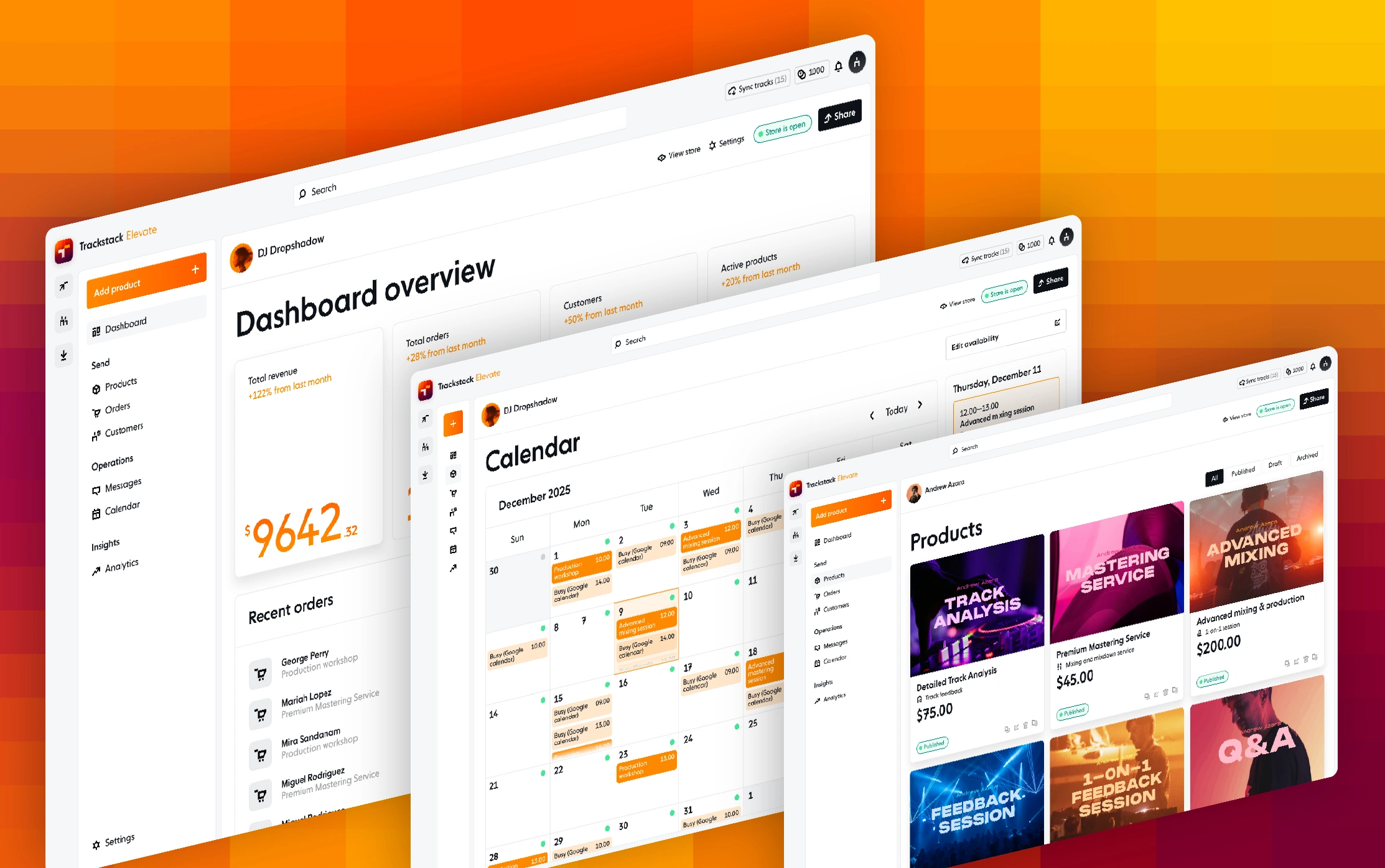
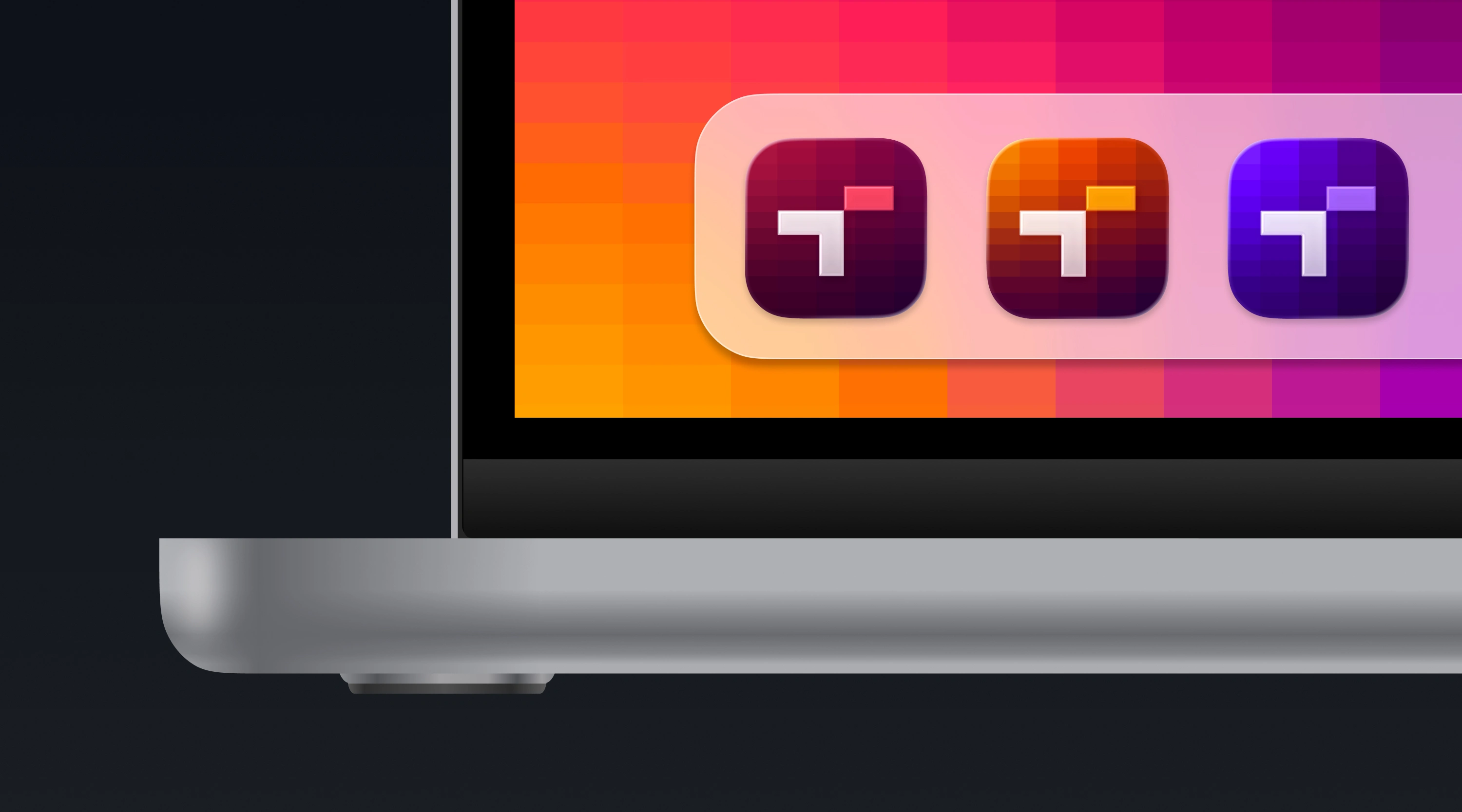
Trackstack is a digital platform that streamlines the workflow for electronic music professionals. With three sub-brands and more likely to come, the design system had to be flexible enough for each sub-brand to have its own unique variation while still feeling consistent with the master brand.
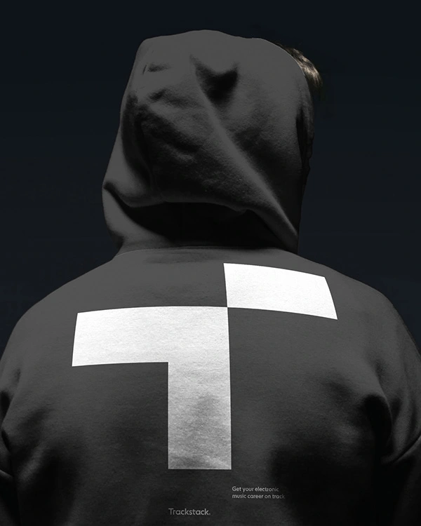
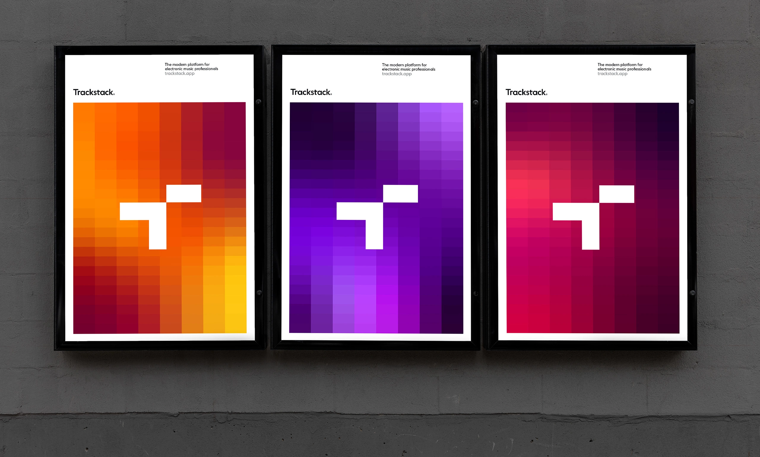
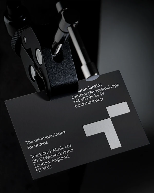
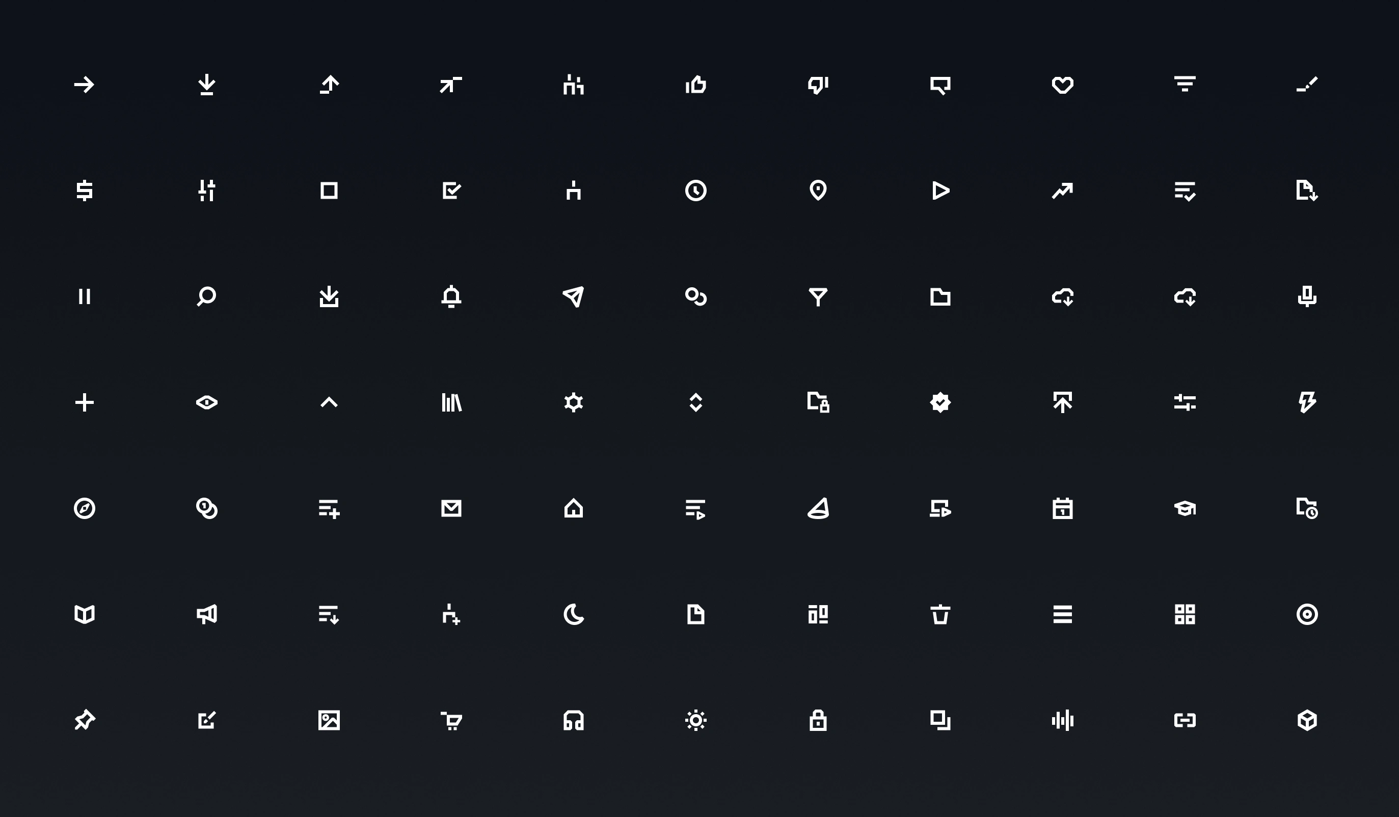
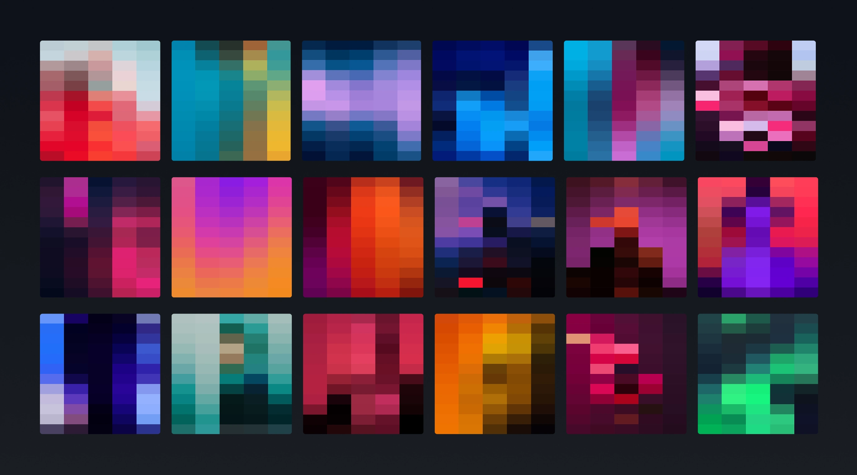
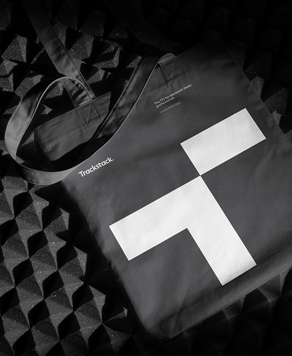
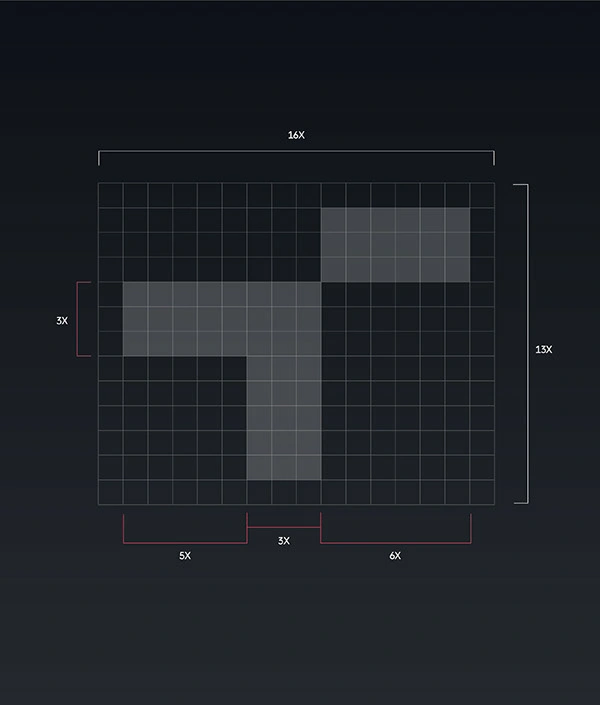
The solution was The Stack, a dynamic gradient tile-pattern derived from the track-shape in the logotype. The stack is used in varying color for each of the sub brands and can also be used for 3rd party videos and imagery to make them into ownable assets for the brand. The symbol for Trackstack consists of the letter T, with one of the horisontal bars raised to represent a track while the angled shape symbolizes an arrow that highlights or promotes the track. The visual metaphor of a track also act as a unifying element throughout the visual identity, tying together the logo, typography, icons, background patterns and image treatment.


Like this project
Posted Apr 15, 2026
Visual identity and UI-design for Trackstack — a digital platform that streamlines the workflow for electronic music professionals.