The Swedish Teachers Union (Sveriges Lärare)
Ville Oké
The Swedish Teachers Union
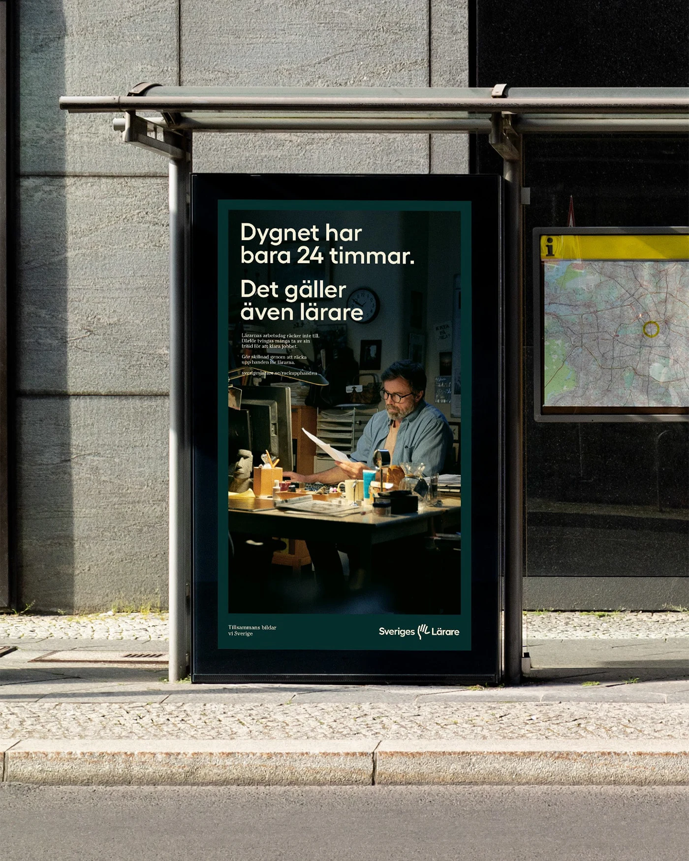
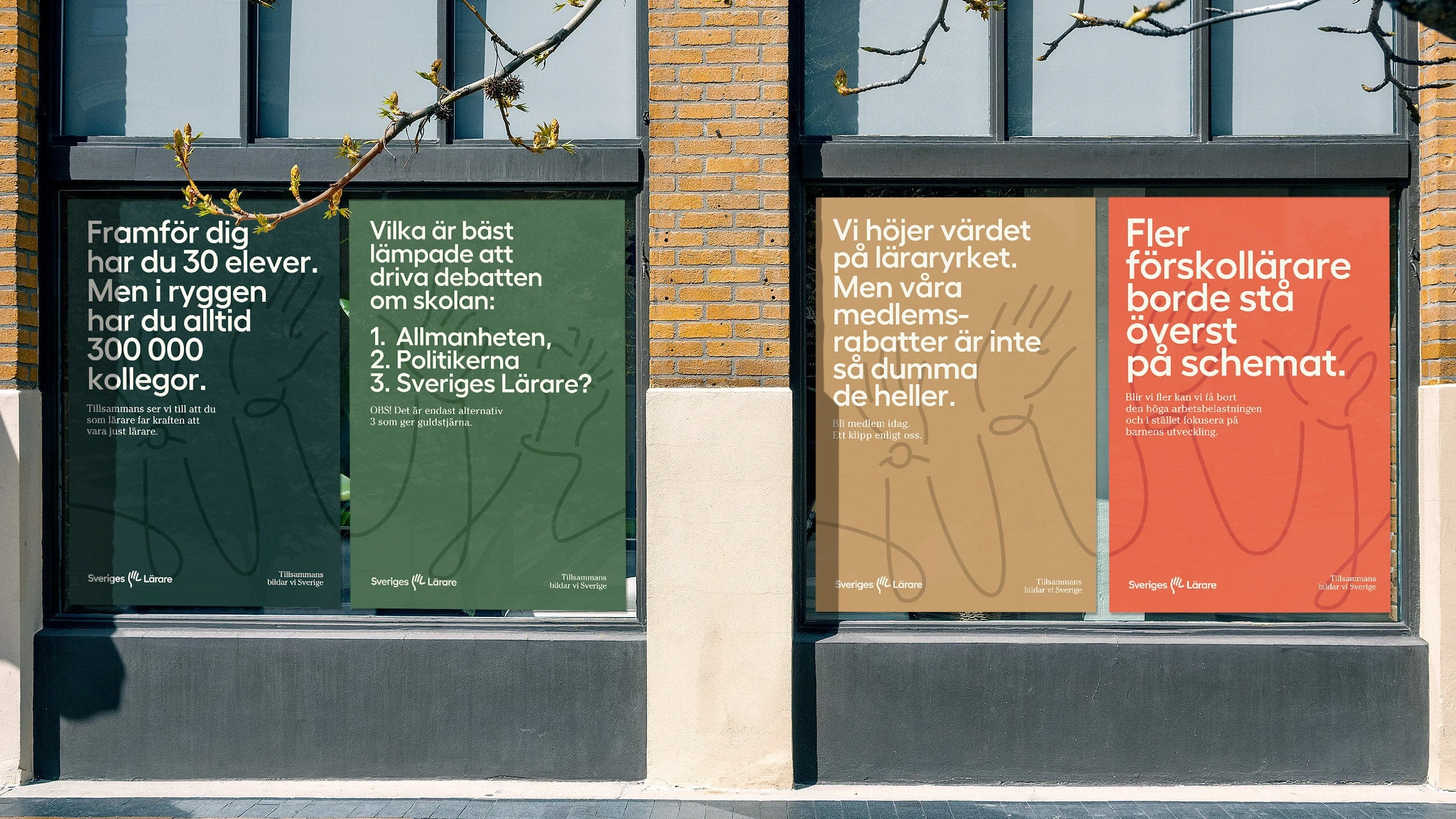
Sveriges Lärare is the result of a merger between two of Swedens biggest unions. Having two very different cultures, the challenge became striking the right balance between a sense of academic gravitas and an expression of warmth and lightheartedness. The brand needed to represent all factions of education, from pre-school all the way up to university.
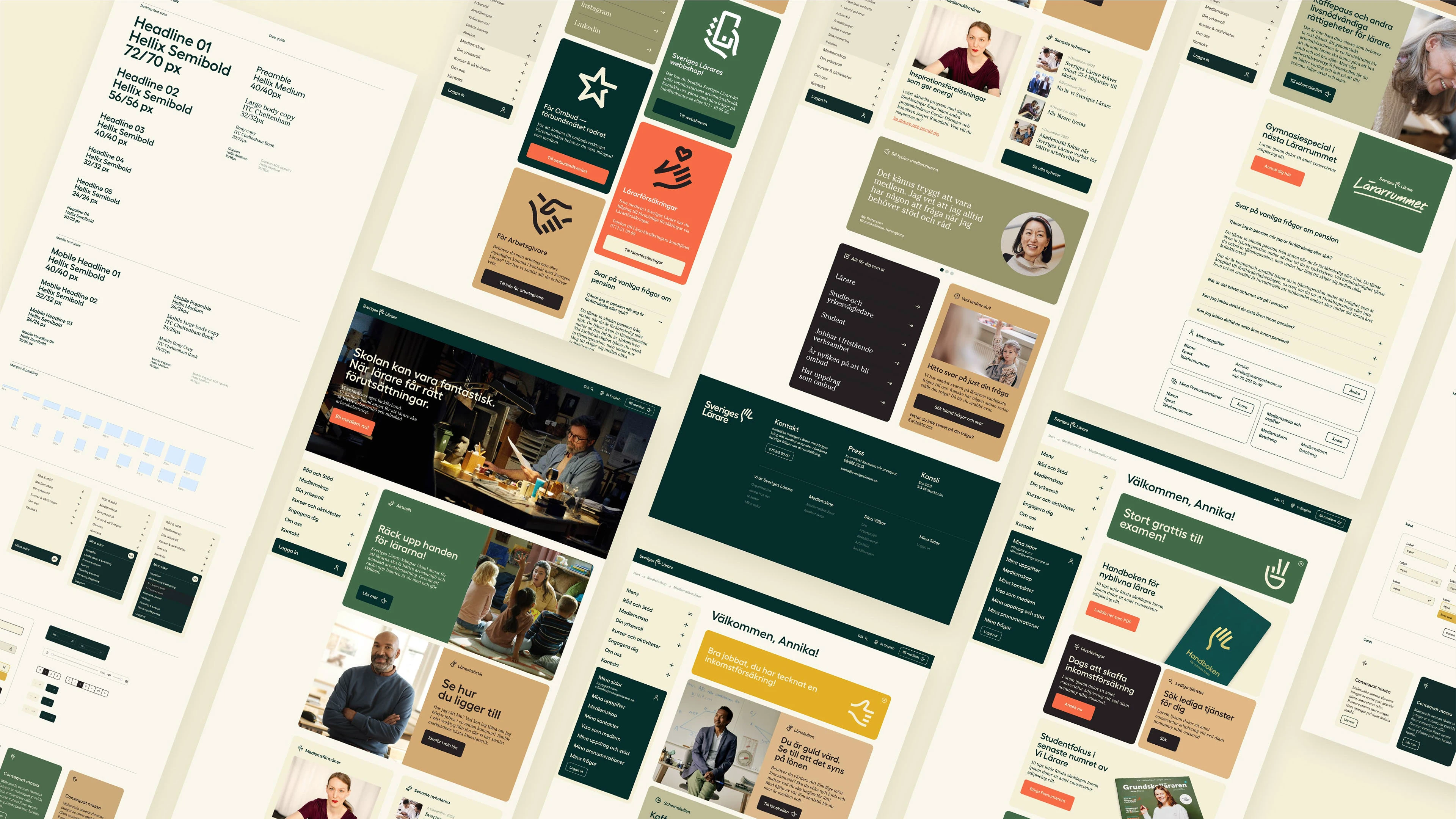
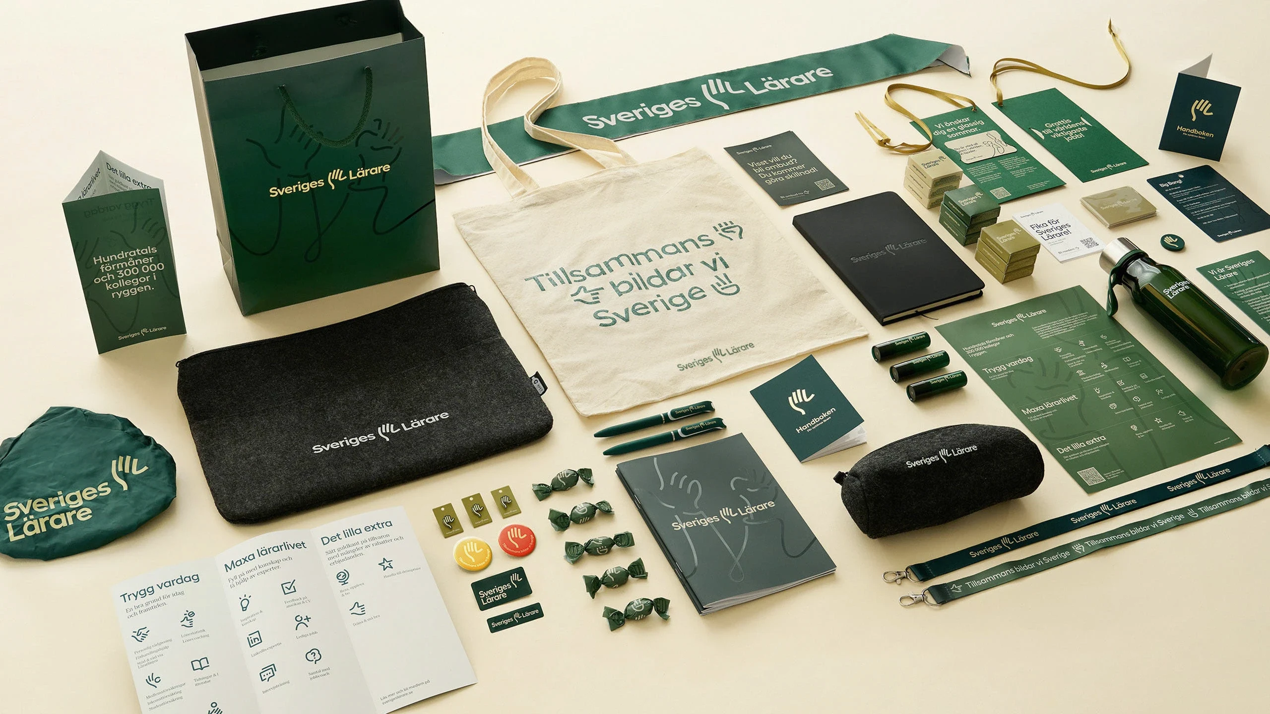
Oké Design created the visual identity and did some of the initial implementations of the brand during the first year before handing over to the in house design team.
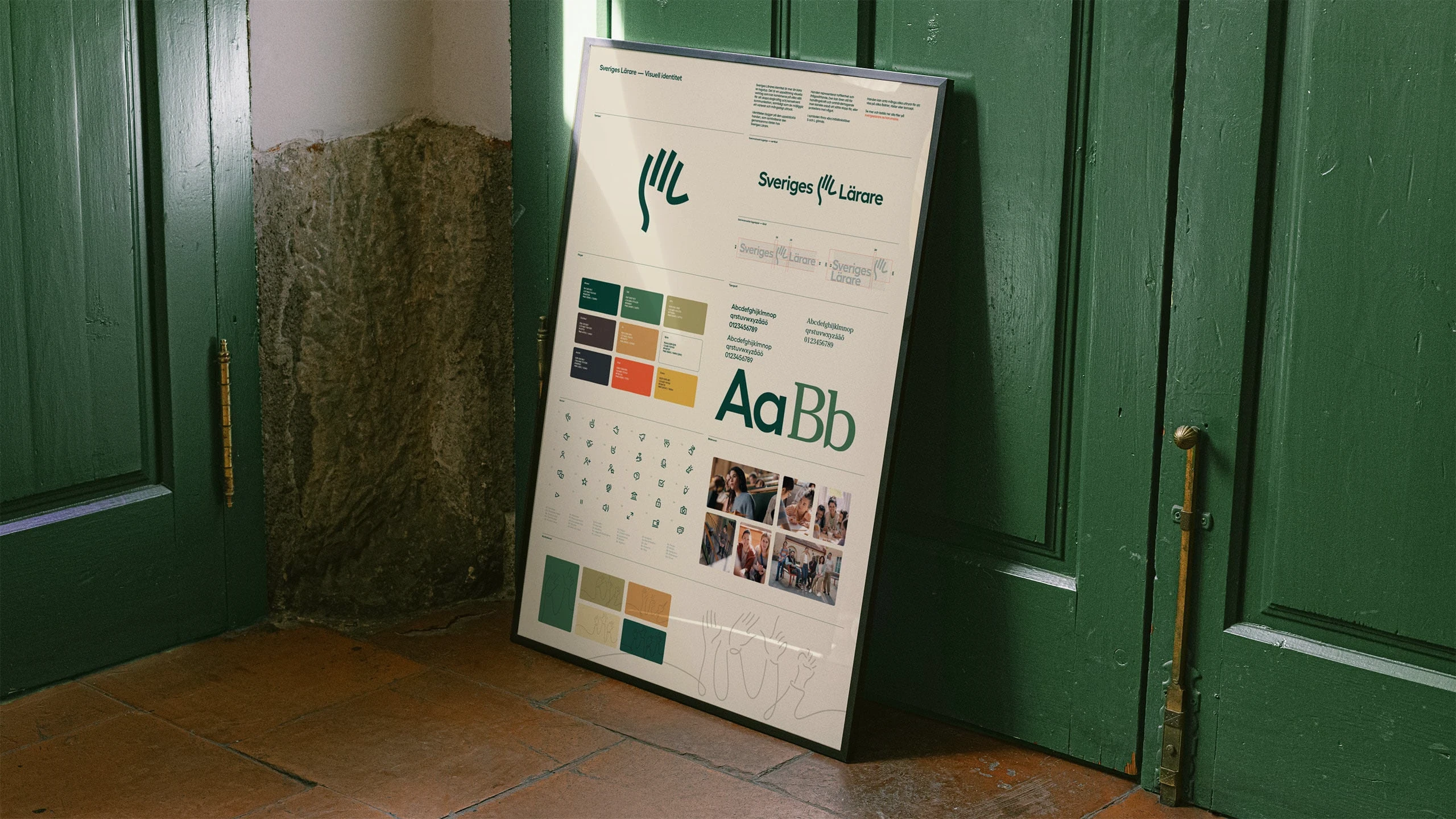
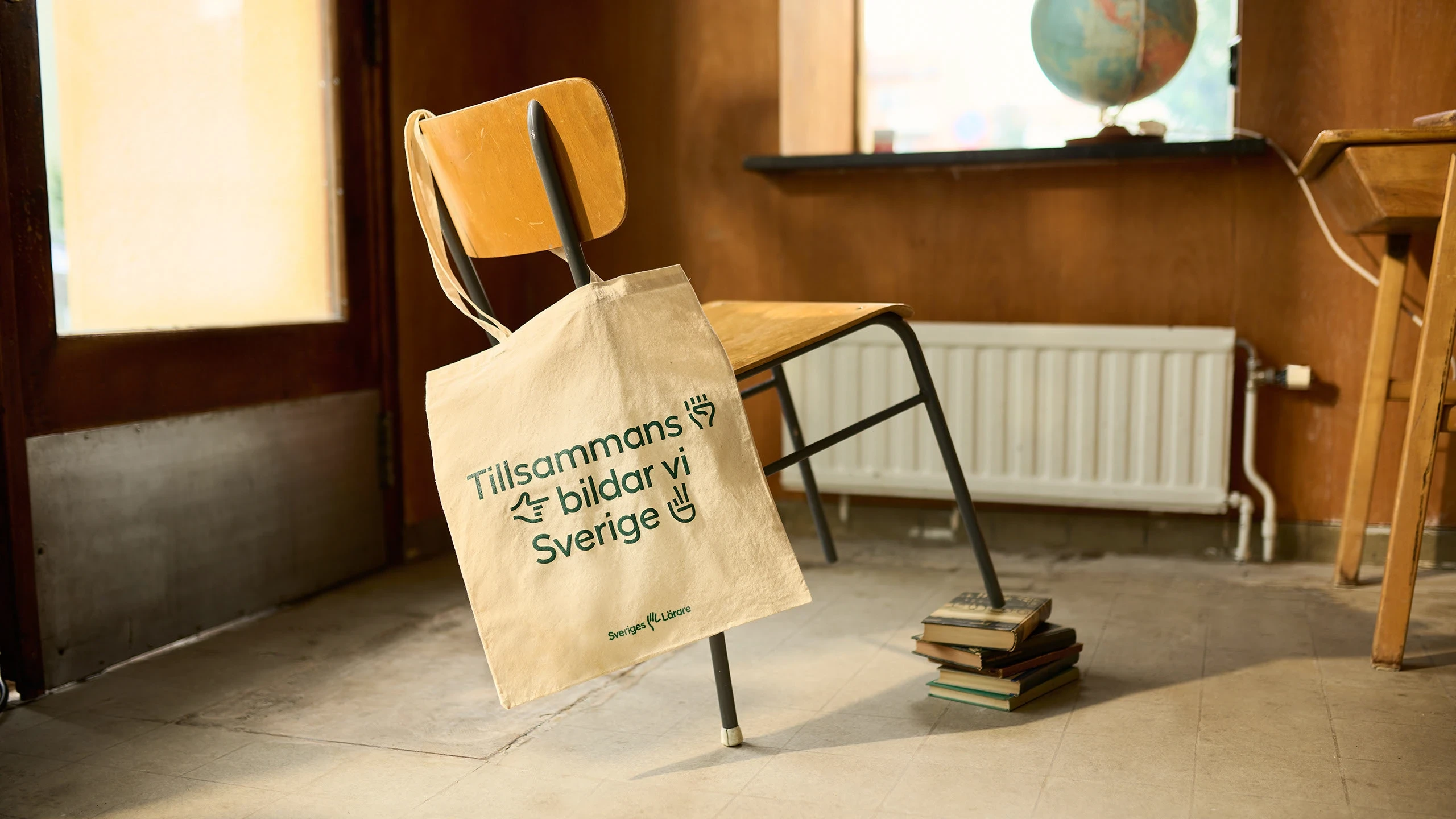
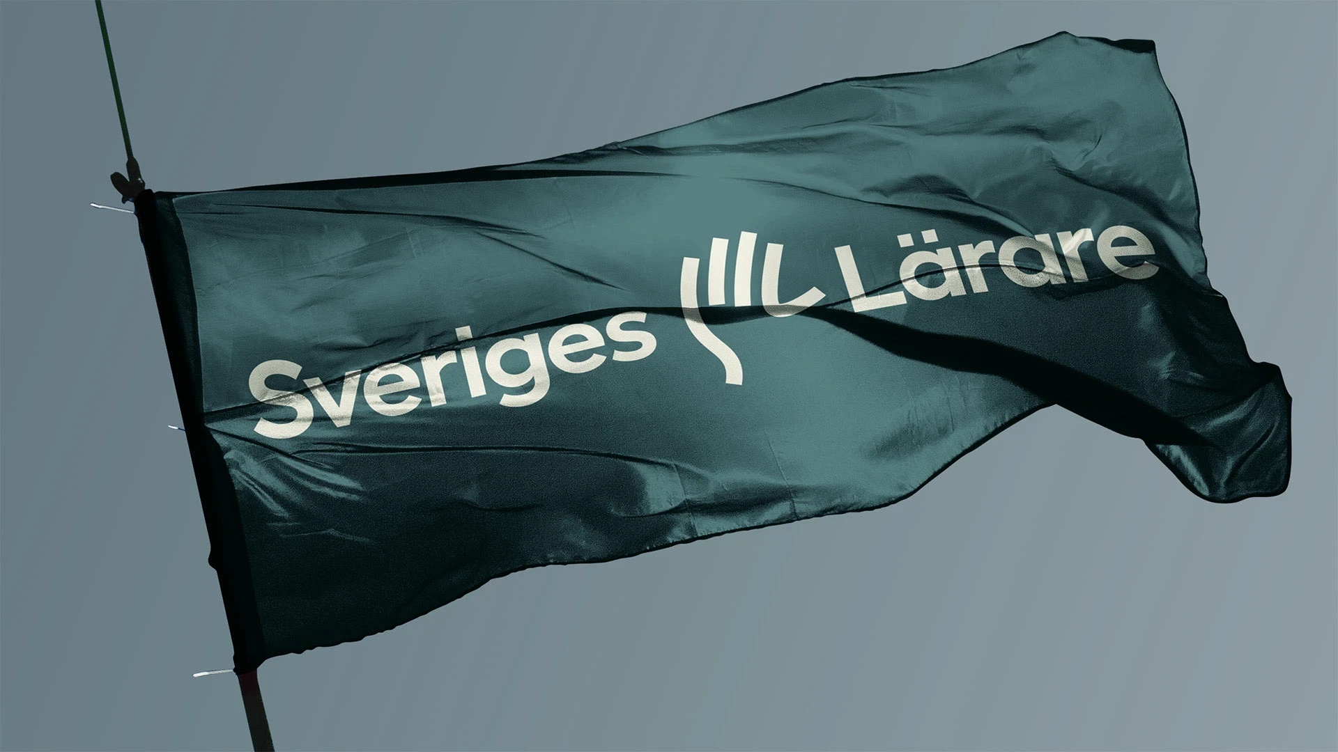
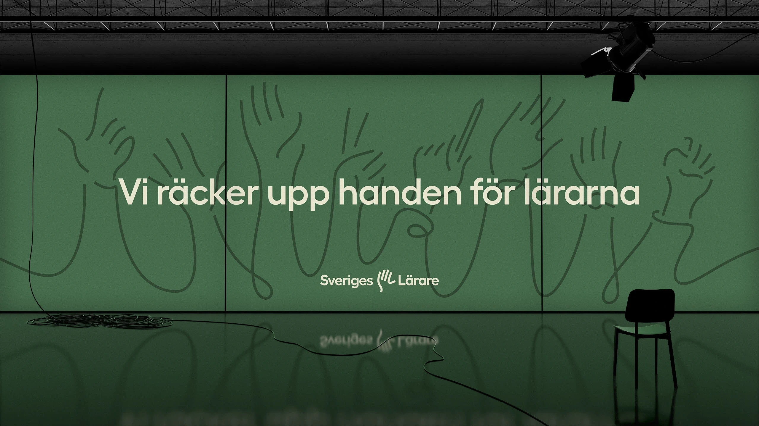
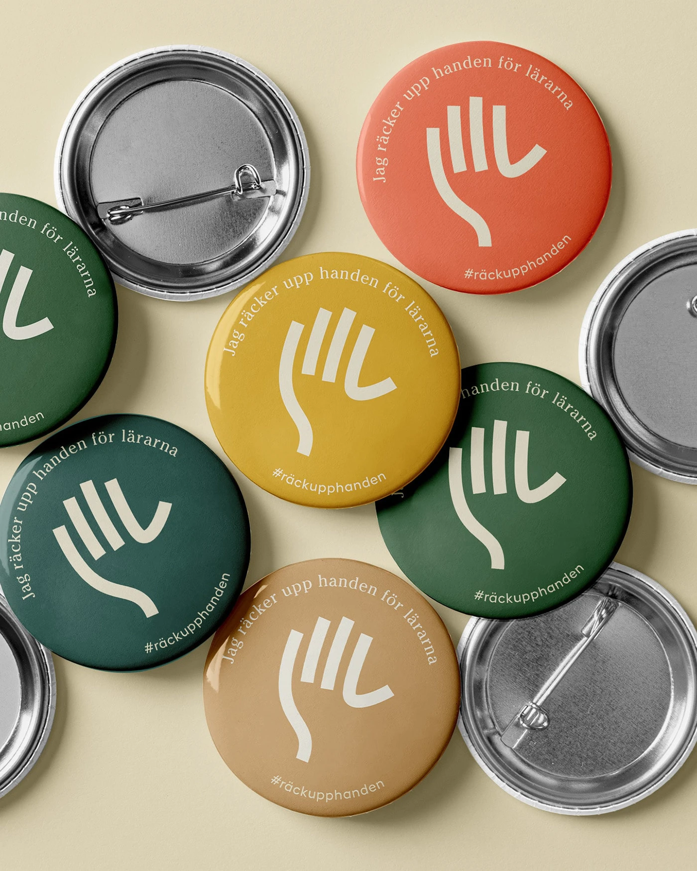
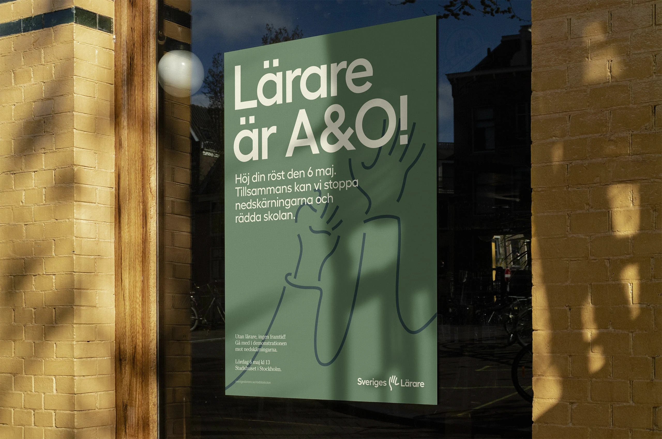
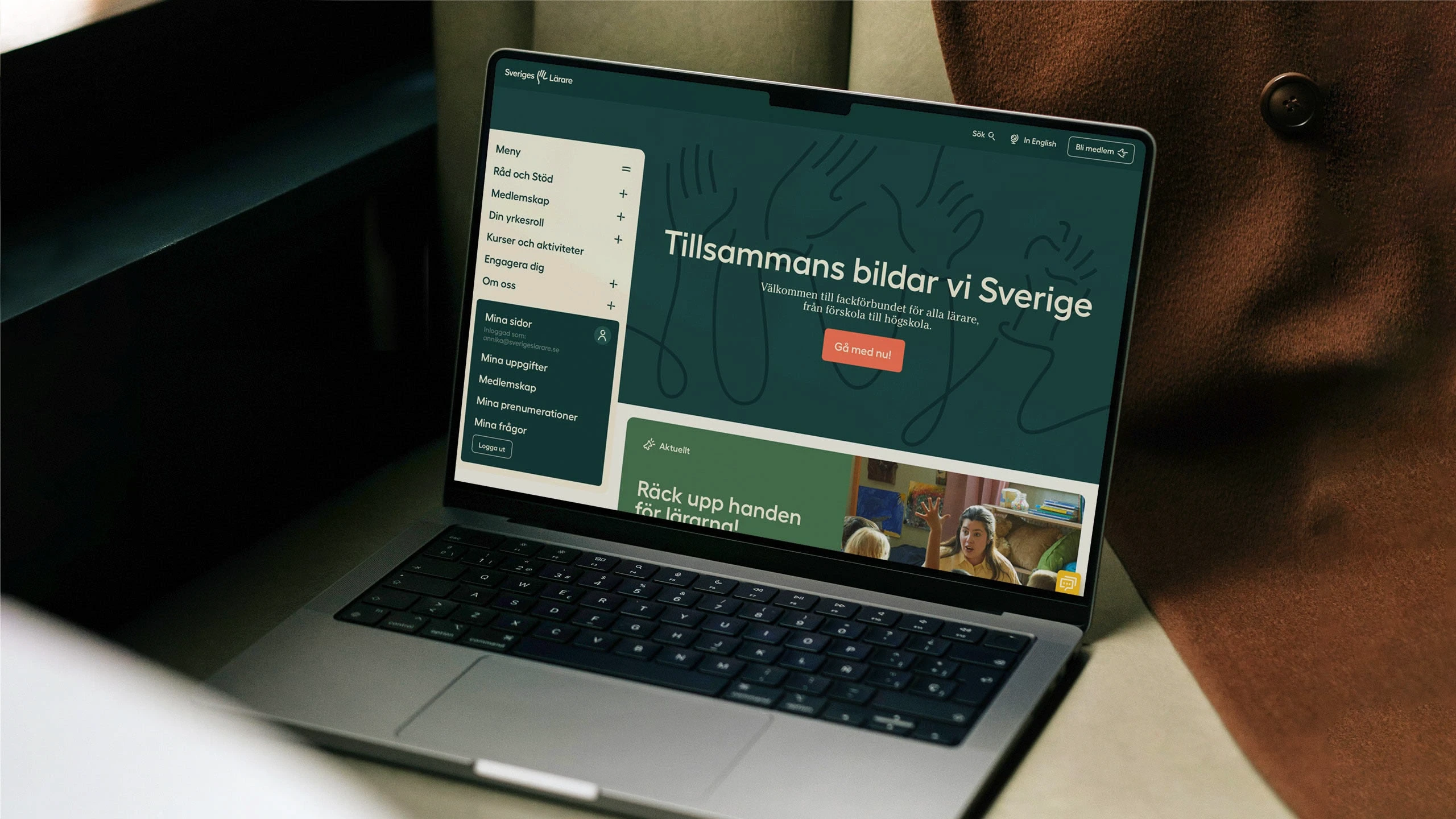
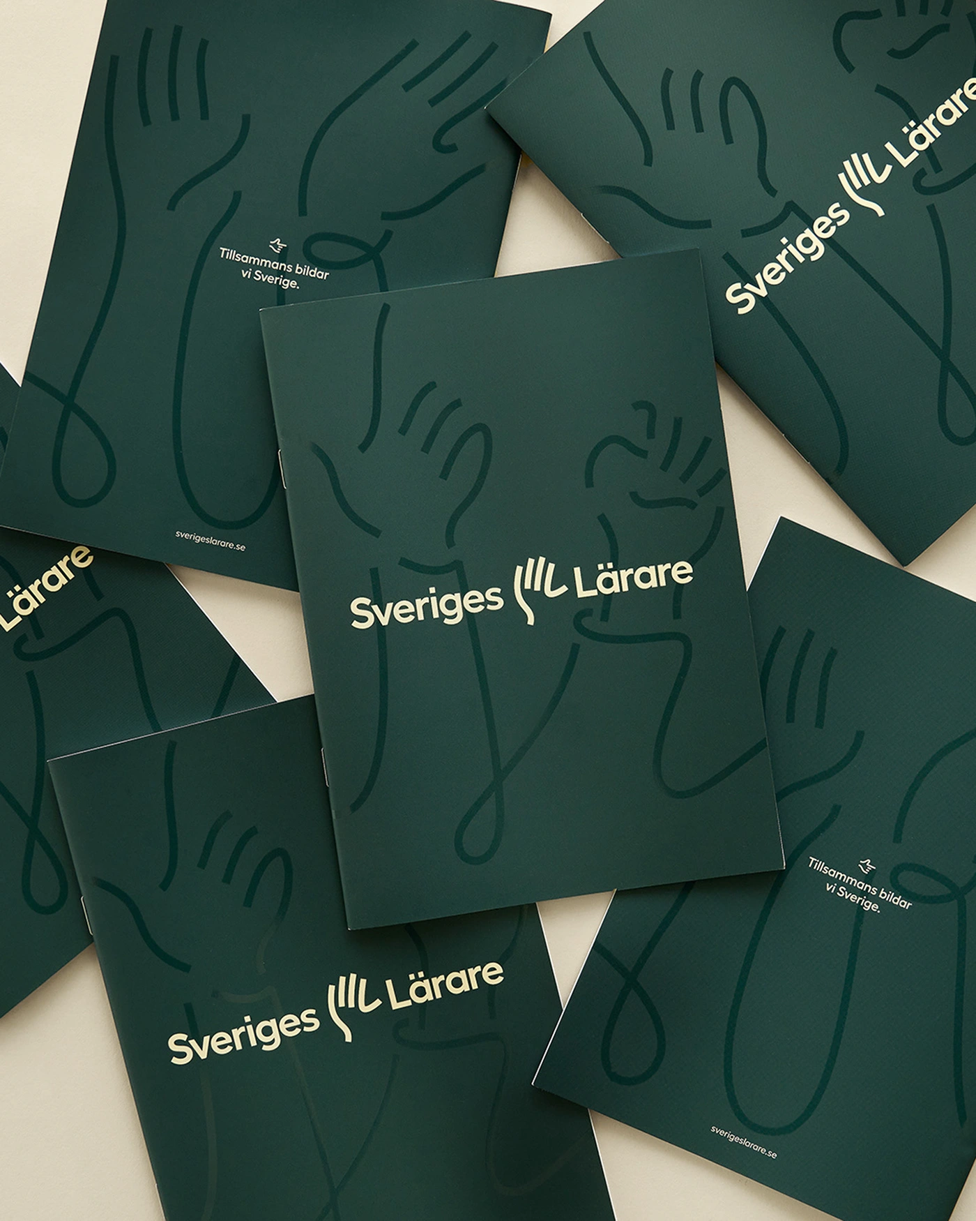
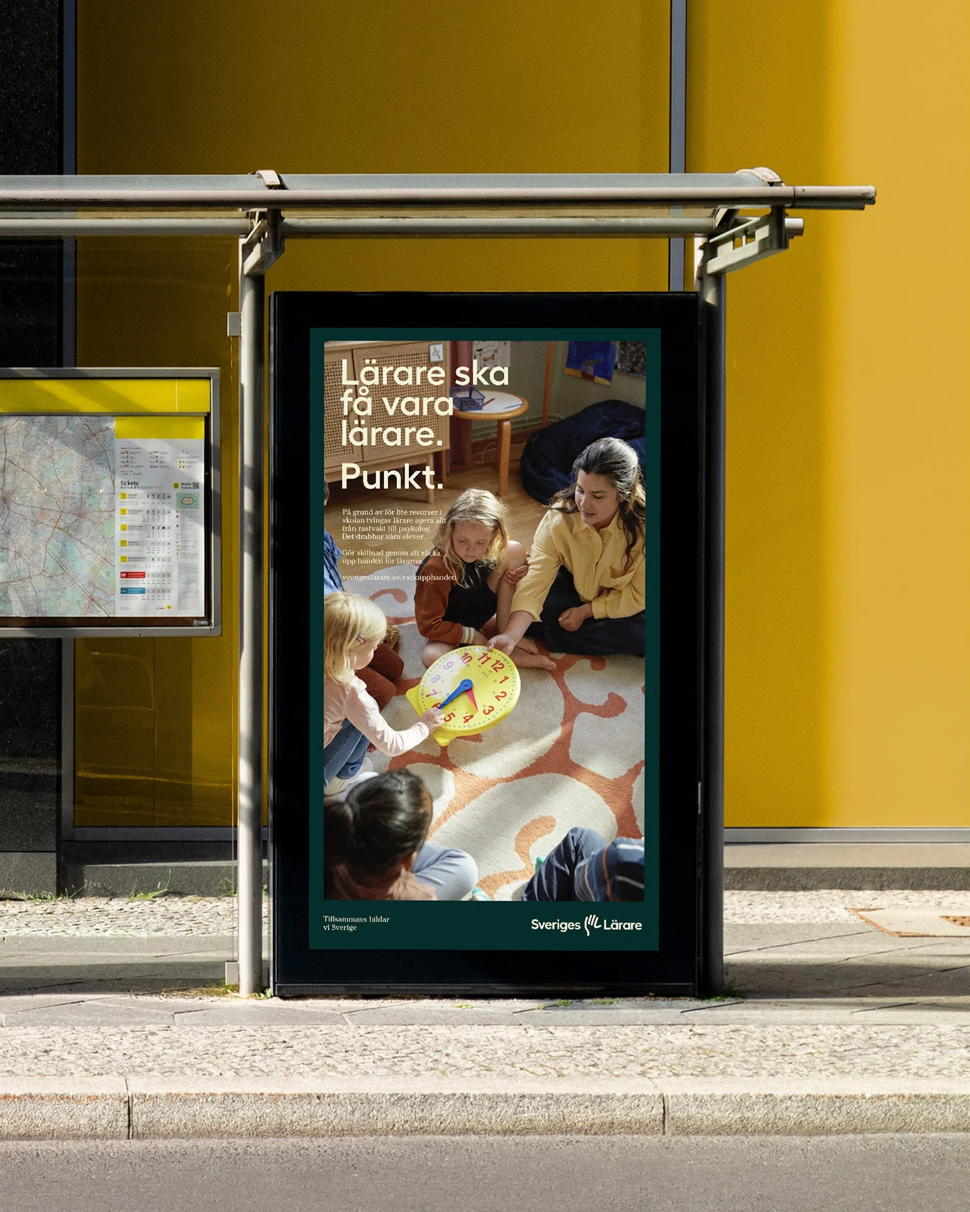
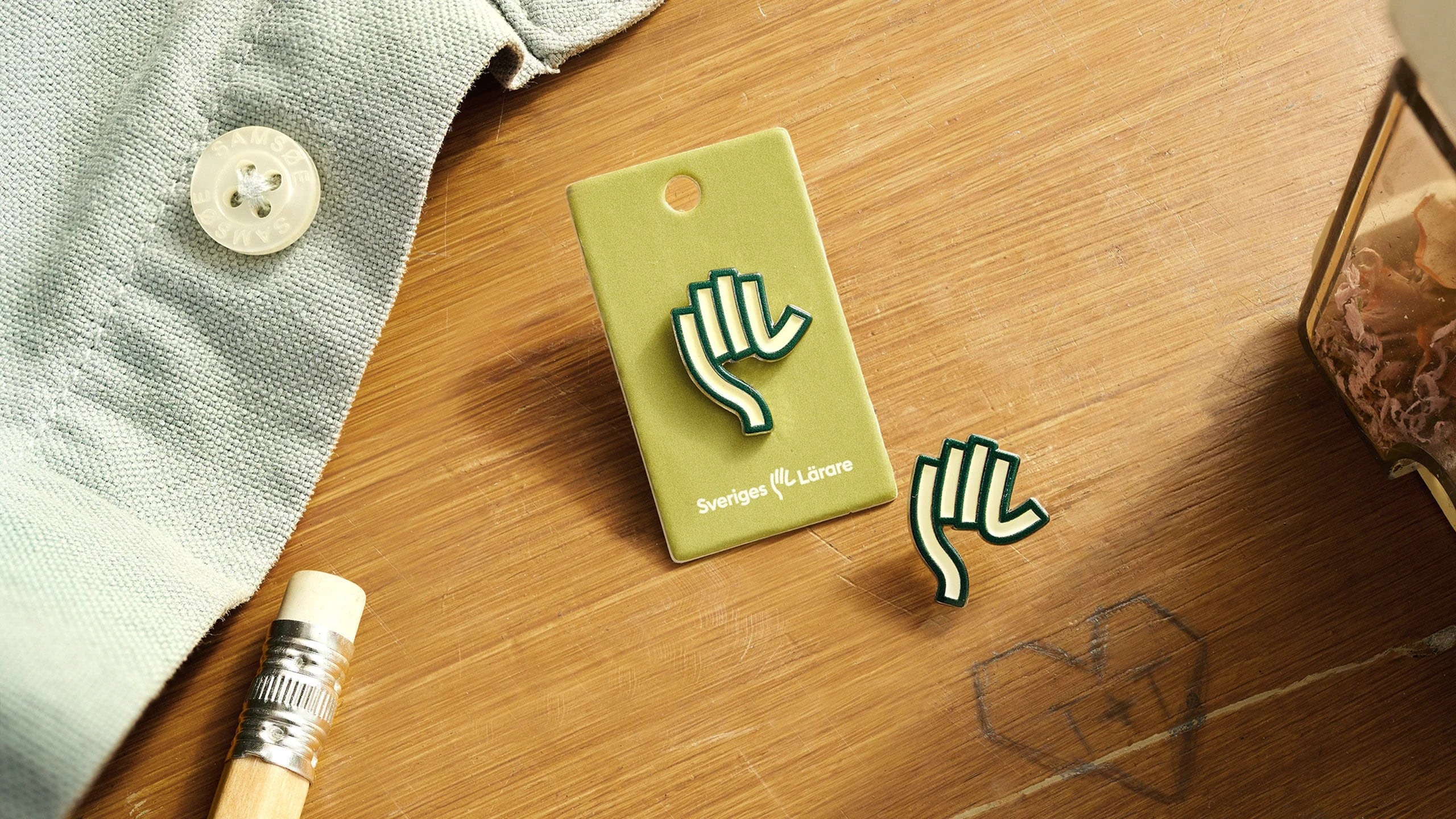
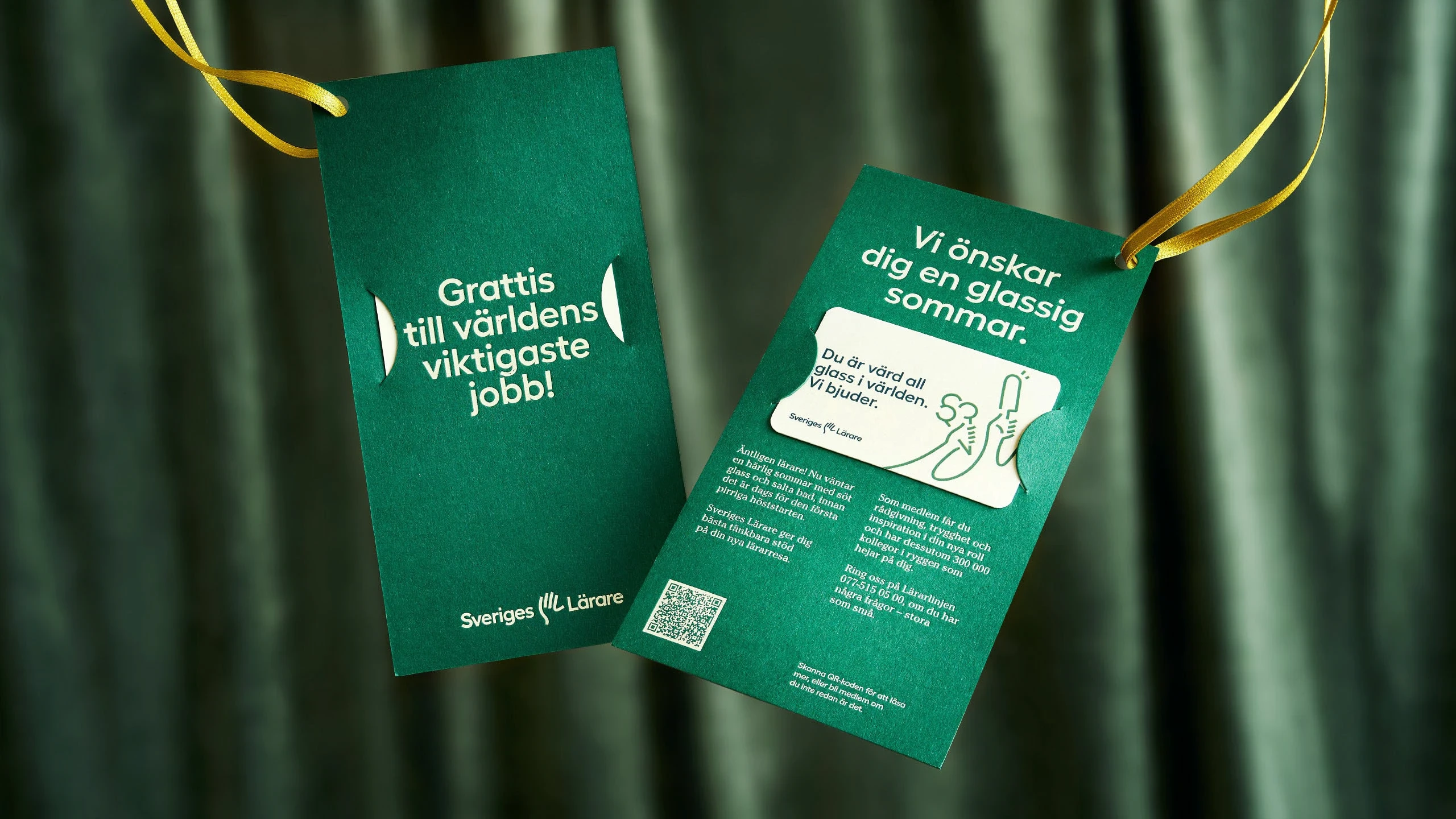
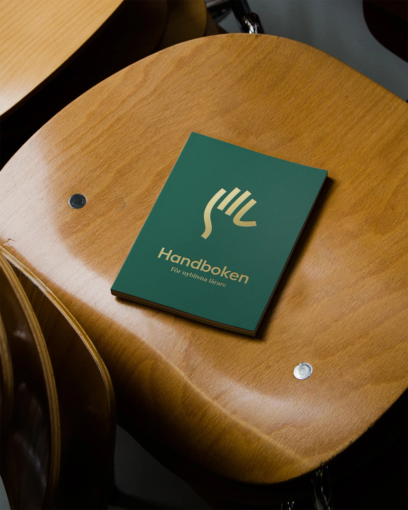
The symbol of the raised hand became the unifying element of the identity, representing the curiosity of learning as well the democratic vote of every individual member of the organisation. Hidden in the hand is also the letters S & L. The hands in the design system can take on different expressions and meaning depending on the context.
As a result of the rebrand, awareness among the general public rose from essentially 0 to 96% in the first year, according to a study made by Kantar Sifo.
See more of the brand at https://varumarke.sverigeslarare.se/
And see the live project at https://www.sverigeslarare.se/

Like this project
Posted May 22, 2025
A guiding hand for Swedens biggest union. Strategy, visual identity and brand implementations for Sveriges Lärare.
Likes
18
Views
197
Timeline
Nov 1, 2023 - Dec 20, 2024
Clients
Sveriges Lärare